Supplying Inadequate Context for the Data
Measures of what's currently going on in the business rarely do well as a solo act; they need a good supporting cast to succeed. For example, to state that quarter-to-date sales total $736,502 without any context means little. Compared to what? Is this good or bad? How good or bad? Are we on track? Are we doing better than we have in the past, or worse than we've forecasted? Supplying the right context for key measures makes the difference between numbers that just sit there on the screen and those that enlighten and inspire action.
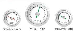
The gauges in Figure 3-4 could easily have incorporated useful context, but they fall short of their potential. For instance, the center gauge tells us only that 7,822 units have sold this year to date, and that this number is good (indicated by the green arrow). A quantitative scale on a graph, such as the radial scales of tick marks on these gauges, is meant to provide an approximation of the measure, but it can only do so if the scale is labeled with numbers, which these gauges lack. If the numbers had been present, the positions of the arrows might have been meaningful, but here the presence of the tick marks along a radial axis suggests useful information that hasn't actually been included.
Figure 3-4. These dashboard gauges fail to provide adequate context to make the measures meaningful.
These gauges use up a great deal of space to tell us nothing whatsoever. The same information could have been communicated simply as text in much less space, without any loss of meaning:
|
YTD Units |
7,822 |
|
October Units |
869 |
|
Returns Rate |
0.26% |
Another failure of these gauges is that they tease us by coloring the arrows to indicate good or bad performance, without telling us how good or bad it is. They could easily have done this by labeling the quantitative scales and visually encoding sections along the scales as good or bad, rather than just encoding the arrows in this manner. Had this been done, we would be able to see at a glance how good or bad a measure is by how far the arrow points into the good or bad ranges.
The gauge that appears in Figure 3-5 does a better job of incorporating context in the form of meaningful comparisons. Here, the potential of the graphical display is more fully realized. The gauge measures the average duration of phone calls and is part of a larger dashboard of call-center data.
Supplying context for measures need not always involve a choice of the single best comparisonrather, several contexts may be given. For instance, quarter-to-date sales of $736,502 might benefit from comparisons to the budget target of $1,000,000; sales on this day last year of $856,923; and a time-series of sales figures for the last six quarters. Such a display would provide much richer insight than a simple display of the current sales figure, with or without an indication of whether it's "good" or "bad." You must be careful, however, when incorporating rich context such as this to do so in a way that doesn't force the viewer to get bogged down in reading the details to get the basic message. It is useful to provide a visually prominent display of the primary information and to subdue the supporting context somewhat, so that it doesn't get in the way when the dashboard is being quickly scanned for key points.
Figure 3-5. This dashboard gauge (found in a paper entitled "Making Dashboards Actionable," written by Laurie M. Orlov and published in December 2003 by Forrester Research, Inc.) does a better job than those in Figure 3-4 of using a gauge effectively.
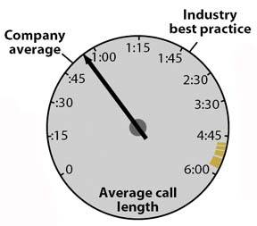
Note: I believe that the circular shape used by gauges like this one wastes valuable space on a dashboard, as I'll explain in Chapter 6, Effective Dashboard Display Media. Nevertheless, I commend this gauge for displaying richer information than most.
The amount of context that ought to be incorporated to enrich the measures on a dashboard depends on its purpose and the needs of its viewers. More is not always better, but when more provides real value, it ought to be included in a way that supports both a quick overview without distraction as well as contextual information for richer understanding.
Clarifying the Vision
- Clarifying the Vision
- All That Glitters Is Not Gold
- Even Dashboards Have a History
- Dispelling the Confusion
- A Timely Opportunity
Variations in Dashboard Uses and Data
Thirteen Common Mistakes in Dashboard Design
- Thirteen Common Mistakes in Dashboard Design
- Exceeding the Boundaries of a Single Screen
- Supplying Inadequate Context for the Data
- Displaying Excessive Detail or Precision
- Choosing a Deficient Measure
- Choosing Inappropriate Display Media
- Introducing Meaningless Variety
- Using Poorly Designed Display Media
- Encoding Quantitative Data Inaccurately
- Arranging the Data Poorly
- Highlighting Important Data Ineffectively or Not at All
- Cluttering the Display with Useless Decoration
- Misusing or Overusing Color
- Designing an Unattractive Visual Display
Tapping into the Power of Visual Perception
- Tapping into the Power of Visual Perception
- Understanding the Limits of Short-Term Memory
- Visually Encoding Data for Rapid Perception
- Gestalt Principles of Visual Perception
- Applying the Principles of Visual Perception to Dashboard Design
Eloquence Through Simplicity
- Eloquence Through Simplicity
- Characteristics of a Well-Designed Dashboard
- Key Goals in the Visual Design Process
Effective Dashboard Display Media
- Effective Dashboard Display Media
- Select the Best Display Medium
- An Ideal Library of Dashboard Display Media
- Summary
Designing Dashboards for Usability
- Designing Dashboards for Usability
- Organize the Information to Support Its Meaning and Use
- Maintain Consistency for Quick and Accurate Interpretation
- Make the Viewing Experience Aesthetically Pleasing
- Design for Use as a Launch Pad
- Test Your Design for Usability
Putting It All Together
EAN: 2147483647
Pages: 80
