Select the Best Display Medium
The best medium for displaying data will always be based on the nature of the information, the nature of the message, and the needs and preferences of the audience. A single dashboard generally displays a variety of data and requires a variety of display media, each matched to specific data. In the next section we'll pair specific data and messages with the graphic media that display them best, but let's begin here with a more fundamental question: "Should the information be encoded as text, graphics, or both?" The appropriateness of each medium for a given situation, either verbal language in written form (text) or visual language (graphics), isn't arbitrary.
Verbal language is processed serially, one word at a time. Some people are much faster readers than othersan ability that I envybut everyone processes language serially. Especially when communicating quantitative information, the strength of written words and numbers compared to graphics is their precision. If your sole purpose is to precisely communicate current year-to-date expenses of $487,321, for example, nothing works better on a dashboard than a simple display like this:
|
YTD Expenses |
$487,321 |
Displaying individual values does not require graphicsindeed, their use would only retard communication. Let's continue to enhance this data to see if there is a point where switching from pure text to the addition of graphics adds clear value.
Sometimes just providing an individual number and label is appropriate, but often you want to say more. Let's enhance the data with a simple evaluative remark that this year-to-date expense figure is higher than it should be:
|
YTD Expenses |
$487,321 |
This certainly isn't the only way to communicate this evaluative information, but it is sufficient. As long as only measures in this condition are displayed in this fashion, even those who are color-blind will be able to recognize that we are calling attention to this expense amount (because we've boldfaced the number).
Now let's add to the general declaration that this expense amount is bad the specific criterion that was used to determine this, which in this case is the target for year-to-date expenses:
|
Actual |
Target |
|
|---|---|---|
|
YTD Expenses |
$487,321 |
$450,000 |
At this stage we're beginning to venture into the territory where a graphical display might be useful, but it certainly isn't imperative yet. The viewer must do a little math to interpret the extent of the expense overage, but in this case the math is simple and fast. You could even remove the need for the viewer to do the calculation by adding the amount of variance from the target, or perhaps by displaying the variance alone, without the actual expense amount, if the variance is all that's needed. Here are some examples of how you could choose to present this data, using text alone:
|
Actual |
Target |
Varience |
|
|---|---|---|---|
|
YTD Expenses |
$487,321 |
$450,000 |
+$37,321 |
|
Actual |
Target |
Varience% |
|
|---|---|---|---|
|
YTD Expenses |
$487,321 |
$450,000 |
+$8% |
|
Actual |
Variance to Target |
|
|---|---|---|
|
YTD Expenses |
$487,321 |
+$37,321 |
|
Actual |
Variance to Target% |
|
|---|---|---|
|
YTD Expenses |
$487,321 |
+8% |
|
YTD Expenses Variance |
+$37,321 |
|
|
YTD Expenses Variance |
+8% |
Any one of these approaches might be appropriate for a single measure that has been enhanced with contextual data such as the target and some indication of whether it is good or bad.
An entire dashboard full of individual measures expressed textually in this manner would work fine if its purpose were to draw attention to individual measures one at a time, but what if you want a bigger picture of the whole or comparisons of multiple measures to emerge? Text alone doesn't support this.
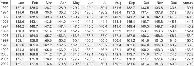
Text, especially when organized into tables (that is, as rows and columns of data), is a superb medium for looking up information. Bus schedules, tax rate tables, and the indexes of books, to name but a few examples, are all organized as tables to support this use. If you need to look up the Consumer Price Index (CPI) rate for September 1996 using the table in Figure 6-1, for example, you can easily find the precise value of 157.8. Graphs don't support looking up individual values as efficiently, and certainly not as precisely.
Figure 6-1. This CPI table illustrates the strength of tables as a means to look up precise individual values.
Now look at the CPI table again, but this time try to determine the shape of the values as they change through the course of the year 1996. Text doesn't support this view of the data, but look at how clearly the graph in Figure 6-2 on the next page presents it.
Figure 6-2. This graph of the CPI for the year 1996 illustrates how well graphs reveal the shape of data, in this case as it changes through time.
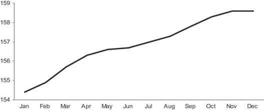
Notice also, however, that the previous task of looking up the index value for September is not supported very well by the graph.
When, in the late 18th century, the British social scientist William Playfair invented many of the graphs that we still use today, he created a powerful language for communicating quantitative information. Giving values shape through the use of grid coordinates along two axes enabled us to visualize numbers, which dramatically extended our ability to think quantitatively. This is the strength of graphs: they give shape to numbers and, in doing so, bring to light patterns that would otherwise remain undetected.
Let's see some of these concepts at work on a dashboard. Look at the predominantly text-based dashboard in Figure 6-3.
Figure 6-3. A predominantly text-based dashboard.
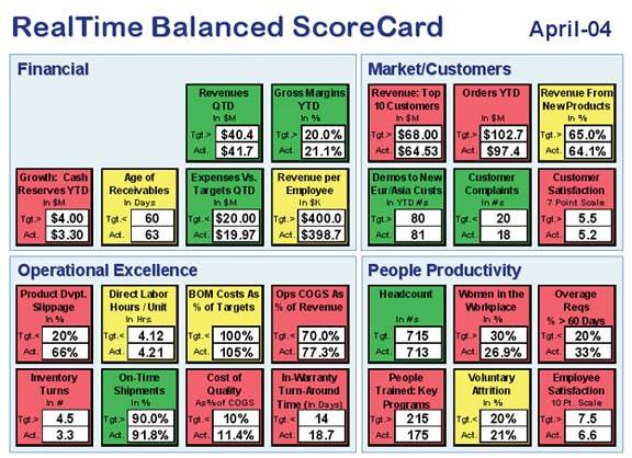
Notice how the textual medium primarily supports the process of lookup. Each measure is isolated from the rest, and comparisons are difficult.
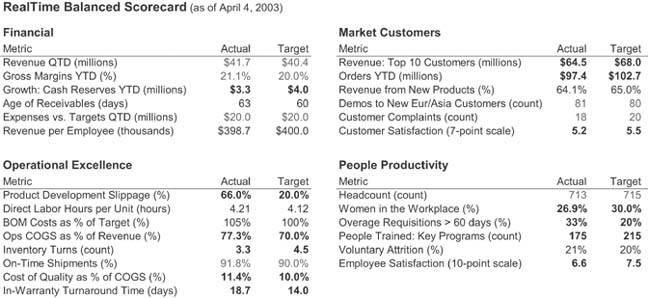
The only big-picture information that is provided is conveyed through the visual attribute of hue. Assuming that you are not color-blind and can distinguish these hues, with a quick scan the many red and yellow boxes reveal that much is wrong. Beyond that, you are forced to consider each measure individually. If no comparisons or patterns are useful for this dashboard, the predominance of text is fine. But even if this were the case, which is unlikely, the textual display of this information could have been presented in a less fragmented way, such as the redesign that you see in Figure 6-4. Here, the measures are arranged in tables to make scanning easier. The red, yellow, and green color-coding has been replaced with boldface, black, and gray text, respectively, to enable perception by people who are color-blind. Note that this redesign has improved the dashboard's use for lookup, but not for gleaning additional meaning.
Figure 6-4. Redesign of the text-based dashboard in Figure 6-3, arranged in tables to better support lookup.
Effective dashboards need to combine text and graphics in a way that supports a rich and meaningful display of data, along with the desired level of quantitative precision, in a way that can be perceived efficiently. With each measure or set of related measures, you must ask what the viewer needs, how the data will be used, and what message the data must convey, and then blend the use of text and graphics to achieve these communication objectives.
Clarifying the Vision
- Clarifying the Vision
- All That Glitters Is Not Gold
- Even Dashboards Have a History
- Dispelling the Confusion
- A Timely Opportunity
Variations in Dashboard Uses and Data
Thirteen Common Mistakes in Dashboard Design
- Thirteen Common Mistakes in Dashboard Design
- Exceeding the Boundaries of a Single Screen
- Supplying Inadequate Context for the Data
- Displaying Excessive Detail or Precision
- Choosing a Deficient Measure
- Choosing Inappropriate Display Media
- Introducing Meaningless Variety
- Using Poorly Designed Display Media
- Encoding Quantitative Data Inaccurately
- Arranging the Data Poorly
- Highlighting Important Data Ineffectively or Not at All
- Cluttering the Display with Useless Decoration
- Misusing or Overusing Color
- Designing an Unattractive Visual Display
Tapping into the Power of Visual Perception
- Tapping into the Power of Visual Perception
- Understanding the Limits of Short-Term Memory
- Visually Encoding Data for Rapid Perception
- Gestalt Principles of Visual Perception
- Applying the Principles of Visual Perception to Dashboard Design
Eloquence Through Simplicity
- Eloquence Through Simplicity
- Characteristics of a Well-Designed Dashboard
- Key Goals in the Visual Design Process
Effective Dashboard Display Media
- Effective Dashboard Display Media
- Select the Best Display Medium
- An Ideal Library of Dashboard Display Media
- Summary
Designing Dashboards for Usability
- Designing Dashboards for Usability
- Organize the Information to Support Its Meaning and Use
- Maintain Consistency for Quick and Accurate Interpretation
- Make the Viewing Experience Aesthetically Pleasing
- Design for Use as a Launch Pad
- Test Your Design for Usability
Putting It All Together
EAN: 2147483647
Pages: 80
