Sample Marketing Analysis Dashboard
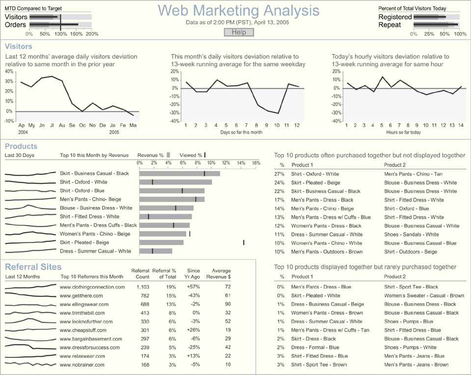
The last sample dashboard we'll look at is an example of one that supports analysis (Figure 8-13). Like all dashboards, it is used to monitor the information needed to do a job, but in this case that job happens to primarily involve analysis. Dashboards can provide a useful means for analysts to watch over their domains and spot conditions that warrant examination. Ideally, they can also serve as direct launch pads to the additional data and tools necessary to perform comprehensive analyses.
This particular scenario involves an analyst whose work supports the marketing efforts of the company's web site. She monitors customer behavior on the site to identify both problems that prevent customers from finding and purchasing what they want and opportunities to interest customers in additional products. To expose activities on the web site that could lead to insight if studied and understood, the following data appears on the dashboard:
- Number of visitors (daily, monthly, and yearly)
- Number of orders
- Number of registered visitors
- Number of times individual products were viewed on the site
- Occasions when products that were displayed on the same page were rarely purchased together
- Occasions when products that were not displayed on the same page were purchased together
- Referrals from other web sites that have resulted in the most visits
The information that appears at the top of this dashboard provides an overview of the web site's performance through time and lists missed opportunities and ineffective marketing efforts. Notice that the time-series information regarding visitors to the site is segmented into three sections, each featuring a different interval of time. The intervals have been tailored to reveal greater detail for the recent past and increasingly less detail the farther back the data goes.
Much of the information on this dashboard has been selected and arranged to display a ranking relationship. This is common when a dashboard is used to feature exceptional conditions, both good and bad. Much of this ranked information is communicated in the form of text, with little graphical content. Given the purpose to inform the analyst of potential areas of interest with a brief explanation of why, text does the job nicely. The analyst must read each entry to decide if she'll investigate the matter, but graphical displays, which could be scanned faster, would not do the job as well. The fact that an item appears on one of these lists already implies its importance, so graphical devices such as alerts would add nothing.
Figure 8-13. A sample web marketing analysis dashboard.
Clarifying the Vision
- Clarifying the Vision
- All That Glitters Is Not Gold
- Even Dashboards Have a History
- Dispelling the Confusion
- A Timely Opportunity
Variations in Dashboard Uses and Data
Thirteen Common Mistakes in Dashboard Design
- Thirteen Common Mistakes in Dashboard Design
- Exceeding the Boundaries of a Single Screen
- Supplying Inadequate Context for the Data
- Displaying Excessive Detail or Precision
- Choosing a Deficient Measure
- Choosing Inappropriate Display Media
- Introducing Meaningless Variety
- Using Poorly Designed Display Media
- Encoding Quantitative Data Inaccurately
- Arranging the Data Poorly
- Highlighting Important Data Ineffectively or Not at All
- Cluttering the Display with Useless Decoration
- Misusing or Overusing Color
- Designing an Unattractive Visual Display
Tapping into the Power of Visual Perception
- Tapping into the Power of Visual Perception
- Understanding the Limits of Short-Term Memory
- Visually Encoding Data for Rapid Perception
- Gestalt Principles of Visual Perception
- Applying the Principles of Visual Perception to Dashboard Design
Eloquence Through Simplicity
- Eloquence Through Simplicity
- Characteristics of a Well-Designed Dashboard
- Key Goals in the Visual Design Process
Effective Dashboard Display Media
- Effective Dashboard Display Media
- Select the Best Display Medium
- An Ideal Library of Dashboard Display Media
- Summary
Designing Dashboards for Usability
- Designing Dashboards for Usability
- Organize the Information to Support Its Meaning and Use
- Maintain Consistency for Quick and Accurate Interpretation
- Make the Viewing Experience Aesthetically Pleasing
- Design for Use as a Launch Pad
- Test Your Design for Usability
Putting It All Together
EAN: 2147483647
Pages: 80
