Choosing Inappropriate Display Media
Choosing inappropriate display media is one of the most common design mistakes made, not just in dashboards, but in all forms of quantitative data presentation. For instance, using a graph when a table of numbers would work better, and vice versa, is a frequent mistake. Allow me to illustrate using several examples beginning with the pie chart in Figure 3-9.
Figure 3-9. This chart illustrates a common problem with pie charts.

This pie chart is part of a dashboard that displays breast cancer statistics. Look at it for a moment and see if anything seems odd.
Pie charts are designed specifically to present parts of a whole, and the whole should always add up to 100%. Here, the slice labeled "Breast 13.30%" looks like it represents around 40% of the piea far cry from 13.3%. Despite the meaning that a pie chart suggests, these slices are not parts of a whole; they represent the probability that a woman will develop a particular form of cancer (breast, lung, colon, and six types that aren't labeled). This misuse of a pie chart invites confusion.
The truth is, I never recommend the use of pie charts. The only thing they have going for them is the fact that everybody immediately knows when they see a pie chart that they are seeing parts of a whole (or ought to be). Beyond that, pie charts don't display quantitative data very effectively. As you'll see in Chapter 4, Tapping into the Power of Visual Perception, humans can't compare two-dimensional areas or angles very accuratelyand these are the two means that pie charts use to encode quantitative data. Bar graphs are a much better way to display this information.
Note: Refer to my book Show Me the Numbers: Designing Tables and Graphs to Enlighten (Oakland, CA: Analytics Press, 2004) for a thorough treatment of the types of graphs that work best for the most common quantitative messages communicated in business.
The pie chart in Figure 3-10 shows that even when correctly used to present parts of a whole, these graphs don't work very well. Without the value labels, you would only be able to discern that opportunities rated as "Fair" represent the largest group, those rated as "Field Sales: 2-Very High" represent a miniscule group, and the other ratings groups are roughly equal in size.
Figure 3-10. This example shows that even when they are used correctly to present parts of a whole, pie charts are difficult to interpret accurately.
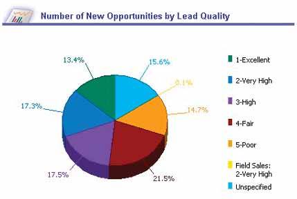
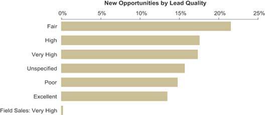
Figure 3-11 displays the same data as Figure 3-10, this time using a horizontal bar graph that can be interpreted much more efficiently and accurately.
Figure 3-11. This horizontal bar graph does a much better job of displaying part-to-whole data than the preceding pie charts.
Other types of graphs can be equally ineffective. For example, the graph in Figure 3-12 shows little regard for the viewer's time and no understanding of visual perception. This graph compares revenue to operating costs across five months, using the size of overlapping circles (sometimes called bubbles) to encode the quantities. Just as with the slices of a pie, using circles to encode quantity relies on the viewer's ability to compare two-dimensional areas, which we simply cannot accurately do. Take the values for the month of February as an example. Assuming that operating costs equal $10,000, what is the revenue value?
Figure 3-12. This graph uses the two-dimensional area of circles to encode their values, which needlessly obscures the data.
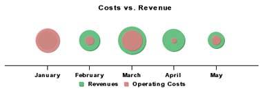
Our natural tendency is to compare the sizes of the two circles using a single dimensionlength or widthequal to the diameter of each, which suggests that revenue is about three times that of operating costs, or about $30,000. This conclusion is wrong, however, to a huge degree. The two-dimensional area of the revenue circle is actually about nine times bigger than that of the operating costs circle, resulting in a value of $90,000. Oops! Not even close.
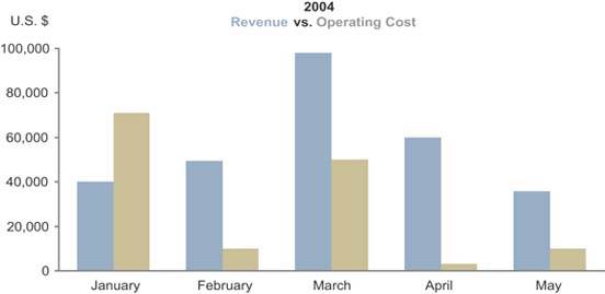
Now compare operating costs for the months of February and May. It appears that costs in May are greater than those in February, right? In fact, the interior circles are the same sizemeasure them and see. The revenue bubble in May is smaller than the one in February, which makes the enclosed operating costs bubble in May seem bigger, but this is an optical illusion. As you can see, the use of a bubble chart for this financial data was a poor choice. A simple bar graph like the one in Figure 3-13 works much better.
Figure 3-13. This bar graph does a good job of displaying a time series of actual versus budgeted revenue values.
Actual versus budgeted revenue is also the subject of Figure 3-14, but this time it's subdivided into geographical regions rather than time slices and displayed as a radar graph. The quantitative scale on a radar graph is laid along each of the axis lines that extend from the center to the perimeter, like radius lines of a circle. The smallest values are those with the shortest distance between the center point and the perimeter.
Figure 3-14. This radar graph obscures the straightforward data that it's trying to convey.
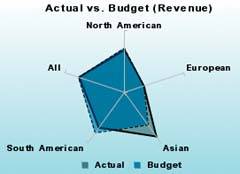
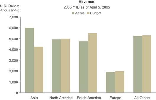
The lack of labeled axes in this graph limits its meaning, but the choice of a radar graph to display this information in the first place is an even more fundamental error. Once again, a simple bar graph like the one in Figure 3-15 would communicate this data much more effectively. Radar graphs are rarely appropriate media for displaying business data. Their circular shape obscures data that would be quite clear in a linear display such as a bar graph.
Figure 3-15. This bar graph effectively compares actual to budgeted revenue data.
The last example that I'll use to illustrate my point about choosing inappropriate means of display appears in Figure 3-16.
Figure 3-16. This display uselessly encodes quantitative values on a map of the United States.
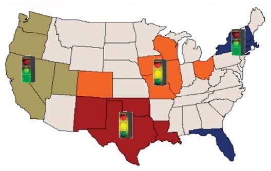
There are times when it is very useful to arrange data spatially, such as in the form of a map or the floor plan of a building, but this isn't one of them. We don't derive any insight by laying out revenue informationin this case, whether revenues are good (green light), mediocre (yellow light), or poor (red light), in the geographical regions South (brown), Central (orange), West (tan), and East (blue)on a map.
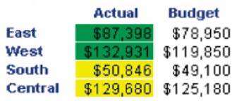
If the graphical display were presenting meaningful geographical relationshipssay, for shipments of wine from California, to indicate where special taxes must be paid whenever deliveries cross state linesperhaps a geographical display would provide some insight. With this simple set of four regions with no particular factors attached to geographical location, however, the use of a map simply takes up a lot of space to say no more than we find in the table that appears on this same dashboard, which is shown in Figure 3-17.
Figure 3-17. This table, from the same dashboard, provides a more appropriate display of the regional revenue data that appears in Figure 3-16.
Clarifying the Vision
- Clarifying the Vision
- All That Glitters Is Not Gold
- Even Dashboards Have a History
- Dispelling the Confusion
- A Timely Opportunity
Variations in Dashboard Uses and Data
Thirteen Common Mistakes in Dashboard Design
- Thirteen Common Mistakes in Dashboard Design
- Exceeding the Boundaries of a Single Screen
- Supplying Inadequate Context for the Data
- Displaying Excessive Detail or Precision
- Choosing a Deficient Measure
- Choosing Inappropriate Display Media
- Introducing Meaningless Variety
- Using Poorly Designed Display Media
- Encoding Quantitative Data Inaccurately
- Arranging the Data Poorly
- Highlighting Important Data Ineffectively or Not at All
- Cluttering the Display with Useless Decoration
- Misusing or Overusing Color
- Designing an Unattractive Visual Display
Tapping into the Power of Visual Perception
- Tapping into the Power of Visual Perception
- Understanding the Limits of Short-Term Memory
- Visually Encoding Data for Rapid Perception
- Gestalt Principles of Visual Perception
- Applying the Principles of Visual Perception to Dashboard Design
Eloquence Through Simplicity
- Eloquence Through Simplicity
- Characteristics of a Well-Designed Dashboard
- Key Goals in the Visual Design Process
Effective Dashboard Display Media
- Effective Dashboard Display Media
- Select the Best Display Medium
- An Ideal Library of Dashboard Display Media
- Summary
Designing Dashboards for Usability
- Designing Dashboards for Usability
- Organize the Information to Support Its Meaning and Use
- Maintain Consistency for Quick and Accurate Interpretation
- Make the Viewing Experience Aesthetically Pleasing
- Design for Use as a Launch Pad
- Test Your Design for Usability
Putting It All Together
EAN: 2147483647
Pages: 80
