Make the Viewing Experience Aesthetically Pleasing
In 1988 Donald Norman, a cognitive scientist, wrote a wonderful book entitled The Design of Everyday Things (New York: Basic Books). It is a classic in the field of design that convincingly argues that the effectiveness of something's design should be judged by how well it works and how easy it is to use. In the years since its publication, designers have often accused Norman of ignoring the value of aesthetics. This frequent critique was one of his motives for writing the recent book entitled Emotional Design: Why We Love (or Hate) Everyday Things (New York: Basic Books, 2004).
In this book, Norman describes the psychological and physiological benefits of aesthetically pleasing design. If applied to dashboard design, Norman's point would argue that aesthetically pleasing dashboards are more enjoyable, which makes them more relaxing, which prepares the viewer for greater insight and creative response. This is not a departure from his earlier assertions in The Design of Everyday Things, but rather an extension asserting that aesthetics, when not in conflict with a product's usability, possess intrinsic qualities that also contribute to usability. This new book convincingly reframes the discussion about the importance of usability as a matter not of usability versus aesthetics but of usability versus anything that flagrantly undermines usability, which good, aesthetically pleasing design manages to avoid.
I love visual art. I appreciate beauty for its own sake. Moments of great beauty exalt me. Information design, however, is about communication: getting an intended message across in a way that results in useful understanding. Aesthetics are an important component of information design, but not in the same way that they are in art. If a dashboard is not designed in an aesthetically pleasing way, the unpleasant experience that results for the viewer undermines the dashboard's ability to communicate. On a dashboard, your aesthetic talent ought to be applied directly to the display of the data itself, not to meaningless and distracting ornamentation. The aesthetics of dashboard design should always express themselves simply, striving for the eloquence that emerges uniquely from simplicity.
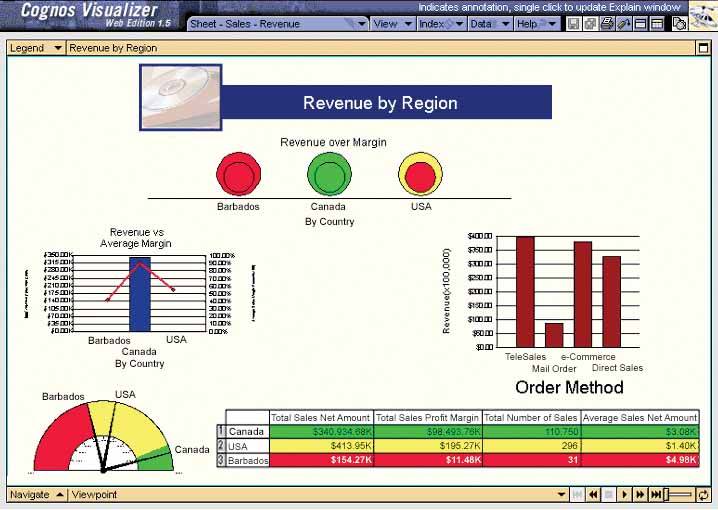
The dashboard shown in Figure 7-5, while simple enough, is a glaring example of design that is anything but aesthetically pleasing. How can you avoid creating a similar monstrosity? Let's look at a few guidelines that will help you achieve a simple aesthetic without compromising the data.
Figure 7-5. An example of a downright ugly dashboard.
7.3.1. Choose Colors Appropriately
Poor use of color is perhaps the most common offense to a dashboard's appearance. Colors that are bright or dark naturally demand more attention. Too many bright or dark colors can quickly become visually exhausting. When selecting colors, keep the following guidelines in mind:
- Keep bright colors to a minimum, using them only to highlight data that requires attention.
- Except for content that demands attention, use less saturated colors such as those that are predominant in nature (for example, the colors of the earth and sky).
- Use a barely discernable pale background color other than pure white to provide a more soothing, less starkly contrasting surface on which the data can reside.
Figure 7-6 illustrates these principles.
Figure 7-6. Avoid the use of bright colors except to highlight particular datastick with more subdued colors for most of what's displayed. Use a background color that is slightly off-white to avoid the stark contrast between foreground colors against a pure white background.

7.3.2. Choose High Resolution for Clarity
The high density of information that typically appears on a dashboard requires that the graphical images be displayed with exceptional visual clarity. Images with poor resolution are hard to read, which slows down the process of scanning the dashboard for information (and is just plain annoying). Visual clarity does not require fancy shading or photo-realism; simple high-resolution images will do.
7.3.3. Choose the Right Text
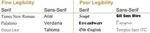
My final recommendation regarding dashboard aesthetics involves the use of text. Use the most legible font you can find. You don't need to set a mood or reinforce a theme by using an unusual font. Ornate text might be appropriate for a poster advertising the circus, but not for a dashboard. You want a font that can be read the fastest with the least amount of strain on the eyes. Find one that works and stick with it throughout the dashboard. You can use a different font for headings to help them stand out if you wish, but that's the practical limit. Figure 7-7 illustrates a few of the good and bad choices that are available.
Figure 7-7. Examples of some fonts that are easy to ready and some that are not.
Clarifying the Vision
- Clarifying the Vision
- All That Glitters Is Not Gold
- Even Dashboards Have a History
- Dispelling the Confusion
- A Timely Opportunity
Variations in Dashboard Uses and Data
Thirteen Common Mistakes in Dashboard Design
- Thirteen Common Mistakes in Dashboard Design
- Exceeding the Boundaries of a Single Screen
- Supplying Inadequate Context for the Data
- Displaying Excessive Detail or Precision
- Choosing a Deficient Measure
- Choosing Inappropriate Display Media
- Introducing Meaningless Variety
- Using Poorly Designed Display Media
- Encoding Quantitative Data Inaccurately
- Arranging the Data Poorly
- Highlighting Important Data Ineffectively or Not at All
- Cluttering the Display with Useless Decoration
- Misusing or Overusing Color
- Designing an Unattractive Visual Display
Tapping into the Power of Visual Perception
- Tapping into the Power of Visual Perception
- Understanding the Limits of Short-Term Memory
- Visually Encoding Data for Rapid Perception
- Gestalt Principles of Visual Perception
- Applying the Principles of Visual Perception to Dashboard Design
Eloquence Through Simplicity
- Eloquence Through Simplicity
- Characteristics of a Well-Designed Dashboard
- Key Goals in the Visual Design Process
Effective Dashboard Display Media
- Effective Dashboard Display Media
- Select the Best Display Medium
- An Ideal Library of Dashboard Display Media
- Summary
Designing Dashboards for Usability
- Designing Dashboards for Usability
- Organize the Information to Support Its Meaning and Use
- Maintain Consistency for Quick and Accurate Interpretation
- Make the Viewing Experience Aesthetically Pleasing
- Design for Use as a Launch Pad
- Test Your Design for Usability
Putting It All Together
EAN: 2147483647
Pages: 80
