All That Glitters Is Not Gold
Dashboards can provide a unique and powerful means to present information, but they rarely live up to their potential. Most dashboards fail to communicate efficiently and effectively, not because of inadequate technology (at least not primarily), but because of poorly designed implementations. No matter how great the technology, a dashboard's success as a medium of communication is a product of design, a result of a display that speaks clearly and immediately. Dashboards can tap into the tremendous power of visual perception to communicate, but only if those who implement them understand visual perception and apply that understanding through design principles and practices that are aligned with the way people see and think. Software won't do this for you. It's up to you.
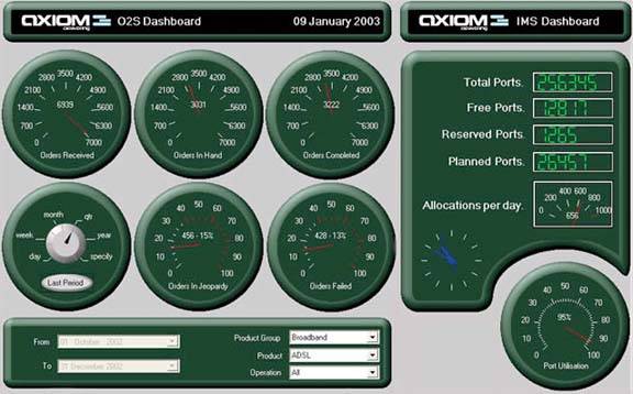
Unfortunately, most vendors that provide dashboard software have done little to encourage the effective use of this medium. They focus their marketing efforts on flash and dazzle that subvert the goals of clear communication. They fight to win our interest by maximizing sizzle, highlighting flashy display mechanisms that appeal to our desire to be entertained. Once implemented, however, these cute displays lose their spark in a matter of days and become just plain annoying. An effective dashboard is the product not of cute gauges, meters, and traffic lights (Figure 1-1), but rather of informed design: more science than art, more simplicity than dazzle. It is, above all else, about communication.
Figure 1-1. A typical flashy dashboard. Can't you just feel the engine revving?
This failure by software vendors to focus on what we actually need is hardly unique to dashboards. Most software suffers from the same shortcomingdespite all the hype about user-friendliness, it is difficult to use. This sad state is so common, and has been the case for so long, we've grown accustomed to the pain. On those occasions when this ugly truth breeches the surface of our consciousness, we usually blame the problem on ourselves rather than the software, framing it in terms of "computer illiteracy." If we could only adapt more to the computer and how it works, there wouldn't be a problemor so we reason. In his insightful book entitled The Inmates Are Running the Asylum, master designer Alan Cooper writes:
The sad thing about dancing bearware [Cooper's term for poorly designed software that is difficult to use] is that most people are quite satisfied with the lumbering beast. Only when they see some real dancing do they begin to suspect that there is a world beyond ursine shuffling. So few software-based products have exhibited any real dancing ability that most people are honestly unaware that things could be bettera lot better.
Note: Alan Cooper, The Inmates Are Running the Asylum (Indianapolis, IN: SAMS Publishing, 1999), 59.
Cooper argues that this failure is rooted in an approach to software development that simply doesn't work. In a genuine attempt to please their customers, software engineers focus on checking all the items, one by one, off of lists of requested features. This approach makes sense to technology-oriented software engineers, but it results in lumbering beasts. Customers are expert in knowing what they need to accomplish, but not in knowing how software ought to be designed to support their needs. Allowing customers to design software through feature requests is the worst form of disaster by committee.
Software vendors should bring design vision and expertise to the development process. They ought to know the difference between superficial glitz and what really works. But they're so exhausted from working ungodly hours trying to squeeze more features into the next release that they're left with no time to do the research needed to discover what actually works, or even to step back and observe how their products are really being used (and failing in the process).
The part of information technology that focuses on reporting and analysis currently goes by the name business intelligence (BI). To date, BI vendors have concentrated on developing the underlying technologies that are used to gather data from source systems, transform data into a more usable form, store data in high-performance databases, access data for use, and present data in the form of reports. Tremendous progress has been made in these areas, resulting in robust technologies that can handle huge repositories of data. However, while we have managed to warehouse a great deal of information, we have made little progress in using that information effectively. Relatively little effort has been dedicated to engaging human intelligence, which is what this industry, by definition, is supposed to be about.
A glossary on the Gartner Group's web site defines business intelligence as "An interactive process for exploring and analyzing structured, domain-specific information… to discern business trends or patterns, thereby deriving insights and drawing conclusions" (http://www.gartner.com/6_help/glossary/GlossaryB.jsp). To progress in this worthwhile venture, the BI industry must shift its focus now to an engaging interaction with human perception and intelligence. To do this, vendors must base their efforts on a firm understanding of how people perceive and think, building interfaces, visual displays, and methods of interaction that fit seamlessly with human ability.
Clarifying the Vision
- Clarifying the Vision
- All That Glitters Is Not Gold
- Even Dashboards Have a History
- Dispelling the Confusion
- A Timely Opportunity
Variations in Dashboard Uses and Data
Thirteen Common Mistakes in Dashboard Design
- Thirteen Common Mistakes in Dashboard Design
- Exceeding the Boundaries of a Single Screen
- Supplying Inadequate Context for the Data
- Displaying Excessive Detail or Precision
- Choosing a Deficient Measure
- Choosing Inappropriate Display Media
- Introducing Meaningless Variety
- Using Poorly Designed Display Media
- Encoding Quantitative Data Inaccurately
- Arranging the Data Poorly
- Highlighting Important Data Ineffectively or Not at All
- Cluttering the Display with Useless Decoration
- Misusing or Overusing Color
- Designing an Unattractive Visual Display
Tapping into the Power of Visual Perception
- Tapping into the Power of Visual Perception
- Understanding the Limits of Short-Term Memory
- Visually Encoding Data for Rapid Perception
- Gestalt Principles of Visual Perception
- Applying the Principles of Visual Perception to Dashboard Design
Eloquence Through Simplicity
- Eloquence Through Simplicity
- Characteristics of a Well-Designed Dashboard
- Key Goals in the Visual Design Process
Effective Dashboard Display Media
- Effective Dashboard Display Media
- Select the Best Display Medium
- An Ideal Library of Dashboard Display Media
- Summary
Designing Dashboards for Usability
- Designing Dashboards for Usability
- Organize the Information to Support Its Meaning and Use
- Maintain Consistency for Quick and Accurate Interpretation
- Make the Viewing Experience Aesthetically Pleasing
- Design for Use as a Launch Pad
- Test Your Design for Usability
Putting It All Together
EAN: 2147483647
Pages: 80
