Key Goals in the Visual Design Process
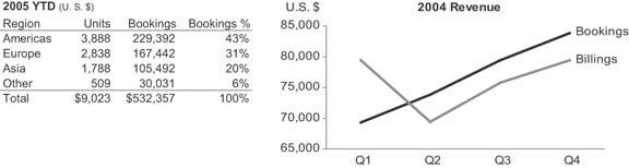
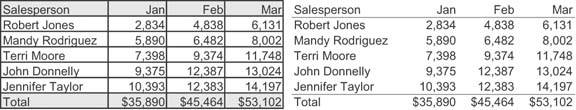
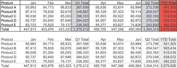
Edward R. Tufte introduced a concept in his 1983 classic The Visual Display of Quantitative Information that he calls the "data-ink ratio." When quantitative data is displayed in printed form, some of the ink that appears on the page presents data, and some presents visual content that is not data (a.k.a. non-data). Figure 5-2 shows two displays of quantitative data: one in the form of a table and the other in the form of a graph. Take a minute to examine them and try to differentiate the data ink from the non-data ink.
Figure 5-2. This table and graph consist of both data ink and non-data ink.
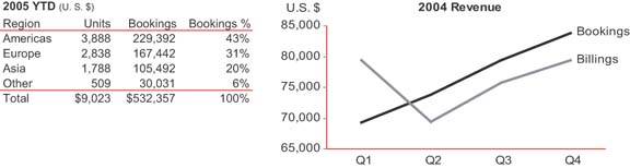
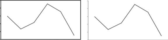
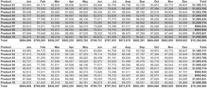
There isn't much non-data ink in either the table or the graph, because they were intentionally designed to keep it to a minimum. Figure 5-3 shows the same table and graph, this time with the non-data ink encoded as red.
Figure 5-3. Here, the non-data ink is highlighted in red.
Note: Edward R. Tufte, The Visual Display of Quantitative Information (Cheshire, CT: Graphics Press, 1983), 93.
Tufte defines the data-ink ratio in the following way:
A large share of ink on a graphic should present data-information, the ink changing as the data change. Data-ink is the non-erasable core of a graphic, the non-redundant ink arranged in response to variation in the numbers represented. Then,
Data-ink ratio
= data-ink / total ink used to print the graphic
= proportion of a graphic's ink devoted to the non-redundant display of data-information
= 1.0 - proportion of a graphic that can be erased without loss of data-information.
He then applies it as a principle of design: "Maximize the data-ink ratio, within reason. Every bit of ink on a graphic requires a reason. And nearly always that reason should be that the ink presents new information."
Note: Ibid., 96.
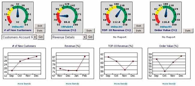
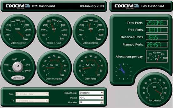
This principle applies perfectly to the design of dashboards, with one simple revision: because dashboards are always displayed on computer screens, I've changed the word "ink" to "pixels." Across the entire dashboard, non-data pixelsany pixels that are not used to display data, excluding a blank backgroundshould be reduced to a reasonable minimum. Take a moment to examine the dashboard in Figure 5-4 on the next page and try to identify the non-data pixels that can be eliminated without sacrificing anything meaningful.
Figure 5-4. This dashboard displays an excessive amount of non-data pixels.

The non-data pixels that you could easily eliminate without any loss of meaning include:
- The third dimension of depth on all the pie charts and on the bars in the upper bar graph
- The grid lines in the bar graphs
- The decoration in the background of the upper bar graph
- The color gradients in the backgrounds of the graphs, which vary from white at the top through shades of blue as they extend downward
Some of the data pixels on this dashboard could also be removed without a loss of useful meaningwe'll come back to that in a moment.
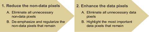
Reducing the non-data pixels to a reasonable minimum is a key objective that places us on the path to effective dashboard design. Much of visual dashboard design revolves around two fundamental goals:
- Reduce the non-data pixels.
- Enhance the data pixels.
You start by reducing the non-data content as much as possible, and then proceed to enhance the data content with as much clarity and meaning as possible, working to make the most important data stand out above the rest (Figure 5-5).
Figure 5-5. Key goals and steps of visual dashboard design.
5.2.1. Reduce the Non-Data Pixels
The goal of reducing the non-data pixels can be broken down into two sequential steps:
- Eliminate all unnecessary non-data pixels.
- De-emphasize and regularize the non-data pixels that remain.
Let's take a look at how to accomplish these two goals.
5.2.1.1. Eliminate all unnecessary non-data pixels
Dashboard design is usually an iterative process. You begin by mocking up a sample dashboard, and then you improve it through a series of redesigns, each followed by a fresh evaluation leading to another redesign, until you have it right. As you get better and better at this, the number of iterations that will be required will decrease, partly because you won't be including unnecessary non-data pixels in the first place. No matter how far you advance, however, the step of looking for unnecessary non-data pixels will never cease to be productive.
The next few figures provide examples of non-data pixels that often find their way onto dashboards but can usually be eliminated without loss.
Graphics that serve merely as decoration (Figure 5-6).
Figure 5-6. You should eliminate graphics that provide nothing but decoration.

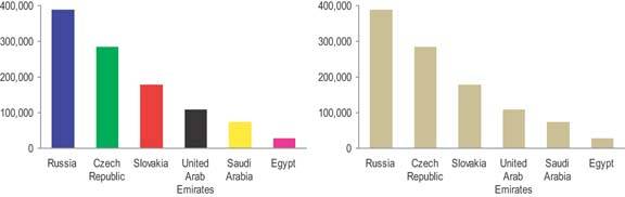
Variations in color that don't encode any meaning (Figure 5-7).
Figure 5-7. These bars vary in color for no meaningful reason.
Borders that are used to delineate sections of data when the simple use of white/blank space alone would work as well (Figure 5-8).
Figure 5-8. Unnecessary borders around sections of data fragment the display.
Fill colors that are used to delineate sections of content such as a title, the data region or legend of a graph, the background of a table, or an entire section of data, when a neutral background would work as well (Figure 5-9).
Figure 5-9. Fill colors to separate sections of the display are unnecessary.
Gradients of fill color when a solid color would work as well (Figure 5-10).
Figure 5-10. Gradients of color both on the bars of this graph and across the entire background add distracting non-data pixels.
Grid lines in graphs (Figure 5-11).
Figure 5-11. Grid lines in graphs are rarely useful. They are one of the most prevalent forms of distracting non-data pixels found in dashboards.
Grid lines in tables, which divide the data into individual cells or divide either the rows or the columns, when white space alone would do the job as well (Figure 5-12).
Figure 5-12. Grid lines in tables can make otherwise simple displays difficult to look at.
Fill colors in the alternating rows of a table to delineate them when white space alone would work as well (Figure 5-13).
Figure 5-13. Fill colors should be used to delineate rows in a table only when this is necessary to help viewers' eyes track across the rows.
Complete borders around the data region of a graph when one horizontal and one vertical axis would sufficiently define the space (Figure 5-14).
Figure 5-14. A complete border around the data region of a graph should be avoided when a single set of axes would adequately define the space.
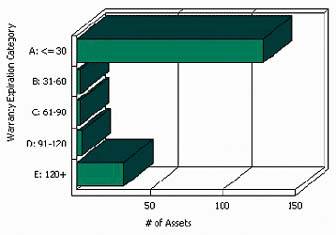
3D in graphs when the third dimension doesn't correspond to actual data (Figure 5-15).
Figure 5-15. 3D should always be avoided when the added dimension of depth doesn't represent actual data.
Visual components or attributes of a display medium that serve no purpose but to make it look more like a real physical object or more ornate (Figure 5-16).
Figure 5-16. This dashboard is filled with visual components and attributes that serve the sole purpose of simulating real physical objects.
This is by no means a comprehensive list, but it does cover much of the non-data content that I routinely run across on dashboards. When you find that you've included useless non-data pixels such as those in any of the above examples, simply remove them.
5.2.1.2. De-emphasize and regularize the non-data pixels that remain
Not all non-data pixels can be eliminated without losing something useful. Some support the structure, organization, or legibility of the dashboard. For instance, when data is tightly packed, sometimes it is necessary to use lines or fill colors to delineate one section from another, rather than white space alone. In these cases, rather than eliminating these useful non-data pixels, you should simply mute them visually so they don't attract attention. Focus should always be placed on the information itself, not on the design of the dashboard, which should be almost invisible. The trick is to de-emphasize these non-data pixels by making them just visible enough to do their job, but no more.
Beginning on the next page are a few examples of non-data pixels that are either always or occasionally useful. I've shown each of these examples in two ways: 1) a version that is too visually prominent, which illustrates what you should avoid; and 2) a version that is just visible enough to do the job, which is the objective.
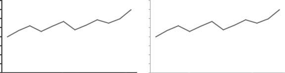
Axis lines that are used to define the data region of a graph (Figure 5-17).
Figure 5-17. Axis lines used to define the data region of a graph are almost always useful, but they can be muted, like those on the right.
Lines, borders, or fill colors that are used to delineate sections of data when white space is not enough (Figure 5-18).
Figure 5-18. Lines can be used effectively to delineate adjacent sections of the display from one another, but the weight of these lines can be kept to a minimum.
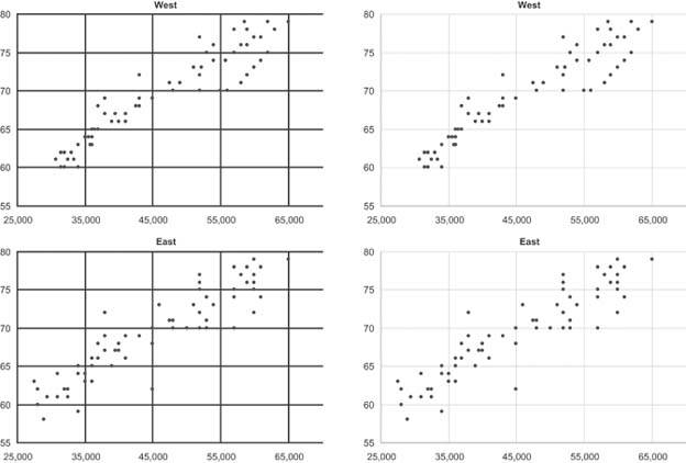
Grid lines in graphs when necessary to read the graph effectively (Figure 5-19).
Figure 5-19. Grid lines are useful when they help viewers compare specific subsections of graphs, such as the range of values that fall within 65 to 75 on the vertical scale and 35,000 to 45,000 on the horizontal scale.
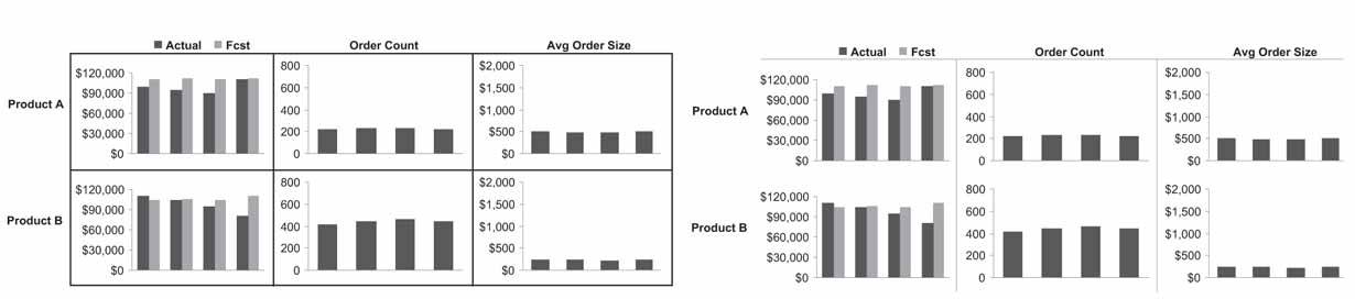
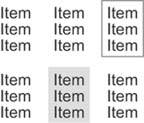
Grid lines and/or fill colors in tables when white space alone cannot adequately delineate columns and/or rows (Figure 5-20).
Figure 5-20. Grid lines and fill colors can be used in tables to clearly distinguish some columns from others, but this should be done in the muted manner seen below rather than the heavy-handed manner seen above.
Fill colors in the alternating rows of a table when white space alone cannot adequately delineate them (Figure 5-21).
Figure 5-21. Fill colors can be used to delineate rows in a table when necessary to help viewers' eyes scan across the rows, but this should always be done in the muted manner seen below rather than the visually weighty manner seen above.
These examples demonstrate how the visual prominence of non-data pixels can usually be de-emphasized by using light, lowly saturated colors, such as light grays, and minimal stroke weights (that is, thin lines).
Non-data pixels also can be pushed further from notice by regularizing them (that is, by making them consistent). If the axis lines of all graphs look the samesay, if you use the same light gray lines wherever they appearno one graph is likely to catch a viewer's eyes more than the others. Differences seldom go unnoticed, even when they are expressed in muted tones. Don't vary the color, weight, or shape of non-data pixels that serve the same purpose in the dashboard.
Another category of content often found on dashboards that can be considered non-data pixels is that which supports navigation and data selection. Buttons and selection boxes are often used to allow users to navigate to another screen or to choose the data that appears on the dashboard (for example, by selecting a different subset, such as hardware rather than software). These elements might serve an important function, but they don't display data. As such, they should not be given prominence. If they must exist, place them in an out-of-the-way location such as the bottom-right corner of the screen and mute them visually, so they won't compete with the data for attention. Notice how much of the dashboard in Figure 5-22 is dedicated to buttons and data selection controls, which I've highlighted with red borders. These elements take up far more valuable and prominent real estate on the dashboard than is required.
Figure 5-22. This dashboard gives navigational and data selection controls far more dominance and space than they deserve.
Similarly, while it may sometimes be necessary to include on the dashboard instructions that provide important support information, any nonessential text just takes up space that could be used by data, attracts attention away from the data, and clutters the dashboard's appearance. It usually works best to place most instructional or descriptive content either on a separate screen that can easily be reached when needed or, if possible, in the form of pop-ups that can be accessed when necessary with a click of the mouse. Notice how much prime real estate is wasted on the dashboard in Figure 5-23 to provide instructions that viewers will probably only need the first time they use the dashboard.
Figure 5-23. As you can see in the area highlighted in red, this dashboard uses up valuable space to display instructions that could have been provided only when needed through a separate screen or a pop-up menu.
5.2.2. Enhance the Data Pixels
Just like the reductionof non-data pixels, the process of enhancing the data pixels can be broken down into two sequential steps:
- Eliminate all unnecessary data pixels.
- Highlight the most important data pixels that remain.
Let's examine these two tasks.
5.2.2.1. Eliminate all unnecessary data pixels
When you're designing a dashboard, it is tempting to throw everything you think anyone could ever possibly want onto it. Those of us who have worked in the field of business intelligence for a while have grown weary of being asked for more (always more!), so the thought of heading off this demand by giving folks everything up front can be appealing. On a dashboard, however, where immediate insight is the goal, this is a costly mistake. I'm not suggesting that you force people to get by with less than they really need, but rather that you honor the consideration of what they really need for the task at hand as a strict criterion for the selection of data. By removing any information that isn't really necessary, you automatically increase focus on the information that remains.
Elimination of unnecessary data pixels is achieved not only through the complete removal of less relevant data but also by condensing data through the use of summaries and exceptions, so that the level of detail that is displayed doesn't exceed what's necessary. For most applications, it would be absurd to include detailed information such as transaction-level sales data on a dashboardsome level of summarization is needed, and it is often up to you to determine what that level is. You might choose to display a single quarter-to-date value, a value per region, or a value per month, just to name a few possibilities.
Exceptions are an especially useful means to reduce the data on a dashboard to what is essential for the task at hand. Often, the state of something need not be presented unless there is a problem or an opportunity that requires action. If you care about staff expenses only when someone has exceeded a defined threshold, why clutter the dashboard with a complete list of all staff members and their expenses?
Beware of taking this useful practice of managing by exception too far, however. I received an email recently from an executive of a software company that specializes in dashboards. We were discussing my definition of a dashboard, and in the course of this discussion he stated that a customer once asserted that his ideal dashboard would display a single traffic signal to indicate if everything was all right or if anything needed attention. The idea was that he didn't want to be bothered with unnecessary information if all was well, and when something was wrong, he could drill down from that single alert to additional, more detailed dashboards or reports to determine exactly what was wrong before taking action. For an instant I found myself enamored with this idea, attracted to its Spartan simplicity but only for a moment. The next moment my mind became haunted by visions of executives trying to run their businesses in ignorant bliss, completely out of touch unless thresholds built into the software determined that they ought to be informed. Anyone who has a job to do needs to keep up with a basic picture of what's going on, even when all is well. Too often leaderswhether in business, academia, religion, or politicsforge ahead with their agendas, relying entirely on others to tell them what they think they should know, only to discover after the dust of some destructive event settles that they knew far too little to lead effectively.
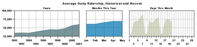
Before departing from the topic of summaries and exceptions, I want to focus in on a particular summarizing technique that I find useful on occasion. This technique involves what I call multi-foci displays. When it is useful to display historical context for a measure, such as the last 12 months or the last 5 years, often information that is more distant from the present is less important than recent history. In such cases, there is no reason to display the full range of data at the same level of detail. For instance, you might want to display the current month as daily measures, the preceding 12 months as monthly measures, and the preceding 4 years as annual measures. This display would consist of three sections, each expressed in different intervals of time, with longer intervals and more summarization used for the period the most distant from the present. Graphic displays can be designed to present time series in this manner, as illustrated in Figure 5-24.
Figure 5-24. These three time-series graphs displaying public transportation rider statistics contain three levels of detail: daily for the current month, monthly for the current year, and yearly for the last 10 years.
Note: Multi-foci displays are not exclusively relevant to dashboards. I have a fondness for beautifully rendered maps, and I enjoy exploring geography and tracing my travels across the surface of maps. In fact, I keep three maps mounted on the walls of my office: an extremely large one of California, my home state; a slightly smaller one of the entire United States; and an even smaller one of the entire world. This might seem counter to the logical arrangement, because the world is certainly larger than California, but it serves my needs precisely. I want to see great detail in places close to home, where I spend most of my time, and gradually less and less detail as the distance from home grows.
Varying interest can correspond to distances in space as well as time. For instance, a viewer might be most interested in data from his immediate geographical region, and gradually less interested in data from increasingly distant geographical areas.
5.2.2.2. Highlight the most important data pixels that remain
All the information that finds its way onto a dashboard should be important, but not all data is created equal: some data is more important than other data. The most important information can be divided into two categories:
- Information that is always important
- Information that is only important at the moment
When you consider the entire collection of information that belongs on a dashboard, you should be able to prioritize it according to what is usually of greatest interest to viewers. For instance, a dashboard that serves the needs of a corporation's executives might display several categories of financial, sales, and personnel data. On the whole, however, the executives usually care about some key measures more than others.
The other category of especially important information is that which is important only when it reveals something out of the ordinary. A measure that has fallen far behind its target, an opportunity that has just arisen and won't last for long, or an operational condition that demands immediate attention all fall into this category.
These two categories of important information require different means of highlighting on a dashboard. The first categoryinformation that is always importantcan be emphasized using static means, but the second categoryinformation that is important only at the momentrequires a dynamic means of emphasis.
The location of data on the screenthe layoutis an aspect of a dashboard's appearance that doesn't, or at least shouldn't, change dynamically. This is true not only because it would be technically difficult to dynamically rearrange the placement of data on the screen, but also because after some use viewers will come to expect specific data to appear in specific locations, which is good because it helps them to scan the dashboard quickly. Because location is static, this is a variable that we can leverage to highlight information that is always important.
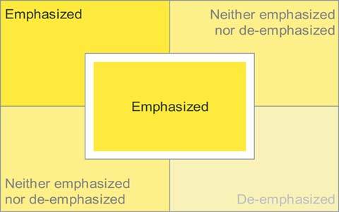
Few aspects of visual design emphasize some data above the rest as effectively as its location. Figure 5-25 identifies the emphasizing effect that different regions of a dashboard provide. The top-left and center sections of the dashboard are the areas of greatest emphasis. The greater emphasis tied to the upper left is primarily due to the conventions of most western languages, which sequence words on a page from left to right and top to bottom. Contrary to the influence of reading conventions, however, the very center of the screen is also a region of strong emphasis, due to a more fundamental inclination of visual perception. I've found, however, that placing information in the center results in emphasis only when it is set apart somewhat from what surrounds it, such as through the use of white space.
Figure 5-25. Different degrees of visual emphasis are associated with different regions of a dashboard.
As much as possible, place the information that is always of great importance in the upper-left or center regions of the dashboard. Never waste this valuable real estate by placing a company logo or controls for navigation or data selection in these areas. Figure 5-26 provides a vivid example of what you should avoid when designing the layout of a dashboard.
Figure 5-26. The most valuable real estate on this dashboard is dedicated to a company logo and meaningless decoration.
Visual attributes other than location on the screen are usually easy to manipulate in a dynamic manner on a dashboard. As such, dynamic techniques can be used to highlight information that is of great importance only at particular times. These techniques can also be used to highlight information that is always important, once you've used up the prime screen locations for other important data.
Many of the visual attributes that we examined in Chapter 4, Tapping into the Power of Visual Perception, can be used effectively to highlight data, both statically and dynamically. Here are two approaches that you can take:
- Use expressions of visual attributes that are greater than the norm (for example, brighter or darker colors).
- Use expressions of visual attributes that simply contrast with the norm (for example, blue text when the norm is black or gray).
Expressions of visual attributes don't need to be greater than others to stand out; contrast from a predominant pattern is all it takes. Visual perception is highly sensitive to differences and ever vigilant to assign meaning to them when they are detected.
Some useful expressions of visual attributes that are perceived as greater than others include the following:
|
Visual attribute |
Useful expressions |
Illustrations |
|---|---|---|
|
Color intensity |
A darker or more fully saturated version of any hue is naturally perceived as greater than a lighter or less-saturated version. |
|
|
Size |
Bigger things clearly stand out as more important than smaller things. |
|
|
Line width |
Thicker lines stand out as more important than thinner lines. |
|


Note: Red does not signify that something is important, urgent, or a problem in all cultures. For example, in China, red connotes happiness. Bear in mind also when choosing symbolic colors that a significant chunk of the population is colorblind.
Some useful expressions of visual attributes that stand out merely through contrast to the norm include the following:
|
Visual attribute |
Useful expressions |
Illustrations |
|---|---|---|
|
Hue |
Any hue that is distinct from the norm will stand out. |
|
|
Orientation |
Anything oriented differently than the norm will stand out. |
|
|
Enclosure |
Anything enclosed by borders or surrounded by a fill color will stand out if different from the norm. |
|
|
Added marks |
Anything with something distinctly added to it or adjacent to it will stand out. |
|

Any of these visual attributes can be used to make the most important information stand out from the rest. Color is especially useful because distinct differences in color stand out very clearly and because it is a variable that is normally easy to change dynamically using dashboard software based on predefined data conditions.
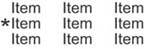
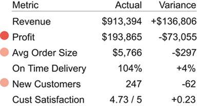
I've also found that one of the best ways to draw attention to particular items, especially those expressed as text, involves the use of an added mark with a distinct color. For example, causing a simple symbol such as a circle, checkmark, or asterisk to appear next to items that need attention does the job nicely. Choosing one color and varying its intensity to indicate varying degrees of importance or urgency works better than using different colors, because even those who are colorblind can detect distinct intensities of the same color. Figure 5-27 illustrates this practice. Different symbols could also be used to indicate different levels of importance or urgency with no need to vary their colors, but increasing color intensities corresponding to increasing levels of importance or urgency are understood more intuitively.
Figure 5-27. Simple symbols can be used along with varying color intensities to dynamically highlight data.
When highlighting important information, you must always be careful to restrict the definition of what's important. If you highlight too much information, nothing will stand out and your effort to communicate will fail. When used with discretion, however, visual highlighting can achieve the goal of immediate recognition and quick response.
Clarifying the Vision
- Clarifying the Vision
- All That Glitters Is Not Gold
- Even Dashboards Have a History
- Dispelling the Confusion
- A Timely Opportunity
Variations in Dashboard Uses and Data
Thirteen Common Mistakes in Dashboard Design
- Thirteen Common Mistakes in Dashboard Design
- Exceeding the Boundaries of a Single Screen
- Supplying Inadequate Context for the Data
- Displaying Excessive Detail or Precision
- Choosing a Deficient Measure
- Choosing Inappropriate Display Media
- Introducing Meaningless Variety
- Using Poorly Designed Display Media
- Encoding Quantitative Data Inaccurately
- Arranging the Data Poorly
- Highlighting Important Data Ineffectively or Not at All
- Cluttering the Display with Useless Decoration
- Misusing or Overusing Color
- Designing an Unattractive Visual Display
Tapping into the Power of Visual Perception
- Tapping into the Power of Visual Perception
- Understanding the Limits of Short-Term Memory
- Visually Encoding Data for Rapid Perception
- Gestalt Principles of Visual Perception
- Applying the Principles of Visual Perception to Dashboard Design
Eloquence Through Simplicity
- Eloquence Through Simplicity
- Characteristics of a Well-Designed Dashboard
- Key Goals in the Visual Design Process
Effective Dashboard Display Media
- Effective Dashboard Display Media
- Select the Best Display Medium
- An Ideal Library of Dashboard Display Media
- Summary
Designing Dashboards for Usability
- Designing Dashboards for Usability
- Organize the Information to Support Its Meaning and Use
- Maintain Consistency for Quick and Accurate Interpretation
- Make the Viewing Experience Aesthetically Pleasing
- Design for Use as a Launch Pad
- Test Your Design for Usability
Putting It All Together
EAN: 2147483647
Pages: 80
