Dispelling the Confusion
Like many products that hit the high-tech scene with a splash, dashboards are veiled in marketing hype. Virtually every vendor in the BI space claims to sell dashboard software, but few clarify what dashboards actually are. I'm reminded of the early years of data warehousing, wheneager to learn about this new approach to data managementI asked my IBM account manager how IBM defined the term. His response was classic and refreshingly candid: "By data warehousing we at IBM mean whatever the customer thinks it means." I realize that this wasn't IBM's official definition, which I'm sure existed somewhere in their literature, but it was my blue-suited friend's way of saying that as a salesperson, it was useful to leave the term vague and flexible. As long as a product or service remains undefined or loosely defined, it is easy to claim that your company sells it.
Those rare software vendors that have taken the time to define the term in their marketing literature start with the specific features of their products as the core of the definition, rather than a generic description. As a result, vendor definitions tend to be self-validating lists of technologies and features. For example, Dr. Gregory L. Hovis, Director of Product Deployment for Snippets Software, Inc., asserts:
Able to universally connect to any XML or HTML data source, robust dashboard products intelligently gather and display data, providing business intelligence without interrupting work flow…An enterprise dashboard is characterized by a collection of intelligent agents (or gauges), each performing frequent bidirectional communication with data sources. Like a virtual staff of 24x7 analysts, each agent in the dashboard intelligently gathers, processes and presents data, generating alerts and revising actions as conditions change.
Note: Gregory L. Hovis, "Stop Searching for InformationMonitor it with Dashboard Technology," DM Direct, February 2002.
Note: Mark Leon, "Dashboard Democracy," Computerworld, June 16, 2003
An article in the June 16, 2003 edition of Computerworld cites statistics from a study done by AMR Research, Inc., which declares that "more than half of the 135 companies… recently surveyed are implementing dashboards."
Unfortunately, the author never tells us what dashboards are. He teases us with hints, stating that dashboards and scorecards are BI tools that "have found a new home in the cubicles," having moved from where they once resided (exclusively in executive suites) under the name Executive Information Systems. He gives examples of how dashboards are being used and speaks of their benefits, but leaves it to us to piece together a sense of what they are. The closest he comes to a definition is when he quotes John Hagerty of AMR Research, Inc.: "Dashboards and scorecards are about measuring."
While conducting an extensive literature review in 2003 in search of a good working definition, I visited DataWarehousingOnline.com and clicked on the link to "Executive Dashboard" articles. In response, I received the same 18 web pages of links that I found when I separately clicked on links for "Balanced Scorecard," "Data Quality and Integration," and "Data Mining." Either the links weren't working properly, or this web portal for the data warehousing industry at the time believed that these terms all meant the same thing.
Note: By including these examples from the web sites of software vendors and a few other sources, I do not mean to endorse any of these dashboards or the software products used to create them as examples of good design, nor as extraordinary examples of poor design. To varying degrees they all exhibit visual design problems that I'll address in later chapters.
I finally decided to begin the task of devising a working definition of my own by examining every example of a dashboard I could find on the Web, in search of their common characteristics. You might find it interesting to take a similar journey. In the next few pages, you'll see screenshots of an assortment of dashboards, which were mostly found on the web sites of vendors that sell dashboard software. Take the time now to browse through these examples and see if you can discern common threads that might be woven into a useful definition.
Figure 1-2. This dashboard from Business Objects relies primarily on graphical means to display a series of performance measures. along with a list of alerts, Notice that the title of this dashboard is "My KPIs." Key performance indicators and dashboards appear to be synonymous in the minds of most vendors. Notice the gauges as well. We'll see quite a few of them.
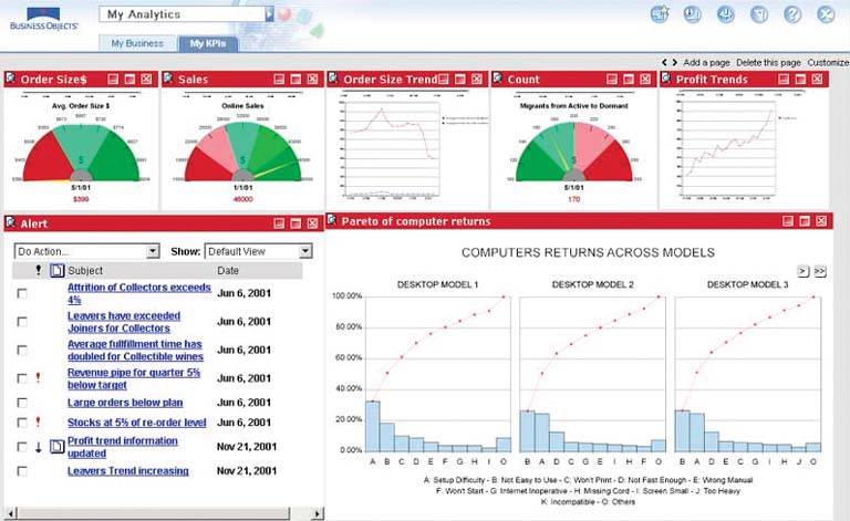
Figure 1-3. This dashboard from Oracle Corporation displays a collection of sales measures for analyzing product performance by category. All of the measures are displayed graphically. We'll find that this emphasis on graphical display media is fairly common.
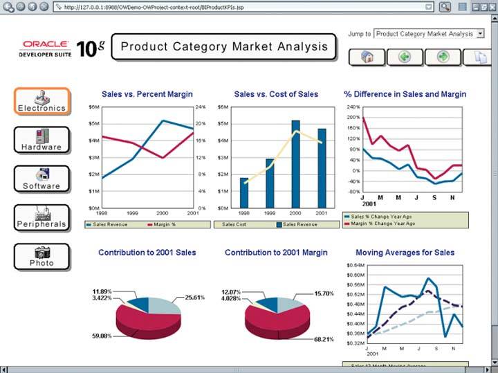
Figure 1-4. This dashboard from Informatica Corporation displays measures of revenue by sales channel along with a list of reports that can be viewed separately. The predominance of graphical display media that we observed on the previous dashboards appears on this one as well, notably in the form of meters designed to look like speedometers. The list of reports adds portal functionality, enabling this dashboard to operate as a launch pad to complementary information.
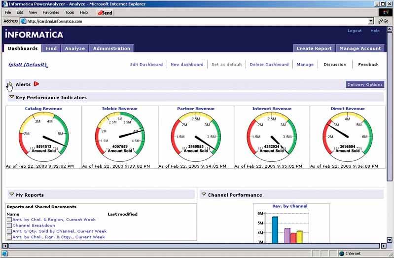
Figure 1-5. This dashboard from Principa provides an overview of a company's financial performance compared to targets for the month of March, both in tabular form and as a series of gauges. The information can be tailored by selecting different months and amounts of history. Once again, we see a strong expression of the dashboard metaphor, this time in the form of graphical devices that were designed to look like fuel gauges.
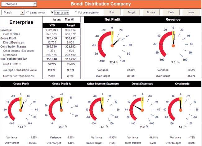
Figure 1-6. This dashboard from Cognos, Inc. displays a table and five graphsone in the form of a world mapto communicate sales information. Despite the one table, there's a continued emphasis on graphical media. Notice also that a theme regarding the visual nature and need for visual appeal of dashboards is emerging in these examples.
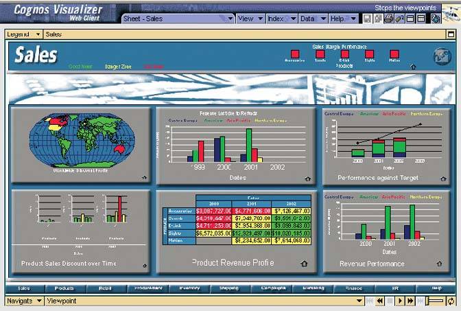
Figure 1-7. This dashboard from Hyperion Solutions Corporation displays regional sales revenue in three forms: on a map, in a bar graph, and in a table. Data can be filtered by means of three sets of radio buttons on the left. These filtering mechanisms build rudimentary analytical functionality into this dashboard. Visual decoration reinforces the theme that dashboards intentionally strive for visual appeal.
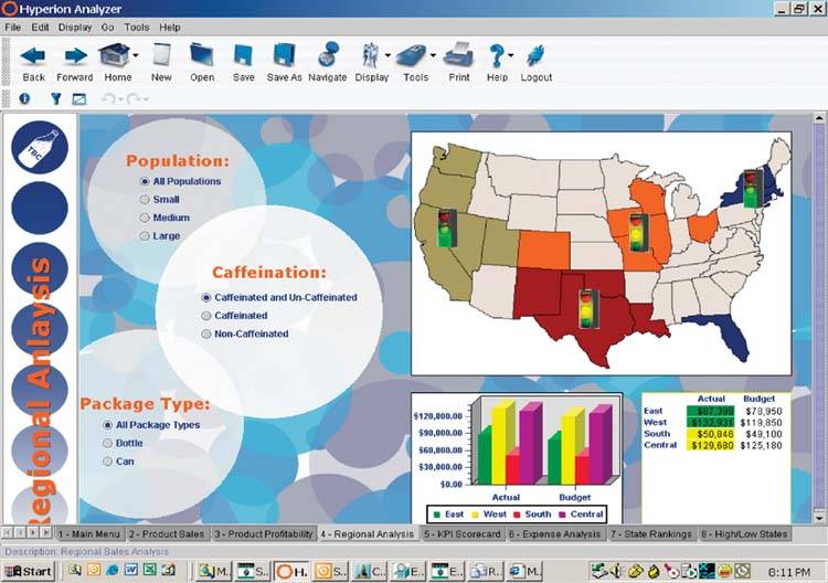
Figure 1-8. This dashboard from Corda Technologies, Inc. features flight-loading measures for an airline using four panels of graphs. Here again we see an attention to the visual appeal of the display. Notice also in the instructions at the top that an ability to interact with the graphs has been built into the dashboard, so that users can access additional information in pop-ups and drill into greater levels of detail.
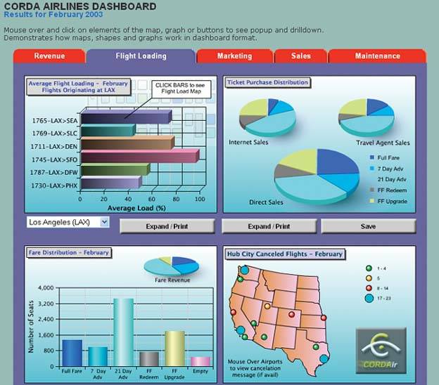
Figure 1-9. This dashboard from Visual Mining, Inc. displays various measures of a city's transit system to give the executives in charge a quick overview of the system's current and historical performance. Use of the colors green, yellow, and red to indicate good, satisfactory, and bad performance, as you can see on the three graphical displays arranged horizontally across the middle, is common on dashboards.
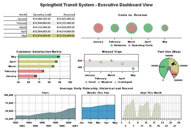
Figure 1-10. This dashboard from Infommersion, Inc. gives executives of a hotel chain the means to view multiple measures of performance, one hotel at a time. It is not unusual for dashboards to divide the full set of data into individual views, as this one does by using the listbox in the upper-left corner to enable viewers to select an individual hotel by location. The great care that we see in this example to realistically reproduce the dashboard metaphor, even down to the sheen on polished metal, is an effort that many vendors take quite seriously.
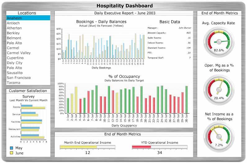
Figure 1-11. This dashboard from Celequest Corporation integrates a series of related tables and graphs that allow executives to view several aspects of sales simultaneously. It exhibits an effort to combine a rich set of related data on the screen to provide a comprehensive overview of a company's sales performance.
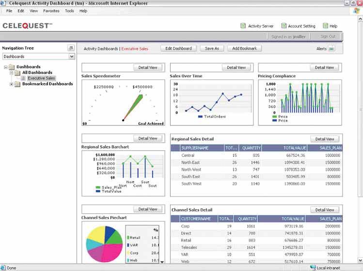
Figure 1-12. This dashboard from General Electric, called a "digital cockpit," provides a tabular summary of performance, complemented by a color-coded indicator light for each measure's status. Rather than a dashboard designed by a software vendor to exhibit its product, this is an actual working dashboard that was designed by a company to serve its own business needs. In this example, no effort was made to literally represent the dashboard (or cockpit) metaphor.
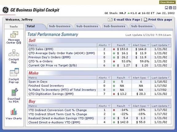
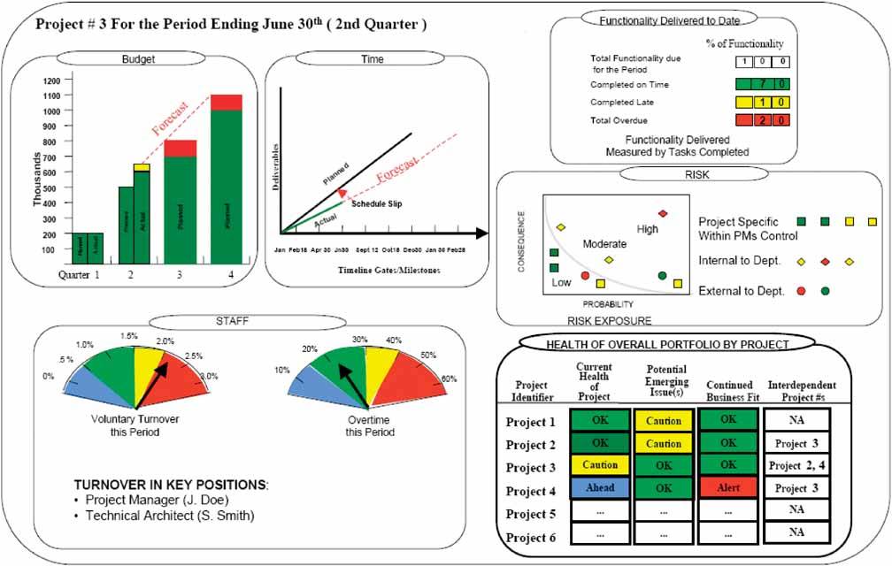
Figure 1-13. This dashboard is used by the Treasury Board of Canada to monitor the performance of a project. Here again we have a dashboard that was designed by an organization for its own use. This time, the dashboard metaphor makes a token appearance in the form of gauges. The traffic-light colors green, yellow, and redhere with the addition of blue for the exceptionally good status of "ahead of schedule"are also used. Unlike some of the examples that we've seen that displayed relatively little information, this one makes the attempt to provide the comprehensive overview that would be needed to effectively monitor progress and performance.
1.3.1. What Is a Dashboard?
As you have no doubt determined by examining these examples, there's a fair degree of diversity in the products that go by the name "dashboard." One of the few characteristics that most vendors seem to agree on is that for something to be called a dashboard it must include graphical display mechanisms such as traffic lights and a variety of gauges and meters, many similar to the fuel gauges and speedometers found in automobiles. This clearly associates BI dashboards with the familiar versions found in cars, thereby leveraging a useful metaphorbut the metaphor alone doesn't provide an adequate definition. About the only other thread that is common to these dashboard examples is that they usually attempt to provide an overview of something that's currently going on in the business.
After a great deal of research and thought, I composed a definition of my own that captures the essence of what I believe a dashboard is (clearly biased toward the characteristics of this medium that I find most useful and unique). To serve us well, this definition must clearly differentiate dashboards from other forms of data presentation, and it must emphasize those characteristics that effectively support the goal of communication. Here's my definition, which originally appeared in Intelligent Enterprise magazine:
A dashboard is a visual display of the most important information needed to achieve one or more objectives; consolidated and arranged on a single screen so the information can be monitored at a glance.
Note: Stephen Few, "Dashboard Confusion," Intelligent Enterprise, March 20, 2004.
Just as the dashboard of a car provides critical information needed to operate the vehicle at a glance, a BI dashboard serves a similar purpose, whether you're using it to make strategic decisions for a huge corporation, run the daily operations of a team, or perform tasks that involve no one but yourself. The means is a single-screen display, and the purpose is to efficiently monitor the information needed to achieve one's objectives.
Visual display of the most information needed to achieve one or more objectives which fits entirely on a single computer screen so it can be monitored at a glance
Let's go over the salient points:
Dashboards are visual displays. The information on a dashboard is presented visually, usually as a combination of text and graphics, but with an emphasis on graphics. Dashboards are highly graphical, not because it is cute, but because graphical presentation, handled expertly, can often communicate with greater efficiency and richer meaning than text alone. How can you best present the information so that human eyes can take it in quickly and human brains can easily extract the correct and most important meanings from it? To design dashboards effectively, you must understand something about visual perceptionwhat works, what doesn't, and why.
Dashboards display the information needed to achieve specific objectives. To achieve even a single objective often requires access to a collection of information that is not otherwise related, often coming from diverse sources related to various business functions. It isn't a specific type of information, but information of whatever type that is needed to do a job. It isn't just information that is needed by executives or even by managers; it can be information that is needed by anyone who has objectives to meet. The required information can be and often is a set of KPIs, but not necessarily, for other types of information might also be needed to do one's job.
A dashboard fits on a single computer screen. The information must fit on a single screen, entirely available within the viewer's eye span so it can all be seen at once, at a glance. If you must scroll around to see all the information, it has transgressed the boundaries of a dashboard. If you must shift from screen to screen to see it all, you've made use of multiple dashboards. The object is to have the most important information readily and effortlessly available so you can quickly absorb what you need to know.
Must the information be displayed in a web browser? That might be the best medium for most dashboards today, but it isn't the only acceptable medium, and it might not be the best medium 10 years from now. Must the information be constantly refreshed in real time? Only if the objectives that it serves require real-time information. If you are monitoring air traffic using a dashboard, you must immediately be informed when something is wrong. On the other hand, if you are making strategic decisions about how to boost sales, a snapshot of information as of last night, or perhaps even the end of last month, should work fine.
Dashboards are used to monitor information at a glance. Despite the fact that information about almost anything can be appropriately displayed in a dashboard, there is at least one characteristic that describes almost all the information found in dashboards: it is abbreviated in the form of summaries or exceptions. This is because you cannot monitor at a glance all the details needed to achieve your objectives. A dashboard must be able to quickly point out that something deserves your attention and might require action. It needn't provide all the details necessary to take action, but if it doesn't, it ought to make it as easy and seamless as possible to get to that information. Getting there might involve shifting to a different display beyond the dashboard, using navigational methods such as drilling down. The dashboard does its primary job if it tells you with no more than a glance that you should act. It serves you superbly if it directly opens the door to any additional information that you need to take that action.
That's the essence of the dashboard. Now let's add to this definition a couple more supporting attributes that help dashboards do their job effectively:
Dashboards have small, concise, clear, and intuitive display mechanisms. Display mechanisms that clearly state their message without taking up much space are required, so that the entire collection of information will fit into the limited real estate of a single screen. If something that looks like a fuel gauge, traffic signal, or thermometer fits this requirement best for a particular piece of information, that's what you should use, but if something else works better, you should use that instead. Insisting on sexy displays similar to those found in a car when other mechanisms would work better is counterproductive.
Dashboards are customized. The information on a dashboard must be tailored specifically to the requirements of a given person, group, or function; otherwise, it won't serve its purpose.
A dashboard is a type of display, a form of presentation, not a specific type of information or technology. Keep this distinction clear, and you will be freed to focus on what really matters: designing dashboards to communicate.
Clarifying the Vision
- Clarifying the Vision
- All That Glitters Is Not Gold
- Even Dashboards Have a History
- Dispelling the Confusion
- A Timely Opportunity
Variations in Dashboard Uses and Data
Thirteen Common Mistakes in Dashboard Design
- Thirteen Common Mistakes in Dashboard Design
- Exceeding the Boundaries of a Single Screen
- Supplying Inadequate Context for the Data
- Displaying Excessive Detail or Precision
- Choosing a Deficient Measure
- Choosing Inappropriate Display Media
- Introducing Meaningless Variety
- Using Poorly Designed Display Media
- Encoding Quantitative Data Inaccurately
- Arranging the Data Poorly
- Highlighting Important Data Ineffectively or Not at All
- Cluttering the Display with Useless Decoration
- Misusing or Overusing Color
- Designing an Unattractive Visual Display
Tapping into the Power of Visual Perception
- Tapping into the Power of Visual Perception
- Understanding the Limits of Short-Term Memory
- Visually Encoding Data for Rapid Perception
- Gestalt Principles of Visual Perception
- Applying the Principles of Visual Perception to Dashboard Design
Eloquence Through Simplicity
- Eloquence Through Simplicity
- Characteristics of a Well-Designed Dashboard
- Key Goals in the Visual Design Process
Effective Dashboard Display Media
- Effective Dashboard Display Media
- Select the Best Display Medium
- An Ideal Library of Dashboard Display Media
- Summary
Designing Dashboards for Usability
- Designing Dashboards for Usability
- Organize the Information to Support Its Meaning and Use
- Maintain Consistency for Quick and Accurate Interpretation
- Make the Viewing Experience Aesthetically Pleasing
- Design for Use as a Launch Pad
- Test Your Design for Usability
Putting It All Together
EAN: 2147483647
Pages: 80
