Arranging the Data Poorly
Dashboards often need to present a large amount of information in a limited amount of space. If the information isn't organized well, with appropriate placement of information based on importance and desired viewing sequence, along with a visual design that segregates data into meaningful groups without fragmenting it into a confusing labyrinth, the result is a cluttered mess. Most examples of dashboards found on the Web are composed of a small amount of data to avoid the need for skilled visual design, but they still often manage to look cluttered and thrown together. The goal is not simply to make the dashboard look good, but to arrange the data in a manner that fits the way it's used. The most important data ought to be prominent. Data that require immediate attention ought to stand out. Data that should be compared ought to be arranged and visually designed to encourage comparisons.
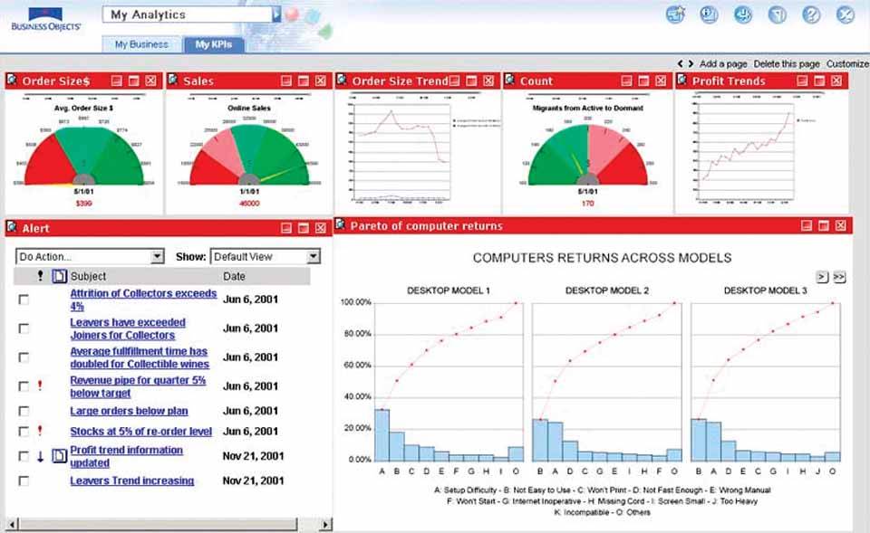
The dashboard in Figure 3-26 illustrates some of the problems often associated with poor arrangement of data. Notice first of all that the most prominent position on this dashboardthe top leftis used to display the vendor's logo and navigational controls. What a waste of prime real estate! As you scan down the screen, the next information that you see is a gauge that presents the average order size. It's possible that average order size might be someone's primary interest, but it's unlikely that, of all the information that appears on this dashboard, this is the most important. As I'll discuss in Chapter 5, Eloquence Through Simplicity, the least prominent real estate on the screen is the lower-right corner. However, in this example the large amount of space taken up by the graphs that present "Computers Returns Across Models," as well as the larger font sizes used in this section, tends to draw attention to data that seems tangential to the rest. This dashboard lacks an appropriate visual sequence and balance based on the nature and importance of the data. Notice also that the bright red bands of color above each section of the display, where the titles appear in white, are far more eye-catching than is necessary to declare the meanings of the individual displays. This visually segments the space to an unnecessary degree. Lastly, note that the similarity of the line graphs that display order size and profit trends invites our eyes to compare them. This is probably a useful comparison, but the positional separation and side-by-side rather than over-under arrangement of the two graphs makes close comparison difficult. As this example illustrates, you can't just throw information onto the screen wherever you can make it fit and expect the dashboard to do its job effectively.
Figure 3-26. This dashboard exemplifies poorly arranged data.

Clarifying the Vision
- Clarifying the Vision
- All That Glitters Is Not Gold
- Even Dashboards Have a History
- Dispelling the Confusion
- A Timely Opportunity
Variations in Dashboard Uses and Data
Thirteen Common Mistakes in Dashboard Design
- Thirteen Common Mistakes in Dashboard Design
- Exceeding the Boundaries of a Single Screen
- Supplying Inadequate Context for the Data
- Displaying Excessive Detail or Precision
- Choosing a Deficient Measure
- Choosing Inappropriate Display Media
- Introducing Meaningless Variety
- Using Poorly Designed Display Media
- Encoding Quantitative Data Inaccurately
- Arranging the Data Poorly
- Highlighting Important Data Ineffectively or Not at All
- Cluttering the Display with Useless Decoration
- Misusing or Overusing Color
- Designing an Unattractive Visual Display
Tapping into the Power of Visual Perception
- Tapping into the Power of Visual Perception
- Understanding the Limits of Short-Term Memory
- Visually Encoding Data for Rapid Perception
- Gestalt Principles of Visual Perception
- Applying the Principles of Visual Perception to Dashboard Design
Eloquence Through Simplicity
- Eloquence Through Simplicity
- Characteristics of a Well-Designed Dashboard
- Key Goals in the Visual Design Process
Effective Dashboard Display Media
- Effective Dashboard Display Media
- Select the Best Display Medium
- An Ideal Library of Dashboard Display Media
- Summary
Designing Dashboards for Usability
- Designing Dashboards for Usability
- Organize the Information to Support Its Meaning and Use
- Maintain Consistency for Quick and Accurate Interpretation
- Make the Viewing Experience Aesthetically Pleasing
- Design for Use as a Launch Pad
- Test Your Design for Usability
Putting It All Together
EAN: 2147483647
Pages: 80
