Sample CIO Dashboard
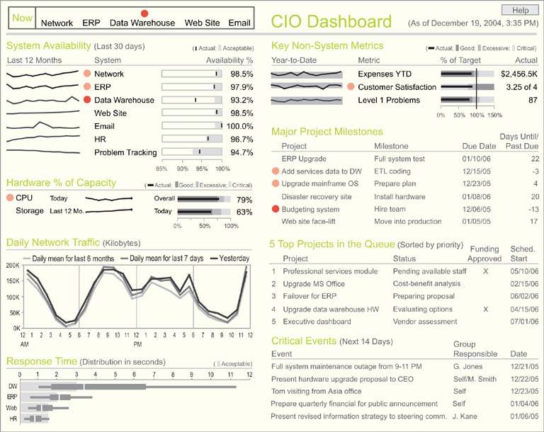
A Chief Information Officer must keep track of many facts regarding the performance of the company's information systems and activities, including projects that serve the company's information needs. I chose to include the following data in my sample dashboard:
- System availability (uptime)
- Expenses
- Customer satisfaction
- Severe problem count
- CPU usage relative to capacity
- Storage usage relative to capacity
- Network traffic
- Application response time
- Major project milestones
- Top projects in the queue
- Other critical events
This is a mixture of strategic and frequently updated operational information that a CIO might need. Examine Figure 8-11 closely and try to get a sense for how it might work in the real world.
Only one section of this dashboardthe upper-left cornerdisplays near real-time data. This section consists of a series of five alerts: one for each of the systems that the CIO might need to respond to immediately when a problem arises. If no red circles appear in this section, nothing critical is currently wrong with any of these systems. To better grab the CIO's attention, red alerts that appear in this section could blink until clicked, or even emit along with the blinks a sound that gradually increases in volume. The red alert objects could also serve as links to other screens that describe precisely what is wrong.
The rest of this dashboard provides the CIO with information that is more strategic in nature. Notice that a great deal of contextual information has been provided to complement the measuresespecially comparisons to measures of acceptable performance. This is the kind of context that could help the CIO easily make sense of these measures.
Figure 8-11. A sample CIO dashboard.

There is a great deal of information on this dashboard, yet it doesn't seem cluttered. This is largely due to the fact that non-data pixels have been reduced to a minimum. For instance, white space alone has been used to separate the various sections of the display. A judicious use of color has also contributed to this effect. Besides gray-scale colors, the only other hues you see are a muted green for the name of each section and two intensities of red, which in every case serves as an alert. It is easy to scan the dashboard and quickly find everything that needs attention, because the red alert objects are unique, visually unlike anything else.
Including information about project milestones, pending projects, and other critical events on this dashboard not only locates all the most important information the CIO needs in one place, but also supports useful comparisons. Being reminded about coming events that might affect existing systems and being able to look immediately at the current performance of those systems could raise useful questions about their readiness.
Clarifying the Vision
- Clarifying the Vision
- All That Glitters Is Not Gold
- Even Dashboards Have a History
- Dispelling the Confusion
- A Timely Opportunity
Variations in Dashboard Uses and Data
Thirteen Common Mistakes in Dashboard Design
- Thirteen Common Mistakes in Dashboard Design
- Exceeding the Boundaries of a Single Screen
- Supplying Inadequate Context for the Data
- Displaying Excessive Detail or Precision
- Choosing a Deficient Measure
- Choosing Inappropriate Display Media
- Introducing Meaningless Variety
- Using Poorly Designed Display Media
- Encoding Quantitative Data Inaccurately
- Arranging the Data Poorly
- Highlighting Important Data Ineffectively or Not at All
- Cluttering the Display with Useless Decoration
- Misusing or Overusing Color
- Designing an Unattractive Visual Display
Tapping into the Power of Visual Perception
- Tapping into the Power of Visual Perception
- Understanding the Limits of Short-Term Memory
- Visually Encoding Data for Rapid Perception
- Gestalt Principles of Visual Perception
- Applying the Principles of Visual Perception to Dashboard Design
Eloquence Through Simplicity
- Eloquence Through Simplicity
- Characteristics of a Well-Designed Dashboard
- Key Goals in the Visual Design Process
Effective Dashboard Display Media
- Effective Dashboard Display Media
- Select the Best Display Medium
- An Ideal Library of Dashboard Display Media
- Summary
Designing Dashboards for Usability
- Designing Dashboards for Usability
- Organize the Information to Support Its Meaning and Use
- Maintain Consistency for Quick and Accurate Interpretation
- Make the Viewing Experience Aesthetically Pleasing
- Design for Use as a Launch Pad
- Test Your Design for Usability
Putting It All Together
EAN: 2147483647
Pages: 80
