Designing an Unattractive Visual Display
Not being one to mince words for the sake of propriety, I'll state quite directly that some dashboards are just plain ugly. When we see them, we're inclined to avert our eyeshardly the desired reaction to a screen that's supposed to be supplying us with important information. You might have assumed from my earlier warning against unnecessary decoration that I have no concern for dashboard aesthetics, but that's not the case. When a dashboard is unattractiveunpleasant to look atthe viewer is put in a frame of mind that is not conducive to its use. I'm not advocating that we add touches to make dashboards pretty, but rather that we attractively display the data itself, without adding anything that distracts from or obscures it. (We'll examine the aesthetics of dashboard design a bit in Chapter 7, Designing Dashboards for Usability.)
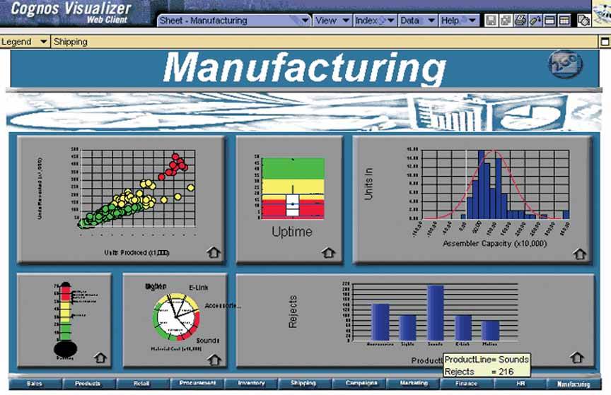
Figure 3-32 on the next page is a stellar example of unattractive dashboard design. It appears that the person who created this dashboard attempted to make it look nice, but he just didn't have the visual design skills needed to succeed. For instance, in an effort to fill up the space, some sections (such as the graph at the bottom right) were simply stretched. Also, although shades of gray can be used effectively as the background color of graphs, this particular shade is too dark. The image that appears under the title "Manufacturing" is clearly an attempt to redeem this dreary dashboard with a splash of decoration, but it only serves to distract from the data and isn't even particularly nice to look at. The guiding design principle of simplicity alone would have saved this dashboard from its current agony.
Figure 3-32. This is an example of a rather unattractive dashboard.
You don't need to be a graphic artist to design an attractive dashboard, but you do need to understand a few basic principles about visual perception. We'll examine these in the next chapter.
Clarifying the Vision
- Clarifying the Vision
- All That Glitters Is Not Gold
- Even Dashboards Have a History
- Dispelling the Confusion
- A Timely Opportunity
Variations in Dashboard Uses and Data
Thirteen Common Mistakes in Dashboard Design
- Thirteen Common Mistakes in Dashboard Design
- Exceeding the Boundaries of a Single Screen
- Supplying Inadequate Context for the Data
- Displaying Excessive Detail or Precision
- Choosing a Deficient Measure
- Choosing Inappropriate Display Media
- Introducing Meaningless Variety
- Using Poorly Designed Display Media
- Encoding Quantitative Data Inaccurately
- Arranging the Data Poorly
- Highlighting Important Data Ineffectively or Not at All
- Cluttering the Display with Useless Decoration
- Misusing or Overusing Color
- Designing an Unattractive Visual Display
Tapping into the Power of Visual Perception
- Tapping into the Power of Visual Perception
- Understanding the Limits of Short-Term Memory
- Visually Encoding Data for Rapid Perception
- Gestalt Principles of Visual Perception
- Applying the Principles of Visual Perception to Dashboard Design
Eloquence Through Simplicity
- Eloquence Through Simplicity
- Characteristics of a Well-Designed Dashboard
- Key Goals in the Visual Design Process
Effective Dashboard Display Media
- Effective Dashboard Display Media
- Select the Best Display Medium
- An Ideal Library of Dashboard Display Media
- Summary
Designing Dashboards for Usability
- Designing Dashboards for Usability
- Organize the Information to Support Its Meaning and Use
- Maintain Consistency for Quick and Accurate Interpretation
- Make the Viewing Experience Aesthetically Pleasing
- Design for Use as a Launch Pad
- Test Your Design for Usability
Putting It All Together
EAN: 2147483647
Pages: 80
