Visually Encoding Data for Rapid Perception
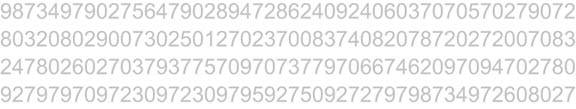
Preattentive processing, the early stage of visual perception that rapidly occurs below the level of consciousness, is tuned to detect a specific set of visual attributes. Attentive processing is sequential, and therefore much slower. The difference is easy to demonstrate. Take a moment to examine the four rows of numbers in Figure 4-1, and try to determine as quickly as you can the number of times the number 5 appears in the list.
Figure 4-1. How many fives are in this list? Note the slow speed at which we process visual stimuli that lack preattentive attributes.
How many did you find? The correct answer is six. Whether you got the answer right or not, the process took you a while because it involved attentive processing. The list of numbers did not exhibit any preattentive attributes that you could use to distinguish the fives from the other numbers. Now try it again, this time using the list of numbers in Figure 4-2.
Figure 4-2. How many fives do you see now? Note the fast speed at which we process visual stimuli that exhibit preattentive attributes.
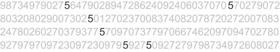
Much easier this time, wasn't it? In this figure the fives could easily be distinguished from the other numbers, due to their differing color intensity (one of the preattentive attributes we'll discuss below): the fives are black while all the other numbers are gray, which causes them to stand out in clear contrast. Why couldn't we easily distinguish the fives in the first set of numbers (Figure 4-1) based purely on their unique shape? Because the complex shapes of the numbers are not attributes that we perceive preattentively. Simple shapes such as circles and squares are preattentively perceived, but the shapes of numbers are too elaborate.
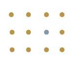
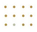
In Information Visualization: Perception for Design, Colin Ware suggests that the preattentive attributes of visual perception can be organized into four categories: color, form, spatial position, and motion. For our present interest related to dashboard design, I've reduced his larger list of 17 preattentive attributes to the following 11:
|
Category |
Attribute |
Illustration |
|---|---|---|
|
Color |
Hue |
|
|
Intensity |
|
|
|
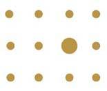
Position |
2-D location |
|
|
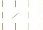
Form |
Orientation |
|
|
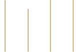
Line length |
|
|
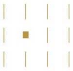
|
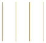
Line width |
|
|
|
Size |
|
|
|
Shape |
|
|
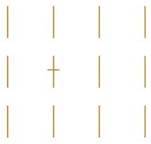
|
Added marks |
|
|
|
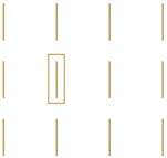
Enclosure |
|
|
|
Motion |
Flicker |
A visual attribute of an object, such as color, continuously changes back and forth between two values, or the entire object it-self repeatedly appears and then disappears. |
Each of these visual attributes can be consciously applied to dashboard design to group or highlight information. Some can be used to encode quantitative information as well, as we'll discuss below.
4.2.1. Attributes of Color
A common way to describe color combines three attributes: hue, saturation, and lightness/brightness. This is sometimes referred to as the HSL or HSB system of describing color. Hue is a more precise term for what we normally think of as color (red, green, blue, purple, etc.). Saturation measures the degree to which a particular hue exhibits its full, pure essence. The saturation of the red hue in Figure 4-3 ranges from 0% saturation on the left to 100% saturation on the right.
Figure 4-3. The full range of color saturation, in this case of the hue red, with 0% saturation on the left and 100% saturation on the right.

Lightness (or brightness) measures the degree to which any hue appears dark or light, ranging from fully dark (black) to fully light (white). The full range of lightness is shown for the red hue in Figure 4-4.
Figure 4-4. The full range of color lightness, in this case of the hue red, with 0% lightness on the left (pure black) and 100% lightness on the right (pure white).

Intensity refers to both saturation and lightness. The illustration of color intensity on Section 4.2 shows a circle that varies from the others not as a different hue but as a lighter (that is, less intense) version of the same hue. Both are different points along a color scale that ranges from white (no brown) to a rich dark shade of brown (fully brown). It really isn't necessary to fully understand the technical distinction between saturation and lightness, which is why I describe them both more simply as intensity.
One of the interesting (but hardly intuitive) things about color is that we don't perceive color in an absolute way. What we see is dramatically influenced by the context that surrounds it. Take a look at the gray squares in Figure 4-5. They appear to vary in intensity, but in fact they are all exactly the same as the lone square that appears against a white background at the bottom.
Figure 4-5. Context affects our perception of color intensity. The small square is actually the exact same shade of gray everywhere it appears.
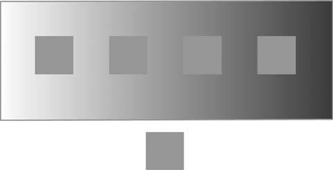
All five squares have a color value of 50% black, yet the surrounding gray-scale gradient, ranging from light on the left to dark on the right, alters our perception of them. This perceptual illusion applies not only to intensity, but to hue. In Figure 4-6, the word "Text" appears against two backgrounds: red and blue. In both cases, the color of the word "Text" is the same. However, it not only looks different, but it's much less visible against the red background.
Figure 4-6. Context also affects our perception of hue. The word "Text" is exactly the same hue in both boxes.

Color must be used with a full awareness of context. We not only want data to be fully legible, but also to appear the same when we wish it to appear the same and different when we wish it to appear different.
4.2.2. Attributes of Form
Some of the visual attributes of form have no obvious connection to dashboard design, but their relevance should become clear with a little explanation. The most common application of orientation is in the form of italicized text, which is text that has been reoriented from straight up and down to slightly slanted to the right. I usually discourage the use of italicized text as a means of making some words stand out from the rest, because italics are harder to read than normal vertically oriented text. However, it is sometimes useful in a pinch.
In dashboard design, the attribute of line length is most useful for encoding quantitative values as bars in a bar graph. Line width, on the other hand, can be useful for highlighting purposes. You can think of line width as the thickness or stroke weight of a line. When lines are used to underline content or, in the form of boxes, to form borders around content, you can draw more attention to that content by increasing the thickness of the lines.
The relative sizes of objects that appear on a dashboard can be used to visually rank their importance. For instance, larger titles for sections of content, or larger tables, graphs, or icons, can be used to declare the greater importance of the associated data. Simple shapes can be used in graphs to differentiate data sets and, in the form of icons, to assign distinct meanings, such as different types of alerts. Added marks are most useful on dashboards in the form of simple icons that appear next to data that need attention. Any simple mark (such as a circle, a square, an asterisk, or an X), when placed next to information only when it must be highlighted, works as a simple means of drawing attention. Last on the list of form attributes is enclosure, which is a powerful means of grouping sections of data or, when used sparingly, highlighting content as important. To create the visual effect of enclosure, you can use either a border or a fill color behind the content.
4.2.3. Attributes of Position
The preattentive attribute 2-D position is the primary means that we use to encode quantitative data in graphs (for example, the position of data points in relation to a quantitative scale). This isn't arbitrary. Of all the preattentive attributes, differences in 2-D position are the easiest and most accurate to perceive.
Note: Perhaps you've noticed that I've specified "2-D" positionan object's location relative to the vertical and horizontal dimensions onlyand have ignored 3-D position, also known as stereoscopic position. 3-D position is also a preattentive attribute, but the pseudo-3-D effect that can be produced on the flat surface of a computer screen comes with a bevy of perceptual problems that complicate its use. 3-D elements are so rarely necessary to communicate business information and so difficult to design effectively that I recommend that you avoid using them altogether.
4.2.4. Attributes of Motion
As I type these words, I am aware of my cursor flickering on and off on the screen. Flicker was chosen as the means to help us locate the cursor because it is a powerful attention-getter. Evolution has equipped us with a heightened sensitivity to something that suddenly appears within our field of vision. Our ancient ancestors found it very valuable to become instantly alert when a saber-toothed tiger suddenly sprang into their peripheral vision. As I'm sure you're aware, flickering objects on a screen can be quite annoying and thus should usually be avoided. Still, there are occasions when flicker is useful. This is especially true for dashboards that are constantly updated with real-time data and are used to monitor operations that require immediate responses.
4.2.5. Encoding Quantitative Versus Categorical Data
Some of the preattentive attributes that we've examined can be used to communicate quantitative data, while others can be used only to communicate categorical data. That is, while some attributes allow us to perceive one thing as greater than others in some way (bigger, taller, more important), others merely indicate that items are distinct from one another, without any sense of some being greater than or less than others. For example, different shapes can be perceived as distinct, but only categorically. Squares are not greater than triangles or circlesthey're just different. The following table again lists each of the preattentive attributes and indicates which are quantitatively perceived:
|
Category |
Attribute |
Quantitative |
|---|---|---|
|
Color |
Hue Intensity |
No Yes, but limited |
|
Position |
2-D position |
Yes |
|
Form |
Orientation Line length Line width Size Shape Added marks Enclosure |
No Yes Yes, but limited Yes, but limited No No No |
|
Motion |
Flicker |
Yes, based on speed, but limited |
Note: You might argue that we can perceive orientation and curvature quantitatively, but there is no natural association of greater or lesser value with different orientations or degrees of curvature (for example, which is greater, a vertical or horizontal line?).
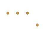
We can use those attributes with quantitative perception described as "Yes, but limited" to encourage perception of one thing as greater than, equal to, or less than another, but not with any degree of precision. For example, in Figure 4-7, it is obvious that the circle on the right is bigger than the circle on the left, but how much bigger? If the small circle has a size of one, what is the size of the bigger circle?
Figure 4-7. This illustrates our inability to assign precise quantitative values to objects of different sizes.
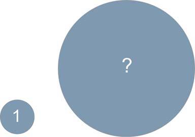
The correct answer is 16, but it's likely that you guessed a lower number. Humans tend to underestimate differences in 2-D areas, and hence you must be wary of using 2-D areas of different sizes to encode quantitative valuesespecially on a dashboard, where speed of interpretation is essential.
It is important to understand the different ways that the preattentive attributes can be used to group and encode data, but by splitting them along these linesquantitative and categoricalI do not mean to imply that only those attributes that enable viewers to make quantitative comparisons are of use to dashboard designers. Our inability to perceive certain preattentive attributes quantitatively does not render them useless to us. Each of them can be used to divide data into distinct categories, to visually link data together even when it is separated spatially, and to highlight data.
4.2.6. Limits to Perceptual Distinctness
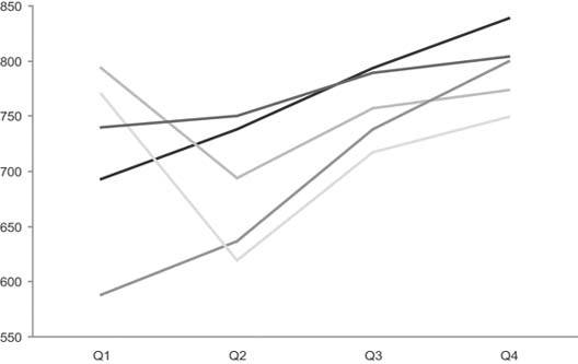
When designing dashboards, bear in mind that there is a limit to the number of distinct expressions of a single preattentive attribute that we can quickly and easily distinguish. For example, when using varying intensities of the color gray to distinguish data sets in a line graph, you must make sure that the color of each line is different enough from those closest in color to it to clearly stand out as distinct. When you place enough perceptual distance between the color intensities of the separate lines to make them sufficiently distinct, there's a practical limit of about five to the number of distinct expressions that are available across the gray scale. In Figure 4-8, it is easy to see that it would be difficult to include more gray lines that would stand out as distinct without requiring careful, conscious, and thus slow examination on the part of the viewer.
Figure 4-8. There is a practical limit of about five distinct color intensities on the gray-scale continuum that can be used to encode separate lines in a graph.
Similar limits apply to every one of the preattentive attributes, except line length (such as the length of a bar on a graph) and 2-D location (such as the location of a data point on a graph). When organizing data into distinct groups using different expressions of any preattentive attribute, you should be careful not to exceed five distinct expressions. When using the shape attribute, in addition to this limit you must also be careful to choose shapes that are simple, such as circles, squares, triangles, dashes, and crosses (or Xs). Remember that complex shapes, including most icons, are not perceived preattentively. When using hue, keep in mind that even though we can easily distinguish more than five hues, short-term memory can't simultaneously retain the meaning of more than about nine in total. Also, the use of too many hues results in a dashboard that looks cluttered, with too many distinctions to sort through quickly. When designing dashboards, it helps to prepare standard sets of hues, color intensities, shapes, and so on from which to choose, and then stick to them. This will keep the display perceptually simple and will eliminate the need to select visual attributes from scratch each time you must choose one.
4.2.7. Using Vivid and Subtle Colors Appropriately
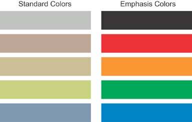
Color is so often misused in dashboard design that I'm compelled to emphasize one more principle of its use. Some colors are soothing, and some take hold of us and shake us around. Knowing the difference is quite important. There are times when particular information needs to grab the viewer's attention in an unavoidable way, but using color for this purpose works only if it's done sparingly. Reserve the use of bright, fully saturated color for these special cases. Colors that are common in nature, such as soft grays, browns, oranges, greens, and blues, work very well as a standard color palette for dashboards. They allow the viewer to peruse the dashboard calmly with an open mind, rather than stressfully, with pinpoint attention in response to assaulting colors. Figure 4-9 displays examples of standard and bold color palettes.
Figure 4-9. Examples of two color palettes: one for standard use and one for emphasis.
Clarifying the Vision
- Clarifying the Vision
- All That Glitters Is Not Gold
- Even Dashboards Have a History
- Dispelling the Confusion
- A Timely Opportunity
Variations in Dashboard Uses and Data
Thirteen Common Mistakes in Dashboard Design
- Thirteen Common Mistakes in Dashboard Design
- Exceeding the Boundaries of a Single Screen
- Supplying Inadequate Context for the Data
- Displaying Excessive Detail or Precision
- Choosing a Deficient Measure
- Choosing Inappropriate Display Media
- Introducing Meaningless Variety
- Using Poorly Designed Display Media
- Encoding Quantitative Data Inaccurately
- Arranging the Data Poorly
- Highlighting Important Data Ineffectively or Not at All
- Cluttering the Display with Useless Decoration
- Misusing or Overusing Color
- Designing an Unattractive Visual Display
Tapping into the Power of Visual Perception
- Tapping into the Power of Visual Perception
- Understanding the Limits of Short-Term Memory
- Visually Encoding Data for Rapid Perception
- Gestalt Principles of Visual Perception
- Applying the Principles of Visual Perception to Dashboard Design
Eloquence Through Simplicity
- Eloquence Through Simplicity
- Characteristics of a Well-Designed Dashboard
- Key Goals in the Visual Design Process
Effective Dashboard Display Media
- Effective Dashboard Display Media
- Select the Best Display Medium
- An Ideal Library of Dashboard Display Media
- Summary
Designing Dashboards for Usability
- Designing Dashboards for Usability
- Organize the Information to Support Its Meaning and Use
- Maintain Consistency for Quick and Accurate Interpretation
- Make the Viewing Experience Aesthetically Pleasing
- Design for Use as a Launch Pad
- Test Your Design for Usability
Putting It All Together
EAN: 2147483647
Pages: 80
- Key #1: Delight Your Customers with Speed and Quality
- Key #2: Improve Your Processes
- Key #4: Base Decisions on Data and Facts
- Making Improvements That Last: An Illustrated Guide to DMAIC and the Lean Six Sigma Toolkit
- The Experience of Making Improvements: What Its Like to Work on Lean Six Sigma Projects
