Highlighting Important Data Ineffectively or Not at All
When you look at a dashboard, your eyes should immediately be drawn to the information that is most important, even when it does not reside in the most visually prominent areas of the screen. In Chapter 5, Eloquence Through Simplicity, we'll examine several visual techniques that can be used to achieve this end. For now, we'll look at what happens when this isn't done at all, or isn't done well.
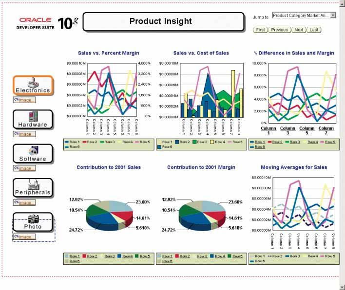
The problem with the dashboard in Figure 3-27 is that everything is visually prominent, and consequently nothing stands out. The logo and navigation controls (the buttons on the left) are prominent both as a result of their placement on the screen and the use of strong borders, but these aren't data and therefore shouldn't be emphasized. Then there are the graphs where the data reside: all the data are equally bold and colorful, leaving us with a wash of sameness and no clue where to focus. Everything that deserves space on a dashboard is important, but not equally sothe viewer's eyes should always be directed to the most crucial information first.
Figure 3-27. This dashboard fails to differentiate data by its importance, giving relatively equal prominence to everything on the screen.
Clarifying the Vision
- Clarifying the Vision
- All That Glitters Is Not Gold
- Even Dashboards Have a History
- Dispelling the Confusion
- A Timely Opportunity
Variations in Dashboard Uses and Data
Thirteen Common Mistakes in Dashboard Design
- Thirteen Common Mistakes in Dashboard Design
- Exceeding the Boundaries of a Single Screen
- Supplying Inadequate Context for the Data
- Displaying Excessive Detail or Precision
- Choosing a Deficient Measure
- Choosing Inappropriate Display Media
- Introducing Meaningless Variety
- Using Poorly Designed Display Media
- Encoding Quantitative Data Inaccurately
- Arranging the Data Poorly
- Highlighting Important Data Ineffectively or Not at All
- Cluttering the Display with Useless Decoration
- Misusing or Overusing Color
- Designing an Unattractive Visual Display
Tapping into the Power of Visual Perception
- Tapping into the Power of Visual Perception
- Understanding the Limits of Short-Term Memory
- Visually Encoding Data for Rapid Perception
- Gestalt Principles of Visual Perception
- Applying the Principles of Visual Perception to Dashboard Design
Eloquence Through Simplicity
- Eloquence Through Simplicity
- Characteristics of a Well-Designed Dashboard
- Key Goals in the Visual Design Process
Effective Dashboard Display Media
- Effective Dashboard Display Media
- Select the Best Display Medium
- An Ideal Library of Dashboard Display Media
- Summary
Designing Dashboards for Usability
- Designing Dashboards for Usability
- Organize the Information to Support Its Meaning and Use
- Maintain Consistency for Quick and Accurate Interpretation
- Make the Viewing Experience Aesthetically Pleasing
- Design for Use as a Launch Pad
- Test Your Design for Usability
Putting It All Together
EAN: 2147483647
Pages: 80
