Special Topics in Quantitative Management
Overview
It is common sense to take a method and try it.
If it fails, admit frankly and try another. But above all, try something.
Franklin Roosevelt [1]
[1]Brooks, Fredrick P., The Mythical Man-Month, Addison Wesley Longman, Inc., Reading, MA, 1995, p. 115.
Regression Analysis
Regression analysis is a term applied by mathematicians to the investigation and analysis of the behaviors of one or more data variables in the presence of another data variable. For example, one data variable in a project could be cost and another data variable could be time or schedule. Project managers naturally ask the question: How does cost behave in the presence of a longer or shorter schedule? Questions such as these are amenable to regression analysis. The primary outcome of regression analysis is a formula for a curve that "best" fits the data observations. Not only does the curve visually reinforce the relationship between the data points, but the curve also provides a means to forecast the next data point before it occurs or is observed, thereby providing lead time to the project manager during which risk management can be brought to bear on the forecasted outcome.
Beyond just the dependency of cost on schedule, cost might depend on the training hours per project staff member, the square feet of facilities allocated to each staff member, the individual productivity of staff, and a host of other possibilities. Of course, there also are many multivariate situations in projects that might call for the mathematical relationship of one on the other, such as employee productivity as an outcome (dependency) of training hours. For each of these project situations, there is also the forecast task of what the next data point is given another outcome of the independent variable. In effect, how much risk is there in the next data set?
Single Variable Regression
Probably the easiest place to start with regression analysis is with the case introduced about cost and schedule. In regression analysis, one or more of the variables must be the independent variable. The remaining data variable is the dependent variable. The simplest relationship among two variables, one independent and one dependent, is the linear equation of the form
Y = a * X + b
where X is the independent variable, and the value of Y is dependent on the value of X. When we plot the linear equation we observe that the "curve" is a straight line. Figure 8-1 provides a simple illustration of the linear "curve" that is really a straight line. In Figure 8-1, the independent variable is time and the dependent variable is cost, adhering to the time-honored expression "time is money."
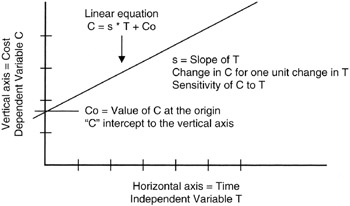
Figure 8-1: Linear Equation.
Those familiar with linear equations from the study of algebra recognize that the parameter "a" is the slope of the line and has dimensions of "Y per X," as in dollars per week if Y were dimensioned in dollars and X were dimensioned in weeks. As such, project managers can always think of the slope parameter as a "density" parameter. [2] The "b" parameter is usually called the "intercept," referring to the fact that when X = 0, Y = b. Therefore, "b" is the intercept point of the curve with the Y-axis at the origin where X = 0.
Of course, X and Y could be deterministic variables (only one fixed value) or they could be random variables (observed value is probabilistic over a range of values). We recognize that the value of Y is completely forecasted by the value of X once the deterministic parameters "a" and "b" are known.
In Figure 8-2, we see a scatter of real observations of real cost and schedule data laid on the graph containing a linear equation of the form we have been discussing, C = a * T + b. Visually, the straight line (that is, the linear curve) seems to fit the data scatter pretty well. As project managers, we might be quite comfortable using the linear curve as the forecast of data values beyond those observed and plotted. If so, the linear equation becomes the "regression" curve for the observed data.
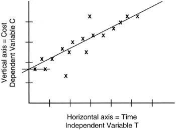
Figure 8-2: Random "Linear" Data.
Calculating the Regression Curve
Up to this point, we have discussed single independent variable regression, albeit with the cart in front of the horse: we discussed the linear equation before we discussed the data observations. In point of fact, the opposite is the case in real projects. The project team has or makes the data observations before there is a curve. The task then becomes to find a curve that "fits" the data. [3]
There is plenty of computer tool support for regression analysis. Most spreadsheets incorporate the capability or there is an add-in that can be loaded into the spreadsheet to provide the functionality. Beyond spreadsheets, there is a myriad of mathematics and statistics computer packages that can perform regression analysis. Suffice it to say that in most projects no one would be called on to actually calculate a regression curve. Nevertheless, it is instructive to understand what lies behind the results obtained from the computer's analysis.
In this book, we will constrain ourselves to a manual calculation of a linear regression curve. Naturally, there are higher order curves involving polynomial equations that plot as curves and not straight lines. Again, most spreadsheets offer a number of curve fits, not just the linear curve.
By now you might be wondering if there is a figure of merit or some other measure or criteria that would help in picking the regression line. In other words, if there is more than one possibility for the regression curve, as surely there always is, then which one is best? We will answer that question in subsequent paragraphs.
Our task is to find a regression curve that fits our data observations. Our deliverable is a formula of the linear equation type Y = a * X + b. Our task really, then, is to find or estimate "a" and "b". As soon as we say "estimate" we are introducing the idea that we might not be able to exactly derive "a" and "b" from the data. "Estimate" means that the "a" and "b" we find are really probabilistic over a range of value possibilities.
Since we are working with a set of data observations, we may not have all the data in the universe (we may have only a sample or subset), but nevertheless we can find the average of the sample we do have: we can find the mean value of X and the mean value of Y, and since we are now talking about random variables, we will use the notation already adopted, X and Y.
It makes some sense to think that any linear regression line we come up with that is "pretty good" should pass through, or very close to, the point on the graph represented by the coordinates of the average value of X and the average value of Y. For this case we have one equation in two unknowns, "a" and "b":
Yav = a * Xav + b
where Xav is the mean or average value of the random variable.
This equation can be rearranged to have the form
0 = a * Xav + b - Yav
Students of algebra know that when there are two unknowns, two independent equations involving those unknowns must be found in order to solve for them. Thus we are now faced with the dilemma of finding a second equation. This task is actually beyond the scope of this book as it involves calculus to find some best-fit values for "a" and "b", but the result of the calculus is not hard to use and understand as our second equation involving "a" and "b" and the observations of X and Y:
0 = a * X2av + b * Xav - (X * Y)av
Solving for "a" and "b" with the two independent equations we have discussed provides the answers we are looking for:
a = [(X * Y)av - Xav * Yav]/[X2av - (Xav)2], and b = Yav - a * Xav
Goodness of Fit to the Regression Line
We are now prepared to address how well the regression line fits the data. We have already said that a good line should pass through the coordinates of Xav and Yav, but the line should also be minimally distant from all the other data. "Minimally distant" is a general objective of all statistical analysis. After all, we do not know these random variables exactly; if we did, they would be deterministic and not random. Therefore, statistical methods in general strive to minimize the distance or error between the probabilistic values found in the probability density function for the random variable and the real value of the variable.
As discussed in Chapter 2, we minimize distance by calculating the square of the distance between a data observation and its real, mean, or estimated value and then minimizing that squared error. Figure 8-3 provides an illustration. From each data observation value along the horizontal axis, we measure the Y-distance to the regression line from that data observation point. Each such measure is of the form:
Y2distance = ∑ (Yi - Yx)2
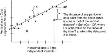
Figure 8-3: Distance Measures in Linear Regression.
where Yi is the specific observation, and Yx is the value of Y on the linear regression line closest to Yi.
Consider also that there is another distance measure that could be made. This second distance measure involves the Yav rather than the Yx:
Y2dAv = ∑ (Yi - Yav)2
Figure 8-4 illustrates the measures that sum to Y2dAv. Ordinarily, this second distance measure is counterintuitive because you would think you would always want to measure distance to the nearest point on the regression line and not to an average point that might be further away than the nearest point on the line. However, the issue is whether or not the variations in Y really are dependent on the variations in X. Perhaps they are strongly or exactly dependent. Then a change in Y can be forecast with almost no error based on a forecast or observation of X. If such is the case, then Y2 distance is the measure to use. However, if Y is somewhat, but not strongly, dependent on X, then a movement in X will still cause a movement in Y but not to the extent that would occur if Y were strongly dependent on X. For the loosely coupled dependency, Y2dAv is the measure to use.
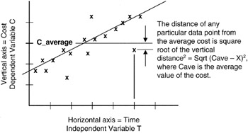
Figure 8-4: Distance Measures to the Average.
The r2 Figure of Merit
Mathematicians have formalized the issue about how dependent Y is on X by developing a figure of merit, r2, which is formally called the "coefficient of determination":
r2 = 1 - (Y2distance/Y2dAv)
0 ≤ r2 ≤ 1
Most mathematical packages that run on computers and provide regression analysis also calculate the r2 and can report the figure in tables or on the graphical output of the package. Being able to calculate r2 so conveniently relieves the project manager of having to calculate all the distances first to the regression line and then to the average value of Y. Moreover, the regression analyst can experiment with various regression lines until the r2 is maximized. After all, if r2 = 1, then the regression line is "perfectly" fitted to the data observations; the advantage to the project team is that with a perfect fit, the next outcome of Y is predictable with near certainty. The corollary is also true: the closer r2 is to 0, the less predictive is the regression curve and the less representative of the relationship between X and Y. Here are the rules:
r2 = 1, then Y2distance/Y2dAv = 0, or Y2distance = 0
where "Y2distance = 0" means all the observations lie on the regression line and the fit of the regression line to the data is perfect.
r2 = 0, then Y2distance/Y2dAv = 1
where "Y2distance/Y2dAv = 1" means that data observations are more likely predicted by the average value of Y than by the formula for the regression line. The line is pretty much useless as a forecasting tool.
Figure 8-5 shows the r2 for a data set.
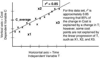
Figure 8-5: r2 of Data Observations.
Some Statistical Properties of Regression Results
There are some interesting results that go along with the analysis we have been developing. For one thing, it can be shown [4] that the estimate of "a" is a random variable with Normal distribution. Such a conclusion should not come as a surprise since there is no particular reason why the distribution of values of "a" should favor the more pessimistic or the more optimistic value. All of the good attributes of the Normal distribution are working for us now: "a" is unbiased maximum likelihood estimator for the true value of "a" in the population. In turn, the expected value of "a" is the true value of "a" itself:
|
Mean value of "a" |
= |
expected value of "a" |
|
= |
true value of "a" in the population |
|
|
Variance (a) |
= |
σ2/∑ (Xi - Xav)2 |
Looking at the data observations of X for a moment, we write:
∑ (Xi - Xav)2 = n * Variance (X)
where n = number of observations of X in the population.
Now we have a couple of interesting results: as the sample size, n, gets larger, the variance of "a" gets smaller, meaning that we can zero in on the true value of "a" all that much better. Another way to look at this is that as the variance of X gets larger, meaning a larger spread of the X values in the population, again the variance of "a" is driven smaller, making estimate all the better. In effect, if all the X data are bunched together, then it is very difficult to find a line that predicts Y. We see that the ks in Figure 8-6 do not provide a sufficient spread to develop a regression curve.
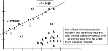
Figure 8-6: Spread of X.
Multiple Independent Variables
Having more than one independent variable complicates calculations immediately. The dependent variable, say cost, now depends on two different and independent variables, say schedule and worker productivity. Much of the conceptual ground is the same. Indeed, the r2 becomes R2, but the idea remains the same: the measure in a figure of merit of how the dependent data are driven by the independent data.
For the more complex projects there may be a need to do multiple variate regression. The only practical approach is to apply a computer program to do the calculations. The more challenging problem for the project manager is to actually deduce the contributing independent variables and make observations simultaneously of all the contributions under the same conditions. Either of a few things may be at work if R2 is not as expected:
- The project manager has deduced incorrectly what the contributing data are to the dependent outcome. For example, does project cost really depend on schedule and productivity or schedule and something else not recognized?
- The independent data really do not predict the dependent data. There simply is not a strong cause-and-effect relationship even though on the surface there appears to be a strong correlation of one data item with another.
- The data observations of the multiple variables were not made at the same time under the same conditions, thereby tainting the cause-and-effect influences.
[2]The word density used in a mathematical context refers to the incremental change in the dependent variable in response to an incremental change in the independent variable. We have already used the density concept when we referred to the probability distribution as the probability density curve.
[3]Of course, there is a place in project management for the "cart to come before the horse" and that is in hypothesis analysis and forecasting before the fact. In hypothesis analysis, the task is to validate that the data observed fit the forecast or hypothesis and that there is proper cause and effect and not just coincidence or other unidentified dependencies.
[4]Downing, Douglas and Clark, Jeffery, Statistics the Easy Way, Barron's, Hauppauge, NY, 1997, pp. 264–269.
Hypothesis Testing
Another common problem facing project managers is hypothesizing what is going to happen in their projects and then evaluating the hypothesis outcomes analytically. The letter H is commonly used to represent a hypothesis, and there is always more than one hypothesis: the true outcome and false outcome, or the null outcome and the alternative outcome, denoted H(0) and H(1). For instance, a project manager working in the environmental area is often faced with the null hypothesis that an additional regulation will not be passed that impacts the project or the alternative hypothesis that additional legislation will be passed and some impact to the project will occur. In this section, we examine some of the quantitative aspects of evaluating hypotheses that might occur in projects.
The Type 1 and Type 2 Error
Right from the outset, we are faced with what the statistical community calls the Type 1 and Type 2 error. The Type 1 error is straightforward: the hypothesis is true but we reject or ignore the possibility. Grave consequences could occur in making the Type 1 error, and the project manager seeks to avoid this mistake. For example, in our environmental example, we reject the possibility of a new regulation that impacts the project, ignoring the possible ramifications, but indeed the hypothesis is true and a new regulation is issued. "Now what?" asks the project sponsor.
The Type 2 error is usually less risky: we falsely believe the alternate hypothesis, H(l), and make investments to protect against the outcome that never happens. It is easy to see how a Type 2 error could be made in the environmental project, spending money to thwart the impact of a new regulation that never happens. Though no project manager or project sponsor wants to waste resources, perhaps a project cost impact is the only consequence of making a Type 2 error.
Interval of Acceptance
In testing for the outcome of the hypothesis, especially by simulation, we will "run" the hypothesis many times. The first few times may not be representative of the final outcome since it takes many runs to converge to the final and ultimate outcome. For a number of reasons, we may not have the luxury of waiting for or estimating the convergence. We may have to establish an interval around the likely outcome, called the interval of acceptance, within which we say that if an outcome falls anywhere in the interval of acceptance, then that outcome is "good enough." Now, if the objective is to avoid the Type 1 error, then we must be careful about rejecting a hypothesis that really is true. Thus we are led by the need to risk-manage the Type 1 error to widen the interval of acceptance. However, the wide acceptance criterion lets in the Type 2 error! Remember that Type 2 is accepting a hypothesis that is really false. There is no absolute rule here. It is all about experience and heuristics. Some say that the interval of acceptance should never be greater than 10%, or at most 20%. Each project team will have to decide for itself.
In many practical situations there is no bias toward optimism or pessimism. Our environmental example could be of this type, though regulatory agencies usually have a bias one way or the other. Nevertheless, if there is no bias, or it is "reasonably" small, then we know the distribution of values of H(0) or H(1) is going to be symmetrical even though we do not know the exact distribution. However, we get some help here as well. Recall the Central Limit Theorem: regardless of the actual distribution, over a very large number of trials the average outcome distribution will be Normal. Thus, the project manager can refer to the Normal distribution to estimate the confidence that goes along with an acceptance interval and thereby manage the risk of the Type 1 error. For instance, we know that only about 4% of all outcomes lie more than 2σ from the mean value of a Normal distribution. In other words, we are about 96% confident that an outcome will be within 2σ of the mean. If the mean and variance (and from variance the standard deviation can be calculated) can be estimated from simulation, then the project manager can get a handle on the Type 1 error (rejecting something that is actually true). Figure 8-7 illustrates the points we are making.
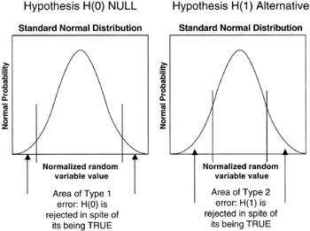
Figure 8-7: Type 1 and 2 Errors.
Testing for the Validity of the Hypothesis
Having constructed a null hypothesis and its alternative, H(0) and H(1), and made some assumptions about the outcomes being Normal because of the tendency of a large number of trials to have a Normal distribution, the question remains: Can we test to see if the H(0) is valid? In fact, there are many things we can do.
The common approach to hypothesis testing is to test the performance of a test statistic. For example, with the Normal distributions of H(0) and H(1) normalized to the standard Normal plot, where the value of σ = 1 and μ = 0, then if an outcome were any normalized number greater than about three, you would suspect that outcome did not belong to the H(0) since the confidence of a normalized outcome of three or more is only about a quarter of a percent, 0.26% to be more precise. We get this figure from a table of two-sided Normal probability density values or from a statistical function in a mathematics and statistical package.
t Statistic Test
The other common test in hypothesis testing is to discover the true mean of the distribution for H(0) and H(1). For this task, we need a statistic commonly called the "t statistic" or the "Student's t" statistic. [5] The following few steps show what is done to obtain an estimate of the mean of the distribution of the hypothesis:
- From the data observations of the outcomes of "n" trials of the hypothesis, calculate the sample average. Sample average = Hav = (1/n) * ∑ Hi, where Hi is the ith outcome of the hypothesis trials.
- Calculate the sample variance, VarH = [1/(n-1)] * ∑ (Hi - Hav)2.
- Calculate a statistic, t = √n * (Hav - μ)/√VarH, where μ is an estimate of the true mean for which we are testing the validity of the assumption that μ is correct.
- Look up the value of t in a table of t statistics where n-1 = "degrees of freedom." If the value of t is realistic from the lookup table, then μ is a good estimate of the mean. For example, using a t-statistics lookup table for n-1 = 100, the probability is 0.99 that the value of t will be between 2.617. If the calculated value of t for the observed data is not in this range, then the hypothesis regarding the estimate of the mean is to be rejected with very little chance, less than 1%, that we are committing a Type 1 error.
[5]The "t statistic" was first developed by a statistics professor to assist his students. The professor chose not to associate his name with the statistic, but named it the "Student's t" instead.
Risk Management with the Probability Times Impact Analysis
It is good practice for the project management team to have a working understanding of statistical and numerical methods to apply to projects. Most of what we have discussed has been aimed at managing risk so that the project delivers business value and satisfies the business users and sponsors. Experienced project managers know that the number of identified risks in projects can quickly grow to a long list, a list so long as to lose meaning and be awkward and ineffective to manage. The project manager's objective is to filter the list and identify the risks that have a prospect of impacting the outcome of the project. For this filtering task, a common tool is the P * I analysis, or the "probability times impact" analysis.
Probability and Impact
To this point we have spent a good deal of time on the probability development and analysis as applied to a project event, work breakdown structure (WBS) work package, or other project activity. We have not addressed to any great extent the impact of any particular risk to the project. Further, the product of impact and probability really sets up the data set to be filtered to whittle down the list. For example, a risk with a $1 million impact is really a $10,000 risk to manage if the probability of occurrence is only 1%. Thus, the attitude of the project manager is that what is being managed is a $10,000 problem, not $1 million.
The $10,000 figure is the weighted value of the risk. Take note that in other chapters we have called the weighted value the expected value (outcome times probability of outcome). When working with weighted values, it is typical to sum all the weighted values to obtain the dollar value of the expected value of the risks under management. On a weighted basis, it is reasonable to expect that some risks will occur in spite of all efforts to the contrary and some risks will not come true. But on average, if the list of risks is long enough, the weighted value is the best estimate of the throughput impact.
Risk under management = ∑ (Risk $value * Risk probability) (dollar value)
Average risk under management = (1/N) * ∑ (Risk $value * Risk probability) (dollar value)
Risk under management = Throughput $impact to project
From the Central Limit Theorem, if the list of risks is "long enough," we know that the probability distribution of the average of the risks under management will be Normal, or approximately so. This means that there is equal pessimism and optimism about the ultimate dollar value of risks paid. We also know that the variance of the average will be improved by a factor of 1/N, where N is the number of risks in the weighted list.
Throughput is a concept from the Theory of Constraints applied to project management. As in the critical chain discussion, throughput is the portion of total activity that makes its way all the way to project outcomes. The constraint in this case is risk management. The risks that make it through the risk management process impact the project. The dollar value of those impacts is the throughput of the risk possibilities to the project.
Obviously, the risk under management must be carried to the project balance sheet on the project side. If the expected value of the project plus the risk under management does not fit within the resources assigned by the business, then the project manager must take immediate steps to more rigorously manage the risks or find other offsets to bring the project into balance.
Probability Times Impact Tools
There are plenty of ways to calculate and convey the results of a P * I analysis. A simple multicolumn table is probably the best. Table 8-1 is one such example. As there are multiple columns in a P * I analysis, so are there multiple decisions to be made:
- First, follow the normal steps of risk management to identify risks in the project. However, identified risks can and should be an unordered list without intelligence as to which risk is more important. The ranking of risks by importance is one of the primary outcomes of the P * I analysis.
- Second, each identified risk, regardless of likelihood, must be given a dollar value equal to the impact on the project if the risk comes true. Naturally, three-point estimates should be made. From the three-point estimates an expected value is calculated.
- The expected value is adjusted according to the risk attitude of the management team. The value of the risk if the risk comes true is the so-called "downside" figure of which we have spoken in other chapters. If the project or the business cannot afford the downside, then according to the concept of utility, the value of the risk is amplified by a weighting factor to reflect the consequences of the impact. The dollar value should be in what might be called "utility dollars" [6] that reflect the risk attitude of the project, the business, or executives who make "bet the business" decisions. [7]
- All risk figures are adjusted for the present value. Making a present value calculation brings into play a risk adjustment of other factors that are summarized in the discount factor.
- An estimate of probability of risk coming true is made. Such an estimate is judgmental and subject to bias if made by a single estimator. Making risk assessments of this type is a perfect opportunity for the Delphi method of independent evaluators to be brought into play.
- Finally, the present value of the impact utility dollars is multiplied by the probability of occurrence in order to get the final expected value of the risk to the project.
|
Risk Event |
Probability of Occurrence |
Impact to Project if Risk Occurs |
P * I |
|---|---|---|---|
|
Vendor fails to deliver computer on time |
50% chance of 5-day delay |
$10,000 per day of delay |
P * I = 0.5 * 5 * 10,000 = $25,000 |
|
New environmental regulations issued |
5% chance of happening during project development |
$100,000 redesign of the environmental module |
P * I = 0.05 * $100,000 = $5,000 |
|
Assembly facility is not available on time |
5% chance of 10-day delay |
$5,000 per day of delay |
P * I = 0.05 * 10 * 5,000 = $2,500 |
|
Truck rental required if boxes exceed half a ton [*] |
30% chance of overweight boxes |
$200 per day rental, 10 days required |
P * I = 0.3 * 200 * 10 = $600 |
|
[*]Truck rental risk may not be of sufficient consequence that it would make the list of risks to watch. Project manager may set a dollar threshold of P * I that would exclude such minor risk events. |
|||
Once the P * I calculations are made, the project team sets a threshold for risks that will be actively managed and are exposed to the project team for tracking. Other risks not above the threshold go on another list of unmanaged risks that are dealt with as circumstances and situations bring them to the forefront.
Unmanaged Risks
Project managers cannot ordinarily devote attention to every risk that anyone can think of during the course of the project life cycle. We have discussed several situations where such a phenomenon occurs: the paths in the network that are not critical or near critical, the risks that have very low P * I, and the project activities that have very low correlation with other activities and therefore very low r2 figures of merit. The fact is that in real projects, low-impact risks go on the back burner. The back burner is really just another list where the activities judged to be low threats are placed. Nothing is ever thrown away, but if a situation arises that promotes one of these unmanaged risks to the front burner, then that situation becomes the time and the place to confront and addresses these unmanaged risks.
[6]Schuyler, John, Risk and Decision Analysis in Projects, Second Edition, Project Management Institute, Newtown Square, PA, 2001, pp. 35 and 52.
[7]Various types of utility factors can be applied to different risks and different cost accounts in the WBS. For instance, the utility concepts in software might be quite different from the utility concepts in a regulatory environment where compliance, or not, could mean shutting down company processes and business value. Generally, if the downside is somehow deemed unaffordable or more onerous than the unweighted impact of the risk, then a weight, greater than 1, is applied to the risk. The utility dollars = real dollars * risk-averse factor. For instance, if the downside of a software failure is considered to have 10 times the impact on the business because of customer and investor relationships than the actual dollar impact to the project, then the equation for the software risk becomes utility dollars = real dollars * 10.
Six Sigma and Project Management
Six Sigma is just making its appearance in project management. Six Sigma is the name coined by Motorola in the 1980s for a process and throughput improvement strategy it developed from some of the process control work done originally in the Bell Laboratories in the 1920s and later taken to Japan in the 1950s by W. Edwards Deming. Six Sigma's goal is to reduce the product errors experienced by customers and to improve the quality of products as seen and used by customers. Employing Six Sigma throughout Motorola led, in part, to its winning the prestigious Malcolm Baldrige National Quality Award 1988.
The name "Six Sigma" has an origin in statistics. The word "sigma" we recognize as the Greek letter "s" which we know as a. From our study of statistics, we know that the standard deviation of a probability distribution is denoted by σ. Furthermore, we know that the confidence measures associated with a Normal distribution are usually cast in terms of so many σ from the mean: for example, as said many times before in this book, 1σ from the mean includes about 68.3% of the possible values of a random variable with a Normal distribution. Most project managers are comfortable with "2σ" estimating, which covers over 95% of all outcomes, and some project managers refine matters to "3σ", which encompasses a little over 99.7% of all outcomes. Six Sigma seems to be about going "6σ" from the mean and looking at the confidence that virtually all outcomes are accounted for in the analysis. In reality only 4.5σ is required and practiced in the Six Sigma program, as we will see.
Six Sigma and Process Capability
Six Sigma is a process capability (Cp) technique. What is meant by process capability? Every man-made process has some inherent errors that are irreducible. Other errors creep in over time as the process is repeated many times, such as the error that might be introduced by tool wear as the tool is used many times in production. The inherent errors and the allowable error "creep" are captured in what is called the "engineering tolerance" of the process. Staying within the engineering tolerances is what is expected of a capable process. If the Normal distribution is laid on a capable process, as shown in Figure 8-8, in such manner that the confidence limits of the Normal distribution conform to the expectations of the process, then process engineers say with confidence that the process will perform to the required specification.
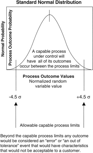
Figure 8-8: Capable Process and Normal Distribution.
A refinement of the process capability was to observe and accommodate a bias in position of the process mean. In other words, in addition to small natural random effects that are irreducible, and the additional process errors that are within the engineering tolerance, there is also the possibility that the mean of the process will drift over time, creating a bias. A capable process with such a characteristic is denoted Cpk.
Parts Per Million
In the Motorola process, as practiced, the process mean is allowed to drift up to 1.5σ in either direction, and the process random effects should stay within an additional 3σ from the mean at all times. Thus, in the limit, the engineering tolerance must allow for a total of 4.5σ from the mean. At 4.5σ, the confidence is so high that speaking in percentages, as we have done to this point, is very awkward. Therefore, one interesting contribution made by the promoters of Six Sigma was to move the conversation of confidence away from the idea of percentages and toward the idea of "errors per million opportunities for error." At the limit of 4.5σ, the confidence level in traditional form is 99.9993198% or, as often said in engineering shorthand, "five nines."
However, in the Six Sigma parlance, the process engineers recognize that the tails of the Normal distribution, beyond 4.5σ in both directions, hold together only 6.8 * 10-6 of the area under the Normal curve:
Total area under the Normal curve = 1
1 - 0.999993198 = 0.00000680161 = 6.8 * 10-6
Each tail, being symmetrical on each side, holds only 3.4 * 10-6 of the area as shown in Figure 8-9. [8] Thus, the mantra of the Six Sigma program was set at having the engineering tolerance encompass all outcomes except those beyond 4.5σ of the mean. In effect, the confidence that no outcome will occur in the forbidden bands is such that only 3.4 out-of-tolerance outcomes (errors) will occur in either direction for every 1 million opportunities. The statement is usually shortened to "plus or minus 3.4 parts per million," with the word "part" referring to something countable, including an opportunity, and the dimension that goes with the word "million" is silently implied but of course the dimension is "parts."
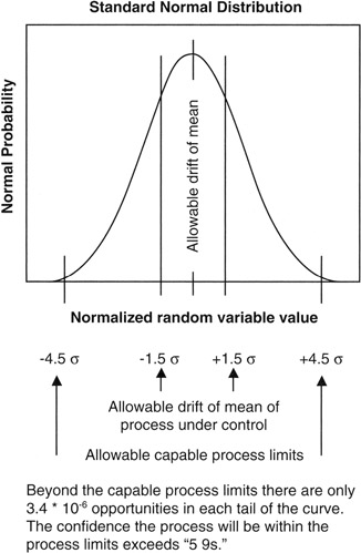
Figure 8-9: 3.4 Parts Per Million.
The move from 4.5σ to Six Sigma is more marketing and promotion than anything else. The standard remains 3.4 parts per million.
Six Sigma Processes
In one sense, Six Sigma fits very well with project management because it is a repeatable methodology and the statistics described above are the outcome of a multistep process not unlike many in project management. Summarizing Six Sigma at a high level:
- Define the problem as observed in the business or by customers and suppliers
- Define the process or processes that are touched by the problem
- List possible causes and effects that lead toward or cause the problem within the process
- Collect data according to an experiment designed and developed to work against the causes and effects in the possible cause list
- Analyze what is collected
- Exploit what is discovered in analysis by designing and implementing solutions to the identified problem
Project Management and Six Sigma
Looking at the project management body of knowledge, especially as set forth by the Project Management Institute virtually every process area of project management has a multistep approach that is similar in concept to the high-level Six Sigma steps just described. Generally, project management is about defining the scope and requirements, developing possible approaches to implementing the scope, estimating the causes and effects of performance, performing, measuring the performance, and then exploiting all efforts by delivering product and services to the project sponsor.
The differences arise from the fact that a project is a one-time endeavor never to be exactly repeated, and Six Sigma is a strategy for repeated processes. Moreover, project managers do a lot of work and make a lot of progress at reasonable cost with engineering-quality estimates of few parts per hundred (2σ) or perhaps a few parts per thousand (3σ). However, even though projects are really only done once, project managers routinely use simulation to run projects virtually hundreds and thousands of times. Thus, there is some data collection and analysis at the level of few parts per thousand though there may be many millions of data elements in the simulation.
The WBS and schedule network on very large projects can run to many thousands of work packages, perhaps even tens of thousands of work packages, and thousands of network tasks, but rare is the project that would generate meaningful data to the level of 4.5σ.
The main contribution to projects is not in the transference to projects of process control techniques applicable to highly repetitive processes, but rather the mind-set of high quality being self-paying and having immeasurable good consequences down the road. In this sense, quality is broadly dimensioned, encompassing the ideas of timeliness, functional fit, environmental fit, no scrap, no rework, and no nonvalue-added work.
Six Sigma stresses the idea of high-quality repeatability that plays well with the emerging maturity model standards for project management. Maturity models in software engineering have been around for more than a generation, first promoted by the Software Engineering Institute in the early 1980s as means to improve the state of software engineering and obtain more predictable results at a more predictable resource consumption than heretofore was possible. In this same time frame, various estimating models came along that depended on past projects for historical data of performance so that future performance could be forecast. A forecast model coupled with a repeatable process was a powerful stimulus to the software industry to improve its performance.
In like manner, the maturity model and the concepts of quality grounded in statistical methods will prove simulative to the project management community and will likely result in more effective projects.
[8]A notation common with very small numbers, 3.4 * 10-6 means "3.4 times 1/1,000,000" or "3.4 times one millionth." In many other venues, including computer spreadsheets, the letter E is used in place of the "10" and the notation would be "3.4 E-6." Another way to refer to small numbers like this is to say "3.4 parts per million parts," usually shortened to "3.4 parts per million." A "part" is anything countable, and a part can be simply an opportunity for an event rather than a tangible gadget.
Quality Function Deployment
Quality Function Deployment (QFD) is about deployment of project requirements into the deliverables of the WBS by applying a systematic methodology that leads to build-to and buy-to specifications for the material items in the project. QFD is a very sophisticated and elegant process that has a large and robust body of knowledge to support users at all levels. One only need consult the Internet or the project library to see the extent of documentation.
QFD is a process and a tool. The process is a systematic means to decompose requirements and relate those lower level requirements to standards, metrics, development and production processes, and specifications. The tool is a series of interlocked and related matrices that express the relationships between requirements, standards, methods, and specifications. At a top level, Figure 8-10 presents the basic QFD starting point.
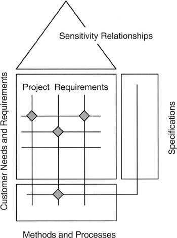
Figure 8-10: The House of Quality.
Phases of Quality Function Deployment
Although there are many implementations and interpretations of QFD that are industry and business specific, the general body of knowledge acknowledges that the deployment of requirements down to detailed specifications requires several steps called phases. Requirements are user or customer statements of need and value. As such, customer requirements should be solution free and most often free of any quantitative specifications that could be construed as "buy-to" or "build-to." Certainly the process limits discussed in the section on Six Sigma would not ordinarily be in the customer specification. Thus, for example, the Six Sigma process limits need to be derived from the requirements by systematic decomposition and then assignment of specification to the lowest level requirements.
Figure 8-11 presents a four-phase model of QFD. Typically, in a real application, the project manager or project architect will customize this model into either more or fewer steps and will "tune" matrices to the processes and business practices of the performing organization. We see in Phase A that the customer's functional and technical requirements are the entry point to the first matrix. The Phase A output is a set of technical requirements that are completely traceable to the customer requirements by means of the matrix mapping. Some project engineers might call such a matrix a "cross-reference map" between "input" and "output." The technical requirements are quantitative insofar as is possible, and the technical requirements are more high level than the specifications found in the next phase. Technical requirements, like functional requirements, are solution free. The solution is really in the hardware and software and process deliverables of the cost accounts and work packages of the WBS. As such, technical requirements represent the integrated interaction of the WBS deliverables.
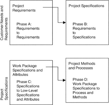
Figure 8-11: QFD Phases.
Following Phase A, we develop the specifications of the build-to or buy-to deliverables that are responsive to the technical and functional requirements. We call the next step Phase B. The build-to or buy-to deliverables might be software or hardware, but generally we are looking at the tangibles in the work packages of the WBS. Specifications typically are numerical and quantitative so as to be measurable.
Subsequent phases link or relate the technical specifications to process and methodology of production or development, and then subsequently to control and feedback mechanisms.
Project managers familiar with relational databases will see immediately the parallels between the matrix model of QFD and the relational model among tables in a database. The "output" of one matrix provides the "input" to the next matrix; in a database, the "outputs" are fields within a table, and the output fields contain the data that are the "keys" to the next table. Thus, it is completely practical to represent QFD in a relational database, and there are many software tools to assist users with QFD practices. Practitioners will find that maintenance of the QFD model is much more efficient when employing an electronic computer-based database rather than a paper-based matrix representation.
Quantitative Attributes on the Quality Function Deployment Matrix
Looking in more detail at the house of quality in Figure 8-12, we see that there are a number of quantitative attributes that can be added to and carried along with the matrices. The specific project to which QFD is applied should determine what attributes are important.
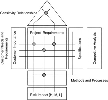
Figure 8-12: QFD Details.
Symbols are sometimes added to the QFD chart; the symbols can be used to denote importance, impact, or probability of occurrence. Symbols could also be used to show sensitivity relationships among matrix entries. Sensitivity refers to the effect on attribute, parameter, or deliverable caused by a change in another attribute, parameter, or deliverable. The usual expression of sensitivity is in the form of a density: "X change per unit of change in Y."
Validating the Quality Function Deployment Analysis
A lot of effort on the part of the project team often goes into building the QFD house of quality matrices; more effort is required to maintain the matrices as more information becomes available. Some project teams build only the first matrix linking customer and project requirements, while others go on to build a second matrix to link project requirements with either key methods, processes, or specifications.
It is imperative that the project efforts toward QFD be relevant and effective. In part, achieving a useful result requires validation of the QFD results by business managers (Phase A) and by other subject matter experts (SMEs) on the various phases. Validation begins with coordination with the business analysis documented on the balanced scorecard, Kano analysis, or other competitive, marketing, or risk analysis. Validation often follows the so-called "V-curve" common in system engineering. An illustration of the "V-curve" applied to the QFD validation is shown in Figure 8-13.
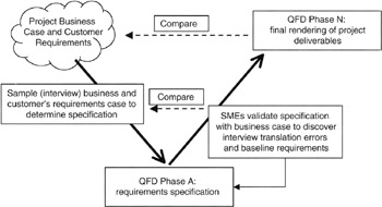
Figure 8-13: V-Curve Validation Process.
Once validated to external drivers, such as the balanced scorecard or Kano analysis, the project team can validate the QFD matrices by examining the internal content. For instance, there should be no blank rows or columns. At least one data element should be associated with every row or column. Attributes that are scored strongly in one area should have strong impacts elsewhere and, of course, document all the assumptions and constraints that bear on attribute ratings and relationships. Examine the assumptions and constraints for consistency and reasonableness as applied across the project. Independent SMEs could be employed for the process, and the independent SMEs could be employed in a Delphi-like strategy to make sure that nothing is left behind or not considered.
Affinity and Tree Diagrams in Quality Function Deployment
Affinity diagrams are graphical portrayals of similar deliverables and requirements grouped together, thereby showing their similarity to or affinity for each other. Tree diagrams are like the WBS, showing a hierarchy of deliverables, but unlike the WBS, the QFD tree diagrams can include requirements, specifications, methods, and processes. Tree diagrams and affinity diagrams are another useful tool for identifying all the relationships that need to be represented on the QFD matrices and for identifying any invalid relationships that might have been placed on the QFD matrix.
Summary of Important Points
Table 8-2 provides the highlights of this chapter.
|
Point of Discussion |
Summary of Ideas Presented |
|---|---|
|
Regression analysis |
|
|
Hypothesis testing |
|
|
Risk management with P * I |
|
|
Six Sigma |
|
|
Quality function deployment |
|
References
1. Brooks, Fredrick P., The Mythical Man-Month, Addison Wesley Longman, Inc., Reading, MA, 1995, p. 115.
2. Downing, Douglas and Clark, Jeffery, Statistics the Easy Way, Barron's, Hauppauge, NY, 1997, pp. 264–269.
3. Schuyler, John, Risk and Decision Analysis in Projects, Second Edition, Project Management Institute, Newtown Square, PA, 2001, pp. 35 and 52.
Preface
- Project Value: The Source of all Quantitative Measures
- Introduction to Probability and Statistics for Projects
- Organizing and Estimating the Work
- Making Quantitative Decisions
- Risk-Adjusted Financial Management
- Expense Accounting and Earned Value
- Quantitative Time Management
- Special Topics in Quantitative Management
- Quantitative Methods in Project Contracts
EAN: 2147483647
Pages: 97
