All Hail Reference
We have a great luxury in our industry, which is that every image we create is meant to look as though it was photographed by a camera. Hey, you have a camera!
You should be taking pictures all the time. Take your camera with you wherever you go. I actually forged a pact with a friend that we would each take a photo every day for the entire year of 2002. Not every one of those was going to be a masterpiece, but it got me thinking about creating an image at least once every day.
The other thing it did was fill my FireWire drive with thousands of photos. Photos of all kinds of crazy things. And these photos are great reference.
The single key to creating believable visual effects is reference. If you were to worship a pagan god of visual effects, it would be named Reference.
Now that brings up a catch, which is that the whole reason we do visual effects tends to be to create images of impossible things. You can search your image database all day long for snapshots you may have taken of Nazis opening ancient artifacts and unleashing God's wrath, but chances are the closest thing you'll find is your friend blowing chunks behind a wurst stand in Linz.
But there's always something to look at to help you combat the misconception that you already know what something should look like. What should a star going supernova look like? Better it look like your friend blasting your Digital Elph with a LED keychain light than the default lens flare preset number 47. What does a helicopter look like flying through the Chunnel? Well, the reflections on its metal surfaces won't be terribly dissimilar from those on a Geo Metro stuck in traffic in the midtown tunnel.
Getting in the habit of taking pictures all the time, even of mundane things, and really looking at those photosexamining what's happening with light and surfaces and transparencieswill do more than supply you with reference for future projects. It will get you thinking about these things in ways that will have a direct impact on your work.
Putting Reference to Use
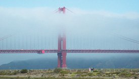
Check out Figure 15.3's picture of the Golden Gate Bridge. Every once in a while this monument is half enshrouded in the "marine layer" like this. (I am told that to call it fog is blasphemous.) But what if it wasn't on the day when your shoot needed it to be, or what if you are compositing a matte painting of a future city with buildings so tall their tops get cut off by clouds?
Figure 15.3. Here's some big, orange bridge I just found while walking around one day.
Zooming way in, you can see how the cloud obscures the bridge in a way that is more complicated than a simple transparent overlay (Figure 15.4). The cloud actually acts like mist on your windshield, diffracting the light before completely occluding it.
Figure 15.4. An enlargement of Figure 15.3 shows light diffraction through clouds.
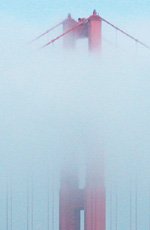
When I first started seeing this in my photography, it changed the way I composited smoke elements. I got in the habit of using the alpha channel of the fog or cloud or water spray element to drive a compound blur of the background.
Here's an example. Figure 15.5 shows a clean photo of the bridge, and Figure 15.6 is the cloud element to be composited over it.
Figure 15.5. The same bridge is bereft of brume.

Figure 15.6. If the weather doesn't cooperate, extract a cloud element from another photo.

If you do a simple A over B comp, you'll end up with something like Figure 15.7.
Figure 15.7. The cloud element is simply layered over the bridge photo.

Now check out that same comp with a subtle compound blur in Figure 15.8.
Figure 15.8. The same composite with Compound Blur. See the difference?

The blur simulates the diffraction of the light and ties the cloud element into the shot. This is a great example of how even the most basic layering requires precomposing in After Effects. Compound Blur uses the pixels from one layer to control how much to blur another layer. But the trick is that it uses the pixels before any effects or transformations. So you need a precomp where you reposition and possibly even animate the cloud layer. Here's how to set it up:
- Create a Cloud Anim comp that features just the semi-transparent cloud with whatever animation you create.
- Bring the Cloud Anim comp into a Cloud Over Bridge comp, and stack it on top of the bridge photo.
- Because Compound Blur cannot directly use this layer's alpha channel as its Blur Layer (it uses Luminance of RGB), duplicate the Cloud Anim layer and apply Shift Channels, setting Alpha to Full On and Red, Green, and Blue to Alpha.
- Because Compound Blur needs to see the pixels of a layer before any effects, precompose this layer (choosing the Move All Attributes option from the dialog), and name the precomp Cloud Blur Map.
- Because Cloud Blur Map is used only to drive the Compound Blur, you can turn its visibility off in Cloud Over Bridge.
- In Cloud Over Bridge, create a new adjustment layer between the cloud and the bridge and apply the Compound Blur effect. Choose Cloud Blur Map from the Blur Layer pull-down menu.
- Adjust both the Maximum Blur and the Opacity of the adjustment layer to dial in the effect to match your reference.
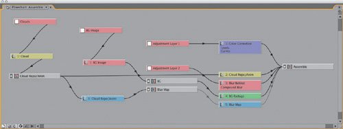
If all goes well, your Flowchart view should look something like Figure 15.9. Now, if you move or even replace your cloud layer in the Cloud Anim comp, the rest of the comp will reflect those changes automatically.
Figure 15.9. Take a look at the bridge composite in Flowchart view.
Integration
In compositing, we talk about integration of elements. Yes, this means color correction, matching black levels, and tracking in the right motion, but the more advanced tricks of integration usually can be filed under the general idea of "everything in the scene affects everything else in the scene." Much of the reference you collect will yield revelations along these lines.
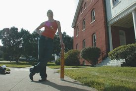
Check out Figure 15.10. Imagine it's your job to add an annoying CG alien next to this handsome guy. The 3D artist has lit the alien to match, but dropping him in A over B leaves the shot looking sad.
Figure 15.10. What a handsome guy.
Take a closer look at the guy by extracting him from the shot (Figure 15.11).
Figure 15.11. Isolate Handsome from his scene.
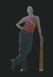
When you isolate him from the scene, it becomes very clear that he has a lot of contamination from the bright background behind him. Your eye can cancel this out in the same way it can allow you to see that the green tomato is really yellow, but when you isolate the guy you prevent your brain from "knowing" that it's right for the dude to look washed out if he's against a bright sky.
That CG alien is going to need more than just color correction, he's going to need light wrap, or a simulation of this contamination. This is a popular effect that is available as a plug-in and tempting to overuse. Because of the order of operations in After Effects layers, however, it's also very easy to use light wrap effect plug-ins incorrectly. For example, if you apply light wrap to a foreground layer and you tell it to wrap to the background, it will grab the pixels of the background before any color correction you may have done to it, which is not good. In the interest of becoming mightier, create a light wrap effect from scratch using only layer blend modes and the Fast Blur effect, using the process detailed back in Chapter 12, "Working with Light." Here it is in brief:
- Create a precomp with your background and foreground elements.
- Set the foreground to the Silhouette Alpha blend mode. This punches a hole in the background.
- Add an adjustment layer at the top, and apply Fast Blur.
- Turn Repeat Edge Pixels on, and crank up Blurriness until you really can see it.
- Duplicate the foreground layer, move the copy to the top, and switch this new top layer to the Stencil Alpha blend mode. You are left with a halo of background color that matches the shape of the foreground.
Notes
Fast Blur and Gaussian Blur are the same (at Best quality), except that Gaussian Blur has no Repeat Edge Pixels option. So you might as well throw Gaussian Blur away. More about the difference between Gaussian, Fast, and Box Blurs is in Chapter 12.
And that's your light wrap element. Create a new comp that has this light wrap precomp on top of the foreground on top of your color-corrected background. As with the last example, it's both the blur size and the opacity of the layer that you use to dial in this effect. Generally you will use big blurs and small opacities, but there are times where you might use just the opposite. And you can play with various blend modes for the light wrap layer; Normal, Screen, Lighten, and Add are all good options.
Sometimes a photo will suggest a cool technique like this. Other times it will simply help you dial in the look of an effect. When I was asked to create the most dreaded of all compositing effects, a lens flare, for a shot in Star Wars, Episode One: The Phantom Menace, I asked John Knoll to shoot some reference the next time he was on the motion control stage. In between explosions and lightsaber sparks, John had the crew shoot a series of flare reference passes with various lenses. We picked the one we liked, and I spent three days (and about 17 nested After Effects comps) matching it exactly.
Emotional Truth
Photographic reference can help you get the facts straight in your shot. The highlights on your stompy robot look just like the ones on the live action car he's about to step onno one can argue with the realism of that. But photos can also help us with another, far more nebulous concern.
Our clients are making movies, and movies are designed to do one thing: elicit an emotional reaction from the audience. Even though our clients know that they are using technical tools to achieve this goal, they are still reacting emotionally to the images we show them. This is true whether you're working for a first time indie auteur or James Cameron. Clients react from the gutas well they should. But here's the catch: They critique in technical terms.
This is a problem that I suspect jazz musicians do not have. When they are jamming and creating a new tune, I bet they are totally comfortable talking in emotional terms about their work. "Dude, this just isn't reminding me enough about the ills of society. We need to get more strife into this track!" OK, clearly I know as much about jazz as I know about running an oil refinery. The point is that our clients are not comfortable saying things like, "This shot isn't scary enough," or, "This shot just needs more umph!" That may well be their reaction, but rather than simply saying that, they feel compelled to suggest possible solutions. "Make his teeth more wet," or "Throw a lens flare in there."
At The Orphanage, we once had a very tech-savvy client who was obsessed with a shot that he felt was falling way short on photorealism. Every time it would come up, this client would explode with reasons why it was not realistic-looking. "This contact shadow isn't right." "There's not enough detail here." "These particles are too bright." We looked at shots that had finaled already and saw what our shot was missing. We made it darker, more blue, and we added contrast. The shot finaled. We addressed the emotional shortcomings of the shot and the technical problems, legitimate as they may have been, magically went away.
The lesson here is: Don't be afraid to make your shots beautiful. And your photography should help you. Chances are you've taken a hundred sunset shots that look like you shot them with a camera phone. Sunsets are hard, especially with digital cameras. But I bet you've got one sunset shot that you just nailed. It's a thing of beauty. Well, compare it to your hundred crappy sunsets and analyze the differences. And when the time comes to create a dusk shot of the enemy base, eyedropper the color palette straight out of your good one.
The matte paintings of Cloud City in The Empire Strikes Back are perfect examples of this. These paintings by Ralph McQuarrie are not very photoreal. But it so does not matter. You know why? Because they are purple and orange. They are beautiful, and they strike an emotional chord in the viewer. Have a smooth Colt 45 and watch your precious laserdiscs of the original Star Wars movies, because you truly belong here with us among the clouds.
If you take enough boring pictures of your car (Figure 15.12), one of them will eventually look decent (Figure 15.13).
Figure 15.12. A boring photo of a non-boring car.

Figure 15.13. Those are speed fangs.

The emotional resonance of a shot can also be linked to a common technical mistake. One of the biggest sins of visual effects shots that are built up from scratch is that they tend to contain no overexposed or underexposed elements. Skies are often a good example of this. Show me a shot with a perfectly exposed blue sky with no blown-out detail, and I'll show you a visual effect. The reason that the notorious car comp, in which the view out the window of a vehicle shot on a green-screen stage is replaced with moving scenery, usually looks wrong is often that the artist failed to slightly overexpose the exterior. Figure 15.14 shows the kind of reference that can help you nail your next car comp.
Figure 15.14. Dare to overexpose the stuff you comp out the window.

Night exteriors are the worst culprits. In the middle of a sequence of inky black night shots set off by artificial but highly cinematic rim lighting, you can smell the matte painting coming from a mile away. It's the only shot where you can clearly see everything except where the light is coming from!
The eyedropper, the Info palette, and our friends Copy and Paste can help make tangible the intangible reasons why some images pop and some go thud. You are not just a technician assembling elements. You are a salesperson, trying to get the audience to buy the shot, warts and all. Use your reference and your dirty tricks, and close that deal.
Rolling Thine Own |
Section I. Working Foundations
The 7.0 Workflow
- The 7.0 Workflow
- Workspaces and Panels
- Making the Most of the UI
- Settings: Project, Footage, Composition
- Previews and OpenGL
- Effects & Presets
- Output: The Render Queue
- Study a Shot like an Effects Artist
The Timeline
- The Timeline
- Organization
- Animation Methods
- Keyframes and The Graph Editor
- Uber-mastery
- Transform Offsets
- Motion Blur
- Manipulating Time Itself
- In Conclusion
Selections: The Key to Compositing
- Selections: The Key to Compositing
- The Many Ways to Create Selections
- Compositing: Science and Nature
- Alpha Channels and Premultiplication
- Masks
- Combining Multiple Masks
- Putting Masks in Motion
- Blending Modes: The Real Deal
- Track Mattes
Optimizing Your Projects
- Optimizing Your Projects
- Navigating Multiple Compositions
- Precomposing and Nesting
- Adjustment and Guide Layers
- Understanding Rendering Order
- Optimizing After Effects
- Onward to Effects
Section II. Effects Compositing Essentials
Color Correction
Color Keying
- Color Keying
- Good Habits and Best Practices
- Linear Keyers and Hi-Con Mattes
- Blue-Screen and Green-Screen Keying
- Understanding and Optimizing Keylight
- Fixing Typical Problems
- Conclusion
Rotoscoping and Paint
- Rotoscoping and Paint
- Articulated Mattes
- Working Around Limitations
- Morphing
- Paint and Cloning
- Conclusion
Effective Motion Tracking
- Effective Motion Tracking
- The Essentials
- Optimizing Tracking Using 3D
- Extending a Track with Expressions
- Tracking for Rotoscoping
- Using 3D Tracking Data
- Conclusion
Virtual Cinematography
- Virtual Cinematography
- 5D: Pick Up the Camera
- Storytelling and the Camera
- Camera Blur
- The Role of Grain
- Film and Video Looks
- Conclusion
Expressions
- Expressions
- Logic and Grammar
- Muting Keyframes
- Linking Animation Data
- Looping Animations
- Smoothing and Destabilizing
- Offsetting Layers and Time
- Conditionals and Triggers
- Tell Me More
Film, HDR, and 32 Bit Compositing
- Film, HDR, and 32 Bit Compositing
- Details
- Film 101
- Dynamic Range
- Cineon Log Space
- Video Gamma Space
- Battle of the Color Spaces
- Floating Point
- 32 Bits per Channel
- Conclusion
Section III. Creative Explorations
Working with Light
- Working with Light
- Light Source and Direction
- Creating a Look with Color
- Backlighting, Flares, Light Volume
- Shadows and Reflected Light
- HDR Lighting
- Conclusion
Climate: Air, Water, Smoke, Clouds
- Climate: Air, Water, Smoke, Clouds
- Particulate Matter
- Sky Replacement
- The Fog, Smoke, or Mist Rolls In
- Billowing Smoke
- Wind
- Water
- Conclusion
Pyrotechnics: Fire, Explosions, Energy Phenomena
- Pyrotechnics: Fire, Explosions, Energy Phenomena
- Firearms
- Sci-Fi Weaponry
- Heat Distortion
- Fire
- Explosions
- In a Blaze of Glory
Learning to See
- Learning to See
- Why Doesnt This Shot Look Real?
- All Hail Reference
- Rolling Thine Own
Index
EAN: 2147483647
Pages: 157
