Creating a Look with Color
Study a movie that you consider to be visually compelling. Particularly if it was created in the last few decades, chances are that the use of color in that film is bold and deliberate. If you've ever seen behind-the-scenes video taken on the set of a film, you might have been startled at how flat and boring all the action looks.
Notes
To see what I mean, compare the behind-the-scenes footage on The Matrix DVD with the look of the film itself.
Some of that movie magic process is the direct result of photochemical processes applied to the film. For example, much of the strange, detached, futuristic appearance of the film Minority Report was derived from the use of the "bleach bypass" method used to process the film. To some degree, it is possible to re-create these kinds of looks purely in After Effects, particularly with good reference.
Using a Solid
Suppose a client or supervisor requests that the shot be "warmer" or "cooler." What tool does this? Levels, Hue/Saturation, Tint, Color Balanceall of these effects and more are capable of satisfactorily altering the color look of your shot.
Before even going there, however, try a more direct and interactive method. The result looks a bit like a colored filter added to the imaginary lens of your virtual camera, because that's effectively what it is.
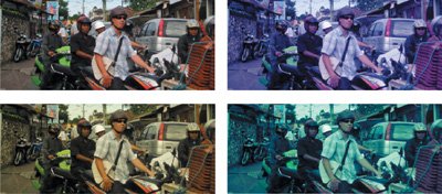
Add a colored solid with its Blending mode set to Color. Choose a color that is pleasing to your eye, has brightness and saturation well above 50%, and fits your color criteria: blue or green for a cooler look, red or yellow for a warmer one (Figure 12.10).
Figure 12.10. The source shot and a blue, yellow, and blue-green (or "Matrix") filter, each added via solids of those colors and the Color Blending mode.
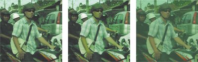
At 100%, this is the equivalent of a full-color tint of the image, which is not typically the goal. Instead, dial Opacity back to somewhere between 10% and 50%, to the threshold where the source colors remain discernable, although filtered by the color added; you're dialing in the look. What I find powerful about this approach is that, assuming you've gotten the color right, you need only adjust it with that Opacity slider. With this approach, you are only ever two adjustments away from transforming the look of your shot. Furthermore, the effect is more natural and subtle, allowing more of the source color through than the alternatives of adding a Tint or an HSB effect (Figures 12.11a, b, and c).
Figures 12.11a, b, and c. The distinction between color detail using a color solid (a) and a Hue/Saturation adjustment (b) may be too subtle for print (if so, check out 12_tintcomparison.aep) but even on the page of this book, the Tint effect (c) makes the source look drowned in pea soup.
Day for Night
Go further with this filter idea and you emulate camera optical effects such as making a daytime scene appear as if it were shot on a moonlit night.
Notes
Because it involves blending color values, this technique does benefit, subtly, from being performed as a linear operation (as described in the previous chapter). Projects with both setups are included on the disc: 12_colorlook_8bpc.aep and 12_colorlook_32bpc.aep.
It's such a classic old Hollywood effect that it became the title of French "new wave" filmmaker Francois Truffaut's ode to filmmaking: the day-for-night effect, or as it is known in French, la nuit américaine. The trick is a simple one: Shoot a normally lit scene using a dark blue filter on the lens, creating the appearance of nightsort of. Ideally, the source would be shot under diffuse, cloudy conditions, but circumstances didn't always cooperate, so the "moon" would sometimes cast hard shadows. It was amazing how bright a specular highlight the moon could cause, kicking off the barrel of the hero's drawn gun.
Notes
The day-for-night process arose prior to the introduction of much faster film stocks in the 1970s. It was a response to the low light-gathering capabilities of film stock, particularly in the sweeping exterior shots favored by westerns.
Lighting techniques and film itself have improved at the high end, but it is still handy (and a good exercise) to completely change the lighting conditions of a shot. Digital cameras are notoriously poor at getting anything but grain out of low-lit scenes; witness the popularity of the cheesy Sony Handicam Nightshot feature, which is destined to go down as a hallmark look of this era (similar to how Super 8 film says 1960s and '70s).
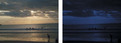
Figure 12.12 shows a demonstration of a day-for-night effect achieved primarily with a dark, desaturated blue solid over a desaturated and darkened background image. This is another good example of where the methodology differs depending on whether you work in 8 bpc or linear floating point; the latter option yields more subtleties and flexibility (which you can check out for yourself by opening 12_dayfornight.aep and 12_dayfornight_32bpc.aep).
Figure 12.12. Sunset becomes moonlight. Most of the color subtleties of this operation are lost to print and best seen on screen.
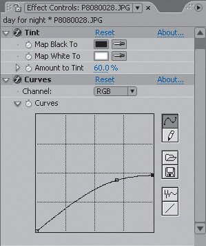
The basic idea is to add a dark blue filter. In LDR color, this is best done via Overlay mode, but in linear floating point, this becomes a Multiply operation. Not only is the white point of the underlying image brought down significantly, the image is desaturated using the Tint effect at the default settings. The art in this case is to let a little of the yellow of the sun remain as the yellow glow of moonlight, so Tint is lowered from 100% to more like 60% (Figure 12.13). The next section explains why Tint, and not Hue/Saturation, is used to desaturate the color.
Figure 12.13. Tint at black and white and 60% partially desaturates the image, and Curves lowers the white point while maintaining some overall brightness with a gamma boost.
Using Effects
Solids, then, can be an effective filter for an entire image, but what about cases that demand the colorization or desaturation of a single element? In these cases, effects such as Hue/Saturation or Tint may be more useful because of how they can be applied individually.
To remove color entirely, rendering an element grayscale, there is a significant difference between these two effects. Tint maintains the human distinction of the relative brightness of red and green and blue. Hue/Saturation does not, but instead maintains numerical proportions. This distinction deserves explication, offered in Figures 12.14a through d using the Mars flag and as follows.
Figures 12.14a through d. Ladies and gentlemen, the Flag of Mars (a): three fields of pure red, green, and bluea perfect candidate to demonstrate that Tint (b), and a monochrome (white, gray, or black) solid with Color Blending mode (c) re-create (and thereby maintain) perceptual differences in the brightness of red, green, and blue, while Hue/Saturation (d) does not. Hue/Saturation is mathematically correct; the perceptual differences are a subjective phenomenon of human vision.
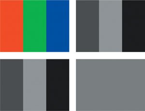
Each color of the flag is fully saturated in one channel. Mathematically, the correct thing to do is to average the luminance of each channel for each color, turning them all an equivalent gray; this is what Hue/Saturation does. It causes all of the apparent contrast between the colors to vanish because it ignores the way the eye sees color.
Notes
The flag of Mars is a red, green, and blue tricolor selected by the Mars Society and flown into orbit by the Space Shuttle Discovery. Seriously. It bears no apparent resemblance to the one Marvin the Martian used to claim Planet X.
As mentioned in Chapter 6, "Color Keying," there is a standard weighting used in digital imaging to replicate and maintain the relative proportions at which the eye perceives the brightness of the primary colors. This weighting is employed by the Tint effect, and in most situations where After Effects internally converts color to luminance. For example, a solid with a 0% Saturation value set with the Color Blending mode has a similar result to a black-and-white Tint at 100%.
Therefore, Hue/Saturation is ill advised as a grayscale conversation tool. It is, however, very useful and convenient for quickly colorizing an element. On The Day After Tomorrow all of us on the compositing team at The Orphanage came to memorize the exact Hue value that the supervisor tended to love (my recollection is that it was 237°) and applied it to various snow and fog overlay elements that had been created as grayscale mattes.
Tip
Hue/Saturation is fine when used lightly to desaturate footage (or less often, to boost saturation). What is not so obvious to a novice artist is when to use it. If you find yourself fighting a color correction and you're focused only on brightness and contrast (using Levels), notice whether overall saturation is a little hotthis is often the case in heavy color corrections.
Three-Way Color Correction
For those of you keeping score, After Effects offers no three-way color corrector, although considering that such a tool recently debuted in Adobe Premiere Pro 2.0 (Figures 12.15a and b), you might expect it to appear in a future version of After Effects.
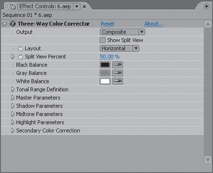
Figures 12.15a and b. The Adobe Three-Way Color Corrector is part of Premiere Pro (a), not After Effects, where it is a hidden effect that appears only when included as part of an imported Premiere Pro project (b).
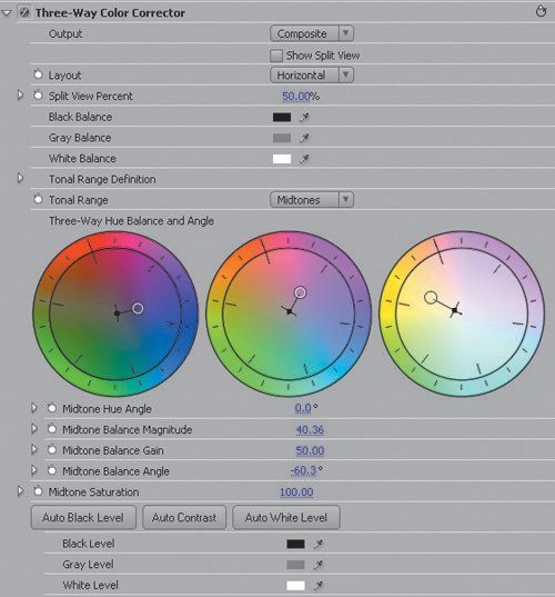
This tool, for those unfamiliar with the term, separates color controls into three basic regionshighlights, midtones, and shadowsand enables you to adjust each separately. After Effects actually has a seldom-used effect that does just the same: Color Balance (HLS). The problem with this tool is its user interface, which consists only of a bunch of sliders. A typical three-way color corrector, such as the one in Premiere Pro, orients its user interface around three color wheels that allow a target color to be set for each of the three tonal regions.
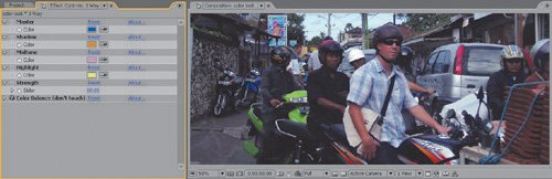
Undeterred by these usability limitations, the author of Chapter 15 decided to design a custom interface for Color Balance (HLS) using expressions. It is included on the disc as 3WayCB_01.ffx; Figure 12.16 shows it in action. The result can be as strong as filtering with a solid, but is designed to allow you to experiment with adding extra subtleties.
Figure 12.16. The image is again tinted predominantly blue via the Master color picker, but warmer tones are introduced to the shadow, midtone, and highlight areas. All of the actual work is done by the Color Balance effect, which is not adjusted directly but via expressions linked to the five controls preceding it. (3-Way Color Balance courtesy Stu Maschwitz.)
Backlighting, Flares, Light Volume |
Section I. Working Foundations
The 7.0 Workflow
- The 7.0 Workflow
- Workspaces and Panels
- Making the Most of the UI
- Settings: Project, Footage, Composition
- Previews and OpenGL
- Effects & Presets
- Output: The Render Queue
- Study a Shot like an Effects Artist
The Timeline
- The Timeline
- Organization
- Animation Methods
- Keyframes and The Graph Editor
- Uber-mastery
- Transform Offsets
- Motion Blur
- Manipulating Time Itself
- In Conclusion
Selections: The Key to Compositing
- Selections: The Key to Compositing
- The Many Ways to Create Selections
- Compositing: Science and Nature
- Alpha Channels and Premultiplication
- Masks
- Combining Multiple Masks
- Putting Masks in Motion
- Blending Modes: The Real Deal
- Track Mattes
Optimizing Your Projects
- Optimizing Your Projects
- Navigating Multiple Compositions
- Precomposing and Nesting
- Adjustment and Guide Layers
- Understanding Rendering Order
- Optimizing After Effects
- Onward to Effects
Section II. Effects Compositing Essentials
Color Correction
Color Keying
- Color Keying
- Good Habits and Best Practices
- Linear Keyers and Hi-Con Mattes
- Blue-Screen and Green-Screen Keying
- Understanding and Optimizing Keylight
- Fixing Typical Problems
- Conclusion
Rotoscoping and Paint
- Rotoscoping and Paint
- Articulated Mattes
- Working Around Limitations
- Morphing
- Paint and Cloning
- Conclusion
Effective Motion Tracking
- Effective Motion Tracking
- The Essentials
- Optimizing Tracking Using 3D
- Extending a Track with Expressions
- Tracking for Rotoscoping
- Using 3D Tracking Data
- Conclusion
Virtual Cinematography
- Virtual Cinematography
- 5D: Pick Up the Camera
- Storytelling and the Camera
- Camera Blur
- The Role of Grain
- Film and Video Looks
- Conclusion
Expressions
- Expressions
- Logic and Grammar
- Muting Keyframes
- Linking Animation Data
- Looping Animations
- Smoothing and Destabilizing
- Offsetting Layers and Time
- Conditionals and Triggers
- Tell Me More
Film, HDR, and 32 Bit Compositing
- Film, HDR, and 32 Bit Compositing
- Details
- Film 101
- Dynamic Range
- Cineon Log Space
- Video Gamma Space
- Battle of the Color Spaces
- Floating Point
- 32 Bits per Channel
- Conclusion
Section III. Creative Explorations
Working with Light
- Working with Light
- Light Source and Direction
- Creating a Look with Color
- Backlighting, Flares, Light Volume
- Shadows and Reflected Light
- HDR Lighting
- Conclusion
Climate: Air, Water, Smoke, Clouds
- Climate: Air, Water, Smoke, Clouds
- Particulate Matter
- Sky Replacement
- The Fog, Smoke, or Mist Rolls In
- Billowing Smoke
- Wind
- Water
- Conclusion
Pyrotechnics: Fire, Explosions, Energy Phenomena
- Pyrotechnics: Fire, Explosions, Energy Phenomena
- Firearms
- Sci-Fi Weaponry
- Heat Distortion
- Fire
- Explosions
- In a Blaze of Glory
Learning to See
Index
EAN: 2147483647
Pages: 157
