Keyframes and The Graph Editor
In the last edition of this book, I began the Keyframes section saying, "The After Effects keyframe interface is fairly highly evolved, meaning you can create quite complex animations." With version 7.0, keyframes are more accessible and powerful thanks to the addition of the Graph Editor.
Sometimes called a "curve editor" in other applications, the Graph Editor is hardly an invention unique to After Effects, which was in fact among the last major animation packages to lack one. If you have animated using a curve editor before, much of what is included with this feature set may seem familiar and intuitive; my goal is to provide a context for all of the options this new toolset offers.
It's not as if the Graph Editor completely supersedes the layer bar view, which is what you see when it's toggled off. You can still more easily see where keyframes are placed on several layers and the overall structure of the composition in that view. The purpose of the Graph Editor is to give you maximum control over fine-tuning an animation, whether it consists of one animated property or several.
Learn to Use The Graph Editor
The simplest way to get started with the Graph Editor is to examine a sample project and to try messing around with it. To demonstrate the many features of this tool set, 02_graphEditor.aep in the accompanying disc's Chapter02 directory contains a simple animation, "bouncing ball 2d." If you preview the one composition in this project, you will see a ball bounce across the frame, with a little bit of squash and stretch animation occurring from where it hits the bottom of the frame. I recommend you begin by studying the existing animation and then try creating your own version.
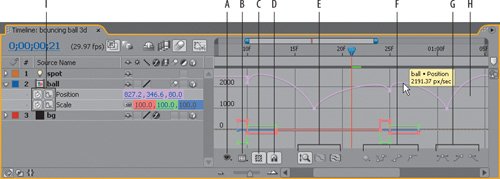
To enable the Graph Editor, click its icon in the Timeline (Figure 2.11); you'll now see a grid in the area previously occupied by the layer bars. At the bottom of this grid are the Graph Editor controls, which are labeled in Figure 2.12.
Figure 2.11. Click this icon in the Timeline to access 7.0's new Graph Editor.

Figure 2.12. The many components of the Graph Editor, detailed: (A) Show Properties, (B) Graph Options, (C) Show Transform Box, (D) Snap (E) Zoom controls, (F) Keyframe controls, (G) Ease controls, (H) properties graphs, and (I) Graph Editor Set toggles.
Show Properties
At this point, if nothing is selected, you will not see any animation data; if you select an animated property you will probably see animation data, but what you see depends on the settings in the Show Properties menu (the eyeball at the lower left). Three toggles in this menu control how animation curves are displayed:
- Show Selected Properties displays animation data for any selected properties
- Show Animated Properties displays all animated properties in a selected layer
- Show Graph Editor Set displays properties whose Graph Editor Set toggle (next to the stopwatch and labeled I in Figure 2.12) is enabled
Notes
The most intuitive way to set Show Properties might seem to be to enable Show Selected Properties and disable the other two, but by default a new copy of After Effects has the opposite configuration (only Show Selected Properties is disabled), which is actually a more powerful (less annoying) way to work.
Here's how it works. Select any component of any layer, or the layer itself, and all animated (keyframe) properties for that layer are displayed. If you want to see only one property from that layersay, only Position in the ball layerdeselect the layer (F2 or Ctrl+Shift+A/Cmd+Shift+A) and enable the Graph Editor toggle for Position.
That way, if a property inadvertently becomes deselected, it doesn't disappear, and if you want an overview of all animation for a layer, you simply select that layer.
Graph Options
Now, how to understand all of that data that shows up and focus only on what you need? The Graph Options menu (labeled B in Figure 2.12) controls which components of the properties are displayed. For example, display only the Position data for ball and you might see something like the keyframe data in Figure 2.13.
Figure 2.13. The 2D version of the bouncing ball animation is shown with the Speed Graph active and the Value Graph shown as a Reference Graph. Although After Effects does not allow you to keyframe individual axes independently of one another, they are both displayed (and if made active, can be edited) in the Graph Editor.

Okay, what's going on here? By default, Auto-Select Graph Type and Show Reference Graph are enabled in the Graph Options. Therefore you see one curve (white or light magenta) with editable vertices (the little squares at each keyframe); this is the Speed Graph for Position. You also see a red and a green curve with no selectable vertices; these are the Value Graphs for X and Y position.
Spatial properties such as Position have two types of values in After Effects: Value (the actual position) and Speed (the rate of transition from one position to the next). Auto-Select Graph Type correctly assumes that with Position it is more useful to adjust speed in the Graph Editor, and position in the composition itself, so it displays Speed as the editable curve (and Value as a reference).
Notes
Auto Select Graph Type selects Speed graphs for spatial properties and Value graphs for all others.
You can, of course, override this by choosing Edit Value Graph instead, and there is one compelling reason to do so: This offers you explicit control over a single axis (X or Y in a 2D composition; X, Y, or Z with 3D). However, it is important to understand that After Effects does not allow you to keyframe spatial axes individually. Notice that if you select a vertex on the red X axis, the vertex on the green Y axis is also selected, and although adjusting its value doesn't affect the other, adjusting its timing does.
Notes
A relatively simple method for separating X, Y, and Z axes for animation using parenting is explored later in this chapter. You can also apply the Separate XYZ Position preset (in Animation Presets, in the Effects & Presets panel) to set up separate axes with expressions.
The Reference Graph shows whichever graph type is not selected, along with corresponding values (in gray) at the right edge of the Graph Editor (look again at Figure 2.13). If you're finding it hard to wrap your head around even seeing spatial values in the graph, toggle Show Reference Graph off and you'll see only the Speed graph (Figure 2.14).
Figure 2.14. Displaying a reference graph as in Figure 2.13 is overkill in many cases; here is a simpler and more typical view of the Speed graph only. The graph shows the rate at which the layer travels at any given point of time; the low points at the bottom of each "v" shape show eases into a keyframe transition (the slowest points in the animation, which in this case are still 1000 pixels per second).

The second set of Graph Options (from Show Audio Waveforms down to Show Expression Editor) are more self-explanatory; most of them pertain to features discussed elsewhere in this chapter. It's worth scanning these to notice, for example, that you can display an audio waveform or an expression in the Graph Editor.
Tip
Show Graph Tool Tips is an especially useful feature to leave on; move your cursor over any animation data and you see relevant values at that exact time, including animation values at points other than keyframes.
At the bottom of the Graph Options menu is the Allow Keyframes Between Frames toggle. With this off, keyframes that you drag snap to precise frame values (as you would expect); turn it on and you can drag a keyframe to any point in time (should you wish to time a keyframe between two frames for some reason). When you scale a set of keyframes using the Transform Box, keyframes can fall in between frames whether or not this option is on.
The Transform Box
With the Transform Box, things really start to get interesting in the Graph Editor. Toggle this on and select more than one keyframe, and you see a semi-opaque white box with handles around the selected frames. Grab the handle at the right side and drag it left: You are scaling the entire animation to occur more quickly. Select all keyframes in the example composition and drag the right handles to the left; the relative timing of the animation is all the same, but it happens more quickly.
Notes
The Snap button causes any keyframe you drag to snap to virtually any other visible marker in the Graph Editor, but it does not snap to whole frame values if Allow Keyframes Between Frames is on.
This is generally intuitive to artists used to editing free-transforms with mask shapes (the same controls used with Masks in After Effects, covered in Chapter 3). To simply translate a set of keyframes, you just drag inside the box. There are additionally a few unique things you can do with this control worth knowing about:
- To offset the center of the Transform Box and scale around the bounding box's anchor point, first move the anchor from the center to wherever you want it, then Ctrl-drag/Cmd-drag and the box scales around that point.
- To reverse keyframes, drag beyond the opposite (left/right) edge of the box.
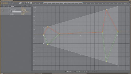
- Speed graphs can only be adjusted horizontally, but value graphs have handles on all corners and sides of the bounding box. To scale the box proportionally, Shift-drag on a corner. To taper values at one end, Ctrl+Alt-drag (Cmd+Option-drag) on a corner (Figure 2.15). To move one side of the box up or down, Ctrl+Alt+Shift-drag (Cmd+Option+Shiftdrag) on a corner. You can even skew the contents of the box by Alt-dragging (Option-dragging) on a corner handle.
Figure 2.15. Artists often wonder how to scale values proportionally; here's how. By Ctrl+Alt-dragging (Cmd+Option-dragging) on the corner of the Transform Box, you can taper (or in this case, expand) values at one end of the selection area.
Temporal Data and Eases
Before you go completely crazy manipulating keyframe data with a bounding box, however, it's worth looking at the basics of how individual keyframes can be set, because you'll make these types of adjustments much more often.
Notes
Spatial interpretations, however, do not default to linear unless you enable Default Spatial Interpretation to Linear in Preferences > General. By default, a Bezier shape eases spatial transitions.
A typical way that keyframes are used in an effects situation is to say, about a given value, "I want it to be this value at this point in the shot, and this value here." By default, After Effects sets linear temporal transitions; in other words, you travel from keyframe A to keyframe B at a steady rate, then from keyframe B to keyframe C at a separate but still steady rate.
Many basic animations are greatly aided by adding eases. Experienced animators and anthropologists alike will tell you how rare it is that anything in nature proceeds in a linear fashion; nature is full of arcs and curves. A classic example of this is a camera push: In most cases, with a real camera operator, a push would start and stop gently, moving at a steady rate only at the middle of the transition.
Close-Up: Flips and Flops
Fine, but how do I flop a shot? New in version 7.0, After Effects does include a "Flop," as well as a "Flip" and a "Flip + Flop" in Animation Presets > Image - Utilities (search on any of these in the Effects & Presets panel). To "flop" a shot means to invert it horizontally, on the Y axis (a "flip" occurs on the X axis). The preset employs the Transform effect, which unfortunately is not compatible with 32 bpc mode; you can instead toggle Constrain Proportions for Scale and add a minus sign beside the X value (Figure 2.16).
Figure 2.16. To flop a shot, be sure to uncheck Constrain Proportions before setting the X value to 100%.

Easy Ease
A quick way to create eases is to apply the Easy Ease keyframe assistants. These can be applied as follows
- Context-click a keyframe and choose one of the Easy Ease options under the Keyframe Assistant submenu
- Use the keyboard shortcuts: F9 applies Bezier interpolation, creating eases in and out of a keyframe, while Shift+F9 creates an ease into the keyframe only, and Ctrl+Shift+F9 (Cmd+Shift+F9) creates an ease out
- Use one of the Easy Ease buttons at the lower right of the Graph Editor
Warning
Mac users beware: The F9 key is already in use by the system for the Exposé feature, revealing all open panels in all applications. You can change or disable this feature in System Preferences > Dashboard & Exposé.
For the camera push example, you might ease out of the first frame and ease in to the final frame, adding an ease in both directions to any keyframes in the middle (for example, if the speed of the push changed at some point).
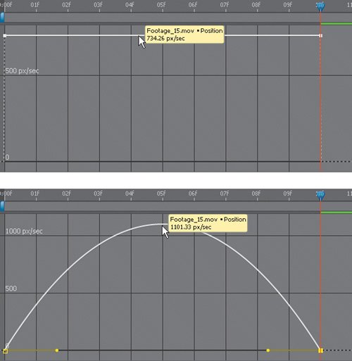
To see the result, twirl down the property to which the eases were applied. Figures 2.17a and b show the difference between a default linear camera push and one to which eases have been applied. The keyframes have changed from linear to Bezier type, and rate of motion is described by a curve instead of a straight line.
Figures 2.17a and b. With no eases, the Speed: Position graph is flat, moving at a steady rate (a). Add eases (b), and it arcs from 0 (at the beginning and end of the move) to a higher value at the center peak of the ease.
Now suppose you want to customize that ease. The Graph Editor makes thispardon the expressioneasier. Select any keyframe and you see yellow handles extending to its left and right. To make a transition ease more, drag the yellow handle away from the keyframe; to reduce the ease, drag it inward toward the keyframe. You can even create eases in this manner without having to set Easy Ease in the first place.
Holds
You must set Hold keyframes deliberately, via one of the following
- Context-click on the keyframe and choose Toggle Hold Keyframe
- Use the shortcut Ctrl+Alt+H (Cmd+Shift+H)
- Choose the Hold button below the Graph Editor (the one with the graph lines all at right angles)
A Hold keyframe's value does not interpolate to the next keyframe. In layer bar mode this is indicated by the square appearance on one or both sides of the keyframe. In the Graph Editor this appears as a flat horizontal line to the right of a keyframe.
Notes
Hold keyframes solve problems any time you see unwanted in-between information creep into an animation; beware of this particularly with spatial animations.
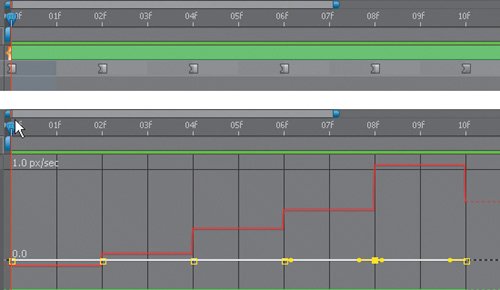
To reposition a layer over time with no transitions (no keyframe in-betweening whatsoever) begin by setting the first frame as a Hold keyframe; all keyframes that follow it in time will be Hold keyframes, signaled by their completely square appearance in layer bar mode or a series of right angles in the Graph Editor (Figures 2.18a and b).
Figures 2.18a and b. A series of Bezier keyframes have been converted to Hold keyframes, evident by the square shape at the right of each keyframe in the layer bar view (a) and right angles in the Graph Editor (b).
Spatial Data and Curves
If you are called upon to create a complex animation, the After Effects interface is up to it. I can't teach you to be a great animator, but I can focus on what you need to know to keyframe effectively and to avoid common pitfalls.
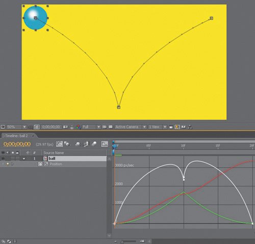
As you saw above, when keyframing Position (or Anchor Point) data, there are in fact two ways you can adjust keyframes: temporally (via the Speed graph) and spatially (via the Value graph, but more likely by adjusting the same keyframes as they appear in the Composition and Layer panels). A closer look at the simple bouncing ball reveals a lot about animating spatial keyframes (Figures 2.19 to 2.22).
Figure 2.19. Under Preferences > General (Ctrl+Alt+; or Cmd+Option+;), the option Default Spatial Interpolation to Linear is off by default, producing this result when you create three or more position keys. After Effects also applies an automatic Bezier shape to any point that falls between two other pointsthe opposite of what you want for a bouncing ball.
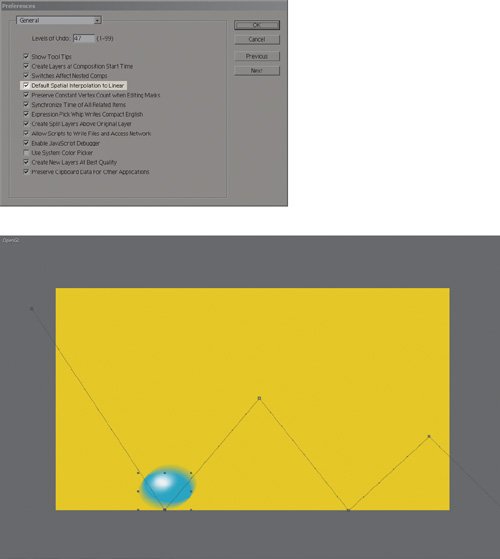
Figure 2.20. Click the check box for Default Spatial Interpolation to Linear, restart After Effects, and this is the result: three keyframes that are linear in both time and position. This is in many cases preferable to movements that always arc through keyframes, and you may want to leave this preference on, but it does not create the realistic arcs of a bouncing ball.
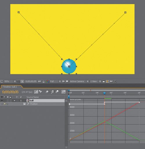
Figure 2.21. Hold down the Ctrl/Cmd key while clicking the middle keyframe to activate its Bezier handles, then Ctrl/Cmd-click on one of the handles to "break" them, enabling you to form the V-shape shown here, which naturally causes curved arcs to and from the bounce point.
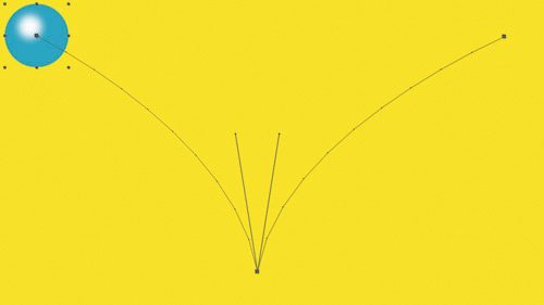
Figure 2.22. Temporal eases create a more realistic variation in motion speed. Selecting the first and last frame and pressing F9 (or selecting an ease shortcut below the Graph Editor) causes eases to those frames and an effective acceleration in and out of the keyframe in between them. Look closely. The dots are spaced further apart (traveling faster) at the bottom and closer together at the top, where the eases are.
In the (somewhat likely) case you never need a bouncing ball animation, what does this example show you? Let's recap:
- You can take control of the shape of your motion path in the Composition panel, using the same shortcuts to adjust Beziers as with the Pen tool (described in detail in the next chapter).
- Realistic motion often requires a combination of shaping the motion path Beziers and adding eases to keyframes; you can perform the two actions independently on any given keyframe.
So, even though there is an infinite variety of position animations available to you in After Effects, they are just elaborations on the basic constraints covered here. True, it can get a little trickier in 3D, but mostly it's just trickier to see what you are doing.
Close-Up: Roving Keyframes
Suppose your animation must follow an exact path, hitting precise points, but progress steadily, with no variation in the rate of travel. This is the situation for which Roving keyframes were devised. Figure 2.23 shows a before and after view of the application of a roving keyframe to the animation in Figure 2.22; the path of the animation is identical, but the keyframes are now evenly spaced.
Figure 2.23. The middle keyframe was set to rove (by turning off the tiny toggle below the keyframe) and is now positioned in between frames 15 and 16; the keyframe's interpolation setting is no longer taken into account, and it moves to keep the curve created by the other keyframes smooth and steady.
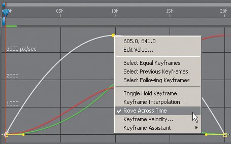
Each keyframe can have one of three basic transition types, each of which has a shortcut at the bottom of the Graph Editor: Hold, Linear, and Automatic Bezier. If you adjust the handles or apply Easy Ease, you create a Custom Bezier Shape.
Copying and Pasting Trickery
There's a bit of a gotcha laying in wait when copying and pasting keyframe data. You must clearly recognize which item is active when you copy, and which is active when you paste, and this is not always as easy as you might think.
By default, After Effects tries to make things clear and automatic. If you copy keyframes from a particular property, then simply paste them to another layer, After Effects pastes them to that layer's corresponding property, beginning at the current time.
If that target property doesn't exist, because it's part of an effect applied only to the source layer, After Effects adds the effect as well as the keyframes. So far, so good.
However, it is also permissible to copy keyframes from one property and paste them to a different, similar property. For example, to apply a 2D Position keyframe to the Flare Center position of a Lens Flare effect, you simply select the Flare Center property in the timeline before pasting (otherwise those keyframes are copied to the Position property).
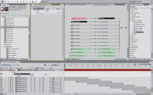
Therein lies the danger for any artist not paying attention, or failing to recognize which item is currently selected when copying or pasting. Figure 2.24 shows a classic example, where a layer's properties are not twirled down, making it easy to miss that the Effect Controls panel is forward and has an effect highlighted. That effect only is copied, instead of the entire layer.
Figure 2.24. It's easy to be tricked when six separate items are highlighted (darker) in the Project, Timeline, Effect Controls Effects & Presets and Flowchart views. Press Delete, and what disappears? Hint: check which panel is activeit's the Slider Control effect in Effect Controls.
Notes
New in After Effects 7.0 is a small lock icon that appears on the Effect Controls tab. Enable this toggle, and that effect remains visible even when you select a different layer. (This toggle also resides on the Composition and Layer tabs; its full use is described in Chapter 4.)
If the result of a copy and paste seems strange, immediately undo and try the copy operation again, selecting exactly the thing you want to copy and copying it with no intervening steps.
Real-World Graph Editor
This section has offered an introduction to the many features of the Graph Editor, but the question remains: How exactly should you use it? Should it ideally be active most of the time, or only when refining an animation? For which types of animations is it most helpful?
Call me old-fashioned, but I don't recommend working in the Graph Editor constantly until you are at the refinement stage of your animation. Basic timing and the decision as to whether a given keyframe should be linear or include eases is more clearly and simply undertaken in the Layer view; the Graph Editor, by and large, is there when you need to go beyond what is possible in that view.
Try recreating a bouncing ball animation of your own from scratch (or anything with natural, specific motion), beginning in the Layer view and moving to the Graph Editor once the basic timing and movement are roughed in. It should only be a couple of minutes before you're ready to activate the Graph Editor, but you may also find that you want to return to the Layer view to simplify the animationsay, to reset a keyframe to be linear (by Ctrl/Cmd-clicking on it).
Overall, Layer view will be preferable when
- Blocking in keyframes with respect to the overall composition
- Timing needs are broad (Linear, Easy Ease, and Auto-Bezier are sufficient)
- Making editorial/compositing decisions with layers (layer start/stop/duration, splitting layers, determining layer order, and so on)
The Graph Editor is essential in cases when
- Refining an individual animation curve
- Comparing spatial and temporal data
- Scaling animation data, especially around a specific pivot point
- Timing is extremely specific (for example, a keyframe is needed between frames)
Either will do when
- Editing expressions
- Changing keyframe type (Linear, Hold, Ease in, and so on)
On the whole, although the Graph Editor is certainly one of the top three changes in After Effects 7.0, you will find that the majority of compositing and even animating is best accomplished in Layer view.
Über mastery |
Section I. Working Foundations
The 7.0 Workflow
- The 7.0 Workflow
- Workspaces and Panels
- Making the Most of the UI
- Settings: Project, Footage, Composition
- Previews and OpenGL
- Effects & Presets
- Output: The Render Queue
- Study a Shot like an Effects Artist
The Timeline
- The Timeline
- Organization
- Animation Methods
- Keyframes and The Graph Editor
- Uber-mastery
- Transform Offsets
- Motion Blur
- Manipulating Time Itself
- In Conclusion
Selections: The Key to Compositing
- Selections: The Key to Compositing
- The Many Ways to Create Selections
- Compositing: Science and Nature
- Alpha Channels and Premultiplication
- Masks
- Combining Multiple Masks
- Putting Masks in Motion
- Blending Modes: The Real Deal
- Track Mattes
Optimizing Your Projects
- Optimizing Your Projects
- Navigating Multiple Compositions
- Precomposing and Nesting
- Adjustment and Guide Layers
- Understanding Rendering Order
- Optimizing After Effects
- Onward to Effects
Section II. Effects Compositing Essentials
Color Correction
Color Keying
- Color Keying
- Good Habits and Best Practices
- Linear Keyers and Hi-Con Mattes
- Blue-Screen and Green-Screen Keying
- Understanding and Optimizing Keylight
- Fixing Typical Problems
- Conclusion
Rotoscoping and Paint
- Rotoscoping and Paint
- Articulated Mattes
- Working Around Limitations
- Morphing
- Paint and Cloning
- Conclusion
Effective Motion Tracking
- Effective Motion Tracking
- The Essentials
- Optimizing Tracking Using 3D
- Extending a Track with Expressions
- Tracking for Rotoscoping
- Using 3D Tracking Data
- Conclusion
Virtual Cinematography
- Virtual Cinematography
- 5D: Pick Up the Camera
- Storytelling and the Camera
- Camera Blur
- The Role of Grain
- Film and Video Looks
- Conclusion
Expressions
- Expressions
- Logic and Grammar
- Muting Keyframes
- Linking Animation Data
- Looping Animations
- Smoothing and Destabilizing
- Offsetting Layers and Time
- Conditionals and Triggers
- Tell Me More
Film, HDR, and 32 Bit Compositing
- Film, HDR, and 32 Bit Compositing
- Details
- Film 101
- Dynamic Range
- Cineon Log Space
- Video Gamma Space
- Battle of the Color Spaces
- Floating Point
- 32 Bits per Channel
- Conclusion
Section III. Creative Explorations
Working with Light
- Working with Light
- Light Source and Direction
- Creating a Look with Color
- Backlighting, Flares, Light Volume
- Shadows and Reflected Light
- HDR Lighting
- Conclusion
Climate: Air, Water, Smoke, Clouds
- Climate: Air, Water, Smoke, Clouds
- Particulate Matter
- Sky Replacement
- The Fog, Smoke, or Mist Rolls In
- Billowing Smoke
- Wind
- Water
- Conclusion
Pyrotechnics: Fire, Explosions, Energy Phenomena
- Pyrotechnics: Fire, Explosions, Energy Phenomena
- Firearms
- Sci-Fi Weaponry
- Heat Distortion
- Fire
- Explosions
- In a Blaze of Glory
Learning to See
Index
EAN: 2147483647
Pages: 157
