Using Visual Programming to Create a Simple Program Displaying Text and an Image
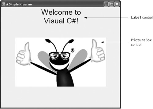
In this section, we create a program that displays the text "Welcome to Visual C#!" and an image of the Deitel & Associates bug mascot. The program consists of a single form that uses a Label and a PictureBox. Figure 2.27 shows the results of the program as it executes. The program and the bug image are available with this chapter's examples. You can download the examples from www.deitel.com/books/csharphtp2/index.html.
Figure 2.27. Simple program executing.
To create the program whose output is shown in Fig. 2.27, you will not write a single line of program code. Instead, you will use visual programming techniques. Visual Studio processes your actions (such as mouse clicking, dragging and dropping) to generate program code. Chapter 3 begins our discussion of how to write program code. Throughout the book, you produce increasingly substantial programs that often include a combination of code written by you and code generated by Visual Studio. The generated code can be difficult for novices to understandfortunately, you rarely need to look at this code.
Visual programming is useful for building GUI-intensive programs that require a significant amount of user interaction. Visual programming cannot be used to create programs that do not have GUIsyou must write such code directly.
To create, run and terminate this first program, perform the following 13 steps:
|
1. |
Create the new project. If a project is already open, close it by selecting File > Close Solution. A dialog asking whether to save the current project might appear. Click Save to save any changes. To create a new Windows application for our program, select File > New Project... to display the New Project dialog (Fig. 2.28). From the template options, select Windows Application. Name the project ASimpleProgram and click OK. [Note: File names must conform to certain rules. For example, file names cannot contain symbols (e.g., ?, :, *, <, >, # and %) or Unicode® control characters (Unicode is a special character set described in Appendix E). Also, file names cannot be system reserved names, such as "CON", "PRN", "AUX" and "COM1" or "." and "..", and cannot be longer than 256 characters in length.] We mentioned earlier in this chapter that you must set the directory in which the project will be saved. In the complete Visual Studio, you do this in the New Project dialog. To specify the directory in Visual C# Express, select File > Save All to display the Save Project dialog (Fig. 2.29). To set the project location, click the Browse... button, which opens the Project Location dialog (Fig. 2.30). Navigate through the directories, select one in which to place the project (in our example, we use a directory named MyProjects) and click OK to close the dialog. Make sure the Create directory for Solution checkbox is selected (Fig. 2.29). Click Save to close the Save Project dialog. Figure 2.28. New Project dialog. (This item is displayed on page 55 in the print version) 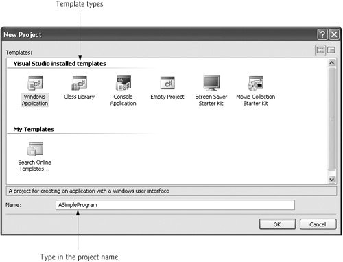
Figure 2.29. Save Project dialog. 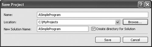
Figure 2.30. Setting the project location in the Project Location dialog. 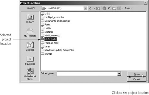
When you first begin working in the IDE, it is in design mode (i.e., the program is being designed and is not executing). While the IDE is in design mode, you have access to all the environment windows (e.g., Toolbox, Properties), menus and toolbars, as you will see shortly. |
|
2. |
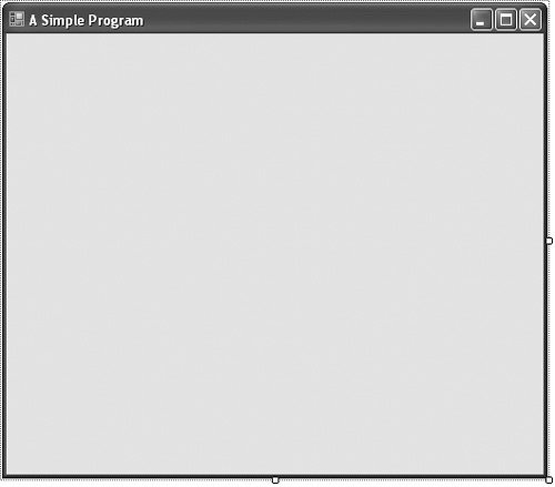
Set the text in the form's title bar. The text in the form's title bar is the value of the form's Text property (Fig. 2.31). If the Properties window is not open, click the properties icon in the toolbar or select View > Properties Window. Click anywhere in the form to display the form's properties in the Properties window. Click in the textbox to the right of the Text property box and type "A Simple Program", as in Fig. 2.31. Press the Enter key when finished; the form's title bar is updated immediately (Fig. 2.32). Figure 2.31. Setting the form's Text property in the Properties window. 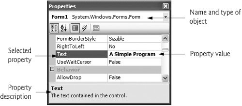
Figure 2.32. Form with enabled sizing handles.
|
|
3. |
Resize the form. Click and drag one of the form's enabled sizing handles (the small white squares that appear around the form, as shown in Fig. 2.32). Using the mouse, select and drag the sizing handle to resize the form (Fig. 2.33). Figure 2.33. Resized form. (This item is displayed on page 58 in the print version)
|
|
4. |
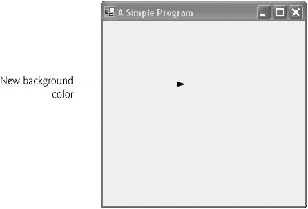
Change the form's background color. The BackColor property specifies a form's or control's background color. Clicking BackColor in the Properties window causes a down-arrow button to appear next to the value of the property (Fig. 2.34). When clicked, the down-arrow button displays a set of other options, which vary depending on the property. In this case, the arrow displays tabs for Custom, Web and System (the default). Click the Custom tab to display the palette (a grid of colors). Select the box that represents light blue. Once you select the color, the palette closes and the form's background color changes to light blue (Fig. 2.35). Figure 2.34. Changing the form's BackColor property. 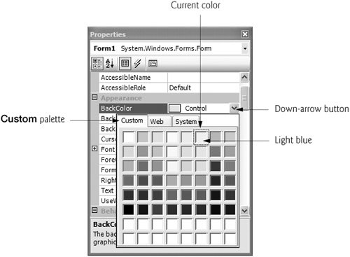
Figure 2.35. Form with new BackColor property applied. (This item is displayed on page 59 in the print version)
|
|
5. |
Add a Label control to the Form. If the Toolbox is not already open, select View > Toolbox to display the set of controls you will use for creating your programs. For the type of program we are creating in this chapter, the typical controls we use will be located in either the All Windows Forms category of the Toolbox or the Common Controls group. If either group name is collapsed, expand it by clicking the plus sign (the All Windows Forms and Common Controls groups are shown near the top of Fig. 2.21). Next, double click the Label control in the Toolbox. This action causes a Label to appear in the upper-left corner of the form (Fig. 2.36). [Note: If the Form is behind the Toolbox, you may need to close the Toolbox to see the Label.] Although double clicking any Toolbox control places the control on the form, you also can "drag" controls from the Toolbox to the form (you may prefer dragging the control because you can position it wherever you want). Our Label displays the text label1 by default. Note that our Label's background color is the same as the form's background color. When a control is added to the form, its BackColor property is set to the form's BackColor. You can change the Label's background color to a different color than the form by changing its BackColor property. Figure 2.36. Adding a Label to the form. 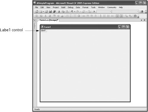
|
|
6. |
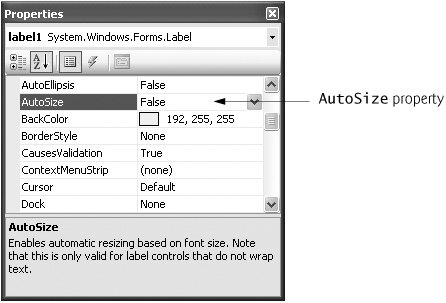
Customize the Label's appearance. Select the Label by clicking it. Its properties now appear in the Properties window (Fig. 2.37). The Label's Text property determines the text (if any) that the Label displays. The form and Label each have their own Text propertyforms and controls can have the same types of properties (such as BackColor and Text) without conflict. Set the Label's Text property to Welcome to Visual C#!. Note that the Label resizes to fit all the typed text on one line. By default, the AutoSize property of the Label is set to TRue, which allows the Label to adjust its size to fit all of the text if necessary. Set the AutoSize property to False (Fig. 2.37) so that you can resize the Label on your own. Resize the Label (using the sizing handles) so that the text fits. Move the Label to the top center of the form by dragging it or by using the keyboard's left and right arrow keys to adjust its position (Fig. 2.38). Alternatively, when the Label is selected, you can center the Label control horizontally by selecting Format > Center In Form > Horizontally. Figure 2.37. Changing the Label's AutoSize property to False.
Figure 2.38. GUI after the form and Label have been customized. 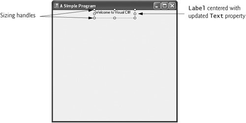
|
|
7. |
Set the Label's font size. To change the font type and appearance of the Label's text, select the value of the Font property, which causes an ellipsis button ( Figure 2.39. Properties window displaying the Label's properties.
Figure 2.40. Font dialog for selecting fonts, styles and sizes. 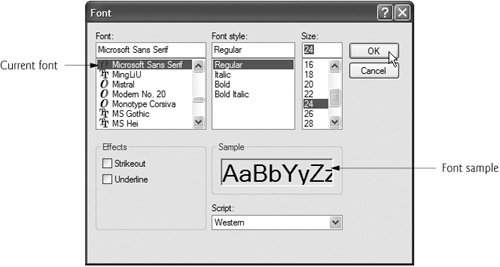
|
|
8. |
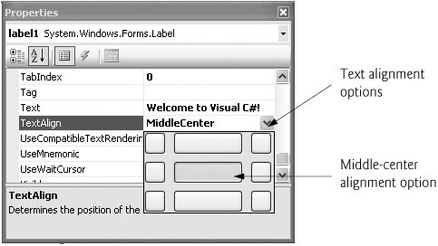
Align the Label's text. Select the Label's TextAlign property, which determines how the text is aligned within the Label. A three-by-three grid of buttons representing alignment choices is displayed (Fig. 2.41). The position of each button corresponds to where the text appears in the Label. For this program, set the TextAlign property to MiddleCenter in the three-by-three grid; this selection causes the text to appear centered in the middle of the Label, with equal spacing from the text to all sides of the Label. The other TextAlign values, such as TopLeft, TopRight and BottomCenter, can be used to position the text anywhere within a Label. Certain alignment values may require that you resize the Label larger or smaller to better fit the text. Figure 2.41. Centering the Label's text.
|
|
9. |
Add a PictureBox to the form. The PictureBox control displays images. The process involved in this step is similar to that of Step 5, in which we added a Label to the form. Locate the PictureBox in the Toolbox menu (Fig. 2.21) and double click it to add the PictureBox to the form. When the PictureBox appears, move it underneath the Label, either by dragging it or by using the arrow keys (Fig. 2.42). Figure 2.42. Inserting and aligning a PictureBox. 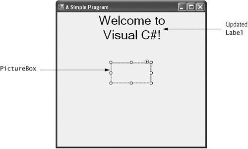
|
|
10. |
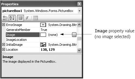
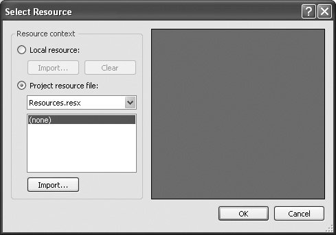
Insert an image. Click the PictureBox to display its properties in the Properties window (Fig. 2.43). Locate the Image property, which displays a preview of the image, if one exists. No picture has been assigned, so the value of the Image property displays (none). Click the ellipsis button to display the Select Resource dialog (Fig. 2.44). This dialog is used to import files, such as images, to any program. Click the Import... button to browse for an image to insert. In our case, the picture is bug.png. In the dialog that appears (Fig. 2.45), click the image with the mouse and click OK. The image is previewed in the Select Resource dialog (Fig. 2.45). Click OK to place the image in your program. Supported image formats include PNG (Portable Network Graphics), GIF (Graphics Interchange Format), JPEG (Joint Photographic Experts Group) and BMP (Windows bitmap). Creating a new image requires image-editing software, such as Jasc® Paint Shop Pro™ (www.jasc.com), Adobe® Photoshop™ Elements (www.adobe.com) or Microsoft Paint (provided with Windows). To size the image to the PictureBox, change the SizeMode property to StretchImage (Fig. 2.46), which scales the image to the size of the PictureBox. Resize the PictureBox, making it larger (Fig. 2.47). Figure 2.43. Image property of the PictureBox.
Figure 2.44. Select Resource dialog to select an image for the PictureBox.
Figure 2.45. Select Resource dialog displaying a preview of selected image. 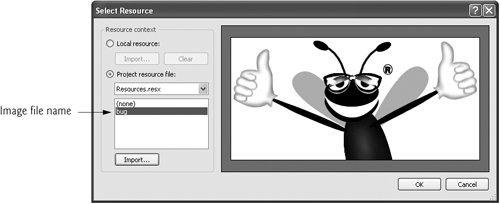
Figure 2.46. Scaling an image to the size of the PictureBox. 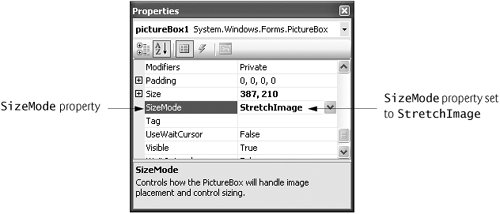
Figure 2.47. PictureBox displaying an image. (This item is displayed on page 65 in the print version) 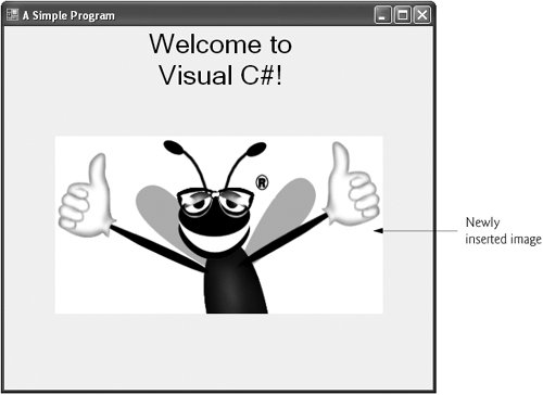
|
|
11. |
Save the project. Select File > Save All to save the entire solution. The solution file contains the name and location of its project, and the project file contains the names and locations of all the files in the project. |
|
12. |
Run the project. Recall that up to this point we have been working in the IDE's design mode (i.e., the program being created is not executing). In run mode, the program is executing, and you can interact with only a few IDE featuresfeatures that are not available are disabled (grayed out). The text Form1.cs [Design] in the tab (Fig. 2.48) means that we are designing the form visually rather than programmatically. If we had been writing code, the tab would have contained only the text Form1.cs. To run the program you must first build the solution. Select Build > Build Solution to compile the project (Fig. 2.48). Once you build the solution (the IDE will display "Build succeeded" in the lower-left corner of the IDEalso known as the status bar), select Debug > Start Debugging to execute the program. Figure 2.49 shows the IDE in run mode. Note that many toolbar icons and menus are disabled. The running program will appear in a separate window outside the IDE (Fig. 2.49). Figure 2.48. Building a solution. 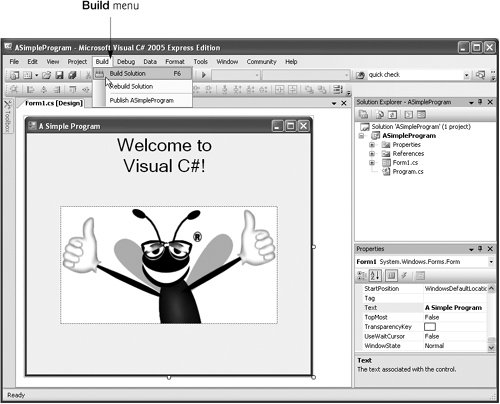
Figure 2.49. IDE in run mode, with the running program in the foreground window. 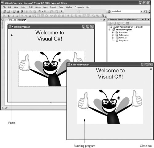
|
|
13. |
Terminate execution. To terminate the program, click the running program's close box (the X in the top-right corner of the running program's window). This action stops the program's execution and returns the IDE to design mode. |

 ) to appear next to the value (Fig. 2.39). When the ellipsis button is clicked, a dialog that provides additional valuesin this case, the Font dialog (Fig. 2.40)is displayed. You can select the font name (e.g., Microsoft Sans Serif, MingLiU, Mistral, Modern No. 20the font options may vary, depending on your system), font style (Regular, Italic, Bold, etc.) and font size (16, 18, 20, etc.) in this dialog. The Sample area shows sample text with the selected font settings. Under Size, select 24 points and click OK. If the Label's text does not fit on a single line, it wraps to the next line. Resize the Label vertically if it's not large enough to hold the text.
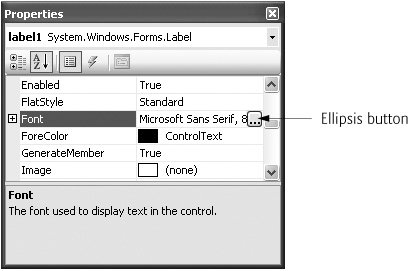
Preface
Index
Introduction to Computers, the Internet and Visual C#
- Introduction
- What Is a Computer?
- Computer Organization
- Early Operating Systems
- Personal Computing, Distributed Computing and Client/Server Computing
- Hardware Trends
- Microsofts Windows® Operating System
- Machine Languages, Assembly Languages and High-Level Languages
- C#
- C, C++, Java and Visual Basic
- Other High-Level Languages
- The Internet and the World Wide Web
- Extensible Markup Language (XML)
- Microsofts .NET
- The .NET Framework and the Common Language Runtime
- Test-Driving a C# Application
- Software Engineering Case Study: Introduction to Object Technology and the UML
- Wrap-Up
- Web Resources
- Summary
- Terminology
- Self-Review Exercises
- Exercises
Introduction to the Visual C# 2005 Express Edition IDE
- Introduction
- Overview of the Visual Studio 2005 IDE
- Menu Bar and Toolbar
- Navigating the Visual Studio 2005 IDE
- Using Help
- Using Visual Programming to Create a Simple Program Displaying Text and an Image
- Wrap-Up
- Web Resources
- Summary
- Terminology
- Self-Review Exercises
- Exercises
Introduction to C# Applications
- Introduction
- A Simple C# Application: Displaying a Line of Text
- Creating Your Simple Application in Visual C# Express
- Modifying Your Simple C# Application
- Formatting Text with Console.Write and Console.WriteLine
- Another C# Application: Adding Integers
- Memory Concepts
- Arithmetic
- Decision Making: Equality and Relational Operators
- (Optional) Software Engineering Case Study: Examining the ATM Requirements Document
- Wrap-Up
- Summary
- Terminology
- Self-Review Exercises
- Exercises
Introduction to Classes and Objects
- Introduction
- Classes, Objects, Methods, Properties and Instance Variables
- Declaring a Class with a Method and Instantiating an Object of a Class
- Declaring a Method with a Parameter
- Instance Variables and Properties
- UML Class Diagram with a Property
- Software Engineering with Properties and set and get Accessors
- Value Types vs. Reference Types
- Initializing Objects with Constructors
- Floating-Point Numbers and Type decimal
- (Optional) Software Engineering Case Study: Identifying the Classes in the ATM Requirements Document
- Wrap-Up
- Summary
- Terminology
- Self-Review Exercises
- Exercises
Control Statements: Part 1
- Introduction
- Algorithms
- Pseudocode
- Control Structures
- if Single-Selection Statement
- if...else Double-Selection Statement
- while Repetition Statement
- Formulating Algorithms: Counter-Controlled Repetition
- Formulating Algorithms: Sentinel-Controlled Repetition
- Formulating Algorithms: Nested Control Statements
- Compound Assignment Operators
- Increment and Decrement Operators
- Simple Types
- (Optional) Software Engineering Case Study: Identifying Class Attributes in the ATM System
- Wrap-Up
- Summary
- Terminology
- Self-Review Exercises
- Exercises
Control Statements: Part 2
- Introduction
- Essentials of Counter-Controlled Repetition
- for Repetition Statement
- Examples Using the for Statement
- do...while Repetition Statement
- switch Multiple-Selection Statement
- break and continue Statements
- Logical Operators
- Structured Programming Summary
- (Optional) Software Engineering Case Study: Identifying Objects States and Activities in the ATM System
- Wrap-Up
- Summary
- Terminology
- Self-Review Exercises
- Exercises
Methods: A Deeper Look
- Introduction
- Packaging Code in C#
- static Methods, static Variables and Class Math
- Declaring Methods with Multiple Parameters
- Notes on Declaring and Using Methods
- Method Call Stack and Activation Records
- Argument Promotion and Casting
- The Framework Class Library
- Case Study: Random-Number Generation
- Case Study: A Game of Chance (Introducing Enumerations)
- Scope of Declarations
- Method Overloading
- Recursion
- Passing Arguments: Pass-by-Value vs. Pass-by-Reference
- (Optional) Software Engineering Case Study: Identifying Class Operations in the ATM System
- Wrap-Up
- Summary
- Terminology
- Self-Review Exercises
- Exercises
Arrays
- Introduction
- Arrays
- Declaring and Creating Arrays
- Examples Using Arrays
- Case Study: Card Shuffling and Dealing Simulation
- foreach Statement
- Passing Arrays and Array Elements to Methods
- Passing Arrays by Value and by Reference
- Case Study: Class GradeBook Using an Array to Store Grades
- Multidimensional Arrays
- Case Study: Class GradeBook Using a Rectangular Array
- Variable-Length Argument Lists
- Using Command-Line Arguments
- (Optional) Software Engineering Case Study: Collaboration Among Objects in the ATM System
- Wrap-Up
- Summary
- Terminology
- Self-Review Exercises
- Exercises
- Special Section: Building Your Own Computer
Classes and Objects: A Deeper Look
- Introduction
- Time Class Case Study
- Controlling Access to Members
- Referring to the Current Objects Members with the this Reference
- Indexers
- Time Class Case Study: Overloaded Constructors
- Default and Parameterless Constructors
- Composition
- Garbage Collection and Destructors
- static Class Members
- readonly Instance Variables
- Software Reusability
- Data Abstraction and Encapsulation
- Time Class Case Study: Creating Class Libraries
- internal Access
- Class View and Object Browser
- (Optional) Software Engineering Case Study: Starting to Program the Classes of the ATM System
- Wrap-Up
- Summary
- Terminology
- Self-Review Exercises
- Exercises
Object-Oriented Programming: Inheritance
- Introduction
- Base Classes and Derived Classes
- protected Members
- Relationship between Base Classes and Derived Classes
- Constructors in Derived Classes
- Software Engineering with Inheritance
- Class object
- Wrap-Up
- Summary
- Terminology
- Self-Review Exercises
- Exercises
Polymorphism, Interfaces & Operator Overloading
- Introduction
- Polymorphism Examples
- Demonstrating Polymorphic Behavior
- Abstract Classes and Methods
- Case Study: Payroll System Using Polymorphism
- sealed Methods and Classes
- Case Study: Creating and Using Interfaces
- Operator Overloading
- (Optional) Software Engineering Case Study: Incorporating Inheritance and Polymorphism into the ATM System
- Wrap-Up
- Summary
- Terminology
- Self-Review Exercises
- Exercises
Exception Handling
- Introduction
- Exception Handling Overview
- Example: Divide by Zero Without Exception Handling
- Example: Handling DivideByZeroExceptions and FormatExceptions
- .NET Exception Hierarchy
- finally Block
- Exception Properties
- User-Defined Exception Classes
- Wrap-Up
- Summary
- Terminology
- Self-Review Exercises
- Exercises
Graphical User Interface Concepts: Part 1
- Introduction
- Windows Forms
- Event Handling
- Control Properties and Layout
- Labels, TextBoxes and Buttons
- GroupBoxes and Panels
- CheckBoxes and RadioButtons
- PictureBoxes
- ToolTips
- NumericUpDown Control
- Mouse-Event Handling
- Keyboard-Event Handling
- Wrap-Up
- Summary
- Terminology
- Self-Review Exercises
- Answers To Self-Review Exercises
- Exercises
Graphical User Interface Concepts: Part 2
- Introduction
- Menus
- MonthCalendar Control
- DateTimePicker Control
- LinkLabel Control
- ListBox Control
- CheckedListBox Control
- ComboBox Control
- TreeView Control
- ListView Control
- TabControl Control
- Multiple Document Interface (MDI) Windows
- Visual Inheritance
- User-Defined Controls
- Wrap-Up
- Summary
- Terminology
- Self-Review Exercises
- Exercises
Multithreading
- Introduction
- Thread States: Life Cycle of a Thread
- Thread Priorities and Thread Scheduling
- Creating and Executing Threads
- Thread Synchronization and Class Monitor
- Producer/Consumer Relationship without Thread Synchronization
- Producer/Consumer Relationship with Thread Synchronization
- Producer/Consumer Relationship: Circular Buffer
- Multithreading with GUIs
- Wrap-Up
- Summary
- Terminology
- Self-Review Exercises
- Exercises
Strings, Characters and Regular Expressions
- Introduction
- Fundamentals of Characters and Strings
- string Constructors
- string Indexer, Length Property and CopyTo Method
- Comparing strings
- Locating Characters and Substrings in strings
- Extracting Substrings from strings
- Concatenating strings
- Miscellaneous string Methods
- Class StringBuilder
- Length and Capacity Properties, EnsureCapacity Method and Indexer of Class StringBuilder
- Append and AppendFormat Methods of Class StringBuilder
- Insert, Remove and Replace Methods of Class StringBuilder
- Char Methods
- Card Shuffling and Dealing Simulation
- Regular Expressions and Class Regex
- Wrap-Up
- Summary
- Terminology
- Self-Review Exercises
- Exercises
Graphics and Multimedia
- Introduction
- Drawing Classes and the Coordinate System
- Graphics Contexts and Graphics Objects
- Color Control
- Font Control
- Drawing Lines, Rectangles and Ovals
- Drawing Arcs
- Drawing Polygons and Polylines
- Advanced Graphics Capabilities
- Introduction to Multimedia
- Loading, Displaying and Scaling Images
- Animating a Series of Images
- Windows Media Player
- Microsoft Agent
- Wrap-Up
- Summary
- Terminology
- Self-Review Exercises
- Exercises
Files and Streams
- Introduction
- Data Hierarchy
- Files and Streams
- Classes File and Directory
- Creating a Sequential-Access Text File
- Reading Data from a Sequential-Access Text File
- Serialization
- Creating a Sequential-Access File Using Object Serialization
- Reading and Deserializing Data from a Sequential-Access Text File
- Wrap-Up
- Summary
- Terminology
- Self-Review Exercises
- Exercises
Extensible Markup Language (XML)
- Introduction
- XML Basics
- Structuring Data
- XML Namespaces
- Document Type Definitions (DTDs)
- W3C XML Schema Documents
- (Optional) Extensible Stylesheet Language and XSL Transformations
- (Optional) Document Object Model (DOM)
- (Optional) Schema Validation with Class XmlReader
- (Optional) XSLT with Class XslCompiledTransform
- Wrap-Up
- Web Resources
- Summary
- Terminology
- Self-Review Exercises
- Exercises
Database, SQL and ADO.NET
- Introduction
- Relational Databases
- Relational Database Overview: Books Database
- SQL
- ADO.NET Object Model
- Programming with ADO.NET: Extracting Information from a Database
- Querying the Books Database
- Programming with ADO.NET: Address Book Case Study
- Using a DataSet to Read and Write XML
- Wrap-Up
- Web Resources
- Summary
- Terminology
- Self-Review Exercises
- Exercises
ASP.NET 2.0, Web Forms and Web Controls
- Introduction
- Simple HTTP Transactions
- Multitier Application Architecture
- Creating and Running a Simple Web-Form Example
- Web Controls
- Session Tracking
- Case Study: Connecting to a Database in ASP.NET
- Case Study: Secure Books Database Application
- Wrap-Up
- Web Resources
- Summary
- Terminology
- Self-Review Exercises
- Exercises
Web Services
- Introduction
- .NET Web Services Basics
- Simple Object Access Protocol (SOAP)
- Publishing and Consuming Web Services
- Session Tracking in Web Services
- Using Web Forms and Web Services
- User-Defined Types in Web Services
- Wrap-Up
- Web Resources
- Summary
- Terminology
- Self-Review Exercises
- Exercises
Networking: Streams-Based Sockets and Datagrams
- Introduction
- Connection-Oriented vs. Connectionless Communication
- Protocols for Transporting Data
- Establishing a Simple TCP Server (Using Stream Sockets)
- Establishing a Simple TCP Client (Using Stream Sockets)
- Client/Server Interaction with Stream-Socket Connections
- Connectionless Client/Server Interaction with Datagrams
- Client/Server Tic-Tac-Toe Using a Multithreaded Server
- WebBrowser Control
- .NET Remoting
- Wrap-Up
- Summary
- Terminology
- Self-Review Exercises
- Exercises
Searching and Sorting
- Introduction
- Searching Algorithms
- Sorting Algorithms
- Wrap-Up
- Summary
- Terminology
- Self-Review Exercises
- Exercises
Data Structures
- Introduction
- Simple-Type structs, Boxing and Unboxing
- Self-Referential Classes
- Linked Lists
- Stacks
- Queues
- Trees
- Wrap-Up
- Summary
- Terminology
- Self-Review Exercises
- Exercises
Generics
- Introduction
- Motivation for Generic Methods
- Generic Method Implementation
- Type Constraints
- Overloading Generic Methods
- Generic Classes
- Notes on Generics and Inheritance
- Wrap-Up
- Summary
- Terminology
- Self-Review Exercises
- Exercises
Collections
- Introduction
- Collections Overview
- Class Array and Enumerators
- Non-Generic Collections
- Generic Collections
- Synchronized Collections
- Wrap-Up
- Summary
- Terminology
- Self-Review Exercises
- Exercises
Appendix A. Operator Precedence Chart
Appendix B. Number Systems
- B.1. Introduction
- B.2. Abbreviating Binary Numbers as Octal and Hexadecimal Numbers
- B.3. Converting Octal and Hexadecimal Numbers to Binary Numbers
- B.4. Converting from Binary, Octal or Hexadecimal to Decimal
- B.5. Converting from Decimal to Binary, Octal or Hexadecimal
- B.6. Negative Binary Numbers: Twos Complement Notation
- Summary
- Terminology
- Self-Review Exercises
- Exercises
Appendix C. Using the Visual Studio 2005 Debugger
- C.1. Introduction
- C.2. Breakpoints and the Continue Command
- C.3. The Locals and Watch Windows
- C.4. Controlling Execution Using the Step Into, Step Over, Step Out and Continue Commands
- C.5. Other Features
- C.6. Wrap-Up
- Summary
- Terminology
- Self-Review Exercises
Appendix D. ASCII Character Set
Appendix E. Unicode®
- E.1. Introduction
- E.2. Unicode Transformation Formats
- E.3. Characters and Glyphs
- E.4. Advantages/Disadvantages of Unicode
- E.5. Using Unicode
- E.6. Character Ranges
- Summary
- Terminology
- Self-Review Exercises
- Answers to Self-Review exercises
- Exercises
Appendix F. Introduction to XHTML: Part 1
- F.1. Introduction
- F.2. Editing XHTML
- F.3. First XHTML Example
- F.4. W3C XHTML Validation Service
- F.5. Headers
- F.6. Linking
- F.7. Images
- F.8. Special Characters and More Line Breaks
- F.9. Unordered Lists
- F.10. Nested and Ordered Lists
- F.11. Web Resources
Appendix G. Introduction to XHTML: Part 2
- G.1. Introduction
- G.2. Basic XHTML Tables
- G.3. Intermediate XHTML Tables and Formatting
- G.4. Basic XHTML Forms
- G.5. More Complex XHTML Forms
- G.6. Internal Linking
- G.7. Creating and Using Image Maps
- G.8. meta Elements
- G.9. frameset Element
- G.10. Nested framesets
- G.11. Web Resources
Appendix H. HTML/XHTML Special Characters
Appendix I. HTML/XHTML Colors
Appendix J. ATM Case Study Code
- Appendix J. ATM Case Study Code
- J.1. ATM Case Study Implementation
- J.2. Class ATM
- J.3. Class Screen
- J.4. Class Keypad
- J.5. Class CashDispenser
- J.6. Class DepositSlot
- J.7. Class Account
- J.8. Class BankDatabase
- J.9. Class Transaction
- J.10. Class BalanceInquiry
- J.11. Class Withdrawal
- J.12. Class Deposit
- J.13. Class ATMCaseStudy
- J.14. Wrap-Up
Appendix K. UML 2: Additional Diagram Types
Appendix L. Simple Types
Index
EAN: 2147483647
Pages: 600
