CheckBoxes and RadioButtons
C# has two types of state buttons that can be in the on/off or true/false statesCheckBoxes and RadioButtons. Like class Button, classes CheckBox and RadioButton are derived from class ButtonBase.
CheckBoxes
A CheckBox is a small square that either is blank or contains a check mark. When the user clicks a CheckBox to select it, a check mark appears in the box. If the user clicks CheckBox again to deselect it, the check mark is removed. Any number of CheckBoxes can be selected at a time. A list of common CheckBox properties and events appears in Fig. 13.25.
|
CheckBox properties and events |
Description |
|---|---|
|
Common Properties |
|
|
Checked |
Indicates whether the CheckBox is checked (contains a check mark) or unchecked (blank). This property returns a Boolean value. |
|
CheckState |
Indicates whether the CheckBox is checked or unchecked with a value from the CheckState enumeration (Checked, Unchecked or Indeterminate). Indeterminate is used when it is unclear whether the state should be Checked or Unchecked. For example, in Microsoft Word, when you select a paragraph that contains several character formats, then go to Format > Font, some of the CheckBoxes appear in the Indeterminate state. When CheckState is set to Indeterminate, the CheckBox is usually shaded. |
|
Text |
Specifies the text displayed to the right of the CheckBox. |
|
Common Events |
|
|
CheckedChanged |
Generated when the Checked property changes. This is a CheckBox's default event. When a user double clicks the CheckBox control in design view, an empty event handler for this event is generated. |
|
CheckStateChanged |
Generated when the CheckState property changes. |
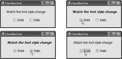
The program in Fig. 13.26 allows the user to select CheckBoxes to change a Label's font style. The event handler for one CheckBox applies bold and the event handler for the other applies italic. If both CheckBoxes are selected, the font style is set to bold and italic. Initially, neither CheckBox is checked.
Figure 13.26. Using CheckBoxes to change font styles.
 1 // Fig. 13.26: CheckBoxTestForm.cs
 2 // Using CheckBoxes to toggle italic and bold styles.
 3 using System;
 4 using System.Drawing;
 5 using System.Windows.Forms;
 6
 7 // Form contains CheckBoxes to allow the user to modify sample text
 8 public partial class CheckBoxTestForm : Form
 9 {
10 // default constructor
11 public CheckBoxTestForm()
12 {
13 InitializeComponent();
14 } // end constructor
15
16 // toggle the font style between bold and
17 // not bold based on the current setting
18 private void boldCheckBox_CheckedChanged(
19  object sender, EventArgs e )
20 {
21  outputLabel.Font =
22  new Font( outputLabel.Font.Name, outputLabel.Font.Size,
23  outputLabel.Font.Style ^ FontStyle.Bold );
24 } // end metod boldCheckBox_CheckedChanged
25
26 // toggle the font style between italic and
27 // not italic based on the current setting
28 private void italicCheckBox_CheckedChanged(
29  object sender, EventArgs e )
30 {
31  outputLabel.Font =
32  new Font( outputLabel.Font.Name, outputLabel.Font.Size,
33  outputLabel.Font.Style ^ FontStyle.Italic );
34 } // end method italicCheckBox_CheckedChanged
35 } // end class CheckBoxTestForm
|
The boldCheckBox has its Text property set to Bold. The italicCheckBox has its Text property set to Italic. The Text property of outputLabel is set to Watch the font style change. After creating the controls, we define their event handlers. Double clicking the CheckBoxes at design time creates empty CheckedChanged event handlers.
To change the font style on a Label, you must set its Font property to a new Font object (lines 2123 and 3133). The Font constructor that we use here takes the font name, size and style as arguments. The first two argumentsoutputLabel.Font.Name and outputLabel.Font.Sizeuse outputLabel's original font name and size. The style is specified with a member of the FontStyle enumeration, which contains Regular, Bold, Italic, Strikeout and Underline. (The Strikeout style displays text with a line through it.) A Font object's Style property is read-only, so it can be set only when the Font object is created.
Styles can be combined via bitwise operatorsoperators that perform manipulation on bits of information. Recall from Chapter 1 that all data is represented in the computer as combinations of 0s and 1s. Each 0 or 1 represents a bit. FontStyle has a System.FlagAttribute, meaning that the FontStyle bit values are selected in a way that allows us to combine different FontStyle elements to create compound styles, using bitwise operators. These styles are not mutually exclusive, so we can combine different styles and remove them without affecting the combination of previous FontStyle elements. We can combine these various font styles, using either the logical OR (|) operator or the logical exclusive OR (^) operator. When the logical OR operator is applied to two bits, if at least one bit of the two has the value 1, then the result is 1. Combining styles using the conditional OR operator works as follows. Assume that FontStyle.Bold is represented by bits 01 and that FontStyle.Italic is represented by bits 10. When we use the conditional OR (||) to combine the styles, we obtain the bits 11.
01 = Bold
10 = Italic
--
11 = Bold and Italic
The conditional OR operator helps create style combinations. However, what happens if we want to undo a style combination, as we did in Fig. 13.26?
The logical exclusive OR operator enables us to combine styles and to undo existing style settings. When logical exclusive OR is applied to two bits, if both bits have the same value, then the result is 0. If both bits are different, then the result is 1.
Combining styles using logical exclusive OR works as follows. Assume, again, that FontStyle.Bold is represented by bits 01 and that FontStyle.Italic is represented by bits 10. When we use logical exclusive OR (^) on both styles, we obtain the bits 11.
01 = Bold
10 = Italic
--
11 = Bold and Italic
Now, suppose that we would like to remove the FontStyle.Bold style from the previous combination of FontStyle.Bold and FontStyle.Italic. The easiest way to do so is to reapply the logical exclusive OR (^) operator to the compound style and FontStyle.Bold.
11 = Bold and Italic
01 = Bold
--
10 = Italic
This is a simple example. The advantages of using bitwise operators to combine FontStyle values become more evident when we consider that there are five different FontStyle values (Bold, Italic, Regular, Strikeout and Underline), resulting in 16 different FontStyle combinations. Using bitwise operators to combine font styles greatly reduces the amount of code required to check all possible font combinations.
In Fig. 13.26, we need to set the FontStyle so that the text appears in bold if it was not bold originally, and vice versa. Notice that line 23 uses the bitwise logical exclusive OR operator to do this. If outputLabel.Font.Style is bold, then the resulting style is not bold. If the text is originally italic, the resulting style is bold and italic, rather than just bold. The same applies for FontStyle.Italic in line 33.
If we did not use bitwise operators to compound FontStyle elements, we would have to test for the current style and change it accordingly. For example, in event handler boldCheckBox_CheckChanged, we could test for the regular style and make it bold; test for the bold style and make it regular; test for the italic style and make it bold italic; and test for the italic bold style and make it italic. This is cumbersome because, for every new style we add, we double the number of combinations. Adding a CheckBox for underline would require testing eight additional styles. Adding a CheckBox for strikeout would require testing 16 additional styles.
RadioButtons
Radio buttons (defined with class RadioButton) are similar to CheckBoxes in that they also have two statesselected and not selected (also called deselected). However, RadioButtons normally appear as a group, in which only one RadioButton can be selected at a time. Selecting one RadioButton in the group forces all the others to be deselected. Therefore, RadioButtons are used to represent a set of mutually exclusive options (i.e., a set in which multiple options cannot be selected at the same time).
|

|
All RadioButtons added to a container become part of the same group. To separate RadioButtons into several groups, the RadioButtons must be added to GroupBoxes or Panels. The common properties and a common event of class RadioButton are listed in Fig. 13.27.
|
RadioButton properties and events |
Description |
|---|---|
|
Common Properties |
|
|
Checked |
Indicates whether the RadioButton is checked. |
|
Text |
Specifies the RadioButton's text. |
|
Common Event |
|
|
CheckedChanged |
Generated every time the RadioButton is checked or unchecked. When you double click a RadioButton control in design view, an empty event handler for this event is generated. |

The program in Fig. 13.28 uses RadioButtons to enable users to select options for a MessageBox. After selecting the desired attributes, the user presses the Display Button to display the MessageBox. A Label in the lower-left corner shows the result of the MessageBox (i.e., which Button the user clickedYes, No, Cancel, etc.).
Figure 13.28. Using RadioButtons to set message-window options.
(This item is displayed on pages 623 - 626 in the print version)
 1 // Fig. 13.28: RadioButtonsTestForm.cs
 2 // Using RadioButtons to set message window options.
 3 using System;
 4 using System.Windows.Forms;
 5
 6 // Form contains several RadioButtons--user chooses one
 7 // from each group to create a custom MessageBox
 8 public partial class RadioButtonsTestForm : Form
 9 {
10 // create variables that store the user's choice of options
11 private MessageBoxIcon iconType;
12 private MessageBoxButtons buttonType;
13
14 // default constructor
15 public RadioButtonsTestForm()
16 {
17 InitializeComponent();
18 } // end constructor
19
20 // change Buttons based on option chosen by sender
21 private void buttonType_CheckedChanged( object sender, EventArgs e )
22 {
23 if ( sender == okButton ) // display OK Button
24 buttonType = MessageBoxButtons.OK;
25
26 // display OK and Cancel Buttons
27 else if ( sender == okCancelButton )
28 buttonType = MessageBoxButtons.OKCancel;
29
30 // display Abort, Retry and Ignore Buttons
31 else if ( sender == abortRetryIgnoreButton )
32 buttonType = MessageBoxButtons.AbortRetryIgnore;
33
34 // display Yes, No and Cancel Buttons
35 else if ( sender == yesNoCancelButton )
36 buttonType = MessageBoxButtons.YesNoCancel;
37
38 // display Yes and No Buttons
39 else if ( sender == yesNoButton )
40 buttonType = MessageBoxButtons.YesNo;
41
42 // only on option left--display Retry and Cancel Buttons
43 else
44 buttonType = MessageBoxButtons.RetryCancel;
45 } // end method buttonType_Changed
46
47 // change Icon based on option chosen by sender
48 private void iconType_CheckedChanged( object sender, EventArgs e )
49 {
50 if ( sender == asteriskButton ) // display asterisk Icon
51 iconType = MessageBoxIcon.Asterisk;
52
53 // display error Icon 54 else if ( sender == errorButton ) 55 iconType = MessageBoxIcon.Error; 56 57 // display exclamation point Icon 58 else if ( sender == exclamationButton ) 59 iconType = MessageBoxIcon.Exclamation; 60 61 // display hand Icon 62 else if ( sender == handButton ) 63 iconType = MessageBoxIcon.Hand; 64 65 // display information Icon 66 else if ( sender == informationButton ) 67 iconType = MessageBoxIcon.Information; 68 69 // display question mark Icon 70 else if ( sender == questionButton ) 71 iconType = MessageBoxIcon.Question; 72 73 // display stop Icon 74 else if ( sender == stopButton ) 75 iconType = MessageBoxIcon.Stop; 76 77 // only one option left--display warning Icon 78 else 79 iconType = MessageBoxIcon.Warning; 80 } // end method iconType_CheckChanged 81 82 // display MessageBox and Button user pressed 83 private void displayButton_Click( object sender, EventArgs e ) 84 { 85 // display MessageBox and store 86 // the value of the Button that was pressed 87 DialogResult result = MessageBox.Show( 88 "This is your Custom MessageBox.", "Custon MessageBox", 89 buttonType, iconType, 0, 0 ); 90 91 // check to see which Button was pressed in the MessageBox 92 // change text displayed accordingly 93 switch (result) 94 { 95 case DialogResult.OK: 96 displayLabel.Text = "OK was pressed."; 97 break; 98 case DialogResult.Cancel: 99 displayLabel.Text = "Cancel was pressed."; 100 break; 101 case DialogResult.Abort: 102 displayLabel.Text = "Abort was pressed."; 103 break;
104 case DialogResult.Retry: 105 displayLabel.Text = "Retry was pressed."; 106 break; 107 case DialogResult.Ignore: 108 displayLabel.Text = "Ignore was pressed."; 109 break; 110 case DialogResult.Yes: 111 displayLabel.Text = "Yes was pressed."; 112 break; 113 case DialogResult.No: 114 displayLabel.Text = "No was pressed."; 115 break; 116 } // end switch 117 } // end method displayButton_Click 118 } // end class RadioButtonsTestForm
(a)
(b)
(c) OKCancel button type
(d) OK button type
(e) AbortRetryIgnore button type
(f) YesNoCancel button type
(g) YesNo button type
(h) RetryCancel button type
|


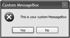
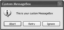
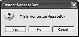

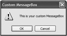
To store the user's choices, we create and initialize the iconType and buttonType objects (lines 1112). Object iconType is of type MessageBoxIcon, and can have values Asterisk, Error, Exclamation, Hand, Information, None, Question, Stop and Warning. The sample output shows only Error, Exclamation, Information and Question icons.
Object buttonType is of type MessageBoxButtons, and can have values AbortRetryIgnore, OK, OKCancel, RetryCancel, YesNo and YesNoCancel. The name indicates the options that are presented to the user in the MessageBox. The sample output windows show MessageBoxes for all of the MessageBoxButtons enumeration values.
We created two GroupBoxes, one for each set of enumeration values. The GroupBox captions are Button Type and Icon. The GroupBoxes contain RadioButtons for the corresponding enumeration options, and the RadioButtons' Text properties are set appropriately. Because the RadioButtons are grouped, only one RadioButton can be selected from each GroupBox. There is also a Button (displayButton) labeled Display. When a user clicks this Button, a customized MessageBox is displayed. A Label (displayLabel) displays which Button the user pressed within the MessageBox.
The event handler for the RadioButtons handles the CheckedChanged event of each RadioButton. When a RadioButton contained in the Button Type GroupBox is checked, the checked RadioButton's corresponding event handler sets buttonType to the appropriate value. Lines 2145 contain the event handling for these RadioButtons. Similarly, when the user checks the RadioButtons belonging to the Icon GroupBox, the event handlers associated with these events (lines 4880) set iconType to its corresponding value.
The Click event handler for displayButton (lines 83117) creates a MessageBox (lines 8789). The MessageBox options are specified with the values stored in iconType and buttonType. When the user clicks one of the MessageBox's buttons, the result of the message box is returned to the application. This result is a value from the DialogResult enumeration that contains Abort, Cancel, Ignore, No, None, OK, Retry or Yes. The switch statement in lines 93116 tests for the result and sets displayLabel.Text appropriately.
PictureBoxes |
Preface
Index
Introduction to Computers, the Internet and Visual C#
- Introduction
- What Is a Computer?
- Computer Organization
- Early Operating Systems
- Personal Computing, Distributed Computing and Client/Server Computing
- Hardware Trends
- Microsofts Windows® Operating System
- Machine Languages, Assembly Languages and High-Level Languages
- C#
- C, C++, Java and Visual Basic
- Other High-Level Languages
- The Internet and the World Wide Web
- Extensible Markup Language (XML)
- Microsofts .NET
- The .NET Framework and the Common Language Runtime
- Test-Driving a C# Application
- Software Engineering Case Study: Introduction to Object Technology and the UML
- Wrap-Up
- Web Resources
- Summary
- Terminology
- Self-Review Exercises
- Exercises
Introduction to the Visual C# 2005 Express Edition IDE
- Introduction
- Overview of the Visual Studio 2005 IDE
- Menu Bar and Toolbar
- Navigating the Visual Studio 2005 IDE
- Using Help
- Using Visual Programming to Create a Simple Program Displaying Text and an Image
- Wrap-Up
- Web Resources
- Summary
- Terminology
- Self-Review Exercises
- Exercises
Introduction to C# Applications
- Introduction
- A Simple C# Application: Displaying a Line of Text
- Creating Your Simple Application in Visual C# Express
- Modifying Your Simple C# Application
- Formatting Text with Console.Write and Console.WriteLine
- Another C# Application: Adding Integers
- Memory Concepts
- Arithmetic
- Decision Making: Equality and Relational Operators
- (Optional) Software Engineering Case Study: Examining the ATM Requirements Document
- Wrap-Up
- Summary
- Terminology
- Self-Review Exercises
- Exercises
Introduction to Classes and Objects
- Introduction
- Classes, Objects, Methods, Properties and Instance Variables
- Declaring a Class with a Method and Instantiating an Object of a Class
- Declaring a Method with a Parameter
- Instance Variables and Properties
- UML Class Diagram with a Property
- Software Engineering with Properties and set and get Accessors
- Value Types vs. Reference Types
- Initializing Objects with Constructors
- Floating-Point Numbers and Type decimal
- (Optional) Software Engineering Case Study: Identifying the Classes in the ATM Requirements Document
- Wrap-Up
- Summary
- Terminology
- Self-Review Exercises
- Exercises
Control Statements: Part 1
- Introduction
- Algorithms
- Pseudocode
- Control Structures
- if Single-Selection Statement
- if...else Double-Selection Statement
- while Repetition Statement
- Formulating Algorithms: Counter-Controlled Repetition
- Formulating Algorithms: Sentinel-Controlled Repetition
- Formulating Algorithms: Nested Control Statements
- Compound Assignment Operators
- Increment and Decrement Operators
- Simple Types
- (Optional) Software Engineering Case Study: Identifying Class Attributes in the ATM System
- Wrap-Up
- Summary
- Terminology
- Self-Review Exercises
- Exercises
Control Statements: Part 2
- Introduction
- Essentials of Counter-Controlled Repetition
- for Repetition Statement
- Examples Using the for Statement
- do...while Repetition Statement
- switch Multiple-Selection Statement
- break and continue Statements
- Logical Operators
- Structured Programming Summary
- (Optional) Software Engineering Case Study: Identifying Objects States and Activities in the ATM System
- Wrap-Up
- Summary
- Terminology
- Self-Review Exercises
- Exercises
Methods: A Deeper Look
- Introduction
- Packaging Code in C#
- static Methods, static Variables and Class Math
- Declaring Methods with Multiple Parameters
- Notes on Declaring and Using Methods
- Method Call Stack and Activation Records
- Argument Promotion and Casting
- The Framework Class Library
- Case Study: Random-Number Generation
- Case Study: A Game of Chance (Introducing Enumerations)
- Scope of Declarations
- Method Overloading
- Recursion
- Passing Arguments: Pass-by-Value vs. Pass-by-Reference
- (Optional) Software Engineering Case Study: Identifying Class Operations in the ATM System
- Wrap-Up
- Summary
- Terminology
- Self-Review Exercises
- Exercises
Arrays
- Introduction
- Arrays
- Declaring and Creating Arrays
- Examples Using Arrays
- Case Study: Card Shuffling and Dealing Simulation
- foreach Statement
- Passing Arrays and Array Elements to Methods
- Passing Arrays by Value and by Reference
- Case Study: Class GradeBook Using an Array to Store Grades
- Multidimensional Arrays
- Case Study: Class GradeBook Using a Rectangular Array
- Variable-Length Argument Lists
- Using Command-Line Arguments
- (Optional) Software Engineering Case Study: Collaboration Among Objects in the ATM System
- Wrap-Up
- Summary
- Terminology
- Self-Review Exercises
- Exercises
- Special Section: Building Your Own Computer
Classes and Objects: A Deeper Look
- Introduction
- Time Class Case Study
- Controlling Access to Members
- Referring to the Current Objects Members with the this Reference
- Indexers
- Time Class Case Study: Overloaded Constructors
- Default and Parameterless Constructors
- Composition
- Garbage Collection and Destructors
- static Class Members
- readonly Instance Variables
- Software Reusability
- Data Abstraction and Encapsulation
- Time Class Case Study: Creating Class Libraries
- internal Access
- Class View and Object Browser
- (Optional) Software Engineering Case Study: Starting to Program the Classes of the ATM System
- Wrap-Up
- Summary
- Terminology
- Self-Review Exercises
- Exercises
Object-Oriented Programming: Inheritance
- Introduction
- Base Classes and Derived Classes
- protected Members
- Relationship between Base Classes and Derived Classes
- Constructors in Derived Classes
- Software Engineering with Inheritance
- Class object
- Wrap-Up
- Summary
- Terminology
- Self-Review Exercises
- Exercises
Polymorphism, Interfaces & Operator Overloading
- Introduction
- Polymorphism Examples
- Demonstrating Polymorphic Behavior
- Abstract Classes and Methods
- Case Study: Payroll System Using Polymorphism
- sealed Methods and Classes
- Case Study: Creating and Using Interfaces
- Operator Overloading
- (Optional) Software Engineering Case Study: Incorporating Inheritance and Polymorphism into the ATM System
- Wrap-Up
- Summary
- Terminology
- Self-Review Exercises
- Exercises
Exception Handling
- Introduction
- Exception Handling Overview
- Example: Divide by Zero Without Exception Handling
- Example: Handling DivideByZeroExceptions and FormatExceptions
- .NET Exception Hierarchy
- finally Block
- Exception Properties
- User-Defined Exception Classes
- Wrap-Up
- Summary
- Terminology
- Self-Review Exercises
- Exercises
Graphical User Interface Concepts: Part 1
- Introduction
- Windows Forms
- Event Handling
- Control Properties and Layout
- Labels, TextBoxes and Buttons
- GroupBoxes and Panels
- CheckBoxes and RadioButtons
- PictureBoxes
- ToolTips
- NumericUpDown Control
- Mouse-Event Handling
- Keyboard-Event Handling
- Wrap-Up
- Summary
- Terminology
- Self-Review Exercises
- Answers To Self-Review Exercises
- Exercises
Graphical User Interface Concepts: Part 2
- Introduction
- Menus
- MonthCalendar Control
- DateTimePicker Control
- LinkLabel Control
- ListBox Control
- CheckedListBox Control
- ComboBox Control
- TreeView Control
- ListView Control
- TabControl Control
- Multiple Document Interface (MDI) Windows
- Visual Inheritance
- User-Defined Controls
- Wrap-Up
- Summary
- Terminology
- Self-Review Exercises
- Exercises
Multithreading
- Introduction
- Thread States: Life Cycle of a Thread
- Thread Priorities and Thread Scheduling
- Creating and Executing Threads
- Thread Synchronization and Class Monitor
- Producer/Consumer Relationship without Thread Synchronization
- Producer/Consumer Relationship with Thread Synchronization
- Producer/Consumer Relationship: Circular Buffer
- Multithreading with GUIs
- Wrap-Up
- Summary
- Terminology
- Self-Review Exercises
- Exercises
Strings, Characters and Regular Expressions
- Introduction
- Fundamentals of Characters and Strings
- string Constructors
- string Indexer, Length Property and CopyTo Method
- Comparing strings
- Locating Characters and Substrings in strings
- Extracting Substrings from strings
- Concatenating strings
- Miscellaneous string Methods
- Class StringBuilder
- Length and Capacity Properties, EnsureCapacity Method and Indexer of Class StringBuilder
- Append and AppendFormat Methods of Class StringBuilder
- Insert, Remove and Replace Methods of Class StringBuilder
- Char Methods
- Card Shuffling and Dealing Simulation
- Regular Expressions and Class Regex
- Wrap-Up
- Summary
- Terminology
- Self-Review Exercises
- Exercises
Graphics and Multimedia
- Introduction
- Drawing Classes and the Coordinate System
- Graphics Contexts and Graphics Objects
- Color Control
- Font Control
- Drawing Lines, Rectangles and Ovals
- Drawing Arcs
- Drawing Polygons and Polylines
- Advanced Graphics Capabilities
- Introduction to Multimedia
- Loading, Displaying and Scaling Images
- Animating a Series of Images
- Windows Media Player
- Microsoft Agent
- Wrap-Up
- Summary
- Terminology
- Self-Review Exercises
- Exercises
Files and Streams
- Introduction
- Data Hierarchy
- Files and Streams
- Classes File and Directory
- Creating a Sequential-Access Text File
- Reading Data from a Sequential-Access Text File
- Serialization
- Creating a Sequential-Access File Using Object Serialization
- Reading and Deserializing Data from a Sequential-Access Text File
- Wrap-Up
- Summary
- Terminology
- Self-Review Exercises
- Exercises
Extensible Markup Language (XML)
- Introduction
- XML Basics
- Structuring Data
- XML Namespaces
- Document Type Definitions (DTDs)
- W3C XML Schema Documents
- (Optional) Extensible Stylesheet Language and XSL Transformations
- (Optional) Document Object Model (DOM)
- (Optional) Schema Validation with Class XmlReader
- (Optional) XSLT with Class XslCompiledTransform
- Wrap-Up
- Web Resources
- Summary
- Terminology
- Self-Review Exercises
- Exercises
Database, SQL and ADO.NET
- Introduction
- Relational Databases
- Relational Database Overview: Books Database
- SQL
- ADO.NET Object Model
- Programming with ADO.NET: Extracting Information from a Database
- Querying the Books Database
- Programming with ADO.NET: Address Book Case Study
- Using a DataSet to Read and Write XML
- Wrap-Up
- Web Resources
- Summary
- Terminology
- Self-Review Exercises
- Exercises
ASP.NET 2.0, Web Forms and Web Controls
- Introduction
- Simple HTTP Transactions
- Multitier Application Architecture
- Creating and Running a Simple Web-Form Example
- Web Controls
- Session Tracking
- Case Study: Connecting to a Database in ASP.NET
- Case Study: Secure Books Database Application
- Wrap-Up
- Web Resources
- Summary
- Terminology
- Self-Review Exercises
- Exercises
Web Services
- Introduction
- .NET Web Services Basics
- Simple Object Access Protocol (SOAP)
- Publishing and Consuming Web Services
- Session Tracking in Web Services
- Using Web Forms and Web Services
- User-Defined Types in Web Services
- Wrap-Up
- Web Resources
- Summary
- Terminology
- Self-Review Exercises
- Exercises
Networking: Streams-Based Sockets and Datagrams
- Introduction
- Connection-Oriented vs. Connectionless Communication
- Protocols for Transporting Data
- Establishing a Simple TCP Server (Using Stream Sockets)
- Establishing a Simple TCP Client (Using Stream Sockets)
- Client/Server Interaction with Stream-Socket Connections
- Connectionless Client/Server Interaction with Datagrams
- Client/Server Tic-Tac-Toe Using a Multithreaded Server
- WebBrowser Control
- .NET Remoting
- Wrap-Up
- Summary
- Terminology
- Self-Review Exercises
- Exercises
Searching and Sorting
- Introduction
- Searching Algorithms
- Sorting Algorithms
- Wrap-Up
- Summary
- Terminology
- Self-Review Exercises
- Exercises
Data Structures
- Introduction
- Simple-Type structs, Boxing and Unboxing
- Self-Referential Classes
- Linked Lists
- Stacks
- Queues
- Trees
- Wrap-Up
- Summary
- Terminology
- Self-Review Exercises
- Exercises
Generics
- Introduction
- Motivation for Generic Methods
- Generic Method Implementation
- Type Constraints
- Overloading Generic Methods
- Generic Classes
- Notes on Generics and Inheritance
- Wrap-Up
- Summary
- Terminology
- Self-Review Exercises
- Exercises
Collections
- Introduction
- Collections Overview
- Class Array and Enumerators
- Non-Generic Collections
- Generic Collections
- Synchronized Collections
- Wrap-Up
- Summary
- Terminology
- Self-Review Exercises
- Exercises
Appendix A. Operator Precedence Chart
Appendix B. Number Systems
- B.1. Introduction
- B.2. Abbreviating Binary Numbers as Octal and Hexadecimal Numbers
- B.3. Converting Octal and Hexadecimal Numbers to Binary Numbers
- B.4. Converting from Binary, Octal or Hexadecimal to Decimal
- B.5. Converting from Decimal to Binary, Octal or Hexadecimal
- B.6. Negative Binary Numbers: Twos Complement Notation
- Summary
- Terminology
- Self-Review Exercises
- Exercises
Appendix C. Using the Visual Studio 2005 Debugger
- C.1. Introduction
- C.2. Breakpoints and the Continue Command
- C.3. The Locals and Watch Windows
- C.4. Controlling Execution Using the Step Into, Step Over, Step Out and Continue Commands
- C.5. Other Features
- C.6. Wrap-Up
- Summary
- Terminology
- Self-Review Exercises
Appendix D. ASCII Character Set
Appendix E. Unicode®
- E.1. Introduction
- E.2. Unicode Transformation Formats
- E.3. Characters and Glyphs
- E.4. Advantages/Disadvantages of Unicode
- E.5. Using Unicode
- E.6. Character Ranges
- Summary
- Terminology
- Self-Review Exercises
- Answers to Self-Review exercises
- Exercises
Appendix F. Introduction to XHTML: Part 1
- F.1. Introduction
- F.2. Editing XHTML
- F.3. First XHTML Example
- F.4. W3C XHTML Validation Service
- F.5. Headers
- F.6. Linking
- F.7. Images
- F.8. Special Characters and More Line Breaks
- F.9. Unordered Lists
- F.10. Nested and Ordered Lists
- F.11. Web Resources
Appendix G. Introduction to XHTML: Part 2
- G.1. Introduction
- G.2. Basic XHTML Tables
- G.3. Intermediate XHTML Tables and Formatting
- G.4. Basic XHTML Forms
- G.5. More Complex XHTML Forms
- G.6. Internal Linking
- G.7. Creating and Using Image Maps
- G.8. meta Elements
- G.9. frameset Element
- G.10. Nested framesets
- G.11. Web Resources
Appendix H. HTML/XHTML Special Characters
Appendix I. HTML/XHTML Colors
Appendix J. ATM Case Study Code
- Appendix J. ATM Case Study Code
- J.1. ATM Case Study Implementation
- J.2. Class ATM
- J.3. Class Screen
- J.4. Class Keypad
- J.5. Class CashDispenser
- J.6. Class DepositSlot
- J.7. Class Account
- J.8. Class BankDatabase
- J.9. Class Transaction
- J.10. Class BalanceInquiry
- J.11. Class Withdrawal
- J.12. Class Deposit
- J.13. Class ATMCaseStudy
- J.14. Wrap-Up
Appendix K. UML 2: Additional Diagram Types
Appendix L. Simple Types
Index
EAN: 2147483647
Pages: 600
