ComboBox Control
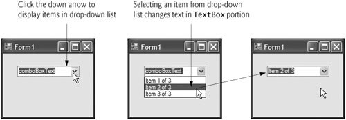
The ComboBox control combines TextBox features with a drop-down lista GUI component that contains a list from which a value can be selected. A ComboBox usually appears as a TextBox with a down arrow to its right. By default, the user can enter text into the TextBox or click the down arrow to display a list of predefined items. If a user chooses an element from this list, that element is displayed in the TextBox. If the list contains more elements than can be displayed in the drop-down list, a scrollbar appears. The maximum number of items that a drop-down list can display at one time is set by property MaxDropDownItems. Figure 14.21 shows a sample ComboBox in three different states.
Figure 14.21. ComboBox demonstration.
(This item is displayed on page 675 in the print version)
As with the ListBox control, you can add objects to collection Items programmatically, using methods Add and AddRange, or visually, with the String Collection Editor. Figure 14.22 lists common properties and a common event of class ComboBox.
|
ComboBox properties and an event |
Description |
|---|---|
|
Common Properties |
|
|
DropDownStyle |
Determines the type of ComboBox. Value Simple means that the text portion is editable, and the list portion is always visible. Value DropDown (the default) means that the text portion is editable, but the user must click an arrow button to see the list portion. Value DropDownList means that the text portion is not editable, and the user must click the arrow button to see the list portion. |
|
Items |
The collection of items in the ComboBox control. |
|
MaxDropDownItems |
Specifies the maximum number of items (between 1 and 100) that the drop-down list can display. If the number of items exceeds the maximum number of items to display, a scrollbar appears. |
|
SelectedIndex |
Returns the index of the selected item. If there is no selected item, -1 is returned. |
|
SelectedItem |
Returns a reference to the selected item. |
|
Sorted |
Indicates whether items are sorted alphabetically. Setting this property's value to true sorts the items. The default is false. |
|
Common Event |
|
|
SelectedIndexChanged |
Generated when the selected index changes (such as when a different item is selected). This is the default event when control is double clicked in the designer. |
|

Property DropDownStyle determines the type of ComboBox, and is represented as a value of the ComboBoxStyle enumeration, which contains values Simple, DropDown and DropDownList. Option Simple does not display a drop-down arrow. Instead, a scrollbar appears next to the control, allowing the user to select a choice from the list. The user also can type in a selection. Style DropDown (the default) displays a drop-down list when the down arrow is clicked (or the down-arrow key is pressed). The user can type a new item in the ComboBox. The last style is DropDownList, which displays a drop-down list but does not allow the user to type in the TextBox.
The ComboBox control has properties Items (a collection), SelectedItem and SelectedIndex, which are similar to the corresponding properties in ListBox. There can be at most one selected item in a ComboBox. If no items are selected, then SelectedIndex is -1. When the selected item changes, a SelectedIndexChanged event occurs.
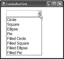
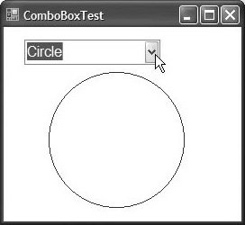
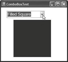
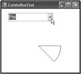
Class ComboBoxTestForm (Fig. 14.23) allows users to select a shape to drawcircle, ellipse, square or pie (in both filled and unfilled versions)by using a ComboBox. The ComboBox in this example is uneditable, so the user cannot type in the TextBox.
Figure 14.23. ComboBox used to draw a selected shape.
 1 // Fig. 14.23: ComboBoxTestForm.cs
 2 // Using ComboBox to select a shape to draw.
 3 using System;
 4 using System.Drawing;
 5 using System.Windows.Forms;
 6
 7 // Form uses a ComboBox to select different shapes to draw
 8 public partial class ComboBoxTestForm : Form
 9 {
10 // default constructor
11 public ComboBoxTestForm()
12 {
13 InitializeComponent();
14 } // end constructor
15
16 // get index of selected shape, draw shape
17 private void imageComboBox_SelectedIndexChanged(
18 object sender, EventArgs e )
19 {
20 // create graphics object, Pen and SolidBrush
21 Graphics myGraphics = base.CreateGraphics();
22
23 // create Pen using color DarkRed
24 Pen myPen = new Pen( Color.DarkRed );
25
26 // create SolidBrush using color DarkRed
27 SolidBrush mySolidBrush = new SolidBrush( Color.DarkRed );
28
29 // clear drawing area setting it to color white
30 myGraphics.Clear( Color.White );
31
32 // find index, draw proper shape
33 switch ( imageComboBox.SelectedIndex )
34 {
35 case 0: // case Circle is selected 36 myGraphics.DrawEllipse( myPen, 50, 50, 150, 150 ); 37 break; 38 case 1: // case Rectangle is selected 39 myGraphics.DrawRectangle( myPen, 50, 50, 150, 150 ); 40 break; 41 case 2: // case Ellipse is selected 42 myGraphics.DrawEllipse( myPen, 50, 85, 150, 115 ); 43 break; 44 case 3: // case Pie is selected 45 myGraphics.DrawPie( myPen, 50, 50, 150, 150, 0, 45 ); 46 break; 47 case 4: // case Filled Circle is selected 48 myGraphics.FillEllipse( mySolidBrush, 50, 50, 150, 150 ); 49 break; 50 case 5: // case Filled Rectangle is selected 51 myGraphics.FillRectangle( mySolidBrush, 50, 50, 150, 150 ); 52 break; 53 case 6: // case Filled Ellipse is selected 54 myGraphics.FillEllipse( mySolidBrush, 50, 85, 150, 115 ); 55 break; 56 case 7: // case Filled Pie is selected 57 myGraphics.FillPie( mySolidBrush, 50, 50, 150, 150, 0, 45 ); 58 break; 59 } // end switch 60 61 myGraphics.Dispose(); // release the Graphics object 62 } // end method imageComboBox_SelectedIndexChanged 63 } // end class ComboBoxTestForm
(a)
(b)
(c)
(d)
|
After creating ComboBox imageComboBox, make it uneditable by setting its DropDownStyle to DropDownList in the Properties window. Next, add items Circle, Square, Ellipse, Pie, Filled Circle, Filled Square, Filled Ellipse and Filled Pie to the Items collection using the String Collection Editor. Whenever the user selects an item from imageComboBox, a SelectedIndexChanged event occurs and event handler imageComboBox_SelectedIndexChanged (lines 1760) executes. Lines 2127 create a Graphics object, a Pen and a SolidBrush, which are used to draw on the Form. The Graphics object (line 21) allows a pen or brush to draw on a component using one of several Graphics methods. The Pen object (line 24) is used by methods DrawEllipse, DrawRectangle and DrawPie (lines 36, 39, 42 and 45) to draw the outlines of their corresponding shapes. The SolidBrush object (line 27) is used by methods FillEllipse, FillRectangle and FillPie (lines 48, 51, 54 and 57) to fill their corresponding solid shapes. Line 30 colors the entire Form White, using Graphics method Clear. These methods are discussed in greater detail in Chapter 17, .
The application draws a shape based on the selected item's index. The switch statement (lines 3359) uses imageComboBox.SelectedIndex to determine which item the user selected. Graphics method DrawEllipse (line 36) takes a Pen, the x- and y-coordinates of the center and the width and height of the ellipse to draw. The origin of the coordinate system is in the upper-left corner of the Form; the x-coordinate increases to the right, and the y-coordinate increases downward. A circle is a special case of an ellipse (with the width and height equal). Line 36 draws a circle. Line 42 draws an ellipse that has different values for width and height.
Class Graphics method DrawRectangle (line 39) takes a Pen, the x- and y-coordinates of the upper-left corner and the width and height of the rectangle to draw. Method DrawPie (line 45) draws a pie as a portion of an ellipse. The ellipse is bounded by a rectangle. Method DrawPie takes a Pen, the x- and y-coordinates of the upper-left corner of the rectangle, its width and height, the start angle (in degrees) and the sweep angle (in degrees) of the pie. Angles increase clockwise. The FillEllipse (lines 48 and 54), FillRectangle (line 51) and FillPie (line 57) methods are similar to their unfilled counterparts, except that they take a SolidBrush instead of a Pen. Some of the drawn shapes are illustrated in the screen shots of Fig. 14.23.
Preface
Index
Introduction to Computers, the Internet and Visual C#
- Introduction
- What Is a Computer?
- Computer Organization
- Early Operating Systems
- Personal Computing, Distributed Computing and Client/Server Computing
- Hardware Trends
- Microsofts Windows® Operating System
- Machine Languages, Assembly Languages and High-Level Languages
- C#
- C, C++, Java and Visual Basic
- Other High-Level Languages
- The Internet and the World Wide Web
- Extensible Markup Language (XML)
- Microsofts .NET
- The .NET Framework and the Common Language Runtime
- Test-Driving a C# Application
- Software Engineering Case Study: Introduction to Object Technology and the UML
- Wrap-Up
- Web Resources
- Summary
- Terminology
- Self-Review Exercises
- Exercises
Introduction to the Visual C# 2005 Express Edition IDE
- Introduction
- Overview of the Visual Studio 2005 IDE
- Menu Bar and Toolbar
- Navigating the Visual Studio 2005 IDE
- Using Help
- Using Visual Programming to Create a Simple Program Displaying Text and an Image
- Wrap-Up
- Web Resources
- Summary
- Terminology
- Self-Review Exercises
- Exercises
Introduction to C# Applications
- Introduction
- A Simple C# Application: Displaying a Line of Text
- Creating Your Simple Application in Visual C# Express
- Modifying Your Simple C# Application
- Formatting Text with Console.Write and Console.WriteLine
- Another C# Application: Adding Integers
- Memory Concepts
- Arithmetic
- Decision Making: Equality and Relational Operators
- (Optional) Software Engineering Case Study: Examining the ATM Requirements Document
- Wrap-Up
- Summary
- Terminology
- Self-Review Exercises
- Exercises
Introduction to Classes and Objects
- Introduction
- Classes, Objects, Methods, Properties and Instance Variables
- Declaring a Class with a Method and Instantiating an Object of a Class
- Declaring a Method with a Parameter
- Instance Variables and Properties
- UML Class Diagram with a Property
- Software Engineering with Properties and set and get Accessors
- Value Types vs. Reference Types
- Initializing Objects with Constructors
- Floating-Point Numbers and Type decimal
- (Optional) Software Engineering Case Study: Identifying the Classes in the ATM Requirements Document
- Wrap-Up
- Summary
- Terminology
- Self-Review Exercises
- Exercises
Control Statements: Part 1
- Introduction
- Algorithms
- Pseudocode
- Control Structures
- if Single-Selection Statement
- if...else Double-Selection Statement
- while Repetition Statement
- Formulating Algorithms: Counter-Controlled Repetition
- Formulating Algorithms: Sentinel-Controlled Repetition
- Formulating Algorithms: Nested Control Statements
- Compound Assignment Operators
- Increment and Decrement Operators
- Simple Types
- (Optional) Software Engineering Case Study: Identifying Class Attributes in the ATM System
- Wrap-Up
- Summary
- Terminology
- Self-Review Exercises
- Exercises
Control Statements: Part 2
- Introduction
- Essentials of Counter-Controlled Repetition
- for Repetition Statement
- Examples Using the for Statement
- do...while Repetition Statement
- switch Multiple-Selection Statement
- break and continue Statements
- Logical Operators
- Structured Programming Summary
- (Optional) Software Engineering Case Study: Identifying Objects States and Activities in the ATM System
- Wrap-Up
- Summary
- Terminology
- Self-Review Exercises
- Exercises
Methods: A Deeper Look
- Introduction
- Packaging Code in C#
- static Methods, static Variables and Class Math
- Declaring Methods with Multiple Parameters
- Notes on Declaring and Using Methods
- Method Call Stack and Activation Records
- Argument Promotion and Casting
- The Framework Class Library
- Case Study: Random-Number Generation
- Case Study: A Game of Chance (Introducing Enumerations)
- Scope of Declarations
- Method Overloading
- Recursion
- Passing Arguments: Pass-by-Value vs. Pass-by-Reference
- (Optional) Software Engineering Case Study: Identifying Class Operations in the ATM System
- Wrap-Up
- Summary
- Terminology
- Self-Review Exercises
- Exercises
Arrays
- Introduction
- Arrays
- Declaring and Creating Arrays
- Examples Using Arrays
- Case Study: Card Shuffling and Dealing Simulation
- foreach Statement
- Passing Arrays and Array Elements to Methods
- Passing Arrays by Value and by Reference
- Case Study: Class GradeBook Using an Array to Store Grades
- Multidimensional Arrays
- Case Study: Class GradeBook Using a Rectangular Array
- Variable-Length Argument Lists
- Using Command-Line Arguments
- (Optional) Software Engineering Case Study: Collaboration Among Objects in the ATM System
- Wrap-Up
- Summary
- Terminology
- Self-Review Exercises
- Exercises
- Special Section: Building Your Own Computer
Classes and Objects: A Deeper Look
- Introduction
- Time Class Case Study
- Controlling Access to Members
- Referring to the Current Objects Members with the this Reference
- Indexers
- Time Class Case Study: Overloaded Constructors
- Default and Parameterless Constructors
- Composition
- Garbage Collection and Destructors
- static Class Members
- readonly Instance Variables
- Software Reusability
- Data Abstraction and Encapsulation
- Time Class Case Study: Creating Class Libraries
- internal Access
- Class View and Object Browser
- (Optional) Software Engineering Case Study: Starting to Program the Classes of the ATM System
- Wrap-Up
- Summary
- Terminology
- Self-Review Exercises
- Exercises
Object-Oriented Programming: Inheritance
- Introduction
- Base Classes and Derived Classes
- protected Members
- Relationship between Base Classes and Derived Classes
- Constructors in Derived Classes
- Software Engineering with Inheritance
- Class object
- Wrap-Up
- Summary
- Terminology
- Self-Review Exercises
- Exercises
Polymorphism, Interfaces & Operator Overloading
- Introduction
- Polymorphism Examples
- Demonstrating Polymorphic Behavior
- Abstract Classes and Methods
- Case Study: Payroll System Using Polymorphism
- sealed Methods and Classes
- Case Study: Creating and Using Interfaces
- Operator Overloading
- (Optional) Software Engineering Case Study: Incorporating Inheritance and Polymorphism into the ATM System
- Wrap-Up
- Summary
- Terminology
- Self-Review Exercises
- Exercises
Exception Handling
- Introduction
- Exception Handling Overview
- Example: Divide by Zero Without Exception Handling
- Example: Handling DivideByZeroExceptions and FormatExceptions
- .NET Exception Hierarchy
- finally Block
- Exception Properties
- User-Defined Exception Classes
- Wrap-Up
- Summary
- Terminology
- Self-Review Exercises
- Exercises
Graphical User Interface Concepts: Part 1
- Introduction
- Windows Forms
- Event Handling
- Control Properties and Layout
- Labels, TextBoxes and Buttons
- GroupBoxes and Panels
- CheckBoxes and RadioButtons
- PictureBoxes
- ToolTips
- NumericUpDown Control
- Mouse-Event Handling
- Keyboard-Event Handling
- Wrap-Up
- Summary
- Terminology
- Self-Review Exercises
- Answers To Self-Review Exercises
- Exercises
Graphical User Interface Concepts: Part 2
- Introduction
- Menus
- MonthCalendar Control
- DateTimePicker Control
- LinkLabel Control
- ListBox Control
- CheckedListBox Control
- ComboBox Control
- TreeView Control
- ListView Control
- TabControl Control
- Multiple Document Interface (MDI) Windows
- Visual Inheritance
- User-Defined Controls
- Wrap-Up
- Summary
- Terminology
- Self-Review Exercises
- Exercises
Multithreading
- Introduction
- Thread States: Life Cycle of a Thread
- Thread Priorities and Thread Scheduling
- Creating and Executing Threads
- Thread Synchronization and Class Monitor
- Producer/Consumer Relationship without Thread Synchronization
- Producer/Consumer Relationship with Thread Synchronization
- Producer/Consumer Relationship: Circular Buffer
- Multithreading with GUIs
- Wrap-Up
- Summary
- Terminology
- Self-Review Exercises
- Exercises
Strings, Characters and Regular Expressions
- Introduction
- Fundamentals of Characters and Strings
- string Constructors
- string Indexer, Length Property and CopyTo Method
- Comparing strings
- Locating Characters and Substrings in strings
- Extracting Substrings from strings
- Concatenating strings
- Miscellaneous string Methods
- Class StringBuilder
- Length and Capacity Properties, EnsureCapacity Method and Indexer of Class StringBuilder
- Append and AppendFormat Methods of Class StringBuilder
- Insert, Remove and Replace Methods of Class StringBuilder
- Char Methods
- Card Shuffling and Dealing Simulation
- Regular Expressions and Class Regex
- Wrap-Up
- Summary
- Terminology
- Self-Review Exercises
- Exercises
Graphics and Multimedia
- Introduction
- Drawing Classes and the Coordinate System
- Graphics Contexts and Graphics Objects
- Color Control
- Font Control
- Drawing Lines, Rectangles and Ovals
- Drawing Arcs
- Drawing Polygons and Polylines
- Advanced Graphics Capabilities
- Introduction to Multimedia
- Loading, Displaying and Scaling Images
- Animating a Series of Images
- Windows Media Player
- Microsoft Agent
- Wrap-Up
- Summary
- Terminology
- Self-Review Exercises
- Exercises
Files and Streams
- Introduction
- Data Hierarchy
- Files and Streams
- Classes File and Directory
- Creating a Sequential-Access Text File
- Reading Data from a Sequential-Access Text File
- Serialization
- Creating a Sequential-Access File Using Object Serialization
- Reading and Deserializing Data from a Sequential-Access Text File
- Wrap-Up
- Summary
- Terminology
- Self-Review Exercises
- Exercises
Extensible Markup Language (XML)
- Introduction
- XML Basics
- Structuring Data
- XML Namespaces
- Document Type Definitions (DTDs)
- W3C XML Schema Documents
- (Optional) Extensible Stylesheet Language and XSL Transformations
- (Optional) Document Object Model (DOM)
- (Optional) Schema Validation with Class XmlReader
- (Optional) XSLT with Class XslCompiledTransform
- Wrap-Up
- Web Resources
- Summary
- Terminology
- Self-Review Exercises
- Exercises
Database, SQL and ADO.NET
- Introduction
- Relational Databases
- Relational Database Overview: Books Database
- SQL
- ADO.NET Object Model
- Programming with ADO.NET: Extracting Information from a Database
- Querying the Books Database
- Programming with ADO.NET: Address Book Case Study
- Using a DataSet to Read and Write XML
- Wrap-Up
- Web Resources
- Summary
- Terminology
- Self-Review Exercises
- Exercises
ASP.NET 2.0, Web Forms and Web Controls
- Introduction
- Simple HTTP Transactions
- Multitier Application Architecture
- Creating and Running a Simple Web-Form Example
- Web Controls
- Session Tracking
- Case Study: Connecting to a Database in ASP.NET
- Case Study: Secure Books Database Application
- Wrap-Up
- Web Resources
- Summary
- Terminology
- Self-Review Exercises
- Exercises
Web Services
- Introduction
- .NET Web Services Basics
- Simple Object Access Protocol (SOAP)
- Publishing and Consuming Web Services
- Session Tracking in Web Services
- Using Web Forms and Web Services
- User-Defined Types in Web Services
- Wrap-Up
- Web Resources
- Summary
- Terminology
- Self-Review Exercises
- Exercises
Networking: Streams-Based Sockets and Datagrams
- Introduction
- Connection-Oriented vs. Connectionless Communication
- Protocols for Transporting Data
- Establishing a Simple TCP Server (Using Stream Sockets)
- Establishing a Simple TCP Client (Using Stream Sockets)
- Client/Server Interaction with Stream-Socket Connections
- Connectionless Client/Server Interaction with Datagrams
- Client/Server Tic-Tac-Toe Using a Multithreaded Server
- WebBrowser Control
- .NET Remoting
- Wrap-Up
- Summary
- Terminology
- Self-Review Exercises
- Exercises
Searching and Sorting
- Introduction
- Searching Algorithms
- Sorting Algorithms
- Wrap-Up
- Summary
- Terminology
- Self-Review Exercises
- Exercises
Data Structures
- Introduction
- Simple-Type structs, Boxing and Unboxing
- Self-Referential Classes
- Linked Lists
- Stacks
- Queues
- Trees
- Wrap-Up
- Summary
- Terminology
- Self-Review Exercises
- Exercises
Generics
- Introduction
- Motivation for Generic Methods
- Generic Method Implementation
- Type Constraints
- Overloading Generic Methods
- Generic Classes
- Notes on Generics and Inheritance
- Wrap-Up
- Summary
- Terminology
- Self-Review Exercises
- Exercises
Collections
- Introduction
- Collections Overview
- Class Array and Enumerators
- Non-Generic Collections
- Generic Collections
- Synchronized Collections
- Wrap-Up
- Summary
- Terminology
- Self-Review Exercises
- Exercises
Appendix A. Operator Precedence Chart
Appendix B. Number Systems
- B.1. Introduction
- B.2. Abbreviating Binary Numbers as Octal and Hexadecimal Numbers
- B.3. Converting Octal and Hexadecimal Numbers to Binary Numbers
- B.4. Converting from Binary, Octal or Hexadecimal to Decimal
- B.5. Converting from Decimal to Binary, Octal or Hexadecimal
- B.6. Negative Binary Numbers: Twos Complement Notation
- Summary
- Terminology
- Self-Review Exercises
- Exercises
Appendix C. Using the Visual Studio 2005 Debugger
- C.1. Introduction
- C.2. Breakpoints and the Continue Command
- C.3. The Locals and Watch Windows
- C.4. Controlling Execution Using the Step Into, Step Over, Step Out and Continue Commands
- C.5. Other Features
- C.6. Wrap-Up
- Summary
- Terminology
- Self-Review Exercises
Appendix D. ASCII Character Set
Appendix E. Unicode®
- E.1. Introduction
- E.2. Unicode Transformation Formats
- E.3. Characters and Glyphs
- E.4. Advantages/Disadvantages of Unicode
- E.5. Using Unicode
- E.6. Character Ranges
- Summary
- Terminology
- Self-Review Exercises
- Answers to Self-Review exercises
- Exercises
Appendix F. Introduction to XHTML: Part 1
- F.1. Introduction
- F.2. Editing XHTML
- F.3. First XHTML Example
- F.4. W3C XHTML Validation Service
- F.5. Headers
- F.6. Linking
- F.7. Images
- F.8. Special Characters and More Line Breaks
- F.9. Unordered Lists
- F.10. Nested and Ordered Lists
- F.11. Web Resources
Appendix G. Introduction to XHTML: Part 2
- G.1. Introduction
- G.2. Basic XHTML Tables
- G.3. Intermediate XHTML Tables and Formatting
- G.4. Basic XHTML Forms
- G.5. More Complex XHTML Forms
- G.6. Internal Linking
- G.7. Creating and Using Image Maps
- G.8. meta Elements
- G.9. frameset Element
- G.10. Nested framesets
- G.11. Web Resources
Appendix H. HTML/XHTML Special Characters
Appendix I. HTML/XHTML Colors
Appendix J. ATM Case Study Code
- Appendix J. ATM Case Study Code
- J.1. ATM Case Study Implementation
- J.2. Class ATM
- J.3. Class Screen
- J.4. Class Keypad
- J.5. Class CashDispenser
- J.6. Class DepositSlot
- J.7. Class Account
- J.8. Class BankDatabase
- J.9. Class Transaction
- J.10. Class BalanceInquiry
- J.11. Class Withdrawal
- J.12. Class Deposit
- J.13. Class ATMCaseStudy
- J.14. Wrap-Up
Appendix K. UML 2: Additional Diagram Types
Appendix L. Simple Types
Index
EAN: 2147483647
Pages: 600
- Assessing Business-IT Alignment Maturity
- Linking the IT Balanced Scorecard to the Business Objectives at a Major Canadian Financial Group
- A View on Knowledge Management: Utilizing a Balanced Scorecard Methodology for Analyzing Knowledge Metrics
- Governance in IT Outsourcing Partnerships
- The Evolution of IT Governance at NB Power
