Adding Field Controls to Layouts
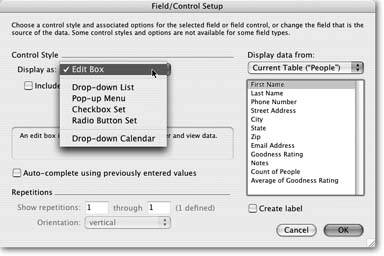
Plain old edit boxes are as popular as they are flexible. They're the kind of field that FileMaker automatically creates when you start a new database or use the field tool to drag a field onto a layout. Maybe a little too flexible: Just about anyone using your database can type just about anything into an edit box. If you're trying to collect specific bits of information, though, you could apply some validation (Section 3.3.1.8). Or for even more, well…control over what your database's users put in a field choose Format images/U2192.jpg border=0> Field/Control
images/U2192.jpg border=0> Setup. In that dialog box, you find drop-down menus, pop-up lists, checkboxes, radio buttons, and pop-up calendarsjust like the ones the pros use in databases and Web sites worldwide.
Figure 6-5 shows the Field/Control Setup dialog box, including the list of available formatting options.
|
6.2.1. Edit Box
Most of the fields you've used so far have been Edit Boxes. These are the click and type variety that normal people call a text box. Distinctive as always, FileMaker has its own moniker.
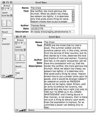
When you select the Edit Box format, you have the choice of turning on the "Include vertical scroll bar" checkbox. You saw this option when you added a scroll bar to the Notes field on Section 4.4.8. If you anticipate that a field will hold lots of information, a scroll bar can be a good idea, as Figure 6-6 shows.
6.2.2. Drop-Down List
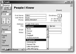
This field type looks just like an Edit Box. But when you click into the field, a list of available choices appears just below it (Figure 6-7).
The items in the list come from a value list (Section 3.4). When you pick the Drop-down List type, you get a "Display values from" pop-up menu. From this menu, choose the value list to use. You can also choose Define Value Lists to create a new one.
|
|
Tip: If you don't apply borders to a Drop-down List, the show/hide arrow only appears when the field is active. Add field borders (Section 4.4.8) to make the arrow a better visual cue.
| UP TO SPEED Drop Down, Pop Up, Turn On |
|
You may wonder how a Drop-down List differs from a Pop-up Menu. They're similar in purpose, but have three differences:
|
Drop-down Lists look just like Edit Boxes until you click them or tab into the field. Then the list drops down for your data entry pleasure. But it could get annoying to have lists flashing at you just because you happen to be tabbing through the data in a record, so FileMaker lets you stop the list waving by choosing "Include arrow to show and hide list." Now the list is a little more polite. When the field is active, the list doesn't drop down until you click the arrow. If you make a choice from the list, the list disappears. Or, if you don't want to enter anything into the field after all, just click the arrow and the list goes back home.
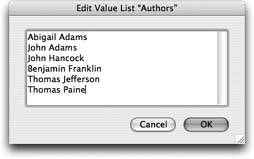
Finally, turn on "Include 'Edit…' item to allow editing of value list" if you want your users to be able to easily modify the list of choices. When folks choose "Edit…" (always the last item in the list), the window in Figure 6-8 shows up so they can modify the value list.
|
6.2.3. Pop-up Menu
When you format a field as a Pop-up Menu, the look changes significantly, as shown in Figure 6-9. Rather than type into the field, your users must click the menu and make a choice.
|
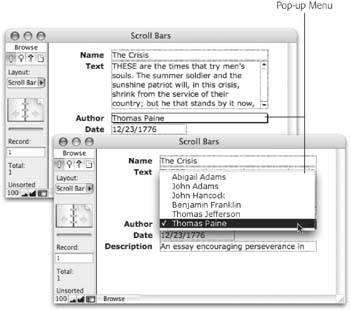
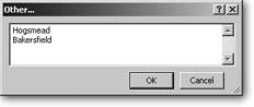
Like Drop-down Lists, Pop-up Menus let mere mortals edit value lists, plus they up the ante by including an Other item. When your users pick "Other…" from the menu, they see the window in Figure 6-10. Entering a value in this window puts it in the field but doesn't add it to the value list. Turn on "Include 'Other…' item to allow entry of other values" to grant this power to the masses. (See the box on Section 6.2.4 for advice on the ramifications of letting your users to edit or bypass your carefully crafted value lists.)
|
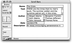
6.2.4. Checkbox Set
Figure 6-11 shows a field formatted as a Checkbox Set. With this format, database users can simply click each item to turn it on or off. As they do, the data in the field changes to reflect the checked items.
|
| UP TO SPEED A Cautionary Tale |
|
Not even the most highly paid database developer can think of everything folks might want to enter in a database, and a Drop-down List with a handy edit option seems an obvious solution. But use it with caution. When some villainous or misguided soul chooses Edit, they're doing just that: editing your value list and potentially defeating the purpose for which you created it. Further more, if other fields in your database are formatted to use the same value list, their list of choices changes too, because the underlying value list itself has changed. So remember that value-list-based fields serve two purposes: simplicity and consistency. If you make it easy for folks to add their own items to a value list, you're also making it easy for the value list to get inconsistent and disorganized. Adding an Other item can undermine consistency even more, because it encourages quick-handed mousers to simply bypass the value list entirely. If the primary purpose of your value list is to gain consistency, you should consider leaving the Edit and Other options turned off. You can always add new choices to the value list yourself at any time as the need arises. |
Checkbox sets can include the Other item, just like a Drop-down List (Section 6.2.1). If someone enters a value that isn't in the value list, FileMaker just turns on the Other checkbox to indicate the field has something more in it.
| WORKAROUND WORKSHOP Taming the Wild Value List |
|
If your value list comes from a field index (Section 3.3.4.2), you can't select the "Include 'Edit' item to allow editing of value list." But like so many things in FileMaker, there's a way or two around that little roadblock. The value list you saw in Chapter 3 was from an index of the field itself. Therefore, the index was a record of one instance of every value that's used in the record throughout the database. But if you click the field after the list has dropped down, you can type a new value into the field. It appears in the value list the next time you select it. But if you make a value list that comes from another field (either in another table in your database (see Section 6.1.2) or from another file, it's a little trickier. This value list is still from a field's index, but it's not from the field you're currently working in. They can still click through the list and type an entry that's not on the value list, but in this case, your users don't change the value list itself. To change the value list, they have to add records or edit the data in the other field. |
6.2.5. Radio Button Set
A Radio Button Set (Figure 6-12) works much like a Checkbox Set. The only distinction is that your users can turn on only one item. If they try to turn another item on, FileMaker turns off items as necessary.
|
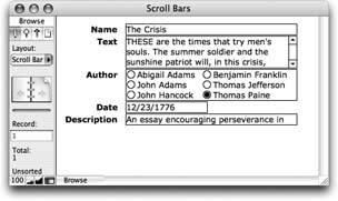
Warning: Some users know they can shift-click to select multiple items in a radio button set. See Section 10.3.3.4 to learn how calculations can control these users' urge to get around the system.
Just as with Drop-down Lists and Checkbox Sets, you can add an Other or Edit item to the Radio Button Set. (See the box on Section 6.2.4 for more detail.)
| GEM IN THE ROUGH Checkboxes Behind the Scenes |
|
The beauty of Checkbox Set fields is that they let folks click more than one checkbox. In other words, you can capture several values in one easy-to-use field. This method comes in handy when the things you're tracking in your database have fields like Available Sizes, Available Colors, Warehouses, or any other attribute of the one or more variety. But wait, you sayhow can a single field hold more than one value? Simple, if you're FileMaker. Just give each checkbox its own line. In other words, if you have a Checkbox Set showing colors, and you turn on Red, Green, and Blue, FileMaker actually thinks of the field like this: Red Green Blue You can show the same field on another layoutor even the same layout if you wantwithout the checkbox formatting. If you do, you see the selected items: one on each line. This is called a "return-separated list". If you change what's in the field without using the checkboxes, you could end up with lines that don't match any of the value list items. In that case, the Checkbox Set turns on its Other item if it has one. (If not, the extra items simply don't show at all.) A final note: Because Checkbox Sets need to be able to put several lines in the field, they're really suitable only for text fields. Other field types don't support multiline values. |
6.2.6. Drop-down Calendar
In FileMaker, you can easily read date fields, and easily set them up. But actually typing dates into them is notoriously tricky. If you don't get just the right combination of numbers and separators, FileMaker gets all huffy and tells you the value you've just typed isn't valid. And if somebody swipes your desk calendar, how are you supposed to know what numbers to type in the first place? FileMaker Pro 8 can handle both these problems. It lets you give your date fields a nifty drop-down calendar where anyone can simply point and click to enter a date.
When you first format a field with a drop-down calendar, FileMaker doesn't give you any visual feedback letting you know a calendar's lurking there, waiting to drop down when you tab into the field. If you want to provide a visual clue, select "Include icon to show and hide calendar." Then you see a teeny, tiny calendar at the right side of your field (see Figure 6-13). Tiny as it is, the calendar icon still takes up some room, so you might have to make the field a little wider to display the entire date plus the new icon.
Tip: Like the show/hide arrow on Drop-down Lists, the calendar icon shows up in an inactive field only if the field has a border. If you're a minimalist on the field border issue, you can format your field with only a right border to force the icon to appear.
The calendar itself is a little dynamo. To enter a date, click the Month Year display at the top and you see a pop-up menu that lets you jump to a specific month in the current calendar year.
|
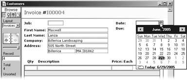
Right-click anywhere on the calendar ( -click on the Mac), and the pop-up menu changes to read "Go to today." The calendar closes and plunks the current date into the field.
You can also change the month with the right and left arrows at either side. The left arrow icon moves you backward in time (careful, don't touch anything or you could change the course of human history!) and the right one moves you forward. The up and down arrow icons change the display of years. Finally, you can move the highlighted date with your keyboard's arrow keys. Tap the down arrow key a few times and you see how fast time flies.
But if you get carried away playing the controls (is my birthday on a Friday in 2015?), the calendar's footer always displays the current date. Just click that display to enter the current date, then drop the calendar down again. It reorients to today's date.
6.2.7. Auto-Complete
Auto-complete is a strong ally both for database designers who care about data consistency and for data entry folk who hate to type. Unlike the other Field/Control field styles, you can apply this little beauty to a regular Edit Box. Once you've turned on the option to "Auto-complete using previously entered values," the field gets ESP and tries to figure out what you want to enter. Where do these super-human powers come from? From that old friend, the field's index (Section 3.3.4.2).
But Auto-complete behaves a little differently on Edit Boxes than it does on Drop-down Lists.
| UP TO SPEED When Is Auto-Complete Not Useful? |
|
With such a cool feature, one that seems to know what people want to type before they do, you may be tempted to add auto-complete powers to most of your fields. But there are cases when it just isn't very helpful. Auto-complete depends on the index (Section 3.3.4.2) to know what to show in its list. There has to be data in at least one field for FileMaker to have any entries in the index. And indexes add a lot of size to your files, so if you index a lot of fields so that Auto-complete works, you may find that the file size balloons. Remember, this feature comes with all of indexing's dark sides as a tradeoff for its power. Another weakness: When someone types a letter that's not used muchlike X, J, or ZAuto-complete may not produce a Drop-down List. This lack of a list doesn't mean Auto-complete's broken. It just means the index doesn't have any entries beginning with that letter. The index saves no time in such cases. Auto-complete works best in larger databases where there are lots of records. And it's usually most effective if the records have a fairly wide range of data in them. For example, if a field is going to have only a few possible values (G, PG, PG-13, R, NC-17) then a drop-down menu or a pop-up list is a better choice than an Auto-complete Edit Box. None of these cautions means that you shouldn't use Auto-complete. Just be aware of its limitations and the overhead it places on your file. |
The differences are discussed in the following sections.
6.2.7.1. Auto-Complete in Edit Boxes
When you start typing into an Edit Box formatted with the Auto-complete option, FileMaker scans the field's index and drops down a list of matching entries. If you type T, for example, you see a list of entries that begin with the letter T. If you type R next, the list shortens to only words beginning with "TR." Once the list is short enough for you to find what you want, just click the list item to select it.
The Auto-complete list behaves just like a regular Drop-down List, so if you prefer you can highlight items with arrow keys and then press Enter.
Note: If there's only one item beginning with "Tr," the list's behavior can be confusing. It shortens to a single item and looks like the item's already in the field. You still have to click the item, or hit Tab or Enter, to complete the data entry, though.
6.2.7.2. Auto-Complete in Drop-down Lists
When you want to use Auto-complete in conjunction with a Drop-down List, you'll also need to specify a value list from which Auto-complete will draw its suggested entries.
| WORKAROUND WORKSHOP One or Many? |
|
Strange as it sounds, Pop-up Menus and radio buttons both allow multiple selections, just like Checkbox Sets. Just hold down the Shift key while you select an item, and FileMaker dutifully turns it on without turning off the item that's already selected. Handy though it may be, however, chances are you don't want anyone to use this trick and choose more than one valueotherwise you use check-boxes to make it obvious that multiple choices are desirable. Unfortunately, there's no direct way to turn this feature off. If you want to prevent your users from picking too many items, you have to get creative. Here's one way of doing so: Chapter 3 introduced you to Auto-Enter calculations (Section 3.3.1.5). They let you automatically change the value in a field, based on a calculation. You'll learn all about calculations in Part 4, so for now you just have to have some blind faith. 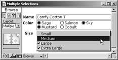
Here's how to limit your fields to a single value:
You're back in your database. Now if you try to Shift-click a second item, FileMaker immediately throws it out. In practice, it looks like it simply doesn't let you Shift-click. |
Use an existing value list or define a specific list just for Auto-complete. Just as with regular field entry, you can use a value list from:
- The field you're formatting with Auto-complete
- Another field in the same table.
- A field in a different table with the same file
- A field in another file
- A custom list
Remember, value lists based on fields depend on the field's index, but custom lists don't.
When you click into an Auto-complete Drop-down List that's formatted with a show/hide arrow, the list doesn't appear until you click the arrow or pres the Esc key. If you want the list to display as soon as the field is entered, then don't select the "Include arrow to show and hide list" option.
Note: Auto-complete works only with Edit boxes and Drop-down lists, so you'll have to stick with these two field controls to use that feature.
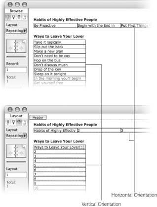
6.2.8. Repetitions
On Section 3.3.4.2, you learned about repeating fields, which let you put several values in one field, with a separate Edit Box for each value. Remember, when you put a repeating field on a layout, you get to decide how many times it shows up. Even if a field has 200 repetitions, you don't have to show them all on the layout. You can elect to show just the first ten. Or just the last ten. Or numbers 37 through 118.
To control how repeating fields display, you use the same Field Format dialog box shown in Figure 6-5. This time, focus your attention at the bottom of this dialog box under Repetitions. Just enter the first repetition you want in the "Show repetitions" box, and the last one in the "through" box. You can't show noncontiguous repetitions hereyou have to pick a range with one beginning and one end. But try this technique instead. Put multiple copies of the field on the layout, but specify that each copy displays a different range of repeats. You'll get much the same effect.
Note: If the "Show repetitions" and "through" options are grayed out, it probably means you didn't have a repeating field selected when you chose the Format  Field Format command.
Say your layout has a series of similar fieldsEmail, Mail, and Phoneeach of which indicates whether or not you have permission to contact a customer using that method. You format the Email field with a nice pop-up control and a value list with the custom values of Yes and No. You shorten it to just the right width and apply beautiful font formatting. Now, select Mail and Phone in turn and give them the same controls and text formatting. But that would take forevertwice!
|
Instead, do the following: Delete the Mail and Phone fields, then copy the Email field, and paste it where the Mail field used to be. Next, use the Field/Control Setup dialog box to tell the duplicated Email field to display data from Mail instead. Paste again, change this copy to display data from the Phone field, and with a few quick clicks, you're done. You've just borrowed the formatting from one field to display the information from another. The moral of the story: Use "Display data from" to avoid doing work you've already done.
Part I: Introduction to FileMaker Pro
Your First Database
- Your First Database
- An Very Quick Database Tour
- Creating a New Database
- Opening and Closing Database Files
- Saving Your Databases
- Adding Records to Your Database
- Navigating Your Database
- Same Database, Multiple Windows
Organizing and Editing Records
- Organizing and Editing Records
- Views
- Advanced Find Mode
- Changing Multiple Records
- Sorting Records
- Editing Whats in Your Fields
- Paragraph Formatting
- Beyond Text: Container Fields
- Checking Spelling
- Printing and Preview Mode
Building a New Database
- Building a New Database
- Tables and Fields
- Defining Fields
- Advanced Field Options
- Bringing It All Together
Part II: Layout Basics
Layout Basics
Creating Layouts
Advanced Layouts and Reports
- Advanced Layouts and Reports
- Setting up Field Controls
- Adding Field Controls to Layouts
- Field Behavior
- Tab Order
- Print-Related Layout Options
- Format the Number/Date/Time/Graphic
- Adding Buttons
- Tab Panels
- Reports and Summary Fields
Part III: Multiple Tables and Relationships
Multiple Tables and Relationships
- Multiple Tables and Relationships
- Relational Databases Explained
- Modeling Your Database
- Creating a Relational Database
- Relational Databases
Advanced Relationship Techniques
- Advanced Relationship Techniques
- Creating Related Records
- Table Occurrences
- Managing Data with Data Tunneling
- Building a Data Tunneling Interface
- Connecting Databases
- Lookups
- Advanced Relationships
Part IV: Calculations
Introduction to Calculations
- Introduction to Calculations
- Understanding Calculations
- The Structure of a Calculation
- Creating a Calculation Field
- Auto-Enter Calculations
- Validate Data Entry with a Calculation
- Replacing Data Using a Calculation
- Comments
Calculations and Data Types
- Calculations and Data Types
- Number Crunching Calculations
- Going Beyond Basic Calculations
- Text Parsing Calculations
- Date and Time Calculations
- Containers in Calculations
Advanced Calculations
- Advanced Calculations
- Stored, Unstored, and Global Fields
- Logical Functions
- The Let Function and Variables
Extending Calculations
Part V: Scripting
Scripting Basics
- Scripting Basics
- Your First Script
- The Importance of the Layout
- Running Scripts
- Branching and Looping in Scripts
Script Steps
- Script Steps
- Go to Layout
- Scripting for Fields
- Working with Records
- Finding Records
- Sorting Records
- Working with Windows
- Working with Files
- Printing
- Other Script Steps
Advanced Scripting
- Advanced Scripting
- Commenting Scripts
- Asking and Telling the User
- Organizing Complex Scripts
- Handling Errors
- Putting a Complex Script Together
Part VI: Security and Integration
Security
Exporting and Importing
- Exporting and Importing
- Exporting a File
- Export Formats
- Importing Data
- Import Data Sources
- Importing and Exporting in a Script
Sharing Your Database
- Sharing Your Database
- FileMaker Network Sharing
- Sharing Over the Internet
- FileMaker Server
- Server Hardware
Developer Utilities
- Developer Utilities
- Script Debugger
- Disable Script Steps
- The Database Design Report
- Tooltips
- Copying Database Structure
- Custom Menus
- Developer Utilities
- File Maintenance
Part VII: Appendixes
Appendix A. Getting Help
EAN: 2147483647
Pages: 176
- Challenging the Unpredictable: Changeable Order Management Systems
- ERP System Acquisition: A Process Model and Results From an Austrian Survey
- The Second Wave ERP Market: An Australian Viewpoint
- Context Management of ERP Processes in Virtual Communities
- Development of Interactive Web Sites to Enhance Police/Community Relations
