Control Chart
The control chart is a powerful tool for achieving statistical process control (SPC). However, in software development it is difficult to use control charts in the formal SPC manner. It is a formidable task, if not impossible , to define the process capability of a software development process. In production environments, process capability is the inherent variation of the process in relation to the specification limits. The smaller the process variation, the better the process's capability. Defective parts are parts that are produced with values of parameters outside the specification limits. Therefore, direct relationships exist among specifications, process control limits, process variations, and product quality. The smaller the process variations, the better the product quality will be. Such direct correlations , however, do not exist or at least have not been established in the software development environment.
In statistical terms, process capability is defined:
where USL and LSL are the upper and lower engineering specification limits, respectively, sigma is the standard deviation of the process, and 6 sigma represents the overall process variation.
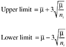
If a unilateral specification is affixed to some characteristics, the capability index may be defined:

where u is the process mean, or

In manufacturing environments where many parts are produced daily, process variation and process capability can be calculated in statistical terms and control charts can be used on a real-time basis. Software differs from manufacturing in several aspects and such differences make it very difficult, if not impossible, to arrive at useful estimates of the process capability of a software development organization. The difficulties include:
- Specifications for most defined metrics are nonexistent or poorly related to real customer needs. Well-defined specifications based on customer requirements that can be expressed in terms of metrics are lacking for practically all software projects (more accurately, they are extremely difficult to derive).
- Software is design and development, not production, and it takes various phases of activity (architecture, design, code, test, etc.) and considerable time to complete one project. Therefore, the life-cycle concept is more applicable to software than control charts, which are more applicable to sequential data from ongoing operations.
- Related to the above, metrics and models specific to software and the life-cycle concept have been and are still being developed (e.g., software reliability models, defect removal models, and various in-process metrics) and they are going through the maturing process. These models and metrics seem to be more effective than control charts for interpreting the software patterns and for product quality management.
- Even with the same development process, there are multiple common causes (e.g., tools, methods , types of software, types of components , types of program modules) that lead to variations in quality. The typical use of control charts in software projects regularly mix data from multiple common cause systems.
- There are also the behavioral aspects of process implementation (e.g., skills, experience, rigor of process implementation) that cause variations in the quality of the product (Layman et al., 2002).
- Many assumptions that underlie control charts are not being met in software data. Perhaps the most critical one is that data variation is from homogeneous sources of variation; this critical assumption is not usually met because of the aforementioned factors. Therefore, even with exact formulas and the most suitable type of control charts, the resultant control limits are not always useful. For instance, the control limits in software applications are often too wide to be useful.
- Within a software development organization, multiple processes are often used, and technology and processes change fast.
- Even when a process parameter is under control in the sense of control charts, without the direct connection between process limits and end-product quality, what does it mean in terms of process capability?
Despite these issues, control charts are useful for software process improvement ” when they are used in a relaxed manner. That means that control chart use in software is not in terms of formal statistical process control and process capability. Rather, they are used as tools for improving consistency and stability. On many occasions, they are not used on a real-time basis for ongoing operations. They are more appropriately called pseudo-control charts.
There are many types of control chart. The most common are the X -bar and S charts for sample averages and standard deviations, and the X -bar and R charts for sample averages and sample ranges. There are also median charts, charts for individuals, the p chart for proportion nonconforming , the np chart for number nonconforming, the c chart for number of nonconformities , the u chart for nonconformities per unit, and so forth. For X -bar and S charts or X -bar and R charts, the assumption of the statistical distribution of the quality characteristic is the normal distribution. For the p and the np charts, the assumption of statistical distribution is the binomial distribution. For the c and the u charts, it is assumed that the distribution of the quality characteristic is the Poisson distribution. For details, see a text in statistical quality control (e.g., Montgomery (1985)).
The most approximate charts for software applications are perhaps the p chart, when percentages are involved, and the u chart, when defect rates are used. The control limits are calculated as the value of the parameter of interest ( X -bar or p , for example) plus/minus three standard deviations. One can also increase the sensitivity of the chart by adding a pair of warning limits, which are normally calculated as the value of the parameter plus/minus two standard deviations. As the calculation of standard deviations differs among types of parameters, the formulas for control limits (and warning limits) also differ .
For example, control limits for defect rates ( u chart) can be calculated as follows :
where  , value for the center line, is the cumulative defect rate (weighted average of defect rates) across the subgroups, and n i is the size of subgroup i for the calculation of defect rate (e.g., the number of lines of source code or the number of function points). Usually the subgroups used as the unit for calculating and controlling defect rates could be program modules, components, design review sessions of similar length in time, design segments, code segments for inspections, and units of document reviews. Note that in the formula, n i is the subgroup size and therefore the control limits are calculated for each sample. Therefore the control limits will be different for each data point (subgroup) in the control chart. The second approach is to base the control chart on an average sample size, resulting in an approximate set of control limits. This requires the assumption that future sample size (subgroup size) will not differ greatly from those previously observed . If this approach is used, the control limits will be constant and the resulting control chart will not look as complex as the control chart with variable limits (Montgomery, 1985). However, if the sample sizes vary greatly, the first approach should be used.
Control limits for percentages (e.g., effectiveness metric) can be calculated as follows:
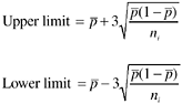
where  , the center line, is the weighted average of individual percentages and n i is the size of subgroup i . Like the m chart, either the approach for variable control limits or the approach for constant control limits (provided the sample sizes don't vary greatly) can be used. If the true value of p is known, or is specified by management (e.g., a specific target of defect removal effectiveness), then p should be used in the formulas, instead of .
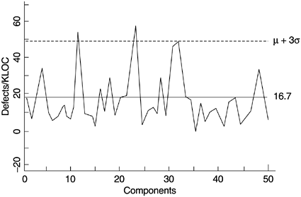
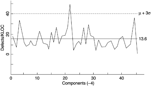
Some examples of metrics from the software development process can be control charted, for instance, inspection defects per thousand lines of source code (KLOC) or function point, testing defects per KLOC or function point, phase effectiveness, and defect backlog management index (as discussed in Chapter 4). Figure 5.12 shows a pseudo-control chart on testing defects per KLOC by component for a project at IBM Rochester, from which error-prone components were identified for further in-depth analysis and actions. In this case, the use of the control chart involved more than one iteration. In the first iteration, components with defect rates outside the control limits (particularly high) were identified. (It should be noted that in this example the control chart is one-sided with only the upper control limit.)
Figure 5.12. Pseudo-Control Chart of Test Defect Rate ”First Iteration
In the second iteration, the previously identified error-prone components were removed and the data were plotted again, with a new control limit (Figure 5.13). This process of "peeling the onion" permitted the identification of the next set of potentially defect-prone components, some of which may have been masked on the initial charts. This process can continue for a few iterations. Priority of improvement actions as they relate to available resources can also be determined based on the order of iteration in which problem components are identified (Craddock, 1988). At each iteration, the out-of-control points should be removed from the analysis only when their causes have been understood and plans put in place to prevent their recurrence .
Figure 5.13. Pseudo-Control Chart of Test Defect Rate ”Second Iteration
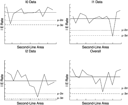
Another example, also from IBM Rochester, is charting the inspection effectiveness by area for the several phases of reviews and inspections, as shown in Figure 5.14. Effectiveness is a relative measure in percentage, with the numerator being the number of defects removed in a development phase and the denominator the total number of defects found in that phase, plus defects found later (for detailed discussion on this subject, see Chapter 6). In the figure, each data point represents the inspection effectiveness of a functional development area. The four panels represent high-level design review (I0), low-level design review (I1), code inspection (I2), and overall effectiveness combining all three phases (lower right). Areas with low effectiveness (below the warning and control limits) as well as those with the highest effectiveness were studied and contributing factors identified. As a result of this control charting and subsequent work, the consistency of the inspection effectiveness across the functional areas was improved.
Figure 5.14. Pseudo-Control Chart of Inspection Effectiveness
In recent years , control charts in software applications have attracted attention. The importance of using quantitative metrics in managing software development is certainly more recognized now than previously. A related reason may be the promotion of quantitative management by the capability maturity model (CMM) of the Software Engineering Institute (SEI) at the Carnegie Mellon University. The concept and terminology of control charts are very appealing to software process improvement professionals. A quick survey of the examples of control chart applications in software in the literature, however, supported and confirmed the challenges discussed earlier. For instance, many of the control limits in the examples were too wide to be useful. For such cases, simple run charts with common sense for decision making would be more useful and control charts might not be needed. There were also cases with a one-sided control limit or a lower control limit close to zero. Both types of cases were likely due to problems related to multiple common causes and sample size. The multiple common cause challenge was discussed earlier. With regard to sample size, again, a production environment with ongoing operations is more able to meet the challenge. The subgroup sample size can be chosen according to statistical considerations in a production environment, such as specifying a sample large enough to ensure a positive lower control limit. In software environments, however, other factors often prohibit operations that are based on statistical considerations. At the same time, it is positive that experts have recognized the problems, begun identifying the specific issues, started the discussions, and embarked on the process of mapping possible solutions (e.g., Layman et al., 2002).
To make control charts more applicable and acceptable in the software environment, a high degree of ingenuity is required. Focused effort in the following three areas by experts of control charts and by software process improvement practitioners will yield fruitful results:
- The control chart applications in software thus far are the Shewhart control charts. Alternative techniques that could be more applicable to software parameters need to be examined, experimented with, and applied. New techniques may even need to be developed. For example, the cusum (cumulative sum) control chart was developed in the 1950s as an alternative to the Shewhart approach when a small but meaningful change needs to be detected as quickly as possible (Burr and Owen, 1996; Montgomery, 1985). The cusum technique incorporates all of the information in the sequence of sample values by plotting the cumulative sums of the deviations of the sample values from a target value. It is therefore more sensitive to detect differences. The cusum control charts are used in the semiconductor industry. Would they be more applicable than the traditional control charts to the behaviors of some key parameters in software? Is cusum suitable for cases in which the process target is not a constant (e.g., a model curve)? Can control charts be applied to the S-curve type of situations that are rather common in software development (e.g., the testing progress S curves and the defect density curves that are modeled by software reliability models)? Are there better alternatives? Questions like these are important topics that need further methodology research and empirical studies.
- Even the basic premise of using the 3-sigma control limits deserves a closer look. Our experience is that even for control charts that are free of problems related to multiple common causes, the 3-sigma control limits are too wide to be useful in software. Judging from some examples in the literature and personal experience, experienced practitioners would have taken actions long before the value of the metric reached the control limits. In general practice, we recommend using warning limits (such as those in Figure 5.14) in addition to control limits, and other criteria that are available in the control chart literature. When control limits are set based on larger sigma values, the risk of false alarm decreases but the control chart becomes less sensitive. On the other hand, when control limits are narrower, the control chart has more power to detect differences but the risk of false alarms becomes higher. There is a need to establish a correlation between the width of control limits and practical experiences based on empirical studies. It will be interesting to conduct experiments with a group of software quality management practitioners, who are experienced in using metrics for project management, to gauge the criteria (or thresholds) for their decision making. The subjects can be asked to assess a group of trend charts with varying degrees of deviation from the targets and to indicate at what level of deviation the cases will become alarming to them. Then control chart techniques can be applied to those charts to derive the control limits and warning limits. The control chart limits then can be correlated with the threshold values of the practitioners.
- For software process improvement practitioners, the challenge is to select and develop meaningful process or quality parameters when control charts are to be used. As a hypothetical example, control charting the backlog of opened problems during the final phase of testing of the software (e.g., system test) may not be a meaningful undertaking if some or all of the following conditions are true:
- Problem backlog is a function of problem arrivals, which in turn , is a function of test progress. Defect arrival pattern (cumulative form) usually follows an S-curve pattern.
- The backlog and related parameters follow the life-cycle or phase concept (e.g., with start, ramp-up , plateau, and end stages). In such cases, they may not be compatible with the control charting approach. For system testing, a cycle of 3 to 4 months is normally regarded as long. Assuming week is the time unit for the control chart, the number of data points is limited. The criteria for backlog may also vary over the testing cycle. For instance, near the end of testing, the backlog criteria are normally much more stringent than at the peak of testing.
- The problem fixing task is also done by the same team. In such cases, the team may adopt a strategy that optimizes the overall test process instead of imposing a constant control on one parameter such as problem backlog.
- Simple trend charts of several related parameters (e.g., test progress, defect arrivals, defect backlog, and severe problems) are being shown together, with targets specified at several key dates throughout the test cycle if needed. In such cases, the multiple trend chart approach will be simpler and more effective than control charts. If the baseline trends were available for comparison, one could make inferences about the quality of the current project vis- -vis the compatible baseline. If some form of statistical quality control is desired, a good approach would be to apply one of the software reliability growth models to project the defect arrival pattern and, based on that, to determine the backlog targets over the test cycle.
In general, data from software maintenance is easier for control charting because it meets the basic assumption of time-related sequential data. For the problem backlog example, even for software maintenance data (i.e., field problem backlog), we recommend using a metric in which the effect of a possible second common cause (such as the cyclical pattern of problem arrivals due to the delivery of new products to the customers) is partialled out. (Refer to the backlog management index discussed in section 4.3.1 in Chapter 4.)
As another hypothetical example, we suggest that metrics related to defect removal effectiveness (see discussions in Chapter 6) are candidates for control charting for software development organizations that deliver a number of products or releases of products within a relatively short period of time. In this case, each product or release is a data point in the control chart. The data is still time related and sequential but the data points are farther apart in time so one could call such charts macro-level pseudo-control charts. It is established in the software engineering literature that the higher the defect removal effectiveness, the better field quality a product will have. With a number of products or releases in the field, one can even establish an empirical correlation between the defect removal effectiveness values and actual field quality levels (use nonparametric statistics if sample size is small). The results can be used to reset the center line of the control chart. The process capability of the organization can then be measured directly and expressed in SPC languages. When the process is under control, it means that the organization is able to keep delivering products that meet certain quality levels in the field. If a software development organization developed five products and provided two releases of each product each year, in one year there would be ten data points. Therefore, it would not take long to form such a control chart. For more data points and more granular control, the unit of observation can be applied to development teams so a given project will have a number of data points. In addition to the overall defect removal effectiveness, this approach can be applied to the specific effectiveness metrics such as inspection effectiveness and test effectiveness.
As a real-life example, Lipke (2002) applied the control chart techniques successfully to two indicators in project management, based on empirical data at the Oklahoma City Air Logistics Center. The two indicators are schedule performance index (SPI) and cost performance index (CPI), which are expressed in earned value terminology in the project management literature. Simply put, the project schedule or cost is on target when the index is 1, ahead of plan when the index is higher than 1, behind plan when the index is below 1. Such control charts are meaningful because when the project is under way, as long as the two indexes are under control, the final outcome will be successful ”in this case, schedule-wise and cost-wise. Lipke also made adjustments to the indexes so that the assumptions of control charts were met.
What Is Software Quality?
Software Development Process Models
- Software Development Process Models
- The Waterfall Development Model
- The Prototyping Approach
- The Spiral Model
- The Iterative Development Process Model
- The Object-Oriented Development Process
- The Cleanroom Methodology
- The Defect Prevention Process
- Process Maturity Framework and Quality Standards
Fundamentals of Measurement Theory
- Fundamentals of Measurement Theory
- Definition, Operational Definition, and Measurement
- Level of Measurement
- Some Basic Measures
- Reliability and Validity
- Measurement Errors
- Be Careful with Correlation
- Criteria for Causality
Software Quality Metrics Overview
- Software Quality Metrics Overview
- Product Quality Metrics
- In-Process Quality Metrics
- Metrics for Software Maintenance
- Examples of Metrics Programs
- Collecting Software Engineering Data
Applying the Seven Basic Quality Tools in Software Development
- Applying the Seven Basic Quality Tools in Software Development
- Ishikawas Seven Basic Tools
- Checklist
- Pareto Diagram
- Histogram
- Run Charts
- Scatter Diagram
- Control Chart
- Cause-and-Effect Diagram
- Relations Diagram
Defect Removal Effectiveness
- Defect Removal Effectiveness
- Literature Review
- A Closer Look at Defect Removal Effectiveness
- Defect Removal Effectiveness and Quality Planning
- Cost Effectiveness of Phase Defect Removal
- Defect Removal Effectiveness and Process Maturity Level
The Rayleigh Model
- The Rayleigh Model
- Reliability Models
- The Rayleigh Model
- Basic Assumptions
- Implementation
- Reliability and Predictive Validity
Exponential Distribution and Reliability Growth Models
- Exponential Distribution and Reliability Growth Models
- The Exponential Model
- Reliability Growth Models
- Model Assumptions
- Criteria for Model Evaluation
- Modeling Process
- Test Compression Factor
- Estimating the Distribution of Total Defects over Time
Quality Management Models
- Quality Management Models
- The Rayleigh Model Framework
- Code Integration Pattern
- The PTR Submodel
- The PTR Arrival and Backlog Projection Model
- Reliability Growth Models
- Criteria for Model Evaluation
- In-Process Metrics and Reports
- Orthogonal Defect Classification
In-Process Metrics for Software Testing
- In-Process Metrics for Software Testing
- In-Process Metrics for Software Testing
- In-Process Metrics and Quality Management
- Possible Metrics for Acceptance Testing to Evaluate Vendor-Developed Software
- How Do You Know Your Product Is Good Enough to Ship?
Complexity Metrics and Models
- Complexity Metrics and Models
- Lines of Code
- Halsteads Software Science
- Cyclomatic Complexity
- Syntactic Constructs
- Structure Metrics
- An Example of Module Design Metrics in Practice
Metrics and Lessons Learned for Object-Oriented Projects
- Metrics and Lessons Learned for Object-Oriented Projects
- Object-Oriented Concepts and Constructs
- Design and Complexity Metrics
- Productivity Metrics
- Quality and Quality Management Metrics
- Lessons Learned from OO Projects
Availability Metrics
- Availability Metrics
- 1 Definition and Measurements of System Availability
- Reliability, Availability, and Defect Rate
- Collecting Customer Outage Data for Quality Improvement
Measuring and Analyzing Customer Satisfaction
- Measuring and Analyzing Customer Satisfaction
- Customer Satisfaction Surveys
- Analyzing Satisfaction Data
- Satisfaction with Company
- How Good Is Good Enough
Conducting In-Process Quality Assessments
- Conducting In-Process Quality Assessments
- The Preparation Phase
- The Evaluation Phase
- The Summarization Phase
- Recommendations and Risk Mitigation
Conducting Software Project Assessments
- Conducting Software Project Assessments
- Audit and Assessment
- Software Process Maturity Assessment and Software Project Assessment
- Software Process Assessment Cycle
- A Proposed Software Project Assessment Method
Dos and Donts of Software Process Improvement
- Dos and Donts of Software Process Improvement
- Measuring Process Maturity
- Measuring Process Capability
- Staged versus Continuous Debating Religion
- Measuring Levels Is Not Enough
- Establishing the Alignment Principle
- Take Time Getting Faster
- Keep It Simple or Face Decomplexification
- Measuring the Value of Process Improvement
- Measuring Process Adoption
- Measuring Process Compliance
- Celebrate the Journey, Not Just the Destination
Using Function Point Metrics to Measure Software Process Improvements
- Using Function Point Metrics to Measure Software Process Improvements
- Software Process Improvement Sequences
- Process Improvement Economics
- Measuring Process Improvements at Activity Levels
Concluding Remarks
- Concluding Remarks
- Data Quality Control
- Getting Started with a Software Metrics Program
- Software Quality Engineering Modeling
- Statistical Process Control in Software Development
A Project Assessment Questionnaire
EAN: 2147483647
Pages: 176
