In-Process Metrics and Quality Management
On the basis of the previous discussions of specific metrics, we have the following recommendations for implementing in-process metrics for software testing in general:
- Whenever possible, use calendar time, instead of phases of the development process, as the measurement unit for in-process metrics. There are some phase-based metrics or defect cause analysis methods available, which we also use. However, in-process metrics based on calendar time provide a direct statement on the status of the project with regard to whether it can be developed on time with desirable quality. As appropriate, a combination of time-based metrics and phase-based metrics may be desirable.
- For time-based metrics, use ship date as the reference point for the X -axis and use week as the unit of measurement. By referencing the ship date, the metric portrays the true in-process status and conveys a " marching toward completion" message. In terms of time units, we found that data at the daily level proved to have too much fluctuation and data at the monthly level lost its timeliness, and neither can provide a trend that can be spotted easily. Weekly data proved optimal in terms of both measurement trends and cycles for actions. Of course, when the project is approaching the back end of the development cycle, some metrics may need to be monitored and actions taken daily. For very small projects, the time units should be scaled according to the length of the test cycle and the pattern of defect arrivals. For instance, the example in Chapter 12 (Figure 12.5) shows the relationship between defect arrivals and hours of testing. The testing cycle was about 80 hours so the time unit was hour. One can observe that the defect arrival pattern by hour of testing shows a start, ramp-up , and then stabilizing pattern, which is a positive pattern.
- Metrics should indicate "good" or "bad" in terms of quality or schedule. To achieve these objectives, a comparison baseline (a model or some history) should always be established. Metrics should also have a substantial visual component so that "good" and "bad" are observable by the users without significant analysis. In this regard, we recommend frequent use of graphs and trend charts .
- Some metrics are subject to strong management actions, whereas a few specific ones should not be intervened with. For example, defect arrival pattern is an important quality indicator of the project. It is driven by test effectiveness and test progress. It should not be artificially controlled. When defects are discovered by testing, defect reports should be opened and tracked. On the other hand, testing progress can be managed. Therefore, defect arrival pattern can be influenced only indirectly via managing the testing. In contrast, defect backlog is completely subject to management and control.
- Finally, the metrics should be able to drive improvements. The ultimate questions for the value of metrics is, as a result of metrics, what kind and how much improvement will be made and to what extent will the final product quality be influenced?
With regard to the last item in the list, to drive specific improvement actions, sometimes the metrics have to be analyzed at a granular level. As a real-life example, for the test progress and defect backlog (PTR backlog) metrics, the following analysis was conducted and guidelines for action were provided for the component teams for an IBM Rochester project near the end of the component test (CT) phase.
- Components that were behind in the CT were identified using the following methods:
- Sorting all components by "% of total test cases attempted" and selecting those that are less than 65%. In other words, with less than 3 weeks to component test complete, these components have more than one-third of testing left.
- Sorting all components by "number of planned cases not attempted" and selecting those that have 100 or larger, and adding these components to those identified in step 1. In other words, these several additional components may be on track or not seriously behind percentage-wise, but because of the large number of test cases they have, a large amount of work remains. (Because the unit (test case, or test variation) is not of the same weight across components, step 1 was used as the major criterion, supplemented by step 2.)
- Components with double-digit PTR backlogs were identified.
- Guidelines for actions were devised:
- If CT is way behind and PTR backlog is not high, the first priority is to focus on finishing CT.
- If CT is on track and PTR backlog is high, the key focus is on reducing PTR backlog.
- If CT is way behind and PTR backlog is high, then these components are really in trouble. GET HELP (e.g., extra resources, temporary help from other component teams who have experience with this component).
- For the rest of the components, continue to keep a strong focus both on finishing CT and reducing PTR backlog.
Furthermore, analysis on defect cause, symptoms, defect origin (in terms of development phase), and where found can provide more information for possible improvement actions. Such analyses are discussed in previous chapters. Tables 10.2 and 10.3 show two examples on defect cause distribution and the distribution of defects found by test phase across development teams for a systems software project. The defect causes are categorized into initialization-related problems (INIT), data definition “related problems (DEFN), interface problems (INTF), logical and algorithmic problems (LGC), problems related to messages, translation, and machine-readable information (MRI), and complex configuration and timing problems (CPLX). The test phases include unit test (UT), component test (CT), component regression test (CRT), artistic test, product level test (PLT), and system test (ST). Artistic test is the informal testing done by developers during the formal CT, CRT, and PLT test cycles. It usually results from a "blitz test" focus on specific functions, additional testing triggered by in-process quality indicators, or new test cases in response to newly discovered problems in the field. In both tables, the percentages that are highlighted in bold numbers differ substantially from the pattern for the overall project.
Table 10.2. Percent Distribution of Defect Cause by Development Team
|
Defect Cause |
Team A |
Team B |
Team C |
Team D |
Team E |
Team F |
Team G |
Team H |
Project Overall |
|---|---|---|---|---|---|---|---|---|---|
|
Initialization (INIT) |
11.5% |
9.8% |
12.3% |
9.6% |
10.6% |
10.4% |
13.9% |
6.4% |
10.6% |
|
Definition (DEFN) |
5.5 |
34.9 |
8.5 |
6.6 |
2.8 |
10.9 |
9.5 |
8.3 |
10.7 |
|
Interface (INTF) |
10.6 |
16.3 |
15.8 |
31.3 |
8.3 |
19.3 |
12.0 |
11.3 |
15.6 |
|
Logic, algorithm (LGC) |
59.9 |
26.1 |
54.2 |
41.4 |
54.4 |
49.7 |
48.6 |
64.9 |
50.4 |
|
Machine readable information (MRI) |
3.7 |
1.4 |
3.1 |
0.5 |
0.9 |
1.8 |
0.7 |
1.1 |
1.7 |
|
Complex problems (CPLX) |
8.8 |
11.6 |
6.1 |
10.6 |
23.0 |
7.9 |
15.3 |
7.9 |
11.0 |
|
TOTAL ( n ) |
100.0% |
100.1% |
100.0% |
100.0% |
100.0% |
100.0% |
100.0% |
99.9% |
100.0% |
|
(217) |
(215) |
(260) |
(198) |
(217) |
(394) |
(274) |
(265) |
(2040) |
Table 10.3. Percent Distribution of Defect Found by Testing Phase by Development Team
|
Team |
UT |
CT |
CRT |
Artistic |
PLT |
ST |
Total ( n ) |
|---|---|---|---|---|---|---|---|
|
A |
26.7% |
35.9% |
9.2% |
8.4% |
6.9% |
12.9% |
100.0% (217) |
|
B |
25.6 |
24.7 |
7.4 |
38.1 |
2.8 |
1.4 |
100.0 (215) |
|
C |
31.9 |
33.5 |
9.2 |
12.3 |
5.4 |
7.7 |
100.0 (260) |
|
D |
41.9 |
29.8 |
11.1 |
12.1 |
1.5 |
3.6 |
100.0 (198) |
|
E |
38.2 |
23.5 |
11.1 |
15.0 |
11.1 |
11.1 |
100.0 (217) |
|
F |
18.0 |
39.1 |
7.4 |
3.3 |
25.3 |
6.9 |
100.0 (394) |
|
G |
19.0 |
29.9 |
18.3 |
21.5 |
4.4 |
6.9 |
100.0 (274) |
|
H |
26.0 |
36.2 |
17.7 |
12.8 |
4.2 |
3.1 |
100.0 (265) |
|
Proejct Overall |
27.1% |
32.3% |
11.4% |
13.4% |
9.1% |
6.7% |
100.0% (2040) |
Metrics are a tool for project and quality management. For many types of projects, including software development, commitment by the teams is very important. Experienced project managers know, however, that subjective commitment is not enough. Do you commit to the system schedules and quality goals? Will you deliver on time with desirable quality? Even with strong commitment by the development teams to the project manager, these objectives are often not met for a host of reasons, right or wrong. In-process metrics provide the added value of objective indication. It is the combination of subjective commitments and objective measurements that will make the project successful.
To successfully manage in-process quality and therefore the quality of the final deliverables, in-process metrics must be used effectively. We recommend an integrated approach to project and quality management vis- -vis these metrics in which quality is managed as vigorously as factors such as schedule, cost, and content. Quality should always be an integral part of the project status report and checkpoint reviews. Indeed, many examples described here are metrics for both quality and schedules (those weeks to delivery date measurements) because the two parameters are often intertwined.
One common observation with regard to metrics in software development is that project teams often explain away the negative signs indicated by the metrics. There are two key reasons for this phenomenon . First, in practice many metrics are inadequate to measure the quality of the project. Second, project managers might not be action-oriented or not willing to take ownership of quality management. Therefore, the effectiveness, reliability, and validity of metrics are far more important than the quantity of metrics. We recommend using only a few important and manageable metrics during the project. When a negative trend is observed , an early urgent response can prevent schedule slips and quality deterioration. Such an approach can be supported by setting in-process metric targets. Corrective actions should be triggered when the measurements fall below a predetermined target.
10.2.1 Effort/Outcome Model
It is clear that some metrics are often used together to provide adequate interpretation of the in-process quality status. For example, test progress and defect arrivals (PTR arrivals), and CPU utilization and the number of system crashes and hangs are two obvious pairs. If we take a closer look at the metrics, we can classify them into two groups: those that measure the testing effectiveness or testing effort, and those that indicate the outcome of the test in terms of quality, or the lack thereof. We call the two groups the effort indicators (e.g., test effectiveness assessment, test progress S curve, CPU utilization during test) and the outcome indicators (PTR arrivals ”total number and arrivals pattern, number of system crashes and hangs , mean time to unplanned initial program load (IPL) ), respectively.
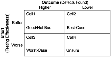
To achieve good test management, useful metrics, and effective in-process quality management, the effort/outcome model should be used. The 2x2 matrix in Figure 10.14 for testing-related metrics is equivalent to that in Figures 9.4 and 9.17 for inspection-related metrics. For the matrix on test effectiveness and the number of defects:
- Cell 2 is the best-case scenario. It is an indication of good intrinsic quality of the design and code of the software ”low error injection during the development process ”and verified by effective testing.
- Cell 1 is a good/not bad scenario. It represents the situation that latent defects were found via effective testing.
- Cell 3 is the worst-case scenario. It indicates buggy code and probably problematic designs ”high error injection during the development process.
- Cell 4 is the unsure scenario. One cannot ascertain whether the lower defect rate is a result of good code quality or ineffective testing. In general, if the test effectiveness does not deteriorate substantially, lower defects is a good sign.
Figure 10.14. An Effort/Outcome Matrix
It should be noted that in an effort/outcome matrix, the better/ worse and higher/ lower designations should be carefully determined based on project-to-project, release-to-release, or actual-to-model comparisons. This effort/outcome approach also provides an explanation of Myers (1979) counterintuitive principle of software testing as discussed in previous chapters. This framework can be applied to pairs of specific metrics. For testing and defect volumes (or defect rate), the model can be applied to the overall project level and in-process metrics level. At the overall project level, the effort indicator is the assessment of test effectiveness compared to the baseline, and the outcome indicator is the volume of all testing defects (or overall defect rate) compared to the baseline, when all testing is complete. As discussed earlier, it is difficult to derive a quantitative indicator of test effectiveness. But an ordinal assessment (better, worse, about equal) can be made via test coverage (functional or some coverage measurements), extra testing activities (e.g., adding a separate phase), and so forth.
At the in-process status level, the test progress S curve is the effort indicator and the defect arrival pattern (PTR arrivals) is the outcome indicator. The four scenarios will be as follows :
- Positive Scenarios
- The test progress S curve is the same as or ahead of baseline (e.g., a previous release) and the defect arrival curve is lower (than that of a previous release). This is the cell 2 scenario.
- The test progress S curve is the same as or ahead of the baseline and the defect arrival is higher in the early part of the curve ” chances are the defect arrivals will peak earlier and decline to a lower level near the end of testing. This is the cell 1 scenario.
- Negative Scenarios
- The test progress S curve is significantly behind and the defect arrival curve is higher (compared with baseline) ”chances are the PTR arrivals will peak later and higher and the problem of late cycle defect arrivals will emerge. This is the cell 3 scenario.
- The test S curve is behind and the defect arrival is lower in the early part of the curve ”this is an unsure scenario. This is the cell 4 scenario.
Both cell 3 (worst case) and cell 4 (unsure) scenarios are unacceptable from quality management's point of view. To improve the situation at the overall project level, if the project is still in early development the test plans have to be more effective. If testing is almost complete, additional testing for extra defect removal needs to be done. The improvement scenarios take three possible paths:
- If the original scenario is cell 3 (worst case), the only possible improvement scenario is cell 1 (good/not bad). This means achieving quality via extra testing.
- If the original scenario is cell 4 (unsure), the improvement scenario can be one of the following two:
- Cell 1 (good/not bad) means more testing leads to more defect removal, and the original low defect rate was truly due to insufficient effort.
- Cell 2 (best case) means more testing confirmed that the intrinsic code quality was good, that the original low defect rate was due to lower latent defects in the code.
For in-process status, the way to improve the situation is to accelerate the test progress. The desirable improvement scenarios take two possible paths:
- If the starting scenario is cell 3 (worst case), then the improvement path is cell 3 to cell 1 to cell 2.
- If the starting scenario is cell 4 (unsure), improvement path could be:
- Cell 4 to cell 2
- Cell 4 to cell 1 to cell 2
The difference between the overall project level and the in-process status level is that for the latter situation, cell 2 is the only desirable outcome. In other words, to ensure good quality, the defect arrival curve has to decrease to a low level when active testing is still going on. If the defect arrival curve stays high, it implies that there are substantial latent defects in the software. One must keep testing until the defect arrivals show a genuine pattern of decline. At the project level, because the volume of defects (or defect rate) is cumulative, both cell 1 and cell 2 are desirable outcomes from a testing perspective.
Generally speaking, outcome indicators are fairly common; effort indicators are more difficult to establish. Moreover, different types of software and tests may need different effort indicators. Nonetheless, the effort/outcome model forces one to establish appropriate effort measurements, which in turn , drives the improvements in testing. For example, the metric of CPU utilization is a good effort indicator for systems software. In order to achieve a certain level of CPU utilization, a stress environment needs to be established. Such effort increases the effectiveness of the test. The level of CPU utilization (stress level) and the trend of the number of system crashes and hangs are a good pair of effort/outcome metrics.
For integration type software where a set of vendor software are integrated together with new products to form an offering, effort indicators other than CPU stress level may be more meaningful. One could look into a test coverage-based metric including the major dimensions of testing such as:
- Setup
- Install
- Min/max configuration
- Concurrence
- Error-recovery
- Cross-product interoperability
- Cross-release compatibility
- Usability
- Double-byte character set (DBCS)
A five-point score (1 being the least effective and 5 being the most rigorous testing) can be assigned for each dimension and their sum can represent an overall coverage score. Alternatively, the scoring approach can include the "should be" level of testing for each dimension and the "actual" level of testing per the current test plan based on independent assessment by experts. Then a "gap score" can be used to drive release-to-release or project-to-project improvement in testing. For example, assume the test strategy for a software offering calls for the following dimensions to be tested , each with a certain sufficiency level: setup, 5; install, 5; cross-product interoperability, 4; cross-release compatibility, 5; usability, 4; and DBCS, 3. Based on expert assessment of the current test plan, the sufficiency levels of testing are setup, 4; install, 3; and cross-product interoperability, 2; cross-release compatibility, 5; usability, 3; DBCS, 3. Therefore the "should be" level of testing would be 26 and the "actual" level of testing would be 20, with a gap score of 6. This approach may be somewhat subjective but it also involves in the assessment process the experts who can make the difference. Although it would not be easy in real-life implementation, the point here is that the effort/outcome paradigm and the focus on effort metrics have direct linkage to test improvements. Further research in this area or implementation experience will be useful.
For application software in the external user test environment, usage of key features of the software and hours of testing would be good effort indicators, and the number of defects found can be the outcome indicator. Again to characterize the quality of the product, the defect curve must be interpreted with data about feature usage and effort of testing. Caution: To define and develop effort indicators, the focus should be on the effectiveness of testing rather than on the person-hour (or person-month) effort in testing per se. A good testing strategy should strive for efficiency (via tools and automation) as well as effectiveness.
What Is Software Quality?
Software Development Process Models
- Software Development Process Models
- The Waterfall Development Model
- The Prototyping Approach
- The Spiral Model
- The Iterative Development Process Model
- The Object-Oriented Development Process
- The Cleanroom Methodology
- The Defect Prevention Process
- Process Maturity Framework and Quality Standards
Fundamentals of Measurement Theory
- Fundamentals of Measurement Theory
- Definition, Operational Definition, and Measurement
- Level of Measurement
- Some Basic Measures
- Reliability and Validity
- Measurement Errors
- Be Careful with Correlation
- Criteria for Causality
Software Quality Metrics Overview
- Software Quality Metrics Overview
- Product Quality Metrics
- In-Process Quality Metrics
- Metrics for Software Maintenance
- Examples of Metrics Programs
- Collecting Software Engineering Data
Applying the Seven Basic Quality Tools in Software Development
- Applying the Seven Basic Quality Tools in Software Development
- Ishikawas Seven Basic Tools
- Checklist
- Pareto Diagram
- Histogram
- Run Charts
- Scatter Diagram
- Control Chart
- Cause-and-Effect Diagram
- Relations Diagram
Defect Removal Effectiveness
- Defect Removal Effectiveness
- Literature Review
- A Closer Look at Defect Removal Effectiveness
- Defect Removal Effectiveness and Quality Planning
- Cost Effectiveness of Phase Defect Removal
- Defect Removal Effectiveness and Process Maturity Level
The Rayleigh Model
- The Rayleigh Model
- Reliability Models
- The Rayleigh Model
- Basic Assumptions
- Implementation
- Reliability and Predictive Validity
Exponential Distribution and Reliability Growth Models
- Exponential Distribution and Reliability Growth Models
- The Exponential Model
- Reliability Growth Models
- Model Assumptions
- Criteria for Model Evaluation
- Modeling Process
- Test Compression Factor
- Estimating the Distribution of Total Defects over Time
Quality Management Models
- Quality Management Models
- The Rayleigh Model Framework
- Code Integration Pattern
- The PTR Submodel
- The PTR Arrival and Backlog Projection Model
- Reliability Growth Models
- Criteria for Model Evaluation
- In-Process Metrics and Reports
- Orthogonal Defect Classification
In-Process Metrics for Software Testing
- In-Process Metrics for Software Testing
- In-Process Metrics for Software Testing
- In-Process Metrics and Quality Management
- Possible Metrics for Acceptance Testing to Evaluate Vendor-Developed Software
- How Do You Know Your Product Is Good Enough to Ship?
Complexity Metrics and Models
- Complexity Metrics and Models
- Lines of Code
- Halsteads Software Science
- Cyclomatic Complexity
- Syntactic Constructs
- Structure Metrics
- An Example of Module Design Metrics in Practice
Metrics and Lessons Learned for Object-Oriented Projects
- Metrics and Lessons Learned for Object-Oriented Projects
- Object-Oriented Concepts and Constructs
- Design and Complexity Metrics
- Productivity Metrics
- Quality and Quality Management Metrics
- Lessons Learned from OO Projects
Availability Metrics
- Availability Metrics
- 1 Definition and Measurements of System Availability
- Reliability, Availability, and Defect Rate
- Collecting Customer Outage Data for Quality Improvement
Measuring and Analyzing Customer Satisfaction
- Measuring and Analyzing Customer Satisfaction
- Customer Satisfaction Surveys
- Analyzing Satisfaction Data
- Satisfaction with Company
- How Good Is Good Enough
Conducting In-Process Quality Assessments
- Conducting In-Process Quality Assessments
- The Preparation Phase
- The Evaluation Phase
- The Summarization Phase
- Recommendations and Risk Mitigation
Conducting Software Project Assessments
- Conducting Software Project Assessments
- Audit and Assessment
- Software Process Maturity Assessment and Software Project Assessment
- Software Process Assessment Cycle
- A Proposed Software Project Assessment Method
Dos and Donts of Software Process Improvement
- Dos and Donts of Software Process Improvement
- Measuring Process Maturity
- Measuring Process Capability
- Staged versus Continuous Debating Religion
- Measuring Levels Is Not Enough
- Establishing the Alignment Principle
- Take Time Getting Faster
- Keep It Simple or Face Decomplexification
- Measuring the Value of Process Improvement
- Measuring Process Adoption
- Measuring Process Compliance
- Celebrate the Journey, Not Just the Destination
Using Function Point Metrics to Measure Software Process Improvements
- Using Function Point Metrics to Measure Software Process Improvements
- Software Process Improvement Sequences
- Process Improvement Economics
- Measuring Process Improvements at Activity Levels
Concluding Remarks
- Concluding Remarks
- Data Quality Control
- Getting Started with a Software Metrics Program
- Software Quality Engineering Modeling
- Statistical Process Control in Software Development
A Project Assessment Questionnaire
EAN: 2147483647
Pages: 176
