Getting Input from the User
In the first two chapters of Book VI, you find out how to use two basic Swing user-interface components-labels and buttons-and how to handle events generated when the user clicks one of those buttons. If all you ever want to write are programs that display text when the user clicks a button, you can put the book down now. But if you want to write programs that actually do something worthwhile, you need to use other Swing components.
In this chapter, you find out how to use components that get information from the user. First, I cover two components that get text input from the user: text fields, which get a line of text, and text areas, which get multiple lines. Then I move on to two components that get either/or information from the user: radio buttons and check boxes.
Along the way, I tell you about some features that let you decorate these controls to make them more functional. Specifically I look at scroll bars (which are commonly used with text areas) and borders (which are used with radio buttons and check boxes).
Using Text Fields
A text field is a box that the user can type text in. You create text fields by using the JTextField class. Table 3-1 shows some of the more interesting and useful constructors and methods of this class.
Table 3-1: Handy JTextField Constructors and Methods
 Open table as spreadsheet
|
Constructor |
Description |
|---|---|
|
JTextField() |
Creates a new text field. |
|
JTextField(int |
cols) Creates a new text field with the specified width. |
|
JTextField(String text, int cols) |
Creates a new text field with the specified width and initial text value. |
Open table as spreadsheet
|
Method |
Description |
|---|---|
|
String getText() |
Gets the text value entered into the field. |
|
void requestFocus() |
Asks for the focus to be moved to this text field. |
|
void setColumns(int cols) |
Sets the size of the text field. (Better to do this in the constructor.) |
|
void setEditable(boolean value) |
If false, makes the field read-only. |
|
void setText(String text) |
Sets the field's text value. |
|
void setToolTipText(String text) |
Sets the tooltip text that's displayed if the user rests the mouse over the text field for a few moments. |
When you create a text field by calling a constructor of the JTextField class, you can specify the width of the text field and an initial text value, as in these examples:
JTextField text1 = new JTextField(15);
JTextField text2 = new JTextField("Initial Value", 20);
The width is specified in columns, which is a vague and imprecise measurement that's roughly equal to the width of one character in the font that the text field uses. You have to experiment a bit to get the text fields the right size.
The usual way to work with text fields is to create them in the frame constructor, and then retrieve text entered by the user in the actionPerformed method of an action listener attached to one of the frame's buttons using code like this:
String lastName = textLastName.getText();
Here the value entered by the user into the textLastName text field is assigned to the String variable lastName.
| Tip |
The following paragraphs describe a few additional details you need to know about using text fields:
|
Looking at a sample program
Figure 3-1 shows the operation of a simple program that uses a text field to ask for the user's name. If the user enters a name, the program uses JOptionPane to say good morning to the user by displaying the middle message box shown in Figure 3-1. But if the user clicks the button without entering anything, the program displays the second JOptionPane message shown at the bottom.
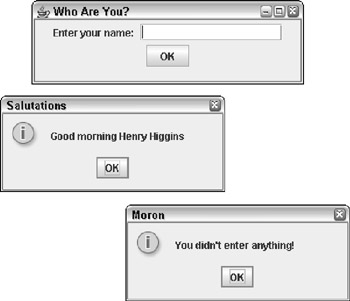
Figure 3-1: The Namer application in action.
The code for this program is shown in Listing 3-1.
Listing 3-1: Saying Good Morning with a Text Field
import javax.swing.*;
import java.awt.event.*;

public class Namer extends JFrame → 4
{

 public static void main(String [] args)
 {
 new Namer();
 }

 private JButton buttonOK;
 private JTextField textName; → 12
 public Namer()
 {
 this.setSize(325,100);
 this.setTitle("Who Are You?");
 this.setDefaultCloseOperation(
 JFrame.EXIT_ON_CLOSE);

 ButtonListener bl = new ButtonListener();

 JPanel panel1 = new JPanel();

 panel1.add(new JLabel("Enter your name: ")); → 25
 textName = new JTextField(15); → 27
 panel1.add(textName);

 buttonOK = new JButton("OK");
 buttonOK.addActionListener(bl);
 panel1.add(buttonOK);

 this.add(panel1);

 this.setVisible(true);
 }

 private class ButtonListener implements
 ActionListener
 {
 public void actionPerformed(ActionEvent e)
 {
 if (e.getSource() == buttonOK)
 {
 String name = textName.getText(); → 46

 if (name.length() == 0) → 47
 {
 JOptionPane.showMessageDialog(
 Namer.this,
 "You didn't
 "Moron",
 JOptionPane.INFORMATION_MESSAGE);
 }
 else
 {
 JOptionPane.showMessageDialog(
 Namer.this,
 "Good morning " + name,
 "Salutations",
 JOptionPane.INFORMATION_MESSAGE);
 }
 textName.requestFocus(); → 63
 }
 }
 }
}
This program isn't very complicated, so the following paragraphs just hit the highlights:
|
→ 4 |
The name of the frame class is Namer. |
|
→ 12 |
A class variable is used to store a reference to the text field so that both the constructor and the action listener can access it. |
|
→ 25 |
A label is created to tell the user what data to enter into the text field. |
|
→ 27 |
The text field is created with a length of 15 columns, and then added to the panel. |
|
→ 46 |
In the actionPerformed method of the action listener class, this statement retrieves the value entered by the user and stores it in a string variable. |
|
→ 47 |
This if statement checks to see if the user entered anything by examining the length of the string variable created in line 46. If the length is zero, JOptionPane is used to display an error message. Otherwise, JOptionPane is used to say good morning to the user. |
|
→ 63 |
The requestFocus method is called to move the focus back to the text field after the user clicks the button. If you don't do this, focus stays on the button and the user has to use the Tab key to move the focus to the text field. |
Open table as spreadsheet
Using text fields for numeric entry
You need to take special care if you're using a text field to get numeric data from the user. The getText method returns a string value. You can pass this value to one of the parse methods of the wrapper classes for the primitive numeric types. For example, to convert the value entered into a text box to an int, you use the parseInt method:
int count = Integer.parseInt(textCount.getText());
Here the result of the getText method is used as the parameter to the parseInt method.
Table 3-2 lists the parse methods for the various wrapper classes. Note that each of these methods throws NumberFormatException if the string can't be converted. As a result, you need to call the parseInt method in a try/catch block to catch this exception.
|
Wrapper Class |
Parse Method |
|---|---|
|
Integer |
parseInt(String) |
|
Short |
parseShort(String) |
|
Long |
parseLong(String) |
|
Byte |
parseByte(String) |
|
Float |
parseFloat(String) |
|
Double |
parseDouble(String) |
| Tip |
If your program uses more than one or two numeric-entry text fields, consider creating separate methods to validate the user's input. For example, here's a method that accepts a text field and a string that provides an error message that's displayed if the data entered into the field can't be converted to an int. The method returns a boolean that indicates whether the field contains a valid integer:
private boolean isInt(JTextField f, String msg)
{
 try
 {
 Integer.parseInt(f.getText());
 return true;
 }
 catch (NumberFormatException e)

 {
 JOptionPane.showMessageDialog(f,
 "Entry Error", msg,
 JOptionPane.ERROR_MESSAGE);
 f.requestFocus();
 return false;
 }
}
|
Then you can call this method whenever you need to check to see if a text field has a valid integer. For example, here's the actionPerformed method for a program that gets the value entered in a textCount text field and displays it in a JOptionPane message box if the value entered is a valid integer:
public void actionPerformed(ActionEvent e)
{
 if (e.getSource() == buttonOK)
 {
 if (isInt(textCount,
 "You must enter an integer."))
 {
 JOptionPane.showMessageDialog(Number.this,
 "You entered " +
 Integer.parseInt(textCount.getText()),
 "Your Number",
 JOptionPane.INFORMATION_MESSAGE);
 }
 textCount.requestFocus();
 }
}
Here the isInt method is called to make sure the text entered by the user can be converted to an int. If so, the text is converted to an int and displayed in a message box. (In this example, the name of the outer class is Number, which is why the first parameter of the showMessageDialog method specifies Number.this.)
Creating a validation class
| TECHNICAL STAUFF |
If you're feeling really ambitious, you can create a separate class to hold methods that do data validation. I suggest you make the methods static so you don't have to create an instance of the validation class to use its methods. And to avoid parsing the data twice, write the validation methods so they return two values: a boolean that indicates whether the data could be parsed, and a primitive that provides the parsed value. |
Of course, a method can return only one value. The only way to coax a method into returning two values is to return an object that contains both of the values. And to do that, you have to create a class that defines the object. Here's an example of a class you could use as the return value of a method that validates integers:
public class IntValidationResult
{
 public boolean isValid;
 public int value;
}
And here's a class that provides a static method named isInt that validates integer data and returns an IntValidationResult object:
public class Validation
{
 public static IntValidationResult isInt(
 JTextField f, String msg)
 {
 IntValidationResult result =
 new IntValidationResult();
 try
 {
 result.value =
 Integer.parseInt(f.getText());
 result.isValid = true;
 return result;
 }
 catch (NumberFormatException e)
 {
 JOptionPane.showMessageDialog(f,
 "Entry Error", msg,
 JOptionPane.ERROR_MESSAGE);
 f.requestFocus();
 result.isValid = false;
 result.value = 0;
 return result;
 }
 }
}
Here's an actionPerformed method that uses the isInt method of this class to validate the textCount field:
public void actionPerformed(ActionEvent e)
{
 if (e.getSource() == buttonOK)
 {
 IntValidationResult ir;
 ir = Validation.isInt(textCount,
 "You must enter an integer.");
 if (ir.isValid)
 {
 JOptionPane.showMessageDialog(Number2.this,
 "You entered " + ir.value,
 "Your Number",
 JOptionPane.INFORMATION_MESSAGE);
 }
 textCount.requestFocus();
 }
}
Using Text Areas
A text area is similar to a text field, but lets the user enter more than one line of text. If the user enters more text into the text area than can be displayed at once, the text area can use a scroll bar to let the user scroll to see the entire text. Figure 3-2 shows a text area in action.
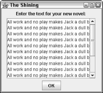
Figure 3-2: A frame that uses a text area.
To create a text area like the one shown in Figure 3-2, you must actually use two classes. First, you use the JTextArea class to create the text area. But unfortunately, text areas by themselves don't have scroll bars. So you have to add the text area to a second component called a scroll pane, created by the JScrollPane class. Then you add the scroll pane-not the text area-to a panel so it can be displayed.
Creating a text area isn't as hard as it sounds. Here's the code I used to create the text area shown in Figure 3-2, which I then added to a panel:
textNovel = new JTextArea(10, 20);
JScrollPane scroll = new JScrollPane(textNovel,
 JScrollPane.VERTICAL_SCROLLBAR_ALWAYS,
 JScrollPane.HORIZONTAL_SCROLLBAR_NEVER);
panel1.add(scroll);
Here the first statement creates a text area, giving it an initial size of 10 rows and 20 columns. Then the second statement creates a scroll pane. Notice that the text area object is passed as a parameter to the constructor for the JScrollPane, along with constants that indicate whether the scroll pane should include vertical or horizontal scroll bars (or both). Finally, the third statement adds the scroll pane to the panel named panel1.
The following sections describe the constructors and methods of the JTextArea and JScrollPane classes in more detail.
The JTextArea class
Table 3-3 lists the most popular constructors and methods of the JTextArea class, which you use to create text areas. In most cases, you use the second constructor, which lets you set the number of rows and columns to display. The rows parameter governs the height of the text area, while the cols parameter sets the width.
Table 3-3: Clever JTextArea Constructors and Methods
Open table as spreadsheet
|
Constructor |
Description |
|---|---|
|
JTextArea() |
Creates a new text area. |
|
JTextArea(int rows, int cols) |
Creates a new text area large enough to display the specified number of rows and columns. |
|
JTextArea(String text, int rows, int cols) |
Creates a new text area with the specified initial text value, large enough to display the specified number of rows and columns. |
Open table as spreadsheet
|
Method |
Description |
|---|---|
|
void append(String text) |
Adds the specified text to the end of the text area's text value. |
|
int getLineCount() |
Gets the number of lines currently in the text value. |
|
String getText() |
Gets the text value entered into the field. |
|
void insert(Stringstr, int pos) |
Inserts the specified text at the specified position. |
|
void requestFocus() |
Asks for the focus to be moved to this text field. |
|
void replaceRange(String str, int start, int end) |
Replaces text indicated by the start and end positions with the new specified text. |
|
void setColumns(int cols) |
Sets the width of the text area. (It's better to do this in the constructor.) |
|
void setEditable(boolean value) |
If false, makes the field read only. |
|
void setLineWrap(boolean value) |
If true, lines wrap if the text doesn't fit on one line. |
|
void setText(String text) |
Sets the field's text value. |
|
void setToolTipText(String text) |
Sets the tooltip text that's displayed if the user rests the mouse pointer over the text field for a few moments. |
|
void setWrapStyleWord() |
If true, the text wraps at word boundaries. |
To retrieve the text that the user enters into a text area, you use the getText method. For example, here's an actionPerformed method from an action listener that retrieves text from a text area:
public void actionPerformed(ActionEvent e)
{
 if (e.getSource() == buttonOK)
 {
 String text = textNovel.getText();
 if (text.contains("All work and no play"))
 JOptionPane.showMessageDialog(textNovel,
 "Can't you see I'm working?",
 "Going Crazy",
 JOptionPane.ERROR_MESSAGE);
 }
}
Here a message box is displayed if the text contains the string All work and no play.
Notice that in addition to the getText method, the JTextArea class has methods that let you add text to the end of the text area's current value (append), insert text in the middle of the value (insert), and replace text (replace). You use these methods to edit the value of the text area.
| Tip |
Two of the JTextArea methods are used to control how lines longer than the width of the text area are handled. If you call setLineWrap with a value of true, lines that are too long to display are automatically wrapped to the next line. And if you call setWrapStyleWord with a value of true, any lines that are wrapped split between words instead of in the middle of a word. You usually use these two methods together: textItinerary = new JTextArea(10, 20); textItinerary.setLineWrap(true); textItinerary.setWrapStyleWord(true); |
The JScrollPane class
Text areas aren't very useful without scroll bars. To create a text area with a scroll bar, you use the JScrollPane class, whose constructors and fields are listed in Table 3-4. Note that this table doesn't show any methods for the JScrollPane class. The JScrollPane class does have methods (plenty of them, in fact). But none of them are particularly useful for ordinary programming, so I didn't include any of them in the table.
Table 3-4: Essential JScrollPane Constructors and Fields
Open table as spreadsheet
|
Constructor |
Description |
|---|---|
|
JScrollPane(Component view) |
Creates a scroll pane for the specified component. |
|
JScrollPane(Component, int vert, int hor) |
Creates a scroll pane for the specified component with the specified policy for the vertical and horizontal scroll bars. |
Open table as spreadsheet
|
Field |
Description |
|---|---|
|
VERTICAL_SCROLLBAR_ALWAYS |
Always adds a vertical scroll bar. |
|
VERTICAL_SCROLLBAR_AS_NEEDED |
Adds a vertical scroll bar if necessary. |
|
VERTICAL_SCROLLBAR_NEVER |
Never adds a vertical scroll bar. |
|
HORIZONTAL_SCROLLBAR_ALWAYS |
Always adds a horizontal scroll bar. |
|
HORIZONTAL_SCROLLBAR_AS_NEEDED |
Adds a horizontal scroll bar if necessary. |
|
HORIZONTAL_SCROLLBAR_NEVER |
Never adds a horizontal scroll bar. |
The usual way to create a scroll pane is to use the second constructor. You use the first parameter of this constructor to specify the component you want to add scroll bars to. For example, to add scroll bars to a textNovel text area, you specify textNovel as the first parameter.
The second parameter tells the scroll pane whether or not to create a vertical scroll bar. The value you specify for this parameter should be one of the first three fields listed in Table 3-4:
- VERTICAL_SCROLLBAR_ALWAYS: Choose this if you always want the scroll pane to show a vertical scroll bar.
- VERTICAL_SCROLLBAR_AS_NEEDED: Specify this if you want to see the vertical scroll bar only when the text area contains more lines that can be displayed at once; the vertical scroll bar is shown only when it's needed.
- VERTICAL_SCROLLBAR_NEVER: Choose this if you never want to see a vertical scroll bar on-screen.
The third parameter uses the three HORIZONTAL_SCROLLBAR constants to indicate whether the scroll pane includes a horizontal scroll bar always, never, or only when necessary.
Thus the following code adds scroll bars to a text area. The vertical scroll bar is always shown, but the horizontal scroll bar is shown only when needed:
JScrollPane scroll = new JScrollPane(textNovel,
 JScrollPane.VERTICAL_SCROLLBAR_ALWAYS,
 JScrollPane.HORIZONTAL_SCROLLBAR_AS_NEEDED);
| Tip |
Use the JScrollPane class with other types of components besides text areas. As you see in the next chapter, scroll panes are often used with list controls as well. |
Using Check Boxes
A check box is a control that the user can click to either check or uncheck. Check boxes are usually used to let the user specify Yes or No to an option. Figure 3-3 shows a frame with three check boxes.
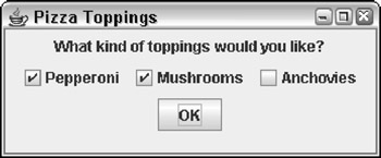
Figure 3-3: A frame with three check boxes.
To create a check box, you use the JCheckBox class. Its favorite constructors and methods are shown in Table 3-5.
Table 3-5: Notable JCheckBox Constructors and Methods
Open table as spreadsheet
|
Constructor |
Description |
|---|---|
|
JCheckBox() |
Creates a new check box that is initially unchecked. |
|
JCheckBox(String text) |
Creates a new check box that displays the specified text. |
|
JCheckBox(String text, boolean selected) |
Creates a new check box with the specified text. The boolean parameter determines whether the check box is initially checked (true) or unchecked (false). |
Open table as spreadsheet
|
Method |
Description |
|---|---|
|
void addActionListener(ActionListener listener) |
Adds an ActionListener to listen for action events. |
|
void addItemListener (ItemListener listener) |
Adds an ItemListener to listen for item events. |
|
String getText() |
Gets the text displayed by the check box. |
|
Boolean isSelected() |
Returns true if the check box is checked, false if the check box is not checked. |
|
void setSelected (boolean value) |
Checks the check box if the parameter is true; unchecks it if the parameter is false. |
|
void setText (String text) |
Sets the check box text. |
|
void setToolTipText(String text) |
Sets the tooltip text that's displayed if the user rests the mouse over the check box for a few moments. |
As with any Swing component, if you want to refer to the component in both the frame class constructor and a listener, you have to declare class variables to refer to the check box components, like this:
JCheckBox pepperoni, mushrooms, anchovies;
Then you can use statements like these in the frame constructor to create the check boxes and add them to a panel (in this case, panel1):
pepperoni = new JCheckBox("Pepperoni");
panel1.add(pepperoni);

mushrooms = new JCheckBox("Mushrooms");
panel1.add(mushrooms);

anchovies = new JCheckBox("Anchovies");
panel1.add(anchovies);
Notice that I didn't specify the initial state of these check boxes in the constructor. As a result, they're initially unchecked. If you want to create a check box that is initially checked, call the constructor like this:
Pepperoni = new JCheckBox("Pepperoni", true);
In an event listener, you can test the state of a check box by using the isSelected method, and you can set the state of a check box by calling its setSelected method. For example, here's an actionPerformed method that displays a message box and unchecks all three check boxes when the user clicks the OK button:
public void actionPerformed(ActionEvent e)
{
 if (e.getSource() == buttonOK)
 {
 String msg = "";
 if (pepperoni.isSelected())
 msg += "Pepperoni
";
 if (mushrooms.isSelected())
 msg += "Mushrooms
";
 if (anchovies.isSelected())
 msg += "Anchovies
";
 if (msg.equals(""))
 msg = "You didn't order any toppings.";
 else
 msg = "You ordered these toppings:
"
 + msg;
 JOptionPane.showMessageDialog(buttonOK,
 msg, "Your Order",
 JOptionPane.INFORMATION_MESSAGE);
 pepperoni.setSelected(false);
 mushrooms.setSelected(false);
 anchovies.setSelected(false);
 }
}
Here the name of each topping selected by the user is added to a text string. For example, if you select Pepperoni and Anchovies, the following message is displayed:
You ordered these toppings:
Pepperoni
Anchovies
| TECHNICAL STAUFF |
If you want, you can add event listeners to check boxes to respond to events generated when the user clicks the check box. Check boxes support both action listeners and item listeners. The difference between them is subtle:
|
Suppose your restaurant has anchovies on the menu, but you refuse to actually make pizzas with anchovies on them. Here's an actionPerformed method from an action listener that displays a message if the user tries to check the Anchovies check box and unchecks the box:
public void actionPerformed(ActionEvent e)
{
 if (e.getSource() == anchovies)
 {
 JOptionPane.showMessageDialog(anchovies,
 "We don't do anchovies here.",
 "Yuck!",
 JOptionPane.WARNING_MESSAGE);
 anchovies.setSelected(false);
 }
}
| Tip |
Only add a listener to a check box if you need to provide immediate feedback to the user when he or she checks or unchecks the box. In most applications, you wait until the user clicks a button to actually examine the state of any check boxes on the frame. |
Using Radio Buttons
Radio buttons are similar to check boxes, but with a crucial difference: Radio buttons travel in groups, and a user can select only one radio button in each group at a time. When you click a radio button to select it, whatever radio button was previously selected is automatically deselected. Figure 3-4 shows a frame with three radio buttons.
To work with radio buttons, you use two classes. First, you create the radio buttons themselves with the JRadioButton class, whose constructors and methods are shown in Table 3-6. Then you create a group for the buttons with the ButtonGroup class. You must add the radio buttons themselves to a panel (so they are displayed) and to a button group (so they're properly grouped with other buttons).
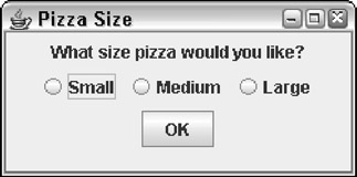
Figure 3-4: A frame with three radio buttons.
Table 3-6: Various JRadioButton Constructors and Methods
Open table as spreadsheet
|
Constructor |
Description |
|---|---|
|
JRadioButton() |
Creates a new radio button with no text. |
|
JRadioButton(String text) |
Creates a new radio button with the specified text. |
Open table as spreadsheet
|
Method |
Description |
|---|---|
|
void addActionListener(ActionListener listener) |
Adds an ActionListener to listen for action events. |
|
void addItemListener (ItemListener listener) |
Adds an ItemListener to listen for item events. |
|
String getText() |
Gets the text displayed by the radio button. |
|
Boolean isSelected() |
Returns true if the radio button is selected, false if the radio button is not selected. |
|
void setSelected (boolean value) |
Selects the radio button if the parameter is true. |
|
void setText(String text) |
Sets the radio button text. |
|
void setToolTipText (String text) |
Sets the tooltip text that's displayed if the user rests the mouse over the radio button for a few moments. |
The usual way to create a radio button is to declare a variable to refer to the button as a class variable so it can be accessed anywhere in the class. For example
JRadioButton small, medium, large;
Then, in the frame constructor, you call the JRadioButton constructor to create the radio button:
small = new JRadioButton("Small");
You can then add the radio button to a panel in the usual way.
To create a button group to group radio buttons that work together, just call the ButtonGroup class constructor:
ButtonGroup group1 = new ButtonGroup();
Then call the add method of the ButtonGroup to add each radio button to the group:
group1.add(small);
group1.add(medium);
group1.add(large);
| Tip |
Note that button groups have nothing to do with how radio buttons appear on the frame. The buttons can appear anywhere on the frame, even in different panels. (I show you how to visually group radio buttons and other components by using borders in the next section, cleverly named "Using Borders.") |
Where button groups really come in handy is when you have more than one set of radio buttons on a form. For example, suppose that in addition to choosing the size of the pizza, the user can also choose the style of crust-thin or thick. In that case, you use a total of five radio buttons and two button groups. The constructor code that creates the radio buttons might look something like this:
ButtonGroup size = new ButtonGroup();
ButtonGroup crust = new ButtonGroup();

small = new JRadioButton("Small");
medium = new JRadioButton("Medium");
large = new JRadioButton("Large");
size.add(small);
size.add(medium);
size.add(large);

thin = new JRadioButton("Thin Crust");
thick = new JRadioButton("Thick Crust");
crust.add(thin);
crust.add(thick);
(To keep this example simple, I omitted the statements that add the radio buttons to the panel.)
| Tip |
Strictly speaking, you don't have to create a button group if all the radio buttons on the frame are in the same group. In that case, Swing creates a default group and adds all the radio buttons to it. But because it's only a few extra lines of code, I suggest you always create a button group-even when you have only one group of radio buttons. |
Using Borders
A border is a decorative element that visually groups components by drawing a line around them. Figure 3-5 shows a frame that shows some radio buttons and check boxes inside borders.
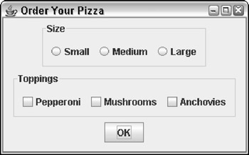
Figure 3-5: A frame with borders.
You can apply a border to any object that inherits JComponent, but the usual technique is to apply the border to a panel and add any components you want to appear within the border to the panel. To create a border, you call one of the static methods listed in Table 3-7. Each of these methods creates a border with a slightly different visual style. You then apply the Border object to a panel by calling the panel's setBorder method.
|
Method |
Description |
|---|---|
|
Border createBevelBorder(int type) |
Creates a bevel border of the specified type. The type parameter can be BevelBorder.LOWERED or BevelBorder.RAISED. |
|
Border createEmptyBorder(int top, int left, int bottom, int right) |
Creates an empty border that occupies the space indicated by the parameters. |
|
Border createEtchedBorder() |
Creates an etched border. |
|
Border createLineBorder() |
Creates a line border. |
|
Border createLoweredBevelBorder() |
Creates a lowered bevel border. |
|
Border createRaisedBevelBorder() |
Creates a raised bevel border. |
|
Border createTitledBorder (String title) |
Creates a titled etched border. |
|
Border createTitledBorder (Border b, String title) |
Creates a titled border from the specified border. |
The BorderFactory class is in the javax.swing package, but the Border interface that defines the resulting border objects is in javax.swing.border. Thus you need to include this import statement at the beginning of the class-in addition to importing javax.swing.*-if you plan on using borders:
import javax.swing.border.*;
| DESIGN PATTERN |
The Factory pattern The BorderFactory class is an example of a very common design pattern called the Factory pattern. In short, when you use the Factory pattern, you don't use constructors to create objects. Instead, you use a factory class that has factory methods that create objects for you. One benefit of the Factory pattern is that the users of the factory class don't need to know what type of object is actually created. For example, Swing actually defines several different classes for borders, all of which implement the Border interface. If you have to use constructors to create border objects, you have to know about all the border classes. By creating a BorderFactory class that returns Border objects, you only have to know about the BorderFactory class and its methods. The designers of the Java API could have created a Border class (instead of an interface) that lets you specify what type of border to create via a parameter passed to the constructor. However, that approach had many problems. For starters, the Border class would be complicated because it would have to implement every type of border. But more importantly, adding a new type of border later on is difficult. With the Factory pattern, you can create a new border type easily by (1) creating a class that implements the Border interface for the new border, and (2) adding a method to the BorderFactory class to create the new border type. |
| Tip |
All the methods listed in Table 3-7 are static methods. As a result, you don't have to create an instance of the BorderFactory class to call these methods. |
For example, here's a snippet of code that creates a panel, creates a titled border, and applies the border to the panel:
JPanel sizePanel = new JPanel();
Border b1 = BorderFactory.createTitledBorder("Size");
sizePanel.setBorder(b1);
Then any components you add to sizePanel appear within this border.
The last method listed in Table 3-7 needs a little explanation. It simply adds a title to a border created by any of the other created methods of the BorderFactory class. For example, you can create a raised bevel border with the title Options like this:
Border b = BorderFactory.createRaisedBevelBorder();
b = BorderFactory.createTitledBorder(b, "Options");
Designing a Pizza Ordering Program
To give you an idea of how borders work together with radio buttons and check boxes, Listing 3-2 presents the complete code for the program that created the frame that was shown in Figure 3-5. When the user clicks the OK button, this program displays a message box summarizing the user's order. For example, if the user orders a medium pizza with pepperoni and mushrooms, the following message is displayed:
You ordered a medium pizza with the following toppings:
Pepperoni
Mushrooms
If you order a pizza with no toppings, the message you get looks something like this:
You ordered a medium pizza with no toppings.
Listing 3-2: The Pizza Order Program
import javax.swing.*;
import java.awt.event.*;
import javax.swing.border.*;

public class Pizza extends JFrame
{
 public static void main(String [] args)
 {
 new Pizza();
 }

 private JButton buttonOK; → 12
 private JRadioButton small, medium, large;
 private JCheckBox pepperoni, mushrooms, anchovies;

 public Pizza()
 {
 this.setSize(320,200);
 this.setTitle("Order Your Pizza");
 this.setDefaultCloseOperation(
 JFrame.EXIT_ON_CLOSE);

 ButtonListener bl = new ButtonListener();

 JPanel mainPanel = new JPanel(); → 24
 JPanel sizePanel = new JPanel(); → 26

 Border b1 = → 27
 BorderFactory.createTitledBorder("Size");
 sizePanel.setBorder(b1); → 29
 ButtonGroup sizeGroup = new ButtonGroup(); → 31
 small = new JRadioButton("Small"); → 33
 small.setSelected(true);
 sizePanel.add(small);
 sizeGroup.add(small);

 medium = new JRadioButton("Medium"); → 38
 sizePanel.add(medium);
 sizeGroup.add(medium);

 large = new JRadioButton("Large"); → 42
 sizePanel.add(large);
 sizeGroup.add(large);

 mainPanel.add(sizePanel); → 46
 JPanel topPanel = new JPanel(); → 48
 Border b2 =
 BorderFactory.createTitledBorder(
 "Toppings");
 topPanel.setBorder(b2);

 pepperoni = new JCheckBox("Pepperoni"); → 53
 topPanel.add(pepperoni);

 mushrooms = new JCheckBox("Mushrooms");
 topPanel.add(mushrooms);

 anchovies = new JCheckBox("Anchovies");
 topPanel.add(anchovies);

 mainPanel.add(topPanel); → 62
 buttonOK = new JButton("OK"); → 64
 buttonOK.addActionListener(bl);
 mainPanel.add(buttonOK);

 this.add(mainPanel); → 68
 this.setVisible(true);
}

private class ButtonListener

 implements ActionListener
 {
 public void actionPerformed(ActionEvent e)
 {
 if (e.getSource() == buttonOK)
 {
 String tops = ""; → 79
 if (pepperoni.isSelected())
 tops += "Pepperoni
";
 if (mushrooms.isSelected())
 tops += "Mushrooms
";
 if (anchovies.isSelected())
 tops += "Anchovies
";

 String msg = "You ordered a "; → 87
 if (small.isSelected())
 msg += "small pizza with ";
 if (medium.isSelected())
 msg += "medium pizza with ";
 if (large.isSelected())
 msg += "large pizza with ";

 if (tops.equals("")) → 95
 msg += "no toppings.";
 else
 msg += "the following toppings:
"
 + tops;
 JOptionPane.showMessageDialog( → 100
 buttonOK, msg, "Your Order",
 JOptionPane.INFORMATION_MESSAGE);

 pepperoni.setSelected(false); → 104
 mushrooms.setSelected(false);
 anchovies.setSelected(false);
 small.setSelected(true);
 }
 }
 }
}
I cover everything in this program in this chapter (or in previous chapters), so I just hit the highlights here:
|
→ 12 |
The components that are added to the frame are declared as class variables so both the constructor and the actionPerformed method of the action event listener can access them. |
|
→ 24 |
This line creates mainPanel, the first of three panels that the program uses. This panel contains the other two panels, which use borders to visually group their components. |
|
→ 26 |
This line creates sizePanel, the panel used to hold the radio buttons that let the user pick the pizza's size. |
|
→ 27 |
The BorderFactory class is used to create a titled border with the word Size as its title. |
|
→ 29 |
The titled border is attached to the size panel. |
|
→ 31 |
A button group is created for the radio buttons. |
|
→ 33 |
The Small radio button is created. Notice that this button's setSelected method is called. As a result, Small is the default size for a pizza order. Notice also that the radio button is added to both the sizePanel panel and the size button group. |
|
→ 38 |
The Medium radio button is created and added to the panel and the button group. |
|
→ 42 |
The Large radio button is created and added to the panel and the button group. |
|
→ 46 |
The size panel is added to the main panel. |
|
→ 48 |
A new panel named topPanel is created to hold the topping check boxes. Like the size panel, this panel is also given a titled border. |
|
→ 53 |
The Pepperoni, Mushrooms, and Anchovies check boxes are created and added to the panel. |
|
→ 62 |
The Toppings panel is added to the main panel. |
|
→ 64 |
The OK button is created and added directly to the main panel. Because this button isn't in a border, it doesn't need to be added to a separate panel like the radio buttons and check boxes do. |
|
→ 68 |
The main panel is added to the frame. The frame is now complete and can be made visible. |
|
→ 79 |
In the actionPerformed method of the action listener, a string named tops is constructed with the toppings that the user selected. |
|
→ 87 |
Next, a string named msg is constructed with the pizza size. These lines build a string that says You ordered a size pizza with, where size is replaced with small, medium, or large, depending on which radio button the user selected. |
|
→ 95 |
This if statement finishes the msg string by adding no toppings if the user didn't pick any toppings, or the tops string if the user did pick toppings. |
|
→ 100 |
This line uses JOptionPane to show a message box that displays the user's order. |
|
→ 104 |
Finally, these lines reset the controls so the application is ready to accept a new order. |
Open table as spreadsheet
Using Sliders
As Figure 3-6 shows, a slider is a component that lets a user pick a value from a set range (say, from 0 to 50) by moving a knob. Sliders are a convenient way to get numeric input from the user when the input falls within a set range of values.
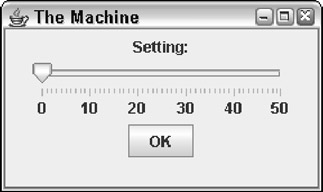
Figure 3-6: A frame with a slider.
To create a slider control, you use the JSlider class. Table 3-8 shows its constructors and methods.
Table 3-8: Selected JSlider Constructors and Methods
Open table as spreadsheet
|
Constructor |
Description |
|---|---|
|
JSlider() |
Creates a new slider. The min and max values default to 0 and 100, and the initial value is set to 50. |
|
JSlider(int min, int max) |
Creates a new slider with the specified minimum and maximum values. The initial value is halfway between min and max. |
|
JSlider(int min, int max, int value) |
Creates a new slider with the specified minimum, maximum, and initial values. |
|
JSlider(int orientation, int max, int value) |
Creates a new slider with the specified minimum, maximum, and initial values. The orientation can be either JSlider.HORIZONTAL or JSlider.VERTICAL. int min, |
Open table as spreadsheet
|
Method |
Description |
|---|---|
|
void addChangeListener (ChangeListener listener) |
Adds a ChangeListener to listen for change events. |
|
int getValue() |
Gets the value indicated by the current position of the knob. |
|
void setFont() |
Sets the font of the text associated with the slider. |
|
void setInvert (boolean value) |
If true, inverts the slider's direction so the max value is on the left and the min value is on the right. |
|
void setMajorTickSpacing (int value) |
Sets the interval for major tick marks. The marks aren't shown unless setPaintTicks(true) is called. |
|
void setMinimum(int value) |
Sets the minimum value. |
|
void setMaximum(int value) |
Sets the maximum value. |
|
void setMinorTickSpacing (int value) |
Sets the interval for minor tick marks. The marks aren't shown unless setPaintTicks(true) is called. |
|
setOrientation (int orientation) |
Sets the orientation. Allowed values are JSlider.HORIZONTAL and JSlider.VERTICAL. |
|
void setPaintLabels (boolean value) |
If true, tick labels are shown. |
|
void setSnapToTicks (boolean value) |
If true, the value returned by the getValue method is rounded to the nearest tick mark. |
|
void setToolTipText |
Sets the tooltip text that's displayed if the user (String text) rests the mouse pointer over the slider for a few moments. |
To create a barebones slider, just call the JSlider constructor. You can create a slider that ranges from 0 to 100 like this:
slider = new JSlider();
Here the slider variable is declared as a class variable of type JSlider.
If you want to specify the minimum and maximum values, use this constructor:
slider = new JSlider(0, 50);
Here the slider lets the user choose a value from 0 to 50. The initial position of the knob is 25, midway between the minimum and maximum values.
To set a different initial value, use this constructor:
slider = new JSlider(0, 0, 50);
Here the slider ranges from 0 to 50, and the initial value is 0.
You usually want to add at least some adornments to the slider to make it more usable. The slider shown in Figure 3-6 has minimum and maximum tick-mark values with labels visible. Here's the code used to create it:
slider = new JSlider(0, 50, 0);
slider.setMajorTickSpacing(10);
slider.setMinorTickSpacing(1);
slider.setPaintTicks(true);
slider.setPaintLabels(true);
panel1.add(slider);
| Note |
Even if you set the major and minor tick-spacing values, the tick marks won't appear on-screen unless you call setPaintTicks with the parameter set to true. The setPaintLabels method shows the labels along with the tick marks. And the setSnapToTicks method rounds the value to the nearest tick mark. |
To get the value of the slider, you use the getValue method. For example, here's the actionPerformed method for the action listener attached to the OK button in Figure 3-6:
public void actionPerformed(ActionEvent e)
{
 if (e.getSource() == buttonOK)
 {
 int level = slider.getValue();
 JOptionPane.showMessageDialog(slider,
 "Remember, this is for posterity.
"
 + "Tell me...how do you feel?",
 "Level " + level,
 JOptionPane.INFORMATION_MESSAGE);
 }
}
Here a message box is displayed when the user clicks the OK button. The current setting of the slider component is retrieved and stored in an int variable named level, which is then used to create the title for the message box.
You can also add an event listener that reacts whenever the user changes the value of the slider. To do that, you use the addChangeListener method. The parameter must be an object that implements the ChangeListener interface, which defines a single method named stateChanged. Here's an example of a class that can be used to react to slider changes:
private class SliderListener implements ChangeListener
{
 public void stateChanged(ChangeEvent e)
 {
 if (slider.getValue() == 50)
 {
 JOptionPane.showMessageDialog(slider,
 "No! Not 50!",
 "The Machine",
 JOptionPane.WARNING_MESSAGE);
 }
 }
}
To wire an instance of this class to the slider, use this method:
slider.addChangeListener(new SliderListener());
Then the stateChanged method is called whenever the user moves the knob to another position. It checks the value of the slider and displays a message box if the user has advanced the slider all the way to 50.
Book I - Java Basics
Book II - Programming Basics
- Book II - Programming Basics
- Java Programming Basics
- Working with Variables and Data Types
- Working with Numbers and Expressions
- Making Choices
- Going Around in Circles (Or, Using Loops)
- Pulling a Switcheroo
- Adding Some Methods to Your Madness
- Handling Exceptions
Book III - Object-Oriented Programming
- Book III - Object-Oriented Programming
- Understanding Object-Oriented Programming
- Making Your Own Classes
- Working with Statics
- Using Subclasses and Inheritance
- Using Abstract Classes and Interfaces
- Using the Object and Class Classes
- Using Inner Classes
- Packaging and Documenting Your Classes
Book IV - Strings, Arrays, and Collections
- Book IV - Strings, Arrays, and Collections
- Working with Strings
- Using Arrays
- Using the ArrayList Class
- Using the LinkedList Class
- Creating Generic Collection Classes
Book V - Programming Techniques
Book VI - Swing
- Book VI - Swing
- Swinging into Swing
- Handling Events
- Getting Input from the User
- Choosing from a List
- Using Layout Managers
Book VII - Web Programming
Book VIII - Files and Databases
- Book VIII - Files and Databases
- Working with Files
- Using File Streams
- Database for $100, Please
- Using JDBC to Connect to a Database
- Working with XML
Book IX - Fun and Games
EAN: 2147483647
Pages: 332
