Using Layout Managers
Controlling the layout of components on a frame is one of the most difficult aspects of working with Swing. In fact, it can be downright exasperating. Sometimes the components almost seem to have minds of their own. They get stubborn and refuse to budge. They line up on top of each other when you want them to be side by side. You make a slight change to a label or text field, and the whole frame seems to rearrange itself. At times you'll want to put your fist through the monitor.
| Warning |
I recommend against putting your fist through your monitor. You'll make a mess, cut your hand, have to spend money on a new monitor, and when you get your computer working again, the components still won't line up the way you want them to be. |
The problem isn't with the components-it's with the layout managers that are responsible for determining where each component appears in its frame or panel. In this chapter, you find out how to work with Swing's layout managers. This chapter takes the mystery out of Swing layout so you have complete control over where components are placed.
Introducing Layout Managers
Understanding layout managers is the key to creating Swing frames that are attractive and usable. Swing provides several different layout managers for you to work with (six are described in the following list):
- Flow: This is the default layout manager for panels. It lays out components one after the other until it runs out of room. Then it starts a new row of components.
- Border: This is the default layout manager for frames. It divides the container into five regions, called North, South, East, West, and Center. When you add a component, you can specify which region you want to place the component in.
- Box: This layout manager arranges components into either a single row or a single column, depending on what alignment you specify when you create the layout manager.
- Grid: This layout manager is ideal when you want to create a grid of identically sized components.
- GridBag: This layout manager uses a more flexible grid than the Grid layout manager. With GridBag, each of the rows or columns can be a different size, a component can span two or more rows or columns, and you can tell the layout manager what to do if the component is smaller or larger than the space allotted for it.
- Group: This layout manager works best with a visual tool for designing user applications. With Group layout you describe an arrangement from two points of view-from left to right and from top to bottom.
Figure 5-1 shows frames arranged with each of these layout managers.
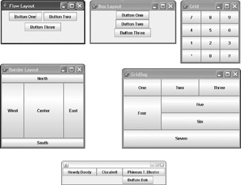
Figure 5-1: The six layout managers.
In addition to these six layout managers, Java provides a few additional ones. The Card layout manager lets you create tabbed layouts, but this manager has been largely replaced by other components that do the same thing more effectively. And the Spring layout manager uses a weird concept called springs to let you position components. This layout manager isn't intended to be hand-coded. Instead, it's designed to be used by code generators that create GUI code for you. Neither of these layout managers are covered in this book.
| Tip |
In many cases, the best approach to creating complex frame layouts is to use a combination of layout managers. For example, you might create a panel with buttons that appear at the bottom of the frame. This panel would use Flow layout. Then you can add this panel to the South region of the frame, which uses Border layout by default. |
To set the layout manager for a panel or frame, you use the setLayout method. For example, here's how you create a panel and set GridBag as its layout manager:
JPanel panel1 = new JPanel();
panel1.setLayout(new GridBagLayout());
| REMEMBER |
If you want to use Flow layout with a panel or Border layout with a frame, you don't have to do anything because those are the defaults. |
Using Flow Layout
Because Flow layout is the default layout manager for panels, you're already familiar with how it works. The components are laid out in a single row if possible. If a component doesn't fit on the current row, a new row is started.
By itself, the Flow layout manager isn't very useful. You'll probably use it mostly for small panels that consist of a few components, such as a row of buttons that is then added to a larger panel that uses one of the other layout managers.
Table 5-1 lists the constructors of the FlowLayout class, which you can use to create a new Flow layout manager.
|
Constructor |
Description |
|---|---|
|
FlowLayout() |
Creates a Flow layout manager with centered alignment and no gaps. |
|
FlowLayout (int align) |
Creates a Flow layout manager with the specified alignment. The align parameter can be FlowLayout.LEFT, FlowLayout.CENTER, or FlowLayout.RIGHT. |
|
FlowLayout(int align, int hgap, int vgap) |
Creates a Flow layout manager with the specified alignment. The int parameters specify the size (in pixels) of gaps that are inserted between elements to space things out a bit. |
By default, the rows are centered. You can specify left alignment for a panel like this:
JPanel panel1 = new JPanel();
panel1.setLayout(new FlowLayout(FlowLayout.LEFT));
To specify right alignment, use this statement instead:
panel1.setLayout(new FlowLayout(FlowLayout.RIGHT));
You can also specify gaps that are inserted between each component. Here's an example:
panel1.setLayout(
 new FlowLayout(FlowLayout.LEFT, 20, 15));
Here the horizontal gap is set to 20, and the vertical gap is set to 15. Figure 5-2 shows a panel with six buttons created with these settings.
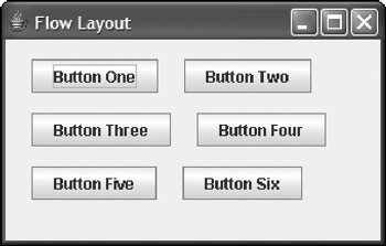
Figure 5-2: Flow layout with left alignment and gaps.
Using Border Layout
The Border layout manager carves up a frame or panel into five regions: North, South, East, West, and Center, as shown in Figure 5-3. Then, when you add a component to the frame or panel, you can specify which of these regions the component goes in.
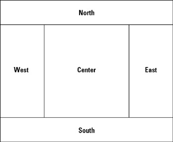
Figure 5-3: How Border layout carves things up.
Border layout is the default for frames. To create a panel with Border layout, use one of the constructors of the BorderLayout class that's shown in Table 5-2. For example:
JPanel panel1 = new JPanel();
panel1.setLayout(new BorderLayout());
Table 5-2: Border Layout Constructors and Fields
 Open table as spreadsheet
|
Constructor |
Description |
|---|---|
|
BorderLayout() |
Creates a Border layout manager with no gaps. |
|
BorderLayout (int hgap, int vgap) |
Creates a Border layout manager with the specified horizontal and vertical gaps. |
Open table as spreadsheet
|
Field |
Description |
|---|---|
|
NORTH |
The North region (at the top of the container). |
|
SOUTH |
The South region (at the bottom of the container). |
|
WEST |
The West region (at the left of the container). |
|
EAST |
The East region (at the right of the container). |
|
CENTER |
The Center region. |
When you add a component to a panel or frame that uses the Border layout manager, you can specify the region to place the component in by using one of the BorderLayout fields, as in this example:
panel1.add(new JLabel("Welcome!"), BorderLayout.NORTH);
Here the label is added to the North region.
| Tip |
Here are a few additional important points to know about Border layout:
|
Using Box Layout
You can use the Box layout to create a panel that contains a single row or column of components. If the components are arranged in a single row, the box is called a horizontal box. If the components are stacked in a column, the box is a vertical box.
Although you can apply the Box layout directly to a panel, it's much more common to use the Box class, which is similar to a panel but defaults to Box layout rather than Flow layout. In addition, the Box class has several static methods that are useful for laying out components in the box. Table 5-3 lists some methods of this class.
Table 5-3: The Box and Dimension Classes
Open table as spreadsheet
|
Box Methods |
Description |
|---|---|
|
static Component createGlue() |
Creates a glue component. This component forces the components on any side of it as far away from each other as possible. |
|
static Box createHorizontalBox() |
Creates a horizontal box. |
|
static Component createHorizontalGlue() |
Creates a horizontal glue component. This component forces the components on either side of it as far away from each other as possible. |
|
static Component createHorizontalStrut (int width) |
Creates a horizontal strut component that places the specified amount of space between the components on either side of it. |
|
static createRigidArea (Dimension d) |
Creates an area with a fixed size. |
|
static Box createVerticalBox() |
Creates a vertical box. |
|
static Component createVerticalGlue () |
Creates a vertical glue component. This component forces the components above and below it as far away from each other as possible. |
|
static Component createVerticalStrut (int width) |
Creates a vertical strut component that places the specified amount of space between the components above and below it. |
Open table as spreadsheet
|
Dimension Constructor |
Description |
|---|---|
|
Dimension(int width, int height) |
Creates a new Dimension object with the specified width and height. |
Here's an example that creates a horizontal box and adds three buttons to it:
Box box1 = Box.createHorizontalBox();
box1.add(new JButton("Accept"));
box1.add(new JButton("Cancel"));
box1.add(new JButton("Close"));
The real power of Box layouts is the use of struts, rigid area, and glue:
- A strut is a component that inserts a specified amount of space between components. You can create a strut by calling the createHorizontalStrut or createVerticalStrut method, depending on which type of strut you want to create. For example, suppose you want the three buttons in the previous example to be separated by 20 pixels, and you want 20 pixels of blank space on either end of the box as well. This code does the trick:
Box box1 = Box.createHorizontalBox(); box1.add(Box.createHorizontalStrut(20)); box1.add(new JButton("Accept")); box1.add(Box.createHorizontalStrut(20)); box1.add(new JButton("Cancel")); box1.add(Box.createHorizontalStrut(20)); box1.add(new JButton("Close")); box1.add(Box.createHorizontalStrut(20)); - A rigid area is like a strut, but spaces things out both horizontally and vertically. For example
 box1.add(new JButton("Accept"));
 box1.add(Box.createRigidArea(new Dimension(20, 40)));
 box1.add(new JButton("Cancel"));
Here I used a rigid area that's 20 by 40 pixels to separate the Accept button from the Cancel button. One side effect of this rigid area is that it increases the height of the box itself to 40 pixels. Empty space is left above and below the buttons.
- Glue is similar to a strut, but it pushes components as far away from each other as possible within the bounds of the box itself. For example, this code uses glue to move the third button as far away from the first two buttons as possible based on the width of the box:
 Box box1 = Box.createHorizontalBox();

 box1.add(Box.createHorizontalStrut(20));
 box1.add(new JButton("Accept"));
 box1.add(Box.createRigidArea(new Dimension(20, 40)));
 box1.add(new JButton("Cancel"));

 box1.add(Box.createHorizontalGlue());

 box1.add(new JButton("Close"));
 box1.add(Box.createHorizontalStrut(20));
Now, if you add this Box layout to the South region of a frame, the buttons appear as shown in Figure 5-4.
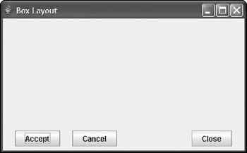
Figure 5-4: Using Box layout to arrange buttons.
Using Grid Layout
The Grid layout is designed for panels that need to have a set number of components all equally sized and arranged into a grid. You probably won't use it much, but if you need to create something that looks like a calculator or a phone, this is the layout manager you need. Table 5-4 lists the constructors of the GridLayout class, which you use to create a grid layout.
|
Constructor |
Description |
|---|---|
|
GridLayout() |
Creates a grid layout that arranges components in a single row. This is equivalent to GridLayout(1, 0). |
|
GridLayout(int rows, int columns) |
Creates a grid layout with the specified number of rows and columns. If one of the parameters is zero, the grid expands to fill as many rows or columns as necessary. (You can't specify zero for both parameters.) |
|
GridLayout(int rows, int columns, int hgap, int vgap) |
Creates a grid layout with the specified number of rows and columns with gaps of the specified size between the rows and columns. |
To create a panel with Grid layout, you call the GridLayout constructor to specify the size of the grid. One of the parameters can be zero to allow the grid to expand to however many rows or columns are necessary to hold all the components you add to the panel.
For example, here's code that creates the Grid layout panel that resembles a phone and was shown earlier in Figure 5-1:
JPanel panel1 = new JPanel();
panel1.setLayout(new GridLayout(0,3));

panel1.add(new JButton("7"));
panel1.add(new JButton("8"));
panel1.add(new JButton("9"));
panel1.add(new JButton("4"));
panel1.add(new JButton("5"));
panel1.add(new JButton("6"));
panel1.add(new JButton("1"));
panel1.add(new JButton("2"));
panel1.add(new JButton("3"));
panel1.add(new JButton("*"));
panel1.add(new JButton("0"));
panel1.add(new JButton("#"));
As you add components to a panel with Grid layout, the components are dropped into the grid's cells row by row, working across each row from left to right. As each row is filled, a new row is started.
Using GridBag Layout
The GridBag layout manager is the layout manager you'll probably use most to lay out complicated panels. Like the Grid layout manager, GridBag lets you carve up a panel into a grid. However, the grid has the following special features:
- The rows and columns don't all have to be the same size. Instead, GridBag automatically adjusts the width of each column and the height of each row based on the components you add to the panel.
- You can specify which cell you want each component to go in. You can control each component's position on the panel.
- You can create components that span multiple rows or columns. For example, you can create a button that is two columns wide or a list box that is four rows high.
- You can tell GridBag to stretch a component to fill the entire space allotted to it if the component isn't already big enough to fill the entire area. You can specify that this stretching be done horizontally, vertically, or both.
- If a component doesn't fill its allotted area, you can tell the GridBag how you want the component positioned within the area. For example, components can be left or right aligned.
The following sections describe the ins and outs of working with GridBag layouts.
Sketching out a plan
The first step when preparing to create a GridBag panel is to draw a sketch of how you want the components on the panel to appear. Then slice the panel into rows and columns and number the rows and columns starting with zero in the top-left corner. Figure 5-5 shows such a sketch, prepared with my own hand.
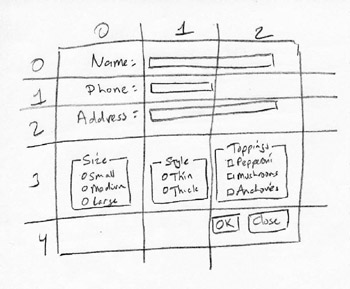
Figure 5-5: Sketching out a panel.
After you have the panel sketched out, make a list of the components, their x and y coordinates on the grid, their alignment, and whether the component spans more than one row or column. Here's an example:
Open table as spreadsheet
|
Component |
x |
y |
Alignment |
Spans |
|---|---|---|---|---|
|
Label "Name" |
0 |
0 |
right |
|
|
Label "Phone" |
0 |
1 |
right |
|
|
Label "Address" |
0 |
2 |
right |
|
|
Name text field |
1 |
0 |
left |
2 |
|
Phone text field |
1 |
1 |
left |
|
|
Address text field |
1 |
2 |
left |
|
|
Size box |
0 |
3 |
left |
|
|
Style box |
1 |
3 |
left |
|
|
Toppings box |
2 |
3 |
left |
|
|
Button box |
2 |
4 |
right |
After you lay out the grid, you can write the code to add each component to its proper place.
Adding components to a GridBag
Before you can add components to a panel using the GridBag layout, you must first specify GridBag as the panel's layout manager. You do that by calling the setLayout method, passing a new GridBagLayout object as a parameter:
JPanel panel1 = new JPanel();
panel1.setLayout(new GridBagLayout());
When a panel uses the GridBag layout, the add method accepts two parameters: the component to add and a GridBagConstraints object that specifies where to place the component in the grid. The trick of using the GridBag layout is figuring out how to set the GridBagConstraints values to get each component to go where you want it to go. Table 5-5 lists the fields of the GridBagConstraints class.
|
Field |
Description |
|---|---|
|
int gridx |
The x position of the component. |
|
int gridy |
The y position of the component. |
|
int gridwidth |
The number of columns spanned by the component. The default is 1. |
|
int gridheight |
The number of rows spanned by the component. The default is 1. |
|
double weightx |
A value that gives the grid layout a hint on how to apportion space for the component's width. |
|
double weighty |
A value that gives the grid layout a hint on how to apportion space for the component's height. |
|
Insets insets |
An Insets object that indicates how much space to use as padding around each component. The Insets class has a simple constructor: Insets(int top, int left, int bottom, int right). |
|
int anchor |
A constant that indicates where to place the component if it doesn't fill the space. Values can be any of the following fields of the GridBagConstraints class: CENTER, NORTH, NORTHEAST, EAST, SOUTHEAST, SOUTH, SOUTHWEST, WEST, and NORTHWEST. |
|
int fill |
A constant that indicates whether to stretch the object to fill available space. Values can be any of the following fields of the GridBagConstraints class: NONE, HORIZONTAL, VERTICAL, or BOTH. |
A few of these fields need some extra explanation:
- The weightx and weighty fields give the GridBag layout manager a hint about how to adjust the size of the columns and rows. If you set one of these values to zero, the row or column remains fixed in size. A common technique is to set both of these parameters to 100, and then adjust them if you think the layout could benefit from some tweaking.
- The insets field lets you provide some padding around components.
You set this field to an Insets object. For example, assuming the GridBagConstraints object is named gc, this statement provides 5 pixels of space on each side of the component and sets the insets field like this:
gc.insets = new Insets(5, 5, 5, 5);
- By default, components are stretched to fill the cells of the grid. This is rarely what you want, so you usually want to set the fill field to change this behavior.
- You also want to set the anchor field to indicate where you want the component placed if it doesn't fill the cell or cells allotted to it.
Working with GridBagConstraints
To create a GridBagConstraint object, you call the GridBagConstraint constructor, and then set any of the fields that you want to vary from the default values. For example, here's code that creates a GridBagConstraint object to add the name text field that is shown earlier in Figure 5-5:
GridBagConstraints nameConstraints
 = new GridBagConstraints();
nameConstraints.gridx = 1;
nameConstraints.gridy = 0;
nameConstraints.gridwidth = 2;
nameConstraints.gridheight = 1;
nameConstraints.weightx = 100.0;
nameConstraints.weighty = 100.0;
nameConstraints.insets = new Insets(5, 5, 5, 5);
nameConstraints.anchor = GridBagConstraints.WEST;
nameConstraints.fill = GridBagConstraints.NONE;
Then you can call the add method to add the name text field to the panel:
panel1.add(name, nameConstraints);
Obviously, this approach to controlling constraints is going to require a lot of coding. You have two common alternatives to creating a new constraint object for every component you add to the panel. The first is to create a single constraint object and reuse it for all the components in the panel.
Then you simply change the fields that need to be changed for each component. For example, here's code that adds all three text fields using a single constraint object:
GridBagConstraints gc = new GridBagConstraints();
gc.gridx = 0;
gc.gridy = 0;
gc.gridwidth = 1;
gc.gridheight = 1;
gc.weightx = 100.0;
gc.weighty = 100.0;
gc.insets = new Insets(5, 5, 5, 5);
gc.anchor = GridBagConstraints.WEST;
gc.fill = GridBagConstraints.NONE;

gc.gridy = 0;
gc.gridwidth = 2;
add(name, gc);
gc.gridy = 1;
gc.gridwidth = 1;
add(phone, gc);
gc.gridy = 2;
gc.gridwidth = 2;
add(address, gc);
Here the first group of statements creates a GridBagConstraints object named gc and sets its values to the defaults that I want to apply to most of the components in the panel. Then the second group of statements sets the gridy and gridwidth fields before adding each text field to the panel.
The second option is to create a helper method that you can call, passing just the values that vary for each component. For example, here's a method named addItem that adds a component and left aligns it within the specified cells:
private void addItem(JPanel p, JComponent c, int x,
 int y, int width, int height, int align)
{
 GridBagConstraints gc = new GridBagConstraints();
 gc.gridx = x;
 gc.gridy = y;
 gc.gridwidth = width;
 gc.gridheight = height;
 gc.weightx = 100.0;
 gc.weighty = 100.0;
 gc.insets = new Insets(5, 5, 5, 5);
 gc.anchor = align;
 gc.fill = GridBagConstraints.NONE;
 p.add(c, gc);
}
Then you can call this method to add a component to the panel. You must pass the panel and the component, its x and y position, and its width and height. For example, here's how you add the name text field:
addItem(panel1, name, 0, 1, 2, 1,
 GridBagConstraints.WEST);
A GridBag layout example
Listing 5-1 shows the code for a program that displays the frame that I drew in Figure 5-5, and Figure 5-6 shows how this frame appears when the program is run. As you can see, the final appearance of this frame is pretty close to the way I sketched it out. I could probably fix a few minor variations with a little tweaking.
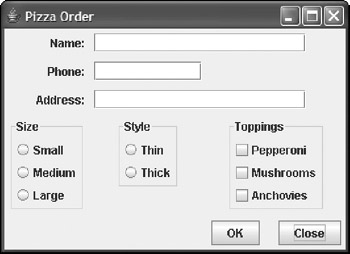
Figure 5-6: The Pizza Order application in action.
Listing 5-1: The Pizza Order Application
import javax.swing.*;
import java.awt.event.*;
import java.awt.*;

public class Pizza extends JFrame
{
 public static void main(String [] args)
 {
 new Pizza();
 }

 JTextField name, phone, address;
 JRadioButton small, medium, large, thick, thin;
 JCheckBox pepperoni, mushrooms, anchovies;
 JButton okButton, closeButton;

 public Pizza()

{
 this.setTitle("Pizza Order");
 this.setDefaultCloseOperation(
 JFrame.EXIT_ON_CLOSE);

 JPanel panel1 = new JPanel();
 panel1.setLayout(new GridBagLayout()); → 23
 addItem(panel1, new JLabel("Name:"), → 25
 0, 0, 1, 1, GridBagConstraints.EAST);
 addItem(panel1, new JLabel("Phone:"),
 0, 1, 1, 1, GridBagConstraints.EAST);
 addItem(panel1, new JLabel("Address:"),
 0, 2, 1, 1, GridBagConstraints.EAST);

 name = new JTextField(20);
 phone = new JTextField(10);
 address = new JTextField(20);

 addItem(panel1, name, 1, 0, 2, 1, → 36
 GridBagConstraints.WEST);
 addItem(panel1, phone, 1, 1, 1, 1,
 GridBagConstraints.WEST);
 addItem(panel1, address, 1, 2, 2, 1,
 GridBagConstraints.WEST);

 Box sizeBox = Box.createVerticalBox(); → 43
 small = new JRadioButton("Small");
 medium = new JRadioButton("Medium");
 large = new JRadioButton("Large");
 ButtonGroup sizeGroup = new ButtonGroup();
 sizeGroup.add(small);
 sizeGroup.add(medium);
 sizeGroup.add(large);
 sizeBox.add(small);
 sizeBox.add(medium);
 sizeBox.add(large);
 sizeBox.setBorder(
 BorderFactory.createTitledBorder("Size"));
 addItem(panel1, sizeBox, 0, 3, 1, 1,
 GridBagConstraints.NORTH);

 Box styleBox = Box.createVerticalBox(); → 59
 thin = new JRadioButton("Thin");
 thick = new JRadioButton("Thick");
 ButtonGroup styleGroup = new ButtonGroup();
 styleGroup.add(thin);
 styleGroup.add(thick);
 styleBox.add(thin);
 styleBox.add(thick);
 styleBox.setBorder(BorderFactory.

 createTitledBorder("Style"));
 addItem(panel1, styleBox, 1, 3, 1, 1,
 GridBagConstraints.NORTH);

 Box topBox = Box.createVerticalBox(); → 72
 pepperoni = new JCheckBox("Pepperoni");
 mushrooms = new JCheckBox("Mushrooms");
 anchovies = new JCheckBox("Anchovies");
 ButtonGroup topGroup = new ButtonGroup();
 topGroup.add(pepperoni);
 topGroup.add(mushrooms);
 topGroup.add(anchovies);
 topBox.add(pepperoni);
 topBox.add(mushrooms);
 topBox.add(anchovies);
 topBox.setBorder(BorderFactory.
 createTitledBorder("Toppings"));
 addItem(panel1, topBox, 2, 3, 1, 1,
 GridBagConstraints.NORTH);

 Box buttonBox = Box.createHorizontalBox(); → 88
 okButton = new JButton("OK");
 closeButton = new JButton("Close");
 buttonBox.add(okButton);
 buttonBox.add(Box.createHorizontalStrut(20));
 buttonBox.add(closeButton);
 addItem(panel1, buttonBox, 2, 4, 1, 1,
 GridBagConstraints.NORTH);

 this.add(panel1);
 this.pack();
 this.setVisible(true);
 }

 private void addItem(JPanel p, JComponent c,
 int x, int y, int width, int height,
 int align)
 {
 GridBagConstraints gc =
 new GridBagConstraints();
 gc.gridx = x;
 gc.gridy = y;
 gc.gridwidth = width;
 gc.gridheight = height;
 gc.weightx = 100.0;
 gc.weighty = 100.0;
 gc.insets = new Insets(5, 5, 5, 5);
 gc.anchor = align;
 gc.fill = GridBagConstraints.NONE;
 p.add(c, gc);
 }
}
Note that this application doesn't include any event listeners, so the buttons don't do anything other than demonstrate how to use the GridBag layout. The following paragraphs point out the highlights:
|
→ 23 |
This line creates a GridBag layout manager for the panel. |
|
→ 25 |
These lines add the labels to the panel. |
|
→ 36 |
These lines add the text fields to the panel. |
|
→ 43 |
These lines use a vertical Box object to create the radio buttons that let the user select the size. |
|
→ 59 |
These lines use a vertical Box object to create the radio buttons that let the user select the crust style. |
|
→ 72 |
These lines use a vertical Box object to create the check boxes that let the user select toppings. |
|
→ 88 |
These lines use a horizontal Box object to hold the OK and Close buttons. |
Open table as spreadsheet
Using Group Layout
Java 1.6 sports a new layout manager called the Group layout. The Group layout is most useful when you use it as part of a visual editor-an IDE in which you draw new buttons, text fields, and other components with your mouse. But the Group layout is also good for plain old code writing.
The thing to remember about the Group layout is that the layout describes an arrangement of components from two directions-from left to right, and from top to bottom. Imagine an ant crawling along a page. The page contains the five buttons shown in Figure 5-7. As the ant crawls from left to right, the ant sees three things:
- A button containing the letter D
- A column of three buttons (a group)
- A button containing the letter Y
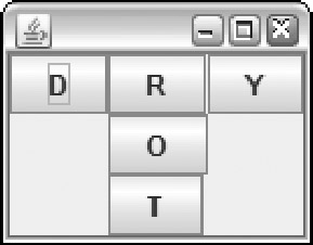
Figure 5-7: An arrangement of buttons with the Group layout.
The ant sees these three things one after another, so these three things form a sequential group. But in the middle of the ant's journey, the ant sees the column of three buttons (R, O, and T) all at once. So this column of three buttons is called a parallel group.
The ant encounters a parallel group within a sequential group. The code to describe the groups looks like this:
GroupLayout.SequentialGroup leftToRight =
 layout.createSequentialGroup();
 leftToRight.addComponent(buttonD);
 GroupLayout.ParallelGroup columnMiddle =
 layout.createParallelGroup();
 columnMiddle.addComponent(buttonR);
 columnMiddle.addComponent(buttonO);
 columnMiddle.addComponent(buttonT);
 leftToRight.addGroup(columnMiddle);
 leftToRight.addComponent(buttonY);
The code's indentation is highly irregular. I indent this way to help you see the group-within-group outline. Maybe the strange indentation helps; maybe it doesn't. You can indent the code any way you want. One way or another, the code describes a parallel group (the middle column of buttons) within a sequential group (the D button, the middle column, and the Y button).
To fully describe a Group layout, you need a second ant. This additional ant crawls from the top of Figure 5-7 downward. As the ant crawls downward, it sees the following things:
- A row of three buttons (a group)
- A button containing the letter O
- A button containing the letter T
The ant sees these three things one after another, so these three things form a sequential group. But at the start of the ant's journey, the ant sees the row of three buttons (D, R, and Y) all at once. So this row of three buttons is a parallel group.
This downward-moving ant encounters a parallel group within a sequential group. The code to describe the groups looks like this:
GroupLayout.SequentialGroup topToBottom =
 layout.createSequentialGroup();
 GroupLayout.ParallelGroup rowTop =
 layout.createParallelGroup();
 rowTop.addComponent(buttonD);
 rowTop.addComponent(buttonR);
 rowTop.addComponent(buttonY);
 topToBottom.addGroup(rowTop);
 topToBottom.addComponent(buttonO);
 topToBottom.addComponent(buttonT);
When you put it all together, you get the code in Listing 5-2.
Listing 5-2: A Frame with a Group Layout
import javax.swing.GroupLayout;
import javax.swing.JButton;
import javax.swing.JFrame;
import javax.swing.JPanel;

public class UseGroupLayout3
{

 public static void main(String[] args)
 {
 JFrame frame = new JFrame();
 JPanel panel = new JPanel();
 frame.setDefaultCloseOperation
 (JFrame.EXIT_ON_CLOSE);
 GroupLayout layout = new GroupLayout(panel);
 panel.setLayout(layout);

 JButton buttonD = new JButton("D");
 JButton buttonR = new JButton("R");
 JButton buttonY = new JButton("Y");
 JButton buttonO = new JButton("O");
 JButton buttonT = new JButton("T");

 GroupLayout.SequentialGroup leftToRight =
 layout.createSequentialGroup();

 leftToRight.addComponent(buttonD);
 GroupLayout.ParallelGroup columnMiddle =
 layout.createParallelGroup();
 columnMiddle.addComponent(buttonR);
 columnMiddle.addComponent(buttonO);
 columnMiddle.addComponent(buttonT);
 leftToRight.addGroup(columnMiddle);
 leftToRight.addComponent(buttonY);

 GroupLayout.SequentialGroup topToBottom =
 layout.createSequentialGroup();
 GroupLayout.ParallelGroup rowTop =
 layout.createParallelGroup();
 rowTop.addComponent(buttonD);
 rowTop.addComponent(buttonR);
 rowTop.addComponent(buttonY);
 topToBottom.addGroup(rowTop);
 topToBottom.addComponent(buttonO);
 topToBottom.addComponent(buttonT);

 layout.setHorizontalGroup(leftToRight);
 layout.setVerticalGroup(topToBottom);

 frame.add(panel);
 frame.pack();
 frame.setVisible(true);
 }
}
A reader from Minnesota asks: "What happens if you change the code in Listing 5-2? What if you modify one of the ants' descriptions so that the two descriptions don't agree?" The answer is: Nothing good happens. Yes, the two ants' descriptions seem redundant; but no, you can't eliminate one of the descriptions or make the descriptions be inconsistent. If you do, then your program exits prematurely with a nasty error message.
At first glance, the Group layout seems quite complex. Like many programming techniques, the Group layout makes simple things difficult. But-also like those other techniques-the Group layout makes some complicated things very easy. Check out some Web-based tutorials on the Group layout. When you learn more about the Group layout, you'll understand this layout's true power.
Book I - Java Basics
Book II - Programming Basics
- Book II - Programming Basics
- Java Programming Basics
- Working with Variables and Data Types
- Working with Numbers and Expressions
- Making Choices
- Going Around in Circles (Or, Using Loops)
- Pulling a Switcheroo
- Adding Some Methods to Your Madness
- Handling Exceptions
Book III - Object-Oriented Programming
- Book III - Object-Oriented Programming
- Understanding Object-Oriented Programming
- Making Your Own Classes
- Working with Statics
- Using Subclasses and Inheritance
- Using Abstract Classes and Interfaces
- Using the Object and Class Classes
- Using Inner Classes
- Packaging and Documenting Your Classes
Book IV - Strings, Arrays, and Collections
- Book IV - Strings, Arrays, and Collections
- Working with Strings
- Using Arrays
- Using the ArrayList Class
- Using the LinkedList Class
- Creating Generic Collection Classes
Book V - Programming Techniques
Book VI - Swing
- Book VI - Swing
- Swinging into Swing
- Handling Events
- Getting Input from the User
- Choosing from a List
- Using Layout Managers
Book VII - Web Programming
Book VIII - Files and Databases
- Book VIII - Files and Databases
- Working with Files
- Using File Streams
- Database for $100, Please
- Using JDBC to Connect to a Database
- Working with XML
Book IX - Fun and Games
EAN: 2147483647
Pages: 332
