In-Process Metrics for Software Testing
In this section, we discuss the key in-process metrics that are effective for managing software testing and the in-process quality status of the project.
10.1.1 Test Progress S Curve (Planned, Attempted, Actual)
Tracking the progress of testing is perhaps the most important tracking task for managing software testing. The metric we recommend is a test progress S curve over time. The X -axis of the S curve represents time units and the Y -axis represents the number of test cases or test points. By "S curve" we mean that the data are cumulative over time and resemble an "S" shape as a result of the period of intense test activity, causing a steep planned test ramp-up . For the metric to be useful, it should contain the following information on one graph:
- Planned progress over time in terms of number of test cases or number of test points to be completed successfully by week (or other time unit such as day or hour )
- Number of test cases attempted by week (or other time unit)
- Number of test cases completed successfully by week (or other time unit)
The purpose of this metric is to track test progress and compare it to the plan, and therefore be able to take action upon early indications that testing activity is falling behind. It is well known that when the schedule is under pressure, testing, especially development testing, is affected most significantly. Schedule slippage occurs day by day and week by week. With a formal test progress metric in place, it is much more difficult for the team to ignore the problem. From the project planning perspective, an S curve forces better planning (see further discussion in the following paragraphs).
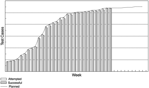
Figure 10.2 is an example of the component test metric at the end of the test of a major release of an integrated operating system. As can be seen from the figure, the testing plan is expressed in terms of a line curve, which is put in place before the test begins. The empty bars indicate the cumulative number of test cases attempted and the solid bars represent the number of successful test cases. With the plan curve in place, each week when the test is in progress, two bars (one for attempted and one for successful) are added to the graph. This example shows that during the rapid test ramp-up period (the steep slope of the curve), for some weeks the test cases attempted were slightly ahead of plan (which is possible), and the successes were slightly behind plan.
Figure 10.1. IBM Rochester's Software Testing Phases
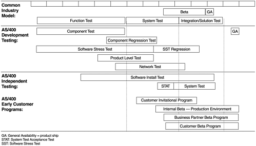
Figure 10.2. Sample Test Progress S Curve
 CTR
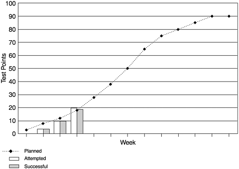
CTR Because some test cases are more important than others, it is not unusual in software testing to assign scores to the test cases. Using test scores is a normalization approach that provides more accurate tracking of test progress. The assignment of scores or points is normally based on experience, and at IBM Rochester, teams usually use a 10-point scale (10 for the most important test cases and 1 for the least). To track test points, the teams need to express the test plan (amount of testing done every week) and track the week-by-week progress in terms of test points. The example in Figure 10.3 shows test point tracking for a product level test, which was underway, for a systems software. It is noted that there is always an element of subjectivity in the assignment of weights. The weights and the resulting test points should be determined in the test planning stage and remain unchanged during the testing process. Otherwise, the purpose of this metric will be compromised in the reality of schedule pressures. In software engineering, weighting and test score assignment remains an interesting area where more research is needed. Possible guidelines from such research will surely benefit the planning and management of software testing.
Figure 10.3. Test Progress S Curve ”Test Points Tracking
For tracking purposes, test progress can also be weighted by some measurement of coverage. Coverage weighting and test score assignment consistency become increasingly important in proportion to the number of development groups involved in a project. Lack of attention to tracking consistency across functional areas can result in a misleading view of the overall project's progress.
When a plan curve is in place, the team can set up an in-process target to reduce the risk of schedule slippage. For instance, a disparity target of 15% between attempted (or successful) and planned can be used to trigger additional actions. Although the test progress S curves, as shown in Figures 10.2 and 10.3, give a quick visual status of the progress against the total plan and plan-to-date (the eye can quickly determine if testing is ahead or behind on planned attempts and successes), it may be difficult to discern the exact amount of slippage. This is particularly true for large testing efforts, where the number of test cases is in the hundreds of thousands. For that reason, it is useful to also display the test status in tabular form, as in Table 10.1. The table also shows underlying data broken out by department and product or component, which helps to identify problem areas. In some cases, the overall test curve may appear to be on schedule, but when progress is viewed only at the system level, because some areas are ahead of schedule, they may mask areas that are behind schedule. Of course, test progress S curves are also used for functional areas and for specific products.
Table 10.1. Test Progress Tracking ”Planned, Attempted, Successful
|
No. of Test Cases Planned to Date |
Prcent of Plan Attempted |
Percent of Plan Successful |
No. of Planned Test Cases Not Yet Attempted |
Percent of Total Attempted |
Percent of Total Successful |
|
|---|---|---|---|---|---|---|
|
System |
60577 |
90.19 |
87.72 |
5940 |
68.27 |
66.10 |
|
Dept A |
1043 |
66.83 |
28.19 |
346 |
38.83 |
15.60 |
|
Dept B |
708 |
87.29 |
84.46 |
90 |
33.68 |
32.59 |
|
Dept C |
33521 |
87.72 |
85.59 |
4118 |
70.60 |
68.88 |
|
Dept D |
11275 |
96.25 |
95.25 |
423 |
80.32 |
78.53 |
|
Dept E |
1780 |
98.03 |
94.49 |
35 |
52.48 |
50.04 |
|
Dept F |
4902 |
100.00 |
99.41 |
96.95 |
95.93 |
|
|
Product A |
13000 |
70.45 |
65.10 |
3841 |
53.88 |
49.70 |
|
Product B |
3976 |
89.51 |
89.19 |
417 |
66.82 |
66.50 |
|
Product C |
1175 |
66.98 |
65.62 |
388 |
32.12 |
31.40 |
|
Product D |
277 |
277 |
||||
|
Product E |
232 |
6.47 |
6.470 |
214 |
3.78 |
3.70 |
An initial plan curve should be subject to brainstorming and challenges. For example, if the curve shows a very steep ramp-up in a short period of time, the project manager may challenge the team with respect to how doable the plan is or the team's specific planned actions to execute the plan successfully. As a result, better planning will be achieved. Caution: Before the team settles on a plan curve and uses it to track progress, a critical evaluation of what the plan curve represents must be made. Is the total test suite considered effective? Does the plan curve represent high test coverage (functional coverage)? What are the rationales for the sequences of test cases in the plan? This type of evaluation is important because once the plan curve is in place, the visibility of this metric tends to draw the whole team's attention to the disparity between attempted, successful, and the planned testing.
Once the plan line is set, any proposed or actual changes to the plan should be reviewed. Plan slips should be evaluated against the project schedule. In general, the baseline plan curve should be maintained as a reference. Ongoing changes to the planned testing schedule can mask schedule slips by indicating that attempts are on track, while the plan curve is actually moving to the right.
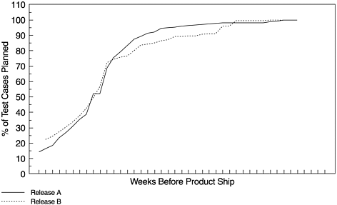
In addition, this metric can be used for release-to-release or project-to-project comparisons, as the example in Figure 10.4 shows. For release-to-release comparisons, it is important to use time units (weeks or days) before product ship (or general availability, GA) as the unit for the X -axis. By referencing the ship dates, the comparison provides a true status of the project in process. In Figure 10.4, it can be observed that Release B, represented by the dotted line, is more back-end loaded than Release A, which is represented by the solid line. In this context, the metric is both a quality and a schedule statement for the testing of the project. This is because late testing causes late cycle defect arrivals and therefore negatively affects the quality of the final product. With this type of comparison, the project team can plan ahead (even before the testing starts) to mitigate the risks.
Figure 10.4. Test Plan Curve ”Release-to-Release Comparison
To implement this metric, the test execution plan needs to be laid out in terms of the weekly target, and actual data needs to be tracked on a weekly basis. For small to medium projects, such planning and tracking activities can use common tools such as Lotus 1-2-3 or other project management tools. For large and complex projects, a stronger tools support facility normally associated with the development environment may be needed. Many software tools are available for project management and quality control, including tools for defect tracking and defect projections. Testing tools usually include test library tools for keeping track of test cases and for test automation, test coverage analysis tools, test progress tracking, and defect tracking tools.
10.1.2 Testing Defect Arrivals over Time
Defect tracking and management during the testing phase is highly recommended as a standard practice for all software testing. Tracking testing progress and defects are common features of many testing tools. At IBM Rochester, defect tracking is done via the problem tracking report (PTR) tool. We have discussed PTR-related models and reports previously. In this chapter we revisit two testing defect metrics (arrivals and backlog) with more details. We recommend tracking the defect arrival pattern over time, in addition to tracking by test phase. Overall defect density during testing, or for a particular test, is a summary indicator, but not really an in-process indicator. The pattern of defect arrivals over time gives more information. As discussed in Chapter 4 (section 4.2.2), even with the same overall defect rate during testing, different patterns of defect arrivals may imply different scenarios of field quality. We recommend the following for this metric:
- Always include data for a comparable baseline (a prior release, a similar project, or a model curve) in the chart if such data is available. If a baseline is not available, at the minimum, when tracking starts, set some expected level of defect arrivals at key points of the project schedule (e.g., midpoint of functional test, system test entry, etc.).
- The unit for the X -axis is weeks (or other time units ) before product ship
- The unit for the Y -axis is the number of defect arrivals for the week, or its variants.
Figure 10.5 is an example of this metric for releases of an integrated operating system. For this example, the main goal is release-to-release comparison at the system level. The metric can be used for the defect arrival patterns based on the total number of defects from all test phases, and for defect arrivals for specific tests. It can be used to compare actual data with a PTR arrival model, as discussed in Chapter 9.
Figure 10.5. Testing Defect Arrival Metric
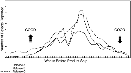
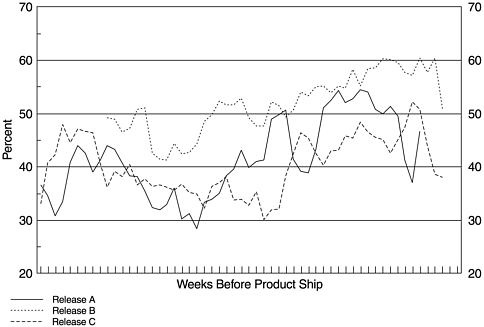
Figure 10.5 has been simplified for presentation. The real graph has much more information on it including vertical lines to depict the key dates of the development cycle and system schedules such as last new function integration, development test completion, start of system test, and so forth. There are also variations of the metric: total defect arrivals, severe defects (e.g., severity 1 and 2 defects in a 4-point severity scale), defects normalized to size of the release (new and changed code plus a partial weight for ported code), and total defect arrivals versus valid defects. The main, and the most useful, chart is the total number of defect arrivals. In our projects, we also include a high severity (severity 1 and 2) defect chart and a normalized view as mainstays of tracking. The normalized defect arrival chart can eliminate some of the visual guesswork of comparing current progress to historical data. In conjunction with the severity chart, a chart that displays the percentage of severity 1 and 2 PTRs per week can be useful. As Figure 10.6 shows, the percentage of high severity problems increases as the release progresses toward the product ship date. Generally, this is because the urgency for problem resolution increases when approaching product delivery, therefore, the severity of the defects was elevated. Unusual swings in the percentage of high severity problems, however, could signal serious problems and should be investigated.
Figure 10.6. Testing Defect Arrivals ”Percentage of Severity 1 and 2 Defects
When do the defect arrivals peak relative to time to product delivery? How does this pattern compare to previous releases? How high do they peak? Do they decline to a low and stable level before delivery? Questions such as these are key to the defect arrival metric, which has significant quality implications for the product in the field. A positive pattern of defect arrivals is one with higher arrivals earlier, an earlier peak (relative to the baseline), and a decline to a lower level earlier before the product ship date, or one that is consistently lower than the baseline when it is certain that the effectiveness of testing is at least as good as previous testing. The tail end of the curve is especially important because it is indicative of the quality of the product in the field. High defect activity before product delivery is more often than not a sign of quality problems. To interpret the defect arrivals metrics properly, refer to the scenarios and questions discussed in Chapter 4 section 4.2.1.
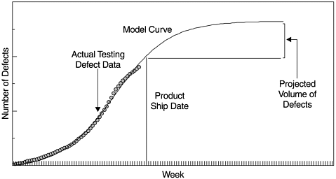
In addition to being an important in-process metric, the defect arrival pattern is the data source for projection of defects in the field. If we change from the weekly defect arrival curve (a density form of the metric) to a cumulative defect curve (a cumulative distribution form of the metric), the curve becomes a well-known form of the software reliability growth pattern. Specific reliability models, such as those discussed in Chapters 8 and 9, can be applied to the data to project the number of residual defects in the product. Figure 10.7 shows such an example. The actual testing defect data represents the total cumulative defects removed when all testing is complete. The fitted model curve is a Weibull distribution with the shape parameter (m) being 1.8. The projected latent defects in the field is the difference in the Y -axis of the model curve between the product ship date and when the curve is approaching its limit. If there is a time difference between the end date of testing and the product ship date, such as this case, the number of latent defects represented by the section of the model curve for this time segment has to be included in the projected number of defects in the field.
Figure 10.7. Testing Defect Arrival Curve, Software Reliability Growth Model, and Defect Projection
10.1.3 Testing Defect Backlog over Time
We define the number of testing defects (or problem tracking reports, PTRs) remaining at any given time as the defect backlog (PTR backlog). Simply put, defect backlog is the accumulated difference between defect arrivals and defects that were closed. Defect backlog tracking and management is important from the perspective of both test progress and customer rediscoveries. A large number of outstanding defects during the development cycle will impede test progress. When a product is about to ship to customers, a high defect backlog means more customer rediscoveries of the defects already found during the development cycle. For software organizations that have separate teams to conduct development testing and to fix defects, defects in the backlog should be kept at the lowest possible level at all times. For organizations that have the same teams responsible for development testing and fixing defects, however, there are appropriate timing windows in the development cycle for which the priority of focuses may vary. While the defect backlog should be managed at a reasonable level at all times, it should not be the highest priority during a period when making headway in functional testing is the critical-path development activity. During the prime time for development testing, the focus should be on test effectiveness and test execution, and defect discovery should be encouraged to the maximum possible extent. Focusing too early on overall defect backlog reduction may conflict with these objectives. For example, the development team may be inclined not to open defect records. The focus during this time should be on the fix turnaround of the critical defects that impede test progress instead of the entire backlog. Of course, when testing is approaching completion, strong focus for drastic reduction in the defect backlog should take place.
For software development projects that build on existing systems, a large backlog of "aged" problems can develop over time. These aged defects often represent fixes or enhancements that developers believe would legitimately improve the product, but which get passed over during development due to resource or design constraints. They may also represent problems that have been fixed or are obsolete as a result of other changes. Without a concerted effort, this aged backlog can build over time. This is one area of the defect backlog that warrants attention early in the development cycle, even prior to the start of development testing.
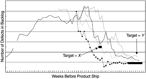
Figure 10.8 is an example of the defect backlog metric for several releases of a systems software product. Again, release-to-release comparisons and actual data versus targets are the main objectives. Target X was a point target for a specific event in the project schedule. Target Y was for the period when the product was being readied to ship.
Figure 10.8. Testing Defect Backlog Tracking
Note that for this metric, a sole focus on the numbers is not sufficient. In addition to the overall reduction, deciding which specific defects should be fixed first is very important in terms of achieving early system stability. In this regard, the expertise and ownership of the development and test teams are crucial.
Unlike defect arrivals, which should not be controlled artificially, the defect backlog is completely under the control of the development organization. For the three metrics we have discussed so far, we recommend the following overall project management approach:
- When a test plan is in place and its effectiveness evaluated and accepted, manage test progress to achieve an early ramp-up in the S curve.
- Monitor defect arrivals and analyze the problems (e.g., defect cause analysis and Pareto analysis of problem areas of the product) to gain knowledge for improvement actions. Do not artificially control defect arrivals, which is a function of test effectiveness, test progress, and the intrinsic quality of the code (the amount of latent defects in the code). Do encourage opening defect records when defects are found.
- Strongly manage defect backlog reduction and achieve predetermined targets associated with the fix integration dates in the project schedule. Known defects that impede testing progress should be accorded the highest priority.
The three metrics discussed so far are obviously related, and they should be viewed together. We'll come back to this point in the section on the effort/outcome model.
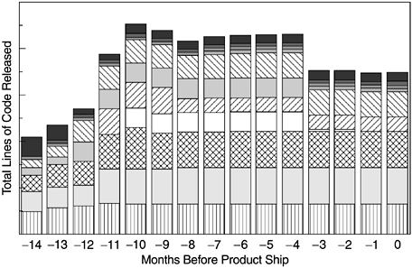
10.1.4 Product Size over Time
Lines of code or another indicator of the project size that is meaningful to the development team can also be tracked as a gauge of the "effort" side of the development equation. During product development, there is a tendency toward growth as requirements and designs are fleshed out. Functions may continue to be added to meet late requirements or the development team wants more enhancements. A project size indicator, tracked over time, can serve as an explanatory factor for test progress, defect arrivals, and defect backlog. It can also relate the measurement of total defect volume to per unit improvement or deterioration. Figure 10.9 shows a project's release size pattern with rapid growth during release definition, stabilization, and then possibly a slight reduction in size toward release completion, as functions that fail to meet schedule or quality objectives are deferred. In the figure, the different segments in the bars represent the different layers in the software system. This metric is also known as an indicator of scope creep. Note that lines of code is only one of the size indicators. The number of function points is another common indicator, especially in application software. We have also seen the number of bytes of memory that the software will use as the size indicator for projects with embedded software.
Figure 10.9. Lines of Code Tracking over Time
10.1.5 CPU Utilization During Test
For computer systems or software products for which a high level of stability is required to meet customers' needs, it is important that the product perform well under stress. In software testing during the development process, the level of CPU utilization is an indicator of the system's stress.
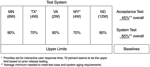
To ensure that its software testing is effective, the IBM Rochester software development laboratory sets CPU utilization targets for the software stress test and the system test. Stress testing starts at the middle of the component test phase and may run into the system test time frame with the purpose of stressing the system in order to uncover latent defects that cause system crashes and hangs that are not easily discovered in normal testing environments. It is conducted with a network of systems. System test is the final test phase with a customerlike environment. Test environment, workload characteristics, and CPU stress level are major factors contributing to the effectiveness of the test. The accompanying box provides an overview of the IBM Rochester system test and its workload characteristics.
The data in Figure 10.10 indicate the recent CPU utilization targets for the IBM Rochester's system test. Of the five systems in the system test environment, there is one system with a 2-way processor (VA), two systems with 4-way processors (TX and WY), and one system each with 8-way and 12-way processors. The upper CPU utilization limits for TX and WY are much lower because these two systems are used for interactive processing. For the overall testing network, the baseline targets for system test and the acceptance test of system test are also shown.
Figure 10.10. CPU Utilization Targets for Testing Systems
The next example, shown in Figure 10.11, demonstrates the tracking of CPU utilization over time for the software stress test. There is a two-phase target as represented by the step-line in the chart. The original target was set at 16 CPU hours per system per day on the average, with the following rationale:
Figure 10.11. CPU Utilization Metrics
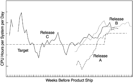
- The stress test runs 20 hours per day, with 4 hours of system maintenance.
- The CPU utilization target is 80% or higher.
The second phase of the target, set at 18 CPU hours per system per day, is for the back end of the stress test. As the figure shows, a key element of this metric, in addition to comparison of actual and target data, is release-to-release comparison. One can observe that the curve for release C had more data points in the early development cycle, which were at higher CPU utilization levels. This is because pretest runs were conducted prior to availability of the new release content. For all three releases, the CPU utilization metric shows an increasing trend with the stress test progress. The CPU utilization metric is used together with the system crashes and hangs metric. This relationship is discussed in the next section.
To collect CPU utilization data, a performance monitor tool runs continuously (24x7) on each test system. Through the communication network, the data from the test systems are sent to a nontest system on a real-time basis. By means of a Lotus Notes database application, the final data can be easily tallied, displayed, and monitored .
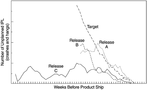
10.1.6 System Crashes and Hangs
Hand in hand with the CPU utilization metric is the system crashes and hangs metric. This metric is operationalized as the number of unplanned initial program loads (IPLs, or reboots) because for each crash or hang, the system has to be re-IPLed (rebooted). For software tests whose purpose is to improve the stability of the system, we need to ensure that the system is stressed and testing is conducted effectively to uncover latent defects that would lead to system crashes and hangs, or in general any unplanned IPLs. When such defects are discovered and fixed, stability of the system improves over time. Therefore, the metrics of CPU utilization (stress level) and unplanned IPLs describe the effort aspect and the outcome aspect respectively, of the effectiveness of the test.
Figure 10.12 shows the system crashes and hangs metric for the same three releases shown in Figure 10.11. The target curve was derived based on data from prior releases by fitting an exponential model.
Figure 10.12. System Crashes and Hangs Metric
In terms of data collection, when a system crash or hang occurs and the tester reboots (re-IPLs) the system, the performance monitor and IPL tracking tool produces a screen prompt and requests information about the last system crash or hang. The tester can ignore the prompt temporarily, but it will reappear regularly after a certain time until the questions are answered . Information elicited via this tool includes test system, network ID, tester name, IPL code and reason (and additional comments), system reference code (SRC) if available, data and time system went down, release, driver, PTR number (the defect that caused the system crash or hang), and the name of the product. The IPL reason code consists of the following categories:
- 001 Hardware problem (unplanned)
- 002 Software problem (unplanned)
- 003 Other problem (unplanned)
- 004 Load fix (planned)
Because the volume and trend of system crashes and hangs are germane to the stability of the product in the field, we highly recommend this in-process metric for software for which stability is an important attribute. These data should also be used to make release-to-release comparisons and as leading indicators to product delivery readiness. While CPU utilization tracking definitely requires a tool, tracking of system crashes and hangs can start with pencil and paper if a disciplined process is in place.
10.1.7 Mean Time to Unplanned IPL
Mean time to failure (MTTF), or mean time between failures (MTBF), are the standard measurements of reliability. In software reliability literature, this metric and various models associated with it have been discussed extensively. Predominantly, the discussions and use of this metric are related to academic research or specific-purpose software systems. To the author's awareness, implementation of this metric is rare in organizations that develop commercial systems. This may be due to several reasons including issues related to single-system versus multiple-systems testing, the definition of a failure, the feasibility and cost in tracking all failures and detailed time-related data (Note: Failures are different from defects or faults; a single defect can cause multiple failures and in different machines) in commercial projects, and the value and return on investment of such tracking.
System crashes and hangs (unplanned IPLs) are the more severe forms of failure. Such failures are clear-cut and easier to track, and metrics based on such data are more meaningful. Therefore, at IBM Rochester, we use mean time to unplanned IPL (MTI) as the software reliability metric. This metric is used only during the system testing period, which, as previously described, is a customerlike system integration test prior to product delivery. Using this metric for other tests earlier in the development cycle is possible but will not be as meaningful because all the components of the system cannot be addressed collectively until the final system test. The formula to calculate the MTI metric is:
where
n = Number of weeks that testing has been performed (i.e., the current week of test)
H = Total of weekly CPU run hours
W = Weighting factor
I = Number of weekly (unique) unplanned IPLs (due to software failures)
Basically the formula takes the total number of CPU run hours for each week ( H i ), divides it by the number of unplanned IPLs plus 1 ( I i + 1), then applies a set of weighting factors to get the weighted MTI number, if weighting is desired. For example, if the total CPU run hours from all test systems for a specific week was 320 CPU hours and there was one unplanned IPL due to a system crash, then the unweighted MTI for that week would be 320/(1+1) = 160 CPU hours. In the IBM Rochester implementation, we apply a set of weighting factors based on results from prior baseline releases. The purpose of weighting factors is to take the outcome from the prior weeks into account so that at the end of the system test (with a duration of 10 weeks), the MTI represents an entire system test statement. It is the practitioner's decision whether to use a weighting factor or how to distribute the weights heuristically. Deciding factors may include type of products and systems under test, test cycle duration, and how the test period is planned and managed.
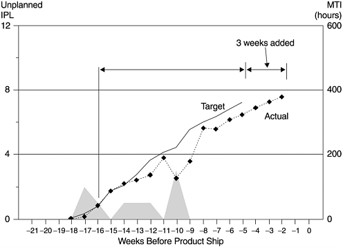
Figure 10.13 is an example of the MTI metric for the system test of a recent release of an integrated operating system. The X -axis represents the number of weeks before product ship. The Y -axis on the right side is MTI and on the left side is the number of unplanned IPLs. Inside the chart, the shaded areas represent the number of unique unplanned IPLs (crashes and hangs) encountered . From the start of the acceptance test of the system test, the MTI metric is shown tracking to plan until week 10 before product ship, when three system crashes occurred during one week. From the significant drop of the MTI, it was evident that with the original test plan, there would not be enough burn-in time for the system to reach the MTI target. Because this lack of burn-in time might result in undetected critical problems, additional testing was done and the system test was lengthened by three weeks. The product ship date remained unchanged.
Figure 10.13. Mean Time to Unplanned IPL Metric
Clearly, discrepancies between actual and targeted MTI should trigger early, proactive decisions to adjust testing plans and schedules to make sure that product ship criteria for burn-in can be achieved. At a minimum, the risks should be well understood and a risk mitigation plan should be developed. Action plans might include:
- Extending test duration and/or adding resources
- Providing for a more exhaustive regression test period if one were planned
- Adding a regression test if one were not planned
- Taking additional actions to intensify problem resolution and fix turnaround time ( assuming that there is enough time available until the test cycle is planned to end)
10.1.8 Critical Problems: Showstoppers
This showstopper parameter is very important because the severity and impact of software defects varies. Regardless of the volume of total defect arrivals, it takes only a few showstoppers to render a product dysfunctional . This metric is more qualitative than the metrics discussed earlier. There are two aspects of this metric. The first is the number of critical problems over time, with release-to-release comparison. This dimension is quantitative. The second, more important, dimension is concerned with the types of the critical problems and the analysis and resolution of each problem.
The IBM Rochester's implementation of this tracking and focus is based on the general criteria that any problem that will impede the overall progress of the project or that will have significant impact on customer's business (if not fixed) belongs to such a list. The tracking normally starts at the middle of the component test phase when a critical problem meeting by the project management team (with representatives from all functional areas) takes place once a week. When it gets closer to system test and product delivery time, the focus intensifies and daily meetings take place. The objective is to facilitate cross-functional teamwork to resolve the problems swiftly. Although there is no formal set of criteria, problems on the critical problem list tend to be problems related to installation, system stability, security, data corruption, and so forth. All problems on the list must be resolved before product delivery.
What Is Software Quality?
Software Development Process Models
- Software Development Process Models
- The Waterfall Development Model
- The Prototyping Approach
- The Spiral Model
- The Iterative Development Process Model
- The Object-Oriented Development Process
- The Cleanroom Methodology
- The Defect Prevention Process
- Process Maturity Framework and Quality Standards
Fundamentals of Measurement Theory
- Fundamentals of Measurement Theory
- Definition, Operational Definition, and Measurement
- Level of Measurement
- Some Basic Measures
- Reliability and Validity
- Measurement Errors
- Be Careful with Correlation
- Criteria for Causality
Software Quality Metrics Overview
- Software Quality Metrics Overview
- Product Quality Metrics
- In-Process Quality Metrics
- Metrics for Software Maintenance
- Examples of Metrics Programs
- Collecting Software Engineering Data
Applying the Seven Basic Quality Tools in Software Development
- Applying the Seven Basic Quality Tools in Software Development
- Ishikawas Seven Basic Tools
- Checklist
- Pareto Diagram
- Histogram
- Run Charts
- Scatter Diagram
- Control Chart
- Cause-and-Effect Diagram
- Relations Diagram
Defect Removal Effectiveness
- Defect Removal Effectiveness
- Literature Review
- A Closer Look at Defect Removal Effectiveness
- Defect Removal Effectiveness and Quality Planning
- Cost Effectiveness of Phase Defect Removal
- Defect Removal Effectiveness and Process Maturity Level
The Rayleigh Model
- The Rayleigh Model
- Reliability Models
- The Rayleigh Model
- Basic Assumptions
- Implementation
- Reliability and Predictive Validity
Exponential Distribution and Reliability Growth Models
- Exponential Distribution and Reliability Growth Models
- The Exponential Model
- Reliability Growth Models
- Model Assumptions
- Criteria for Model Evaluation
- Modeling Process
- Test Compression Factor
- Estimating the Distribution of Total Defects over Time
Quality Management Models
- Quality Management Models
- The Rayleigh Model Framework
- Code Integration Pattern
- The PTR Submodel
- The PTR Arrival and Backlog Projection Model
- Reliability Growth Models
- Criteria for Model Evaluation
- In-Process Metrics and Reports
- Orthogonal Defect Classification
In-Process Metrics for Software Testing
- In-Process Metrics for Software Testing
- In-Process Metrics for Software Testing
- In-Process Metrics and Quality Management
- Possible Metrics for Acceptance Testing to Evaluate Vendor-Developed Software
- How Do You Know Your Product Is Good Enough to Ship?
Complexity Metrics and Models
- Complexity Metrics and Models
- Lines of Code
- Halsteads Software Science
- Cyclomatic Complexity
- Syntactic Constructs
- Structure Metrics
- An Example of Module Design Metrics in Practice
Metrics and Lessons Learned for Object-Oriented Projects
- Metrics and Lessons Learned for Object-Oriented Projects
- Object-Oriented Concepts and Constructs
- Design and Complexity Metrics
- Productivity Metrics
- Quality and Quality Management Metrics
- Lessons Learned from OO Projects
Availability Metrics
- Availability Metrics
- 1 Definition and Measurements of System Availability
- Reliability, Availability, and Defect Rate
- Collecting Customer Outage Data for Quality Improvement
Measuring and Analyzing Customer Satisfaction
- Measuring and Analyzing Customer Satisfaction
- Customer Satisfaction Surveys
- Analyzing Satisfaction Data
- Satisfaction with Company
- How Good Is Good Enough
Conducting In-Process Quality Assessments
- Conducting In-Process Quality Assessments
- The Preparation Phase
- The Evaluation Phase
- The Summarization Phase
- Recommendations and Risk Mitigation
Conducting Software Project Assessments
- Conducting Software Project Assessments
- Audit and Assessment
- Software Process Maturity Assessment and Software Project Assessment
- Software Process Assessment Cycle
- A Proposed Software Project Assessment Method
Dos and Donts of Software Process Improvement
- Dos and Donts of Software Process Improvement
- Measuring Process Maturity
- Measuring Process Capability
- Staged versus Continuous Debating Religion
- Measuring Levels Is Not Enough
- Establishing the Alignment Principle
- Take Time Getting Faster
- Keep It Simple or Face Decomplexification
- Measuring the Value of Process Improvement
- Measuring Process Adoption
- Measuring Process Compliance
- Celebrate the Journey, Not Just the Destination
Using Function Point Metrics to Measure Software Process Improvements
- Using Function Point Metrics to Measure Software Process Improvements
- Software Process Improvement Sequences
- Process Improvement Economics
- Measuring Process Improvements at Activity Levels
Concluding Remarks
- Concluding Remarks
- Data Quality Control
- Getting Started with a Software Metrics Program
- Software Quality Engineering Modeling
- Statistical Process Control in Software Development
A Project Assessment Questionnaire
EAN: 2147483647
Pages: 176
