Scatter Diagram
Compared to other tools, the scatter diagram is more difficult to apply. It usually relates to investigative work and requires precise data. It is often used with other techniques such as correlational analysis, regression, and statistical modeling.
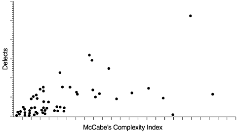
Figure 5.9 is a scatter diagram that illustrates the relationship between McCabe's complexity index and defect level. Each data point represents a program module with the X coordinate being its complexity index and the Y coordinate its defect level. Because program complexity can be measured as soon as the program is complete, whereas defects are discovered over a long time, the positive correlation between the two allows us to use program complexity to predict defect level. Furthermore, we can reduce the program complexity when it is developed (as measured by McCabe's index), thereby reducing the chance for defects. Reducing complexity can also make programs easier to maintain. Some component teams of the AS/400 operating system adopt this approach as their strategy for quality and maintainability improvement. Program modules with high-complexity indexes are the targets for analysis and possible module breakup, encapsulation, intramodule cleanup, and other actions. Of course, low-complexity indexes coupled with high defects are clear indications of modules that are poorly designed or implemented and should also be scrutinized.
Figure 5.9. Scatter Diagram of Program Complexity and Defect Level

Other examples of the scatter diagram include the relationships among defects, fan-in and fan-out, quality index of the same components between the current and previous releases, the relationship between testing defect rates and field defect rates, and so forth. We have gained insights in software quality engineering through the investigations of such relationships.
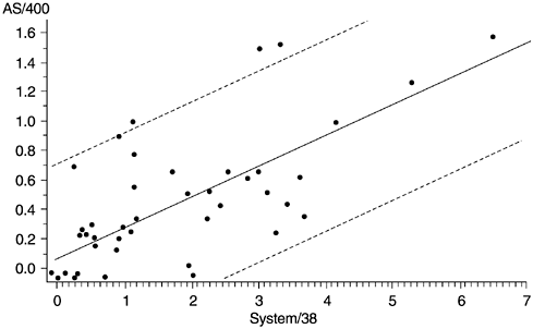
In software development, reuse is perhaps the most significant factor in improving productivity. The quality of the new software, however, is often constrained by the latent defects or design limitations in the legacy code. For the AS/400 software system, some products were developed by reusing components of products on the IBM System/38 platform. To examine the relationship of the defect rate of the reused components between the two platforms, we used the scatter diagrams. Figure 5.10 is a scatter diagram for one product. In the figure, each data point represents a component, with the X coordinate indicating its defect rate in the System/38 platform and the Y coordinate indicating its defect rate in the AS/400 platform. Although there are changes and modifications to the AS/400 product and additional reviews and tests were conducted , clearly the correlation (0.69) is quite strong. Also shown are both the linear regression line (the diagonal line) and the 95% confidence interval (area between the two broken lines).
Figure 5.10. Correlation of Defect Rates of Reused Components Between Two Platforms

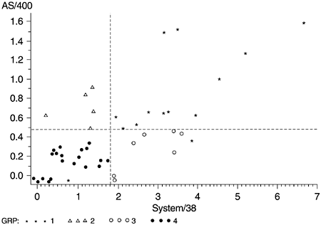
We then proceeded to classify the scattergram into four quadrants according to the medians of the component defect rates on the AS/400 and System/38 platforms (Figure 5.11). Such classification allows different analysis and improvement strategies to be applied to different groups of components.
Figure 5.11. Grouping of Reused Components Based on Defect Rate Relationship

- The components in the upper right quadrant (stars) are the chronic problem components. The fact that these components sustained high defect rates in spite of years of aging on the System/38 platform implies that significant actions (e.g., examination of the design structure, a rewrite of error-prone modules, etc.) need to be considered .
- The components in the upper left quadrant ( triangles ) are components with low defect rates on System/38 but high on AS/400. The improvement strategy should focus on the nature of the enhancements on AS/400 and the process the development teams used.
- Those in the lower right quadrant (circles) are the components that had high defect rates on System/38 but low on AS/400. The changes to these components for AS/400 and the actions taken during the AS/400 development should be examined to shed light for other components.
- In the lower left quadrant (darkened circles) are components that have low defect rates in both platforms. The focus of analysis should be on their usage and if the usage is not low, on their design structure.
What Is Software Quality?
Software Development Process Models
- Software Development Process Models
- The Waterfall Development Model
- The Prototyping Approach
- The Spiral Model
- The Iterative Development Process Model
- The Object-Oriented Development Process
- The Cleanroom Methodology
- The Defect Prevention Process
- Process Maturity Framework and Quality Standards
Fundamentals of Measurement Theory
- Fundamentals of Measurement Theory
- Definition, Operational Definition, and Measurement
- Level of Measurement
- Some Basic Measures
- Reliability and Validity
- Measurement Errors
- Be Careful with Correlation
- Criteria for Causality
Software Quality Metrics Overview
- Software Quality Metrics Overview
- Product Quality Metrics
- In-Process Quality Metrics
- Metrics for Software Maintenance
- Examples of Metrics Programs
- Collecting Software Engineering Data
Applying the Seven Basic Quality Tools in Software Development
- Applying the Seven Basic Quality Tools in Software Development
- Ishikawas Seven Basic Tools
- Checklist
- Pareto Diagram
- Histogram
- Run Charts
- Scatter Diagram
- Control Chart
- Cause-and-Effect Diagram
- Relations Diagram
Defect Removal Effectiveness
- Defect Removal Effectiveness
- Literature Review
- A Closer Look at Defect Removal Effectiveness
- Defect Removal Effectiveness and Quality Planning
- Cost Effectiveness of Phase Defect Removal
- Defect Removal Effectiveness and Process Maturity Level
The Rayleigh Model
- The Rayleigh Model
- Reliability Models
- The Rayleigh Model
- Basic Assumptions
- Implementation
- Reliability and Predictive Validity
Exponential Distribution and Reliability Growth Models
- Exponential Distribution and Reliability Growth Models
- The Exponential Model
- Reliability Growth Models
- Model Assumptions
- Criteria for Model Evaluation
- Modeling Process
- Test Compression Factor
- Estimating the Distribution of Total Defects over Time
Quality Management Models
- Quality Management Models
- The Rayleigh Model Framework
- Code Integration Pattern
- The PTR Submodel
- The PTR Arrival and Backlog Projection Model
- Reliability Growth Models
- Criteria for Model Evaluation
- In-Process Metrics and Reports
- Orthogonal Defect Classification
In-Process Metrics for Software Testing
- In-Process Metrics for Software Testing
- In-Process Metrics for Software Testing
- In-Process Metrics and Quality Management
- Possible Metrics for Acceptance Testing to Evaluate Vendor-Developed Software
- How Do You Know Your Product Is Good Enough to Ship?
Complexity Metrics and Models
- Complexity Metrics and Models
- Lines of Code
- Halsteads Software Science
- Cyclomatic Complexity
- Syntactic Constructs
- Structure Metrics
- An Example of Module Design Metrics in Practice
Metrics and Lessons Learned for Object-Oriented Projects
- Metrics and Lessons Learned for Object-Oriented Projects
- Object-Oriented Concepts and Constructs
- Design and Complexity Metrics
- Productivity Metrics
- Quality and Quality Management Metrics
- Lessons Learned from OO Projects
Availability Metrics
- Availability Metrics
- 1 Definition and Measurements of System Availability
- Reliability, Availability, and Defect Rate
- Collecting Customer Outage Data for Quality Improvement
Measuring and Analyzing Customer Satisfaction
- Measuring and Analyzing Customer Satisfaction
- Customer Satisfaction Surveys
- Analyzing Satisfaction Data
- Satisfaction with Company
- How Good Is Good Enough
Conducting In-Process Quality Assessments
- Conducting In-Process Quality Assessments
- The Preparation Phase
- The Evaluation Phase
- The Summarization Phase
- Recommendations and Risk Mitigation
Conducting Software Project Assessments
- Conducting Software Project Assessments
- Audit and Assessment
- Software Process Maturity Assessment and Software Project Assessment
- Software Process Assessment Cycle
- A Proposed Software Project Assessment Method
Dos and Donts of Software Process Improvement
- Dos and Donts of Software Process Improvement
- Measuring Process Maturity
- Measuring Process Capability
- Staged versus Continuous Debating Religion
- Measuring Levels Is Not Enough
- Establishing the Alignment Principle
- Take Time Getting Faster
- Keep It Simple or Face Decomplexification
- Measuring the Value of Process Improvement
- Measuring Process Adoption
- Measuring Process Compliance
- Celebrate the Journey, Not Just the Destination
Using Function Point Metrics to Measure Software Process Improvements
- Using Function Point Metrics to Measure Software Process Improvements
- Software Process Improvement Sequences
- Process Improvement Economics
- Measuring Process Improvements at Activity Levels
Concluding Remarks
- Concluding Remarks
- Data Quality Control
- Getting Started with a Software Metrics Program
- Software Quality Engineering Modeling
- Statistical Process Control in Software Development
A Project Assessment Questionnaire
EAN: 2147483647
Pages: 176
