Hack 83. Map Numerical Data the Easy Way


Hacking the color palette of a GIF image offers a cheap and simple route to mapping all sorts of quantitative data.
Geographical maps are often used to represent some quantifiable property of each country or region depicted, such as population, GDP, health, and so on. Making similar maps of your own involves finding a base map and then coloring each country or region based on the value in question. A number of commercial applications are able to do something along these lines, but for a price. And, of course, it ain't much of a hack if you let your MS Excel plug-in do the work.
This hack is based on the fact that pixels in a GIF are internally just indexes in a palette and is therefore somewhat similar to the old palette animation trick. A simple GIF image starts with 13 bytes of header data, followed by the palette, which is then followed by the actual image data. Modifying the image data on the fly is hard, since it is compressed. However, modifying the palette information is not difficult. The palette is basically just a list of byte triplets, each describing the RGB color of one pixel, holding a maximum of 256 entries.
|

7.7.1. Hacking the GIF Palette
Let's work our way up from a simple example. Say we want to convert a color GIF into grayscale. Using Python and some image library, this can perhaps be done more elegantly, but if we don't care too much about image size, the following little script will do. If we assume that f is a file-like object containing a GIF and o is a file-like object able to receive a GIF, then this bit of Python will recolor the image in grayscale and dump it to o:
header = f.read(13)
o.write( header )
for i in range(1 << ( (ord(header[10]) & 7) +1 )):
 gray = (ord(f.read(1)) + ord(f.read(1)) + ord(f.read(1)))/3
 o.write(3*chr(gray))
o.write( f.read( ) )
Not bad for six lines of code! In the third line, we calculate the size of the palette by left-shifting the lowest 4 bits of the tenth byte of the header. Then we loop through the palette and average each RGB triple and write that to the output. We finish by writing what's left in the buffer back to the output.
In order to make this work for a map, obviously we're going to need a map where each distinct region/country is color-coded in a special way. If we had a list of regions numbered 0 through n, and we could palette-index i for country i, then this would be easy. Unfortunately, most imaging tools work with colors and not with palette indexes. Furthermore, these imaging tools tend to reshuffle the palette as they see fit, which makes this setup rather risky. Instead, we can use the RGB color scheme, using a unique color for each country, which we can later replace on the fly with the color needed.
7.7.2. Getting the Data
Let's say we want to create maps showing the population growth in different shades of red for all countries. The CIA Factbook supplies this information in a nice parseable HTML format at http://www.cia.gov/cia/publications/factbook/fields/2002.html. In addition to population growth, other interesting CIA-gathered facts can be used for mapping. (You can find a list of some possibilities at http://www.cia.gov/cia/publications/factbook/docs/notesanddefs.html.)
The following Python code harvests the population data by downloading the page and scraping the HTML. The output is, interestingly, another Python script, which contains the population growth values and can be imported into yet another Python script to generate the imagery. A more advanced version of this hack might save the data in a database somewhere for later use, but...this is a hack, after all:
import urllib

res = [ ]
html = urllib.urlopen('http://www.cia.gov/cia/publications/factbook/fields/
2002.html').read( )
for tag in html.split('>')[1:]:
 country, tag = tag.split('',1)[1].split('%')[0].strip( )
 if growth[0]= ='N': growth = None
 else: growth = float(growth)
 res.append( [country,growth] )
print "countryList = %s" % `res`
Note the use of the backticks in the last line, which causes Python to produce the representation of the associated list in Python code. We save the Python code generated by this script as countryList.py:
$ python getCountryList.py > countryList.py
7.7.3. Tying It All Together
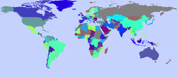
Now, fire up your favorite image editor, load a world map with countries on it, and give country i in the produced list RGB color (i, 255 - i, 238). Yes, it might take some time, and each country needs to be done in the exact order it's listed in your data set, but the task will be quite good for your sense of geography! Alternatively, if you're feeling lazy, you can download such a map from http://mappinghacks.com/maps/worldmap.gif. Save the map as worldmap.gif. Figure 7-4 shows what the "pristine" version of this file looks like, with one shade per country.
Figure 7-4. worldmap.gif, with its original color palette
Our main code is going to do something very similar to the "grayer" in the first code fragment we looked at. However, instead of replacing all palette entries with averages of red, green, and blue, it checks whether blue is 238 and red equals 255 minus green. If so, then we'll replace the entry by the target color of the countryin this case, the result of an equation converting the growth of the country to RGB:
for i in range(1 << ( (ord(header[10]) & 7) +1 )):
 r,g,b = [ord(c) for c in f.read(3)]
 if r= =255-g and b= =238:
 growth = countryList[r][1]
 if growth!=None:
 r = int(30*max(0,growth+2))+64
 g = b = 92
 else:
 r = g = b = 64
 o.write( chr(r)+chr(g)+chr(b) )
Variations of this code can be used to generate all kinds of dynamic maps. It is probably most useful as a CGI script on a web site, where one could use it to generate dynamic maps: for example, a map showing where your web site visitors are coming from. The following code is an implementation of the population growth map as a CGI script.
#!/usr/bin/python

print "Content-Type: image/gif

"

from countryList import countryList

f = open( 'worldmap.gif', 'rb' )
output = f.read(13)
for i in range(1 << ( (ord(output[10]) & 7) +1 )):
 r,g,b = [ord(c) for c in f.read(3)]
 if r= =255-g and b= =238:
 growth = countryList[r][1]
 if growth!=None:
 r = int(30*max(0,growth+2))+64
 g = b = 92
 else:
 r = g = b = 64
 output += chr(r)+chr(g)+chr(b)

print output + f.read( )
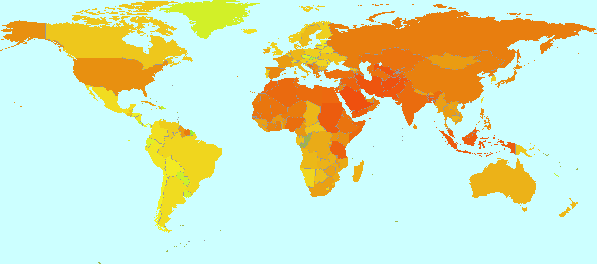
As it happens, the exact same technique is used to make the maps explored in [Hack #3]. The result is shown in Figure 7-5.
Figure 7-5. worldmap.gif recolored to show population growth by country
7.7.4. See Also
- [Hack #35]
- [Hack #3]
- "Land Geist" (http://douweosinga.com/projects/landgeist) shows Google shares for different word-country combinations using the techniques in this hack.
Douwe Osinga
Mapping Your Life
- Hacks 1-13
- Hack 1. Put a Map on It: Mapping Arbitrary Locations with Online Services
- Hack 2. Route Planning Online
- Hack 3. Map the Places Youve Visited
- Hack 4. Find Your House on an Aerial Photograph
- Hack 5. The Road Less Traveled by in MapQuest
- Hack 6. Make Route Maps Easier to Read
- Hack 7. Will the Kids Barf?
- Hack 8. Publish Maps of Your Photos on the Web
- Hack 9. Track the Friendly Skies with Sherlock
- Hack 10. Georeference Digital Photos
- Hack 11. How Far? How Fast? Geo-Enabling Your Spreadsheet
- Hack 12. Create a Distance Grid in Excel
- Hack 13. Add Maps to Excel Spreadsheets with MapPoint
Mapping Your Neighborhood
- Hacks 14-21
- Hack 14. Make Free Maps of the United States Online
- Hack 15. Zoom Right In on Your Neighborhood
- Hack 16. Who Are the Neighbors Voting For?
- Hack 17. Map Nearby Wi-Fi Hotspots
- Hack 18. Why You Cant Watch Broadcast TV
- Hack 19. Analyze Elevation Profiles for Wireless Community Networks
- Hack 20. Make 3-D Raytraced Terrain Models
- Hack 21. Map Health Code Violations with RDFMapper
Mapping Your World
- Hacks 22-34
- Hack 22. Digging to China
- Hack 23. Explore David Rumseys Historical Maps
- Hack 24. Explore a 3-D Model of the Entire World
- Hack 25. Work with Multiple Lat/Long Formats
- Hack 26. Work with Different Coordinate Systems
- Hack 27. Calculate the Distance Between Points on the Earths Surface
- Hack 28. Experiment with Different Cartographic Projections
- Hack 29. Plot Arbitrary Points on a World Map
- Hack 30. Plot a Great Circle on a Flat Map
- Hack 31. Plot Dymaxion Maps in Perl
- Hack 32. Hack on Base Maps in Your Favorite Image Editor
- Hack 33. Georeference an Arbitrary Tourist Map
- Hack 34. Map Other Planets
Mapping (on) the Web
- Hacks 35-46
- Hack 35. Search Local, Find Global
- Hack 36. Shorten Online Map URLs
- Hack 37. Tweak the Look and Feel of Web Maps
- Hack 38. Add Location to Weblogs and RSS Feeds
- Hack 39. View Your Photo Thumbnails on a Flash Map
- Hack 40. Plot Points on a Spinning Globe Applet
- Hack 41. Plot Points on an Interactive Map Using DHTML
- Hack 42. Map Your Tracklogs on the Web
- Hack 43. Map Earthquakes in (Nearly) Real Time
- Hack 44. Plot Statistics Against Shapes
- Hack 45. Extract a Spatial Model from Wikipedia
- Hack 46. Map Global Weather Conditions
Mapping with Gadgets
- Hacks 47-63
- How GPS Works
- Hack 47. Get Maps on Your Mobile Phone
- Hack 48. Accessorize Your GPS
- Hack 49. Get Your Tracklogs in Windows or Linux
- Hack 50. The Serial Port to USB Conundrum
- Hack 51. Speak in Geotongues: GPSBabel to the Rescue
- Hack 52. Show Your Waypoints on Aerial Photos with Terrabrowser
- Hack 53. Visualize Your Tracks in Three Dimensions
- Hack 54. Create Your Own Maps for a Garmin GPS
- Hack 55. Use Your Track Memory as a GPS Base Map
- Hack 56. Animate Your Tracklogs
- Hack 57. Connect to Your GPS from Multiple Applications
- Hack 58. Dont Lose Your Tracklogs!
- Hack 59. Geocode Your Voice Recordings and Other Media
- Hack 60. Improve the Accuracy of Your GPS with Differential GPS
- Hack 61. Build a Map of Local GSM Cells
- Hack 62. Build a Car Computer
- Hack 63. Build Your Own Car Navigation System with GpsDrive
Mapping on Your Desktop
- Hacks 64-77
- Hack 64. Mapping Local Areas of Interest with Quantum GIS
- Hack 65. Extract Data from Maps with Manifold
- Hack 66. Java-Based Desktop Mapping with Openmap
- Hack 67. Seamless Data Download from the USGS
- Hack 68. Convert Geospatial Data Between Different Formats
- Hack 69. Find Your Way Around GRASS
- Hack 70. Import Your GPS Waypoints and Tracklogs into GRASS
- Hack 71. Turn Your Tracklogs into ESRI Shapefiles
- Hack 72. Add Relief to Your Topographic Maps
- Hack 73. Make Your Own Contour Maps
- Hack 74. Plot Wireless Network Viewsheds with GRASS
- Hack 75. Share Your GRASS Maps with the World
- Hack 76. Explore the Effects of Global Warming
- Conclusion
- Hack 77. Become a GRASS Ninja
Names and Places
- Hacks 78-86
- Hack 78. What to Do if Your Government Is Hoarding Geographic Data
- Hack 79. Geocode a U.S. Street Address
- Hack 80. Automatically Geocode U.S. Addresses
- Hack 81. Clean Up U.S. Addresses
- Hack 82. Find Nearby Things Using U.S. ZIP Codes
- Hack 83. Map Numerical Data the Easy Way
- Hack 84. Build a Free World Gazetteer
- Hack 85. Geocode U.S. Locations with the GNIS
- Hack 86. Track a Package Across the U.S.
Building the Geospatial Web
- Hacks 87-92
- Hack 87. Build a Spatially Indexed Data Store
- Hack 88. Load Your Waypoints into a Spatial Database
- Hack 89. Publish Your Geodata to the Web with GeoServer
- Hack 90. Crawl the Geospatial Web with RedSpider
- Hack 91. Build Interactive Web-Based Map Applications
- Hack 92. Map Wardriving (and other!) Data with MapServer
Mapping with Other People
- Hacks 93-100
- Hack 93. Node Runner
- Hack 94. Geo-Warchalking with 2-D Barcodes
- Hack 95. Model Interactive Spaces
- Hack 96. Share Geo-Photos on the Web
- Hack 97. Set Up an OpenGuide for Your Hometown
- Hack 98. Give Your Great-Great-Grandfather a GPS
- Hack 99. Map Your Friend-of-a-Friend Network
- Hack 100. Map Imaginary Places
EAN: 2147483647
Pages: 172
