MonthCalendar
The MonthCalendar control allows the user to pick a date or a range of dates. Unlike the DateTimePicker, it does not offer any time component, nor does it provide extensive formatting capabilities. However, the DateTime objects it makes available in the SelectionStart, SelectionEnd, and SelectionRange properties can always be formatted after the fact.
By default, the control displays a single month, although you can display a rectangular array of up to 12 months by setting the CalendarDimensions property. This property is of type Size, where the first coordinate is the number of columns and the second is the number of rows.
|

Paradoxically, the size of the control cannot be set directly using the Size property as with most other controls (nor the Height nor Width properties, for that matter), even when creating a new Size object. The Size property instead effectively changes the CalendarDimensions property: if the new size is large enough to accommodate another row or column of months, then the size of the array of months increases; otherwise, no change in size occurs.
The actual size of the calendar can be changed by setting the Font property. Setting the Font property to a larger font increases the size of the control.
Several properties change the appearance of the control, including ShowTodayCircle, ShowWeekNumbers, TitleBackColor, TitleForeColor, and TrailingForeColor, all of which are described in Table 16-14.
By default, today's date (DateTime.Today) is displayed at the bottom of the control, as shown in Figure 16-5. It can be turned off by setting the ShowToday property to false. Clicking on today's date at any time will immediately scroll the control back to today's date and select today.
You can programmatically bold one or more dates, on an annual, monthly, or one-time basis, by adding DateTime objects to the arrays of DateTime objects referenced in the AnnuallyBoldedDates, MonthlyBoldedDates, or BoldedDates properties. Anytime you modify the contents of one of the bolded date arrays, you must call the UpdateBoldedDates method to force the calendar to repaint and reflect the new bolded dates.
You can also add dates to these arrays by using the AddAnnuallyBoldedDate, AddMonthlyBoldedDate, and AddBoldedDate methods described in Table 16-15. Likewise, you can clear a specific bolded date, using the RemoveAnnuallyBoldedDate, RemoveMonthlyBoldedDate, and RemoveBoldedDate methods, or clear all the bolded dates by using the RemoveAllAnnuallyBoldedDates, RemoveAllMonthlyBoldedDates, and RemoveAllBoldedDates methods.
Three properties retrieve the selected dates from the MonthCalendar control. The SelectionStart property contains the starting date, and the SelectionEnd property contains the ending date. If only a single date is selected, then these two properties will have the same value. The SelectionRange property, of type SelectionRange, contains both the starting and ending dates in SelectionRange.Start and SelectionRange.End, respectively.
By default, only seven days can be selected. This default can be overridden by setting the MaxSelectionCount property. If the range of selected days exceeds the value specified in the MaxSelectionCount property, the SelectionEnd property will be adjusted to conform automatically.
All properties mentioned above, as well as other commonly used properties of the MonthCalendar class, are listed in Table 16-14.
|
Property |
Value type |
Description |
|---|---|---|
|
AnnuallyBoldedDates |
DateTime array |
Read/write. An array of annual DateTime objects that are displayed in a bold font. |
|
BoldedDates |
DateTime array |
Read/write. An array of dates displayed in a bold font. |
|
CalendarDimensions |
Size |
Read/write. Specifies the number of columns and rows of displayed months. Maximum number of displayed months is 12. If product of x (columns) and y (rows) values is greater than 12, the greater of the two values is reduced until the product is 12 or less. |
|
FirstDayOfWeek |
Day |
Read/write. Specifies the first day of the week to display in the control. Default is Day.Default, which corresponds to Day.Sunday on systems with the locale set to English (US) and to Day.Monday on systems with the locale set to most European countries. |
|
Font |
Font |
Read/write. The font used by the text displayed in the control. Use this property to change the size of the calendar. |
|
MaxDate |
DateTime |
Read/write. The maximum allowable date that can be selected. The default is 12/31/9998. |
|
MaxSelectionCount |
Integer |
Read/write. The maximum number of days that can be selected. Default is 7. The SelectionStart and SelectionEnd properties can be no more than MaxSelectionCount - 1 days apart. |
|
MinDate |
DateTime |
Read/write. The minimum allowable date that can be selected. The default is 01/01/1753. |
|
MonthlyBoldedDates |
DateTime array |
Read/write. An array of monthly DateTime objects that are displayed in a bold font. |
|
ScrollChange |
Integer |
Read/write. A positive number representing the scroll rate, or number of months the calendar moves when the user clicks a scroll button. The default is the number of months currently displayed. The maximum value is 20,000. A value of zero resets the property to the default value. |
|
SelectionEnd |
DateTime |
Read/write. The last date in the selection range. If the resulting number of selected days exceeds the value of MaxSelectionCount, the SelectionEnd property is automatically adjusted so the number of days selected is equal to MaxSelectionCount. |
|
SelectionRange |
SelectionRange |
Read/write. The range of selected dates. The starting date is SelectionRange.Start and the ending date is SelectionRange.End. If only one day is selected, the two values are equal. |
|
SelectionStart |
DateTime |
Read/write. The first date in the selection range. If the resulting number of selected days exceeds the value of MaxSelectionCount, the SelectionEnd property is automatically adjusted so the number of days selected is equal to MaxSelectionCount. |
|
ShowToday |
Boolean |
Read/write. If true (the default), today's date (DateTime.Today) is displayed at the bottom of the control. Clicking on that date scrolls the calendar so today's date is visible. |
|
ShowTodayCircle |
Boolean |
Read/write. If true (the default), today's date (DateTime.Today) is circled. |
|
ShowWeekNumbers |
Boolean |
Read/write. If true, week numbers are displayed. The default is false. |
|
SingleMonthSize |
Size |
Read-only. Returns the minimum size, in pixels, to display one month. The size depends on the font. |
|
Size |
Size |
Read/write. Must declare new Size object for this to have any effect. Does not set the size of the control as it does for most controls, but effectively changes the CalendarDimensions property to fit as many months as possible into the specified size. |
|
Text |
String |
Read/write. Always an empty string unless set otherwise in code. Does not display as part of the control. |
|
TitleBackColor |
Color |
Read/write. The color of the title background area, the days of the week, the highlighting of the currently selected date(s), and the week numbers (if ShowWeekNumbers is true). Default is the system color for active captions. |
|
TitleForeColor |
Color |
Read/write. The color that the title text and currently selected date(s) display in. Default is the system color for active caption text. |
|
TodayDate |
DateTime |
Read/write. The value used as today's date. By default, it is DateTime.Today and TodayDateSet is false. If TodayDate is set, then TodayDateSet becomes true. |
|
TodayDateSet |
Boolean |
Read-only. Returns true if the TodayDate property has been set. Default is false. |
|
TrailingForeColor |
Color |
Read/write. The color of the leading and trailing dates. The default is Color.Gray. |
In addition to the MonthCalendar methods just described for setting and unsetting bolded dates, the control has other commonly used methods, all of which are listed and described in Table 16-15.
|
Method |
Description |
|---|---|
|
AddAnnuallyBoldedDate |
Adds the specified DateTime to the array of annually bolded dates specified by the AnnuallyBoldedDates property. |
|
AddBoldedDate |
Adds the specified DateTime to the array of bolded dates specified by the BoldedDates property. |
|
AddMonthlyBoldedDate |
Adds the specified DateTime to the array of monthly bolded dates specified by the MonthlyBoldedDates property. |
|
GetDisplayRange |
Returns a SelectionRange that contains the start and ending dates of dates displayed in the control. |
|
HitTest |
Overloaded. Returns a HitTestInfo object with information about the specified spot on the control. |
|
RemoveAllAnnuallyBoldedDates |
Clears the annually bolded dates array. |
|
RemoveAllBoldedDates |
Clears the bolded dates array. |
|
RemoveAllMonthlyBoldedDates |
Clears the monthly bolded dates array. |
|
RemoveAnnuallyBoldedDate |
Removes the specified date from the array of annually bolded dates. |
|
RemoveBoldedDate |
Removes the specified date from the array of bolded dates. |
|
RemoveMonthlyBoldedDate |
Removes the specified date from the array of monthly bolded dates. |
|
SetCalendarDimension |
Sets the number of columns and rows of months to display. Equivalent to setting the CalendarDimensions property. |
|
SetDate |
Sets the specified date as the currently selected date. |
|
SetSelectionRange |
Sets the range specified by two dates as currently selected. |
|
UpdateBoldedDates |
Repaints the calendar to reflect any changes made to the bolded dates properties. |
The MonthCalendar control has only two events, listed in Table 16-16, other than those inherited from the Control class. These two events are redundant. The DateChanged event is always raised when a new date is selected or the selection range is changed, either by clicking with the mouse or using the keyboard arrow keys. If the mouse is used to click on a date, then the DateSelected event is also raised before the DateChanged event. Both events take an event argument of type DateRangeEventArgs, which has the two properties listed in Table 16-17, for getting the start and end dates of the selection range.
|
Event |
Event argument |
Description |
|---|---|---|
|
DateChanged |
DateRangeEventArgs |
Raised when the selected date range in the control is changed. The event argument returns the properties listed in Table 16-17. |
|
DateSelected |
DateRangeEventArgs |
Raised before DateChanged when a date is selected in the control. The event argument returns the properties listed in Table 16-17. |
|
Property |
Description |
|---|---|
|
End |
Returns the last date-time value selected in the control. |
|
Start |
Returns the first date-time value selected in the control. |
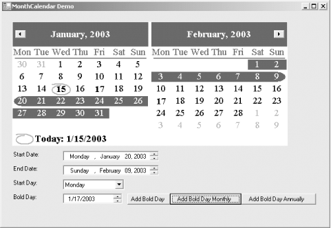
The examples listed in Example 16-3 (in C#) and in Example 16-4 (in VB.NET) demonstrate the use of the MonthCalendar control. The resulting application is shown in Figure 16-5 after changing the start and end dates and bolding some dates. The default color scheme is used.
The CalendarDimension property has been set to 2 x 1 so that two months display. Clicking on the scroll buttons at the top left and right corners of the control scroll the control two months at a time. The ScrollChange property could have been set to a non-default value to change the number of months the control scrolls when the scroll buttons are clicked.
Below the MonthCalendar control are two DateTimePickers: one labeled Start Date and the other End Date. Changing the selected dates in the MonthCalendar updates the dates displayed in the DateTimePickers, and vice versa: changing the values displayed in the DateTimePickers changes the selection in the MonthCalendar control.
|
Below the DateTimePicker controls is a read-only combo box that allows selection of a day of the week to be assigned to the FirstDayOfWeek property. This example initializes with the nondefault value (for English-US systems) of Monday.
Below the Start Day combo box is another DateTimePickerthis one configured to display the date in the Short format. When one of the three buttons next to that control are clicked, the displayed date is added to the respective bolded date array. In Figure 16-5, 1/15/03 is bolded and the 17th is bolded monthly. This example does not provide any means of clearing or otherwise manipulating the bolded dates, but that functionality would be easy to implement.
Figure 16-5. MonthCalendar control
A full analysis of the example follows the code listings.
Example 16-3. MonthCalendar application in C# (MonthCalendar.cs)

using System;
using System.Drawing;
using System.Windows.Forms;

namespace ProgrammingWinApps
{
 public class Calendar : Form
 {
 MonthCalendar mc;
 DateTimePicker dtpStart;
 DateTimePicker dtpEnd;
 DateTimePicker dtpBold;
 Label lblStart;
 Label lblEnd;
 Label lblStartDay;
 Label lblBold;
 ComboBox cmbStart;
 Button btnBoldDay;
 Button btnBoldMonthly;
 Button btnBoldAnnually;

 public Calendar( )
 {
 Text = "MonthCalendar Demo";
 Size = new Size(650,450);
 this.Load += new EventHandler(this_Load);

 mc = new MonthCalendar( );
 mc.Parent = this;
 mc.Location = new Point(20,20);
 mc.Font = new Font("Times New Roman", 14);
 mc.CalendarDimensions = new Size(2,1);
 mc.FirstDayOfWeek = Day.Monday;
 mc.MaxSelectionCount = 45;
 mc.DateChanged += new DateRangeEventHandler(mc_DateChanged);
 mc.DateSelected += new DateRangeEventHandler(mc_DateSelected);

 lblStart = new Label( );
 lblStart.Parent = this;
 lblStart.Text = "Start Date:";

 dtpStart = new DateTimePicker( );
 dtpStart.Parent = this;
 dtpStart.Size = new Size((int)(Font.Height * .6) *
 dtpStart.Value.ToString("D").Length,
 dtpStart.PreferredHeight);
 dtpStart.Format = DateTimePickerFormat.Long;
 dtpStart.ShowUpDown = true;
 dtpStart.ValueChanged +=
 new EventHandler(dtpStart_ValueChanged);

 lblEnd = new Label( );
 lblEnd.Parent = this;
 lblEnd.Text = "End Date:";

 dtpEnd = new DateTimePicker( );
 dtpEnd.Parent = this;
 dtpEnd.Size = new Size((int)(Font.Height * .6) *
 dtpEnd.Value.ToString("D").Length,
 dtpEnd.PreferredHeight);
 dtpEnd.Format = DateTimePickerFormat.Long;
 dtpEnd.ShowUpDown = true;
 dtpEnd.ValueChanged +=
 new EventHandler(dtpEnd_ValueChanged);

 lblStartDay = new Label( );
 lblStartDay.Parent = this;
 lblStartDay.Text = "Start Day:";

 cmbStart = new ComboBox( );
 cmbStart.Parent = this;
 cmbStart.DropDownStyle = ComboBoxStyle.DropDownList;
 cmbStart.Items.AddRange(new object[] {"Monday",
 "Tuesday",
 "Wednesday",
 "Thursday",
 "Friday",
 "Saturday",
 "Sunday"});
 cmbStart.SelectedIndex = 0;
 cmbStart.SelectedIndexChanged +=
 new EventHandler(cmbStart_SelectedIndexChanged);

 lblBold = new Label( );
 lblBold.Parent = this;
 lblBold.Text = "Bold Day:";

 dtpBold = new DateTimePicker( );
 dtpBold.Parent = this;
 dtpBold.Size = new Size((int)(Font.Height ) *
 dtpBold.Value.ToString("d").Length,
 dtpBold.PreferredHeight);
 dtpBold.Format = DateTimePickerFormat.Short;
 dtpBold.ShowUpDown = true;

 btnBoldDay = new Button( );
 btnBoldDay.Parent = this;
 btnBoldDay.Text = "Add Bold Day";
 btnBoldDay.Size = new Size((int)(Font.Height * .6) *
 btnBoldDay.Text.Length,
 (int)(Font.Height * 1.75));
 btnBoldDay.Click += new EventHandler(btnBoldDay_Click);

 btnBoldMonthly = new Button( );
 btnBoldMonthly.Parent = this;
 btnBoldMonthly.Text = "Add Bold Day Monthly";
 btnBoldMonthly.Size = new Size((int)(Font.Height * .6) *
 btnBoldMonthly.Text.Length,
 (int)(Font.Height * 1.75));
 btnBoldMonthly.Click += new EventHandler(btnBoldMonthly_Click);

 btnBoldAnnually = new Button( );
 btnBoldAnnually.Parent = this;
 btnBoldAnnually.Text = "Add Bold Day Annually";
 btnBoldAnnually.Size = new Size((int)(Font.Height * .6) *
 btnBoldAnnually.Text.Length,
 (int)(Font.Height * 1.75));
 btnBoldAnnually.Click += new EventHandler(btnBoldAnnually_Click);
 } // close for constructor

 static void Main( )
 {
 Application.Run(new Calendar( ));
 }

 private void this_Load(object sender, EventArgs e)
 {
 lblStart.Location = new Point(mc.Left, mc.Bottom + 10);
 dtpStart.Location = new Point(lblStart.Right, mc.Bottom + 10);

 lblEnd.Location = new Point(mc.Left, lblStart.Bottom + 5);
 dtpEnd.Location = new Point(lblStart.Right, lblStart.Bottom + 5);

 lblStartDay.Location = new Point(mc.Left, lblEnd.Bottom + 5);
 cmbStart.Location = new Point(lblStart.Right, lblEnd.Bottom + 5);

 lblBold.Location = new Point(mc.Left, lblStartDay.Bottom + 5);
 dtpBold.Location = new Point(lblBold.Right,
 lblStartDay.Bottom + 5);

 btnBoldDay.Location = new Point(dtpBold.Right + 10, dtpBold.Top);
 btnBoldMonthly.Location = new Point(btnBoldDay.Right,
 dtpBold.Top);
 btnBoldAnnually.Location = new Point(btnBoldMonthly.Right,
 dtpBold.Top);
 }

 private void dtpStart_ValueChanged(object sender, EventArgs e)
 {
 mc.SelectionStart = dtpStart.Value;
 }

 private void dtpEnd_ValueChanged(object sender, EventArgs e)
 {
 mc.SelectionEnd = dtpEnd.Value;
 }

 private void mc_DateChanged(object sender, DateRangeEventArgs e)
 {
// MessageBox.Show("DateChanged");
 dtpStart.Value = e.Start;
 dtpEnd.Value = e.End;
 }

 private void mc_DateSelected(object sender, DateRangeEventArgs e)
 {
// MessageBox.Show("DateSelected");
 }

 private void cmbStart_SelectedIndexChanged(object sender,
 EventArgs e)
 {
 mc.FirstDayOfWeek = (Day)cmbStart.SelectedIndex;
 }

 private void btnBoldDay_Click(object sender, EventArgs e)
 {
 mc.AddBoldedDate(dtpBold.Value);
 mc.UpdateBoldedDates( );
 }

 private void btnBoldMonthly_Click(object sender, EventArgs e)
 {
 mc.AddMonthlyBoldedDate(dtpBold.Value);
 mc.UpdateBoldedDates( );
 }

 private void btnBoldAnnually_Click(object sender, EventArgs e)
 {
 mc.AddAnnuallyBoldedDate(dtpBold.Value);
 mc.UpdateBoldedDates( );
 }
 } // close for form class
} // close form namespace
Example 16-4. MonthCalendar application in VB.NET (MonthCalendar.vb)

Option Strict On
imports System
imports System.Drawing
imports System.Windows.Forms

namespace ProgrammingWinApps
 public class Calendar : inherits Form

 dim mc as MonthCalendar
 dim dtpStart as DateTimePicker
 dim dtpEnd as DateTimePicker
 dim dtpBold as DateTimePicker
 dim lblStart as Label
 dim lblEnd as Label
 dim lblStartDay as Label
 dim lblBold as Label
 dim cmbStart as ComboBox
 dim btnBoldDay as Button
 dim btnBoldMonthly as Button
 dim btnBoldAnnually as Button

 public sub New( )
 Text = "MonthCalendar Demo"
 Size = new Size(690,450)
 AddHandler me.Load, AddressOf me_Load

 mc = new MonthCalendar( )
 mc.Parent = me
 mc.Location = new Point(20,20)
 mc.Font = new Font("Times New Roman", 14)
 mc.CalendarDimensions = new Size(2,1)
 mc.FirstDayOfWeek = Day.Monday
 mc.MaxSelectionCount = 45
 AddHandler mc.DateChanged, AddressOf mc_DateChanged
 AddHandler mc.DateSelected, AddressOf mc_DateSelected

 lblStart = new Label( )
 lblStart.Parent = me
 lblStart.Text = "Start Date:"

 dtpStart = new DateTimePicker( )
 dtpStart.Parent = me
 dtpStart.Size = new Size(CInt(Font.Height * .6) * _
 dtpStart.Value.ToString("D").Length, _
 dtpStart.PreferredHeight)
 dtpStart.Format = DateTimePickerFormat.Long
 dtpStart.ShowUpDown = true
 AddHandler dtpStart.ValueChanged, _
 AddressOf dtpStart_ValueChanged

 lblEnd = new Label( )
 lblEnd.Parent = me
 lblEnd.Text = "End Date:"

 dtpEnd = new DateTimePicker( )
 dtpEnd.Parent = me
 dtpEnd.Size = new Size(CInt(Font.Height * .6) * _
 dtpEnd.Value.ToString("D").Length, _
 dtpEnd.PreferredHeight)
 dtpEnd.Format = DateTimePickerFormat.Long
 dtpEnd.ShowUpDown = true
 AddHandler dtpEnd.ValueChanged, _
 AddressOf dtpEnd_ValueChanged

 lblStartDay = new Label( )
 lblStartDay.Parent = me
 lblStartDay.Text = "Start Day:"

 cmbStart = new ComboBox( )
 cmbStart.Parent = me
 cmbStart.DropDownStyle = ComboBoxStyle.DropDownList
 cmbStart.Items.AddRange(new object( ) { _
 "Monday", _
 "Tuesday", _
 "Wednesday", _
 "Thursday", _
 "Friday", _
 "Saturday", _
 "Sunday"})
 cmbStart.SelectedIndex = 0
 AddHandler cmbStart.SelectedIndexChanged, _
 AddressOf cmbStart_SelectedIndexChanged

 lblBold = new Label( )
 lblBold.Parent = me
 lblBold.Text = "Bold Day:"

 dtpBold = new DateTimePicker( )
 dtpBold.Parent = me
 dtpBold.Size = new Size(CInt(Font.Height) * _
 dtpBold.Value.ToString("d").Length, _
 dtpBold.PreferredHeight)
 dtpBold.Format = DateTimePickerFormat.Short
 dtpBold.ShowUpDown = true

 btnBoldDay = new Button( )
 btnBoldDay.Parent = me
 btnBoldDay.Text = "Add Bold Day"
 btnBoldDay.Size = new Size(CInt(Font.Height * .6) * _
 btnBoldDay.Text.Length, _
 CInt(Font.Height * 1.75))
 AddHandler btnBoldDay.Click, AddressOf btnBoldDay_Click

 btnBoldMonthly = new Button( )
 btnBoldMonthly.Parent = me
 btnBoldMonthly.Text = "Add Bold Day Monthly"
 btnBoldMonthly.Size = new Size(CInt(Font.Height * .6) * _
 btnBoldMonthly.Text.Length, _
 CInt(Font.Height * 1.75))
 AddHandler btnBoldMonthly.Click, AddressOf btnBoldMonthly_Click

 btnBoldAnnually = new Button( )
 btnBoldAnnually.Parent = me
 btnBoldAnnually.Text = "Add Bold Day Annually"
 btnBoldAnnually.Size = new Size(CInt(Font.Height * .6) * _
 btnBoldAnnually.Text.Length, _
 CInt(Font.Height * 1.75))
 Addhandler btnBoldAnnually.Click, AddressOf btnBoldAnnually_Click
 end sub ' close for constructor

 public shared sub Main( )
 Application.Run(new Calendar( ))
 end sub

 private sub me_Load(ByVal sender as object, _
 ByVal e as EventArgs)
 lblStart.Location = new Point(mc.Left, mc.Bottom + 10)
 dtpStart.Location = new Point(lblStart.Right, mc.Bottom + 10)

 lblEnd.Location = new Point(mc.Left, lblStart.Bottom + 5)
 dtpEnd.Location = new Point(lblStart.Right, lblStart.Bottom + 5)

 lblStartDay.Location = new Point(mc.Left, lblEnd.Bottom + 5)
 cmbStart.Location = new Point(lblStart.Right, lblEnd.Bottom + 5)

 lblBold.Location = new Point(mc.Left, lblStartDay.Bottom + 5)
 dtpBold.Location = new Point(lblBold.Right, _
 lblStartDay.Bottom + 5)

 btnBoldDay.Location = new Point(dtpBold.Right + 10, dtpBold.Top)
 btnBoldMonthly.Location = new Point(btnBoldDay.Right, _
 dtpBold.Top)
 btnBoldAnnually.Location = new Point(btnBoldMonthly.Right, _
 dtpBold.Top)
 end sub

 private sub dtpStart_ValueChanged(ByVal sender as object, _
 ByVal e as EventArgs)
 mc.SelectionStart = dtpStart.Value
 end sub

 private sub dtpEnd_ValueChanged(ByVal sender as object, _
 ByVal e as EventArgs)
 mc.SelectionEnd = dtpEnd.Value
 end sub

 private sub mc_DateChanged(ByVal sender as object, _
 ByVal e as DateRangeEventArgs)
' MessageBox.Show("DateChanged")
 dtpStart.Value = e.Start
 dtpEnd.Value = e.End
 end sub

 private sub mc_DateSelected(ByVal sender as object, _
 ByVal e as DateRangeEventArgs)
' MessageBox.Show("DateSelected")
 end sub

 private sub cmbStart_SelectedIndexChanged(ByVal sender as object, _
 ByVal e as EventArgs)
 mc.FirstDayOfWeek = CType(cmbStart.SelectedIndex, Day)
 end sub

 private sub btnBoldDay_Click(ByVal sender as object, _
 ByVal e as EventArgs)
 mc.AddBoldedDate(dtpBold.Value)
 mc.UpdateBoldedDates( )
 end sub

 private sub btnBoldMonthly_Click(ByVal sender as object, _
 ByVal e as EventArgs)
 mc.AddMonthlyBoldedDate(dtpBold.Value)
 mc.UpdateBoldedDates( )
 end sub

 private sub btnBoldAnnually_Click(ByVal sender as object, _
 ByVal e as EventArgs)
 mc.AddAnnuallyBoldedDate(dtpBold.Value)
 mc.UpdateBoldedDates( )
 end sub
 end class
end namespace
As with the previous examples in this chapter, an event handler for the Form Load event is added to the event delegate. In this example, this addition is necessary to achieve the correct positioning of the controls, as explained shortly.
The MonthCalendar control is instantiated and several properties are set. The Font property is changed to a 14-point Times New Roman. This enlarges the size of the control.
mc.Font = new Font("Times New Roman", 14)
The CalendarDimensions property is set for 2 in the x direction and 1 in the y direction, or two columns and one row.
mc.CalendarDimensions = new Size(2,1)
The FirstDayOfWeek property is set for Monday. This setting is the default for most European systems, but for US and many other systems, the default is Day.Sunday.
mc.FirstDayOfWeek = Day.Monday
The MaxSelectionCount is increased from its default value of 7 to 45, allowing a date range to span 45 days.
mc.MaxSelectionCount = 45
Finally, two event handlers are added for the MonthCalendar control: DateChanged and DateSelected:
mc.DateChanged += new DateRangeEventHandler(mc_DateChanged);
mc.DateSelected += new DateRangeEventHandler(mc_DateSelected);
AddHandler mc.DateChanged, AddressOf mc_DateChanged
AddHandler mc.DateSelected, AddressOf mc_DateSelected
The event handler for the DateChanged event assigns the Start and End properties of the DateRangeEventArgs event argument, which are equivalent to the MonthCalendar control's SelectionStart and SelectionEnd properties, to the Start Date and End Date DateTimePicker controls. Both event handlers also have a commented-out MessageBox, which you can uncomment to observe under which circumstances these events are raised:
private void mc_DateChanged(object sender, DateRangeEventArgs e)
{
 // MessageBox.Show("DateChanged");
 dtpStart.Value = e.Start;
 dtpEnd.Value = e.End;
}

private void mc_DateSelected(object sender, DateRangeEventArgs e)
{
 // MessageBox.Show("DateSelected");
}
private sub mc_DateChanged(ByVal sender as object, _
 ByVal e as DateRangeEventArgs)
 ' MessageBox.Show("DateChanged")
 dtpStart.Value = e.Start
 dtpEnd.Value = e.End
end sub

private sub mc_DateSelected(ByVal sender as object, _
 ByVal e as DateRangeEventArgs)
 ' MessageBox.Show("DateSelected")
end sub
The Size properties of the DateTimePickers are dynamically based on the Height of the form Font property and the length of the displayed date as it is formatted, as well as the control's PreferredHeight property. The .6 scale factor is arrived at empiricallythe result looks good:
dtpStart.Size = new Size((int)(Font.Height * .6) *
 dtpStart.Value.ToString("D").Length,
 dtpStart.PreferredHeight);
dtpStart.Size = new Size(CInt(Font.Height * .6) * _
 dtpStart.Value.ToString("D").Length, _
 dtpStart.PreferredHeight)
The first two DateTimePickers, those for the Start Date and End Date, have event handlers in place that change the selected dates in the MonthCalendar control.
private void dtpStart_ValueChanged(object sender, EventArgs e)
{
 mc.SelectionStart = dtpStart.Value;
}

private void dtpEnd_ValueChanged(object sender, EventArgs e)
{
 mc.SelectionEnd = dtpEnd.Value;
}
private sub dtpStart_ValueChanged(ByVal sender as object, _
 ByVal e as EventArgs)
 mc.SelectionStart = dtpStart.Value
end sub

private sub dtpEnd_ValueChanged(ByVal sender as object, _
 ByVal e as EventArgs)
 mc.SelectionEnd = dtpEnd.Value
end sub
The Combo box has its DropDownStyle set to DropDownList so it will be read-only. It displays the days of the week and provides an event handler to change the FirstDayOfWeek property of the MonthCalendar control:
 cmbStart.DropDownStyle = ComboBoxStyle.DropDownList;
 cmbStart.Items.AddRange(new object[] {"Monday",
 "Tuesday",
 "Wednesday",
 "Thursday",
 "Friday",
 "Saturday",
 "Sunday"});
 cmbStart.SelectedIndex = 0;
 cmbStart.SelectedIndexChanged +=
 new EventHandler(cmbStart_SelectedIndexChanged);


private void cmbStart_SelectedIndexChanged(object sender,
 EventArgs e)
{
 mc.FirstDayOfWeek = (Day)cmbStart.SelectedIndex;
}
cmbStart.DropDownStyle = ComboBoxStyle.DropDownList
 cmbStart.Items.AddRange(new object( ) { _
 "Monday", _
 "Tuesday", _
 "Wednesday", _
 "Thursday", _
 "Friday", _
 "Saturday", _
 "Sunday"})
 cmbStart.SelectedIndex = 0
 AddHandler cmbStart.SelectedIndexChanged, _
 AddressOf cmbStart_SelectedIndexChanged


private sub cmbStart_SelectedIndexChanged(ByVal sender as object, _
 ByVal e as EventArgs)
 mc.FirstDayOfWeek = CType(cmbStart.SelectedIndex, Day)
end sub
Notice how the event handler method casts the SelectedIndex property of the Combo box to a Day object before assigning it to the FirstDayOfWeek property.
The third DateTimePicker, labeled Bold Day, has no event handler associated with it. Instead, each of the three bolding buttons reads the value of the control and calls the appropriate method for bolding the date, followed by a call to UpdateBoldedDates that ensures their proper display:
private void btnBoldDay_Click(object sender, EventArgs e)
{
 mc.AddBoldedDate(dtpBold.Value);
 mc.UpdateBoldedDates( );
}

private void btnBoldMonthly_Click(object sender, EventArgs e)
{
 mc.AddMonthlyBoldedDate(dtpBold.Value);
 mc.UpdateBoldedDates( );
}

private void btnBoldAnnually_Click(object sender, EventArgs e)
{
 mc.AddAnnuallyBoldedDate(dtpBold.Value);
 mc.UpdateBoldedDates( );
}
(The VB.NET code is essentially the same.)
You will notice that all controls on the form, other than the MonthCalendar control, have their location properties set in the Form Load event handler rather than in the constructor. The Location properties are all based on the size and location of the control immediately above it, so ultimately all the controls are based on the size of the MonthCalendar control. The size of that control depends on the font used in the control. The final size of the MonthCalendar control with non-default font size is not known until after the form initializes. Setting the Location properties of the subsequent controls in the Form Load event handler allows them to accurately know the final size of the MonthCalendar control.
|
Windows Forms and the .NET Framework
Getting Started
Visual Studio .NET
- Overview
- Start Page
- Projects and Solutions
- The Integrated Development Environment (IDE)
- Building and Running
Events
Windows Forms
- Windows Forms
- Web Applications Versus Windows Applications
- The Forms Namespace
- Form Properties
- Forms Inheritance
- User Interface Design
Dialog Boxes
- Dialog Boxes
- Modal Versus Modeless
- Form Properties
- DialogResult
- Termination Buttons
- Apply Button
- CommonDialog Classes
Controls: The Base Class
Mouse Interaction
Text and Fonts
Drawing and GDI+
Labels and Buttons
Text Controls
Other Basic Controls
TreeView and ListView
List Controls
Date and Time Controls
Custom Controls
- Custom Controls
- Specializing an Existing Control
- Creating a User Control
- Creating Custom Controls from Scratch
Menus and Bars
ADO.NET
- ADO.NET
- Bug Database: A Windows Application
- The ADO.NET Object Model
- Getting Started with ADO.NET
- Managed Providers
- Binding Data
- Data Reader
- Creating a DataGrid
Updating ADO.NET
- Updating ADO.NET
- Updating with SQL
- Updating Data with Transactions
- Updating Data Using DataSets
- Multiuser Updates
- Command Builder
Exceptions and Debugging
- Exceptions and Debugging
- Bugs Versus Exceptions
- Exceptions
- Throwing and Catching Exceptions
- Bugs
- Debugging in Visual Studio .NET
- Assert Yourself
Configuration and Deployment
EAN: 2147483647
Pages: 148
