ListControls
In addition to the TreeView and ListView controls described in the previous chapter, the .NET Framework provides three other controls that display lists of items: the ListBox, the CheckedListBox, and the ComboBox. All derive from the ListControl base class shown in Figure 15-1. The ListControl class is abstract (MustInherit in VB.NET); it cannot be instantiated itself, but concrete classes derived from it can be instantiated.
The ListControl class provides much (although not all, as you will see) of the common functionality of these three controls. Table 15-1 lists the five native properties of the ListControl class that are inherited by derived classes. These properties include the DataSource property and several properties useful to a single-selection list. Table 15-2 lists properties that are not actually members of the ListControl class, but are members of all three derived classes. They include properties used to define the appearance of the control and properties related to the controls' Items collection, described next. Table 15-3 lists commonly used methods of the ListControl class.
|
Property |
Value type |
Description |
|---|---|---|
|
DataSource |
Object |
Read/write. Specifies the data source for the list control. |
|
DisplayMember |
String |
Read/write. Specifies the property of the data source displayed by the list control. |
|
SelectedValue |
Object |
Read/write. Contains the value of the currently selected item specified by the ValueMember property. If ValueMember is not specified, returns object.ToString( ). |
|
ValueMember |
String |
Read/write. Specifies the property of the data source returned as the SelectedValue property. Can be cleared by setting to empty string ("") or null (Nothing) reference. |
|
SelectedIndex |
Integer |
Read/write. The zero-based index of the currently selected item. A value of -1 corresponds to no item currently selected. |
|
Property |
Value type |
Description |
|---|---|---|
|
DrawMode |
DrawMode |
Read/write. Specifies the drawing mode for the control. Valid values are DrawMode.Normal (the default), DrawMode.OwnerDrawFixed, and DrawMode.OwnerDrawVariable. The latter two values indicate that application code handles drawing the control, as opposed to the operating system. |
|
IntegralHeight |
Boolean |
Read/write. If true (the default), control resizes to avoid displaying partial items. |
|
ItemHeight |
Integer |
Read/write. Height of an item in the control, in pixels. |
|
Items |
ObjectCollection |
Read-only. Collection of items in the control. |
|
PreferredHeight |
Integer |
Read-only. The height of all items in the control, in pixels. This is the height the control needs to be to display all the items without a vertical scrollbar. |
|
SelectedItem |
Object |
Read/write. The item currently selected in the control. |
|
Sorted |
Boolean |
Read/write. If false (the default), items in the control are not sorted and new items are added to the end of the list; otherwise they are sorted in an ascending, case-insensitive, alphabetical order. If true, the index of specific items may change as new items are added. |
|
Text |
String |
Read/write. The text associated with the currently selected item. |
|
Method |
Description |
|---|---|
|
BeginUpdate |
Prevents redrawing of control while items are added to the Items collection. |
|
EndUpdate |
Resumes drawing of the control after BeginUpdate was called. |
|
FindString |
Overloaded. Returns zero-based index of first item in Items collection that starts with the specified string, optionally starting at the specified index (-1 to search from beginning). Not case-sensitive. Returns ListBox.NoMatches if nothing found. |
|
FindStringExact |
Overloaded. Returns zero-based index of first item in Items collection that exactly matches the specified string, optionally starting at the specified index (-1 to search from beginning). Not case-sensitive. Returns ListBox.NoMatches if nothing found. |
15.2.1 Filling a ListControl
There are two ways to fill a ListControl: via the Items property of the control or by data-binding the control to a data source.
15.2.1.1 Filling a ListControl via the Items collection
The Items property represents the collection of objects contained in the list. Like all collection objects, it implements the IList, ICollection, and IEnumerable interfaces, and provides methods for adding to, deleting from, and otherwise manipulating the collection. Table 15-4 lists the most commonly used methods.
Table 15-2 indicates that the Items collection is of type ObjectCollection, and Table 15-4 lists the commonly used ObjectCollection methods. This discussion now needs some clarification. There is no ObjectCollection class per se. Each of the three controls derived from ListControl have their own ObjectCollection class: ListBox.ObjectCollection, CheckedListBox.ObjectCollection, and ComboBox.ObjectCollection. However, all three classes contain essentially the same methods, with the exceptions noted in the relevant sections following.
|
Method |
Description |
|---|---|
|
Add |
Adds new object to the current Items collection. Returns the zero-based index of the item in the collection. |
|
AddRange |
Adds an array of objects to the collection. |
|
Clear |
Removes all the items from the collection. |
|
Contains |
Returns true if the specified object is found in the collection. |
|
CopyTo |
Copies the entire collection to the specified object array, starting at the specified index. |
|
IndexOf |
Returns zero-based index of the specified object within the collection. If object is not found, returns -1. |
|
Insert |
Inserts an object into the collection at the specified index. If the Sorted property is true, the index is ignored. |
|
Remove |
Removes the specified object from the collection. All subsequent objects move up one position. |
|
RemoveAt |
Removes the object from the collection at the location specified by the index. All subsequent items move up one position. |
In addition to the methods listed in Table 15-4, the ObjectCollection classes contain a read-only Count property that returns the number of items in the collection and a read/write Item property that is an indexer into the collection. These properties will be demonstrated in the examples below.
When using Visual Studio .NET, strings can be added to the Items collection at design time by using the Strings Collection Editor. This is accessed in Design view by clicking on the Build button (with three dots) next to the Items property in the Property window. Doing so will bring up the dialog box shown in Figure 15-2.
Figure 15-2. String Collection Editor dialog box
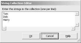
The String Collection Editor uses the AddRange method shown in Table 15-4 to add the strings to the Items collection. The code that does this is in the InitializeComponent method autogenerated by Visual Studio .NET. Your code can then further manipulate the collection, if necessary.
15.2.1.2 Filling a ListControl using a DataSource
The second way to fill a ListControl is to data bind the control to a data source using the DataSource property. The DataSource can be any object that implements the IList interface. The IList interface represents collections of objects that are individually accessible by index, including:
- ADO.NET classes such as DataTable, DataView, or DataSet
- Array or ArrayList
- Any strongly typed collection that derives from CollectionBase

Database access using ADO.NET is covered in Chapters 19 and 20.
The DataSource property binds the data in the DataSource to the control. Generally a DataSource has one or more members, such as DataColumns in a DataTable or member fields of a class that populates an array. You will often want to display one of these members in the user interface, but pass a different member to the program for processing when an item in the list is selected. For example, you might like to list a series of products, but when the user selects one product, your program might obtain the associated ProductID. The DisplayMember property specifies the member to display in the user interface (e.g., the Product Name) and the ValueMember property specifies the member to return to your program (e.g., the Product ID).
For example, suppose you have a database table that contains all the states in the United States. Further, suppose this table has two columns: StateName and Abbreviation. You would like to display the StateName in the list control, but pass the Abbreviation to the program for processing. Your code might look something like the following, where the highlighted lines are crucial for this discussion:

string connectionString =
 "server=YourServer; uid=sa; pwd=YourPassword; database=YourDB";
string commandString =
 "Select StateName, Abbreviation from States";
SqlDataAdapter dataAdapter =
 new SqlDataAdapter(commandString, connectionString);
DataSet dataSet = new DataSet( );
dataAdapter.Fill(dataSet,"States");
DataTable dataTable = dataSet.Tables[0];

// bind to the DataTable
lb.DataSource= dataTable;
lb.DisplayMember = "StateName";
lb.ValueMember = "Abbreviation";
Then in the SelectedValueChanged event handler for the ListBox, the lines of code shown next would extract the value member for further processing (assuming that the string variable strState was previously declared).
if (lb.SelectedIndex != -1)
 strState = lb.SelectedValue.ToString( );

if lb.SelectedIndex <> -1 then
 strState = CType(lb.SelectedValue, string)
end if
You must cast or convert the SelectedValue property to the correct type (in this case, string) because the property is inherently of type object, as is each item in the Items collection. This point is important when working with ListControls.
In Example 19-6 (C#) and Example 19-7 (VB.NET), a ListBox is populated from a database table without using the DataSource property to data-bind the control. Instead, a DataTable is iterated and the Items.Add method are called for each record. The relevant C# code is shown here:
foreach (DataRow dataRow in dataTable.Rows)
{
 lbBugs.Items.Add(
 dataRow["BugID"] + ": " + dataRow["Description"] );
}
This technique offers two apparent benefits over data binding. The first is that it is a convenient way to display the concatenation of one or more member fields and text strings. The second benefit derives from the fact that if the DataSource property is used, then the Items collection of the list cannot be modified. This technique avoids that pitfall of not being able to modify the Items collection. However, it loses the ability to display one value in the list, represented by the DisplayMember property, and retrieve a different value for further processing, represented by the ValueMember.
You can use the DataSource property and data binding, thereby preserving the use of both the DisplayMember and ValueMember properties while still concatenating fields and text strings. Consider the code snippet in Example 15-1 for retrieving the author ID, last name, and first name from the authors table of the pubs database that is included with the default installations of Microsoft Access and SQL Server.
Example 15-1. Binding ListBox to database table
string connectionString =
 "server= YourServer; uid=sa; pwd=YourPassword; database=pubs";
string commandString =
 "Select au_id, au_lname + ', ' + au_fname as name from authors";
SqlDataAdapter dataAdapter =
 new SqlDataAdapter(commandString, connectionString);
DataSet dataSet = new DataSet( );
dataAdapter.Fill(dataSet,"Authors");
DataTable dataTable = dataSet.Tables[0];

// bind to the data table
lb.DataSource= dataTable;
lb.DisplayMember = "name";
lb.ValueMember = "au_id";
The SQL query contained in the command string retrieves the au_id column, plus a concatenation of the last name and first name columns with a comma separating the two, calling that field name. Then after setting the DataSource property, the DisplayMember property is set to the name member, and the ValueMember property is set to the au_id member.
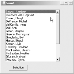
Suppose this code were part of form that contains a listbox and a button for displaying the selected items, as shown in Figure 15-3.
Figure 15-3. DataBound ListBox
The Click event handler for the button might look like Example 15-2, if the listbox were single selectioni.e., had its SelectionMode property (described in Table 15-8) set to 1.
Example 15-2. Click Event Handler for single selection ListBox (in C#)
private void btnSelect_Click(object sender, System.EventArgs e)
{
 if (lb.SelectedIndex != -1)
 {
 string s = ((DataRowView)lb.SelectedItem)["name"].ToString( );
 MessageBox.Show("Value: " + lb.SelectedValue.ToString( ) +
 "
Display: " + s);
 }
 else
 {
 MessageBox.Show("Nothing selected");
 }
}
The equivalent if block in VB.NET would look like Example 15-3.
Example 15-3. Click event handler if block for single selection ListBox (in VB.NET)
if lb.SelectedIndex <> -1 then
 dim s as String = CType(lb.SelectedItem, DataRowView) _
 ("name").ToString( )
 MessageBox.Show("Value: " + lb.SelectedValue.ToString( ) + vbCrLf + _
 "Display: " + s)
else
 MessageBox.Show("Nothing selected")
end if
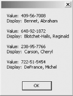
The resulting message box will look like that shown in Figure 15-4.
Figure 15-4. MessageBox from single selection ListBox
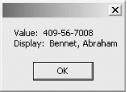
Looking at Example 15-2 and Example 15-3, the SelectedValue property and the ToString method display the member specified by the ValueMember property. However, displaying the member specified by the DisplayMember property is a bit convoluted.
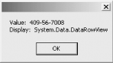
You might expect that you could replace the argument to the MessageBox with the following code:
MessageBox.Show("Value: " + lb.SelectedValue.ToString( ) + vbCrLf + _
 "Display:" + lb.SelectedItem.ToString( ))
Doing so, however, results in the MessageBox shown in Figure 15-5. This result drives home the point, mentioned above, that the items in the Items collection are objectsin this case, DataRowView objects.
You might expect that the items in the Items Collection in this example would be DataRow objects, since the DataSource property is a DataTable, which is comprised of DataRows. However, whenever data is displayed in a Windows Forms control, it is displayed as a DataRowView object.
Figure 15-5. Erroneous MessageBox from single selection ListBox
Therefore, the highlighted lines of code in Example 15-2 and Example 15-3 cast the SelectedItem to a DataRowView object, index into that object to get the member named name, and then call the ToString method on it to convert it to a string for display in the MessageBox.
This works fine, except for two shortcomings. First, it requires hardcoding the name of the member. Second, if the ListBox were multiselect, it would display only the first selected item.
Replacing the Click event handler with the code shown in Example 15-4 (in C#) and in Example 15-5 (in VB.NET) solves both issues.
Example 15-4. Click Event Handler for multiselection ListBox (in C#)
private void btnSelect_Click(object sender, System.EventArgs e)
{
 string strMsg = "";
 if (lb.SelectedIndex != -1)
 {
 foreach(object item in lb.SelectedItems)
 {
 string s1 = ((DataRowView) item)[lb.ValueMember].ToString( );
 string s2 = ((DataRowView) item)[lb.DisplayMember].ToString( );
 strMsg += "Value: " + s1 + "
" + "Display: " + s2 + "

";
 }
 MessageBox.Show(strMsg);
 }
 else
 {
 MessageBox.Show("Nothing selected");
 }
}
Example 15-5. Click Event Handler for multiselection ListBox (in VB.NET)
Private Sub btnSelect_Click(ByVal sender As System.Object, _
 ByVal e As System.EventArgs) _
 Handles btnSelect.Click
 dim strMsg as String = ""
 if lb.SelectedIndex <> -1 then
 dim item as Object
 for each item in lb.SelectedItems
 dim s1 as string = _
 CType(item, DataRowView)(lb.ValueMember).ToString( )
 dim s2 as String = _
 CType(item,DataRowView)(lb.DisplayMember).ToString( )
 strMsg += _
 "Value: " + s1 + vbCrLf + "Display: " + s2 + vbCrLf + vbCrLf
 next
 MessageBox.Show(strMsg)
 else
 MessageBox.Show("Nothing selected")
 end if
End Sub
The code in Example 15-4 and Example 15-5 solves the multiple items selected issue by iterating through the SelectedItems collection of items, building up a string to display in the MessageBox. The member names are not hardcoded, but the ValueMember and DisplayMember properties are used directly to index into the DataRowView objects. The results of selecting several items from the ListBox are shown in Figure 15-6.
Figure 15-6. MessageBox from multiple selection ListBox
Many developers are not allowed direct access to the database layer of the application for practical reasons. They cannot write or embed ad hoc database queries in their code. Instead, there may be stored procedures they can call that return fixed columns of data. In these situations, you can create virtual columns in the DataSet based on an expression that concatenates other columns or applies any number of transformations to the data. The DataSet with the expression column(s) provides the same sort of capabilities as those shown in Example 15-1.
15.2.2 Retrieving Item Text
The examples above demonstrated different ways to retrieve the text associated with an item in the Items collection, such as by using the SelectedItem, SelectedItems, and SelectedValue properties. The ListControl class also provides the GetItemText method to simplify this task, which takes an item object as an argument and returns a text string.
Using the GetItemText method, you can rewrite and consolidate Example 15-2 and Example 15-4 (in C#) and Example 15-3 and Example 15-5 (in VB.NET) to demonstrate both single selection and multiselection techniques. Example 15-6 shows this concept in C# and Example 15-7 shows it in VB.NET.
Example 15-6. Click Event Handler using GetItemText (in C#)
private void btnSelect_Click(object sender, System.EventArgs e)
{
 string strMsg = "";
 if (lb.SelectedIndex != -1)
 {
 // for single selection listbox
 MessageBox.Show("ItemText: " + lb.GetItemText(lb.SelectedItem));

 // for multi selection listbox
 foreach(object item in lb.SelectedItems)
 {
 string s1 = ((DataRowView) item)[lb.ValueMember].ToString( );
 string s2 = ((DataRowView) item)[lb.DisplayMember].ToString( );
 string s3 = lb.GetItemText(item);
 strMsg += "Value: " + s1 + "
" + "Display: " + s2 + "
" +
 "ItemText: " + s3 + "

";
 }
 }
 MessageBox.Show(strMsg);
}
else
{
 MessageBox.Show("Nothing selected");
}
Example 15-7. Click Event Handler using GetItemText (in VB.NET)
Private Sub btnSelect_Click(ByVal sender As System.Object, _
 ByVal e As System.EventArgs) _
 Handles btnSelect.Click
 dim strMsg as String = ""
 if lb.SelectedIndex <> -1 then
 ' for single selection listbox
 MessageBox.Show("ItemText: " + lb.GetItemText(lb.SelectedItem))

 ' for multi-selection listbox
 dim item as Object
 for each item in lb.SelectedItems
 dim s1 as string = _
 CType(item, DataRowView)(lb.ValueMember).ToString( )
 dim s2 as String = _
 CType(item,DataRowView)(lb.DisplayMember).ToString( )
 dim s3 as String = lb.GetItemText(item)
 strMsg += "Value: " + s1 + vbCrLf + "Display: " + s2 + vbCrLf + _
 "ItemText: " + s3 + vbCrLf + vbCrLf
 next
 MessageBox.Show(strMsg)
 else
 MessageBox.Show("Nothing selected")
 end if
End Sub
Finally, there is yet another, simpler way to retrieve the displayed item. The Text property of the classes derived from ListControl overrides the base Control.Text property. The Text property of ListBox, CheckedListBox, and ComboBox reflects not the text string associated with the control itself, but the currently selected item. In the case of the controls that support multiselection (ListBox and CheckedListBox), it corresponds to the text of the first selected item.
So the lines of code in Example 15-6 and Example 15-7 that display the value of the single selected value could be equivalently replaced with the following:
MessageBox.Show("Text: " + lb.Text);
15.2.3 ListControl Events
Two commonly used scenarios retrieve and process the currently selected items of a list control. The first, demonstrated in the ListControl examples above, uses an event external to the ListControl, such as a button click, to capture the current state of the list. The second scenario uses a ListControl event.
The ListControl class provides five events, listed in Table 15-5, that can be trapped and handled. These events allow your program to respond immediately to any change in selection made by the user, as well as changes to the DataSource, DisplayMember, or ValueMember properties.
|
|
Event |
Event argument |
Description |
|---|---|---|
|
DataSourceChanged |
EventArgs |
Raised when a new data source is set |
|
DisplayMemberChanged |
EventArgs |
Raised when a new data member is set |
|
SelectedIndexChanged |
EventArgs |
Raised when the SelectedIndex changes |
|
SelectedValueChanged |
EventArgs |
Raised when the SelectedValue changes |
|
ValueMemberChanged |
EventArgs |
Raised when a new ValueMember property is set |
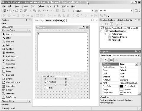
The following examples created in Visual Studio .NET (csListBoxEvents in C# and vbListBoxEvents in VB.NET) demonstrate the use of these events. As you will see, some events are not always raised when you would expect, and others are raised at times you would not expect. These examples consist of a form with a listbox and a pair of radio buttons for selecting the data source for the listbox. One data source will be the authors table from the pubs database, as demonstrated earlier in Example 15-1. The other data source will be an array of football quarterbacks who are members of a class called QB.
To create the list control events example, open Visual Studio .NET and create a new Windows Application project in the language of your choice. Drag a ListBox onto the form, and then a GroupBox, and then two radio buttons inside the GroupBox. Rename the controls as indicated in Table 15-6. Set the Checked property of the Authors radio button to True.
|
Control |
Name |
Text |
|---|---|---|
|
ListBox |
lb |
|
|
GroupBox |
DataSource |
|
|
RadioButton |
rbAuthors |
Authors |
|
RadioButton |
rbQBs |
QB's |
The form in design view should look something like Figure 15-7.
Figure 15-7. ListBoxEvents design view
Right-click on the form in design view and select View Code to open the source file in the code editor. To prepare for database access, add the following using statements to the C# version:
using System.Data;
using System.Data.SqlClient;
or this imports statement to the VB.NET version:
imports System.Data.SqlClient
Add the code from Example 15-8 to define the QB class in C#.
Example 15-8. QB class in C#
public class QB
{
 private string theID ;
 private string theName ;
 public QB(string strName, string strID)
 {
 this.theID = strID;
 this.theName = strName;
 }
 public string ID
 {
 get
 {
 return theID;
 }
 }
 public string Name
 {
 get
 {
 return theName ;
 }
 }
 public override string ToString( )
 {
 return this.theID + " : " + this.Name;
 }
}
And code from Example 15-9 to define the QB class in VB.NET.
Example 15-9. QB class in VB.NET
public class QB
 dim theID as string
 dim theName as string

 public sub New(strName as string, strID as string)
 me.theID = strID
 me.theName = strName
 end sub

 public readonly property ID as string
 get
 return theID
 end get
 end property

 public readonly property Name as string
 get
 return theName
 end get
 end property

 public overrides function ToString( ) as string
 return me.theID + " : " + me.Name
 end function
end class
The QB class has two read-only properties: ID and Name, both strings. It also overrides the ToString method to return a concatenation of the two properties.
Now move your attention to the Form1 class. First, add the following declarations to the class outside the constructor:
private DataTable dataTable;
private ArrayList QBs = new ArrayList( );
dim dt as DataTable
dim QBs as new ArrayList( )
Add the code from Example 15-10 to the C# constructor to connect to and query the pubs database and set the data source properties of the listbox. This code also populates the ArrayList of QB objects in C#.
Example 15-10. Constructor code in C#
string connectionString =
 "server= YourServer; uid=sa; pwd=YourPassword; database=pubs";
string commandString =
 "Select au_id, au_lname + ', ' + au_fname as name from authors";
SqlDataAdapter dataAdapter =
 new SqlDataAdapter(commandString, connectionString);
DataSet dataSet = new DataSet( );
dataAdapter.Fill(dataSet,"Authors");
dataTable = dataSet.Tables[0];

// bind to the data table
lb.DataSource= dataTable;
lb.DisplayMember = "name";
lb.ValueMember = "au_id";

// populate the arraylist for later use.
QBs.Add(new QB("Joe Montana", "SF"));
QBs.Add(new QB("Joe Willie", "NYJ"));
QBs.Add(new QB("Tom Brady", "NE"));
QBs.Add(new QB("Drew Bledsoe", "Buf"));
QBs.Add(new QB("Johny Unitas", "Bal"));
QBs.Add(new QB("Troy Aikman", "Dal"));
QBs.Add(new QB("Brett Favre", "GB"));
It populates code from Example 15-11 in VB.NET as well.
Example 15-11. Constructor code in VB.NET
dim connectionString as String = _
 "server=YourServer; uid=sa; pwd=YourPassword; database=pubs"
dim commandString as String = _
 "Select au_id, au_lname + ', ' + au_fname as name from authors"
dim dataAdapter as new SqlDataAdapter(commandString, connectionString)
dim ds as new DataSet( )
dataAdapter.Fill(ds,"Authors")
dt = ds.Tables(0)

' bind to the data table
lb.DataSource= dt
lb.DisplayMember = "name"
lb.ValueMember = "au_id"

' populate the arraylist for later use.
QBs.Add(new QB("Joe Montana", "SF"))
QBs.Add(new QB("Joe Willie", "NYJ"))
QBs.Add(new QB("Tom Brady", "NE"))
QBs.Add(new QB("Drew Bledsoe", "Buf"))
QBs.Add(new QB("Johny Unitas", "Bal"))
QBs.Add(new QB("Troy Aikman", "Dal"))
QBs.Add(new QB("Brett Favre", "GB"))
You are now going to use Visual Studio .NET to create the event handlers. In the C# version, add an event handler by going to the design view of the form, clicking on the yellow lightning bolt in the Properties window, selecting the control whose event you wish to handle, and double-clicking in the Properties window next to the event name. In VB.NET, you can achieve the same result by going to the code editor, selecting the control from the drop-down menu at the top left of the code window, and then clicking on the desired event name in the drop-down menu at the top right of the code window.
In either language, a code skeleton will be opened, in the code window with the property declaration for an event handler method, with a default name for that control's default event, plus the code required to hook that event handler to the event.
This technique will not work directly for this example because you want to use the same event handler for multiple controls, i.e., both radio buttons, which is not how Visual Studio .NET does things by default. You can, however, accomplish this task directly.
To do so in C#, select both radio button controls in design view. Then click on the yellow lightning bolt in the Properties window, and enter the desired method name (rb_CheckedChanged) next to the CheckedChanged event. A code skeleton will be created in the code window for an event handler named rb_CheckedChanged and the cursor will be placed in the method, ready for typing. Enter the highlighted code shown in Example 15-12.
Example 15-12. Radio button event handler in C#
private void rb_CheckedChanged(object sender, System.EventArgs e)
{
 if (rbAuthors.Checked )
 {
 lb.DataSource= dataTable;
 lb.DisplayMember = "name";
 lb.ValueMember = "au_id";
 }
 else
 {
 lb.DataSource = QBs;
 lb.DisplayMember = "Name";
 lb.ValueMember = "ID";
 }
}
In VB.NET, the procedure is somewhat different. Create an event handler with the default name for the CheckedChanged event for one of the radio buttons. In the code window, change the name of the event handler to rb_CheckedChanged. Add the highlighted code shown in Example 15-13. Be sure to modify the Handles clause to list the CheckedChanged event for both radio button events.
Example 15-13. Radio button event handler in VB.NET
Private Sub rb_CheckedChanged(ByVal sender As Object, _
 ByVal e As System.EventArgs) _
 Handles rbQBs.CheckedChanged, rbAuthors.CheckedChanged
 if rbAuthors.Checked then
 lb.DataSource= dt
 lb.DisplayMember = "name"
 lb.ValueMember = "au_id"
 else
 lb.DataSource = QBs
 lb.DisplayMember = "Name"
 lb.ValueMember = "ID"
 end if
End Sub
Now both rbAuthors and rbQBs use the same event handler for the CheckedChanged event in both languages.
Run the form. When you click on the radio buttons, the items displayed in the listbox will be populated from either the Authors table or the array of quarterbacks.
Next, add event handlers for the ListBox SelectedIndexChanged, SelectedValueChanged, DataSourceChanged, DisplayMemberChanged, and ValueMemberChanged events, as described above. All of these event handlers do nothing more than display a MessageBox with the name of the event handler as a caption and relevant listbox properties as the body. The event handlers look like Example 15-14 and Example 15-15.
Example 15-14. Event handlers in C#
private void lb_SelectedIndexChanged(object sender, System.EventArgs e)
{
 MessageBox.Show(lb.SelectedIndex.ToString( )+ "
" +
 lb.GetItemText(lb.SelectedItem),
 "lb_SelectedIndexChanged");
}
private void lb_SelectedValueChanged(object sender, System.EventArgs e)
{
 MessageBox.Show(lb.GetItemText(lb.SelectedItem),
 "lb_SelectedValueChanged");
}
private void lb_DataSourceChanged(object sender, System.EventArgs e)
{
 MessageBox.Show(lb.DataSource.ToString( ), "lb_DataSourceChanged");
}
private void lb_DisplayMemberChanged(object sender, System.EventArgs e)
{
 MessageBox.Show(lb.DisplayMember.ToString( ),
 "lb_DisplayMemberChanged");
}
private void lb_ValueMemberChanged(object sender, System.EventArgs e)
{
 MessageBox.Show(lb.ValueMember.ToString( ), "lb_ValueMemberChanged");
}
Example 15-15. Event handlers in VB.NET
Private Sub lb_SelectedIndexChanged(ByVal sender As Object, _
 ByVal e As System.EventArgs) _
 Handles lb.SelectedIndexChanged
 MessageBox.Show(lb.SelectedIndex.ToString( )+ vbCrLf + _
 lb.GetItemText(lb.SelectedItem), _
 "lb_SelectedIndexChanged")
End Sub

Private Sub lb_SelectedValueChanged(ByVal sender As Object, _
 ByVal e As System.EventArgs) _
 Handles lb.SelectedValueChanged
 MessageBox.Show(lb.GetItemText(lb.SelectedItem), _
 "lb_SelectedValueChanged")
End Sub

Private Sub lb_DataSourceChanged(ByVal sender As Object, _
 ByVal e As System.EventArgs) _
 Handles lb.DataSourceChanged
 MessageBox.Show(lb.DataSource.ToString( ), _
 "lb_DataSourceChanged")
End Sub

Private Sub lb_DisplayMemberChanged(ByVal sender As Object, _
 ByVal e As System.EventArgs) _
 Handles lb.DisplayMemberChanged
 MessageBox.Show(lb.DisplayMember.ToString( ), _
 "lb_DisplayMemberChanged")
End Sub

Private Sub lb_ValueMemberChanged(ByVal sender As Object, _
 ByVal e As System.EventArgs) _
 Handles lb.ValueMemberChanged
 MessageBox.Show(lb.ValueMember.ToString( ), _
 "lb_ValueMemberChanged")
End Sub
When you run this application now, you will see a surprising number of events being raised. First, the SelectedIndexChanged and SelectedValueChanged events always fire in pairs: they are redundant. You can comment out one of them to reduce clutter when this application runs.
Of more interest is the sheer number of times either event is raised. It turns out that when the DataSource, DisplayMember and ValueMember properties are set, the SelectedIndexChanged and SelectedValueChanged events are raised repeatedly, as well as twice more when the constructor completes. Notably, the pair of events is raised only once if you use Items.Add rather than data binding to populate the listbox.
This is not the behavior most applications want. Typically, you should raise the SelectedIndexChanged or SelectedValueChanged events only when a user interaction causes a change. To force this, you must undo a bit of the plumbing code inserted by Visual Studio .NET and replace it with some of your own.
Create an event handler for the form Load event by double-clicking on the form in design view. Then go to the code window.
In the C# version, find the two lines of code in InitializeComponent( ) that add the event handlers for the two events in question. They look like the following:
this.lb.SelectedValueChanged +=
 new System.EventHandler(this.lb_SelectedValueChanged);
this.lb.SelectedIndexChanged +=
 new System.EventHandler(this.lb_SelectedIndexChanged);
Move those lines of code out of InitializeComponent( ) and into the Form1_Load event handler method.
In the VB.NET version, add the following lines of code to the Form1_Load event handler method:
AddHandler lb.SelectedIndexChanged, AddressOf lb_SelectedIndexChanged
AddHandler lb.SelectedValueChanged, AddressOf lb_SelectedValueChanged
Then delete the Handles clause from the method declarations for each of the two event handlers.
Now when you run the application in either language, neither the SelectedIndexChanged nor SelectedValueChanged events will be handled until after the form is loaded.
|

15.2.4 ListBox
As seen in the previous examples in this chapter and displayed in Figure 15-3, a ListBox presents a list of items to a user.
The items displayed in the list are members of an Items collection, which may be filled either by manipulating the Items collection directly or by data binding the control to a data source via the DataSource property. The Items property is of type ListBox.ObjectCollection. Other commonly used ListBox methods are listed in Table 15-7. Table 15-4 lists commonly used methods available to all ObjectCollections. In addition, the ListBox.ObjectCollection has an overloaded form of the AddRange method that lets you add the items from an existing ListBox.ObjectCollection to the collection.
The programs listed in Example 15-16 (in C#) and Example 15-17 (in VB.NET) demonstrate the use of the Items.Add method to populate the Items collection. Note the call to the BeginUpdate method before any items are added to the collection, followed by a call to EndUpdate. When adding items individually, thi provides better performance and prevents screen flicker by suspending the redrawing of the control until EndUpdate is called.
Example 15-16. Adding Items to ListBox Items Collection in C# (ListBoxItems.cs)
using System;
using System.Drawing;
using System.Windows.Forms;
using System.Data;
using System.Data.SqlClient;
namespace ProgrammingWinApps
{
 public class ListBoxItems : Form
 {
 ListBox lb;
 public ListBoxItems( )
 {
 Text = "ListBox Items Collection";
 Size = new Size(300,400);
 lb = new ListBox( );
 lb.Parent = this;
 lb.Location = new Point(10,10);
 lb.Size = new Size(ClientSize.Width - 20, Height - 200);
 lb.Anchor = AnchorStyles.Top | AnchorStyles.Left |
 AnchorStyles.Right | AnchorStyles.Bottom;
 lb.BorderStyle = BorderStyle.Fixed3D;
 // get the data to populate the ListBox from pubs authors table
 string connectionString =
 "server=YourServer; uid=sa; pwd=YourPassword; database=pubs";
 string commandString =
 "Select au_id,au_lname +', ' + au_fname as name from authors";
 SqlDataAdapter dataAdapter =
 new SqlDataAdapter(commandString, connectionString);
 DataSet dataSet = new DataSet( );
 dataAdapter.Fill(dataSet,"Authors");
 DataTable dataTable = dataSet.Tables[0];
 lb.BeginUpdate( );
 for (int i = 0; i < dataTable.Rows.Count; i++)
 {
 lb.Items.Add(
 dataTable.Rows[i]["au_id"] + "	" +
 dataTable.Rows[i]["name"]);
 }
 lb.Items.Add("12345	Hurwitz, Dan");
 lb.Items.Add("67890	Liberty, Jesse");
 lb.EndUpdate( );
 } // close for constructor
 static void Main( )
 {
 Application.Run(new ListBoxItems( ));
 }
 } // close for form class
} // close form namespace
Example 15-17. Adding Items to ListBox Items Collection in VB.NET (ListBoxItems.vb)
Option Strict On
imports System
imports System.Drawing
imports System.Windows.Forms
imports System.Data
imports System.Data.SqlClient
Imports System.Xml

namespace ProgrammingWinApps
 public class ListBoxItems : inherits Form

 dim lb as ListBox

 public sub New( )
 Text = "ListBox Items Collection"
 Size = new Size(300,400)

 lb = new ListBox( )
 lb.Parent = me
 lb.Location = new Point(10,10)
 lb.Size = new Size(ClientSize.Width - 20, Height - 200)
 lb.Anchor = AnchorStyles.Top or AnchorStyles.Left or _
 AnchorStyles.Right or AnchorStyles.Bottom
 lb.BorderStyle = BorderStyle.Fixed3D

 ' get the data to populate the ListBox from pubs authors table
 dim connectionString as String = _
 "server=YourServer; uid=sa; pwd=YourPassword; database=pubs"
 dim commandString as String = _
 "Select au_id,au_lname + ', ' + au_fname as name from authors"
 dim dataAdapter as new SqlDataAdapter(commandString, _
 connectionString)
 dim ds as new DataSet( )
 dataAdapter.Fill(ds,"Authors")
 dim dt as new DataTable( )
 dt = ds.Tables(0)

 lb.BeginUpdate( )
 dim i as integer
 for i = 0 to dt.Rows.Count - 1
 lb.Items.Add( _
 dt.Rows(i)("au_id").ToString( ) + vbTab + _
 dt.Rows(i)("name").ToString( ))
 next

 lb.Items.Add("12345" + vbTab + "Hurwitz, Dan")
 lb.Items.Add("67890" + vbTab + "Liberty, Jesse")
 lb.EndUpdate( )
 end sub ' close for constructor

 public shared sub Main( )
 Application.Run(new ListBoxItems( ))
 end sub
 end class
end namespace
In these examples, you are precluded from using data binding (i.e., the DataSource property) because items are added to the Items collection that are not in the database. (You could, if you wanted, add these extra items to the DataSet after populating from the database but before data binding occurs.) However, it is still more efficient to add the items from the database as a group, using the AddRange method rather than the Add method. To do this, replace the highlighted code in Example 15-16 with the following block of code:
 string[] arNames = new string[dataTable.Rows.Count];
 lb.BeginUpdate( );
 for (int i = 0; i < dataTable.Rows.Count; i++)
 {
 arNames[i] = dataTable.Rows[i]["au_id"] + "	" +
 dataTable.Rows[i]["name"];
 }
 lb.Items.AddRange(arNames);

 lb.Items.Add("12345	Hurwitz, Dan");
 lb.Items.Add("67890	Liberty, Jesse");
 lb.EndUpdate( );
and the highlighted code in Example 15-17 with the block of code shown next.
 dim arNames(dt.Rows.Count - 1) as string
 lb.BeginUpdate( )
 dim i as integer
 for i = 0 to dt.Rows.Count - 1
 arNames(i) = dt.Rows(i)("au_id").ToString( ) + vbTab + _
 dt.Rows(i)("name").ToString( )
 next
 lb.Items.AddRange(arNames)

 lb.Items.Add("12345" + vbTab + "Hurwitz, Dan")
 lb.Items.Add("67890" + vbTab + "Liberty, Jesse")
 lb.EndUpdate( )
In these code snippets, an array list is created to hold the database data. Since the overloaded version of the AddRange method used here takes an array of objects as an argument, the ArrayList.ToArray method converts the array list to the requisite array. If AddRange is used exclusively to add all the items to the collection, then using the BeginUpdate and EndUpdate methods is not beneficial. Table 15-7 lists common ListBox methods.
|
Method |
Description |
|---|---|
|
ClearSelected |
Unselects all selected items. Equivalent to setting SelectedIndex property to -1. |
|
GetSelected |
Returns true if the item at the specified index is selected. |
|
IndexFromPoint |
Overloaded. Returns zero-based index of item at the specified point. Returns ListBox.NoMatches if nothing found. |
|
SetSelected |
Sets or clears the selection status of the item at the specified index, based on specified Boolean value. |
The ListBox control has a number of properties, listed in Table 15-8, in addition to those derived from the ListControl class (listed in Table 15-1) and those in common with the other list controls (listed in Table 15-2).
The ListBox control (and the CheckedListBox that derives from it) can allow either no selections, a single selection, or multiple selections, depending on the value of the of the SelectionMode property. Valid values of the SelectionMode property are members of the SelectionMode enumeration, listed in Table 15-9. The default mode is single selection (i.e., a value of SelectionMode.One).
If the SelectionMode is set to SelectionMode.None, meaning that no selection is possible, then you cannot use data binding to populate the ListBox, since doing so implicitly sets the SelectedIndex to 0. Nor can you explicitly select an item in code, such as setting the SelectedIndex or SelectedItem properties or calling the SetSelected method. Any attempt to do so will not cause a compile error, but will cause a runtime error.
|
Property |
Value type |
Description |
|---|---|---|
|
ColumnWidth |
Integer |
Read/write. The width, in pixels, of each column in a multicolumn listbox. If set to zero, the default width is assigned. |
|
HorizontalExtent |
Integer |
Read/write. The width, in pixels, that the horizontal scrollbar can scroll the listbox if the HorizontalScrolling property is set to true. |
|
HorizontalScrollbar |
Boolean |
Read/write. If true, a horizontal scrollbar is displayed when the width of the items exceeds the width of the control. Default value is false. |
|
Items |
ListBox.ObjectCollection |
Collection of items in the listbox. ListBox.ObjectCollection class has the methods listed in Table 15-4 plus AddRange. |
|
MultiColumn |
Boolean |
Read/write. If true, the listbox displays the items in multiple columns. Default value is false. |
|
ScrollAlwaysVisible |
Boolean |
Read/write. If true, the vertical scrollbar is always visible in a listbox with MultiColumn set false. For multicolumn listboxes, this property controls the horizontal scrollbar. Default value is false. |
|
SelectedIndices |
ListBox.SelectedIndexCollection |
Read-only. The collection of zero-based indexes of all currently selected items. |
|
SelectedItems |
ListBox.SelectedObjectCollection |
Read-only. The collection of all currently selected items. |
|
SelectionMode |
SelectionMode |
Read/write. Specifies the selection mode of the ListBox. Valid values are members of the SelectionMode enumeration, listed in Table 15-9. The default value is SelectionMode.One. |
|
TopIndex |
Integer |
Read/write. The zero-based index of the first visible item in the control. |
|
Value |
Description |
|---|---|
|
MultiExtended |
Multiple items can be selected using the Shift, Ctrl, and arrow keys. |
|
MultiSimple |
Multiple items can be selected using the arrow keys and the spacebar. |
|
None |
No items can be selected. |
|
One |
A single item can be selected. |
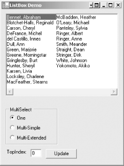
The application shown in Example 15-18 (in C#) and Example 15-19 (in VB.NET) demonstrates several properties, including SelectionMode and TopIndex. When run, it looks something like Figure 15-8. A set of radio buttons allows you to switch between the different selection modes. (SelectionMode.None is not supported because the listbox is data bound.) Clicking on the Update button displays the current value of TopIndex in the text box. This number will change as you resize the form and/or scroll the listbox.
Figure 15-8. ListBox properties application
Example 15-18. ListBox properties in C# (ListBox.cs)
using System;
using System.Drawing;
using System.Windows.Forms;
using System.Data;
using System.Data.SqlClient;
namespace ProgrammingWinApps
{
 public class ListBoxes : Form
 {
 ListBox lb;
 RadioButton rdoMultiExtended;
 RadioButton rdoMultiSimple;
 RadioButton rdoMultiOne;
 TextBox txtTop;
 Button btnTop;
 public ListBoxes( )
 {
 int xSize, ySize;
 Text = "ListBox Demo";
 Size = new Size(300,400);
 lb = new ListBox( );
 lb.Parent = this;
 lb.Location = new Point(10,10);
 lb.Size = new Size(ClientSize.Width - 20, Height - 200);
 lb.Anchor = AnchorStyles.Top | AnchorStyles.Left |
 AnchorStyles.Right | AnchorStyles.Bottom;
 lb.BorderStyle = BorderStyle.Fixed3D;
 lb.MultiColumn = true;
 lb.ScrollAlwaysVisible = true;
 GroupBox grpMulti = new GroupBox( );
 grpMulti.Parent = this;
 grpMulti.Text = "MultiSelect";
 grpMulti.Location = new Point(lb.Left, lb.Bottom + 25);
 grpMulti.Anchor = AnchorStyles.Left | AnchorStyles.Bottom;
 rdoMultiOne = new RadioButton( );
 rdoMultiOne.Parent = grpMulti;
 rdoMultiOne.Text = "One";
 rdoMultiOne.Tag = SelectionMode.One;
 rdoMultiOne.Checked = true;
 rdoMultiOne.Location = new Point(10,15);
 rdoMultiOne.CheckedChanged +=
 new System.EventHandler(rdoMulti_CheckedChanged);
 rdoMultiSimple = new RadioButton( );
 rdoMultiSimple.Parent = grpMulti;
 rdoMultiSimple.Text = "Multi-Simple";
 rdoMultiSimple.Tag = SelectionMode.MultiSimple;
 rdoMultiSimple.Location = new Point(10, rdoMultiOne.Bottom);
 rdoMultiSimple.CheckedChanged +=
 new System.EventHandler(rdoMulti_CheckedChanged);
 rdoMultiExtended = new RadioButton( );
 rdoMultiExtended.Parent = grpMulti;
 rdoMultiExtended.Text = "Multi-Extended";
 rdoMultiExtended.Tag = SelectionMode.MultiExtended;
 rdoMultiExtended.Location = new Point(10, rdoMultiSimple.Bottom);
 rdoMultiExtended.CheckedChanged +=
 new System.EventHandler(rdoMulti_CheckedChanged);
 // Set the size of the groupbox based on the child radio buttons
 xSize = (int)(Font.Height * .75) * rdoMultiExtended.Text.Length;
 ySize = ((int)rdoMultiOne.Height * 3) + 20;
 grpMulti.Size = new Size(xSize, ySize);
 // 3 controls to display TopIndex inside a panel
 Panel pnlTop = new Panel( );
 pnlTop.Parent = this;
 pnlTop.Location = new Point(lb.Left, grpMulti.Bottom + 10);
 pnlTop.Anchor = AnchorStyles.Left | AnchorStyles.Bottom;
 Label lblTop = new Label( );
 lblTop.Parent = pnlTop;
 lblTop.Text = "TopIndex: ";
 xSize = ((int)(Font.Height * .5) * lblTop.Text.Length);
 lblTop.Size = new Size(xSize, Font.Height + 10);
 txtTop = new TextBox( );
 txtTop.Parent = pnlTop;
 txtTop.Location = new Point(lblTop.Right, lblTop.Top);
 txtTop.Text = lb.TopIndex.ToString( );
 txtTop.Size = new Size((int)(Font.Height * .75) * 3,
 Font.Height + 10);
 btnTop = new Button( );
 btnTop.Parent = pnlTop;
 btnTop.Text = "Update";
 btnTop.Location = new Point(txtTop.Right + 10, txtTop.Top);
 btnTop.Click += new System.EventHandler(btnTop_Click);
 // get the data to populate the ListBox from pubs authors table
 string connectionString =
 "server=YourServer; uid=sa; pwd=YourPassword; database=pubs";
 string commandString =
 "Select au_id,au_lname +', ' + au_fname as name from authors";
 SqlDataAdapter dataAdapter =
 new SqlDataAdapter(commandString, connectionString);
 DataSet dataSet = new DataSet( );
 dataAdapter.Fill(dataSet,"Authors");
 DataTable dataTable = dataSet.Tables[0];
 // bind to the data table
 lb.DataSource= dataTable;
 lb.DisplayMember = "name";
 lb.ValueMember = "au_id";
 } // close for constructor
 static void Main( )
 {
 Application.Run(new ListBoxes( ));
 }
 private void rdoMulti_CheckedChanged(object sender, EventArgs e)
 {
 RadioButton rdo = (RadioButton)sender;
 lb.SelectionMode = (SelectionMode)rdo.Tag;
 }
 private void btnTop_Click(object sender, EventArgs e)
 {
 txtTop.Text = lb.TopIndex.ToString( );
 }
 } // close for form class
} // close form namespace
Example 15-19. ListBox properties in VB.NET (ListBox.vb)
Option Strict On
imports System
imports System.Drawing
imports System.Windows.Forms
imports System.Data
imports System.Data.SqlClient

namespace ProgrammingWinApps
 public class ListBoxes : inherits Form

 dim lb as ListBox
 dim rdoMultiExtended as RadioButton
 dim rdoMultiSimple as RadioButton
 dim rdoMultiOne as RadioButton
 dim txtTop as TextBox
 dim btnTop as Button

 public sub New( )
 dim xSize, ySize as integer

 Text = "ListBox Demo"
 Size = new Size(300,400)

 lb = new ListBox( )
 lb.Parent = me
 lb.Location = new Point(10,10)
 lb.Size = new Size(ClientSize.Width - 20, Height - 200)
 lb.Anchor = AnchorStyles.Top or AnchorStyles.Left or _
 AnchorStyles.Right or AnchorStyles.Bottom
 lb.BorderStyle = BorderStyle.Fixed3D
 lb.MultiColumn = true
 lb.ScrollAlwaysVisible = true

 dim grpMulti as new GroupBox( )
 grpMulti.Parent = me
 grpMulti.Text = "MultiSelect"
 grpMulti.Location = new Point(lb.Left, lb.Bottom + 25)
 grpMulti.Anchor = AnchorStyles.Left or AnchorStyles.Bottom

 rdoMultiOne = new RadioButton( )
 rdoMultiOne.Parent = grpMulti
 rdoMultiOne.Text = "One"
 rdoMultiOne.Tag = SelectionMode.One
 rdoMultiOne.Checked = true
 rdoMultiOne.Location = new Point(10,15)
 AddHandler rdoMultiOne.CheckedChanged, _
 AddressOf rdoMulti_CheckedChanged

 rdoMultiSimple = new RadioButton( )
 rdoMultiSimple.Parent = grpMulti
 rdoMultiSimple.Text = "Multi-Simple"
 rdoMultiSimple.Tag = SelectionMode.MultiSimple
 rdoMultiSimple.Location = new Point(10, rdoMultiOne.Bottom)
 AddHandler rdoMultiSimple.CheckedChanged, _
 AddressOf rdoMulti_CheckedChanged

 rdoMultiExtended = new RadioButton( )
 rdoMultiExtended.Parent = grpMulti
 rdoMultiExtended.Text = "Multi-Extended"
 rdoMultiExtended.Tag = SelectionMode.MultiExtended
 rdoMultiExtended.Location = new Point(10, rdoMultiSimple.Bottom)
 AddHandler rdoMultiExtended.CheckedChanged, _
 AddressOf rdoMulti_CheckedChanged

 ' Set the size of the groupbox based on the child radio buttons
 xSize = CType(Font.Height * .75, integer) * _
 rdoMultiExtended.Text.Length
 ySize = CType(rdoMultiOne.Height * 3, integer) + 20
 grpMulti.Size = new Size(xSize, ySize)

 ' 3 controls to display TopIndex inside a panel
 dim pnlTop as new Panel( )
 pnlTop.Parent = me
 pnlTop.Location = new Point(lb.Left, grpMulti.Bottom + 10)
 pnlTop.Anchor = AnchorStyles.Left or AnchorStyles.Bottom

 dim lblTop as new Label( )
 lblTop.Parent = pnlTop
 lblTop.Text = "TopIndex: "
 xSize = CType(Font.Height * .5, integer) * lblTop.Text.Length
 lblTop.Size = new Size(xSize, Font.Height + 10)

 txtTop = new TextBox( )
 txtTop.Parent = pnlTop
 txtTop.Location = new Point(lblTop.Right, lblTop.Top)
 txtTop.Text = lb.TopIndex.ToString( )
 txtTop.Size = new Size(CType((Font.Height * .75) * 3, integer), _
 Font.Height + 10)

 btnTop = new Button( )
 btnTop.Parent = pnlTop
 btnTop.Text = "Update"
 btnTop.Location = new Point(txtTop.Right + 10, txtTop.Top)
 AddHandler btnTop.Click, _
 AddressOf btnTop_Click

 ' get the data to populate the ListBox from pubs authors table
 dim connectionString as String = _
 "server=YourServer; uid=sa; pwd=YourPassword; database=pubs"
 dim commandString as String = _
 "Select au_id,au_lname + ', ' + au_fname as name from authors"
 dim dataAdapter as new SqlDataAdapter(commandString, _
 connectionString)
 dim ds as new DataSet( )
 dataAdapter.Fill(ds,"Authors")
 dim dt as new DataTable( )
 dt = ds.Tables(0)

 ' bind to the data table
 lb.DataSource= dt
 lb.DisplayMember = "name"
 lb.ValueMember = "au_id"
 end sub ' close for constructor

 public shared sub Main( )
 Application.Run(new ListBoxes( ))
 end sub

 private sub rdoMulti_CheckedChanged(ByVal sender as object, _
 ByVal e as EventArgs)
 dim rdo as RadioButton = CType(sender, RadioButton)
 lb.SelectionMode = CType(rdo.Tag, SelectionMode)
 end sub

 private sub btnTop_Click(ByVal sender as object, _
 ByVal e as EventArgs)
 txtTop.Text = lb.TopIndex.ToString( )
 end sub
 end class
end namespace
The listbox created in Example 15-18 and Example 15-19 has the MultiColumn and ScrollAlwaysVisible properties set to true, neither of which is the default value. A MultiColumn listbox creates as many columns as are necessary to display the data. You can control the column width by setting the ColumnWidth property. A default width is used either by setting the property to zero or omitting the property altogether, as was done in these examples.
The radio buttons used to set the SelectionMode use the Tag property. This property lets the common radio button CheckedChanged event handler set the value of the SelectionMode property directly from the value of the Tag property. (For a complete discussion of radio buttons, refer to Chapter 11.)
15.2.4.1 CheckedListBox
The CheckedListBox derives from ListBox, so it inherits all the members and functionality of the ListBox class. The two controls have just a few differences. Table 15-10 lists the properties that are unique to the CheckedListBox control.
|
Property |
Value type |
Description |
|---|---|---|
|
CheckedIndices |
CheckedListBox.CheckedIndexCollection |
Read-only. The collection of indexes that are either checked or indeterminate. |
|
CheckedItems |
CheckedListBox.CheckedItemCollection |
Read-only. The collection of items that are either checked or indeterminate. |
|
CheckOnClick |
Boolean |
Read/write. If true, an item's checked status will be toggled immediately when it is clicked. The default, false, allows the user to select an item without changing its checked status. A second click then changes the checked status. Use of the arrow keys and the spacebar to toggle the checked status is unaffected by this property. |
|
Items |
CheckedListBox.ObjectCollection |
Collection of items in the control. |
|
SelectionMode |
SelectionMode |
Overridden from ListBox. Since multiple selection is not supported (other than by checking multiple checkboxes), the only legal values are SelectionMode.One and SelectionMode.None. |
|
ThreeDCheckBoxes |
Boolean |
Read/write. If true, checkboxes have a 3-D appearance. If false (the default), checkboxes are flat squares. |
The obvious visual difference between ListBoxes and CheckedListBoxes is that each item in the list of the CheckedListBox has a small square checkbox next to it. Checked items display a checkmark in the checkbox rather than display the item in a highlighted color. The ThreeDCheckBoxes property can be set true to force the checkboxes to display with a three-dimensional appearance; otherwise, they are flat squares.
The second significant difference between the two controls is that the CheckedListBox has a tri-state selection capability: each item can have one of the three CheckState enumeration values listed in Table 15-11. Only the Checked and Unchecked states can be set by the end user. No provision in the UI sets the checked state of an item to Indeterminate; this must be done in code. Typically the indeterminate state is used when the UI tries to convey mixed information. A common example would be a checkbox that indicates bold text. If some of the text is bold and some is not, then it is indeterminate.
|
Value |
Description |
|---|---|
|
Checked |
Item is checked. |
|
Unchecked |
Item is not checked. |
|
Indeterminate |
Item is indeterminate. Checkbox has a shaded appearance. |
The SelectedItems and SelectedIndices collections are still available to the CheckedListBox control, but as seen in Example 15-20 and Example 15-21, they contain only the currently selected item. In their places, you will usually use the analogous CheckedItems and CheckedIndices collections.
The Items property, of type CheckedListBox.ObjectCollection, contains the collection of items in the control. The CheckedListBox.ObjectCollection class has the methods common to all the list controls listed in Table 15-4, plus two additional overloaded forms of the Add method that take into account the checked status.
The CheckedListBox class has several methods, listed in Table 15-12, that allow your code to set and retrieve the checked status of an item in the control. The GetItemChecked method treats Indeterminate items as though they are Checked, while the GetItemCheckState and SetItemCheckState methods explicitly take the trimodal CheckState into account.
|
Method |
Description |
|---|---|
|
GetItemChecked |
Returns true if the item at the specified index is Checked or Indeterminate; otherwise returns false. |
|
GetItemCheckState |
Returns the checked status of the item at the specified index. Return values are members of the CheckState enumeration, listed in Table 15-11. |
|
SetItemChecked |
Sets the item at the specified index to either CheckState.Checked or CheckState.Unchecked. |
|
SetItemCheckState |
Sets the item at the specified index to the specified CheckState value. Legal values of CheckState are members of the CheckState enumeration, listed in Table 15-11. |
The CheckedListBox has a single event, ItemCheck, which is not inherited from the ListBox control. It takes an event argument of type ItemCheckEventArgs, which exposes the properties listed in Table 15-13. This event is raised before the change takes effect. The event argument exposes both the old and the new values, and your code can change the new value, but as demonstrated in Example 15-20 and Example 15-21, if you need information about the CheckedIndices or CheckedItems collections that is current after the change takes effect, then you should trap the SelectedIndexChanged event instead.
|
Property |
Description |
|---|---|
|
CurrentValue |
The current state, before the change takes effect, of the item's checkbox. |
|
Index |
The zero-based index of the item whose check state is about to change. |
|
NewValue |
Read/write. The new check state of the item after the change takes effect. |
The application listed in Example 15-20 (in C#) and Example 15-21 (in VB.NET) demonstrates the usage of the CheckedListBox control. It is based on the ListBox examples seen previously in Figures Figure 15-7 and Figure 15-8, with the list items coming from the authors table of the pubs database. (Since the CheckedListBox control is data bound, the Items collection cannot be further manipulated, precluding a demonstration of the Add methods.)
When compiled and run, the example looks like Figure 15-9. The MultiColumn, ScrollAlwaysVisible, and ThreeDCheckBoxes properties are all true, resulting in a nondefault but intuitive appearance. The CheckOnClick property is also set to true, so the first click on an item toggles the check state between Checked and Unchecked.
Figure 15-9. CheckedListBox application
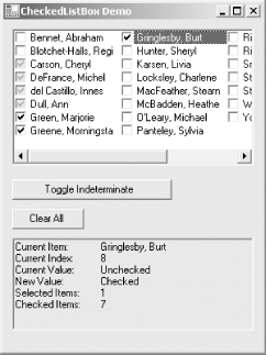
The Toggle Indeterminate button toggles all the checked items to Indeterminate, and vice versa. In Figure 15-9, four items are Indeterminate, displayed as grayed checkmarks in a gray checkbox. The Clear All button clears all the checkboxes. The gray text box displays information about the currently selected item as well as a count of the selected items and the checked items. As seen later, this last bit of information was tricky to get.
An analysis follows the code listings.
Example 15-20. CheckedListBox demo in C# (CheckedListBox.cs)
using System;
using System.Drawing;
using System.Windows.Forms;
using System.Data;
using System.Data.SqlClient;
namespace ProgrammingWinApps
{
 public class CheckedListBoxes : Form
 {
 CheckedListBox clb;
 Button btnToggle;
 Button btnClear;
 TextBox txt;
 String str;
 public CheckedListBoxes( )
 {
 Text = "CheckedListBox Demo";
 Size = new Size(300,400);
 this.Load += new EventHandler(this_Load);
 clb = new CheckedListBox( );
 clb.Parent = this;
 clb.Location = new Point(10,10);
 clb.Size = new Size(ClientSize.Width - 20, Height - 240);
 clb.Anchor = AnchorStyles.Top | AnchorStyles.Left |
 AnchorStyles.Right | AnchorStyles.Bottom;
 clb.BorderStyle = BorderStyle.Fixed3D;
 clb.MultiColumn = true;
 clb.ScrollAlwaysVisible = true;
 clb.ThreeDCheckBoxes = true;
 clb.CheckOnClick = true;
 clb.ItemCheck += new ItemCheckEventHandler(clb_ItemCheck);
 // Toggle Indeterminate Button
 btnToggle = new Button( );
 btnToggle.Parent = this;
 btnToggle.Text = "Toggle Indeterminate";
 btnToggle.Size = new Size(
 (int)(Font.Height * .75) * btnToggle.Text.Length,
 Font.Height + 10);
 btnToggle.Location = new Point( clb.Left, clb.Bottom + 10);
 btnToggle.Anchor = AnchorStyles.Left | AnchorStyles.Bottom;
 btnToggle.Click += new System.EventHandler(btnToggle_Click);
 // Clear Button
 btnClear = new Button( );
 btnClear.Parent = this;
 btnClear.Text = "Clear All";
 btnClear.Size = new Size(
 (int)(Font.Height * .75) * btnClear.Text.Length,
 Font.Height + 10);
 btnClear.Location = new Point(btnToggle.Left,
 btnToggle.Bottom + 10);
 btnClear.Anchor = AnchorStyles.Left | AnchorStyles.Bottom;
 btnClear.Click += new System.EventHandler(btnClear_Click);
 // Selected Items TextBox
 txt = new TextBox( );
 txt.Parent = this;
 txt.Multiline = true;
 txt.ReadOnly = true;
 txt.BackColor = Color.LightGray;
 txt.Location = new Point(btnClear.Left, btnClear.Bottom + 10);
 txt.Size = new Size(clb.Width, Font.Height * 8);
 txt.Anchor = AnchorStyles.Left | AnchorStyles.Bottom |
 AnchorStyles.Right;
 // get the data to populate the ListBox from pubs authors table
 string connectionString =
 "server=YourServer; uid=sa; pwd=YourPassword; database=pubs";
 string commandString =
 "Select au_id,au_lname+', ' + au_fname as name from authors";
 SqlDataAdapter dataAdapter =
 new SqlDataAdapter(commandString, connectionString);
 DataSet dataSet = new DataSet( );
 dataAdapter.Fill(dataSet,"Authors");
 DataTable dataTable = dataSet.Tables[0];
 // bind to the data table
 clb.DataSource= dataTable;
 clb.DisplayMember = "name";
 clb.ValueMember = "au_id";
 } // close for constructor
 static void Main( )
 {
 Application.Run(new CheckedListBoxes( ));
 }
 private void btnToggle_Click(object sender, EventArgs e)
 {
 for (int i = 0; i <= (clb.Items.Count - 1); i++)
 {
 if (clb.GetItemCheckState(i) == CheckState.Checked)
 {
 clb.SetItemCheckState(i, CheckState.Indeterminate);
 }
 else if (clb.GetItemCheckState(i) == CheckState.Indeterminate)
 {
 clb.SetItemCheckState(i, CheckState.Checked);
 }
 }
 }
 private void btnClear_Click(object sender, EventArgs e)
 {
 for (int i = 0; i <= (clb.Items.Count - 1); i++)
 {
 clb.SetItemChecked(i, false);
 }
 txt.Text = "";
 }
 private void clb_ItemCheck(object sender, ItemCheckEventArgs e)
 {
 str = "";
 str += "Current Item:	" +
 clb.GetItemText(clb.Items[e.Index]) + "
";
 str += "Current Index:	" + e.Index.ToString( ) + "
";
 str += "Current Value:	" + e.CurrentValue.ToString( ) + "
";
 str += "New Value:	" + e.NewValue.ToString( );
 }
 private void clb_SelectedIndexChanged(object sender, EventArgs e)
 {
 str += "
";
 str += "Selected Items:	" +
 clb.SelectedItems.Count.ToString( ) + "
";
 str += "Checked Items:	" + clb.CheckedItems.Count.ToString( );
 txt.Text = str;
 }
 private void this_Load(object sender, EventArgs e)
 {
 clb.SelectedIndexChanged +=
 new EventHandler(clb_SelectedIndexChanged);
 }
 } // close for form class
} // close form namespace
Example 15-21. CheckedListBox demo in VB.NET (CheckedListBox.vb)
Option Strict On
imports System
imports System.Drawing
imports System.Windows.Forms
imports System.Data
imports System.Data.SqlClient
namespace ProgrammingWinApps
 public class CheckedListBoxes : inherits Form
 dim clb as CheckedListBox
 dim txt as TextBox
 dim btnToggle as Button
 dim btnClear as Button
 dim str as string

 public sub New( )
 Text = "CheckedListBox Demo"
 Size = new Size(300,400)
 AddHandler me.Load, AddressOf me_Load
 clb = new CheckedListBox( )
 clb.Parent = me
 clb.Location = new Point(10,10)
 clb.Size = new Size(ClientSize.Width - 20, Height - 240)
 clb.Anchor = AnchorStyles.Top or AnchorStyles.Left or _
 AnchorStyles.Right or AnchorStyles.Bottom
 clb.BorderStyle = BorderStyle.Fixed3D
 clb.MultiColumn = true
 clb.ScrollAlwaysVisible = true
 clb.ThreeDCheckBoxes = true
 clb.CheckOnClick = true
 AddHandler clb.ItemCheck, AddressOf clb_ItemCheck

 ' Toggle Indeterminate Button
 btnToggle = new Button( )
 btnToggle.Parent = me
 btnToggle.Text = "Toggle Indeterminate"
 btnToggle.Size = new Size(CType(Font.Height * .75, integer) * _
 btnToggle.Text.Length, Font.Height + 10)
 btnToggle.Location = new Point( clb.Left, clb.Bottom + 10)
 btnToggle.Anchor = AnchorStyles.Left or AnchorStyles.Bottom
 AddHandler btnToggle.Click, AddressOf btnToggle_Click

 ' Clear Button
 btnClear = new Button( )
 btnClear.Parent = me
 btnClear.Text = "Clear All"
 btnClear.Size = new Size(CType(Font.Height * .75, integer) * _
 btnClear.Text.Length, Font.Height + 10)
 btnClear.Location = new Point(btnToggle.Left, _
 btnToggle.Bottom + 10)
 btnClear.Anchor = AnchorStyles.Left or AnchorStyles.Bottom
 AddHandler btnClear.Click, AddressOf btnClear_Click

 ' Selected Items TextBox
 txt = new TextBox( )
 txt.Parent = me
 txt.Multiline = true
 txt.ReadOnly = true
 txt.BackColor = Color.LightGray
 txt.Location = new Point(btnClear.Left, _
 btnClear.Bottom + 10)
 txt.Size = new Size(clb.Width, Font.Height * 7)
 txt.Anchor = AnchorStyles.Left or _
 AnchorStyles.Bottom or AnchorStyles.Right

 ' get the data to populate the ListBox from pubs authors table
 dim connectionString as String = _
 "server=YourServer; uid=sa; pwd=YourPassword; database=pubs"
 dim commandString as String = _
 "Select au_id,au_lname + ', ' + au_fname as name from authors"
 dim dataAdapter as new SqlDataAdapter(commandString, _
 connectionString)
dim ds as new DataSet( )
 dataAdapter.Fill(ds,"Authors")
 dim dt as new DataTable( )
 dt = ds.Tables(0)

 ' bind to the data table
 clb.DataSource= dt
 clb.DisplayMember = "name"
 clb.ValueMember = "au_id"
 end sub ' close for constructor

 public shared sub Main( )
 Application.Run(new CheckedListBoxes( ))
 end sub

 private sub btnToggle_Click(ByVal sender as object, _
 ByVal e as EventArgs)
 dim i as integer
 for i = 0 to clb.Items.Count - 1
 if clb.GetItemCheckState(i) = CheckState.Checked then
 clb.SetItemCheckState(i, CheckState.Indeterminate)
 else if clb.GetItemCheckState(i)=CheckState.Indeterminate then
 clb.SetItemCheckState(i, CheckState.Checked)
 end if
 next
 end sub

 private sub btnClear_Click(ByVal sender as object, _
 ByVal e as EventArgs)
 dim i as integer
 for i = 0 to clb.Items.Count - 1
 clb.SetItemChecked(i, false)
 next
 txt.Text = ""
 end sub

 private sub clb_ItemCheck(ByVal sender as object, _
 ByVal e as ItemCheckEventArgs)
 str = ""
 str += "Current Item:" + vbTab + _
 clb.GetItemText(clb.Items(e.Index)) + vbCrLf
 str += "Current Index:" + vbTab + _
 e.Index.ToString( ) + vbCrLf
 str += "Current Value:" + vbTab + _
 e.CurrentValue.ToString( ) + vbCrLf
 str += "New Value:" + vbTab + e.NewValue.ToString( )
 end sub

 private sub clb_SelectedIndexChanged(ByVal sender as object, _
 ByVal e as EventArgs)
 str += vbCrLf
 str += "Selected Items:" + vbTab + _
 clb.SelectedItems.Count.ToString( ) + vbCrLf
 str += "Checked Items:" + vbTab + _
 clb.CheckedItems.Count.ToString( )
 txt.Text = str
 end sub

 private sub me_Load(ByVal sender as object, _
 ByVal e as EventArgs)
 AddHandler clb.SelectedIndexChanged, _
 AddressOf clb_SelectedIndexChanged
 end sub
 end class
end namespace
Looking in the constructor, an event handler is installed for the Form Load event and an event handler is for the CheckedListBox ItemCheck event:
this.Load +=
 new EventHandler(this_Load);
clb.ItemCheck += new ItemCheckEventHandler(clb_ItemCheck);
AddHandler me.Load, AddressOf me_Load
AddHandler clb.ItemCheck, AddressOf clb_ItemCheck
Looking ahead to the Form Load event handler, an event handler is installed for the CheckedListBox SelectedIndexChanged event:
private void this_Load(object sender, EventArgs e)
{
 clb.SelectedIndexChanged +=
 new EventHandler(clb_SelectedIndexChanged);
}
private sub me_Load(ByVal sender as object, _
 ByVal e as EventArgs)
 AddHandler clb.SelectedIndexChanged, _
 AddressOf clb_SelectedIndexChanged
end sub
You must use the SelectedIndexChanged event to get the current count of checked items for display in the text box. Although you can retrieve the value of the CheckedListBox.CheckedItems.Count property in the ItemCheck event handler, it will lag the current value by one operation; the ItemCheck event is raised before the change takes place, while the SelectedIndexChanged event is raised after the change. The SelectedIndexChanged event handler is added to the event delegate in the Form Load event handler to avoid the SelectedIndexChanged event being handled during the data binding and form initialization, as discussed earlier in this chapter in Section 15.2.3.
The Toggle Indeterminate button toggles all the checked items to Indeterminate and vice versa. This is accomplished by iterating through the CheckedListBox Items collection and using the GetItemCheckState method to test each item within an if/else if construct. The advantage to this technique is that the index of the for loop corresponds to the index of each item within the collection. All the CheckedListBox methods listed in Table 15-12 require the index of the item it manipulates.
An alternative technique would iterate through the CheckedItems collection with a code snippet similar to the following:
if (clb.CheckedItems.Count != 0)
{
 for (int i = 0; i <= clb.CheckedItems.Count - 1; i++)
 {
 // Do some processing here
 }
}
if clb.CheckedItems.Count <> 0 then
 dim i as integer
 for i = 0 to clb.CheckedItems.Count - 1
 ' Do some processing here
 next i
end if
In this case, the loop index does not correspond to the index of the item in the Items collection, but to the index within the CheckedItems collection. The requirements of your application will determine which one is the appropriate technique.
The Clear All button clears all the checked items, whether the check state is Checked or Indeterminate. Similar to the btnToggle_Click event handler, it iterates through the Items collection and uses the CheckedListBox SetItemChecked method to unconditionally clear the checkbox. It also clears the contents of the text box used to display item information.
|
As mentioned above, the ItemCheck event is raised whenever the user changes the check status of one of the items, before the change takes effect, and the SelectedIndexChanged event is raised after the change takes effect. The two event handlers work in concert here to build up a text string for display in the text box.
You could also change the new value of the checkbox in the ItemCheck event handler with a line of code similar to the following:
e.NewValue = CheckState.Indeterminate
15.2.5 ComboBox
A ComboBox control, derived from the ListControl class, is essentially a single selection ListBox combined with an edit field that allows the user to modify existing values and enter values not currently included in the list. As with the other list controls, the contents of the list are contained in the Items collection. This collection may be populated either by manipulating the Items collection directly using the ObjectCollection methods (listed in Table 15-4 and discussed in Section 15.2.1.1 or by data binding with the DataSource property (listed in Table 15-1 and discussed in Section 15.2.1.2).
The list in a ComboBox is typically displayed as a drop-down menu with a user-editable text field, although this need not always be the case. Depending on the value of the DropDownStyle property, listed in Table 15-14 along with other commonly used ComboBox properties, the control may also be displayed as a simple list that is always visible or as a drop-down menu whose text field is not editable.
The default value for the DropDownStyle property, ComboBoxStyle.DropDown, is well suited to applications where there are a relatively large number of possible values, with the possibility of more being added by the user. ComboBoxStyle.Simple lends itself to applications where the form has enough screen real-estate to accommodate the 13 or so values that are always displayed. While these two editable styles don't totally preclude erroneous entries, the mere presence of pre-existing items tends to minimize the proliferation of similar, but misspelled, entries in the list. ComboBoxStyle.DropDownList is the value to use if the list of items is read-onlyfor example, a lookup of product codes or months of the year.
|
Property |
Value type |
Description |
|---|---|---|
|
DropDownStyle |
ComboBoxStyle |
Read/write. A member of the ComboBoxStyle enumeration, listed in Table 15-15, which controls the appearance and editability of the control. The default value is ComboBoxStyle.DropDown. |
|
DropDownWidth |
Integer |
Read/write. Specifies the width of the drop-down box, in pixels. This property must be equal to or greater than the width of the control. Not relevant if DropDownStyle set to ComboBoxStyle.Simple. |
|
DroppedDown |
Boolean |
Read/write. If true, the drop-down menu is displayed. Default is false. |
|
Items |
ComboBox.ObjectCollection |
Collection of items in the combo box. The ComboBox.ObjectCollection class has the methods listed in Table 15-4. |
|
MaxDropDownItems |
Integer |
Read/write. An integer between 1 and 100, inclusive, specifying the number of items in the drop-down menu. Default value is 8. |
|
MaxLength |
Integer |
Read/write. The maximum number of characters allowed in an editable combo box. |
|
SelectedIndex |
Integer |
Read/write. The zero-based index of the currently selected item, unless the current item is being edited, in which case it returns -1. |
|
SelectedText |
String |
Read/write. The text that is currently selected in the editable text field. Setting this property changes the text in the edit field. If no text is selected or if the DropDownStyle property is set to ComboBoxStyle.DropDownList, SelectedText returns a zero-length string. |
|
SelectionLength |
Integer |
Read/write. The number of characters selected in the edit field. |
|
SelectionStart |
Integer |
Read/write. The zero-based index of the first character in the selected text within the edit field. Setting this property when no text is selected specifies the insertion point. |
|
Text |
String |
Read/write. The text that appears in the edit field. |
|
Value |
Description |
|---|---|
|
DropDown |
The user clicks the drop-down arrow to display the list. The text is editable. |
|
DropDownList |
The user clicks the drop-down arrow to display the list. The text is not editable. The TextChanged event is never raised. |
|
Simple |
The list is always visible and the text is editable. DropDownWidth and MaxDropDownItems properties are ignored. |
Unlike the other ListControls, you cannot always depend on the SelectedIndex property to return the index of the currently selected item if the control is editablei.e., if the DropDownStyle property is set to either ComboBoxStyle.DropDown or ComboBoxStyle.Simple. As soon as the edit field is edited, the value of the SelectedIndex property changes to -1. When the editing is complete, depending on the specific sequence of user actions, the SelectedIndex typically reverts to zeroi.e., the first item in the list becomes the currently selected item.
The Text property will always reflect the text contained in the edit field. This is true whether or not the contents of the field is edited. As the user selects different items from the list or edits the contents of the field, the Text property will change accordingly.
In addition to the list control methods listed in Table 15-3, the ComboBox has two commonly used methods listed in Table 15-16. The Select and SelectAll methods allow you to select either a range of text in the edit field or all the text in the edit field. As with all selected text in Windows, it displays in a highlighted color and may be manipulated with standard Windows features such as cutting and pasting and replacing with typing. The SelectedText property reflects the selected text, and may be manipulated programmatically.
|
Method |
Description |
|---|---|
|
Select |
Selects a range of text in the edit field of the control, starting at the specified zero-based index, and of specified length. |
|
SelectAll |
Selects all the text in the control's edit field. |
In addition to the ListControl events listed in Table 15-5, the ComboBox has several other events, the most commonly used of which are listed in Table 15-17. Among other things, these events allow your code to detect when a new item has been selected and when the user has edited the text in the edit field.
You can validate the new text character by character, for example, modify the value in the list, or add the new value to the list or a database, or both. As seen in the following example, however, retrieving the new value after editing is completed is not straightforward since no single event is raised when the editing is complete.
|
Event |
Event argument |
Description |
|---|---|---|
|
DropDown |
EventArgs |
Raised when the drop-down menu is displayed. |
|
DropDownStyleChanged |
EventArgs |
Raised when the DropDownStyle property has changed. |
|
SelectedIndexChanged |
EventArgs |
Raised when the SelectedIndex property has changed. |
|
SelectionChangeCommitted |
EventArgs |
Raised when the selected index has changed and the change is committed. |
|
TextChanged |
EventArgs |
Raised when the text in the edit field changes (with every keystroke) or the currently selected item changes. Never raised if the DropDownStyle property is set to ComboBoxStyle.DropDownList. |
The sample application listed in Example 15-22 (in C#) and Example 15-23 (in VB.NET) demonstrates many of the properties, methods and events of the ComboBox. Similarly to the previous examples in this chapter, it populates the Items collection from the authors table of the pubs database.
The form has a label below the ComboBox that displays the currently selected item. If the user edits that text, that too is reflected in the label. When the user finishes editing the text, either by leaving the control or moving to the next item in the list, then the label displays:
Edited:
Clicking on the Insert Item button inserts the edited value into the list if it is neither a duplicate with an existing item nor an empty string.
The Display Items button displays the current contents of the entire list beneath a timestamp in the large text box. The Select 4 button selects four characters in the current item, starting with the second character (index 1).
The running application, after you select a name from the list and click the Display Items and Select 4 buttons, looks something like that shown in Figure 15-10. A full analysis follows the code listings.
Figure 15-10. ComboBox application
Example 15-22. ComboBox demo in C# (ComboBox.cs)
using System;
using System.Drawing;
using System.Windows.Forms;
using System.Data;
using System.Data.SqlClient;
namespace ProgrammingWinApps
{
 public class ComboBoxes : Form
 {
 ComboBox cmb;
 Button btnDisplay;
 Button btnInsert;
 Button btnSelect;
 Label lblEdit;
 TextBox txtDisplay;
 Boolean boolChange = false;
 Boolean boolProcessed = false;
 public ComboBoxes( )
 {
 Text = "ComboBox Demo";
 Size = new Size(300,400);
 this.Load += new EventHandler(this_Load);
 cmb = new ComboBox( );
 cmb.Parent = this;
 cmb.Location = new Point(10,10);
 cmb.Size = new Size(ClientSize.Width / 2, Height - 200);
 cmb.Anchor = AnchorStyles.Top | AnchorStyles.Left |
 AnchorStyles.Right | AnchorStyles.Bottom;
 cmb.DropDownStyle = ComboBoxStyle.DropDown; // default
 cmb.DropDownWidth = (int)(cmb.Width * 1.5);
 cmb.MaxDropDownItems = 12;
 cmb.MaxLength = 20;
 cmb.SelectionChangeCommitted +=
 new EventHandler(cmb_SelectionChangeCommitted);
 cmb.Leave += new EventHandler(cmb_Leave);
 btnInsert = new Button( );
 btnInsert.Parent = this;
 btnInsert.Text = "&Insert Item";
 btnInsert.Size = new Size(
 (int)(Font.Height * .75) * btnInsert.Text.Length,
 cmb.Height);
 btnInsert.Location = new Point(cmb.Right + 10, cmb.Top);
 btnInsert.Click += new System.EventHandler(btnInsert_Click);
 lblEdit = new Label( );
 lblEdit.Parent = this;
 lblEdit.BorderStyle = BorderStyle.Fixed3D;
 lblEdit.Location = new Point(cmb.Left, cmb.Bottom + 10);
 lblEdit.BackColor = Color.LightGray;
 lblEdit.Text = "";
 lblEdit.Size = new Size(cmb.DropDownWidth, Font.Height * 2);
 btnDisplay = new Button( );
 btnDisplay.Parent = this;
 btnDisplay.Text = "&Display Items";
 btnDisplay.Size = new Size(
 (int)(Font.Height * .75) * btnDisplay.Text.Length,
 cmb.Height);
 btnDisplay.Location = new Point(lblEdit.Left,
 lblEdit.Bottom + 10);
 btnDisplay.Click += new System.EventHandler(btnDisplay_Click);
 txtDisplay = new TextBox( );
 txtDisplay.Parent = this;
 txtDisplay.Location = new Point(btnDisplay.Left,
 btnDisplay.Bottom + 10);
 txtDisplay.Multiline = true;
 txtDisplay.ReadOnly = true;
 txtDisplay.BackColor = Color.LightGray;
 txtDisplay.ScrollBars = ScrollBars.Vertical;
 txtDisplay.Text = "";
 txtDisplay.Size = new Size(cmb.DropDownWidth, 200);

 btnSelect = new Button( );
 btnSelect.Parent = this;
 btnSelect.Text = "&Select 4";
 btnSelect.Size = new Size(
 (int)(Font.Height * .75) * btnSelect.Text.Length,
 cmb.Height);
 btnSelect.Location = new Point(btnDisplay.Right + 10,
 btnDisplay.Top);
 btnSelect.Click += new System.EventHandler(btnSelect_Click);
 // get the data to populate the ListBox from pubs authors table
 string connectionString =
 "server=YourServer; uid=sa; pwd=YourPassword; database=pubs";
 string commandString =
 "Select au_id,au_lname+', ' + au_fname as name from authors";
 SqlDataAdapter dataAdapter =
 new SqlDataAdapter(commandString, connectionString);
 DataSet dataSet = new DataSet( );
 dataAdapter.Fill(dataSet,"Authors");
 DataTable dataTable = dataSet.Tables[0];
 // Iterate the dataset and add the rows to the Items collection
 foreach (DataRow dataRow in dataTable.Rows)
 {
 cmb.Items.Add(dataRow["name"]);
 }
 cmb.SelectedIndex = 0;
 } // close for constructor
 static void Main( )
 {
 Application.Run(new ComboBoxes( ));
 }
 private void this_Load(object sender, EventArgs e)
 {
 cmb.TextChanged += new EventHandler(cmb_TextChanged);
 cmb.SelectedIndexChanged +=
 new EventHandler(cmb_SelectedIndexChanged);
 }
 private void cmb_TextChanged(object sender, EventArgs e)
 {
 if (!boolProcessed)
 lblEdit.Text = cmb.Text;
 boolChange = true;
 }
 private void cmb_SelectedIndexChanged(object sender, EventArgs e)
 {
 if (boolChange)
 {
 boolChange = false;
 boolProcessed = false;
 }
 }
 private void cmb_SelectionChangeCommitted(object sender,
 EventArgs e)
 {
 if (boolChange)
 ProcessChange( );
 }
 private void cmb_Leave(object sender, EventArgs e)
 {
 if (boolChange)
 {
 ProcessChange( );
 boolChange = false;
 }
 }
 private void ProcessChange( )
 {
 lblEdit.Text = "Edited: " + cmb.Text;
 boolProcessed = true;
 }
 private void btnDisplay_Click(object sender, EventArgs e)
 {
 string str = DateTime.Now.ToString( ) + "
";
 foreach (object item in cmb.Items)
 {
 str += item.ToString( ) + "
";
 }
 txtDisplay.Text = str;
 }

 private void btnSelect_Click(object sender, EventArgs e)
 {
 cmb.Select(1,4);
 }
 private void btnInsert_Click(object sender, EventArgs e)
 {
 // Determine if current item already in the list
 if (cmb.FindStringExact(cmb.Text) != -1)
 {
 MessageBox.Show("'" + cmb.Text +
 "' already exists in the list.
" +
 "Will not be added again.",
 "Already Exists!");
 }
 else if (cmb.Text == "")
 {
 MessageBox.Show("There is nothing to add.","Nothing There");
 }
 else
 {
 cmb.Items.Add(cmb.Text);
 }
 }
 } // close for form class
} // close form namespace
Example 15-23. ComboBox demo in VB.NET (ComboBox.vb)
Option Strict On
imports System
imports System.Drawing
imports System.Windows.Forms
imports System.Data
imports System.Data.SqlClient

namespace ProgrammingWinApps
 public class ComboBoxes : inherits Form

 dim cmb as ComboBox
 dim btnDisplay as Button
 dim btnInsert as Button
 dim btnSelect as Button
 dim lblEdit as Label
 dim txtDisplay as TextBox
 dim boolChange as Boolean = false
 dim boolProcessed as Boolean = false

 public sub New( )
 Text = "ComboBox Demo"
 Size = new Size(300,400)
 AddHandler me.Load, AddressOf me_Load

 cmb = new ComboBox( )
 cmb.Parent = me
 cmb.Location = new Point(10,10)
 cmb.Size = new Size(CInt(ClientSize.Width / 2), Height - 200)
 cmb.Anchor = AnchorStyles.Top or AnchorStyles.Left or _
 AnchorStyles.Right or AnchorStyles.Bottom
 cmb.DropDownStyle = ComboBoxStyle.DropDown ' default
 cmb.DropDownWidth = CInt(cmb.Width * 1.5)
 cmb.MaxDropDownItems = 12
 cmb.MaxLength = 20

 AddHandler cmb.SelectionChangeCommitted, _
 AddressOf cmb_SelectionChangeCommitted
 AddHandler cmb.Leave, AddressOf cmb_Leave
 btnInsert = new Button( )
 btnInsert.Parent = me
 btnInsert.Text = "&Insert Item"
 btnInsert.Size = new Size( _
 CInt(Font.Height * .75) * btnInsert.Text.Length, cmb.Height)
 btnInsert.Location = new Point(cmb.Right + 10, cmb.Top)
 AddHandler btnInsert.Click, AddressOf btnInsert_Click

 lblEdit = new Label( )
 lblEdit.Parent = me
 lblEdit.BorderStyle = BorderStyle.Fixed3D
 lblEdit.Location = new Point(cmb.Left, cmb.Bottom + 10)
 lblEdit.BackColor = Color.LightGray
 lblEdit.Text = ""
 lblEdit.Size = new Size(cmb.DropDownWidth, Font.Height * 2)

 btnDisplay = new Button( )
 btnDisplay.Parent = me
 btnDisplay.Text = "&Display Items"
 btnDisplay.Size = new Size( _
 CInt(Font.Height * .75) * btnDisplay.Text.Length, cmb.Height)
 btnDisplay.Location = new Point(lblEdit.Left, _
 lblEdit.Bottom + 10)
 AddHandler btnDisplay.Click, AddressOf btnDisplay_Click

 txtDisplay = new TextBox( )
 txtDisplay.Parent = me
 txtDisplay.Location = new Point(btnDisplay.Left, _
 btnDisplay.Bottom + 10)
 txtDisplay.Multiline = true
 txtDisplay.ReadOnly = true
 txtDisplay.BackColor = Color.LightGray
 txtDisplay.ScrollBars = ScrollBars.Vertical
 txtDisplay.Text = ""
 txtDisplay.Size = new Size(cmb.DropDownWidth, 200)

 btnSelect = new Button( )
 btnSelect.Parent = me
 btnSelect.Text = "&Select 4"
 btnSelect.Size = new Size( _
 CInt(Font.Height * .75) * btnSelect.Text.Length, cmb.Height)
 btnSelect.Location = new Point(btnDisplay.Right + 10, _
 btnDisplay.Top)
 AddHandler btnSelect.Click, AddressOf btnSelect_Click

 ' get the data to populate the ComboBox from pubs authors table
 dim connectionString as String = _
 "server=YourServer; uid=sa; pwd=YourPassword; database=pubs"
 dim commandString as String = _
 "Select au_id,au_lname + ', ' + au_fname as name from authors"
 dim dataAdapter as new SqlDataAdapter(commandString, _
 connectionString)
 dim ds as new DataSet( )
 dataAdapter.Fill(ds,"Authors")
 dim dt as new DataTable( )
 dt = ds.Tables(0)

 ' Iterate the dataset and add the rows to the Items collection
 dim dr as DataRow
 for each dr in dt.Rows
 cmb.Items.Add(dr("name"))
 next
 cmb.SelectedIndex = 0
 end sub ' close for constructor

 public shared sub Main( )
 Application.Run(new ComboBoxes( ))
 end sub

 private sub me_Load(ByVal sender as object, _
 ByVal e as EventArgs)
 AddHandler cmb.TextChanged, AddressOf cmb_TextChanged
 AddHandler cmb.SelectedIndexChanged, _
 AddressOf cmb_SelectedIndexChanged
 end sub

 private sub cmb_TextChanged(ByVal sender as object, _
 ByVal e as EventArgs)
 if not boolProcessed then
 lblEdit.Text = cmb.Text
 end if
 boolChange = true
 end sub

 private sub cmb_SelectedIndexChanged(ByVal sender as object, _
 ByVal e as EventArgs)
 if boolChange then
 boolChange = false
 boolProcessed = false
 end if
 end sub

 private sub cmb_SelectionChangeCommitted(ByVal sender as object, _
 ByVal e as EventArgs)
 if boolChange then
 ProcessChange( )
 end if
 end sub

 private sub cmb_Leave(ByVal sender as object, _
 ByVal e as EventArgs)
 if boolChange then
 ProcessChange( )
 boolChange = false
 end if
 end sub

 private sub ProcessChange( )
 lblEdit.Text = "Edited: " + cmb.Text
 boolProcessed = true
 end sub

 private sub btnDisplay_Click(ByVal sender as object, _
 ByVal e as EventArgs)
 dim str as string = DateTime.Now.ToString( ) + vbCrLf
 dim item as object
 for each item in cmb.Items
 str += item.ToString( ) + vbCrLf
 next

 txtDisplay.Text = str
 end sub

 private sub btnSelect_Click(ByVal sender as object, _
 ByVal e as EventArgs)
 cmb.Select(1,4)
 end sub

 private sub btnInsert_Click(ByVal sender as object, _
 ByVal e as EventArgs)
 ' Determine if current item already in the list
 if cmb.FindStringExact(cmb.Text) <> -1 then
 MessageBox.Show("'" + cmb.Text + _
 "' already exists in the list." + _
 vbCrLf + "Will not be added again.", _
 "Already Exists!")
 else if cmb.Text = "" then
 MessageBox.Show("There is nothing to add.","Nothing There")
 else
 cmb.Items.Add(cmb.Text)
 end if
 end sub

 end class
end namespace
Like the CheckedListBox examples shown in Example 15-20 and Example 15-21, an event handler is loaded for the Form Load event in the constructor, and for the same reason: ComboBox event handlers are loaded in the Form Load event to prevent those events from being handled until after the form is fully initialized. In this case, two event handlers are installed in the Form Load event: TextChanged and SelectedIndexChanged.
Several properties of the ComboBox are then set. The DropDownStyle property is set to the default value of ComboBoxStyle.DropDown, which provides for a drop-down menu with an editable text field. You can easily change this property to one of the other values in Table 15-15 to see the effect.
The DropDownWidth property is set to one and half times the width of the ComboBox. This causes the drop-down menu to be wider than its parent control. The MaxDropDownItems property is increased from its default of 8 to 12 so that more of the list is visible at one time, and the MaxLength property is set to 20, the maximum number of characters a user can enter into the edit field.
|
Two event handlers are added for the ComboBox and discussed next: SelectionChangeCommitted and Leave.
Although this example populates the Items collection from the authors table in the pubs database, it does so using the Add method of the ComboBox.ObjectCollection class rather than the DataSource property, as was done in the previous examples in this chapter. This change occurs because the requirements of the application called for the Insert Item button to add an item to the Items collection. If the control were data bound, the Items collection could not be modified. Instead, you would need to either add the appropriate data to the database and rebind the data to the control or add the item to the DataTable directly without rebinding.
Handling the events in this application is less intuitive than might be expected. Let's review the design goals:
- The contents of the current item should be echoed in the label below the ComboBox, including edits made by the user.
- When the user is finished editing an item, the label will display the legend Edited: .
- Clicking the Insert Item button will add the currently selected item to the list.
- If the current item is identical to the pre-existing item, it will not be added, preventing duplicates.
- If the edit field is empty, nothing will be added, preventing blanks in the Items collection.
- Clicking the Display Items button will display a time stamp, followed by the entire Items collection in the large text box.
- Clicking the Select 4 button will select the second through fifth characters in the edit field.
The design goals for the three buttons are easy to implement. The Insert Item button is implemented in the btnInsert_Click event handler. The Text property of the ComboBox returns the current contents of the edit field. The FindExactString method determines whether that string already exists in the list: it returns -1 if it is not found. An if/else if/else construct tests whether the string already exists in the list or whether the edit field is empty. If neither of these conditions are met, then the string is added to the Items collection by using the Add method of the ComboBox.ObjectCollection class.
The Display Items button is implemented in the btnDisplay_Click event handler. It instantiates a string with the time stamp followed by a Carriage Return/Line Feed. Then the Items collection is iterated, concatenating each item, along with a the CR/LF characters, to the string. Finally, the text box Text property is set to the string.
|
The Select 4 button is even easier to implement. The btnSelect_Click event handler consists of a single line of code, a call to the ComboBox Select method. When running the application, if you click the button with the mouse and then try to do something with the highlighted characters, such as delete them, the selection changes when you click back on the ComboBox to give it focus. The solution here is to leave the focus on the ComboBox, and then use the Select 4 button shortcut key (Alt-S) to select the characters.
The first design goal, echoing the contents of the edit field in the label below the ComboBox, should be easy, since the TextChanged event is raised after every keystroke and whenever a new item is selected from the list. If the second design goal did not exist, i.e., if there were no need to determine when the user finished editing the item, then the contents of the cmb_TextChanged event handler would consist of a single line of code:
lblEdit.Text = cmb.Text
The second requirement, the need to determine when the user finished editing the item, throws a monkey wrench into the works. Unfortunately, this requirement is fairly typical: your program must be able to distinguish when to add the edited item to the database, for example, and what exactly should be added. However, the .NET Framework does not provide an intrinsic event to tell the program when the editing is complete.
For this application, you will consider the editing to be complete if either of two user actions occur: focus leaves the ComboBox control or a new item is selected from the list. The first action raises the Leave event, while the second action raises both the SelectionChangeCommitted and the SelectedIndexChanged events.
Whenever it is determined that editing has occurred and the editing is complete, the ProcessChange method is called. In this example, that processing consists only of updating the Text property of the appropriate label. In a production application, it may consist of a validation routine, a database update, adding the item to the list, or something similar.
To understand exactly what events are raised and in what sequence, run the example in Visual Studio .NET and trace the execution by using the debugger. Figure 15-11 shows this process, with set breakpoints and a Watch window displaying useful values. This snapshot was taken after moving from the first item in the list to the sixth (index = 5). In the code shown in Figure 15-11, the SelectedValueChanged event handler has been inserted with a line of dummy code to observe the role it plays in the event stream.
Figure 15-11. ComboBox event tracing
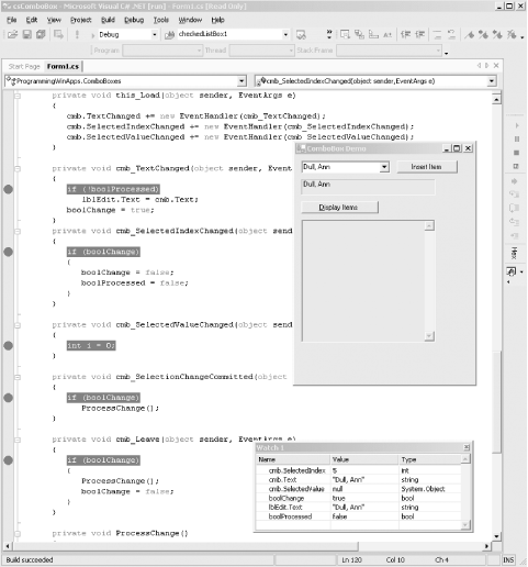
Now run the program and change the selected item from the first item (Bennet, Abraham) to the sixth (Dull, Ann) using either the down arrow key or the mouse. The sequence of events shown in Table 15-18 occurs with associated values.
|
Event |
SelectedIndex |
Text |
|---|---|---|
|
SelectionChangeCommitted |
5 |
Bennet, Abraham |
|
TextChanged |
5 |
Dull, Ann |
|
SelectedValueChanged |
5 |
Dull, Ann |
|
SelectedIndexChanged |
5 |
Dull, Ann |
Now edit the text field, changing "Dull, Ann" to "Dull, AnnXXX," and then press the Tab key to move focus off the ComboBox control. The sequence of events listed in Table 15-19 occur.
|
Event |
SelectedIndex |
Text |
|---|---|---|
|
Press X |
||
|
TextChanged |
5 |
Dull, AnnX |
|
Press X |
||
|
TextChanged |
-1 |
Dull, AnnXX |
|
Press X |
||
|
TextChanged |
-1 |
Dull, AnnXXX |
|
Tab |
||
|
Leave |
-1 |
Dull, AnnXXX |
Notice that neither the SelectedValueChanged, the SelectedIndexChanged, nor the SelectionChangeCommitted events are raised in this scenario. Also observe what happens to the value of the SelectedIndex property.
Finally, repeat the above scenario, only this time selecting a new item with the down arrow key, rather than using the Tab key to shift focus away from the control. The events listed in Table 15-20 will occur.
|
Event |
SelectedIndex |
Text |
|---|---|---|
|
Press X |
||
|
TextChanged |
5 |
Dull, AnnX |
|
Press X |
||
|
TextChanged |
-1 |
Dull, AnnXX |
|
Press X |
||
|
TextChanged |
-1 |
Dull, AnnXXX |
|
Down Arrow |
||
|
SelectionChangeCommitted |
0 |
Dull, AnnXXX |
|
TextChanged |
0 |
Bennet, Abraham |
|
SelectedValueChanged |
0 |
Bennet, Abraham |
|
SelectedIndexChanged |
0 |
Bennet, Abraham |
In this scenario, the SelectionChangeCommitted event is raised and the Text property contains the final edited value, although at that point, the SelectedIndex property has already changed to 0, even though you pressed the down arrow that would indicate the new index should have been 6. Setting aside for a moment the fact that the next item displayed after editing is always the first item in the list (index 0), this scenario demonstrates that although the Text property during the SelectionChangeCommitted event is the final, committed text, the SelectedIndex already points to the next item. It sort of makes sense that the next item will be the first item, since the SelectedIndex property changes to -1 during editing and the control has no way of knowing where in the list it was. This is true even if only a single character was added to the text field, contrary to what you might think by examining Table 15-20.
Interestingly, throughout all these scenarios, the value of the SelectedValue property was unchanged at null (Nothing in VB.NET).
With all this in mind, you can now go back to the code and understand what is going on. Remember, the goal is to determine when editing is complete and what is the final edited value.
A flag, boolChange, keeps track of whether editing has occurred, a so-called dirty bit. It is initialized to false, set true in the TextChanged event handler, and then reset to false either in the Leave event handler when focus leaves the control or in the SelectedIndexChanged event handler when a new item is selected.
A second flag, boolProcess, keeps track of whether or not the final value has been processed. This is necessary in this application to prevent the TextChanged event handler from overwriting the contents of the label after the SelectionChangeCommitted event handler has written the "Edited:" text string to it in the scenario outlined in Table 15-20.
Windows Forms and the .NET Framework
Getting Started
Visual Studio .NET
- Overview
- Start Page
- Projects and Solutions
- The Integrated Development Environment (IDE)
- Building and Running
Events
Windows Forms
- Windows Forms
- Web Applications Versus Windows Applications
- The Forms Namespace
- Form Properties
- Forms Inheritance
- User Interface Design
Dialog Boxes
- Dialog Boxes
- Modal Versus Modeless
- Form Properties
- DialogResult
- Termination Buttons
- Apply Button
- CommonDialog Classes
Controls: The Base Class
Mouse Interaction
Text and Fonts
Drawing and GDI+
Labels and Buttons
Text Controls
Other Basic Controls
TreeView and ListView
List Controls
Date and Time Controls
Custom Controls
- Custom Controls
- Specializing an Existing Control
- Creating a User Control
- Creating Custom Controls from Scratch
Menus and Bars
ADO.NET
- ADO.NET
- Bug Database: A Windows Application
- The ADO.NET Object Model
- Getting Started with ADO.NET
- Managed Providers
- Binding Data
- Data Reader
- Creating a DataGrid
Updating ADO.NET
- Updating ADO.NET
- Updating with SQL
- Updating Data with Transactions
- Updating Data Using DataSets
- Multiuser Updates
- Command Builder
Exceptions and Debugging
- Exceptions and Debugging
- Bugs Versus Exceptions
- Exceptions
- Throwing and Catching Exceptions
- Bugs
- Debugging in Visual Studio .NET
- Assert Yourself
Configuration and Deployment
EAN: 2147483647
Pages: 148
