Introduction to Ink-Enabled Applications
 Download CD Content
In this chapter, we build our first ink-enabled applications using VB .NET. We also use source code for C# in this chapter so that you can see the differences and similarities between the languages. For the remaining chapters, we provide source code in VB .NET, but if you prefer C#, it won't take you very long to convert the samples.
| Note |
The source code for the projects are located on the CD-ROM in the PROJECTS folder. You can either type them in as you go or you can copy the projects from the CD-ROM to your hard drive for editing. |
Introduction to Ink Controls
In Chapter 12, Obtaining the Tablet PC SDK, we looked at the InkEdit and InkPicture controls. Now, in this chapter, we learn how to utilize the controls to build fully aware ink applications.
The InkPicture and InkEdit controls allow a developer to quickly add ink capabilities to an application. Depending on the needs for a given project, a developer may need the ability to have ink conversion to text, ink for annotating an existing image, or countless other variations. These two controls provide enough functionality to take care of most of the projects you will develop.
Differences between the Controls
The InkEdit control was derived from the standard RichTextBox class and is the control of choice when you want to perform handwriting recognition. By default, the control recognizes the text as you enter it and automatically displays it within the text display area. If you are using a keyboard, you can also enter text into the control, which provides most of the functionality of the RichTextBox. In addition to collecting ink and recognizing and displaying it in text form, the InkEdit control also allows you to display ink as an embedded object, with text formatting options such as underline.
Like the InkEdit control, the InkPicture control is also derived from a standard control. This time, it's the Picture class and it offers an area on which you can annotate. This control is most often used when you do not have a need for ink recognition. Popular uses include capturing signatures, or because it includes the ability to display an image that the user can draw on, it can be used for marking up a scanned form or even drawing. The control accepts a variety of formats, such as jpg, bmp, gif, or png.
Using the InkEdit Control
As was mentioned previously, the InkEdit control was derived from the RichTextBox class. In its default state, the control automatically captures ink, recognizes the handwriting, 'erases' the ink, and then displays the recognized text inside the text box. Interestingly, the handwriting is not really erased, and you can alter between the recognized text and the handwritten information at runtime. Recognition occurs very quickly and allows the user to enter relatively large amounts of information.
Creating a Project
To create a project with the InkEdit control, you need to create a new Windows Forms application and then add it to your Toolbox. Follow these steps to add the control to the toolbox:
- Create a new project.
- Right-click on the Toolbox.
- Select Customize.
- Select the .NET Framework Components tab.
- Check InkEdit and then click OK.
Note There is another way that you can access these controls. Instead of adding them to your Toolbox, you can reference and create it in code. However, it's much easier to add them to the Toolbox.
After you have the InkEdit control in the Toolbox, you can add it to your form as quickly as you can to any standard application. To add an instance of the InkEdit control to your form, select the InkEdit control in your Toolbox, and then draw a rectangle region on your form. The size you draw the control is very important because the inkable region is located within the control itself. As with much of Tablet PC development, user interface design is important. If the control is too small, it is difficult for the user to write within its boundaries and the resulting recognition will not be very good. At a minimum, you should size the control to allow a few words and preferably more.
As a reminder, the InkEdit control automatically collects ink and gestures (a sort of shorthand that we discuss in greater detail in Chapter 18, Using Gestures to Control Tablet Media Player). This can be a problem if you are developing only on a desktop PC because you do not have the ability to draw within the control. You can use your mouse for input by adding a single line of code:
InkEdit1.UseMouseForInput = True
Of course, if you are developing on a Tablet PC, this will not be an issue. Either way, after you have added the control to a form, you can run the application in the IDE. Once started, you can write on the InkEdit control. As you can see, the control already provides the ability to write on it without a single line of code (unless you set it up to handle mouse input, which is discussed above) and also converts ink to text automatically. Figures 13.1 and 13.2 display an example of ink and the resulting text.
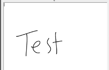
Figure 13.1: Ink being entered.

Figure 13.2: Conversion has taken place.
You can change many aspects of how the InkEdit control recognizes ink. For example, you have the ability to alter the size and position of ink into the control. By setting various properties, you could quickly alter the control to capture a signature or write a handwritten letter. The properties are quite simple, and are discussed in the following sections.
Property Description
This section details the properties available for InkEdit.
Active X Only
We'll look at the properties that are specific to the Active X control first.
Appearance: Returns or sets a value that determines whether the control appears flat or 3D
BackColor: Returns or sets the background color for the control
BorderStyle: Returns or sets a value that determines whether the control has a border
DisableNoScroll: Returns or sets a value that determines whether scroll bars in the control are disabled
DragIcon: Returns or sets the icon that appears as the pointer in a drag-and-drop operation
Font: Returns or sets the font of the text that the control displays
HWnd: Returns the window handle to which the control is bound
Locked: Returns or sets a value that specifies whether the control is read-only
MaxLength: Returns or sets a value indicating whether an InkEdit control can hold a maximum number of characters and, if so, specifies the maximum number of characters
MouseIcon: Returns or sets the current custom mouse icon
MousePointer: Returns or sets a value that indicates the type of mouse pointer that appears when the mouse is over a particular part of the control
MultiLine: Returns or sets a value that indicates whether this is a multiline control
ScrollBars: Returns or sets the type of scroll bars that appear in the control
SelAlignment: Returns or sets the alignment to apply to the current selection or insertion point
SelBold: Returns or sets a value that specifies whether the font style of the currently selected text in the control is bold
SelCharOffset: Returns or sets whether text in the control appears on the baseline, as a superscript, or as a subscript
SelColor: Returns or sets the text color of the current text selection or insertion point
SelFontName: Returns or sets the font name of the selected text within the control
SelFontSize: Returns or sets the font size of the selected text within the control
SelItalic: Returns or sets a value that specifies whether the font style of the currently selected text in the control is italic
SelLength: Returns or sets the number of characters that are selected in the control
SelRTF: Returns or sets the currently selected Rich Text Format (RTF) formatted text in the control
SelStart: Returns or sets the starting point of the text that is selected in the text box
SelText: Returns or sets the selected text within the control
SelUnderline: Returns or sets a value that specifies whether the font style of the currently selected text in the control is underlined
Text: Returns or sets the current text in the text box
TextRTF: Returns or sets the text of the control, including all Rich Text Format (RTF) codes
Managed Library Only
The Managed Library has its own set of properties.
CreateParams: Returns the required creation parameters when the control handle is created
Cursor: Returns or sets the cursor that appears when the mouse pointer is over the control
DrawingAttributes: Returns or sets the drawing attributes to apply to ink as it is drawn
| Note |
This property behaves differently than the DefaultDrawingAttributes property of the InkCollector object, the InkOverlay object, and the InkPicture control.Whereas the DefaultDrawingAttributes property specifies the drawing attributes that are applied to a new cursor, the DrawingAttributes property specifies the drawing attributes for ink that is yet to be collected by the InkEdit control. |
Enabled: Set to True or False to enable or disable
General
There are properties that are available for both the Active X and Managed Libraries.
Factoid: Returns or sets the factoid that a recognizer uses to constrain its search for the recognition result
InkInsertMode: Returns or sets the value that specifies how ink is collected when drawn on the control
InkMode: Returns or sets a value that specifies whether ink collection is disabled, ink is collected, or ink and gestures are collected
RecoTimeout: Returns or sets the number of milliseconds after an ink stroke has ended that text recognition begins
Recognizer: Returns or sets the recognizer to use for recognition
SelInks: Returns or sets the array of embedded Ink objects (if displayed as ink) that the current selection contains
SelInksDisplayMode: Returns or sets a value that allows toggling the appearance of the selection between ink and text
Status: Returns a value that specifies whether the control is idle, collecting ink, or recognizing ink
UseMouseForInput: Returns or sets a value that indicates whether the mouse is used as an input device
Having Fun with Properties
With so many properties that we have access to, there is a great deal of fun we can have with them. Before we go further, we need to add the following line to the top of the project:
Imports Microsoft.Ink
Next, we are going to add a series of buttons that will allow us to set some of the various properties for the control. Add the following buttons with their respective properties (see Table 13.1) and place them on the form using Figure 13.3 as an example.
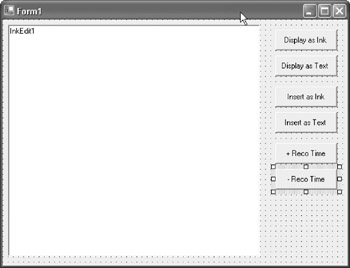
Figure 13.3: Button layout for our example.
|
Name |
Text |
|---|---|
|
btnDisplayAsInk |
Display as Ink |
|
btnDisplayAsText |
Display as Text |
|
btnInsertAsInk |
Insert as Ink |
|
btnInsertAsText |
Insert as Text |
|
btnIncreaseRecoTime |
+ Reco Time |
|
btnSubRecoTime |
- Reco Time |
You can probably tell what each of these controls will be used for by their names and text properties. We'll begin with btnDisplayAsInk. Double-click the control to open the Code Editor and create the btnDisplay_Click event procedure. We need to add two lines to the event:
InkEdit1.SelectAll()
InkEdit1.SelInksDisplayMode = InkDisplayMode.Ink
The previous code begins by selecting all of the text located with InkEdit1, which was added earlier in the chapter. The text needs to be selected before changing its display mode to ink, which is accomplished in the second line. If you do not first select the ink, you will not see a change in your control. It's worth noting that the InkEdit control does not try to convert text, which was entered into the control as text, into ink. Obviously, it would be impossible for the control to try to simulate what your handwriting should look like so that it could convert it into a mock form of writing.
We'll continue the process by adding the opposite code-displaying ink as text. We can begin by choosing 'btnDisplayAsText' from the class name listbox and then choose 'click' from the method name listbox. This creates the click event for the control for us. We need to add the following code to the event:
InkEdit1.SelectAll()
InkEdit1.SelInksDisplayMode = InkDisplayMode.Text
This code, like most in this section of the chapter, works similarly to the previous code. Again, it begins by selecting the text and then changes the display mode, but this time, it converts it to text.
Not only can we change the way ink is displayed, but we can also determine in what format the control actually collects ink. Remember that if you set this to insert the ink as text, it actually converts the ink to text, and, therefore, you cannot get the ink back. On the other hand, if you insert as ink, you can display it as ink or text and change it back and forth as many times as you want because there is no conversion actually taking place. Additionally, when the control tries to convert ink to text, it also tries to determine what type of word was entered and, therefore, may make changes you were not intending. These properties play a crucial role in the way the ink is utilized, so depending on the type of application you are trying to create, the correct property is extremely important.
To change the way the ink is inserted, you need a single line of code entered into the btnInsertAsInk and btnInsertAsText click events (refer back earlier in the chapter for information on creating the events):
Private Sub btnInsertAsInk_Click(ByVal sender As System.Object, ByVal e
As System.EventArgs) Handles btnInsertAsInk.Click
 InkEdit1.InkInsertMode = InkInsertMode.InsertAsInk
End Sub

Private Sub btnInsertAsText_Click(ByVal sender As System.Object, ByVal e
As System.EventArgs) Handles btnInsertAsText.Click
 InkEdit1.InkInsertMode = InkInsertMode.InsertAsText
End Sub
The final property we are going to work with at this time is the RecoTimeout property, which determines how long it takes for the control to begin the recognition process after your pen leaves the control. The property is set using milliseconds. You can create the btnSubRecoTime and btnIncreaseRecoTime events and enter the following code:
Private Sub btnSubRecoTime_Click(ByVal sender As System.Object, ByVal e
As System.EventArgs) Handles btnSubRecoTime.Click
 If InkEdit1.RecoTimeout > 100 Then
 InkEdit1.RecoTimeout = InkEdit1.RecoTimeout - 100
 End If
End Sub

Private Sub btnIncreaseRecoTime_Click(ByVal sender As System.Object, ByVal e
As System.EventArgs) Handles btnIncreaseRecoTime.Click
 If InkEdit1.RecoTimeout < 10000 Then
 InkEdit1.RecoTimeout = InkEdit1.RecoTimeout + 100
 End If
End Sub
The code uses a simple If...Then statement to determine how small the current timeout values are set. Its purpose is to limit how quickly the recognition occurs because a negative value would obviously cause problems. You can now save your project and run the application. You can try the various properties to see how they work. Figure 13.4 displays an example of what you will see as you set properties. For additional information, the default value for RecoTimeout is 2 seconds or 2000 milliseconds. Changing this value, like the earlier values, can play an important role in your applications. If you are writing some general purpose applications, 2 seconds is probably a good starting point. However, if you are writing something, such as a game, that recognizes what you are writing, you may need to shorten the value, or if you are creating an application for children, you may want to lengthen the time to allow for their generally slow handwriting speed.
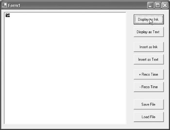
Figure 13.4: Setting various properties changes the way ink is displayed.
There are many other properties we could work with, but they are all covered extensively in the SDK. In addition, we also mention the specific properties we use during the creation of our many applications as we progress through the book.
Saving Content
After you have some content entered into the control, it is very easy to save it to disk and then reload it when needed. You simply need to call the SaveFile method and the LoadFile method to save to a file or to a stream. As an example, let's extend the application we have been working on to save the contents to 'C:myinktext.rtf.'
First, add buttons for loading and saving to the form with the properties shown in Table 13.2.
|
Name |
Text |
|---|---|
|
btnSaveFile |
Save File |
|
btnLoadFile |
LoadFile |
The next step is to add a single line of code to the btnSaveFile and btnLoadFile click events. The line calls the SaveFile method and saves the file to C:MyInkTest.rtf. You will probably notice the RTF extension on the file that is given as the InkEdit control is based on the RichTextBox.
First, here is the code for the btnSaveFile event procedure:
InkEdit1.SaveFile("C:MyInkTest.rtf")
To load the file, you should call the LoadFile method. You can open the file with the following line of code to the btnLoadFile click event procedure:
InkEdit1.LoadFile("C:MyInkTest.rtf")
The sample you have now allows you to set various properties of the InkEdit control. You can also load and save files albeit in an extremely simple manner. There is one final thing that you can add to the program. To erase the text in InkEdit1 that is visible on startup, you can add the following line to the Form_Load event:
InkEdit1.Text = ""
That's it for this simple example. You can now save it and then create a new project as we now turn our attention to the InkPicture control.
Using the InkPicture Control
If you have not already done so, you need to create a new Windows Forms application and then add the InkPicture control to the form:
- Right-click on the Toolbox.
- Select Customize.
- Select the .NET Framework Components tab.
- Check InkPicture and then click OK.
You can now add an instance of the InkPicture control to your form as it is now visible in the Toolbox. You can select it and then draw a rectangle shape on your form. It will be positioned in the area in which you draw the rectangle.
The InkPicture control has some unique properties that we have the ability to manipulate. By default, the control captures ink and displays the ink so you don't have to do anything special with it. If you were to save and then run the current sample, you would see that the control does allow you to write with your pen (see Figure 13.5).
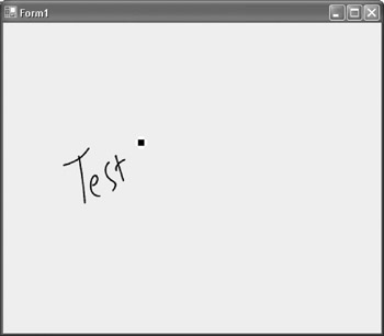
Figure 13.5: The control displays ink by default.
You can close the running sample to return to the IDE, and we'll look at some of the properties provided by the InkPicture control.
Property Description
Like InkEdit, InkPicture also has its own set of properties. We'll look at the ActiveX properties, the Managed Library properties, and then a set of properties that are general to both.
ActiveX Only
The ActiveX control provides a set of properties that are specific to it.
hWnd: Returns the window handle to which the control is bound
MouseIcon: Returns or sets the current custom mouse icon
MousePointer: Returns or sets a value that indicates the type of mouse pointer that appears when the mouse is over a particular part of the control
tbpropicturePicture: Returns the graphics file to appear on the control
Managed Library Only
The Managed Library has a set of properties that are unique.
AccessibleDescription: Returns or sets the description of the control that the accessibility client applications use
AccessibleName: Returns or sets the name of the control that the accessibility client applications use
AccessibleRole: Returns or sets the role of the control that the accessibility client applications use
Anchor: Returns or sets which edges of the control are anchored to the edges of its container
BackgroundImage: Returns or sets the background image that appears in the control; allows you to add a picture that can be used for markup
BorderStyle: Returns or sets the border style for the control
ClipInkToMargin: Returns a value that specifies whether to clip strokes when they are outside the default margin
CollectingInk: Returns the value that specifies whether the control is collecting ink
ContextMenu: Returns or sets the shortcut menu to appear when the user right-clicks the control
DefaultMargin: Returns the default margin that the MarginX and MarginY properties use
Dock: Returns or sets to which edge of the parent container the control is docked
Handle: Gets the window handle to which the control is bound
Image: Returns or sets the image that appears in the control
Location: Returns or sets the coordinates of the upper-left corner of the control relative to the upper-left corner of its container
Size: Returns or sets the height and width of the control in pixels
General
The ActiveX and Managed Libraries both offer these properties.
AutoRedraw: Returns or sets a value that specifies whether the InkPicture repaints when the window is invalidated
BackColor: Returns or sets the background color for the control. The default background color is the system window background color, which is typically white
CollectionMode: Returns or sets the collection mode that determines whether ink, gestures, or ink and gestures are recognized as the user writes
Cursor: Returns or sets the cursor that appears when the mouse pointer is over the control
Cursors: Returns the number of cursors available for use in the ink-enabled region; each cursor corresponds to the tip of a pen or other ink input device
DefaultDrawingAttributes: Returns or sets the default drawing attributes to use when collecting and displaying ink
DesiredPacketDescription: Returns or sets the packet description of the control
DynamicRendering: Returns or sets the value that specifies whether the control dynamically renders the ink as it is collected
EditingMode: Returns or sets a value that specifies whether the control is in ink mode, deletion mode, or selecting/editing mode
Enabled: Returns or sets a value that determines whether the control can respond to user-generated events
EraserMode: Returns or sets the value that specifies whether ink is erased by stroke or by point
EraserWidth: Returns or sets the value that specifies the width of the eraser pen tip
| Note |
This property also appears in the InkOverlay object. |
Ink: Returns or sets the Ink object that is associated with the InkPicture control
InkEnabled: Returns or sets a value that specifies whether the InkPicture control collects pen input
MarginX: Returns or sets the x-axis margin around the window rectangle in screen coordinates
MarginY: Returns or sets the y-axis margin around the window rectangle in screen coordinates
Selection: Returns or sets the collection of ink strokes that are currently selected
SizeMode: Returns or sets how the control handles image placement and sizing
SupportHighContrastInk: Returns a value that specifies whether ink is rendered as just one color when the system is in High Contrast mode
SupportHighContrastSelectionUI: Returns or sets a value that specifies whether all selection user interfaces are drawn in high contrast when the system is in High Contrast mode
Tablet: Returns the Tablet object that the InkPicture control is currently using to collect input; returns the object that represents the tablet hardware, such as manufacturer information
If you quickly browse the list, you will see some interesting properties and many will already look familiar to you because the InkEdit control shares many of the same properties.
As you remember, the InkPicture control is most often used to annotate images. With that in mind, it's important to learn about the properties that control ink selection and ink erasing. The first thing we'll deal with is removing (erasing) ink from the control. Your application can offer two erasing modes:
Point erase: Allows the user to erase a single pixel at a time
Stroke erase: Allows the user to erase the entire stroke, if the user touches anywhere on a stroke
Supporting erase functionality is imperative to many applications because it allows users to easily erase and reenter drawings that they have produced with ink. With the form you already have, add two buttons to the form with the properties shown in Table 13.3.
|
Name |
Text |
|---|---|
|
btnErasePoint |
Erase Point |
|
btnEraseStroke |
Erase Stroke |
Your form should now look like Figure 13.6.
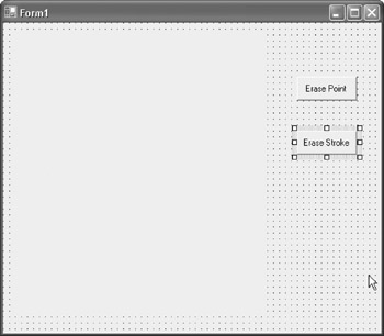
Figure 13.6: Your form now has buttons added for ink erasing.
It's now very quick and easy to add the erasing capability. Create the click events for both controls and then add the following code into the appropriate procedures:
Private Sub btnErasePoint_Click(ByVal sender As System.Object, ByVal e
As System.EventArgs) Handles btnErasePoint.Click
 InkPicture1.EraserMode = InkOverlayEraserMode.PointErase
 InkPicture1.EditingMode = InkOverlayEditingMode.Delete
End Sub

Private Sub btnEraseStroke_Click(ByVal sender As System.Object, ByVal e
As System.EventArgs) Handles btnEraseStroke.Click
 InkPicture1.EraserMode = InkOverlayEraserMode.StrokeErase
 InkPicture1.EditingMode = InkOverlayEditingMode.Delete
End Sub
The first line of code in each procedure sets the EraserMode property to Point or Ink respectively, whereas the second line of code sets the EditingMode property to Delete. These are the only two properties required for erasing. You should save the application and then test out the erasing. At this time, you can erase, but you don't have a way to begin drawing again. This can be handled with another button and a single line of code. Add the button shown in Table 13.4 to the form.
|
Name |
Test |
|---|---|
|
btnDraw |
Draw |
Next, in the button's click event, you can add the following line of code, which again uses the EditingMode property, but now sets it to Ink:
InkPicture1.EditingMode = InkOverlayEditingMode.Ink
You can now move back and forth between the two different types of ink deletion and can also support drawing. Along these same lines, you might want to give the user the ability to select ink. Again, we can use the EditingMode property, but this time we can set it to Select. Add another button to the form called btnSelection and change its Text property to 'Selection.' Within the button's click event procedure, you can add the following line of code:
InkPicture1.EditingMode = InkOverlayEditingMode.Select
Your application now provides the ability to select ink, erase ink, and draw ink. We're now going to look at how we can alter the appearance of the ink collected in the control beginning with antialiasing. When you typically draw a line on a computer screen, its edges often have jagged edges. To antialias the controls so that they appear smooth, you use the Form_Load event and add the following line of code:
InkPicture1.DefaultDrawingAttributes.AntiAliased = True
Now, as you draw on the InkPicture control, the ink will be antialiased. There are certainly a number of additional properties, but these are some of the most important. In later chapters, we cover additional properties as we need them and you can refer to the SDK for additional information if needed.
Objects
Along with the controls we have been using in this chapter, the SDK also provides several objects that we can use throughout our applications.
InkCollector Object
The InkCollector object captures ink input that is placed into a known application window. The InkCollector object captures the input in real time and then directs it into an Ink object. The ink strokes can then be manipulated or sent to a recognizer for recognition.
InkOverlay Object
The next object to look at is the InkOverlay object, which is a superset of the InkCollector object and provides editing support. Both objects, as does the InkPicture control, use common constructs, such as the Ink object and the InkDrawingAttributes collection, so that the basic way to change the color of ink is the same everywhere. This enables you to reuse code and makes it much easier for you to remember. InkOverlay is perfect for annotation in which pen size, ink, color, and position are the most important aspects for a program.
InkOverlay differs from InkCollector in several ways:
- It raises events for begin and end stroke, along with ink attribute changes.
- It enables users to select, erase, and resize ink.
- It supports Cut, Copy, and Paste commands.
The process for using InkOverlay and InkCollector are very similar. Let's create a sample application. First, open VB .NET and create a new Windows Forms application. Next, add a label control to the form and resize it so that it takes up much of the form's visible area. Open the Code Editor and then add references to the following:
Microsoft Tablet PC API
The next step is to add a button to the form and just leave it with its given name of Button1. You can also leave the standard Text property of 'Button1.' Now, back in the Code Editor, we can use the Form_Load event to programmatically set some of these properties and create the InkCollector:
Private Sub Form1_Load(ByVal sender As System.Object, ByVal e As System.EventArgs) Handles MyBase.Load
 Label1.BackColor = Color.White
 Label1.Text = ""
 Button1.Text = "Recognize It"
 theInkCollector = New Microsoft.Ink.InkCollector(Label1.Handle)
 theInkCollector.Handle = Label1.Handle
 theInkCollector.Enabled = True
End Sub
The next step is to add the Button1_Click event, which we'll use to display a message box with the recognized text from our strokes. We'll use a simple Try and Catch to make sure we are executing this on a Tablet PC. This is good programming practice, but because we know that the applications we are developing in the majority of the examples are only going to run on a Tablet PC, we may skip this step.
Here is the code:
Private Sub Button1_Click(ByVal sender As System.Object, ByVal e As System.EventArgs) Handles Button1.Click
 Dim strokes As Microsoft.Ink.Strokes = theInkCollector.Ink.Strokes

 Try
 MsgBox(strokes.ToString(), MsgBoxStyle.OKOnly, "VB.NET API")
 Catch
 MsgBox("Not a Tablet PC", MsgBoxStyle.OKOnly, "Error in VB.NET API")
 End Try
End Sub
The last thing we need to do is use the Dispose method of the InkCollector to prevent memory leaks. We can use the Form1_Closing event as a place to handle this:
Private Sub Form1_Closing(ByVal sender As Object, ByVal e As System.ComponentModel.CancelEventArgs) Handles MyBase.Closing
 theInkCollector.Dispose()
End Sub
Selecting Ink
You can now save and run the application. Enter some ink into the white area and then click the button that says 'Recognize It.' This should display the recognized text in a message similar to the one seen in Figure 13.7.
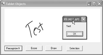
Figure 13.7: Our application being tested.
Now, if you want to change the InkCollector to an InkOverlay, it's as simple as changing these two lines:
Dim WithEvents theInkCollector As Microsoft.Ink.InkCollector
theInkCollector = New Microsoft.Ink.InkCollector(Label1.Handle)
to read:
Dim WithEvents theInkCollector As Microsoft.Ink.InkOverlay
theInkCollector = New Microsoft.Ink.InkOverlay(Label1.Handle)
After changing the code, you can check the application to make sure everything works as expected. Now, let's expand upon the application. The InkOverlay object enables users to use a Lasso tool to select Ink objects or they can select ink by tapping any Ink object. It also allows us to erase ink. Like InkPicture, we also need to have a way to get back to Drawing mode. Now, let's add three additional buttons to the application, leaving them as named by default (i.e., Button2, Button3, Button4). We now go into the Form_Load event and add the following three lines of code:
Button2.Text = "Erase"
Button3.Text = "Draw"
Button4.Text = "Selection"
You're already familiar with the properties, so we can simply write the code for each of the events:
Private Sub Button2_Click(ByVal sender As System.Object, ByVal e As
System.EventArgs) Handles Button2.Click
 theInkCollector.EraserMode = Microsoft.Ink.InkOverlayEraserMode.StrokeErase
 theInkCollector.EditingMode = Microsoft.Ink.InkOverlayEditingMode.Delete
End Sub

Private Sub Button3_Click(ByVal sender As System.Object, ByVal e As
System.EventArgs) Handles Button3.Click
 theInkCollector.EditingMode = Microsoft.Ink.InkOverlayEditingMode.Ink
End Sub

Private Sub Button4_Click(ByVal sender As System.Object, ByVal e As
System.EventArgs) Handles Button4.Click
 theInkCollector.EditingMode = Microsoft.Ink.InkOverlayEditingMode.Select
End Sub
Adding Ink to Existing Applications
The final part of this chapter is devoted to adding ink to existing Windows Forms applications. You can certainly add controls such as InkPicture or InkEdit, or you can use objects such as InkOverlay, but the easiest way to add ink to an existing application is via the PenInputPanel object. As an attachable object, it allows you to add in-place pen input to your applications. You can choose either handwriting or keyboard options for the input method for the Pen Input Panel. Your end user will have the ability to switch between input methods using buttons on the user interface.
Let's create a simple example using the Pen Input Panel. Begin by creating a new Window Forms application in VB .NET. Next, add four standard TextBox controls to the window to simulate an existing VB application. Next, we need to add a reference to the Tablet PC API 1.5. Make sure to select the 1.5 API because version 1 does not include the PenInputPanel object.
The next step is to add the following Imports statement to the Code Editor:
Imports Microsoft.Ink
Add the following code to create the Pen Input Panel:
Dim thePenInputPanel As New PenInputPanel()
Now that we have created the Pen Input Panel, we need to attach it to a control before we can use it. We have two options for this. The first is to create three separate Pen Input Panels and then assign each of them to one of the text boxes. The other option is to create the single Pen Input Panel and then attach the control as necessary. In our case, we are going to attach the controls during the Mouse_Down events of the first three TextBox controls. We'll leave the last one alone so we can verify that the Pen Input Panel only works when we attach it to a control.
Here are the procedures and the code:
Private Sub TextBox1_MouseDown(ByVal sender As Object, ByVal e As
System.Windows.Forms.MouseEventArgs) Handles TextBox1.MouseDown
 thePenInputPanel.AttachedEditControl = TextBox1
End Sub

Private Sub TextBox2_MouseDown(ByVal sender As Object, ByVal e As
System.Windows.Forms.MouseEventArgs) Handles TextBox2.MouseDown
 thePenInputPanel.AttachedEditControl = TextBox2
End Sub

Private Sub TextBox3_MouseDown(ByVal sender As Object, ByVal e As
System.Windows.Forms.MouseEventArgs) Handles TextBox3.MouseDown
 thePenInputPanel.AttachedEditControl = TextBox3
End Sub
You can now test the application. You should try to use your pen to click in the first three text boxes to verify that it works (see Figure 13.8). Additionally, try clicking in the fourth text box to verify that the Pen Input Panel does not appear. Lastly, if you have a mouse attached, try clicking in the text boxes with a mouse. This should verify that the Pen Input Panel does not work unless a pen is being used.
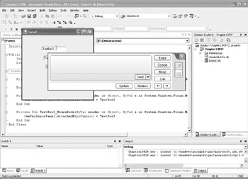
Figure 13.8: The Pen Input Panel is displayed.
Summary
In this chapter, we were able to look at the InkEdit and InkPicture controls and also a few of the objects available to us, such as InkOverlay and InkCollector. They each offer various advantages and disadvantages depending on the type of application you are developing. You can use the InkEdit control for applications when text recognition is required, such as address text boxes, and use the InkPicture control for scenarios when you don't need text recognition, such as when you need to capture signatures. The objects are equally easy to use and share many of the same properties, making your decision on which way to develop a very easy decision. In Chapter 14, Tablet PC Full Screen Utility, we look at some of the hardware of the Tablet PC, including its special buttons and screen rotation.
- The Tablet PC
- Introduction to Visual Basic .NET
- Working with VB .NET
- Basics of the .NET Framework
- Introduction to the VB .NET Language
- Object-Oriented Programming with VB .NET
- Strings, GDI+, and Error Handling in VB .NET
- Math and Random Number Functions in VB .NET
- Your First Program
- Console Application Input/Output
- Your First Windows Forms Application
- Obtaining the Tablet PC SDK
- Introduction to Ink-Enabled Applications
- Tablet PC Full Screen Utility
- Tablet PC Screen Rotation and Special Buttons
- Creating an MP3 Player
- Form Effects
- Using Gestures to Control Tablet Media Player
- Getting Started with Microsoft Agent
- Advanced Microsoft Agent
- Speech Input with SAPI
- Custom Grammars for Speech Recognition
- WMI and Hardware
- Power Management for the Tablet PC
- Virtual Joystick
- Pong Game
- Not Quite a Magic Ball
- Storing Ink in a Database
- 3D Rendering with OpenGL and DirectX 9
- Using Third-Party Engines
- Tablet Fax
EAN: 2147483647
Pages: 191
