Drawing GDI+ Primitives
 |
The list of features to be implemented in this iteration is quite comprehensive. Therefore, we present here a rough outline of the various tasks. This list will also enable you to navigate more easily through this iteration if you're using the book as a reference for your own applications. |
The following list shows the high-level tasks that need to be done in order to draw graphics primitives and text on the screen. It also shows the tasks that have to be done to fulfill the requirements of this chapter:
- The Graphics reference to the customScrollableControl must be passed to the graphics primitives in order for the primitives to draw themselves on the screen.
- A GraphicsComponent class must be defined. All graphics, text, and picture classes will derive from it.
- We must define the line, circle, rectangle, and text classes. All these classes derive from the common graphics Component class (see the design specification in section 6.3).
- The picture component needs to implement a list that contains all the graphical objects that are to be drawn on the screen. We must implement functionality to add and remove graphical objects.
- The Draw method of the Picture class must iterate through all the components to call the corresponding Draw method (so that the primitives can draw themselves on the provided graphics drawing surface).
- We must define a new tab control within the photo editor GUI and add buttons for the new functionalities.
- To let users select the desired graphical tool (such as the line or circle), we must define an enumeration in the PhotoEditorForm class.
- We must implement mouse event handlers.
- We need to add other functionality (such as picking an object or removing components), some cosmetics, and some bug fixes.
Now that the high-level tasks are presented, the implementation (fun) can begin.
6.6.1 The Infrastructure Implementation
The first task is to create the graphics component class. The component class acts as the base class for all the graphics primitive classes (components) and the Picture class. Therefore, we add a new class file to the Photo Editor Application project and give it the name GraphicsComponent.cs. The new class, if generated with the class wizard, is defined within the namespace Photo_Editor_Application. Also, make sure you have included the using statements for the System and the System.Drawing namespaces at the beginning of the class file.
Defining the Abstract GraphicsComponent Class
The GraphicsComponent class itself is defined as follows:
public abstract class GraphicsComponent
The abstract keyword indicates that this class cannot be instantiated (as with C++ classes that contain pure virtual methods). Therefore, abstract classes can be used only as base classes. In addition, abstract classes can (but are not required to) contain abstract methods. If an abstract class defines abstract methods, then the methods define the signature but do not provide any implementation. All classes that derive from an abstract class are required to provide implementations for all inherited abstract methods. To make the point even clearer, abstract methods and properties can be defined only in abstract classes. In addition to classes and methods, property access methods can be declared as abstract. The abstract property method does not provide any implementation for the get or set property, but it defines the get and/or set stubs without implementation.
Based on these qualities of abstract classes, it is obvious that abstract classes cannot be defined as sealed (where the keyword sealed indicates that no other class can derive from it).
Listing 6.1 shows the very basic implementation for the Graphics Component class.
Listing 6.1 Abstract GraphicsComponent Class
using System;
using System.Drawing;

namespace Photo_Editor_Application
{
 ///
/// Abstract Component class. /// Every graphic primitive and picture has to derive from /// this class. It provides the common interfaces the /// application can use. ///
public abstract class GraphicsComponent
{
 ///
/// Constructor. ///
public GraphicsComponent() { } ///
/// Abstract method to be implemented by the derived /// classes to draw the corresponding primitive into /// the drawing surface. ///
public abstract void Draw(); ///
/// Method to add a component to the list of components. /// Default behavior is to do nothing. ///
public virtual void Add(GraphicsComponent comp){} ///
/// Method to remove a component from the list of components. /// Default behavior is to do nothing. ///
public virtual void Remove(GraphicsComponent comp){} ///
/// Accessor method for the static deviceContext /// field that holds the graphics reference to /// the drawing surface. ///
public static Graphics DeviceContext { get { return deviceContext; } set { deviceContext = value; } } ///
/// Holds the drawing surface. ///
private static Graphics deviceContext; } }
First, the constructor is provided. The constructor does not implement any functionality. After that you can see the declaration of the abstract method Draw, which is declared but does not provide any implementation. That is, the implementation is left to the derived classes. In addition, two virtual methods for adding and removing components from the list of components are defined.
Virtual methods, unlike abstract methods, provide a default behavior for the functionality defined. However, virtual methods allow the derived classes to provide their own specialized implementation. The default implementation for both accessor methods is to do nothing at all. Virtual methods do not have to be implemented by the derived classes (in which case, the default behavior is used).
Next, the private static field deviceContext and its property accessor method are defined. The deviceContext field holds the reference to the Graphics object in order to draw the components on the drawing surface. The keyword static indicates to the compiler that only a single instance of the field exists for all objects created. A static field is used here because all the components will share one drawing surface.
In addition to this implementation, some helper functionality and properties must be provided by the GraphicsComponent class to support the drawing of the components. We implement two private fields of type Point that represent the start (upper-left) and the end (lower-right) points of the graphics components. These fields define the components completely as long as we draw with only one default color and line width. (Remember that a line is defined by two points, and the rectangle and circle are defined by the start point and their width and height, where the width and height can be calculated from the two upper-left and lower-right points.)
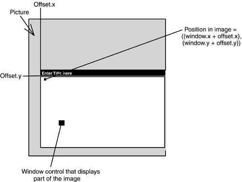
Another functionality that we need to provide for all the components is a method that transforms coordinates from screen coordinates into image coordinates. This feature is used in case the image is larger than the custom scrollable control and the user has scrolled the image. If the graphics primitive is then drawn, it will be at the same position with respect to the control, but not relative to the image. This means that the graphics will not scroll and will not be bound to the position in the image but rather will stay at the same position within the control. This is because the coordinates provided by the mouse event always correspond to the position of the mouse within the control, and not to the position relative to the image (as shown in Figure 6.9). In fact, the system doesn't really know which position in the image is shown. The management of which part of the image is shown in the control is the responsibility of the custom control that displays the image. All the system knows is the control and the position of the mouse pointer within the control. Therefore, we must convert and store the coordinates provided by the mouse event handlers into coordinates relative to the image. The GraphicsComponent class provides this functionality. The transformation method is also used when the graphical components are drawn to convert the image coordinates back to viewport coordinates.
Figure 6.9. Window versus Image Coordinates
The GraphicsComponent class implements a property and a set accessor method to store the location of the viewport coordinates. This property, called viewportCoords, is declared static because all graphical components draw in the same window with the same viewport coordinates. Then we provide a method that converts the coordinates of a point relative to the image into coordinates relative to the window. Listing 6.2 shows these additional functionalities of the Component class.
Listing 6.2 The Component Class Helper Functions
public abstract class GraphicsComponent
{
///
/// Constructor initializes the start and end point /// of each primitive to be the origin. ///
public GraphicsComponent() { startPoint.X = startPoint.Y = 0; endPoint.X = endPoint.Y = 0; } * * * ///
/// Accessor method for the coordinates of /// the upper-left corner of the primitive, or /// the start point of a line. ///
public Point StartPoint { get { return startPoint; } set { startPoint = value; } } ///
/// Accessor method for the coordinates of /// the lower-right corner of the primitive, or /// the end point of a line. ///
public Point EndPoint { get { return endPoint; } set { endPoint = value; } } ///
/// Calculates the coordinates within the display /// window from a /// point relative to the image. ///
///Point in image /// coordinates public Point CalcViewportCoords(Point imagePoint) { Point viewportPoint = new Point(imagePoint.X - viewportCoords.X, imagePoint.Y - viewportCoords.Y); return viewportPoint; } ///
/// Set method for the coordinates of /// the image within the display window. ///
public static Point ViewportCoords { set { viewportCoords = value; } } private Point endPoint; private Point startPoint; private static Point viewportCoords; }
After the Component class is implemented, we must change the existing Picture class to be derived from the GraphicsComponent base class. In addition, we must implement in the base class (GraphicsComponent) the methods defined as abstract. Furthermore, we must create and manage a list of components. Luckily, the .NET Framework provides a class called ArrayList.
The ArrayList class provides several convenience functions for list management, and these functions are useful for our implementation of the component list. The add, remove, clear, and dynamic size allocation features are used for this implementation. Please see the MSDN files for a complete description of the functionalities provided by ArrayList. Because the ArrayList class is defined in the System.Collections namespace, this namespace must be included in the Picture.cs file.
Listing 6.3 shows the features we have added to the Picture class. You can see that the Draw method is marked with the keyword override to indicate that it overrides, or in this case implements, the Draw method declared by the base class GraphicsCompnent. The Draw method loops through all the components in ArrayList and calls the Draw method of each component. The foreach loop is used to loop through the list and to draw all the components. In general, foreach loops are used to iterate over arrays and collections without changing them.
The rest of the shown implementation is self-explanatory. It basically deals with ArrayList management. In addition to the shown implementation, we add the following line to the constructor of the Picture class to create an ArrayList at initialization time. Initially, an array of 20 components is created. This seems to be a good value, and the ArrayList class will expand the list if necessary.
compList = new ArrayList(20);
Listing 6.3 The Picture Class
using System;
using System.Drawing;
using System.Windows.Forms;
using System.Collections;

namespace Photo_Editor_Application
{
 ///
/// Image class stores all image-related data. /// It also provides the basic functionality and /// is derived from the Component class. ///
public class Picture : GraphicsComponent { * * * ///
/// The Draw method walks through the list /// of created components and calls the Draw /// method for each of the components. ///
public override void Draw() { foreach(GraphicsComponent obj in compList) { GraphicsComponent theComp = (GraphicsComponent)obj; theComp.Draw(); } } ///
/// Method adds a new component to the list of /// components. ///
public override void Add(GraphicsComponent comp) { compList.Add(comp); } ///
/// Removes a component from the list of components. ///
public override void Remove(GraphicsComponent comp) { compList.Remove(comp); } ///
/// Clears the list of components. ///
public void ClearComponentList() { compList.Clear(); } private ArrayList compList; private Bitmap backUpImage; } }
Now that the groundwork is finished, it is time to start implementing the first graphical component. As an example, we'll show the Rectangle primitive. We leave the implementation of the Line and Circle primitives to you.
6.6.2 Drawing GDI+ Graphics Primitives: Lines, Rectangles, and Ellipses
The implementation of the graphics primitives is fairly easy. The implementation of all the graphical components can be broken down into five steps:
- Create the component and implement the inherited abstract methods. Implement a Draw method that draws the graphical component.
- Add a button to the graphical user interface.
- Add the graphics tool to the enumeration of selection tools.
- Create an event handler for the button click event. In the event handler, reset all buttons and the selected tool if another tool has already been selected. If no tool has been selected, then set the selected tool enumeration to the corresponding value.
- Implement the action that needs to be taken for the mouse down, mouse up, and mouse move events if the corresponding tool was selected. For example, on mouse down, a new graphics component is created and the position of the mouse is stored as the start and end points. A flag is set to indicate drawing, and the component is added to the list of components to be drawn in the Picture class. Then on mouse move, if a tool was selected and the drawing flag is set, then the corresponding graphics component is drawn by using the current mouse position as the new end point. If the mouse up event handler is called, indicate that no more drawing will occur.
According to our to-do list, we first add another class named RectangleComponent. For the implementation, only the constructors and the implementation of the abstract Draw method have to be provided by the class. The constructor does not implement any functionality. The Draw method has the responsibility to draw the specific graphics primitive on the drawing surface. The drawing surface is provided by the static base class property.
Drawing a rectangle on the provided drawing surface is straight forward. The Graphics object, in this case stored under the name deviceContext, provides a number of draw methods. One of the supported draw methods is the DrawRectangle method, which is what we use to draw the rectangle. It defines multiple overloaded methods to draw a rectangle. The overloaded method used in this example expects as parameters a pen (which in this iteration will be a black pen), the x- and y-coordinates of the upper-left corner, and the width and height of the rectangle to be drawn. Before sending the coordinates to the drawing method, we convert them from image coordinates to display window coordinates (as mentioned earlier, all the coordinates that we store in a component are relative to the image and must be converted at drawing time).
One additional consideration is worth mentioning. To draw the graphics object, GDI+ expects the width and height to be positive. Therefore, we check whether the end point stored in the object is indeed below and to the right of the start point. If it is not, the coordinates of the points must be switched so that we can draw the rectangle with positive width and height. Therefore, we first check whether the calculated width and height are negative numbers. If that is the case, the start and end points must be exchanged, and the width and height must be provided as absolute numbers (the other option would be to recalculate the coordinates).
The Math namespace provides the ABS method, which returns the absolute value of a provided number (meaning it always returns a positive number; for example, 45 returns 45). We then check whether the width is negative. If the width is negative, only the x values of the start and end points are swapped, and the width is converted to a positive number so that we can draw the rectangle. After that, the height is checked, and the appropriate action is taken to ensure proper drawing. If everything is in order, the rectangle is drawn without doing any calculation.
Listing 6.4 shows the implementation of the rectangle component.
Listing 6.4 The Rectangle Implementation
using System;
using System.Drawing;

namespace Photo_Editor_Application
{
 ///
/// The RectangleComponent class implements the /// functionality to draw a rectangle in the picture. ///
/// F:image_graphics_annotations public class RectangleComponent : GraphicsComponent { ///
/// Constructs a Rectangle object. ///
public RectangleComponent() { } ///
/// Method that draws the rectangle component into the /// graphics /// object. The DrawRectangle method provided by GDI+ is /// used to /// actually draw the graphic primitive. Depending on /// the mouse /// movement, the width, height, and position are /// adjusted. ///
public override void Draw() { int width = CalcViewportCoords(EndPoint).X - CalcViewportCoords(StartPoint).X; int height = CalcViewportCoords(EndPoint).Y CalcViewportCoords(StartPoint).Y; // if width and height are less than zero, then //exchange start and end point. if(width < 0 && height < 0) DeviceContext.DrawRectangle(Pens.Black, CalcViewportCoords(EndPoint).X, CalcViewportCoords(EndPoint).Y, Math.Abs(width), Math.Abs(height)); else if (width < 0) // if only width < 0 then x coordinate of start // and end point have to be // swapped in order to draw the rectangle with // positive width and height. DeviceContext.DrawRectangle(Pens.Black, CalcViewportCoords(EndPoint).X, CalcViewportCoords(StartPoint).Y, Math.Abs(width), height); else if (height < 0) // if only height < 0 then y coordinate of start // and end point have to be // swapped in order to draw the rectangle with // positive width and height. DeviceContext.DrawRectangle(Pens.Black, CalcViewportCoords(StartPoint).X, CalcViewportCoords(EndPoint).Y, width, Math.Abs(height)); else // if everything is OK then just draw the // rectangle using the provided coordinates. DeviceContext.DrawRectangle(Pens.Black, CalcViewportCoords(StartPoint).X, CalcViewportCoords(StartPoint).Y, width, height); } } }
The rectangle component is now ready to use. The next step is to extend the photo editor application to let users select a drawing tool by using a button from the GUI. Therefore, a new tab needs to be added to the tab control of the PhotoEditor.cs[Design] page. This is done by right-clicking on the existing tab control and selecting Add Tab. After the tab is created, change the properties as follows:
|
Properties of the Overlay Tab |
|
|---|---|
|
(Name) |
Overlays |
|
Text |
Graphics and Text |
Then add a button to the new tab and change its properties as follows:
|
Properties of the Rectangle Button |
|
|---|---|
|
(Name) |
RectangleButton |
|
Text |
Rectangle |
After that, create an event handler for the button click event. To let users distinguish various tools, we define an enumeration toolSelection, whose elements are the tools that are defined or None. The enumeration members defined until now are the rectangle tool or none. Then the button style is changed if it was selected. If any tool (except None) was already selected, then the tool is deselected and the button style is changed back to the standard appearance. We also implement a helper method that resets all the buttons and the selected tool, as shown in Listing 6.5.
Listing 6.5 The RectangleTool_Click Event Handler
///
/// Convenience method to reset all buttons to /// default appearance and to reset toolSelected. ///
private void resetButtons() { // Resets all the implemented graphics tool buttons RectangleButton.FlatStyle = FlatStyle.Standard; // Resets the tool currently used to none. toolSelected = 0; } // All possible tools that can be selected private enum toolSelection { None = 0, RectangleTool} // Tool currently selected private toolSelection toolSelected; ///
/// Sets the selected tool to RectangleTool if no tool /// was selected before. If a tool was selected before /// then the tool selection is reset to no tool. ///
///Object that sent the event. ///Parameters provided by the event. private void RectangleButton_Click(object sender, System.EventArgs e) { if(toolSelected == toolSelection.None) { // Calls the convenience method to // reset the buttons to no tool selected. resetButtons(); toolSelected = toolSelection.RectangleTool; // Changes the appearance of the button to show it // is actually selected RectangleButton.FlatStyle = FlatStyle.Flat; } else { // Calls the convenience method to // reset the buttons to no tool selected. resetButtons(); } }
Now that the button can be selected, we proceed to implement the mouse event handlers for interactive drawing of the graphical component.
6.6.3 Handling Mouse Events and Interactive Drawing
Before we start to implement the mouse event handler, it is important to explain the principles of event handlers in .NET and explore how they differ from the C/C++ event handlers of previous Visual Studio implementations.
Even though automatically generated event handlers were used earlier in the book (the button click events were generated by the class wizard), it is worthwhile to look behind the scenes to see how event handlers work. The knowledge you gain about event handlers in this section will help you to understand and implement the mouse event handlers used for interactive drawing in this chapter.
Delegates and Events
Events are raised in response to actions such as mouse moves, clicks, or other program logic. Two parties are involved in event handling. One is the object that raises the event, also called the sender object. The other participant is the object responding to the event, also referred to as the event receiver. The sender object does not know which object or method will respond to or handle the event it raises. For that reason the .NET Framework provides a type called a delegate, which is similar to a function pointer in C/C++. Delegates use the Observer design pattern. Unlike function pointers, though, the delegate class has a signature, and it can hold references that match this signature. This is why delegates offer the big advantage (compared with function pointers) of being type-safe. In addition, a delegate can hold more than one reference.
To use a delegate, it must be declared, assigned, and invoked. The following example shows these principles:
// declaration of a delegate
delegate int DelegateExample();

// assigning a delegate method to be called is
// MyClass.InstanceMethod
DelegateExample delegateType = new
 DelegateExample(MyClass.InstanceMethod);

//Call the event handling Instance Method
delegateType();
Later in this chapter you will learn how to implement a delegate.
What is the connection between delegates and events? The answer is fairly easy: Events are declared using delegates. An event allows clients to define methods that are called if a certain event occurs. In .NET, an event is declared as taking two parameters: One is the object source, which indicates the source of the event. The other one is an additional parameter, e, which encapsulates additional information regarding the event. The type of e should derive from the EventArgs class. If no more information is supplied to the delegate, then the .NET-defined delegate type EventHandler can be used. This is all you need to know to understand events in .NET.
To see how these concepts work, take the Visual Studio Designer as an example. If you add a new button and need to add its click event, all you have to do is to double-click the new button in the Designer. The Designer automatically generates code for the click event by linking the event handler method to the event, assigning the delegate method, and supplying the body for the event handler method (using the signature provided by the event source). All you have to do is to fill in the functionality.
Implementing Event Handlers for Interactive Drawing
This section describes the steps to implement interactive drawing of the rectangle component. First, we let the components know in what window they will be drawn: We set the static GraphicsComponent field deviceContext to a reference to the Graphics object of customScrollableControl in the PhotoEditorForm constructor. In addition, we set the isDrawing flag to false in the constructor.
After that, we implement the mouse event handlers. To add the event handler for the mouse, select the customScrollableControl in PhotoEditor.cs[Design], go to the properties, and select the event symbol (the lightning symbol). Double-click on the event that needs to be added (the events needed are MouseUp, -Down, -Move, -Enter, and -Leave). If a mouse event handler is called (such as down, move, or up), some action must be taken to draw the selected component, if any was selected.
If the customScrollableControl_MouseDown event was encountered, the corresponding component object is created. In addition, the start and end points of the component are initialized to the current coordinates (where the current mouse coordinates are provided in the event arguments). In addition, the component is added to the component list of the Picture object. If an invalid tool was selected, an exception is thrown. Then the isDrawing property is set to true to indicate that the component was created and needs to be drawn if the mouse is moved or the mouse button is released.
When the customScrollableControl_MouseMove event handler is called, we first check whether a tool was selected. If a tool was selected, then the mouse pointer is changed to a cross shape. Then we check whether a component was created and needs drawing. If the isDrawing flag is set to true, then the coordinates must be updated and the object must be redrawn with its new lower-right-corner position.
Next, the customScrollableControl_MouseUp event handler is implemented. If the mouse button is released, then the component's end position is updated to the current mouse position and the isDrawing flag is set to false before the screen is redrawn.
In addition, we add the customScrollableControl_MouseEnter event handler to change the cursor shape to a cross shape if a tool is selected and the mouse pointer enters the control.
Listing 6.6 shows the changed parts of the code.
Listing 6.6 Interactive Drawing
namespace Photo_Editor_Application
{
 ///
/// The GUI class for the photo editor application. ///
/// F:photo_editor public class PhotoEditorForm : System.Windows.Forms.Form { * * * ///
/// Constructor of the application class. /// PhotoEditorForm provides the GUI for the photo /// editor project. ///
public PhotoEditorForm() { * * * //sets the private property to not drawing isDrawing = false; // Sets the static property of the component to the // Graphics object of the window it is drawn in Component.DeviceContext = customScrollableControl.CreateGraphics(); // Display the Image at startup } // Indicates that if a tool was selected, the mouse button // was selected // and is not released yet => currently drawing the selected // component private bool isDrawing; // All possible tools that can be selected private enum toolSelection { None = 0, RectangleTool} // Currently selected tool private toolSelection toolSelected; // The selected component that is currently drawing private Component compObject; // If tool was selected and mouse is clicked in the window // then // create the component, initialize the variables, and draw // everything. private void customScrollableControl_MouseDown( object sender, System.Windows.Forms.MouseEventArgs e) { // Check whether a drawing tool is selected and // whether we need to draw. if(!isDrawing && (toolSelected != toolSelection.None)) { switch(toolSelected) { //create component according to tool selected case toolSelection.RectangleTool: compObject = new RectangleComponent(); break; default: toolSelected = toolSelection.None; throw(new Exception("Error, Tool selected not implemented")) ; } // Set the Graphics referenced in // the component to the window object. GraphicsComponent.DeviceContext = customScrollableControl.CreateGraphics(); // Add the component to the // list that needs to be drawn. PictureObject.Add(compObject); // Get the coordinates and // transform them to coordinates // relative to the image Point tempPoint = new Point(e.X + customScrollableControl.ViewportCoords().X, e.Y + customScrollableControl.ViewportCoords().Y); // Set the points compObject.StartPoint = tempPoint; compObject.EndPoint = tempPoint; // Now we started drawing a component isDrawing = true; // Display the image plus the components. DisplayImage(); PictureObject.Draw(); } } // Event Handler for mouse move, // draws component when in draw mode. private void customScrollableControl_MouseMove(object sender, System.Windows.Forms.MouseEventArgs e) { // Check whether there was a tool selected. if(toolSelected != toolSelection.None) { // Change cursor to cross shape. Cursor.Current = Cursors.Cross; } // Check whether in drawing mode. if(isDrawing) { // Set new coordinate of end point for component // in // coordinates relative to the image. Point tempPoint = new Point(e.X + customScrollableControl.ViewportCoords().X, e.Y + customScrollableControl.ViewportCoords().Y); compObject.EndPoint = tempPoint; // Draw everything DisplayImage(); PictureObject.Draw(); } } // If mouse button is released and drawing mode then // add object to list and redraw everything private void customScrollableControl_MouseUp(object sender, System.Windows.Forms.MouseEventArgs e) { if(isDrawing) { // Update end point to final position relative to image tempPoint = new Point(e.X + customScrollableControl.ViewportCoords().X, e.Y + customScrollableControl.ViewportCoords().Y); compObject.EndPoint = tempPoint; // Reset mode to not drawing isDrawing = false; // Display all DisplayImage(); PictureObject.Draw(); } } private Point tempPoint; // If mouse enters control and a tool is selected // then change the cursor to cross private void customScrollableControl_MouseEnter(object sender, System.EventArgs e) { if(toolSelected != 0) { Cursor.Current = Cursors.Cross; } } // If mouse leaves control make sure // mouse pointer is standard private void customScrollableControl_MouseLeave( object sender, System.EventArgs e) { Cursor.Current = Cursors.Default; } } }
This completes the implementation of the Rectangle tool. If the Graphics and Text tab is selected, then the Rectangle tool can be chosen. When the mouse button is clicked and the mouse is moved, the application starts drawing the component. The drawing continues until the mouse button is released.
If you test your application now, you will notice that the graphic flickers while it is being drawn and that the graphic disappears when the mouse is not moved or the mouse button is released. What happened is that customScrollableControl is repainted and the components are not. This means that the image has been painted over the graphics, and that makes them disappear. You can avoid this by adding a paint event handler for customScrollableControl to the PhotoEditorForm class. In the event handler, we simply call Draw() on the graphics components. Here is the implementation:
private void customScrollableControl_Paint(object sender,
 System.Windows.Forms.PaintEventArgs e)
{
 // First update the viewport Coordinates.
 GraphicsComponent.ViewportCoords =
 customScrollableControl.ViewportCoords();
 // Draw all graphic components.
 PictureObject.Draw();
}
This fixes the problem. You can also see that before the components are redrawn, we first update the viewport position to make sure that the graphics are painted at the correct position if scrolling was done.
6.6.4 Drawing Text in GDI+
The strategy for displaying text is essentially the same as that for drawing graphical components. But some additional work must be done to make this work. To hold the text that is to be displayed when drawing the text component, we define a member textInput of type string and an accessor. In addition to the position and the text, we need to know in what font and with which brush the text is drawn. The font defines the type of the letters used, and the brush defines the color of the characters. Therefore, we create a member that holds an instance of a font; for the brush, we use the system-defined brush in the color black.
Now the text can be drawn using the DrawString command of GDI+. Listing 6.7 shows the implementation of the text component.
Listing 6.7 Text Drawing Component
///
/// The text component is responsible for drawing /// text to the drawing surface. ///
/// F:image_text_annotations public class TextComponent : GraphicsComponent { ///
/// Constructor for text component. ///
public TextComponent() { } ///
/// Accessor for textInput, which represents the /// text to be drawn. ///
public string TextInput { get { return textInput; } set { textInput = value; } } ///
/// Draws the text into the Graphics object provided. ///
public override void Draw() { Font ff = new Font("Arial",18); Point tempPoint = new Point(StartPoint.X, StartPoint.Y); tempPoint = CalcViewportCoords(tempPoint); DeviceContext.DrawString(textInput, ff, Brushes.Black, tempPoint.X, tempPoint.Y); // Dispose of the font created ff.Dispose(); } private string textInput; }
After the TextComponent is implemented, we need to add the support for the new functionality in the PhotoEditorForm class.
The first step is to add TextTool to the toolSelection enumeration in the PhotoEditorForm class. After that, we add to the GUI a button with the name TextButton (we also change the text of the button to Text); we create the button click event handler by double-clicking on the button. In the button click event handler, we set toolSelected to the TextTool enumeration member, if no tool was selected before.
Next, we change customScrollableControl_MouseDown to support text drawing. If the mouse button is pressed within the control and the text tool is selected, then a text box is shown on the screen that allows the user to enter some text. After the OK button is pressed, a callback method is called and the text is displayed with its upper-left point at the position where the mouse was clicked. Therefore, we add a private member variable of type TextBox to the PhotoEditorForm class:
private TextBoxInput inputTextBox;
Then we add following lines to the constructor of the PhotoEditorForm in order to create a text box:
// Create TextBoxInput to get the input text
inputTextBox = new TextBoxInput();
Now we can implement the customScrollableControl_MouseDown event handler. First, we check whether the selected tool is not the TextTool. If the selected tool is not the text tool, then we continue as usual. If the text tool was selected, then we create a TextComponent object. Then we set the viewport coordinates and set the current mouse position to the upper-left point of the text box. Then we show a dialog box for text input and register the event handler, as described earlier in this chapter.
MyEventHandler is the event handler called by the text box after OK is clicked. Within the handler we extract the text that was entered, and then we add the component to the list so that it gets drawn with the other components. After that, the image is displayed and the graphics are drawn on the screen.
Listing 6.8 shows the implementation of the text box creation and callback function definition using a delegate.
Listing 6.8 Using a Delegate to Display Text Input
// If tool was selected and mouse is clicked in the window then
// create the component, initialize the variables, and draw
// everything.
private void customScrollableControl_MouseDown(object sender,
 System.Windows.Forms.MouseEventArgs e)
{
 // Go here only if tool is not textTool
 if(toolSelected != toolSelection.TextTool)
 {
 // Check whether tool is selected and drawing and it is not
 // the select tool.
 if(!isDrawing && toolSelected != ToolSelection.None)
 {
 switch(toolSelected)
 {
 //create component according to tool selected
 case toolSelection.LineTool:
 compObject = new LineComponent();
 break;
 *
 *
 *
 }
 // Display the components.
 PictureObject.Draw();
 }
 }
 else
 {
 // Create component
 compObject = new TextComponent();

 // Set Graphics object to the customScrollableControl
 GraphicsComponent.DeviceContext =
 customScrollableControl.CreateGraphics();
 tempPoint = new Point(e.X +
 customScrollableControl.ViewportCoords().X, e.Y +
 customScrollableControl.ViewportCoords().Y);
 compObject.StartPoint = tempPoint;
 compObject.EndPoint = tempPoint;
 // Show the text input box
 inputTextBox.Show();
 // Register the callback function
 inputTextBox.CallMethod(new
 TextBoxInput.Feedback(MyEventHandler));
 }
}

// Delegate example for callback function.
void MyEventHandler(string text)
{
 TextComponent texC = (TextComponent) compObject;
 texC.TextInput = inputTextBox.TextInput;

 //Add component to list
 PictureObject.Add(compObject);

 //Display everything
 DisplayImage();
 PictureObject.Draw();
}
Obviously, the TextBoxInput implementation is still missing. This class allows the user to enter text that is displayed via a dialog window. The TextBoxInput class provides the declaration for the delegate method and its signature. To implement this feature, add a new form to the solution with the name TextBoxInput. After creation, modify the user interface to look similar to Figure 6.10.
Figure 6.10. Text Input Window
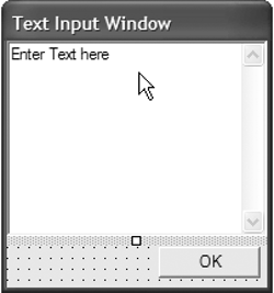
Don't forget to enable multiline text and enable return characters.
After the GUI is created, we add the event handler for the OK button click. To implement the functionality, we first declare some fields and helper methods in the TextBoxInput class. A private field of type string is added to hold the text that was entered by the user. Then the delegate method and its signature are declared. In addition, we define a private field of type delegate, which holds the callback method provided by the client. Then we implement a CallMethod that is instantiated by the client in order to register the callback method. Within the call method, the callback method is stored in the private field that was created earlier, and the client method is called to display the current text.
Last but not least, we provide the button click event handler. If the OK button was pressed, then the text entered is stored in the textInput field, the text box is hidden (disappears from the screen), and the callback method is called. Listing 6.9 shows the implementation of TextBoxInput.
Listing 6.9 Text Box Implementation, Including Delegate Declaration
///
/// Summary description for Form1. ///
public class TextBoxInput : System.Windows.Forms.Form { * * * // Holds the text to be displayed. private string textInput; ///
/// Accessor to the text input. ///
public string TextInput { get { return textInput; } } ///
/// Declaration of the client delegate that /// is called when the /// Text Box OK button was pressed! ///
public delegate void Feedback(string text); Feedback tempMethod; ///
/// CallMethod used to register the callback function. ///
///Function Pointer public void CallMethod(Feedback feedback) { tempMethod = feedback; feedback(textInput); } ///
/// Event handler called when the text box /// has done its duty. /// It's time to call the registered callback method. ///
///sender object ///additional info private void textOKButton_Click(object sender, System.EventArgs e) { textInput = this.textBox1.Text; this.Hide(); CallMethod(tempMethod); } }
After implementing the interactive drawing capabilities, we implement a selection handler, a region of interest, an Apply button to "burn" the graphics into the image, and a Reset button that provides the capabilities to restore the originally loaded image.
6.6.5 The Region of Interest, Erase, Reset, and Apply Functionality
Of the remaining components, let's first discuss the region of interest (ROI) tool. If the ROI tool is selected and the mouse button is clicked inside the control, then a rectangle will be drawn in a gray color. To store a reference to the ROI component in the PhotoEditorForm object, we use a get accessor that can be called from other modules of the program. If the mouse up event is encountered, then the ROI component is removed from the list of components that need to be drawn. The implementation of the ROI component is essentially the same as the rectangle and can be found in the sample solution of this chapter on the accompanying CD.
Another feature that needs to be implemented is the erase tool. If the erase tool is selected and the mouse is moved over the start or end point of a nonpermanent component, then users can delete the component from the screen by clicking the mouse button within the displayed marker. To implement this, first create a button called Erase and create the event handler for the EraseButton click event. Implement the event handler by resetting the buttons and setting the tool to SelectTool. Add SelectTool to the enumeration of toolSelection. Next, check whether the erase tool is selected if the current mouse position is in the range of a component. If it is, draw a marker in the form of a red rectangle around the start and end points.
But be careful: The coordinates must be converted to compensate for scrolling. Another helper method is included. It is called PositionIsComponent.
This method is provided by the PictureComponent class. You can find the implementation in the sample solution for this chapter on the accompanying CD. The PositionIsComponent method walks through the component list and checks whether the mouse pointer is within the picking area of a graphics component (where the picking area is the area around the start and end points of a component). When walking through the component list, the Picture class calls each component and calls the new method isPicked, which is implemented by GraphicsComponent. The isPicked call to a component returns true if the mouse pointer is within the picking area. If a component returns true from the isPicked method, then the PositionIsComponent call returns a generic reference to that object. The generic reference is of type Object. We therefore must cast the returned value to a GraphicsComponent object in order to use it. The implementation can be seen in Listing 6.10.
Listing 6.10 Erase Tool Implementation Using Picking
// Event handler for mouse move,
// draws component when in draw mode.
private void customScrollableControl_MouseMove(object sender,
 System.Windows.Forms.MouseEventArgs e)
{
 *
 *
 *

 if(toolSelected == toolSelection.SelectTool)
 {
 const int delta = 10;
 compObject = null;
 // check whether mouse is moved over a component
 // start or end point by providing image coordinates
 compObject =
 (GraphicsComponent)PictureObject.PositionIsComponent(
 e.X +
 customScrollableControl.ViewportCoords().X,
 e.Y +customScrollableControl.ViewportCoords().Y);

 if(compObject != null)
 {
 Graphics myDC =
 customScrollableControl.CreateGraphics();
 // convert coordinates to viewport coordinates.
 Point tempPoint = new Point(compObject.StartPoint.X
 - 5,
 compObject.StartPoint.Y - 5);
 tempPoint =
 compObject.CalcViewportCoords(tempPoint);
 myDC.DrawRectangle(Pens.Red, tempPoint.X,
 tempPoint.Y, delta, delta);
 tempPoint.X = compObject.EndPoint.X - 5;
 tempPoint.Y = compObject.EndPoint.Y - 5;
 tempPoint =
 compObject.CalcViewportCoords(tempPoint);
 myDC.DrawRectangle(Pens.Red, tempPoint.X,
 tempPoint.Y, delta, delta);

 }
 else
 {
 // Draw everything
 DisplayImage();
 PictureObject.Draw();
 }
}
The method PositionIsComponent of the Picture class walks through the list of components. On each component in the list, it calls the IsPicked method with the mouse position coordinates as arguments. The IsPicked method checks whether the component's start or end point is within a range of 5 pixels of the current mouse position. If it is, then true is returned to the Picture class; otherwise, false is returned. If the return value is true, then the PositionIsComponent method returns a reference to that component to the PhotoEditor form; otherwise, null is returned. If a reference to a component is returned to the mouse move event handler, then a red rectangle is drawn around the start and end points of the component.
If the mouse button is clicked, the same check must be done in order to verify whether a component is picked. If a component is picked and the Erase tool is selected, then the returned component is removed from the list of components by a call to the Remove method with the component as an argument. This will make the component disappear from the screen.
The last two features that are still missing are the apply functionality (to permanently add the drawn graphics to the bitmap) and the reset method, which reloads the original image. The implementation of both functionalities is easy.
To apply the graphics to the bitmap, the components must be drawn into the Graphics object of the bitmap instead of the customScrollableControl. You do this by simply exchanging the Graphics object of the customScrollableControl temporarily with the Graphics object of the bit map and calling Draw on the Picture component. After the list of components is drawn, the image is invalidated and the list of graphics component objects is deleted.
You can implement the reset functionality by storing a copy of the loaded image in a member field of the Picture class. At the time of reset, the backup image can simply be copied into the loaded image.
6.6.6 Debugging and Defect Resolution
Before the project can proceed to the testing workflow, we must resolve the defects that were reported and scheduled for this iteration. The defects are scheduled for resolution according to their priority. Defects with the highest priority are scheduled first.
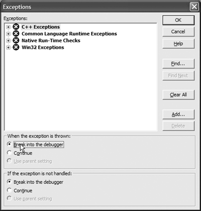
To debug more efficiently, it seems to be a good idea to set the debugger to break on any exception, even if it is handled. In.NET Studio, you do this by choosing the Debug menu and then choosing Exceptions. A window opens, as shown in Figure 6.11.
Figure 6.11. Debug Exceptions
Choose the option to break for handled exceptions. This will help you locate the defect in case a handled exception occurs at the time of the error. Next, run the application in Debug mode (go to the Debug menu and choose Start) and minimize the application. An exception is caught (see Figure 6.12).
Figure 6.12. CustomScrollableControlException
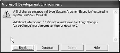
The exception that occurred during execution was thrown in the customScrollableControl's adjustScrollBars() method. In the debugger you can watch the values of the local variables by browsing through the window in the lower-left part of the Visual Studio window. You can see a suspicious value that most likely is the source of the exception in the ScrollingImageArea.Width value. It seems that this value is out of bounds (it is actually negative).
To fix this problem, we must check the width and the height of ScrollingImageArea for valid values before doing any calculation. Therefore, add the following line to perform the calculation only if these values are within the range:
if(ScrollingImageArea.Width >= 0 && ScrollingImageArea.Height >= 0) {***}
Compile the solution, including customScrollableControl and PhotoEditorApplication, and run the same scenario again. The bug is fixedeasy, wasn't it? Now the status of the defect can be changed to "solved" in the Excel spreadsheet, and the changes should be checked in with a comment indicating that the bug was fixed.
The next reported defect that needs some rework is the error message in case the default image cannot be found in the current directory. This fix is also fairly trivial. All that needs to be done is to put the LoadImage call within a try-catch block, and an exception with the meaningful message must be thrown if the load operation failed. The solution could look like Listing 6.11.
Listing 6.11 Load Image Bug Fix
// Load default image and throw exception if not found
string defaultImage =
 PhotoEditorForm.GetApplicationDirectory + @"Hawaii.jpg";
try
{
 LoadImage(defaultImage);
}
catch(Exception e)
{
 Exception b = e;
 throw(new Exception("Check if default image Hawaii.jpg is in the
path!"));
}
Double-check that the fix works, rename the image, and run the scenario that produced the error condition. As you can see, a meaningful error message is produced that the user can use to resolve the problem of the missing image.
Do It YourselfFix the last open defect from the defect spreadsheet. A solution is given in the sample application provided on the accompanying CD. |
Introducing .NET
- Introducing .NET
- The Need for .NET
- The .NET Framework
- The C# Language
- Debugging and the IDE
- References for Further Reading
Introducing Software Engineering
- Introducing Software Engineering
- Introducing Software Engineering Practices
- Choosing a Software Development Model
- Commonly Used Software Development Models
- Conclusion
- References for Further Reading
A .NET Prototype
- Getting Started
- Evaluating .NET for Windows Client Applications
- Our First .NET Application
- Prototyping
- Implementing the SmartNotes Application
- Visual Studio.NET: Platform of Choice
- References for Further Reading
Project Planning
- Project Planning
- The Project Vision and Business Case
- The Initial Use Case Model
- Project Requirements
- Initial Project Planning
- Initial Risk Analysis
- Initial Requirements Analysis and Design
- Conclusion
- References for Further Reading
The Photo Editor Application
- The Photo Editor Application
- The Refined Project Vision and Business Case
- Refined Requirements for Online Photo Shop
- Analysis of the Photo Editor Requirements
- Design of the Photo Editor Application
- The Detailed Project Schedule
- Implementation of the Photo Editor Application
- Unit Tests
- Conclusion
- References for Further Reading
GDI+ Graphics Extensions
- GDI+ Graphics Extensions
- Requirements for the GDI+ Extensions
- Analysis of the GDI+ Extensions Requirements
- Design of the GDI+ Extensions
- Project Management Issues
- GDI+ Programming
- Drawing GDI+ Primitives
- Unit Tests
- Conclusion
- References for Further Reading
Advanced GDI+ Operations
- Advanced GDI+ Operations
- Advanced GDI+ Extensions
- Analysis of the Advanced GDI+ Extensions Requirements
- Design of the Advanced GDI+ Extensions
- Project Management Issues
- Using Pens and Brushes in GDI+
- Implementation of Regions, Pens, and Brushes
- Unit Tests
- Conclusion
Dynamic Loading of Components
- Dynamic Loading of Components
- Requirements for Image Postprocessing Components
- Analysis of the Image Postprocessing Requirements
- Design of the Image-Processing Components Using Late Binding
- Project Management Issues
- Implementing Dynamically Loadable Image Postprocessing Plugins
- Unit Tests
- Conclusion
- References for Further Reading
Accessing System Resources
- Accessing System Resources
- Refining Requirements for 3D Text Display
- Three-Dimensional Rendering Technologies
- Analyzing User Interface Needs
- Using OpenGL.NET
- Adding 3D Text to the Photo Editor Application
- Conclusion: Dont Reinvent the Wheel
- References for Further Reading
Performance Optimization, Multithreading, and Profiling
- Performance Optimization, Multithreading, and Profiling
- Requirements for Performance Optimization
- Analysis of the Editor Optimization Requirement
- Design of the Optimizations
- Project Management Issues
- Multithreading and Optimization Implementation
- Unit Tests
- Conclusion
- References for Further Reading
Building the Web Application with ASP.NET
- Building the Web Application with ASP.NET
- Online Store Requirements
- Analyzing Interfaces and Activities
- Breakdown of the Code Modules
- Implementation of Online Photo Shop
- Conclusion
Security and Database Access
- Security and Database Access
- Secure Checkout
- Integrating Externally Supplied Software
- E-mail, Password, Credit Card: Creating a Customer Profile
- Secure Web Applications
- Database Access with ADO.NET
- Putting It All Together
- No Longer under Construction
- References for Further Reading
Product Release
EAN: 2147483647
Pages: 123
