Implementation of the Photo Editor Application
  |
After all the ground work is set, the implementation can start. To begin the implementation, a project workspace must be set up and added to configuration management. As mentioned in Chapter 4, the configuration management administrator is the person who should set up the directory structure. Based on the directory structure (see Figure 4.3), a solution is created that will contain all the subprojects of the software developed during the course of this book. |
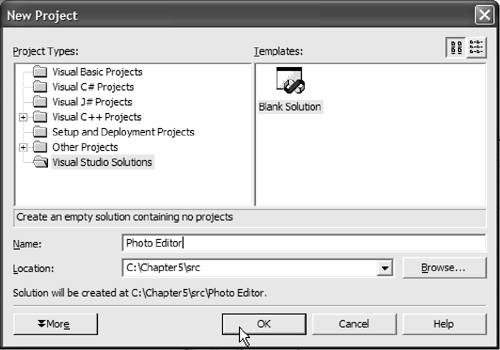
To create an empty Visual Studio solution, open Visual Studio.NET (see Figure 5.8). Then select Visual Studio Solutions and Blank Solution, and name the solution Photo Editor. The solution should be crated in the src directory, so browse to src in your project directory tree and click on the OK button. The Visual Studio solution will be created.
Figure 5.8. Creating an Empty Solution
5.6.1 The Basic Photo Editor Application
Now that we have an empty Visual Studio solution, we can add other projects to it.
Creating a Basic Application
We will develop the GUI and most of the functionality of the photo editor application in C# using Microsoft Visual Studio 2003. The first implementation step is to create a Windows application project; we will then extend it to provide exception handling and image loading, saving, and displaying. The application is created as a project within the Photo Editor solution.
Therefore, with the Photo Editor solution opened in Visual Studio, click on the File menu and then Add Project. Then choose New Project. In the dialog window that appears, choose Visual C# Projects and Windows Application. In the Name field, type Photo Editor Application. Click on OK, and Visual Studio.NET creates a new project within the Photo Editor solution.
The Microsoft wizard in the solution generates three files: App.ico, AssemblyInfo.cs, and Form1.cs. You can explore all three files by double-clicking on the file name in Solution Explorer. Obviously, App.ico is the icon associated with the photo editor application and can be customized. The AssemblyInfo.cs file contains assembly-related information such as version and binding. The version information is updated before all releases (including intermediate releases); binding will be discussed when the product is deployed to the customer in the final release. The more interesting file that was generated is Form1.cs. This file contains the form design and the code for the photo editor application. To see the generated code, go to the Form1.cs [Design] view, choose the form, right-click on the form, and choose View Code.
The top of the file shows various namespaces that are used in the application (similar to the kind of information you see in #include statements in C++). These using statements define shortcuts for the compiler to use in resolving externally defined namespaces. Extern in this case relates to objects that are not defined in the project's namespace. If a call to a method cannot be resolved, the compiler will try to resolve the call by checking the namespaces defined by the using statement.
Listing 5.1 shows the namespaces used by the code generated by Visual Studio.NET. The System namespace contains the basic .NET Framework types, classes, and second-level namespaces. In contrast, the second- and third-level namespaces contain types, classes, and methods to support various kinds of development, such as GUI, the runtime infrastructure, .NET security, component model, and Web services development, to name only a few categories.
In the photo editor application, you can see that several second-level namespaces are automatically included. The System.Drawing namespace, for example, provides rich two-dimensional graphics functionality and access to Microsoft's GDI+ functionalities. (GDI+ is explained in more detail in Chapter 6.) For the remainder of this chapter, we use GDI+ to provide a memory location where the image can be stored and then displayed; in addition, we use some GDI+ methods for image operations.
The System.Collections namespace holds collections of objects, such as lists, queues, arrays, hash tables, and dictionaries. In addition, System.ComponentModel implements components, including licensing and design-time adaptations. For a rich set of Windows-based user interface features, we also include the System.Windows.Forms namespace. Last but not least, the System.Data namespace lets us access and manage data and data sources. For more information on the namespaces provided by the .NET Framework, please refer to the MSDN help.
Listing 5.1 Using Externally Defined Namespaces
using System;
using System.Drawing;
using System.Collections;
using System.ComponentModel;
using System.Windows.Forms;
using System.Data;
The next section in the source file defines the namespace for the application, the basic application classes, and the methods. Listing 5.2 shows the source code that is created.
Listing 5.2 The Photo Editor Namespace
namespace Photo_Editor_Application
{
 ///
/// Summary description for Form1. ///
public class Form1 : System.Windows.Forms.Form { ///
/// Required designer variable. ///
private System.ComponentModel.Container components = null; public Form1() { // // Required for Windows Form Designer support // InitializeComponent(); // // TODO: Add any constructor code after // InitializeComponent call // } ///
/// Clean up any resources being used. ///
protected override void Dispose( bool disposing ) { if( disposing ) { if (components != null) { components.Dispose(); } } base.Dispose( disposing ); } #region Windows Form Designer generated code ///
/// Required method for Designer support - do not modify /// the contents of this method with the code editor. ///
private void InitializeComponent() { this.components = new System.ComponentModel.Container(); this.Size = new System.Drawing.Size(300,300); this.Text = "Form1"; } #endregion ///
/// The main entry point for the application. ///
[STAThread] static void Main() { Application.Run(new Form1()); } } }
First, we define the namespace Photo_Editor_Application. This is the namespace that refers to all the classes, types, and methods defined by the photo editor application. Next, class Form1 is defined as public and is derived from System.Windows.Forms.Form. This class implements the application window, which is called Form1, at least for now. The first property defined in the Form1 class is declared private, named components, and defined to be of type System.ComponentModel.Container. The value is set to null to indicate that no initialization has yet been done.
Next, we define the public constructor of Form1. The implementation first calls the InitializeComponent method created by Visual Studio Designer. This method takes care of the necessary Windows Forms property initialization. You should not modify the Designer-generated part of the code directly, but you can do so through the properties window of Form1.cs[Design].
After the constructor, the dispose method is defined. The Dispose() method is used to free system resources if they are no longer needed. Even though Visual Studio.NET provides garbage collection for allocated memory, we must explicitly delete other system resources at the time they are no longer used. Resources other than memory should be disposed of in order to keep the resource footprint (memory, disk space, handles, and so on) as small as possible. In the example, the components are disposed of if they were allocated (not null); to do this, we call the base class's dispose method.
Next comes a block specified with the #region and #endregion keywords. This block allows the developer to write code that can be expanded or collapsed within the Visual Studio.NET development environment. In the example, the #region-#endregion block encloses the initializing method of the Designer-generated form, as described earlier, and this code should not be altered. You can collapse the code by pressing the "-" symbol, or expand it by selecting the "+" symbol next to the keyword. Usually the IDE provides the expand-collapse feature automatically for multiline comments, class definitions, and method definitions, to name only a few. The developer can define additional collapsible and expandable regions. The region statements can be nested. In that case, the #endregion matches the last defined #region statement that has not yet been matched.
The final part of the code defines the static main entry point for the application. The application is defined to be running in a single-threaded apartment (STA), and the main entry point then creates and runs an instance of Form1.
The next step is to change the output directory of the compiler to the bin and bind directories. As mentioned in Chapter 4, the bin directory holds all assemblies necessary to run the photo editor application in release configuration, whereas the bind directory holds the same files but compiled in debug configuration. To change the output directory, choose the project in the Solution Explorer window and then choose Project | Properties | Configuration Properties | Build | Output Path; change the path to the bin directory (for release configuration) and bind (for debug configuration).
Before you check the source files into the configuration management system, you need to make some additional changes. For easier readability, maintainability, and understanding, it is worthwhile to rename some of the generated source files to more meaningful names. We do this before checkin because renaming files already under configuration management is not always easy.
Therefore, we change the name of the application source file from Form1.cs to PhotoEditor.cs. We do this by right-clicking on the file name Form1.cs in the Solution Explorer window and then going to the Properties window below Solution Explorer and changing the name in the File Name field. After the name is changed, we adjust other properties of PhotoEditor.cs[Design]. We select the corresponding tab and click on the form. We change the Text field to Photo Editor Application, and change the (Name) field to PhotoEditorForm.
To finish the cosmetics, click on the photo editor form and choose View Code (by right-clicking on the form and choosing the option). Change Form1()to PhotoEditorForm(), as shown in Listing 5.3.
Listing 5.3 PhotoEditorForm Creation
static void Main()
 {
 Application.Run(new PhotoEditorForm());
 }
Before you put the project into the source control system, make sure that it compiles. Go to the Build menu in Visual Studio, and choose Build Project (or use the shortcut by pressing Ctrl+Shift+B). If there are any errors during compilation, they will be shown in the output window below the main window. Double-clicking on the error message will open the correct source file to the approximate position of the error.
5.6.2 Using Version Control
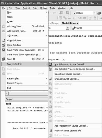
The Visual Source Safe source control system integrates smoothly with the Visual Studio.NET IDE. There are several ways to communicate with it. The following assumes that Visual Source Safe is installed on the computer (even though working with other source control systems may be quite similar). The first possibility is to use the File | Source Control menu, which is shown in Figure 5.9.
Figure 5.9. Visual Source Safe Menu
Another method of communicating with the version control system is to configure a toolbar menu. Go to View | Toolbars | Source Control. You'll get a toolbar (shown in Figure 5.10) that can be added to the toolbar section of Visual Studio.
Figure 5.10. Visual Source Safe Toolbar

There is yet another way to check the project into the source control system. Right-click on the project in Solution Explorer and choose Add Solution to Source Control.
In our sample project, we add the project to the source control system by using the latter method. The system asks for the login credentials before the Visual Source Safe dialog appears, as shown in Figure 5.11.
Figure 5.11. Source Safe Dialog
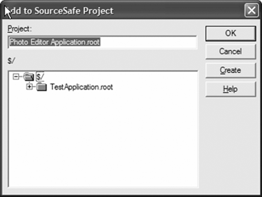
Now we choose the name and location for storing the project in the source control system. For this project, we take the defaults suggested by Source Safe (location root and project name Photo Editor Application), so we just click OK. The system asks whether it should create the new project, and again we simply confirm by clicking OK. As you can see, all files in Visual Studio Explorer now have a little lock symbol next to them; this means that the files are read-only (checked in) under source control.
Before a developer can make any change to the files, he or she must check out the files to get write permissions to them. Checkout means that the developer will work on a private copy of the file. The developer works on the private copy, keeping it checked out, until the change is (partially) complete and compiled; then the file must be checked in. At checkin time the private file is added to the version control as the newest version of the file; the file becomes read-only again, and all developers on the project can see the the new file. Changes can be made only by the developer who currently has the file checked out. It is also possible to undo a checkout, thereby reverting to the original version of the file and discarding the changes made. (Nobody will ever know about the changes. Usually it is a good practice to save the changes under a different file name in a private file before undoing a checkout and losing the changes.)
Visual Source Safe provides many other useful tools, such as forcing the system to get the latest version of all files and comparing the changes in different file versions. Most of the functionality is self-explanatory. For more detailed information, you can consult the Visual Source Safe help files.
5.6.3 The Exception-Handling Application Block
The first "real" functionality that we will implement is exception management. As discussed earlier, exception handling in the photo editor application is based on the Microsoft Exception Management Application Block. You can download this application block from http://msdn.microsoft.com/downloads/list/bda.asp. You install the files by following the instructions on the screen. Alternatively, you can simply take the installed source files from the sample solutions provided on the CD under Chapter5srcException Management Application Block.
Next, go to the installation directory of the application block and open the Code directory with a double-click in Windows Explorer. There are two versions of the exception management block installed. The first version is written in Visual Basic (VB), and the second version is implemented using C# (CS). We are interested in the C# version, so open the CS subdirectory and double-click on the Exception Management Application Block (CS) solution. This will open a solution with two projects: Microsoft.ApplicationBlocks.ExceptionManagement.Interfaces and Microsoft.ApplicationBlocks.ExceptionManagement in Visual Studio.NET.
To use the application blocks, we need to build both projects. But before we actually build them, we first set the output path of both projects to the bin and bind directories of the photo editor project. To set the output path of the compiler-generated assemblies, right-click on the project in Solution Explorer. Choose Properties and go to Configuration Properties | Build | Outputs | Output Path. Make sure that the configuration of the selected project is set to Release. Choose the table entry for Output Path, and navigate to the photo editor bin directory. Then choose Apply. If the project is now being built in release mode, then the assemblies will be saved in the bin directory of the photo editor project. Do the same for the Debug configuration of both projects by specifying the bind directory as the output path.
After that, build the solution by going to the Build menu and choosing Build Solution (or by using one of the previously mentioned shortcuts). Then change the build configuration in the Active Solution Configuration list box and build this configuration as well. (Either use the menu bar or go to the Build menu, choose Configuration Management, and choose Debug or Release depending on the configuration you just built.) You can check the success of the build by checking the bin and bind directories for the created assemblies. You should be able to see ExceptionManagement.dll and ExceptionManagement.Interfaces.dll in both directories.
After the assemblies are built, we add references to Microsoft. ApplicationBlock.ExceptionManagement.dll and Microsoft.ApplicationBlock.ExceptionManagement.Interfaces.dll to the photo editor application project. To do this, you choose the menu item Project | Add Reference. Alternatively, you can right-click on the Photo Editor Application project in Solution Explorer and choose Add Reference. A dialog box opens. Choose Browse and navigate to the bin directory, where the assemblies for the Microsoft Exception Management Application Block reside. (By referencing the assemblies in the bin directory we are referencing the assembly that was built in release configuration. Alternatively, we could reference the debug version. But we do not intend to debug the application block, so we reference the release version.) Select the two assemblies and press OK.
Another Source Safe dialog box opens that lets you choose whether to check out the project file for editing. Because we will add references to the project, we need to update the file Photo Editor Application.csproj to reflect these changes. Click OK to check out the file. You can add a comment to the history of the file before checkout. The rule for the photo editor application is to add checkin comments that explain the changes made. In Solution Explorer, you can now see the newly added references in the Reference section. In addition to the references, we need to add a using statement to the photo editor application to indicate the use of the externally defined functionality. Again, the source control will ask whether the PhotoEditor.cs file should be checked out; we acknowledge this by choosing checkout. The added code can be seen in Listing 5.4.
Listing 5.4 Using the Microsoft Exception Management Application Block
using System;
using System.Drawing;
using System.Collections;
using System.ComponentModel;
using System.Windows.Forms;
using System.Data;

using Microsoft.ApplicationBlocks.ExceptionManagement;
Now that the photo editor application is aware of the exception management class, the classes and methods provided by it can be used. The provided default publisher logs the exceptions to the event log. This is not the behavior we intend for the photo editor application, so we must create a custom publisher. Before continuing, make sure that all changes are saved and the project compiles.
5.6.4 Customized Exception Handling
You create custom publishers by implementing the IExceptionPublisherInterface, which is defined in the Microsoft.ApplicationBlocks.ExceptionManagement.Interfaces.dll assembly. To keep the exception publisher code separate from the application code, add a new file to the photo editor application project. To add a file, right-click on Photo Editor Application in Solution Explorer and choose Add | New Item (see Figure 5.12).
Figure 5.12. Adding the ExceptionPublisher.cs File
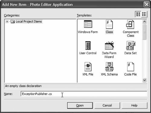
Select Class in the dialog box and type the name ExceptionPublisher.cs for the file. Click on Open; this will open a new file with the added name selected. The file contains the using system statement and shows that it is part of the Photo_Editor_Application namespace. In addition, a class definition for class ExceptionPublisher and its constructor are provided. The new file is automatically added to Visual Source Safe and is marked as checked out (marked with a red check mark next to the file name in Solution Explorer).
Next, we add the using statement for the Exception Management Application Block in the same way as was shown for the PhotoEditor.cs file. In addition, we add the using System.Windows.Forms statement for Windows Forms support. Then we must derive the ExceptionPublisher class from IExceptionPublisher. Therefore, we change the class definition to public class ExceptionPublisher : IExceptionPublisher. When we're finished typing, a stub for the IExceptionPublisher interface can be added automatically by pressing the Tab key (otherwise, we simply type it in as shown in Listing 5.5). The finished Publish method is shown in Listing 5.5. It also shows the three arguments the Publish method takes.
Listing 5.5 Publish Interface Implementation with XML Documentation
#region IExceptionPublisher Members
 ///
/// Custom Publisher, displays error message on screen. ///
///Exception, containing meaningful /// error message ///Provides additional info /// about the exception ///Describes the config /// settings defined in the app.config file public void Publish(Exception exception, System.Collections.Specialized.NameValueCollection additionalInfo, System.Collections.Specialized.NameValueCollection configSettings) { // TODO: Add ExceptionPublisher.Publish implementation string caption = "Photo Editor"; DialogResult result; // Displays the MessageBox. result = MessageBox.Show( exception.Message, caption, MessageBoxButtons.OK, MessageBoxIcon.Error, MessageBoxDefaultButton.Button1, MessageBoxOptions.RightAlign); } #endregion
To generate nicely formatted documentation from the source code, we add the XML description as specified in Chapter 4. You generate the documentation from the code by selecting the Tools menu in Visual Studio and choosing Build Comment Web Pages. Then select the radio button Build for the entire solution, and specify Save Web Pages in the doc directory of your project (in the sample solution this is Chapter5doc) and click OK. The documentation is generated, and an Explorer window opens that shows the generated solution's comment Web pages. Click on the namespace to navigate down the program documentation tree and open the next lower level.
According to the requirements, exceptions are to be published via a message box displaying meaningful error messages. This leads us to the next implementation step, which is to implement the message box. The easiest way to display a message box is to use a Windows message box. The System.Windows.Forms namespace, which we have already added to the using statement section, provides the functionality to display a simple message box. Several overloaded types of message boxes are supported by the .NET Framework. The one that we use here is as follows:
MessageBox.Show( text, caption, buttons, icon, defaultButton, options);
The message box used in this example takes six parameters, which are explained in Table 5.3. For other variants of the message box, please refer to the MSDN help.
To use the customized exception publisher, the final step is to provide a configuration file. The configuration file makes the exception application block aware of the custom publisher that is to be used (this is similar to registration of the custom publisher). To add an application configuration file, right-click on Photo Editor Application in Solution Explorer and choose Add | New item. In the dialog window that opens, choose Application Configuration File and press Open. A configuration file is added to the solution. Change the configuration file to correspond with Listing 5.6.
|
Parameter Type |
Name |
Description |
|---|---|---|
|
string |
text |
Text to be displayed in the dialog box, which is the error message in this case. |
|
string |
caption |
Text displayed in message box title. |
|
MessageBoxButtons |
buttons |
The buttons to be displayed in the dialog window. For the error message dialog window, this is just the OK button. |
|
MessageBoxIcon |
icon |
This defines the icon displayed in the message box. For an error message the displayed icon is a red circle with a white x inside. |
|
MessageBoxDefaultButton |
defaultButton |
The default button. In this case there is only one button displayed, so button1 is the only and default button. |
|
MessageBoxOptions |
options |
The text in the message box is right-aligned. |
Listing 5.6 App.config: The Application Configuration File
As you can see, the configuration file provides information regarding the customized publisher. The configuration entry defines the name of the assembly in which the customized exception publisher is defined. The type="..." defines the namespace and the method name for the publisher, whereas the file name specifies the log file name to which exceptions are logged in case the defined publisher cannot be found. If an exception occurs, the Exception Manager Application Block will now know about the customized exception publisher and will call the specified exception publisher.
Make sure that the project compiles, and check in all the changes by choosing the Pending Checkins tab below the main window. When you check in a file, usually it is good practice to provide a meaningful comment. The comment for the checkin at this point might read, "Added custom exception handling using the Microsoft Exception Manager Application Block. Exceptions are published in a window on the screen." After typing the comment, choose Check In. A dialog opens if the files really should be checked in. Click on OK, and all the changes are available in the repository, visible to everybody on the team.
Now the exceptions can be used in the photo editor application. All code that could possibly throw an exception should be put in a try-catch-finally block:
try
{
 // Some code here
 *
 *
 *
 //in case a problem is found, an exception can be thrown
 throw(new Exception("Some information here"));
}
catch(Exception exception)
{
 ExceptionManager.Publish(exception);
}
finally
{
 // Code here will always be executed, whether
 //there was an exception thrown or not.
}
The example also shows how an exception is thrown within a method and how it provides additional information as a string. C# defines a finally block in addition to the catch block. The finally statement can be put after the catch block. The code in the block is always executed, either after the catch is finished or if the try block is finished.
5.6.5 Loading an Image
After the implementation of the custom exception publisher is completed, we start to implement the basic functionality of the photo editor application: loading an image. The .NET Framework provides standard file dialogs for loading and for saving files. The standard implementation of the Windows File dialog provides a window that enables the user to browse, select, name, and filter files. Because this functionality corresponds to what was specified in the requirements, the photo editor application uses the .NET-provided standard file dialogs. To start the implementation, we click on the PhotoEditor.cs[Design] tab and choose the Photo Editor Application form.
Next, we set the WindowState in the Layout section of the properties to Maximized. This sets the main window to maximized when the application is started. Compile and run the solution to see the described effect. After that, we add the File menu to the form. Go to the Toolbox, choose MainMenu, and drop the main menu on the form. (The Toolbox is usually shown on the left border of the screen. If the Toolbox is not visible, go to the View menu and select Toolbox, or simply press Ctrl+Alt+X.)
This action adds an empty menu bar to the form. Rename the menu to MainMenu in the properties window. To do that, first make sure that mainMenu1 is selected. Then go to the menu bar and type &File where the text Type Here is shown, and press Return. This will add a top-level menu item called File. The prefix & indicates that the shortcut to access the menu is the Alt+F key combination. After that, change the name of the menu in the properties section to FileMenu. Add a submenu item for the Open File menu item, as shown in Figure 5.13.
Figure 5.13. Creating the File Menu
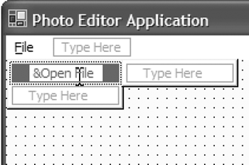
Change the name in the property section of the submenu item to OpenFile. To add functionality to the menu, double-click on the OpenFile menu item. The PhotoEditor.cs source file will be opened, and the Designer adds a stub implementation of the OpenFile_Click event handler. The Designer also adds code to make the system aware of the function that handles the event of the specified type. Listing 5.7 shows the generated code that initializes some properties of the OpenFile menu item and registers the event handler method.
Listing 5.7 Adding an Event Handler Method
//
// OpenFile
//
this.OpenFile.Index = 0;
this.OpenFile.Text = "&Open File";
this.OpenFile.Click +=
 new System.EventHandler(this.OpenFile_Click);
To load an image, we must add a new field to the PhotoEditorForm class. To add new fields to a class using the Visual Studio class wizard, click on the Class View tab, right-click on the class, and select Add | Add Field. In the dialog window that opens, you specify the properties of the field. To create the field, specify private as the field access, OpenFileDialog as the field type, and loadFileDialog as the field name. Alternatively, simply add the field to the class manually by adding the following line to the class:
private OpenFileDialog loadFileDialog;
At initialization time the loadFileDialog object is created and memory is allocated for it. To do that, add the following line to the constructor PhotoEditorForm():
//
// TODO: Add any constructor code after InitializeComponent call
//
loadFileDialog = new OpenFileDialog();
Finally, you implement the loadFileDialog in the OpenFile_Click( ) method, as shown in Listing 5.8.
Listing 5.8 The File Open Dialog
[View full width]
loadFileDialog.Filter = " jpg files (*.jpg)|*.jpg| gif files (*.gif)|*.gif| bmp files (*.bmp)|*.bmp| All files (*.*)|*.*"; loadFileDialog.ShowDialog(); loadedImage = new Bitmap(loadFileDialog.FileName); this.Invalidate();
First, you define a file filter whose task it is to show only files of certain file types within the chosen directory. Files of other types (or file extensions) than the ones specified are not shown in the dialog window. This filter operation is provided by the OpenFileDialog class, which defines a Filter property that can be used to filter files by their types. In our example, the files that are of interest are image files of various types. The supported types are images with the extensions .jpg, .gif, and .bmp. In addition, we want to show all files in a directory when the file name is specified as "*.*".
After the file filter is defined, the standard Windows File Open dialog box is shown by calling its method ShowDialog(). A file dialog window appears that enables the user to browse directories and select a file. After the user has selected a file and clicked the Open button, the selected file name can be extracted from the file dialog object using the FileName() method. The .NET Framework provides converters to load and save the most commonly used image types. For all image types supported by the photo editor application, converters are provided by the .NET Framework. Thus, we need no customized functionality to work with the various image types. For supported formats and available conversion types, refer to the MSDN help pages.
To work with the loaded image, we must create a Bitmap object and allocate memory for it. We do this by calling the Bitmap constructor with the file name as a parameter and assigning the image to loadedImage. The loaded image field is not yet defined. Therefore, we add the following line to the PhotoEditorForm class:
private Bitmap loadedImage;
As you can see, the application uses a bitmap type image to work with rather than using the type under which the image was actually stored. It is at this point that Windows' automatic image type conversion saves a lot of work. To show the loaded image on the screen, we next force a refresh, invalidating the current Windows form. Invalidating the window (or parts of it) sends a paint message to the appropriate window: either the control or the child window. As a result, the part of the screen that has been invalidated is redrawn using the Paint event handler method.
Before an image is loaded by the user, a default image will be shown. The image provided is Hawaii.jpg and should be located in the bin and bind directories if the debug version is run. To initialize the bitmap, simply add a line to the PhotoEditorForm constructor:
loadedImage = new Bitmap(@"Hawaii.JPG");
The last step tells Windows that custom drawing is needed for this form. To do that, you overridee the OnPaint method. To implement that method, you can either add the event handler manually by typing or create a stub implementation using Visual Studio.NET. To automatically create a stub, click on PhotoEditorForm in the PhotoEditor.cs[Design] view, and go to the properties section. If you press the yellow lightning symbol underneath the Solution Explorer window, you will see a tab with all the events listed. Double-click on the Paint event. This will create a stub implementation. Then implement the code as shown in Listing 5.9. The implementation reveals that the Graphics class is used to save the image in memory, which is then displayed on the screen.
Listing 5.9 Overriding the OnPaint Method
///
/// Custom paint method. ///
protected override void OnPaint(PaintEventArgs e) { try { Graphics deviceContext = e.Graphics; deviceContext.DrawImage(loadedImage, 0,0); } catch(Exception exception) { ExceptionManager.Publish(exception); } }
Compile and run the project. The default image will be displayed as the background image when the application is first started. To display another image, go to File | Open File. The Open File dialog will be shown, and you can browse the file system. Select an image, and it will be displayed in the application window.
5.6.6 Scrolling and Basic Image Operations
Loading a large image or resizing the application window shows a drawback of the current implementation: If the image is larger than the application window, only part of the image is shown. A better behavior for a Windows application is to show scrollbars if the image is larger than the window. Because the photo editor should be a well-behaved application, we need to add scrolling.
Depending on the needs of an application, there are several ways to add scrolling capabilities. Table 5.4 gives a short overview of the various techniques, describing how they are implemented and when they should be used.
|
Scrolling Technique |
Description |
When to Use |
|---|---|---|
|
Using a scrollable control |
These are controls directly or indirectly derived from System.Windows.Forms.Scrollable Control. They support scrolling, provided by the .NET Framework. For example, TextBox, ListBox, and the Form class itself support scrolling. |
Use this scrolling technique when there is no need to draw in the control with GDI+, the control is composed of this custom control and other controls, and the virtual space is limited. |
|
Placing a non-scrollable control in the Panel control |
An instance of the Picture control is created, and the Picture control is placed in a Panel control. You then create a new image in which you can draw (possibly using GDI+). Then the background image of the custom control is set to the new image (including the graphics you were drawing). |
Use this technique if you want to be able to draw into the image with GDI+, the custom control is not composed of other custom controls, and the virtual space is limited. |
|
Using the UserControl class with child controls |
Derive the control from the UserControl class, build an image, draw into the image, and set the BackgroundImage property of this control to the build image. |
Use this technique if you need to draw into the limited virtual space (possibly using GDI+) and you're using child controls (constituent controls) of the custom controls. |
|
Smooth scrolling |
Create a custom control that derives from the User control, add vertical and horizontal scrollbars as child (constituent) controls, and write a Paint event handler that draws the image incrementally according to the scrollbar's position. In addition, the background color of the part of the control that is not covered by the image can be drawn in a defined background color. |
This technique creates a polished and professional appearance. The image scrolls smoothly to the desired position rather than jumping to the new position, as it does when you use the build in scrolling. |
For the photo editor application, we choose smooth scrolling to give the application a professional and polished appearance. This also lets us support graphics drawn with GDI+, something that is necessary for the supported graphics and text overlays described in the later chapters.
5.6.7 Refactoring of the Current Code
Before we begin implementing scrolling, we must do some refactoring of the existing project code. Even though the implemented code works and shows a quick result, we need to adapt it to meet the approved design and to give us the flexibility to accommodate the implementation of functional requirements to be added in later iterations.
According to the design specification, the Picture class should be split out as an independent class. This makes perfect sense, because the image and all its properties should be self-contained and separate from the GUI code. To add a new class, go to Solution Explorer, right-click on Photo Editor Application, and select Add | Add Class. Type Picture for the name of the class to be created, and press Open. After that, add a reference to the System.Drawing namespace to the new file by adding the following statement:
using System.Drawing;
The reference is needed to access the type Bitmap, which is used to store the image.
To implement the functionality to load an image, to the Picture class we add a public method named LoadImage with the return type void and no parameters. Switch to the class view and right-click on the Picture class and Add | Add Method. Or simply add the following line:
public void LoadImage() {...}
We also add a field for storing the image data. Add the following line to the Picture class:
private Bitmap loadedImage;
In C#, properties (also called accessors) are used to access private field data. To add the property, right-click on the Picture class (in the Class View tab of Solution Explorer) and select Add | Property. This will display a dialog box as shown in Figure 5.14.
Figure 5.14. Adding the loadedImage Property
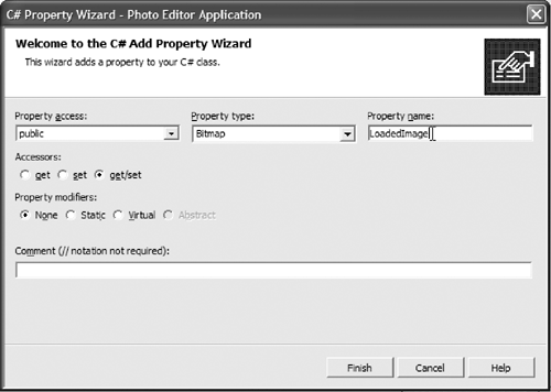
Enter the data as it is shown in Figure 5.14, and press Finish. The property functionality with public accessor methods is generated automatically and is added to the class. To actually return the loaded image when the get method is called, change the return value from null to loadedImage. For now, the set part of the property is not used. In theory you could set the image by assigning the loaded image to the provided value:
loadedImage = value;
The next step is to add to the PhotoEditorForm class a public field that is of type Picture and is named PictureObject. This field will hold a reference to an instance of a Picture class object. The PictureObject then needs to be initialized with an allocated Picture class instance. This is done in the constructor of the PhotoEditorForm. Add the following line to the PhotoEditorForm() constructor:
PictureObject = new Picture();
The previously added lines in the PhototEditorForm constructor need to be deleted because the OpenFileDialog and the loadedImage functionalities are now responsibilities of the Picture class. Therefore, we delete the following lines in the PhotoEditorForm constructor:
loadFileDialog = new OpenFileDialog();
loadedImage = new Bitmap(@"Hawaii.JPG");
Next, in the OnPaint event handler method, the PictureObject.LoadedImage should be painted instead of the default image. We implement this by changing the DrawImage call in the OnPaint event handler to look like this:
deviceContext.DrawImage(PictureObject.LoadedImage, 0,0);
To load an image via the Picture class, we change the OpenFile_Click event handler method to call the LoadImage method of the Picture class by adding this line:
PictureObject.LoadImage();
From the same method, we move the code for opening the file dialog window to the LoadImage method of the Picture class. Basically this is all the code except the following line:
this.Invalidate();
Now add the following statement to the Picture.cs file:
using System.Windows.Forms;
Then add a field for OpenFileDialog to the Picture class by adding this line:
private OpenFileDialog loadFileDialog;
Now it is time to load the default image at startup and to create an instance of OpenFileDialog in the Picture class constructor. Therefore, we add the following two lines to the Picture class constructor:
string defaultImage =
 PhotoEditorForm.GetApplicationDirectory + @"Hawaii.jpg";
loadFileDialog = new OpenFileDialog();
You can see in this code that we have introduced an additional method to the PhotoEditorForm with the name GetApplicationDirectory. When you call this method, the path to the directory in which the photo editor application was started is returned. This is necessary in case a user starts the application from a different directory via the command line (in that case, if we would search the current directory for the default image we would search in the directory the command line shows and not the directory where the application was started). To make this work, add the following lines to the PhotoEditorForm class:
// Get the directory in which the application was started.
// Note: In C# you can initialize a member at definition time.
// The compiler will take care of initializing the member in the
// constructor of the corresponding class.
private static string applicationDirectory = Application.StartupPath;
///
/// Accessor to the Application directory. ///
public static string GetApplicationDirectory { get { return applicationDirectory; } }
To complete the refactoring, we delete the fields for loadFileDialog and loadedImage from the PhotoEditorForm class. Check the implementation by compiling and running the application.
Even though the changes made in this section are not very large, they show that refactoring can take a substantial amount of time. We think that this time is well invested if developers consistently try to improve the existing code. This does not mean that the implementation should necessarily become more complex by refactoring, but if developers identify possibilities to improve existing code with regard to maintainability and extensibility (if needed), the refactoring should be implemented (in fact, refactoring should simplify the code by making it easier for other developers to read and understand). We also strongly recommend that you do refactoring in very small steps. Refactoring can be a powerful tool if done consistently over the life cycle of a project. On the other hand, refactoring can become a nightmare if it is not done consistently throughout the whole life cycle of the project and if it is not done in small chunks with thorough testing in place.
5.6.8 Creating a Custom Control for Smooth Scrolling
Even though Visual Studio provides a wide variety of controls and wizards, sometimes it is necessary to develop controls with different, customized behavior. For the scrolling in this project, we want to provide smooth scrolling, something that the Visual Studio controls do not provide. Therefore, we'll develop a custom control. Before we start, it's a good idea to check whether a control that satisfies the needs of the project has already been developed and is available on the Internet.
As mentioned earlier, we want to implement the smooth scrolling control to give our application a professional feel when users scroll an image. The advantage of developing a custom control for this is that we can use the control in other applications if needed. Another advantage is certainly that implementation of a custom control is a common task in application development, and we want to show how to develop and use a custom control to extend the features provided by Visual Studio.
For the implementation details of CustomScrollableControl, please refer to the sample solution on the CD. The project can be found in the Chapter5srcPhoto Editor directory. Instead of showing all the implementation details here, we explain the functionalities implemented and the necessary properties without the implementation details. You can implement the custom control based on the description of the functionality, or simply read through the text while checking the source code for the implementation details. If you try to implement the functionality, the Web comment report, which is available in the doc directory, might be helpful. It shows all members of the CustomScrollableControl class along with comments explaining the functionality.
To create custom controls, add a new C# project to the photo editor solution. The type of the project is a Windows control library, and the name of the control is CustomScrollableControl. After the project and its files are generated, change the name of the generated file and the class name from UserControl1 to CustomScrollableControl and change the output directories to bin and bind.
5.6.9 Implementation of CustomScrollableControl
All fields are defined as private, and accessor methods are provided for fields that need to be accessed by other classes.
The Image scrollingImage field is used to store the image that is displayed in the control. The get property for this field returns the image; the set method sets the scrollable image and calls a method to adjust the scrollbars.
Another field needed is a point that specifies the viewport coordinates. Point viewportCoords represents the coordinates of the image relative to the control. The viewport defines the coordinates of the image relative to the window. If the image is not scrolled, the pixel at position (0/0) of the picture is shown at position (0/0) of the control. If the image is scrolled by 100 pixels in y direction, the picture position (0/100) is shown at the (0/0) position of the custom control.
Rectangle ScrollingImageArea is a convenience accessor that returns a rectangle whose size is measured from the origin of the control to the x-coordinate of the vertical scrollbar and the y-coordinate of the horizontal scrollbar. This is equivalent to the area of the control that is available for drawing the image and is defined as the client area minus the area that is taken by the scrollbars.
The base functionality of this control is to scroll through an image smoothly. Therefore, we add vertical and horizontal scrollbars to the CustomScrollableControl form. The scrollbars can be dragged from the toolbox onto the form. The scrollbars are positioned and docked in the form to the right and the bottom of the form, as in other Windows applications.
private void drawImage is a helper method that is used to calculate and draw the correct portion of the bitmap in the custom control. This method is called directly by the scrollbars whenever a change is detected. The method clips the region of the image to the area of the image that is visible in the control and draws the image. To clip the region, we use a Rectangle method that is defined in the Windows.System.Drawing namespace.
We customize the Paint event handler using private void CustomScrollableControl_Paint so that we can repaint parts or the entire image (in case, for example, the image is restored after the control was minimized). The GDI+ drawing surface, provided as a parameter to PaintEventArgs, is stored in a local variable called graphics. Then a solidBrush is created to fill the client area with a solid color. Next, we check whether the scrollingImage exists. If it does not, then there is no image and the complete client area is filled by the solid brush.
After that, a local variable of type Rectangle is created. The rectangle to the right of the image and left of the scrollbar is calculated and stored in the local variable rect. If the calculated rectangle is not empty, this area will be filled with the solid brush. After that, we do the same thing for the area below the image and above the horizontal scrollbar. Then the small rectangle in the lower-right corner is calculated and filled with the solid brush.
The private void adjustScrollBars method dimensions and sets certain properties for the scrollbars. This method does not take any parameters. A constant field is defined that is used to calculate the number of incremental steps for each scroll request. Then we check whether an image exists. If it does, the minimum and maximum values of the scrollbars are set to 0 and the width or height of the image. In addition, we define the behavior of small and large changes to the scrollbars. The actual values of the scrollbars are set to the corresponding value of the viewport (meaning the coordinates of the upper-left corner in the actual image).
The private void scroll method is the heart of the custom scrolling functionality. This is the code that actually does the smooth scrolling. This method handles the scrolling from the given previous position to the current position of the scrollbars. To achieve a smooth scrolling effect, the viewport is incrementally changed until it is in the new end position. In between the incremental steps, the method is sleeping for a short time to simulate the effect of a sliding image. Therefore, two constants are defined. The first constant is used for the time period during which the control sleeps before displaying the next image position relative to the viewport, and the second is a divisor for the difference calculation of the previous and the current position of the scrollbar.
We also create a local variable that holds the drawing context; this variable is checked to see whether the previous value of the scrollbar is the same as the current value. If it is not, we must apply horizontal scrolling. A Boolean local variable indicates that the direction the scrollbar was moved, and the defined integer divides the absolute change that was made into the smaller, incremental steps. The incremental steps are then checked to see whether they are smaller than 1. If they are, then the value is set to 1 for scrolling up, or to 1 for scrolling down. Following that, the loop in which the incremental scrolling over the image is executed.
Then some checks are added to make sure that scrolling is stopped if the image is shown according to the scrollbar position and that the stepping did not go too far (if it did, the values are set to the final position). Before the image is drawn at its new position (with respect to the control), the control sleeps for a specified amount of time. Then the image is drawn, and the next image position is calculated and displayed. This continues until the image is shown in its final position, in which case a break statement is executed what makes the program jump out of the while loop.
private void hScrollBar_Scroll and private void vScrollBar_Scroll are the event handlers for the scrollbars. The Scroll event is triggered whenever the user clicks on the scrollbar and changes its position. The parameters that are passed to the event handler methods are references to the sender's object and ScrollEventArgs. The ScrollEventArgs object provides information on the scroll type. If the user clicks on the small arrows of the scrollbar, either a ScrollEventType.SmallDecrement or a ScrollEventType.SmallIncrement is provided. If the user clicks inside the scrollbar or drags the scrollbar, a ScrollEventType.LargeDecrement or ScrollEventType.LargeIncrement type is provided. The event handlers for the scrollbars usually contain a switch statement, depending on the scroll type. In the case of customScrollableControl, the event handler stores the previous position of the viewport in a local variable before it assigns the current position to the viewport. Then the scrolling method is called with the previous position and the new position.
private void CustomScrollableControl_Resize implements the event handler for the resize event. The resize event is triggered whenever the control window is resized. In that case, the scrollbar position must be recalculated and the viewport may have to be updated. The implementation checks to see whether there is an image, and, if there is, the new viewportCoords are calculated. The Math.Min method is used to return the value of the smaller number that was provided. The Math.Max method is used to return the maximum value of the provided parameters.
Build the custom control from the sample solution so that it can be used in Visual Studio.NET.
5.6.10 Configuring the Custom Control for Use in Visual Studio.NET
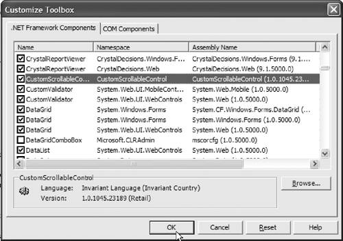
It's easy to configure Visual Studio.NET to use the custom control. Just go to the Tools menu. Choose Add/Remove Toolbox Items, and browse to the directory in which the control was built (navigate to the bind directory if the debug version is used; otherwise, go to the bin directory, assuming we set the output path correctly) and choose the control, as shown in Figure 5.15. The control is then shown in the Toolbox. Like any other control, it can be used by dragging it from the Toolbox onto the form.
Figure 5.15. Adding a Custom Control to the Toolbox
To implement the custom scrolling in the photo editor application, add the control to the form PhotoEditorForm[Design]. Position it as shown in the requirements and dock it to the top, left, and right of the form (by using the Dock property) and rename it customScrollableControl. Then double-click on the new control to create the Load event handler.
The next step is to draw the image to the custom control instead of the Form. In order to do that, remove the following line from the Paint event handler:
deviceContext.DrawImage(PictureObject.LoadedImage, 0,0);
Change the OpenFile_Click event handler method to display the image in the custom control, and invalidate the control to force a paint event. This will show the image within the new control. Listing 5.10 shows the new event handler.
Listing 5.10 The New OpenFile_Click Event Handler
///
/// Opens a file dialog window so the user can select an /// image to be loaded ///
///A reference to the object calling /// this method ///The event arguments provided by the /// event handler /// F:editor_load_and_save private void OpenFile_Click(object sender, System.EventArgs e) { try { PictureObject.LoadImage(); if(PictureObject.LoadedImage == null) throw(new Exception("Error, image could not be loaded")); DisplayImage(); } catch(Exception exception) { ExceptionManager.Publish(exception); } }
In addition, a new DisplayImage method is introduced in this example. This method is implemented in the PhotoEditorForm class.
Its implementation sets the scrolling image of the custom control to the currently loaded image of the Picture class instance, and it invalidates the custom control. The implementation of the DisplayImage method is as follows:
public void DisplayImage();
customScrollableControl.ScrollingImage = PictureObject.LoadedImage;
customScrollableControl.Invalidate();
The application, in its first cut, shows the default image when first loaded. To get the same result with the custom control, we call the newly implemented DisplayImage() method from within the customScrollableControl_Load event handler (which was generated by Visual Studio.NET automatically by the double-click on customScrollableControl in the PhotoEditor.cs[Design] tab).
This completes the implementation of smooth scrolling. It is now time to test the implemented functionality. Running the application and loading an image shows that the scrolling works smoothly, but the image flickers when the scrollbar is moved. We can prevent this by setting a style property in the CustomScrollableControl constructor. As a result of the change, the background is not drawn in the background color before the image is drawn. The following line is used in the constructor to accomplish this:
this.SetStyle (ControlStyles.Opaque, true);
After this change, the control works without any noticeable flicker. The next step is to provide the tab control containing the buttons for the basic image operations.
5.6.11 Cropping an Image
Cropping an image means to cut a particular region out of the image, keep the cropped portion, and delete the rest. For the photo editor, users will crop their images to get them to a standard size and upload them to the online shop. In a later version, we might provide interactive graphics for this task, but for the first version we present a dialog box where users specify the new size of the image.
To implement the crop dialog box, choose PhotoEditorForm and go to the Toolbox to drag a TabControl onto the form. In the properties of the tab control, select the following properties:
|
Properties of TabControl |
|
|---|---|
|
(Name) |
tabControl |
|
Dock |
Bottom |
A tab control is used to group related image-processing functionality. Later in the book we will add other tab controls. Now rename the tab control to tabControl. Add a tab to the control by selecting and then right-clicking on the tabControl. Then select Add Tab to add the actual tab. Set its properties as follows:
|
Properties of Tab |
|
|---|---|
|
(Name) |
basicImageOperations |
|
Text |
Basic Image Operations |
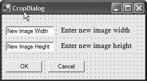
When the photo editor application is now run, the screen layout should correspond to the GUI shown in the photo_editor requirements, except that the buttons are still missing. To add a button for the cropping functionality, drag a button to the tab. Change the displayed text on the button to Crop Image, and change the name of it to cropImageButton. Double-click on the button to add the event handler for the click event. We use a dialog box to collect the size information for the crop rectangle. To let users open a dialog box when the crop button is pressed, you must add a new form to the photo editor application. You do this by right-clicking the Photo Editor Application project in Solution Explorer and selecting Add | Add Windows Form. Name the new form CropDialog. Then drag two text boxes onto the form and change their properties as follows:
|
Properties of TextBox1 (Left) and TextBox2 (Right) |
||
|---|---|---|
|
(Name) |
imageWidth |
imageHeight |
|
AcceptsReturn |
True |
True |
|
AcceptsTab |
True |
True |
|
Text |
Image Width |
ImageHeight |
In addition, add two buttons; change their names to OKBtn and CancelBtn (and change the text to be displayed on the button accordingly). Also add two labels next to the text boxes that explain what the text box input isfor example, "Enter new image height." The Form should now look approximately like Figure 5.16.
Figure 5.16. The Crop Dialog Box
After adding all the design-related properties, we add the event handlers. A double-click on the image width text box will add an imageWidth_TextChanged event handler. Before implementing the event handler, add to the CropDialog class two private integer variables called tempWidth and tempHeight for the width and height. The event handlers are then implemented. To extract the new width from the text box entry, the imageWidth object provides a property, Text, that represents the text in the text box. This text is converted to an integer value and stored in the tempWidth variable. The functionality is shown in Listing 5.11.
Listing 5.11 The TextChanged Event Handler for the Width
private void imageWidth_TextChanged(object sender,
 System.EventArgs e)
 {
 tempWidth = Convert.ToInt32(imageWidth.Text);
 }
Do It Yourself
Implement the height text box event handler method using Listing 5.11 as a template.
Next, we implement the OK and Cancel buttons. We start with the implementation of the Cancel button. To add the event handler for the button, double-click on the Cancel button in the CropDialog.cs[Design] view. If the Cancel button is selected, no cropping action is done and the PhotoEditor form should be invalidated (to force a repaint). In addition, the CropDialog box can be disposed of to indicate to the garbage collector that the memory is no longer being used. Therefore, we change the constructor of CropDialog to accept one argument of type object named sender. This object will be a reference to the calling PhotoEditorForm object. The sender object is then cast in the constructor to a PhotoEditorForm object and is stored in a local private variable of type PhotoEditorForm named editorForm. The code to be added to the constructor, after creating the private field, is as follows:
editorForm = (PhotoEditorForm)sender;
The CancelBtn_Click event handler is then implemented as shown in Listing 5.12.
Listing 5.12 The CropDialog Cancel Button
private void CancelBtn_Click(object sender, System.EventArgs e)
 {
 editorForm.Invalidate();
 this.Dispose();
 }
After that, we implement the OK button click event handler for the Crop dialog box. When the OK button is pressed, the stored values for width and height are sent to PictureObject.CropImage. The Picture object is then responsible for cropping the loaded image to the specified size. Therefore, we add the event handler by double-clicking on the OK button and adding the following lines to the event handler:
editorForm.PictureObject.CropImage(tempWidth, tempHeight);
editorForm.DisplayImage();
this.Dispose();
This will crop the image, assuming that a CropImage method is provided by the Picture class. Therefore, we must add the CropImage method to the Picture class in the next step.
Add a new public void method CropImage to the Picture class. This method takes two integer variables (the width and the height). Now that we have defined the signature, let's take care of the implementation. The CropImage method should check whether the provided parameters specify a region within the loaded image and whether the parameters are actually larger than zero. After that, the clip region needs to be calculated as a rectangle. We then clone the current image by applying the calculated cropping rectangle, and we store a copy of the cropped image in a temporary bitmap called croppedImage. The loadedImage is then set to the cropped image and is displayed. The complete implementation of the CropImage method is shown in Listing 5.13.
Listing 5.13 The CropImage Method
///
/// Method called from CropDialog. The current /// shown image is cropped to the size provided /// in the parameters. The cropping is done /// with a rectangle whose center is put on /// the center of the image. ///
/// F:image_crop ///width of the cropped /// image public void CropImage(int newWidth, int newHeight) { // Check that cropping region is // actually within the image and that // the values provided are positive if((newWidth < loadedImage.Size.Width) && (newHeight < loadedImage.Size.Height) && (newHeight > 0) && (newWidth > 0)) { int xmin = (loadedImage.Size.Width / 2) - (newWidth / 2); int xdim = newWidth; int ymin = (loadedImage.Size.Height / 2) - (newHeight / 2); int ydim = newHeight; Rectangle rectangle = new Rectangle(xmin, ymin, xdim, ydim); if(rectangle.IsEmpty) { throw(new Exception("Error, CropImage failed to allocate clipping rectangle")); } Bitmap croppedImage = loadedImage.Clone(rectangle, System.Drawing.Imaging.PixelFormat.DontCare); Bitmap oldImage = loadedImage; loadedImage = new Bitmap(croppedImage, rectangle.Size); if(loadedImage == null) { throw(new Exception("Error, Image memory allocation failed")); } } }
The last step is to implement the cropImage button click event handler. First, create the event handler. Then in the event handler create a new CropDialog object and show the dialog on the screen by adding the following lines:
CropDialog openDialog = new CropDialog(this);
openDialog.Show();
This completes the implementation of the cropping functionality. Compile and run the project to see whether it works. If you added the XML code documentation while implementing the functionality, then you can also generate the comment Web pages and you will have a nice description of the newly added functionality.
5.6.12 Rotate and Flip an Image
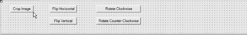
Now we show how to implement the rotate and flip functionality. To support this, we add new buttons to the tab card of PhotoEditor.cs[Design]. Add the buttons to match the screen layout shown in Figure 5.17. Then rename them and change the text of the buttons.
Figure 5.17. The Photo Editor Form Buttons
To add the event handler method for horizontal flipping, double-click on the corresponding button. Before adding the event handler, though, you should consider that the flipping and rotating of an image are basic image operations and therefore they should be handled by the Picture class. Therefore, add to the Picture class a public void method called RotateFlipImage that takes a parameter of type RotateFlipType that is named rotateFlip. (The Bitmap class actually supports rotating and flipping and provides an enumeration for various rotation and flip values.) Implement the event handlers for the button click events by passing the correct RotateFlipType to the RotateFlipImage method of the Picture class. (For information about RotateFlipType, see the MSDN documentation or the sample solution.) Then the RotateFlipImage method can be implemented as shown in Listing 5.14.
Listing 5.14 The RotateFlipImage Method
public void RotateFlipImage(RotateFlipType rotateFlip)
 {
 loadedImage.RotateFlip(rotateFlip);
 }
Do It Yourself
Implement the functionality for vertical flipping, rotating clockwise, and rotating counterclockwise in the same way the horizontal flipping functionality was added. Use the enumeration members of RotateFlipType.
5.6.13 Save an Image
Before testing is started, we need to implement the last feature that is missing in the implementation. We have not implemented the functionality to save an image on disk. This task is very similar to the implementation of image loading. Instead of OpenFileDialog, we use SaveFialeDialog; and instead of loading the image, we save the image under the user-selected name.
Go to the [Design] view of PhotoEditor.cs and add a new menu item in the main menu, underneath the Open File entry. Name the menu item saveMenu, and change the text to &Save as .... Add the event handler for the click event. The save file functionality is also implemented in the Picture class. Therefore, add a public method called SaveFile() to the Picture class, and call it from the event handler of the Save button. To make SaveFileDialog work, add a private member variable to the Picture class of type SaveFileDialog, and in the constructor create the object for it. The SaveFile method then can be implemented as shown in Listing 5.15.
Listing 5.15 The SaveFile Method
public void SaveImage()
 {
 saveFileDialog.Filter = " jpg files (*.jpg)|*.jpg|
 gif files (*.gif)|*.gif| bmp files (*.bmp)|*.bmp|
 All files (*.*)|*.*";
 saveFileDialog.ShowDialog();
 loadedImage.Save(saveFileDialog.FileName);
 saveFileDialog.Dispose();
 }
After this change has been made, compile and run the application to see the result. The images can now be loaded, rotated, flipped, cropped, and saved. This is all the functionality that is needed for the project in the elaboration phase. The next task is to write unit tests to validate the implemented functionality.
Do It Yourself
The buttons provided are not very nice-looking. You can make the program more appealing by adding bitmaps that show the user what the result of a requested image transformation will be. (Customize the rudimentary buttons provided, or develop custom bitmaps that can be loaded onto the buttons.) Also, we recommend that you change and play around with the implementation to see what improvements you can make.
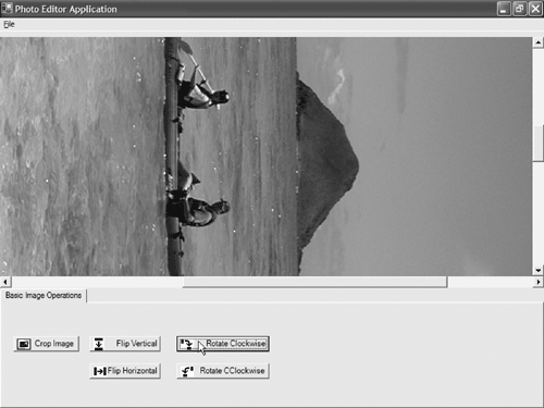
Figure 5.18 shows the working application.
Figure 5.18. The Working Photo Editor Application
5 7 Unit Tests |
Introducing .NET
- Introducing .NET
- The Need for .NET
- The .NET Framework
- The C# Language
- Debugging and the IDE
- References for Further Reading
Introducing Software Engineering
- Introducing Software Engineering
- Introducing Software Engineering Practices
- Choosing a Software Development Model
- Commonly Used Software Development Models
- Conclusion
- References for Further Reading
A .NET Prototype
- Getting Started
- Evaluating .NET for Windows Client Applications
- Our First .NET Application
- Prototyping
- Implementing the SmartNotes Application
- Visual Studio.NET: Platform of Choice
- References for Further Reading
Project Planning
- Project Planning
- The Project Vision and Business Case
- The Initial Use Case Model
- Project Requirements
- Initial Project Planning
- Initial Risk Analysis
- Initial Requirements Analysis and Design
- Conclusion
- References for Further Reading
The Photo Editor Application
- The Photo Editor Application
- The Refined Project Vision and Business Case
- Refined Requirements for Online Photo Shop
- Analysis of the Photo Editor Requirements
- Design of the Photo Editor Application
- The Detailed Project Schedule
- Implementation of the Photo Editor Application
- Unit Tests
- Conclusion
- References for Further Reading
GDI+ Graphics Extensions
- GDI+ Graphics Extensions
- Requirements for the GDI+ Extensions
- Analysis of the GDI+ Extensions Requirements
- Design of the GDI+ Extensions
- Project Management Issues
- GDI+ Programming
- Drawing GDI+ Primitives
- Unit Tests
- Conclusion
- References for Further Reading
Advanced GDI+ Operations
- Advanced GDI+ Operations
- Advanced GDI+ Extensions
- Analysis of the Advanced GDI+ Extensions Requirements
- Design of the Advanced GDI+ Extensions
- Project Management Issues
- Using Pens and Brushes in GDI+
- Implementation of Regions, Pens, and Brushes
- Unit Tests
- Conclusion
Dynamic Loading of Components
- Dynamic Loading of Components
- Requirements for Image Postprocessing Components
- Analysis of the Image Postprocessing Requirements
- Design of the Image-Processing Components Using Late Binding
- Project Management Issues
- Implementing Dynamically Loadable Image Postprocessing Plugins
- Unit Tests
- Conclusion
- References for Further Reading
Accessing System Resources
- Accessing System Resources
- Refining Requirements for 3D Text Display
- Three-Dimensional Rendering Technologies
- Analyzing User Interface Needs
- Using OpenGL.NET
- Adding 3D Text to the Photo Editor Application
- Conclusion: Dont Reinvent the Wheel
- References for Further Reading
Performance Optimization, Multithreading, and Profiling
- Performance Optimization, Multithreading, and Profiling
- Requirements for Performance Optimization
- Analysis of the Editor Optimization Requirement
- Design of the Optimizations
- Project Management Issues
- Multithreading and Optimization Implementation
- Unit Tests
- Conclusion
- References for Further Reading
Building the Web Application with ASP.NET
- Building the Web Application with ASP.NET
- Online Store Requirements
- Analyzing Interfaces and Activities
- Breakdown of the Code Modules
- Implementation of Online Photo Shop
- Conclusion
Security and Database Access
- Security and Database Access
- Secure Checkout
- Integrating Externally Supplied Software
- E-mail, Password, Credit Card: Creating a Customer Profile
- Secure Web Applications
- Database Access with ADO.NET
- Putting It All Together
- No Longer under Construction
- References for Further Reading
Product Release
EAN: 2147483647
Pages: 123
