Analysis of the Advanced GDI+ Extensions Requirements
 |
After we refine the requirements, we need to analyze them. We start by updating the GUI to add the controls that allow the user to use the newly implemented functionality. The first requirement key we analyze is the photo_editor key, which needs to reflect the GUI changes. |
7.2.1 The photo_editor Requirement
To provide the new functionality, we update the GUI to enable the user to access the new features. This update is based on the GUI introduced in Chapter 6. In close collaboration with the customer, we decide on the new GUI elements to use for the new functionality.
Usually, this process takes several rounds of discussions and evaluations before a decision is made. The decision process depends on many factors, such as industry standards, the capability and limitations of the provided functionality, and the targeted user group. For example, using radio buttons for the frame feature is a good choice because only one of the frames can be selected at any time. Radio buttons are often used in Windows applications to let users choose from a list of mutually exclusive functionalities. It could be argued that the graphical component functionalities implemented in Chapter 6 should also have used radio buttons. That would have been a good choice, but regular buttons were used because the customer preferred them for esthetic reasons.
For choosing the line thickness, we use a spin button, also called a numeric up/down button. The spin button enables the user to increment and decrement the line thickness by using only the mouse, without the need to type anything. Therefore, it is perfect for choosing the line thickness.
In addition, we introduce a button for the color functionality. The button opens a dialog box in which the user can choose a drawing color. Figure 7.1 shows the part of the GUI that is changed.
Figure 7.1. The Photo Editor GUI
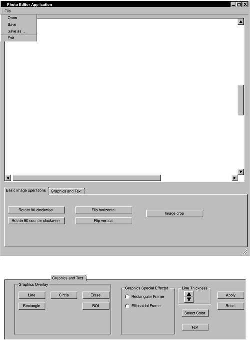
By default, both radio buttons for the frame feature are unselected. Furthermore, only one or none of the radio buttons can be selected at any time. If another graphics tool is selected, then the two frame tool radio buttons are set to not selected. The need for this is obvious if we consider the fact that only one drawing tool can be used to draw on the screen at a given time.
As discussed next, users can set the line thickness between 1 and 20. The Select Color button opens a .NET Framework-provided standard color dialog that enables the user to choose a color.
7.2.2 The image_graphics_annotations Requirement
Users can draw a line, rectangle, or ellipse in various colors and line widths. They choose the line width by using a numeric up/down button, which increments or decrements through the range of possible line widths of 1 to 20.
Users choose the color by selecting the corresponding button of the GUI. If the button is selected, then a standard color dialog box is shown from which the user can select a drawing color. If a new line width or color is chosen, then all graphics primitives that are not yet permanently added to the image (by using the Apply button) are updated and drawn using the new color and line thickness.
7.2.3 The image_graphics_special_effects Requirement
A tool is provided that enables the user to draw an interactive frame object. The supported object shapes are a rectangle and an ellipsis. The thickness of the frame is adjustable from 1/40th of the shape's size up to the entire size.
In addition, the user can select a fill color to fill the shape. The fill color is solid on the borders of the shape and becomes transparent toward the center of the shape. If the frame width is the size of the rectangle, then the center is completely transparent, and this means that no color is visible except that of the original image. If the frame is smaller than the rectangle, the behavior is the same in that the center point is transparent even if that point is not within the frame to be drawn. Users can adjust the size of the border by using the line thickness spin button. If the value of the spin button is 20, then the complete rectangle is assumed to be the frame. The functionalities of the Apply and Reset buttons work according to the description in Chapter 6.
Introducing .NET
- Introducing .NET
- The Need for .NET
- The .NET Framework
- The C# Language
- Debugging and the IDE
- References for Further Reading
Introducing Software Engineering
- Introducing Software Engineering
- Introducing Software Engineering Practices
- Choosing a Software Development Model
- Commonly Used Software Development Models
- Conclusion
- References for Further Reading
A .NET Prototype
- Getting Started
- Evaluating .NET for Windows Client Applications
- Our First .NET Application
- Prototyping
- Implementing the SmartNotes Application
- Visual Studio.NET: Platform of Choice
- References for Further Reading
Project Planning
- Project Planning
- The Project Vision and Business Case
- The Initial Use Case Model
- Project Requirements
- Initial Project Planning
- Initial Risk Analysis
- Initial Requirements Analysis and Design
- Conclusion
- References for Further Reading
The Photo Editor Application
- The Photo Editor Application
- The Refined Project Vision and Business Case
- Refined Requirements for Online Photo Shop
- Analysis of the Photo Editor Requirements
- Design of the Photo Editor Application
- The Detailed Project Schedule
- Implementation of the Photo Editor Application
- Unit Tests
- Conclusion
- References for Further Reading
GDI+ Graphics Extensions
- GDI+ Graphics Extensions
- Requirements for the GDI+ Extensions
- Analysis of the GDI+ Extensions Requirements
- Design of the GDI+ Extensions
- Project Management Issues
- GDI+ Programming
- Drawing GDI+ Primitives
- Unit Tests
- Conclusion
- References for Further Reading
Advanced GDI+ Operations
- Advanced GDI+ Operations
- Advanced GDI+ Extensions
- Analysis of the Advanced GDI+ Extensions Requirements
- Design of the Advanced GDI+ Extensions
- Project Management Issues
- Using Pens and Brushes in GDI+
- Implementation of Regions, Pens, and Brushes
- Unit Tests
- Conclusion
Dynamic Loading of Components
- Dynamic Loading of Components
- Requirements for Image Postprocessing Components
- Analysis of the Image Postprocessing Requirements
- Design of the Image-Processing Components Using Late Binding
- Project Management Issues
- Implementing Dynamically Loadable Image Postprocessing Plugins
- Unit Tests
- Conclusion
- References for Further Reading
Accessing System Resources
- Accessing System Resources
- Refining Requirements for 3D Text Display
- Three-Dimensional Rendering Technologies
- Analyzing User Interface Needs
- Using OpenGL.NET
- Adding 3D Text to the Photo Editor Application
- Conclusion: Dont Reinvent the Wheel
- References for Further Reading
Performance Optimization, Multithreading, and Profiling
- Performance Optimization, Multithreading, and Profiling
- Requirements for Performance Optimization
- Analysis of the Editor Optimization Requirement
- Design of the Optimizations
- Project Management Issues
- Multithreading and Optimization Implementation
- Unit Tests
- Conclusion
- References for Further Reading
Building the Web Application with ASP.NET
- Building the Web Application with ASP.NET
- Online Store Requirements
- Analyzing Interfaces and Activities
- Breakdown of the Code Modules
- Implementation of Online Photo Shop
- Conclusion
Security and Database Access
- Security and Database Access
- Secure Checkout
- Integrating Externally Supplied Software
- E-mail, Password, Credit Card: Creating a Customer Profile
- Secure Web Applications
- Database Access with ADO.NET
- Putting It All Together
- No Longer under Construction
- References for Further Reading
Product Release
EAN: 2147483647
Pages: 123
