Visual Controls
Overview
Now that you've been introduced to the Delphi environment and have seen an overview of the Delphi language and the base elements of component library, we are ready to delve into the use of components and the development of the user interface of applications. This is really what Delphi is about. Visual programming using components is a key feature of this development environment.
Delphi comes with a large number of ready-to-use components. I won't describe every component in detail, examining each of its properties and methods; if you need this information, you can find it in the Help system. The aim of this chapter and the following ones of this book is to show you how to use some of the advanced features offered by the Delphi predefined components to build applications and to discuss specific programming techniques.
I'll start with a comparison of the VCL and VisualCLX libraries and coverage of the core classes (particularly TControl). Then I'll examine the various visual components, because choosing the right basic controls will often help you get a project underway more quickly.
VCL versus VisualCLX
As you saw in Chapter 4, "Core Library Classes," Delphi has two visual class libraries: the cross-platform library (CLX) alongside the traditional Windows library (VCL). There are certainly many differences, even in the use of the RTL and code library classes, between developing programs specifically for Windows or with a cross-platform attitude, but the differences are most striking in the user interface portion.
The visual portion of VCL is a wrapper of the Window API. It includes wrappers of the native Windows controls (like buttons and edit boxes), the common controls (like TreeViews and ListViews), plus a bunch of native Delphi controls bound to the Windows concept of a window. In addition, a TCanvas class wraps the basic graphic calls, so you can easily paint on the surface of a window.
VisualCLX, the visual portion of CLX, is a wrapper of the Qt (pronounced "cute") library. It includes wrappers of the native Qt widgets, which range from basic to advanced controls, very similar to Windows' standard and common controls. It also includes painting support using another, similar, TCanvas class. Qt is a C++ class library developed by Trolltech (www.trolltech.com), a Norwegian company with a strong relationship with Borland.
On Linux, Qt is one of the de facto standard user-interface libraries and is the basis of the KDE desktop environment. On Windows, Qt provides an alternative to the use of the native APIs. Unlike VCL, which provides a wrapper to the native controls, Qt provides an alternate implementation to those controls. Even if each of them is based on Windows's window, a QT button isn't a Windows BUTTON class control (you can see this by running WinSight32). This allows programs to be truly portable, because no hidden differences are created by the operating system (or introduced by the operating system vendor behind the scenes). It also allows you to avoid an extra layer; CLX on top of Qt on top of Windows native controls suggests three layers, but in fact there are two layers in each solution (CLX controls on top of Qt, VCL controls on top of Windows).
| Note |
Distributing Qt applications on Windows implies the distribution of the Qt library itself. On the Linux platform, you can generally take the presence of the Qt library for granted, but you still have the interface library to deploy. Also, Linux Borland's CLX is tied to a specific version of Qt (which in Kylix 3 has been specifically patched by Borland), so you'll probably have to distribute it anyway. Distributing the Qt libraries with a professional application (as opposed to an open source project) generally implies paying a license to Trolltech. If you use Delphi or Kylix to build Qt applications, however, Borland has already paid the license to Trolltech for you. You must use at least one CLX class wrapping Qt: If you use the Qt classes exclusively (no CLX at all), you still owe the license to Qt, even when using Delphi or Kylix. |
Technically, huge differences exist behind the scenes between a native Windows application built with VCL and a portable Qt program developed with VisualCLX. Suffice to say that at the low level, Windows uses API function calls and messages to communicate with controls, whereas Qt uses class methods and direct method callbacks and has no internal messages. Technically, the Qt classes offer a high-level object-oriented architecture, but the Windows API is still bound to its C legacy and a message-based system dated 1985 (when Windows was released). VCL offers an object-oriented abstraction on top of a low-level API, whereas VisualCLX remaps an already high-level interface into a more familiar class library. (For more on the Qt architecture, see the following sidebar "From Qt to CLX.")
| Note |
Microsoft has reached the point of starting to abandon the traditional low-level Windows API for a native high-level class library, part of the .NET architecture. You can read more about this topic in Part IV of this book. |
If the underlying architectures of the Windows API on one side and Qt on the other side are relevant, the two class libraries built by Borland (VCL and CLX) flatten out most differences, making the code of Delphi and Kylix applications extremely similar. Using VisualCLX on Linux offers Delphi programmers the advantage of having a familiar class library on top of a totally new platform. From the outside, a button is an object of the TButton class for both libraries, and it has more or less the same set of methods, properties, and events. In many cases, you can recompile your existing programs for the new class library in a matter of minutes, if they don't use low-level API calls, platform-dependent features (like ADO or COM), or legacy features (like the BDE).
From Qt to CLX
Qt is a C++ class library that includes a complete set of widgets resembling not only Windows core components (buttons, list boxes, and the like) but also most of the common controls (such as TreeView and ListView controls). Because Qt is a C++ library, it cannot be invoked directly from the Delphi language code. The Qt API is accessible instead through a binding layer, defined in the Qt.pas unit.
This binding layer consists of a long list of wrappers of almost every Qt class suffixed with a final H. So, for example, the Qt QPainter class becomes the QPainterH type in the binding layer. The Qt.pas unit also includes a long list of all the public methods of these classes, transformed into standard functions (not class methods) that have as their first parameter the object to which they apply. The only relevant exception to this approach is the class constructors, which are transformed into functions that return the new instance of the class.
Notice that the use of at least one of the classes of the mapping layer is compulsory for the Qt license that comes with Delphi (and Kylix). Qt is free for non-commercial use under X Window (it is called Qt Free Edition), but you must pay a license fee to Trolltech to develop commercial applications. When you buy Delphi, the Qt license has already been paid for you by Borland, but you must use Qt primarily through CLX (even if low-level calls to Qt within a CLX application are allowed). You cannot use the Qt.pas unit directly and avoid including the QForms unit (which is mandatory). Borland enforces this limitation by omitting from the Qt interface the QFormH and QApplicationH constructors.
In most of this book's Delphi programs, I'll use only CLX objects and methods. It is important to know that if necessary, you can use some extra Qt features directly; or you may have to do low-level calls to bypass CLX bugs. The Qt documentation is not included in the Delphi help, but you can find it on the Trolltech website (www.trolltech.com) in HTML and PDF format.
Delphi s Dual Library Support
Delphi has full support for both libraries at design time and at run time. As you begin developing a new application, you can use the File ® New Application command to create a new VCL-based program or File ® New CLX Application for a new CLX-based program. After you give one of these commands, Delphi's IDE will create a VCL or CLX design-time form and update the Component Palette so that it displays only the visual components compatible with the type of application you've selected (see Figure 5.1 for a comparison). You cannot place a VCL button into a CLX form, and you cannot even mix forms of the libraries within a single executable file. In other words, the user interface of every application must be built using one of the two libraries exclusively, which (aside from the technical implications) makes a lot of sense to me.
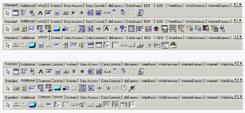
Figure 5.1: A comparison of the first three pages of the Component Palette for a CXL-based application (above) and a VCL-based application (below)
If you haven't already done so, I suggest you to try experimenting with the creation of a CLX application, looking at the available controls and trying to use them. You'll find few differences in the use of the components, and if you have been using Delphi for some time, you'll probably be immediately adept with CLX.
Same Classes, Different Units
One of the cornerstones of the source-code compatibility between CLX and VCL is the fact that similar classes in the two libraries have the same class name. For example, each library has a class called TButton representing a push button; the methods and properties are so similar that this code will work with both libraries:
with TButton.Create (Self) do
begin
 SetBounds (20, 20, 80, 35);
 Caption := 'New';
 Parent := Self;
end;
The two TButton classes can have the same name because they are saved in two different units, called StdCtrls and QStdCtrls. Of course, you cannot have the two components available at design time in the palette, because the Delphi IDE can register only components with unique names. The entire VisualCLX library is defined by units corresponding to the VCL units, but with the letter Q as a prefix—so there is a QForms unit, a QDialogs unit, a QGraphics unit, and so on. A few peculiar units, such as QStyle, have no corresponding unit in VCL because they map to features of Qt with no correspondence in the Windows API.
Notice that there are no compile settings or other hidden techniques to distinguish between the two libraries; what matters is the set of units referenced in the code. Remember that these references must be consistent—you cannot mix visual controls of the two libraries in a single form or even in a single program.
DFM and XFM
As you create a form at design time, it is saved to a form definition file. Traditional VCL applications use the DFM extension, which stands for Delphi form module. CLX applications use the XFM extension, which stands for cross-platform (X) form module. A form module is the result of streaming the form and its components: The two libraries share the streaming code, so they produce a similar effect. The format of DFM and XFM files, which can be based on a textual or binary representation, is identical.
So, the reason for having two different extensions doesn't lie in internal compiler tricks or incompatible formats. It is merely an indication to programmers and to the IDE of the type of components you should expect to find within that definition (this indication is not included in the file).
If you want to convert a DFM file into an XFM file, you can simply rename the file. However, expect to find some differences in the properties, events, and available components— reopening the form definition for a different library will probably cause quite a few warnings.
| Tip |
Delphi's IDE chooses the active library by looking at the extension of the form module, ignoring the references in the uses statements. For this reason, you should change the extension if you plan to use CLX. On Kylix, a different extension is useless, because any form is opened in the IDE as a CLX form regardless of the extension. On Linux, there is only the Qt-based CLX library, which is both the cross-platform and the native library. |
As an example, I've built two identical applications, LibComp and QLibComp, with only a few components and a single event handler. Listing 5.1 presents the textual form definitions for two applications, built using the same steps in the Delphi IDE, after choosing a CLX or VCL application. I've marked differences in bold; as you can see, there are very few, most relating to the form and its font. OldCreateOrder is a legacy property used for compatibility with Delphi 3 and older code; standard colors have different names; and CLX saves the scroll bars' ranges.
Listing 5.1: An XFM File (Left) and an Equivalent DFM File (Right)
object Form1: TForm1 object Form1: TForm1
 Left = 192 Left = 192
 Top = 107 Top = 107
 Width = 350 Width = 350
 Height = 210 Height = 210
 Caption = 'QLibComp' Caption = 'LibComp'
 Color = clBackground Color = clBtnFace
 VertScrollBar.Range = 161 Font.Charset = DEFAULT_CHARSET
 HorzScrollBar.Range = 297 Font.Color = clWindowText
                                   Font.Height = -11
                                   Font.Name = 'MS Sans Serif'
                                   Font.Style = []
 TextHeight = 13 TextHeight = 13
 TextWidth = 6 OldCreateOrder = False
 PixelsPerInch = 96 PixelsPerInch = 96
  object Button1: TButton object Button1: TButton
 Left = 56 Left = 56
 Top = 64 Top = 64
 Width = 75 Width = 75
 Height = 25 Height = 25
 Caption = 'Add' Caption = 'Add'
 TabOrder = 0 TabOrder = 0
 OnClick = Button1Click OnClick = Button1Click
 end end
  object Edit1: TEdit object Edit1: TEdit
 Left = 40 Left = 40
 Top = 32 Top = 32
 Width = 105 Width = 105
 Height = 21 Height = 21
 TabOrder = 1 TabOrder = 1
 Text = 'my name' Text = 'my name'
 end end
  object ListBox1: TListBox object ListBox1: TListBox
 Left = 176 Left = 176
 Top = 32 Top = 32
 Width = 121 Width = 121
 Height = 129 Height = 129
    Rows = 3 ItemHeight = 13
 Items.Strings = ( Items.Strings = (
      'marco' 'marco'
      'john' 'john'
      'helen')                          'helen')
 TabOrder = 2 TabOrder = 2
 end end
end end
uses Statements
If you look at the source code of a VCL or CLX application, the only relevant difference relates to the uses statements. The form of the CLX application has the following initial code:
unit QLibCompForm;
interface
uses
 SysUtils, Types, Classes, QGraphics, QControls, QForms, QDialogs, QStdCtrls;
The form of the VCL program has the traditional uses statement:
unit LibCompForm;
interface
uses
 Windows, Messages, SysUtils, Variants, Classes, Graphics, Controls, Forms,
 Dialogs, StdCtrls;
The code of the class and of the only event handler is absolutely identical. Of course, the compiler directive {$R *.dfm} is replaced by {$R *.xfm} in the CLX version of a standard program.
Disabling the Dual Library Help Support
When you press the F1 key in the editor to ask for help on a routine, class, or method of the Delphi library, you'll usually get a choice between the VCL and CLX declarations of the same feature. You'll need to make a choice to proceed to the related help page, which can be quite annoying after a while (especially because the two pages are often identical).
If you don't care about CLX and are planning to use only VCL (or vice versa), you can disable this alternative by choosing the Help ® Customize command, removing everything with CLX in the name from Contents, Index, and Link, and saving the project. Then restart the Delphi IDE, and the Help engine won't bother asking you about CLX any more. Of course, don't forget to add those help files again if you decide to begin using CLX. Similarly, you can reduce the memory occupation and load time of the Delphi IDE by uninstalling all the CLX-related packages.
Choosing a Visual Library
Because two different user interface libraries are available in Delphi, you'll have to choose one for each visual application. You must evaluate multiple criteria to come to the proper decision, which isn't always easy.
The first criterion is portability. If running your program on Windows and on Linux, with the same user interface, is a major concern to you, then using CLX will make your life simpler and let you keep a single source code file with limited IFDEFs. The same applies if you consider Linux to be (or think it possibly will become) your key platform. On the other hand, if most of your users are on Windows and you just want to extend your offering with a Linux version, you might want to keep a dual VCL/CLX system. Doing so means you'll probably need two different sets of source code files, or you may have too many IFDEFs.
Another criterion is the native look-and-feel. Is you use CLX on Windows, some controls will behave slightly differently than users expect—at least expert users. For a simple user interface (edits, buttons, grids), this probably won't matter much; but if you have many tree view and list view controls, the differences will be clear. On the other hand, with CLX, you'll be able to let your users choose a look-and-feel that's different from the basic Windows look, and use it consistently across platforms. This means that a Motif fan will be able to choose this style even when forced to use the Windows platform. While this flexibility is common on Linux, you'll seldom use a non-native look-and-feel on Windows.
Using native controls also implies that as soon as you get a new version of the Windows operating system, your application will (probably) adapt to it. This is good for the user, but might cause you a lot of headaches in case of incompatibilities. Differences in the Microsoft common controls library over the last few years have been a major source of frustration for Windows programmers in general, including Delphi programmers.
Another criterion is deployment: If you use CLX, you'll have to ship your Windows and Linux program with the Qt libraries.
I've done a little testing, and the speed of VCL and CLX applications is similar. I've tried creating 1,000 components and showing them on screen, and the speed differences are few; the VCL-based solution offered a 30 percent advantage (for what this limited benchmark is worth). You can try my tests with the LibSpeed and QLibSpeed examples for this chapter.
Another important criterion for deciding to use CLX instead of VCL is a need for Unicode support. CLX has Unicode support in controls by default (even on Win9x platforms where it isn't supported by Microsoft). VCL, however, has very little Unicode support even on versions of Windows that provide it, making it difficult to build VCL apps for countries where the local character is managed more easily when it is Unicode based.
Running It on Linux
The real issue of choosing the library resolves to the importance of Linux or Unicode for you and your users. It's important to notice that if you create a CLX application, you'll be able to recompile it unchanged (with the exact source code) with Kylix, producing a native Linux application, unless you've done any Windows API programming at all, in which case conditional compilation will be essential.
As an example, I've recompiled the QLibComp example introduced earlier. Figure 5.2 shows it running; you can also see the Kylix IDE in action on KDE.
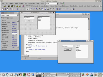
Figure 5.2: An application written with CLX can be directly recompiled under Linux with Kylix (displayed in the background).
Conditional Compilation for Libraries
If you want to keep a single source code file but compile with VCL on Windows and CXL on Linux, you can use platform-specific symbols (such as $IFDEF LINUX) to distinguish the two situations in case of conditional compilation. But what if you want to be able to compile a portion of code for both libraries on Windows?
You can either define a symbol of your own and use conditional compilation, or (at times) test for the presence of identifiers that exist only in VCL or CLX:
{$IF Declared(QForms)}
  ...CLX-specific code
{$IFEND}
Converting Existing Applications
Besides starting with new CLX applications, you might want to convert some of your existing VCL applications to the new class library. You must perform a series of operations without any specific help from the Delphi IDE:
- Rename the DFM file using the XFM extension and update all the {$R *.DFM} statements as {$R *.XFM}.
- Update all the uses statements in your program (in the units and project files) to refer to the CLX units instead of the VCL units. If you miss even a few, you'll bump into trouble when running your application.
| Tip |
To prevent a CLX application from compiling if it contains references to VCL units, you can move the VCL units to a different directory under lib and avoid including this folder in your search path. This way, leftover references to VCL units will cause a "Unit not found" error. |
Table 5.1 compares the names of the visual VCL and CLX units, excluding the database portion and some rarely referenced units.
|
VCL |
CLX |
|---|---|
|
ActnList |
QActnList |
|
Buttons |
QButtons |
|
Clipbrd |
QClipbrd |
|
ComCtrls |
QComCtrls |
|
Consts |
QConsts |
|
Controls |
QControls |
|
Dialogs |
QDialogs |
|
ExtCtrls |
QExtCtrls |
|
Forms |
QForms |
|
Graphics |
QGraphics |
|
Grids |
QGrids |
|
ImgList |
QImgList |
|
Menus |
QMenus |
|
Printers |
QPrinters |
|
Search |
QSearch |
|
StdCtrls |
QStdCtrls |
You might also convert references to Windows and Messages into references to the Qt unit. Some Windows data structures are now also available in the Types unit (see Chapter 3, "The Run-Time Library," for details), so you might have to add it to your CLX programs. Notice, however, that the QTypes unit is not the CLX version of VCL's Types unit; these two units are totally unrelated.
| Warning |
Watch out for your uses statements! If you compile a project that includes a CLX form, but you fail to update the project source code, leaving a reference to the VCL Forms unit there, your program will run but stop immediately. The reason is that no VCL form was created, so the program terminated right away. In other cases, trying to create a CLX form within a VCL application will cause run-time errors. Finally, the Delphi IDE might inappropriately add references to uses statements of the wrong library; in this case you end up with a single uses statement that refers to the same unit for both libraries, but only the second of the two will be effective. This situation rarely prevents the program from compiling, but you won't be able to run it. |
As a helper in converting some of my own programs, I've written a simple unit-replacement tool called VclToClx; it's available in the Tools section of the source code that accompanies the book. You can find more information about this program in Appendix A, "Extra Delphi Tools by the Author."
TControl and Derived Classes
In Chapter 4, I discussed the base classes of the Delphi library, focusing particularly on the TComponent class. One of the most important subclasses of TComponent is TControl, which corresponds to visual components. This base class is available in both CLX and VCL and defines general concepts, such as the position and the size of the control, the parent control hosting it, and more. For an actual implementation, though, you have to refer to its two subclasses. In VCL these are TWinControl and TGraphicControl; in CLX they are TWidgetControl and TGraphicControl. Here are their key features:
Window-Based Controls (Also Called Windowed Controls) Visual components based on an operating-system window. A TWinControl in VCL has a window handle, which is a number referring to an internal Windows structure. A TWidgetControl in CLX has a Qt handle, which is a reference to the internal Qt object. From a user perspective, windowed controls can receive the input focus, and some of them can contain other controls. This is the biggest group of components in the Delphi library. We can further divide windowed controls into two groups: wrappers of native controls of Windows or Qt; and custom controls, which generally inherit from TCustomControl.
Graphical Controls (Also Called Nonwindowed Controls) Visual components not based on an operating-system window. Therefore, these components have no handle, cannot receive the focus, and cannot contain other controls. They inherit from TGraphicControl and are painted by their parent control, which sends them mouse-related and other events. Examples of non-windowed controls are the Label and SpeedButton components. There are just a few controls in this group, which were critical to minimizing the use of system resources in the early days of Delphi (on 16-bit Windows). Using graphical controls to save Windows resources is still useful on Win9x/Me, which has pushed the system limits higher but hasn't fully gotten rid of them (unlike Windows NT/2000).
Parent and Controls
The Parent property of a control indicates which other control is responsible for displaying it. When you drop a component into a form in the Form Designer, the form will become both parent and owner of the new control. But if you drop the component inside a Panel, ScrollBox, or any other container component, this will become its parent, whereas the form will still be the owner of the control.
When you create the control at run time, you'll need to set the owner (using the Create constructor's parameter); but you must also set the Parent property, or the control won't be visible.
Like the Owner property, the Parent property has an inverse. The Controls array lists all the controls parented by the current one, numbered from 0 to ControlCount - 1. You can scan this property to operate on all the controls hosted by another control, eventually using a recursive method that operates on the controls parented by each subcontrol.
Properties Related to Control Size and Position
Some of the properties introduced by TControl and common to all controls are those related to size and position. The position of a control is determined by its Left and Top properties, and its size is specified by the Height and Width properties. Technically, all components have a position, because when you reopen an existing form at design time, you want to be able to see the icons for the nonvisual components in exactly the position where you've placed them. This position is visible in the form file.
| Tip |
As you change any of the positional or size properties, you end up calling the single SetBounds method. So, any time you need to change two or more of these properties at once, calling SetBounds directly will speed up the program. Another method, BoundsRect, returns the rectangle bounding the control and corresponds to accessing the properties Left, Top, Height, and Width. |
An important feature of the position of a component is that, like any other coordinate, it always relates to the client area of its parent component (indicated by its Parent property). For a form, the client area is the surface included within its borders and caption (excluding the borders themselves). It would have been messy to work in screen coordinates, although some ready-to-use methods convert the coordinates between the form and the screen and vice versa.
Note, however, that the coordinates of a control are always relative to the parent control, such as a form or another container component. If you place a panel in a form and a button in a panel, the coordinates of the button relate to the panel and not to the form containing the panel. In this case, the parent component of the button is the panel.
Activation and Visibility Properties
You can use two basic properties to let the user activate or hide a component. The simpler is the Enabled property. When a component is disabled (when Enabled is set to False), usually some visual hint indicates this state to the user. At design time, the "disabled" property does not always have an effect; but at run time, disabled components are generally grayed.
For a more radical approach, you can completely hide a component, either by using the corresponding Hide method or by setting its Visible property to False. Be aware, however, that reading the status of the Visible property does not tell you whether the control is actually visible. If the container of a control is hidden, even if the control is set to Visible, you cannot see it. For this reason, you can read the value of the run-time, read-only Showing property to determine whether the control is really visible to the user; that is, if it is visible, its parent control is also visible, the parent control of the parent control is also visible, and so on.
Fonts
The Color and Font properties are often used to customize the user interface of a component. Several properties are related to the color. The Color property itself usually refers to the background color of the component. There is also a Color property for fonts and many other graphical elements. Many components also have ParentColor and ParentFont properties, indicating whether the control should use the same font and color as its parent component, which is usually the form. You can use these properties to change the font of each control on a form by setting only the Font property of the form itself.
When you set a font, either by entering values for the attributes of the property in the Object Inspector or by using the standard font selection dialog box, you can choose one of the fonts installed in the system. The fact that Delphi allows you to use all the fonts installed on your system has both advantages and drawbacks. The main advantage is that if you have a number of nice fonts installed, your program can use any of them. The drawback is that if you distribute your application, these fonts might not be available on your users' computers.
If your program uses a font that your user doesn't have, Windows will select some other font to use in its place. A program's carefully formatted output can be ruined by the font substitution. For this reason, you should rely on standard Windows fonts (such as MS Sans Serif, System, Arial, Times New Roman, and so on).
Colors
There are various ways to set the value of a color. The type of this property is TColor, which isn't a class type but just an integer type. For properties of this type, you can choose a value from a series of predefined name constants or enter a value directly. The constants for colors include clBlue, clSilver, clWhite, clGreen, clRed, and many others (including Delphi 6's clMoneyGreen, clSkyBlue, clCream, and clMedGray). As a better alternative, you can use one of the colors used by the system to denote the status of given elements. These sets of colors are different in VCL and CLX.
VCL includes predefined Windows colors such as the background of a window (clWindow), the color of the text of a highlighted menu (clHighlightText), the active caption (clActiveCaption), and the ubiquitous button face color (clBtnFace). CLX includes a different and incompatible set of system colors, including clBackground, which is the standard color of a form; clBase, used by edit boxes and other visual controls; clActiveForeground, the foreground color for active controls; and clDisabledBase, the background color for disabled text controls. All the color constants mentioned here are listed in VCL and CLX Help files under the "TColor type" topic.
Another option is to specify a TColor as a number (a 4-byte hexadecimal value) instead of using a predefined value. If you use this approach, you should know that the low three bytes of this number represent RGB color intensities for blue, green, and red, respectively. For example, the value $00FF0000 corresponds to a pure blue color, the value $0000FF00 to green, the value $000000FF to red, the value $00000000 to black, and the value $00FFFFFF to white. By specifying intermediate values, you can obtain any of 16 million possible colors.
Instead of specifying these hexadecimal values directly, you should use the Windows RGB function, which has three parameters, all ranging from 0 to 255. The first indicates the amount of red, the second the amount of green, and the last the amount of blue. Using the RGB function makes programs generally more readable than using a single hexadecimal constant. RGB is almost a Windows API function; it is defined by the Windows-related units and not by Delphi units, but a similar function does not exist in the Windows API. C includes a macro that has the same name and effect, which is a welcome addition to the Windows unit. RGB is not available on CLX, so I've written my own version:
function RGB (red, green, blue: Byte): Cardinal;
begin
 Result := blue + green * 256 + red * 256 * 256;
end;
The highest-order byte of the TColor type is used to indicate which palette should be searched for the closest matching color, but palettes are too advanced a topic to discuss here. (Sophisticated imaging programs also use this byte to carry transparency information for each display element on the screen.)
Regarding palettes and color matching, note that Windows sometimes replaces an arbitrary color with the closest available solid color, at least in video modes that use a palette. This is always the case with fonts, lines, and so on. At other times, Windows uses a dithering technique to mimic the requested color by drawing a tight pattern of pixels with the available colors. In 16-color (VGA) adapters and at higher resolutions, you often end up seeing strange patterns of pixels of different colors rather than the color you had in mind.
The TWinControl Class (VCL)
In Windows, most elements of the user interface are windows. From a user standpoint, a window is a portion of the screen surrounded by a border, having a caption and usually a system menu. But technically speaking, a window is an entry in an internal system table, often corresponding to an element visible on the screen that has some associated code. Most of these windows have the role of controls; others are temporarily created by the system (for example, to show a pull-down menu). Still other windows are created by the application but remain hidden from the user and are used only as a way to receive a message (for example, nonblocking sockets use windows to communicate with the system).
The common denominator of all windows is that they are known by the Windows system and refer to a function for their behavior; each time something happens in the system, a notification message is sent to the proper window, which responds by executing some code. Each window of the system has an associated function (generally called its window procedure), which handles the various messages the window is interested in.
In Delphi, any TWinControl class can override the WndProc method or define a new value for the WindowProc property. Interesting Windows messages, however, can be better tracked by providing specific message handlers. Even better, VCL converts these lower-level messages into events. In short, Delphi allows you to work at a high level, making application development easier, but still allows you to go low-level when required.
Notice also that creating an instance of a TWinControl-based class doesn't automatically create its corresponding Window handle. Delphi uses a lazy initialization technique, so that the low-level control is created only when required—generally as soon as a method accesses the Handle property. The get method for this property calls HandleNeeded the first time, which eventually calls CreateHandle … and so on, eventually reaching CreateWnd, CreateParams, and CreateWindowHandle (the sequence is complex, and you don't need to know it in detail). At the opposite end, you can keep an existing (perhaps invisible) control in memory but destroy its window handle, to save system resources.
The TWidgetControl Class (CLX)
In CLX, every TWidgetControl has an internal Qt object, referenced using the Handle property. This property has the same name as the corresponding Windows property, but it is totally different behind the scenes.
A TWidgetControl object generally owns the corresponding Qt/C++ object. The CLX class uses delayed construction (the internal object is not created until one of its methods is required) implemented in InitWidget and other methods. The CLX class also frees the internal object when it is destroyed. However, it is also possible to create a widget around an existing Qt object: In this case, the CLX object won't own the Qt object and won't destroy it. This behavior is indicated in the OwnHandle property.
To be more precise, each VisualCLX component has two associated C++ objects: the Qt Handle and the Qt Hook, which is the object receiving the system events. With the current Qt design, the Qt Hook must be a C++ object, which acts as an intermediary to the event handlers of the Delphi language control. The HookEvents method associates the hook object to the CLX control.
Unlike Windows, Qt defines two different types of events:
- Events are the translation of user input or system events (such as keystroke, mouse move, and paint).
- Signals are internal component events (corresponding to VCL internal or abstract operations, such as OnClick and OnChange).
The events of a CLX component, however, merge events and signals. Generic Delphi CLX control events include OnMouseDown, OnMouseMove, OnKeyDown, OnChange, OnPaint, and many others, exactly as in the VCL (which fires most events as a response to Windows messages).
| Note |
Expert programmers may notice that CLX includes a seldom-used EventHandler method, which corresponds more or less to the WndProc method of VCL TWinControl. |
Opening the Component Toolbox
So, you want to write a Delphi application. You open a new Delphi project and find yourself faced with a large number of components. The problem is that for every operation, there are multiple alternatives. For example, you can show a list of values using a list box, a combo box, a radio group, a string grid, a list view, or even a tree view if there is a hierarchical order. Which should you use? That's difficult to say. There are many considerations, depending on what you want your application to do. For this reason, I've provided a highly condensed summary of alternative options for a few common tasks.
| Note |
For some of the controls described in the following sections, Delphi also includes a data-aware version, usually indicated by the DB prefix. As you'll see in Chapter 13, "Delphi's Database Architecture," the DB version of a control typically serves a role similar to that of its "standard" equivalent; but the properties and the ways you use it are often quite different. For example, in an Edit control you use the Text property, whereas in a DBEdit component you access the Value of the related field object. |
The Text Input Components
Although a form or component can handle keyboard input directly using the OnKeyPress event, this isn't a common operation. Windows provides ready-to-use controls you can use to get string input and even build a simple text editor. Delphi has several slightly different components in this area.
The Edit Component
The Edit component allows the user to enter a single line of text. You can also display a single line of text with a Label or a StaticText control, but these components are generally used only for fixed text or program-generated output, not for input. In CLX, there is also a native LCD digit control you can use to display numbers.
The Edit component uses the Text property, whereas many other controls use the Caption property to refer to the text they display. The only condition you can impose on user input is the number of characters to accept. If you want to accept only specific characters, you can handle the OnKeyPress event of the edit box. For example, you can write a method that tests whether the character is a number or the Backspace key (which has a numerical value of 8). If it's not, you change the value of the key to the null character (#0), so that it won't be processed by the edit control and will produce a warning beep:
procedure TForm1.Edit1KeyPress(
 Sender: TObject; var Key: Char);
begin
 // check if the key is a number or backspace
 if not (Key in ['0'..'9', #8]) then
 begin
 Key := #0;
 Beep;
 end;
end;
| Note |
A minor difference of CLX is that the Edit control has no built-in Undo mechanism. Another is that the PasswordChar property is replaced by the EchoMode property. You don't determine the character to display, but whether to echo the entered text or display an asterisk instead. |
The LabeledEdit Control
Delphi 6 added a nice control called LabeledEdit, which is an Edit control with a label attached to it. The Label appears as a property of the compound control, which inherits from TCustomEdit.
This component is very handy, because it allows you to reduce the number of components on your forms, move them around more easily, and have a more consistent layout for all of the labels of an entire form or application. The EditLabel property is connected with the subcomponent, which has the usual properties and events. Two more properties, LabelPosition and LabelSpacing, allow you to configure the relative positions of the two controls.
| Note |
This component has been added to the ExtCtrls unit to demonstrate the use of subcomponents in the Object Inspector. I'll discuss the development of these components in Chapter 9, "Writing Delphi Components." Notice also that this component is not available on CLX. |
The MaskEdit Component
To customize the input of an edit box further, you can use the MaskEdit component. It has an EditMask property, which is a string indicating for each character whether it should be uppercase, lowercase, or a number, and other similar conditions. You can see the editor for the EditMask property here:
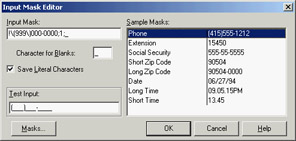
The Input Mask Editor allows you to enter a mask, but it also asks you to indicate a character to be used as a placeholder for the input and to decide whether to save the literals present in the mask, together with the final string. For example, you can choose to display the parentheses around the area code of a phone number only as an input hint or to save them with the string holding the resulting number. These two entries in the Input Mask Editor correspond to the last two fields of the mask (separated by semicolons).
| Tip |
Clicking the Masks button in the Input Mask Editor lets you choose predefined input masks for different countries. |
The Memo and RichEdit Components
The controls discussed so far allow a single line of input. The Memo component, by contrast, can host several lines of text but (on the Win95/98 platforms) still retains the 16-bit Windows text limit (32 KB) and allows only a single font for the entire text. You can work on the text of the memo line by line (using the Lines string list) or access the entire text at once (using the Text property).
If you want to host a large amount of text or change fonts and paragraph alignments, in VCL you should use the RichEdit control, a Win32 common control based on the RTF document format. You can find an example of a complete editor based on the RichEdit component among the sample programs that ship with Delphi. (The example is named RichEdit, too.)
| Warning |
The RichEdit control is one of the few commonly used Delphi controls not available in CXL and in Kylix. The latest version of Qt has a similar native control, so these controls may be supported by future versions of CLX. |
The RichEdit component has a DefAttributes property indicating the default styles and a SelAttributes property indicating the style of the current selection. These two properties are not of the TFont type, but they are compatible with fonts, so you can use the Assign method to copy the value, as in the following code fragment:
procedure TForm1.Button1Click(Sender: TObject);
begin
 if RichEdit1.SelLength > 0 then
 begin
 FontDialog1.Font.Assign (RichEdit1.DefAttributes);
 if FontDialog1.Execute then
 RichEdit1.SelAttributes.Assign (FontDialog1.Font);
 end;
end;
The TextViewer CLX Control
CLX and Qt lack a RichEdit control, but on the other hand they provide a full-blown HTML viewer, which is powerful for displaying formatted text but not for typing it. This HTML viewer is embedded in two controls: the single-page TextViewer control and the TextBrowser control with active links.
As a simple demo, I've added a memo and a text viewer to a CLX form and connected them so that everything you type on the memo is immediately displayed in the viewer. I've called the example HtmlEdit not because this is a real HTML editor, but because this is the simplest way I know to build an HTML preview inside a program. The program's form is shown at run time in Figure 5.3.
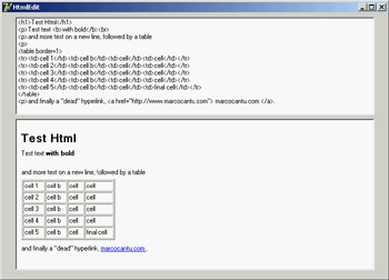
Figure 5.3: The HtmlEdit example at run time: When you add new HTML text to the memo, you get an immediate preview.
| Tip |
I originally built this example with Kylix on Linux. To port it to Windows and Delphi, all I had to do was copy the files and recompile. |
Selecting Options
Two standard Windows controls allow the user to choose different options. Two other controls let you group sets of options.
The CheckBox and RadioButton Components
The first standard option-selecting control is the check box, which corresponds to an option that can be selected regardless of the status of other check boxes. Setting the AllowGrayed property of the check box allows you to display three different states (selected, not selected, and grayed), which alternate as a user clicks the check box.
The second type of control is the radio button, which corresponds to an exclusive selection. Two radio buttons on the same form or inside the same radio group container cannot be selected at the same time, and one of them should always be selected (as programmer, you are responsible for selecting one of the radio buttons at design time).
The GroupBox Components
To host several groups of radio buttons, you can use a GroupBox control to hold them together, both functionally and visually. To build a group box with radio buttons, simply place the GroupBox component on a form and then add the radio buttons to the group box, as in the following example:
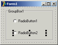
You can handle the radio buttons individually, but it's easier to navigate through the array of controls owned by the group box, as discussed in Chapter 4. Here is a small code excerpt used to get the text of a group's selected radio button:
var
 I: Integer;
 Text: string;
begin
 for I := 0 to GroupBox1.ControlCount - 1 do
 if (GroupBox1.Controls[I] as TRadioButton).Checked then
 Text := TRadioButton(GroupBox1.Controls[I]).Caption;
The RadioGroup Component
Delphi has a similar component that can be used specifically for radio buttons: the RadioGroup component. A RadioGroup is a group box with some radio buttons inside it. The difference is that these internal radio buttons are managed automatically by the container control. Using a radio group is generally easier than using a group box, because the various items are part of a list, as in a list box. This is how you can get the text of the selected item:
Text := RadioGroup1.Items [RadioGroup1.ItemIndex];
Another advantage is that the RadioGroup component can automatically align its radio buttons in one or more columns (as indicated by the Columns property), and you can easily add new choices at run time by adding strings to the Items string list. By contrast, adding new radio buttons to a group box is quite complex.
Lists
When you have many selections, radio buttons are not appropriate. The usual number of radio buttons is no more than five or six, to avoid cluttering the user interface; when you have more choices, you can use a list box or one of the other controls that display lists of items and allow the user to select one of them.
The ListBox Component
The selection of an item in a list box uses the Items and ItemIndex properties as in the earlier code shown for the RadioGroup control. If you need access to the text of selected list box items often, you can write a small wrapper function like this:
function SelText (List: TListBox): string;
var
 nItem: Integer;
begin
 nItem := List.ItemIndex;
 if nItem >= 0 then
 Result := List.Items [nItem]
 else
 Result := '';
end;
Another important feature is that by using the ListBox component, you can choose between allowing only a single selection, as in a group of radio buttons, and allowing multiple selections, as in a group of check boxes. You make this choice by specifying the value of the MultiSelect property. There are two kinds of multiple selections in Windows and in Delphi list boxes: multiple selection and extended selection. In the first case, a user selects multiple items simply by clicking them; in the second case, the user can use the Shift and Ctrl keys to select multiple consecutive or nonconsecutive items, respectively. The two alternatives are determined by the status of the ExtendedSelect property.
For a multiple-selection list box, a program can retrieve information about the number of selected items by using the SelCount property, and it can determine which items are selected by examining the Selected array. This array of Boolean values has the same number of entries as the list box. For example, to concatenate all the selected items into a string, you can scan the Selected array as follows:
var
 SelItems: string;
 nItem: Integer;
begin
 SelItems := '';
 for nItem := 0 to ListBox1.Items.Count - 1 do
 if ListBox1.Selected [nItem] then
 SelItems := SelItems + ListBox1.Items[nItem] + ' ';
Differently from VCL, in CLX you can configure a ListBox to use a fixed number of columns and rows, using the Columns, Row, ColumnLayout, and RowLayout properties. Of these, the VCL ListBox has only the Columns property.
The ComboBox Component
List boxes take up a lot of screen space, and they offer a fixed selection—that is, a user can choose only among the items in the list box and cannot enter any choice the programmer did not specifically foresee.
You can solve both problems by using a ComboBox control, which combines an edit box and a drop-down list. The behavior of a ComboBox component changes a lot depending on the value of its Style property:
- The csDropDown style defines a typical combo box, which allows direct editing and displays a list box on request.
- The csDropDownList style defines a combo box that does not allow editing (but uses the keystrokes to select an item).
- The csSimple style defines a combo box that always displays the list box below it.
Note also that accessing the text of the selected value of a ComboBox is easier than doing the same operation for a list box, because you can simply use the Text property. A useful and common trick for combo boxes is to add a new element to the list when a user enters some text and presses the Enter key. The following method first tests whether the user has pressed that key, by looking for the character with the numeric (ASCII) value of 13. It then tests to make sure the text of the combo box is not empty and is not already in the list (if its position in the list is less than zero). Here is the code:
procedure TForm1.ComboBox1KeyPress(
 Sender: TObject; var Key: Char);
begin
 // if the user presses the Enter key
 if Key = Chr (13) then
 with Sender as TComboBox do
 if (Text <> '') and (Items.IndexOf (Text) < 0) then
 Items.Add (Text);
end;
| Tip |
In CLX, the combo box can automatically add the text typed into the edit box to the drop-down list when the user presses the Enter key. Also, some events fire at different times than in VCL. |
Since version 6, Delphi includes two new events for the combo box. The OnCloseUp event corresponds to the closing of the drop-down list and complements the preexisting OnDropDown event. The OnSelect event fires only when the user selects something in the drop-down list, as opposed to typing in the edit portion.
Another nice feature is the AutoComplete property. When it is set, the ComboBox component (and the ListBox, as well) automatically locates the string nearest to the one the user is entering, suggesting the final part of the text. The core of this feature, also available in CLX, is implemented in the TCustomListBox.KeyPress method.
The CheckListBox Component
Another extension of the list box control is represented by the CheckListBox component, a list box with each item preceded by a check box:
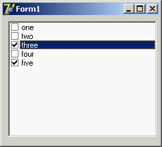
A user can select a single item in the list, but can also click the check boxes to toggle their status. This makes the CheckListBox a very good component for multiple selections or for highlighting the status of a series of independent items (as in a series of check boxes).
To check the current status of each item, you can use the Checked and State array properties (use the latter if the check boxes can be grayed). Delphi 5 introduced the ItemEnabled array property, which you can use to enable or disable each item of the list. You'll use the CheckListBox in the DragList example, later in this chapter.
| Tip |
Most of the list-based controls share a common and important feature: Each item in the list has an associated 32-bit value, usually indicated by the TObject type. This value can be used as a tag for each list item, and it's very useful for storing additional information along with each item. This approach is connected to a specific feature of the native Windows list box control, which offers four bytes of extra storage for each list box item. You'll use this feature in the ODList example later in this chapter. |
The Extended Combo Boxes: ComboBoxEx and ColorBox
The ComboBoxEx (where ex stands for extended) is the wrapper of a new Win32 common control that extends the traditional combo box by allowing images to appear next to the items in the list. You attach an image list to the combo box, and then select an image index for each item to display. The effect of this change is that the simple Items string list is replaced by a more complex collection, the ItemsEx property. I'll use the ComboBoxEx control in the RefList2 example in Chapter 7, "Working with Forms."
| Tip |
In Delphi 7, the ComboBoxEx component has the new AutoCompleteOptions property, enabling the combo box to respond to user keystrokes. |
The ColorBox control is a version of the combo box specifically aimed at selecting colors. You can use its Style property to choose which groups of colors you want to see in the list (standard color, extended colors, system colors, and so on).
The ListView and TreeView Components
If you want an even more sophisticated list, you can use the ListView common control, which will make the user interface of your application look very modern. This component is slightly more complex to use, as described in the section "ListView and TreeView Controls" later in this chapter. Other alternatives for listing values are the TreeView common control, which shows items in a hierarchical output, and the StringGrid control, which shows multiple elements for each line. For an actual example of the use of this component, refer to the free online chapter "Graphics in Delphi" discussed in Appendix C.
If you use the common controls in your application, users will already know how to interact with them, and they will regard the user interface of your program as up to date. TreeView and ListView are the two key components of Windows Explorer, and you can assume that many users will be familiar with them—even more so than with the traditional Windows controls. CLX adds also an IconView control, which parallels some features of the VCL ListView.
| Warning |
The ListView control in CLX doesn't have the small/large icon styles of its Windows counterpart, but a companion control, IconView, provides this capability. |
The ValueListEditor Component
Delphi applications often use the name/value structure natively offered by string lists, which I discussed in Chapter 4. Delphi 6 introduced a version of the StringGrid (technically a TCustomDrawGrid descendant class) component specifically geared toward this type of string lists. The ValueList-Editor has two columns in which you can display and let the user edit the contents of a string list with name/value pairs, as you can see in Figure 5.4. This string list is indicated in the Strings property of the control.
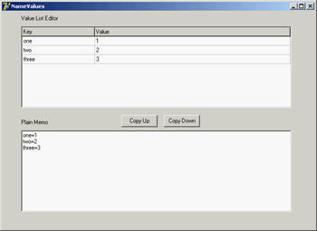
Figure 5.4: The NameValues example uses the ValueListEditor component, which shows the name/value or key/ value pairs of a string list, also visible in a plain memo.
The power of this control lies in the fact that you can customize the editing options for each position of the grid or for each key value, using the run-time-only ItemProps array property. For each item, you can indicate:
- Whether it is read-only
- The maximum number of characters of the string
- An edit mask (eventually requested in the OnGetEditMask event)
- The items in a drop-down pick list (eventually requested in the OnGetPickList event), as demonstrated by the first item of the example.
- The display of a button that will show an editing dialog box (in the OnEditButtonClick event, which the example handles with a message box)
Needless to say, this behavior resembles what is available generally for string grids and the DBGrid control, and also the behavior of the Object Inspector.
The ItemProps property must be set up at run time, by creating an object of the TItemProp class and assigning it to an index or a key of the string list. To have a default editor for each line, you can assign the same item property object multiple times. In the example, this shared editor sets an edit mask for up to three numbers:
procedure TForm1.FormCreate(Sender: TObject);
var
 I: Integer;
begin
 SharedItemProp := TItemProp.Create (ValueListEditor1);
 SharedItemProp.EditMask := '999;0; ';
 SharedItemProp.EditStyle := esEllipsis;

 FirstItemProp := TItemProp.Create (ValueListEditor1);
 for I := 1 to 10 do
 FirstItemProp.PickList.Add(IntToStr (I));

 Memo1.Lines := ValueListEditor1.Strings;
 ValueListEditor1.ItemProps [0] := FirstItemProp;
 for I := 1 to ValueListEditor1.Strings.Count - 1 do
 ValueListEditor1.ItemProps [I] := SharedItemProp;
end;
You must repeat similar code in case the number of lines changes—for example, by adding new elements in the memo and copying them to the value list.
procedure TForm1.ValueListEditor1StringsChange(Sender: TObject);
var
 I: Integer;
begin
  ValueListEditor1.ItemProps [0] := FirstItemProp;
 for I := 1 to ValueListEditor1.Strings.Count - 1 do
 if not Assigned (ValueListEditor1.ItemProps [I]) then
 ValueListEditor1.ItemProps [I] := SharedItemProp;
end;
| Note |
Reassigning the same editor twice causes trouble, so I've assigned the editor only to the lines that don't already have one. |
Another property, KeyOptions, allows you to let the user edit the keys (the names), add new entries, delete existing entries, and allow for duplicated names in the first portion of the string. Oddly enough, you cannot add new keys unless you also activate the edit options, which makes it hard to let the user add extra entries while preserving the names of the basic entries.
Ranges
Finally, you can use a few components to select values in a range. Ranges can be used for numeric input and for selecting an element in a list.
The ScrollBar Component
The stand-alone ScrollBar control is the original component of this group, but it is seldom used by itself. Scroll bars are usually associated with other components, such as list boxes and memo fields, or are associated directly with forms. In all these cases, the scroll bar can be considered part of the surface of the other components. For example, a form with a scroll bar is actually a form that has an area resembling a scroll bar painted on its border, a feature governed by a specific Windows style of the form window. By resembling, I mean that it is not technically a separate window of the ScrollBar component type. These "fake" scroll bars are usually controlled in Delphi using two specific properties of the form and the other components hosting them: VertScrollBar and HorzScrollBar.
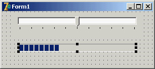
The TrackBar and ProgressBar Components
Direct use of the ScrollBar component is quite rare, especially with the TrackBar component introduced with Windows 95, which is used to let a user select a value in a range. Among Win32 common controls is the companion ProgressBar control, which allows the program to output a value in a range, showing the progress of a lengthy operation. These two components are visible here:
The UpDown Component
Another related control is the UpDown component, which is usually connected to an edit box so that the user can either type a number in it or increase and decrease the number using the two small arrow buttons. To connect the two controls, you set the Associate property of the UpDown component. Nothing prevents you from using the UpDown component as a stand-alone control, displaying the current value in a label or in some other way.
| Note |
CLX has no UpDown control, but it offers a SpinEdit that bundles an Edit with the UpDown in a single control. |
The PageScroller Component
The Win32 PageScroller control is a container allowing you to scroll the internal control. For example, if you place a toolbar in the page scroller and the toolbar is larger than the available area, the PageScroller will display two small arrows on the side. Clicking these arrows will scroll the internal area. This component can be used as a scroll bar, but it also partially replaces the ScrollBox control.
The ScrollBox Component
The ScrollBox control represents a region of a form that can scroll independently from the rest of the surface. For this reason, the ScrollBox has two scroll bars used to move the embedded components. You can easily place other components inside a ScrollBox, as you do with a panel. In fact, a ScrollBox is basically a panel with scroll bars to move its internal surface, an interface element used in many Windows applications. When you have a form with many controls and a toolbar or status bar, you might use a ScrollBox to cover the central area of the form, leaving its toolbars and status bars outside of the scrolling region. By relying on the scroll bars of the form, you might allow the user to move the toolbar or status bar out of view (a very odd situation).
Commands
The final category of components is not as clear-cut as the previous ones, and relates to commands. The basic component of this group is the TButton (or push button, in Windows jargon). More than stand-alone buttons, Delphi programmers use buttons (or TToolButton objects) within toolbars (in the early ages of Delphi, they used speed buttons within panels). Beside buttons and similar controls, the other key technique for issuing commands is the use of menu items, part of the pull-down menus attached to forms' main menus or local pop-up menus activated with the right mouse button.
Menu- or toolbar-related commands fall into different categories depending on their purpose and the feedback their interface provides to the user:
Commands Menu items or buttons used to execute an action.
State-setters Menu items or buttons used to toggle an option on and off, to change the state of a particular element. The menu items of these commands usually have a check mark to their left to indicate that they are active (you can automatically obtain this behavior using the AutoCheck property). Buttons are generally painted in a pressed down state to indicate the same status (the ToolButton control has a Down property).
Radio Items Menus items that display a bullet and are grouped to represent alternative selections, like radio buttons. To obtain radio menu items, set the RadioItem property to True and set the GroupIndex property for the alternative menu items to the same value. In a similar fashion, you can have groups of toolbar buttons that are mutually exclusive.
Dialog Openers Items that cause a dialog box to appear. They are usually indicated by an ellipsis (…) after the text.
Commands and Actions
As you'll see in Chapter 6, modern Delphi applications tend to use the ActionList component or its ActionManager extension to handle menu and toolbar commands. In short, you define a series of action objects and associate each of them to a toolbar button and/or a menu item. You can define the command execution in a single place but also update the user interface simply by targeting the action; the related visual control will automatically reflect the status of the action object.
The Menu Designer
If you just need to show a simple menu in your application, you can place a MainMenu or PopupMenu component on a form and double-click on it to fire up the Menu Designer, shown in Figure 5.5. You add new menu items and provide them with a Caption property, using a hyphen (-) to separate caption menu items.
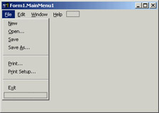
Figure 5.5: Delphi's Menu Designer in action
Delphi creates new components for each menu item you add. To name each component, Delphi uses the caption you enter and appends a number (so that Open becomes Open1). After removing spaces and other special characters from the caption, if nothing is left Delphi adds the letter N to the name. Finally it appends the number. Thus menu item separators are called N1, N2, and so on. Knowing what Delphi tends to do by default, you should think of editing the name first, which is necessary if you want to end up with a sensible component naming scheme.
| Warning |
Do not use the Break property, which is used to lay out a pull-down menu on multiple columns. The mbMenuBarBreak value indicates that this item will be displayed on a second or subsequent line; the mbMenuBreak value means this item will be added to a second or subsequent column of the pull-down menu. |
To obtain a more modern-looking menu, you can add an image list control to the program, hosting a series of bitmaps, and connect the image list to the menu using its Images property. You can then set an image for each menu item by setting the proper value of its ImageIndex property. The definition of images for menus is quite flexible—you can associate an image list with any specific pull-down menu (and even a specific menu item) using the SubMenuImages property. Having a specific smaller image list for each pull-down menu instead of a single large image list for the entire menu allows for more run-time customization of an application.
| Tip |
Creating menu items at run time is so common that Delphi provides some ready-to-use functions in the Menus unit. The names of these global functions are self-explanatory: NewMenu, NewPopupMenu, NewSubMenu, NewItem, and NewLine. |
Pop-Up Menus and the OnContextPopup Event
The PopupMenu component is typically displayed when the user right-clicks a component that uses the given pop-up menu as the value for its PopupMenu property. However, besides connecting the pop-up menu to a component with the corresponding property, you can call its Popup method, which requires the position of the pop-up in screen coordinates. The proper values can be obtained by converting a local point to a screen point with the ClientToScreen method of the local component, which is a label in this code fragment:
procedure TForm1.Label3MouseDown(Sender: TObject;
 Button: TMouseButton; Shift: TShiftState; X, Y: Integer);
var
 ScreenPoint: TPoint;
begin
 // if some condition applies...
 if Button = mbRight then
 begin
 ScreenPoint := Label3.ClientToScreen (Point (X, Y));
 PopupMenu1.Popup (ScreenPoint.X, ScreenPoint.Y)
 end;
end;
An alternative approach is to use the OnContextMenu event. This event, introduced in Delphi 5, fires when a user right-clicks a component—exactly what I traced previously with the test if Button = mbRight. The advantage is that the same event is also fired in response to a Shift+F10 key combination, as well as the shortcut-menu key of some keyboards. You can use this event to fire a pop-up menu with little code:
procedure TFormPopup.Label1ContextPopup(Sender: TObject;
 MousePos: TPoint; var Handled: Boolean);
var
 ScreenPoint: TPoint;
begin
 // add dynamic items
 PopupMenu2.Items.Add (NewLine);
 PopupMenu2.Items.Add (NewItem (TimeToStr (Now), 0, False, True, nil, 0, ''));
 // show popup
 ScreenPoint := ClientToScreen (MousePos);
 PopupMenu2.Popup (ScreenPoint.X, ScreenPoint.Y);
 Handled := True;
 // remove dynamic items
 PopupMenu2.Items [4].Free;
 PopupMenu2.Items [3].Free;
end;
This example adds some dynamic behavior to the shortcut menu, adding a temporary item indicating when the pop-up menu is displayed. This result is not particularly useful, but it illustrates that if you need to display a plain pop-up menu, you can easily use the PopupMenu property of the control in question or one of its parent controls. Handling the OnContextMenu event makes sense only when you want to do some extra processing.
The Handled parameter is preinitialized to False, so that if you do nothing in the event handler, the normal pop-up menu processing will occur. If you do something in your event handler to replace the normal pop-up menu processing (such as popping up a dialog or a customized menu, as in this case), you should set Handled to True and the system will stop processing the message. You'll rarely set Handled to True, because you'll generally handle the OnContextPopup to dynamically create or customize the pop-up menu, but then you can let the default handler show the menu.
The handler of an OnContextPopup event isn't limited to displaying a pop-up menu. It can perform any other operation, such as directly display a dialog box. Here is an example of a right-click operation used to change the color of the control:
procedure TFormPopup.Label2ContextPopup(Sender: TObject;
 MousePos: TPoint; var Handled: Boolean);
begin
 ColorDialog1.Color := Label2.Color;
 if ColorDialog1.Execute then
 Label2.Color := ColorDialog1.Color;
 Handled := True;
end;
All the code snippets from this section are available in the simple CustPop example for VCL and QCustPop for CLX.
Control Related Techniques
After this general overview of the most commonly used Delphi controls, I'll devote some space to discussing generic core techniques not related to a specific component. I'll cover the input focus, control anchors, the use of the splitter component, and the display of fly-by hints. Of course, these topics don't include everything you can do with visual controls, but they provide a starting point for exploration to get you up and running with some of the most common techniques.
Handling the Input Focus
Using the TabStop and TabOrder properties available in most controls, you can specify the order in which controls will receive the input focus when the user presses the Tab key. Instead of setting the tab order property of each component of a form manually, you can use the shortcut menu of the Form Designer to activate the Edit Tab Order dialog box, shown in Figure 5.6.
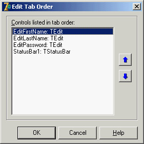
Figure 5.6: The Edit Tab Order dialog box
Besides these basics settings, it is important to know that each time a component receives or loses the input focus, it receives a corresponding OnEnter or OnExit event. This allows you to fine-tune and customize the order of the user operations. Some of these techniques are demonstrated by the InFocus example, which creates a typical password-login window. Its form has three edit boxes with labels indicating their meaning, as shown in Figure 5.7. At the bottom of the window is a status area with prompts guiding the user. Each item needs to be entered in sequence.
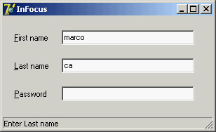
Figure 5.7: The InFocus example at run time
For the output of the status information, I've used the StatusBar component, with a single output area (obtained by setting its SimplePanel property to True). Here is a summary of the properties for this example. Notice the & character in the labels, indicating a shortcut key, and the connection of these labels with corresponding edit boxes (using the FocusControl property):
object FocusForm: TFocusForm
 ActiveControl = EditFirstName
 Caption = 'InFocus'
 object Label1: TLabel
 Caption = '&First name'
 FocusControl = EditFirstName
 end
 object EditFirstName: TEdit
 OnEnter = GlobalEnter
 OnExit = EditFirstNameExit
 end
 object Label2: TLabel
 Caption = '&Last name'
 FocusControl = EditLastName
 end
 object EditLastName: TEdit
 OnEnter = GlobalEnter
 end
 object Label3: TLabel
 Caption = '&Password'
 FocusControl = EditPassword
 end
 object EditPassword: TEdit
 PasswordChar = '*'
 OnEnter = GlobalEnter
 end
 object StatusBar1: TStatusBar
 SimplePanel = True
 end
end
The program is simple and performs only two operations. The first is to identify, in the status bar, the edit control that has the focus. It does this by handling the controls' OnEnter event, using a single generic event handler to avoid repetitive code. In the example, instead of storing extra information for each edit box, I've checked each control of the form to determine which label is connected to the current edit box (indicated by the Sender parameter):
procedure TFocusForm.GlobalEnter(Sender: TObject);
var
 I: Integer;
begin
 for I := 0 to ControlCount - 1 do
 // if the control is a label
 if (Controls [I] is TLabel) and
 // and the label is connected to the current edit box
 (TLabel(Controls[I]).FocusControl = Sender) then
 // copy the text, leaving off the initial & character
 StatusBar1.SimpleText := 'Enter ' +
 Copy (TLabel(Controls[I]).Caption, 2, 1000);
end;
The form's second event handler relates to the first edit box's OnExit event. If the control is left empty, it refuses to release the input focus and sets it back before showing a message to the user. The methods also look for a given input value, automatically filling the second edit box and moving the focus directly to the third one:
procedure TFocusForm.EditFirstNameExit(Sender: TObject);
begin
 if EditFirstName.Text = '' then
 begin
 // don't let the user get out
 EditFirstName.SetFocus;
 MessageDlg ('First name is required', mtError, [mbOK], 0);
 end
 else if EditFirstName.Text = 'Admin' then
 begin
 // fill the second edit and jump to the third
 EditLastName.Text := 'Admin';
 EditPassword.SetFocus;
 end;
end;
| Tip |
The CLX version of this example has the same code and is available as the QInFocus program. |
Control Anchors
To let you create a nice, flexible user interface, with controls adapting themselves to the current size of the form, Delphi allows you to determine the relative position of a control with the Anchors property. Before this feature was introduced in Delphi 4, every control placed on a form had coordinates relative to the top and bottom, unless it was aligned to the bottom or right side. Aligning is good for some controls but not all of them, particularly buttons.
By using anchors, you can make the position of a control relative to any side of the form. For example, to anchor a button to the bottom-right corner of the form, you place the button in the required position and set its Anchors property to [akRight, akBottom]. When the form size changes, the distance of the button from the anchored sides is kept fixed. In other words, if you set these two anchors and remove the two defaults, the button will remain in the bottom-right corner.
On the other hand, if you place a large component such as a Memo or a ListBox in the middle of a form, you can set its Anchors property to include all four sides. This way the control will behave as an aligned control, growing and shrinking with the size of the form, but there will be some margin between it and the form sides.
| Tip |
Anchors, like constraints, work both at design time and at run time. You should set them up as early as possible, to benefit from this feature while you're designing the form as well as at run time. |
As an example of both approaches, you can try the Anchors application, which has two buttons in the bottom-right corner and a list box in the middle. As shown in Figure 5.8, the controls automatically move and stretch as the form size changes. To make this form work properly, you must also set its Constraints property; otherwise, if the form becomes too small, the controls can overlap or disappear.
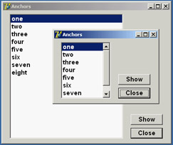
Figure 5.8: The controls of the Anchors example move and stretch automatically as the user changes the size of the form. No code is needed to move the controls, only proper use of the Anchors property.
Notice that if you remove all the anchors or two opposite ones (for example, left and right), the resize operations will cause the control to float in the form. The control keeps its current size, and the system adds or removes the same number of pixels on each side of it. This anchor can be defined as centered, because if the component is initially in the middle of the form it will keep that position. If you want a centered control you should generally use both opposite anchors, so that if the user makes the form larger, the control size will grow as well. In the case just presented, making the form larger leaves a small control in its center.
Using the Splitter Component
There are several ways to implement form-splitting techniques in Delphi, but the simplest approach is to use the Splitter component, found in the Additional page of the Component Palette. To make it more effective, the splitter can be used in combination with the Constraints property of the controls it relates to. As you'll see in the Split1 example, this technique allows you to define maximum and minimum positions for the splitter and the form. To build this example, simply place a ListBox component in a form; then add a Splitter component, a second ListBox, another Splitter, and finally a third ListBox component. The form also has a simple toolbar based on a panel.
By simply placing these two splitter components, you give your form the complete functionality of moving and sizing the controls it hosts at run time. The Width, Beveled, and Color properties of the splitter components determine their appearance, and in the Split1 example you can use the toolbar controls to change them. Another relevant property is MinSize, which determines the minimum size of the form's components. During the splitting operation (see Figure 5.9), a line marks the final position of the splitter, but you cannot drag this line beyond a certain limit. The behavior of the Split1 program is not to let controls become too small. An alternative technique is to set the new AutoSnap property of the splitter to True. This property will make the splitter hide the control when its size goes below the MinSize limit.
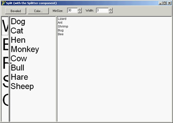
Figure 5.9: The Split1 example's splitter component determines the minimum size for each control on the form, even those not adjacent to the splitter.
I suggest you try using the Split1 program, so that you'll fully understand how the splitter affects its adjacent controls and the other controls of the form. Even if you set the MinSize property, a user can reduce the size of the program's entire form to a minimum, hiding some of the list boxes. If you test the Split2 version of the example, you'll get better behavior. In Split2, I've set some Constraints for the ListBox controls:
object ListBox1: TListBox
 Constraints.MaxHeight = 400
 Constraints.MinHeight = 200
 Constraints.MinWidth = 150
The size constraints are applied only as you resize the controls; so, to make this program work satisfactorily, you have to set the ResizeStyle property of the two splitters to rsUpdate. This value indicates that the controls' position is updated for every movement of the splitter, not only at the end of the operation. If you select the rsLine or the new rsPattern value, instead, the splitter simply draws a line in the required position, checking the MinSize property but not the constraints of the controls.
| Tip |
When you set the Splitter component's AutoSnap property to True, the splitter will completely hide the neighboring control when the size of that control is below the minimum set for it in the Splitter component. |
Horizontal Splitting
You can also use the Splitter component for horizontal splitting, instead of the default vertical splitting. Basically, you place a component on a form, align it to the top, and then place the splitter on the form. By default, the splitter will be left aligned. Choose the alTop value for the Align property, and you're done. You can see a form with a horizontal splitter in the SplitH example. This program has two memo components into which you can open a file, and it has a splitter dividing them, defined as follows:
object Splitter1: TSplitter
 Cursor = crVSplit
 Align = alTop
 OnMoved = Splitter1Moved
end
The program features a status bar, which keeps track of the current height of the two memo components. It handles the OnMoved event of the splitter (the only event of this component) to update the text of the status bar. The same code is executed whenever the form is resized:
procedure TForm1.Splitter1Moved(Sender: TObject);
begin
 StatusBar1.Panels[0].Text := Format ('Upper Memo: %d - Lower Memo: %d',
 [MemoUp.Height, MemoDown.Height]);
end;
Accelerator Keys
Since Delphi 5, you don't need to enter the & character in the Caption of a menu item, which provides an automatic accelerator key if you omit one. Delphi's automatic accelerator-key system can also figure out if you have entered conflicting accelerator keys and fix them on the fly. This doesn't mean you should stop adding custom accelerator keys with the & character, because the automatic system simply uses the first available letter and doesn't follow the default standards. You might also find better mnemonic keys than those chosen by the automatic system.
This feature is controlled by the AutoHotkeys property, which is available in the main menu component and in each of the pull-down menus and menu items. In the main menu, this property defaults to maAutomatic; in the pull-downs and menu items, it defaults to maParent, so the value you set for the main menu component will be used automatically by all the subitems, unless they have a specific value of maAutomatic or maManual.
The engine behind this system is the RethinkHotkeys method of the TMenuItem class, and the companion InternalRethinkHotkeys method. There is also a RethinkLines method, which checks whether a pull-down has two consecutive separators or begins or ends with a separator. In all these cases, the separator is automatically removed.
One of the reasons Delphi includes this feature is the support for translations. When you need to translate an application's menu, it is convenient if you don't have to deal with the accelerator keys, or at least if you don't have to worry about whether two items on the same menu conflict. Having a system that can automatically resolve similar problems is definitely an advantage. Another motivation was Delphi's IDE. With all the dynamically loaded packages that install menu items in the IDE main menu or in pop-up menus, and with different packages loaded in different versions of the product, it's next to impossible to get nonconflicting accelerator-key selections in each menu. That is why this mechanism isn't a wizard that does static analysis of your menus at design time; it was created to deal with the real problem of managing menus created dynamically at run time.
| Warning |
This feature is certainly handy, but because it is active by default, it can break existing code. I had to modify two of this chapter's program examples, between the Delphi 4 and Delphi 5 edition of the book, just to avoid run-time errors caused by this change. The problem is that I use the caption in the code, and the extra & broke my code. The change was quite simple, though: All I had to do was to set the AutoHotkeys property of the main menu component to maManual. |
Using the Fly by Hints
Another common element in toolbars is the tooltip, also called fly-by hint—text that briefly describes the button currently under the cursor. This text is usually displayed in a yellow box after the mouse cursor has remained steady over a button for a set amount of time. To add hints to a group of buttons or components, simply set the ShowHints property of the parent control to True and enter some text for the Hint property of each element. You might want to enable the hints for all the components on a form, or all the buttons of a toolbar or panel.
If you want to have more control over how hints are displayed, you can use some of the properties and events of the Application object. This global object has, among others, the following properties:
|
Property |
Defines |
|---|---|
|
HintColor |
The background color of the hint window |
|
HintPause |
How long the cursor must remain on a component before hints are displayed |
|
HintHidePause |
How long the hint will be displayed |
|
HintShortPause |
How long the system should wait to display a hint if another hint has just been displayed |
For example, a program might allow a user to customize the hint background color by selecting a specific color with the following code:
ColorDialog.Color := Application.HintColor;
if ColorDialog.Execute then
 Application.HintColor := ColorDialog.Color;
As an alternative, you can change the hint color by handling the OnShowHint property of the Application object. This handler can change the hint's color for specific controls. The OnShowHint event is used in the CustHint example described in the next section.
Customizing the Hints
Just as you can add hints to an application's toolbar, you can add hints to forms or to the components of a form. For a large control, the hint will show up near the mouse cursor. In some cases, it is important to know that a program can freely customize how hints are displayed. One thing you can do is to change the value of the properties of the Application object, as I mentioned at the end of the last section. To obtain more control over hints, you can customize them even further by assigning a method to the application's OnShowHint event. You need to either hook up this event manually or—better—add an ApplicationEvents component to the form and handle its OnShowHint event.
The event handler method has some interesting parameters, such as a string with the hint's text, a Boolean flag for its activation, and a THintInfo structure with further information, including the control, the hint position, and its color. The parameters are passed by reference, so you have a chance to change them and also modify the values of the THintInfo structure; for example, you can change the position of the hint window before it is displayed.
This is what I've done in the CustHint example, which shows the hint for the label at the center of its area.
procedure TForm1.ShowHint (var HintStr: string; var CanShow: Boolean;
 var HintInfo: THintInfo);
begin
 with HintInfo do
    // if the control is the label show the hint in the middle
 if HintControl = Label1 then
 HintPos := HintControl.ClientToScreen (Point (
 HintControl.Width div 2, HintControl.Height div 2));
end;
The code retrieves the center of the generic control (the HintInfo.HintControl) and then converts its coordinates to screen coordinates, applying the ClientToScreen method to the control.
You can further update the CustHint example in a different way. The form's ListBox control has some rather long text items, so you might want to display the entire text in a hint while the mouse moves over the item. Setting a single hint for the list box won't do, of course.
A good solution is to customize the hint system by providing a hint dynamically corresponding to the text of the list box item under the cursor. You also need to indicate to the system which area the hint belongs to, so that by moving over the next line a new hint will be displayed. You accomplish this by setting the CursorRect field of the THintInfo record, which indicates the area of the component that the cursor can move over without disabling the hint. When the cursor moves outside this area, Delphi hides the hint window. Here is the related code snippet I've added to the ShowHint method:
 else if HintControl = ListBox1 then
 begin
 nItem := ListBox1.ItemAtPos(
 Point (CursorPos.x, CursorPos.Y), True);
 if nItem >= 0 then
 begin
 // set the hint string
 HintStr := ListBox1.Items[nItem];
 // determine area for hint validity
 CursorRect := ListBox1.ItemRect(nItem);
 // display over the item
 HintPos := HintControl.ClientToScreen (Point(
 0, ListBox1.ItemHeight * (nItem - ListBox1.TopIndex)));
 end
 else
 CanShow := False;
 end;
The resulting effect is that each line of the list box appears to have a specific hint, as shown in Figure 5.10. The hint position is computed so that it covers the current item text, extending beyond the list box border.
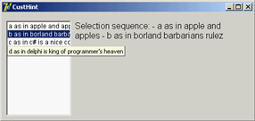
Figure 5.10: The ListBox control of the CustHint example shows a different hint, depending on which list item the mouse is over.
Owner Draw Controls and Styles
In Windows, the system is usually responsible for painting buttons, list boxes, edit boxes, menu items, and similar elements. Basically, these controls know how to paint themselves. As an alternative, however, the system allows the owner of these controls, generally a form, to paint them. This technique, available for buttons, list boxes, combo boxes, and menu items, is called owner-draw.
In the VCL, the situation is slightly more complex. The components can take care of painting themselves in this case (as in the TBitBtn class for bitmap buttons) and possibly activate corresponding events. The system sends the request for painting to the owner (usually the form), and the form forwards the event back to the proper control, firing its event handlers. In CLX, some of the controls, such as ListBoxes and ComboBoxes, surface events very similar to Windows owner-draw, but menus lack them. The native approach of Qt is to use styles to determine the graphical behavior of all the controls in the system, of a specific application, or of a given control. I'll introduce styles shortly, later in this section.
| Note |
Most of the Win32 common controls have support for the owner-draw technique, generally called custom drawing. You can fully customize the appearance of a ListView, TreeView, TabControl, PageControl, HeaderControl, StatusBar, or ToolBar. The ToolBar, ListView, and TreeView controls also support advanced custom drawing, a more fine-tuned drawing capability introduced by Microsoft in the latest versions of the Win32 common controls library. The downside to owner-draw is that when the Windows user interface style changes in the future (and it always does), your owner-draw controls that fit in perfectly with the current user interface styles will look outdated and out of place. Because you are creating a custom user interface, you'll need to keep it updated yourself. By contrast, if you use the standard output of the controls, your applications will automatically adapt to a new version of such controls. |
Owner-Draw Menu Items
VCL makes the development of graphical menu items quite simple compared to the traditional approach of the Windows API: You set the OwnerDraw property of a menu item component to True and handle its OnMeasureItem and OnDrawItem events. In the OnMeasureItem event, you can determine the size of the menu items. This event handler is activated once for each menu item when the pull-down menu is displayed and has two reference parameters you can set: Width and Height. In the OnDrawItem event, you paint the actual image. This event handler is activated every time the item has to be repainted. This happens when Windows first displays the items and each time the status changes; for example, when the mouse moves over an item, the item should become highlighted.
To paint the menu items, you must consider all the possibilities, including drawing the highlighted items with specific colors, drawing the check mark if required, and so on. Luckily, the Delphi event passes to the handler the Canvas where it should paint, the output rectangle, and the status of the item (selected or not). In the ODMenu example, I'll handle the highlighted color, but skip other advanced aspects (such as the check marks). I've set the OwnerDraw property of the menu and written handlers for some of the menu items. To write a single handler for each event of the three color-related menu items, I've set their Tag property to the value of the color in the OnCreate event handler of the form. This makes the handler of the items' OnClick event quite straightforward:
procedure TForm1.ColorClick(Sender: TObject);
begin
 ShapeDemo.Brush.Color := (Sender as TComponent).Tag
end;
The handler of the OnMeasureItem event doesn't depend on the actual items, but uses fixed values (different from the handler of the other pull-down). The most important portion of the code is in the handlers of the OnDrawItem events. For the color, you use the value of the tag to paint a rectangle of the given color, as you can see in Figure 5.11. Before doing this, however, you have to fill the background of the menu items (the rectangular area passed as a parameter) with the standard color for the menu (clMenu) or the selected menu items (clHighlight):
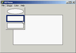
Figure 5.11: The owner-draw menu of the ODMenu example
procedure TForm1.ColorDrawItem(Sender: TObject; ACanvas: TCanvas;
 ARect: TRect; Selected: Boolean);
begin
 // set the background color and draw it
 if Selected then
 ACanvas.Brush.Color := clHighlight
 else
 ACanvas.Brush.Color := clMenu;
 ACanvas.FillRect (ARect);
 // show the color
 ACanvas.Brush.Color := (Sender as TComponent).Tag;
 InflateRect (ARect, -5, -5);
 ACanvas.Rectangle (ARect.Left, ARect.Top, ARect.Right, ARect.Bottom);
end;
The three handlers for this event of the Shape pull-down menu items are all different, although they use similar code:
procedure TForm1.Ellipse1DrawItem(Sender: TObject; ACanvas: TCanvas;
 ARect: TRect; Selected: Boolean);
begin
 // set the background color and draw it
 if Selected then
 ACanvas.Brush.Color := clHighlight
 else
 ACanvas.Brush.Color := clMenu;
 ACanvas.FillRect (ARect);
 // draw the ellipse
 ACanvas.Brush.Color := clWhite;
 InflateRect (ARect, -5, -5);
 ACanvas.Ellipse (ARect.Left, ARect.Top, ARect.Right, ARect.Bottom);
end;
| Note |
To accommodate the increasing number of states in the Windows 2000 user interface style, Delphi includes the OnAdvancedDrawItem event for menus. |
A ListBox of Colors
As you have just seen for menus, list boxes have an owner-draw capability, which means a program can paint the items of a list box. The same support is provided for combo boxes and is also available on CLX. To create an owner-draw list box, you set its Style property to lbOwnerDrawFixed or lbOwnerDrawVariable. The first value indicates that you will set the height of the list box items by specifying the ItemHeight property and that this will be the height of every item. The second owner-draw style indicates a list box with items of different heights; in this case, the component will trigger the OnMeasureItem event for each item, to ask the program for their heights.
In the ODList example (and its QODList version), I'll stick with the first, simpler, approach. The example stores color information along with the list box items and then draws the items using those colors (instead of using a single color for the whole list).
The DFM or XFM file of every form, including this one, has a TextHeight attribute, which indicates the number of pixels required to display text. You should use this value for the list box's ItemHeight property. An alternative solution is to compute this value at run time, so that if you later change the font at design time, you don't have to remember to set the height of the items accordingly.
| Note |
I've just described TextHeight as an attribute of the form, not a property. It isn't a property, but a local value of the form. If it is not a property, you might ask, how does Delphi save it in the DFM file? The answer is that Delphi's streaming mechanism is based on properties plus special property clones created by the DefineProperties method. |
Because TextHeight is not a property, although it is listed in the form description, you cannot access it directly. Studying the VCL source code, I found that this value is computed by calling a private method of the form: GetTextHeight. Because it is private, you cannot call this function. Instead, you can duplicate its code (which is quite simple) in the FormCreate method of the form, after selecting the font of the list box:
Canvas.Font := ListBox1.Font;
ListBox1.ItemHeight := Canvas.TextHeight('0');
Next you add some items to the list box. Because this is a list box of colors, you want to add color names to the Items of the list box and the corresponding color values to the Objects data storage related to each list item. Instead of adding the two values separately, I've written a procedure to add new items to the list:
procedure TODListForm.AddColors (Colors: array of TColor);
var
 I: Integer;
begin
 for I := Low (Colors) to High (Colors) do
 ListBox1.Items.AddObject (ColorToString (Colors[I]), TObject(Colors[I]));
end;
This method uses an open-array parameter, an array of an undetermined number of elements of the same type. For each item passed as a parameter, you add the name of the color to the list, and you add its value to the related data by calling the AddObject method. To obtain the string corresponding to the color, you call the Delphi ColorToString function. It returns a string containing either the corresponding color constant, if any, or the hexadecimal value of the color. The color data is added to the list box after casting its value to the TObject data type (a four-byte reference), as required by the AddObject method.
| Tip |
Besides ColorToString, which converts a color value into the corresponding string with the identifier or the hexadecimal value, the Delphi StringToColor function converts a properly formatted string into a color. |
In the ODList example, this method is called in the form's OnCreate event handler (after the height of the items has been set):
AddColors ([clRed, clBlue, clYellow, clGreen, clFuchsia, clLime, clPurple,
 clGray, RGB (213, 23, 123), RGB (0, 0, 0), clAqua, clNavy, clOlive, clTeal]);
To compile the CLX version of this code, I've added to it the RGB function described earlier in the section "Colors." The code used to draw the items is not particularly complex. You simply retrieve the color associated with the item, set it as the color of the font, and then draw the text:
procedure TODListForm.ListBox1DrawItem(Control: TWinControl; Index: Integer;
 Rect: TRect; State: TOwnerDrawState);
begin
 with Control as TListbox do
 begin
 // erase
 Canvas.FillRect(Rect);
 // draw item
 Canvas.Font.Color := TColor (Items.Objects [Index]);
 Canvas.TextOut(Rect.Left, Rect.Top, Listbox1.Items[Index]);
 end;
end;
The system already sets the proper background color, so the selected item is displayed properly even without any extra code on your part. Moreover, the program allows you to add new items by double-clicking on the list box:
procedure TODListForm.ListBox1DblClick(Sender: TObject);
begin
 if ColorDialog1.Execute then
 AddColors ([ColorDialog1.Color]);
end;
If you try using this capability, you'll notice that some colors you add are turned into color names (one of the Delphi color constants), whereas others are converted into hexadecimal numbers.
ListView and TreeView Controls
In the earlier section "Opening the Component Toolbox," I introduced the various visual controls you can use to display lists of values. The standard list box and combo box components are very common, but they are often replaced by the more powerful ListView and TreeView controls. These two controls are part of the Win32 common controls, stored in the ComCtl32.DLL library. Similar controls are available in Qt and VisualCLX, both on Windows and Linux.
A Graphical Reference List
When you use a ListView component, you can provide bitmaps both indicating the status of the element (for example, the selected item) and describing the contents of the item in a graphical way.
To connect the images to a list or tree, you need to refer to the ImageList component you've already used for the menu images. A ListView can have three image lists: one for the large icons (the LargeImages property), one for the small icons (the SmallImages property), and one for the state of the items (the StateImages property). In the RefList example, I've set the first two properties using two different ImageList components.
Each item of the ListView has an ImageIndex, which refers to its image in the list. For this technique to work properly, the elements in the two image lists should follow the same order. When you have a fixed image list, you can add items to it using Delphi's ListView Item Editor, which is connected to the Items property. In this editor, you can define items and subitems. The subitems are displayed only in the detailed view (when you set the vsReport value of the ViewStyle property) and are connected with the titles set in the Columns property:
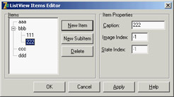
| Warning |
The ListView control in CLX doesn't have the small and large icon views. In Qt, this type of display is available from another component, the IconView. |
In my RefList example (a simple list of references to books, magazines, CD-ROMs, and websites), the items are stored to a file, because users of the program can edit the contents of the list, which are automatically saved as the program exits. This way, edits made by the user become persistent. Saving and loading the contents of a ListView is not trivial, because the TListItems type doesn't have an automatic mechanism to save the data. As an alternative approach, I've copied the data to and from a string list, using a custom format. The string list can then be saved to a file and reloaded with a single command.
The file format is simple, as you can see in the following saving code. For each list item, the program saves the caption on one line, the image index on another line (prefixed by the @ character), and the subitems on the following lines, indented with a tab character:
procedure TForm1.FormDestroy(Sender: TObject);
var
 I, J: Integer;
 List: TStringList;
begin
 // store the items
 List := TStringList.Create;
 try
 for I := 0 to ListView1.Items.Count - 1 do
 begin
 // save the caption
 List.Add (ListView1.Items[I].Caption);
 // save the index
 List.Add ('@' + IntToStr (ListView1.Items[I].ImageIndex));
 // save the subitems (indented)
 for J := 0 to ListView1.Items[I].SubItems.Count - 1 do
 List.Add (#9 + ListView1.Items[I].SubItems [J]);
 end;
 List.SaveToFile (ExtractFilePath (Application.ExeName) + 'Items.txt');
 finally
 List.Free;
 end;
end;
The items are then reloaded in the FormCreate method:
procedure TForm1.FormCreate(Sender: TObject);
var
 List: TStringList;
 NewItem: TListItem;
 I: Integer;
begin
 // stops warning message
 NewItem := nil;
 // load the items
 ListView1.Items.Clear;
 List := TStringList.Create;
 try
 List.LoadFromFile (
 ExtractFilePath (Application.ExeName) + 'Items.txt');
 for I := 0 to List.Count - 1 do
 if List [I][1] = #9 then
 NewItem.SubItems.Add (Trim (List [I]))
 else if List [I][1] = '@' then
 NewItem.ImageIndex := StrToIntDef (List [I][2], 0)
      else
      begin
 // a new item
 NewItem := ListView1.Items.Add;
 NewItem.Caption := List [I];
 end;
 finally
 List.Free;
 end;
end;
The program has a menu you can use to choose one of the different views supported by the ListView control and to add check boxes to the items, as in a CheckListBox control. You can see some combinations of these styles in Figure 5.12.
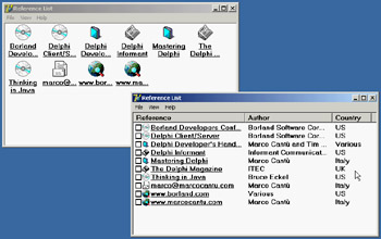
Figure 5.12: Different examples of the output of a ListView compo-nent in the RefList program, obtained by changing the ViewStyle property and adding the check boxes
Another important feature, which is common in the detailed or report view of the control, lets a user sort the items on one of the columns. In the VCL, this technique requires three operations. First, you set the SortType property of the ListView to stBoth or stData. This way, the ListView will sort based not on the captions, but by calling the OnCompare event for each two items it has to sort.
Second, because you want to sort on each of the columns of the detailed view, you also handle the OnColumnClick event (which takes place when the user clicks on the column titles in the detailed view, but only if the ShowColumnHeaders property is set to True). Each time a column is clicked, the program saves the number of that column in the form class's nSortCol private field:
procedure TForm1.ListView1ColumnClick(Sender: TObject;
 Column: TListColumn);
begin
 nSortCol := Column.Index;
 ListView1.AlphaSort;
end;
Then, in the third step, the sorting code uses either the caption or one of the subitems according to the current sort column:
procedure TForm1.ListView1Compare(Sender: TObject;
 Item1, Item2: TListItem; Data: Integer; var Compare: Integer);
begin
  if nSortCol = 0 then
 Compare := CompareStr (Item1.Caption, Item2.Caption)
 else
 Compare := CompareStr (Item1.SubItems [nSortCol - 1],
 Item2.SubItems [nSortCol - 1]);
end;
In the CLX version of the program (called QRefList) you don't have to do any of the previous steps. The control is already capable of sorting itself properly when its caption is clicked. You automatically get multiple columns that auto-sort (both ascending and descending).
The final features I've added to the program relate to mouse operations. When the user left-clicks an item, the RefList program shows a description of the selected item. Right-clicking the selected item sets it in edit mode, and a user can change it (keep in mind that the changes will automatically be saved when the program terminates). Here is the code for both operations, in the OnMouseDown event handler of the ListView control:
procedure TForm1.ListView1MouseDown(Sender: TObject; Button: TMouseButton;
 Shift: TShiftState; X, Y: Integer);
var
 strDescr: string;
 I: Integer;
begin
 // if there is a selected item
 if ListView1.Selected <> nil then
 if Button = mbLeft then
 begin
 // create and show a description
 strDescr := ListView1.Columns [0].Caption + #9 +
 ListView1.Selected.Caption + #13;
 for I := 1 to ListView1.Selected.SubItems.Count do
 strDescr := strDescr + ListView1.Columns [I].Caption + #9 +
 ListView1.Selected.SubItems [I-1] + #13;
 ShowMessage (strDescr);
 end
    else if Button = mbRight then
 // edit the caption
 ListView1.Selected.EditCaption;
end;
Although it is not feature-complete, this example shows some of the potential of the ListView control. I've also activated the "hot-tracking" feature, which lets the list view highlight and underline the item under the mouse. The relevant properties of the ListView can be seen in its textual description:
object ListView1: TListView
 Align = alClient
 Columns = <
 item
 Caption = 'Reference'
 Width = 230
 end
 item
 Caption = 'Author'
 Width = 180
 end
 item
 Caption = 'Country'
 Width = 80
 end>
 Font.Height = -13
 Font.Name = 'MS Sans Serif'
 Font.Style = [fsBold]
 FullDrag = True
 HideSelection = False
 HotTrack = True
 HotTrackStyles = [htHandPoint, htUnderlineHot]
 SortType = stBoth
 ViewStyle = vsList
 OnColumnClick = ListView1ColumnClick
 OnCompare = ListView1Compare
 OnMouseDown = ListView1MouseDown
end
This program is quite interesting, and I'll further extend it in Chapter 9 by adding a dialog box.
To build its CLX version, QRefList, I had to use only one of the image lists and disable the small images and large images menus, because a ListView is limited to the list and report view styles. Large and small icons are available in a different control, called IconView. As previously mentioned, the sorting support was already there, which could have saved most of the code of the example.
A Tree of Data
Now that you've seen an example based on the ListView, let's examine the TreeView control. The TreeView has a user interface that is flexible and powerful (with support for editing and dragging elements). It is also standard, because it is the Windows Explorer user interface. There are properties and various ways to customize the bitmap of each line or each type of line.
To define the structure of the TreeView nodes at design time, you can use the TreeView Items Editor:
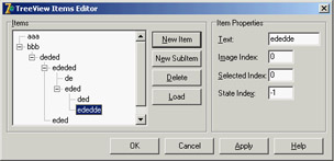
In this case, however, I've decided to load the TreeView data at startup, in a way similar to the last example.
The Items property of the TreeView component has many member functions you can use to alter the hierarchy of strings. For example, you can build a two-level tree with the following lines:
var
 Node: TTreeNode;
begin
 Node := TreeView1.Items.Add (nil, 'First level');
 TreeView1.Items.AddChild (Node, 'Second level');
Using the Add and AddChild methods, you can build a complex structure at run time. To load the information, you can again use a StringList at run time, load a text file with the information, and parse it.
However, because the TreeView control has a LoadFromFile method, the DragTree and QDragTree examples use the following simpler code:
procedure TForm1.FormCreate(Sender: TObject);
begin
 TreeView1.LoadFromFile (ExtractFilePath (Application.ExeName) +
 'TreeText.txt');
end;
The LoadFromFile method loads the data in a string list and checks the level of each item by looking at the number of tab characters. (If you are curious, see the TTreeStrings.GetBufStart method, which you can find in the ComCtrls unit in the VCL source code included in Delphi.) The data I've prepared for the TreeView is the organizational chart of a multinational company, as you can see in Figure 5.13.
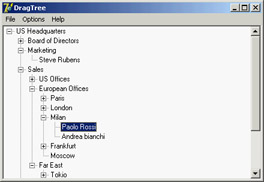
Figure 5.13: The DragTree example after loading the data and expanding the branches
Instead of expanding the node items one by one, you can also use the File ® Expand All menu of this program, which calls the FullExpand method of the TreeView control or executes the equivalent code (in this specific case of a tree with a root item):
TreeView1.Items [0].Expand(True);
Besides loading the data, the program saves the data when it terminates, making the changes persistent. It also has a few menu items to customize the font of the TreeView control and change some other simple settings. The specific feature I've implemented in this example is support for dragging items and entire subtrees. I've set the DragMode property of the component to dmAutomatic and written the event handlers for the OnDragOver and OnDragDrop events.
In the first of the two handlers, the program makes sure the user is not trying to drag an item over a child item (which would be moved along with the item, leading to an infinite recursion):
procedure TForm1.TreeView1DragOver(Sender, Source: TObject;
 X, Y: Integer; State: TDragState; var Accept: Boolean);
var
 TargetNode, SourceNode: TTreeNode;
begin
 TargetNode := TreeView1.GetNodeAt (X, Y);
 // accept dragging from itself
 if (Source = Sender) and (TargetNode <> nil) then
 begin
 Accept := True;
 // determines source and target
 SourceNode := TreeView1.Selected;
 // look up the target parent chain
 while (TargetNode.Parent <> nil) and (TargetNode <> SourceNode) do
 TargetNode := TargetNode.Parent;
 // if source is found
 if TargetNode = SourceNode then
 // do not allow dragging over a child
 Accept := False;
 end
 else
 Accept := False;
end;
The effect of this code is that (except for the particular case you need to disallow) a user can drag a TreeView item over another item. Writing the code for moving the items is simple, because the TreeView control provides support for this operation through the TTreeNode class's MoveTo method:
procedure TForm1.TreeView1DragDrop(Sender, Source: TObject; X, Y: Integer);
var
 TargetNode, SourceNode: TTreeNode;
begin
 TargetNode := TreeView1.GetNodeAt (X, Y);
 if TargetNode <> nil then
 begin
 SourceNode := TreeView1.Selected;
 SourceNode.MoveTo (TargetNode, naAddChildFirst);
 TargetNode.Expand (False);
 TreeView1.Selected := TargetNode;
 end;
end;
| Note |
Among the demos shipping with Delphi is an interesting one showing a custom-draw TreeView control. The example is in the CustomDraw subdirectory. |
The Portable Version of DragTree
Because I use this program in numerous porting demonstrations, I've built a version you can compile as a native VCL application with Delphi and as a CLX application with Kylix. This is different from most other programs in this book, including the previous version of this same example, which can be ported to Delphi by using VisualCLX and also Qt on Windows. Following a different path once in a while can be instructive.
The first thing I had to do was use two different sets of uses statements, using conditional compilation. The unit of the PortableDragTree example begins as follows:
unit TreeForm;

interface

uses
 SysUtils, Classes,

{$IFDEF LINUX}
 Qt, Libc, QGraphics, QControls, QForms, QDialogs,
 QStdCtrls, QComCtrls, QMenus, QTypes, QGrids;
{$ENDIF}

{$IFDEF MSWINDOWS}
 Windows, Graphics, Controls, Forms, Dialogs,
 StdCtrls, ComCtrls, Menus, Grids;
{$ENDIF}
A similar conditional directive is used in the initial portion of the implementation section, to include the proper resource file for the form (the two resource files are different):
{$IFDEF LINUX}
  {$R *.xfm}
{$ENDIF}

{$IFDEF MSWINDOWS}
  {$R *.dfm}
{$ENDIF}
I've omitted some of the Windows-specific features anyway, so the only difference in code is in the FormCreate method. The program loads the data file from the user's default folder, not the same folder as the executable. Depending on the operating system, the user's folder is the home directory (and the hidden file has a starting dot) or the specific My Documents area (available with a special API call):
procedure TForm1.FormCreate(Sender: TObject);
var
 path: string;
begin
{$IFDEF LINUX}
 filename := GetEnvironmentVariable('HOME') +
 '/.TreeText.txt';
{$ELSE}
 SetLength (path, 100);
 ShGetSpecialFolderPath (Handle, PChar(path),
 CSIDL_PERSONAL, False);
 path := PChar (path); // fix string length
 filename := path + 'TreeText.txt';
{$ENDIF}
 TreeView1.LoadFromFile (filename);
end;
Custom Tree Nodes
Delphi 6 added a few features to the TreeView controls, including multiple selection (see the MultiSelect and MultiSelectStyle properties and the Selections array), improved sorting, and several new events. The key improvement, however, is letting the programmer determine the class of the tree view's node items. Having custom node items implies the ability to attach custom data to the nodes in a simple, object-oriented way. To support this technique, there is a new AddNode method for the TTreeItems class and a new specific event, OnCreateNodesClass. In the handler for this event, you return the class of the object to be created, which must inherit from TTreeNode.
This is a very common technique, so I've built an example to discuss it in detail. The CustomNodes example doesn't focus on a real-world case, but it shows a rather complex situation in which two different custom tree node classes are derived one from the other. The base class adds an ExtraCode property, mapped to virtual methods, and the subclass overrides one of these methods. For the base class, the GetExtraCode function simply returns the value; for the derived class, the value is multiplied to the parent node value. Here are the classes and this second method:
type
 TMyNode = class (TTreeNode)
 private
 FExtraCode: Integer;
 protected
 procedure SetExtraCode(const Value: Integer); virtual;
 function GetExtraCode: Integer; virtual;
 public
 property ExtraCode: Integer read GetExtraCode write SetExtraCode;
 end;

 TMySubNode = class (TMyNode)
 protected
 function GetExtraCode: Integer; override;
 end;

function TMySubNode.GetExtraCode: Integer;
begin
 Result := fExtraCode * (Parent as TMyNode).ExtraCode;
end;
With these custom tree node classes available, the program creates a tree of items, using the first type for the first-level nodes and the second class for the other nodes. Because you have only one OnCreateNodeClass event handler, the program uses the class reference stored in a private field of the form (CurrentNodeClass of type TTreeNodeClass):
procedure TForm1.TreeView1CreateNodeClass(Sender: TCustomTreeView;
 var NodeClass: TTreeNodeClass);
begin
 NodeClass := CurrentNodeClass;
end;
The program sets this class reference before creating nodes of each type—for example, with code like the following:
var
 MyNode: TMyNode;
begin
 CurrentNodeClass := TMyNode;
 MyNode := TreeView1.Items.AddChild (nil, 'item' + IntToStr (nValue))
 as TMyNode;
 MyNode.ExtraCode := nValue;
Once the entire tree has been created, when the user selects an item, you can cast its type to TMyNode and access the extra properties (but also methods and data):
procedure TForm1.TreeView1Click(Sender: TObject);
var
 MyNode: TMyNode;
begin
 MyNode := TreeView1.Selected as TMyNode;
 Label1.Caption := MyNode.Text + ' [' + MyNode.ClassName + '] = ' +
 IntToStr (MyNode.ExtraCode);
end;
This is the code used by the CustomNodes example to display the description of the selected node in a label, as you can see in Figure 5.14. Note that when you select an item within the tree, its value is multiplied for that of each parent node. There are certainly easier ways to obtain this effect, but having a tree view with item objects created from different classes of a hierarchy provides an object-oriented structure upon which you can base some very complex code.
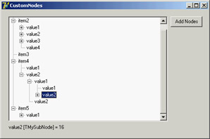
Figure 5.14: The CustomNodes example has a tree view with node objects based on different custom classes, thanks to the OnCreateNodes-Class event.
What s Next?
In this chapter, we have explored the foundations of the libraries available in Delphi for building user interfaces: the native-Windows VCL and the Qt-based CLX. I've discussed the TControl class, its properties, and its most important derived classes.
We explored some of the basic components available in Delphi, looking at both libraries. These components correspond to the standard Windows controls and some of the common controls, and they are extremely common in applications. You've also seen how to create main menus and pop-up menus and how to add extra graphics to some of these controls.
The next step is to explore in depth the elements of a complete user interface, discussing action lists and the Action Manager, and building some simple but complete examples. This is the topic of Chapter 6; then, Chapter 7 is devoted to forms.
Part I - Foundations
- Delphi 7 and Its IDE
- The Delphi Programming Language
- The Run-Time Library
- Core Library Classes
- Visual Controls
- Building the User Interface
- Working with Forms
Part II - Delphi Object-Oriented Architectures
- The Architecture of Delphi Applications
- Writing Delphi Components
- Libraries and Packages
- Modeling and OOP Programming (with ModelMaker)
- From COM to COM+
Part III - Delphi Database-Oriented Architectures
- Delphis Database Architecture
- Client/Server with dbExpress
- Working with ADO
- Multitier DataSnap Applications
- Writing Database Components
- Reporting with Rave
Part IV - Delphi, the Internet, and a .NET Preview
- Internet Programming: Sockets and Indy
- Web Programming with WebBroker and WebSnap
- Web Programming with IntraWeb
- Using XML Technologies
- Web Services and SOAP
- The Microsoft .NET Architecture from the Delphi Perspective
- Delphi for .NET Preview: The Language and the RTL
- Appendix A Extra Delphi Tools by the Author
- Appendix B Extra Delphi Tools from Other Sources
- Appendix C Free Companion Books on Delphi
EAN: 2147483647
Pages: 279
