Writing Delphi Components
Overview
Most Delphi programmers are probably familiar with using existing components, but at times it can also be useful to write your own components or to customize existing ones. One of the most interesting aspects of Delphi is that creating components is not much more difficult than writing programs. For this reason, even though this book is intended for Delphi application programmers and not Delphi tool writers, this chapter will discuss creating components and introduce Delphi add-ins, such as component and property editors.
This chapter gives you an overview of writing Delphi components and presents some examples. There is not enough space to present very complex components, but the ideas I've included cover all the basics and will get you started.
| Note |
You'll find more information about writing components in Chapter 17, "Writing Database Components," including how to build data-aware components. |
Extending the Delphi Library
Delphi components are classes, and the Visual Components Library (VCL) is the collection of all the classes defining Delphi components. You extend the VCL by writing new component classes in a package and installing it in Delphi. These new classes will be derived from one of the existing component-related classes or the generic TComponent class, adding new capabilities to those they inherit.
You can derive a new component from an existing component or from an abstract component class—one that does not correspond to a usable component. The VCL hierarchy includes many of these intermediate classes (often indicated with the TCustom prefix in their name) to let you choose a default behavior for your new component and change its properties.
Component Packages
Components are added to component packages. Each component package is basically a DLL (a dynamic link library) with a BPL extension (which stands for Borland Package Library).
Packages come in two flavors: design-time packages used by the Delphi IDE and run-time packages optionally used by applications. The design-only or run-only package option determines the package's type. When you attempt to install a package, the IDE checks whether it has the design-only or run-only flag, and decides whether to let the user install the package and whether it should be added to the list of run-time packages. Because there are two nonexclusive options, each with two possible states, there are four different kinds of component packages—two main variations and two special cases:
- Design-only component packages can be installed in the Delphi environment. These packages usually contain the design-time parts of a component, such as its property editors and the registration code. Often they also contain the components themselves, although this is not the most professional approach. The code of a design-only package's components is usually statically linked into the executable file, using the code of the corresponding Delphi Compiled Unit (DCU) files. Keep in mind, however, that it is also technically possible to use a design-only package as a run-time package.
- Run-only component packages are used by Delphi applications at run time. They cannot be installed in the Delphi environment, but they are automatically added to the list of run-time packages when they are required by a design-only package you install. Run-only packages usually contain the code of the component classes, but no design-time support (this is done to minimize the size of the component libraries you ship with your executable file). Run-only packages are important because they can be freely distributed with applications, but other Delphi programmers won't be able to install them in the environment to build new programs.
- Plain component packages (having neither the design-only nor the run-only option set) cannot be installed and will not be added to the list of run-time packages automatically. This option might make sense for utility packages used by other packages, but such packages are certainly rare.
- Packages with both flags set can be installed and are automatically added to the list of run-time packages. Usually these packages contain components requiring little or no design-time support (apart from the limited component registration code).
| Tip |
The filenames of Delphi's own design-only packages begin with the letters DCL (for example, DCLSTD60.BPL); filenames of run-only packages begin with the letters VCL ( for example, VCL60.BPL). You can follow the same approach for your own packages, if you wish. |
In Chapter 1, "Delphi 7 and Its IDE," we discussed the effect of packages on the size of a program's executable file. Now we'll focus on building packages, because this is a required step in creating or installing components in Delphi.
When you compile a run-time package, you produce both a DLL with the compiled code (the BPL file) and a file with only symbol information (a DCP file), including no compiled machine code. The Delphi compiler uses the latter file to gather symbol information about the units that are part of the package without having access to the unit (DCU) files, which contain both the symbol information and the compiled machine code. This process reduces compilation time and allows you to distribute just the packages without the precompiled unit files. The precompiled units are still required to statically link the components into an application. Distribution of precompiled DCU files (or source code) may make sense depending on the kind of components you develop. You'll see how to create a package after we've discussed some general guidelines and built a component.
| Note |
DLLs are executable files containing collections of functions and classes, which can be used by an application or another DLL at run time. The typical advantage is that if many applications use the same DLL, only one copy needs to be on the disk or loaded in memory, and the size of each executable file will be much smaller. This is what happens with Delphi packages, as well. Chapter 10, "Libraries and Packages," looks at DLLs and packages in more detail. |
Rules for Writing Components
Some general rules govern the writing of components. You can find a detailed description of most of them in the Delphi Component Writer's Guide Help file, which is required reading for Delphi component writers.
Here is my own summary of the rules for component writers:
- Study the Delphi language with care. Particularly important concepts are inheritance, method overriding and overloading, the difference between public and published sections of a class, and the definition of properties and events. If you don't feel confident with the Delphi language or basic VCL concepts, you can refer to the overall description of the language and library presented in Part I of the book, particularly Chapters 2 ("The Delphi Programming Language") and 4 ("Core Library Classes").
- Study the structure of the VCL class hierarchy and keep a graph of the classes at hand (such as the one included with Delphi).
- Follow the standard Delphi naming conventions. There are several for components, as you will see, and following these rules makes it easier for other programmers to interact with your components and further extend them.
- Keep components simple, mimic other components, and avoid dependencies. These three rules basically mean that a programmer using your components should be able to use them as easily as preinstalled Delphi components. Use similar property, method, and event names whenever possible. If users don't need to learn complex rules about the use of your component (that is, if the dependencies between methods or properties are limited) and can access properties with meaningful names, they'll be happy.
- Use exceptions. When something goes wrong, the component should raise an exception. When you are allocating resources of any kind, you must protect them with try/ finally blocks or destructor calls as appropriate.
- To complete a component, add a bitmap to it, which will be used by Delphi's Component Palette. If you intend for your component to be used by more than a few people, consider adding a Help file as well.
- Be ready to write real code and forget about the visual aspects of Delphi. Writing components generally means writing code without visual support (although Class Completion can speed up the coding of plain classes). The exception to this rule is that you can use frames to write components visually.
| Note |
You can also use a third-party component-writing tool to build your component or to speed up its development. The most powerful third-party tool I know of for creating Delphi components is the Class Developer Kit (CDK) from Eagle Software (www.eagle-software.com), but many others are available. |
The Base Component Classes
To build a new component, you generally begin with an existing one or with one of the VCL base classes. In either case, your component is in one of three broad component categories (introduced in Chapter 4), set by the three basic classes of the component hierarchy:
- TWinControl is the parent class of any component based on a window. Components that descend from this class can receive the input focus and get Windows messages from the system. You can also use their window handle when calling API functions. When creating a brand-new window control, you'll generally inherit from the derived class TCustomControl, which has a few extra useful features (particularly some support for painting the control).
- TGraphicControl is the parent class of visible components that have no Windows handle (which saves some Windows resources). These components cannot receive the input focus or respond to Windows messages directly. When creating a brand-new graphical control, you'll inherit directly from this class (which has a set of features very similar to TCustomControl).
- TComponent is the parent class of all components (including the controls) and can be used as a direct parent class for nonvisual components.
In the rest of the chapter, you will build some components using various parent classes, and we'll look at the differences among them. Let's begin with components inheriting from existing components or classes at a low level of the hierarchy, and then look at examples of classes inheriting directly from the ancestor classes just mentioned.
Building Your First Component
Building components is an important activity for Delphi programmers. Basically, any time you need the same behavior in two different places in an application, or in two different applications, you can place the shared code in a class—or, even better, in a component.
In this section, I'll introduce a couple of components to give you an idea of the steps required to build one. I'll also show you different things you can do to customize an existing component with a limited amount of code.
The Fonts Combo Box
Many applications have a toolbar with a combo box you can use to select a font. If you often use such a customized combo box, why not turn it into a component? Doing so will probably take less than a minute.
To begin, close any active projects in the Delphi environment and start the Component Wizard, either by choosing Component ® New Component, or by selecting File ® New ® Other to open the Object Repository and then choosing the component in the New page. As you can see, the Component Wizard requires the following information:
- The name of the ancestor type: the component class you want to inherit from. In this case, use TComboBox.
- The name of the class of the new component you are building; use TMdFontCombo.
- The Component Palette page where you want to display the new component, which can be a new or an existing page. Create a new page, called Md.
- The filename of the unit where Delphi will place the source code of the new component; type MdFontCombo.
- The current search path (which should be set up automatically).
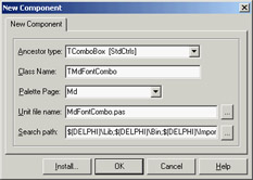
Click the OK button, and the Component Wizard will generate the source file shown in Listing 9.1 with the structure of your component. The Install button can be used to install the component in a package immediately. Let's look at the code first and then discuss the installation.
Listing 9.1: Code of the TMdFontCombo Class, Generated by the Component Wizard
unit MdFontCombo;

interface

uses
 Windows, Messages, SysUtils, Classes, Graphics, Controls, Forms, Dialogs,
 StdCtrls;

type
 TMdFontCombo = class (TComboBox)
 private
    { Private declarations }
 protected
    { Protected declarations }
 public
    { Public declarations }
 published
    { Published declarations }
 end;

procedure Register;

implementation

procedure Register;
begin
 RegisterComponents('Md', [TMdFontCombo]);
end;

end.
One of the key elements of this listing is the class definition, which begins by indicating the parent class. The only other relevant portion is the Register procedure. As you can see, the Component Wizard does very little work.
| Warning |
The Register procedure must be written with an uppercase R. This requirement is imposed for C++Builder compatibility (identifiers in C++ are case-sensitive). |
| Tip |
Use a naming convention when building components. All the components installed in Delphi should have different class names. For this reason, most Delphi component developers have chosen to add a two- or three-letter signature prefix to the names of their components. I've done the same, using Md ( for Mastering Delphi) to identify components built in this book. The advantage of this approach is that you can install my TMdFontCombo component even if you've already installed a component named TFontCombo. Notice that the unit names must also be unique for all the components installed in the system, so I've applied the same prefix to the unit names. |
That's all it takes to build a component. Of course, this example doesn't include much code. You need only copy all the system fonts to the Items property of the combo box at startup. To do so, you might try to override the Create method in the class declaration, adding the statement Items := Screen.Fonts. However, this is not the correct approach. The problem is, you cannot access the combo box's Items property before the window handle of the component is available; the component cannot have a window handle until its Parent property is set; and that property isn't set in the constructor, but later.
For this reason, instead of assigning the new strings in the Create constructor, you must perform this operation in the CreateWnd procedure, which is called to create the window control after the component is constructed, its Parent property is set, and its window handle is available. Again, you execute the default behavior, and then you can write your custom code. I could have skipped the Create constructor and written all the code in CreateWnd, but I decided to use both startup methods to demonstrate the difference between them. Here is the declaration of the component class:
type
 TMdFontCombo = class (TComboBox)
 private
 FChangeFormFont: Boolean;
 procedure SetChangeFormFont(const Value: Boolean);
 public
 constructor Create (AOwner: TComponent); override;
 procedure CreateWnd; override;
 procedure Change; override;
 published
 property Style default csDropDownList;
 property Items stored False;
 property ChangeFormFont: Boolean
 read FChangeFormFont write SetChangeFormFont default True;
 end;
And here is the source code of its two methods executed at startup:
constructor TMdFontCombo.Create (AOwner: TComponent);
begin
 inherited Create (AOwner);
 Style := csDropDownList;
 FChangeFormFont := True;
end;

procedure TMdFontCombo.CreateWnd;
begin
 inherited CreateWnd;
 Items.Assign (Screen.Fonts);

 // grab the default font of the owner form
 if FChangeFormFont and Assigned (Owner) and (Owner is TForm)
 then
 ItemIndex := Items.IndexOf ((Owner as TForm).Font.Name);
end;
Notice that besides giving a new value to the component's Style property in the Create method, you redefine this property by setting a value with the default keyword. You have to do both operations because adding the default keyword to a property declaration has no direct effect on the property's initial value. Why specify a property's default value then? Because properties that have a value equal to the default are not streamed with the form definition (and they don't appear in the textual description of the form, the DFM file). The default keyword tells the streaming code that the component initialization code will set the value of that property.
| Tip |
It is important to specify a default value for a published property to reduce the size of the DFM files and, ultimately, the size of the executable files (which include the DFM files). |
The other redefined property, Items, is set as a property that should not be saved to the DFM file at all, regardless of the actual value. This behavior is obtained with the stored directive followed by the value False. The component and its window will be created again when the program starts, so it doesn't make sense to save in the DFM file information that will be discarded later (to be replaced with the new list of fonts).
| Note |
You can write the code of the CreateWnd method to copy the fonts to the combo box items only at run time, using statements such as if not (csDesigning in ComponentState). But for this first component you are building, the less efficient but more straightforward method I've described offers a clearer illustration of the basic procedure. |
The third property, ChangeFormFont, is not inherited but introduced by the component. It is used to determine whether the current font selection in the combo box should specify the font of the form hosting the component. Again, this property is declared with a default value, which is set in the constructor. The ChangeFormFont property is used in the code of the CreateWnd method, shown earlier, to set up the initial selection of the combo depending on the font of the form hosting the component. This is generally the component's Owner, although I could also have walked the Parent tree looking for a form component. This code isn't perfect, but the Assigned and is tests provide some extra safety.
The ChangeFormFont property and the same if test play a key role in the Changed method, which in the base class triggers the OnChange event. By overriding this method, you provide a default behavior (which can be disabled by toggling the value of the property) but also allow the execution of the OnChange event, so that users of this class can fully customize its behavior. The final method, SetChangeFormFont, has been modified to refresh the form's font in case the property is being turned on. The complete code is as follows:
procedure TMdFontCombo.Change;
begin
  // assign the font to the owner form
 if FChangeFormFont and Assigned (Owner)
 and (Owner is TForm)
 then
 TForm (Owner).Font.Name := Text;
 inherited;
end;

procedure TMdFontCombo.SetChangeFormFont(const Value: Boolean);
begin
 FChangeFormFont := Value;
  // refresh font
 if FChangeFormFont then
 Change;
end;
Creating a Package
Now you have to install the component in the environment, using a package. For this example, you can either create a new package or use an existing one, such as the default user's package.
In either case, choose the Component ® Install Component menu command. The resulting dialog box has a page that lets you install the component into an existing package, and a page where you can create a new package. In the latter case, type in a filename and a description for the package. Clicking OK opens the Package Editor (see Figure 9.1), which has two parts:
- The Contains list indicates the components included in the package (or, to be more precise, the units defining those components).
- The Requires list indicates the packages required by this package. Your package will generally require the rtl and vcl packages (the main run-time library package and core VCL package), but it might also need the vcldb package (which includes most of the database-related classes) if the components of the new package do any database-related operations.
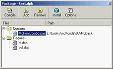
Figure 9.1: The Package Editor
| Note |
Since Delphi 6, package names aren't version specific, even if the compiled packages have a version number in the filename. See the section "Changing Project and Library Names" in Chapter 10 for more details about how this is achieved technically. |
Add the component to the new package you've just defined, and then compile the package and install it (using the two corresponding toolbar buttons in the Package Editor); the new component will immediately appear in the Md page of the Component Palette. The component unit file's Register procedure told Delphi where to install the new component. By default, the bitmap used will be the same as that of the parent class, because you haven't provided a custom bitmap (you will do this in later examples). Notice also that if you move the mouse over the new component, Delphi displays as a hint the name of the class without the initial letter T.
What's Behind a Package?
The Package Editor generates the source code for the package project: a special kind of DLL built in Delphi. The package project is saved in a file with the DPK (for Delphi PacKage) extension, displayed if you press the F12 key in the package editor. A typical package project looks like this:
package MdPack;

{$R *.RES}
{$ALIGN ON}
{$BOOLEVAL OFF}
{$DEBUGINFO ON}
...
{$DESCRIPTION 'Mastering Delphi Package'}
{$IMPLICITBUILD ON}

requires
 vcl;

contains
 MdFontBox in 'MdFontBox.pas';

end.
As you can see, Delphi uses specific language keywords for packages. The first is the package keyword (similar to the library keyword I'll discuss in the next chapter), which introduces a new package project. Then comes a list of all the compiler options, some of which I've omitted from the listing. Usually the options for a Delphi project are stored in a separate file; packages, by contrast, include all the compiler options directly in their source code. Among the compiler options is a DESCRIPTION compiler directive, used to make the package description available to the Delphi environment. After you've installed a new package, its description will appear in the Packages page of the Project Options dialog box, a page you can also activate by selecting the Component ® Install Packages menu item. This dialog box is shown in Figure 9.2.
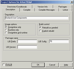
Figure 9.2: The Project Options for packages
In addition to common directives like DESCRIPTION, there are other compiler directives specific to packages. The most common of these options are easily accessible through the Package Editor's Options button. After this list of options come the requires and contains keywords, which list the items displayed visually in the two pages of the Package Editor. Again, requires lists the packages required by the current package, and contains lists the units installed by this package.
Let's consider the technical effect of building a package. Besides the DPK file with the source code, Delphi generates a BPL file with the dynamic link version of the package and a DCP file with the symbol information. In practice, this DCP file is the sum of the symbol information for the DCU files of the units contained in the package.
At design time, Delphi requires both the BPL and DCP files, because the BPL file has the code of the components created on the design form and the symbol information required by the code insight technology. If you link the package dynamically (using it as a run-time package), the DCP file will also be used by the linker, and the BPL file should be shipped along with the application's main executable file. If you instead link the package statically, the linker refers to the DCU files, and you'll need to distribute only the final executable file.
For this reason, as a component designer, you should generally distribute at least the BPL file, the DCP file, and the DCU files of the units contained in the package and any corresponding DFM files, plus a Help file. As an option, of course, you can also make available the source code files of the package units (the PAS files) and of the package itself (the DPK file).
| Warning |
By default, Delphi places all the compiled package files (BPL and DCP) not in the package source code's folder but under the ProjectsBPL folder. It does this so the IDE can easily locate the files, and the location creates no particular problem. However, when you have to compile a project using components declared in those packages, Delphi may complain that it cannot find the corresponding DCU files, which are stored in the package source code folder. You can solve this problem by indicating the package source code folder in the library path (specified in the Environment Options, which affect all projects) or by indicating it in the search path for the current project (in the Project Options). If you choose the first approach, placing different components and packages in a single folder may result in a real time savings. |
Installing the Components Created in This Chapter
Having built your first package, you can now begin using the component you've added to it. Before you do so, however, I should mention that I've extended the MdPack package to include all the components you will build in this chapter, including different versions of the same component. I suggest you install this package. The best approach is to copy it into a directory of your path, so that it will be available both to the Delphi environment and to the programs you build with it. I've collected all the component source code files and the package definition in a single subdirectory, called MdPack. This allows the Delphi environment (or a specific project) to refer to only one directory when looking for the package's DCU files. As suggested in the earlier warning, I could have collected all the components presented in the book in a single folder on the website; however, I decided that keeping the chapter-based organization was more understandable for readers.
Remember, if you compile an application using the packages as run-time libraries, you'll need to install these new libraries on your clients' computers. If you instead compile the programs by statically linking to the units contained in the package, the package library will be required only by the development environment and not by the users of your applications.
Using the Font Combo Box
Let's create a new Delphi program to test the Font combo box. Move to the Component Palette, select the new component, and add it to a new form. A traditional-looking combo box will appear. However, if you open the Items property editor, you'll see a list of the fonts installed on your computer. To build a simple example, I added a Memo component to the form with some text in it. By leaving the ChangeFormFont property on, you don't need to write any other, as you'll see in the example. As an alternative, I could have turned off the property and handled the component's OnChange event with code like this:
Memo1.Font.Name := MdFontCombo1.Text;
The aim of this program is only to test the behavior of the new component you have built. The component is still not very useful—you could have added a couple of lines of code to a form to obtain the same effect—but looking at a couple of components should help you get an idea of what is involved in component building.
The Component Palette Bitmaps
Before installing a component, you can take one further step: define a bitmap for the Component Palette. If you fail to do so, the Palette uses the parent class's bitmap, or a default object's bitmap if the parent class is not an installed component. Defining a new bitmap for the component is easy, once you know the rules. You can create one with the Image Editor included in Delphi by starting a new project and selecting the Delphi Component Resource (DCR) project type.
| Tip |
DCR files are standard RES files with a different extension. If you prefer, you can create them with any resource editor—including the Borland Resource Workshop, which is certainly a more powerful tool than the Delphi Image Editor. When you finish creating the resource file, rename the RES file to use a DCR extension. |
The resource file should have one (or more) bitmap, each 24×24 pixels. The only important rules refer to naming. In this case, the naming rules are not just a convention; they are required so that the IDE can find the image for a given component class:
- The name of the bitmap resource must match the name of the component, including the initial T. In this case, the name of the bitmap resource should be TMDFONTCOMBO. The name of the bitmap resource must be uppercase—this is mandatory.
- If you want the Package Editor to recognize and include the resource file, the name of the DCR file must match the name of the compiled unit that defines the component. In this case, the filename should be MdFontBox.dcr. If you manually include the resource file via a $R directive, you can give it any name you like, as well as use an RES extension and add multiple bitmaps in it.
When the bitmap for the component is ready, you can install the component in Delphi by using the Package Editor's Install Package toolbar button. After this operation, the Contains section of the editor will list both the component's PAS file and the corresponding DCR file. In Figure 9.3, you can see all the files (including the DCR files) of the final version of the MdPack package. If the DCR installation doesn't work properly, you can manually add the {$R unitname.dcr} statement in the package source code.
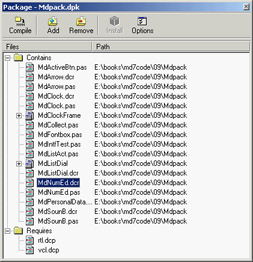
Figure 9.3: The Contains section of the Package Editor shows both the units that are included in the package and the component resource files.
Creating Compound Components
Components don't exist in isolation. Programmers often use components in conjunction with other components, coding the relationship in one or more event handlers. An alternative approach is to write compound components, which can encapsulate this relationship and make it easy to handle. There are two different types of compound components:
Internal Components Created and managed by the main component, which may surface some of their properties and events.
External Components Connected using properties. Such a compound component automates the interaction of two separate components, which can be on the same or a different form or designer.
In both cases, development follows some standard rules.
A third, less-explored alternative, involves the development of component containers, which interact with the child controls. This is a more advanced topic, and I won't explore it here.
Internal Components
The next component I will focus on is a digital clock. This example has some interesting features. First, it embeds a component (a Timer) in another component; second, it shows the live-data approach: you'll be able to see a dynamic behavior (the clock time being updated) even at design time, as it happens, for example, with data-aware components.
| Note |
The first feature has become more relevant since Delphi 6, because the Object Inspector now allows you to expose properties of subcomponents directly. As a result, the example presented in this section has been modified (and simplified) compared to the Delphi 5 edition of the book. I'll mention the differences, when relevant. |
The digital clock will provide some text output, so I considered inheriting from the TLabel class. However, doing so would allow a user to change the label's caption—that is, the text of the clock. To avoid this problem, I used the TCustomLabel component as the parent class. A TCustomLabel object has the same capabilities as a TLabel object, but few published properties. In other words, a class that inherits from TCustomLabel can decide which properties should be available and which should remain hidden.
| Note |
Most of the Delphi components, particularly the Windows-based ones, have a TCustomXxx base class, which implements the entire functionality but exposes only a limited set of properties. Inheriting from these base classes is the standard way to expose only some of the properties of a component in a customized version. You cannot hide public or published properties of a base class, unless you hide them by defining a new property with the same name in the descendant class. |
With past versions of Delphi, the component had to define a new property, Active, wrapping the Enabled property of the Timer. A wrapper property means that the get and set methods of this property read and write the value of the wrapped property, which belongs to an internal component (a wrapper property generally has no local data). In this specific case, the code looks like this:
function TMdClock.GetActive: Boolean;
begin
 Result := FTimer.Enabled;
end;

procedure TMdClock.SetActive (Value: Boolean);
begin
 FTimer.Enabled := Value;
end;
Publishing Subcomponents
Beginning with Delphi 6, you can expose the entire subcomponent (the timer) in a property of its own that will be regularly expanded by the Object Inspector, allowing a user to set each of its subproperties and even to handle its events.
Here is the full type declaration for the TMdClock component, with the subcomponent declared in the private data and exposed as a published property (in the last line):
type
 TMdClock = class (TCustomLabel)
 private
 FTimer: TTimer;
 protected
 procedure UpdateClock (Sender: TObject);
 public
 constructor Create (AOwner: TComponent); override;
 published
 property Align;
 property Alignment;
 property Color;
 property Font;
 property ParentColor;
 property ParentFont;
 property ParentShowHint;
 property PopupMenu;
 property ShowHint;
 property Transparent;
 property Visible;
 property Timer: TTimer read FTimer;
 end;
The Timer property is read-only, because I don't want users to select another value for this component in the Object Inspector (or detach the component by clearing the value of this property). Developing sets of subcomponents that can be used alternately is certainly possible, but adding write support for this property in a safe way is far from trivial (considering that the users of your component might not be expert Delphi programmers). So, I suggest you stick with read-only properties for subcomponents.
To create the Timer, you must override the clock component's constructor. The Create method calls the corresponding method of the base class and creates the Timer object, installing a handler for its OnTimer event:
constructor TMdClock.Create (AOwner: TComponent);
begin
 inherited Create (AOwner);
 // create the internal timer object
 FTimer := TTimer.Create (Self);

 FTimer.Name := 'ClockTimer';
 FTimer.OnTimer := UpdateClock;
 FTimer.Enabled := True;
 FTimer.SetSubComponent (True);
end;
The code gives the component a name for display in the Object Inspector (see Figure 9.4) and calls the specific SetSubComponent method. You don't need a destructor; the FTimer object has the TMDClock component as owner (as indicated by the parameter of its Create constructor), so it will be destroyed automatically when the clock component is destroyed.
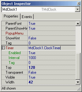
Figure 9.4: The Object Inspector can automatically expand sub-components, showing their properties, as in the case of the Timer property of the TMdClock component.
| Note |
In the previous code, the call to the SetSubComponent method sets an internal flag that's saved in the ComponentStyle property. The flag (csSubComponent) affects the streaming system, allowing the subcomponent and its properties to be saved in the DFM file. The streaming system by default ignores components that are not owned by the form. |
The key piece of the component's code is the UpdateClock procedure, which is just one statement:
procedure TMdLabelClock.UpdateClock (Sender: TObject);
begin
 // set the current time as caption
 Caption := TimeToStr (Time);
end;
This method uses Caption, which is an unpublished property, so that a user of the component cannot modify it in the Object Inspector. This statement displays the current time continuously, because the method is connected to the Timer's OnTimer event.
| Note |
Events of subcomponents can be edited in the Object Inspector, so that a user can handle them. If you handle the event internally, as I did in TMdLabelClock, a user can override the behavior by handling the event, in this case OnTimer. In general, the solution is to define a derived class for the internal component, overriding its virtual methods, such as the TTimer class's Timer method. In this case, though, this technique won't work, because Delphi activates the timer only if an event handler is attached to it. If you override the virtual method and do not provide the event handler (as would be correct in a subcomponent), the timer won't work. |
External Components
When a component refers to an external component, it doesn't create this component itself (which is why this is called external). It is the programmer using the components that creates both of them separately (for example dragging them to a form from the Components Palette) and connects the two components using one of their properties. So we can say that a property of a component refers to an externally linked component. This property must be of a class type that inherits from TComponent.
To demonstrate, I've built a nonvisual component that can display data about a person on a label and refresh the data automatically. The component has these published properties:
type
 TMdPersonalData = class(TComponent)
 ...
 published
 property FirstName: string read FFirstName write SetFirstName;
 property LastName: string read FLastName write SetLastName;
 property Age: Integer read FAge write SetAge;
 property Description: string read GetDescription;
 property OutLabel: TLabel read FLabel write SetLabel;
 end;
There is some basic data plus a read-only Description property that returns all the information at once. The OutLabel property is connected with a local private field called FLabel. In the component's code, I've used this external label by means of the internal FLabel reference, as in the following:
procedure TMdPersonalData.UpdateLabel;
begin
 if Assigned (FLabel) then
 FLabel.Caption := Description;
end;
This UdpateLabel method is triggered every time one of the other properties changes (as you can see at design time in Figure 9.5), as shown here:
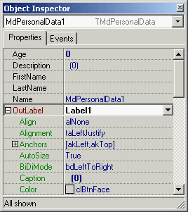
Figure 9.5: A component referencing an external label at design time
procedure TMdPersonalData.SetFirstName(const Value: string);
begin
  if FFirstName <> Value then
  begin
 FFirstName := Value;
 UpdateLabel;
 end;
end;
Of course, you cannot use the label if it is not assigned; hence the need for the initial test. However, this test doesn't guarantee the label won't be used after it is destroyed (either at run time or at design time). When you write a component with a reference to an external component you need to override the Notification method in the component you are developing (the one with the external reference). This method is fired when a sibling component (one having the same owner) is created or destroyed. Consider the case of the TMdPersonalData class that receives the notification of the destruction (opRemove) of the Label component:
procedure TMdPersonalData.Notification(
 AComponent: TComponent; Operation: TOperation);
begin
  inherited;
  if (AComponent = FLabel) and (Operation = opRemove) then
 FLabel := nil;
end;
This code is enough to avoid problems with components in the same form or designer (such as a data module), because when a component is destroyed, its owner notifies all the other components it owns (the siblings of the one being destroyed). To account for components connected across forms or data modules, however, you need to perform an extra step. Every component has an internal notification list of one or more components it must notify about its destruction. Your component can add itself to the notification list of components hooked to it (in this case, the label) by calling its FreeNotification method. So, even if the externally referenced label is on a different form, it will tell the component it is being destroyed by firing the Notification method (which is already handled and doesn't need to be updated):
procedure TMdPersonalData.SetLabel(const Value: TLabel);
begin
 if FLabel <> Value then
 begin
 FLabel := Value;
 if FLabel <> nil then
 begin
 UpdateLabel;
 FLabel.FreeNotification (Self);
 end;
 end;
end;
| Tip |
You can also use the opposite notification (opInsert) to hook up components automatically as they are added to the same form or designer. I'm not sure why this technique is so rarely used, because it's helpful in many common situations. It is true that it makes more sense to build specific property and component editors to support design-time operations, rather than embed special code within the components. |
Referring to Components with Interfaces
When referring to external components, we've traditionally been limited to a subhierarchy. For example, the component built in the previous section can refer only to objects of class TLabel or classes inheriting from TLabel, although it would make sense to also be able to output the data to other components. Delphi 6 added support for an interesting feature that has the potential to revolutionize some areas of the VCL: interface-type component references.
| Note |
This feature is used sparingly in Delphi 7. As it is probably too late to update Delphi's data-aware components architecture using interfaces, all we can hope is that this will be used to express other future complex relationships within the library. |
If you have components supporting a given interface (even if they are not part of the same subhierarchy), you can declare a property with an interface type and assign any of those components to it. For example, suppose you have a nonvisual component attached to a control for its output, similar to what I did in the previous section. I used a traditional approach and hooked the component to a label, but you can now define an interface as follows:
type
 IMdViewer = interface
 ['{9766860D-8E4A-4254-9843-59B98FEE6C54}']
 procedure View (const str: string);
 end;
A component can use this viewer interface to provide output to another control (of any type). Listing 9.2 shows how to declare a component that uses this interface to refer to an external component.
Listing 9.2: A Component that Refers to an External Component Using an Interface
type
 TMdIntfTest = class(TComponent)
 private
 FViewer: IViewer;
 FText: string;
 procedure SetViewer(const Value: IViewer);
 procedure SetText(const Value: string);
 protected
 procedure Notification(AComponent: TComponent;
 Operation: TOperation); override;
 published
 property Viewer: IViewer read FViewer write SetViewer;
 property Text: string read FText write SetText;
 end;

{ TMdIntfTest }

procedure TMdIntfTest.Notification(AComponent: TComponent;
 Operation: TOperation);
var
 intf: IMdViewer;
begin
 inherited;
 if (Operation = opRemove) and
 (Supports (AComponent, IMdViewer, intf)) and (intf = FViewer) then
 begin
 FViewer := nil;
 end;
end;

procedure TMdIntfTest.SetText(const Value: string);
begin
 FText := Value;
 if Assigned (FViewer) then
 FViewer.View(FText);
end;

procedure TMdIntfTest.SetViewer(const Value: IMdViewer);
var
 iComp: IInterfaceComponentReference;
begin
 if FViewer <> Value then
 begin
 FViewer := Value;
 FViewer.View(FText);
 if Supports (FViewer, IInterfaceComponentReference, iComp) then
 iComp.GetComponent.FreeNotification(Self);
 end;
end;
The use of an interface implies two relevant differences, compared to the traditional use of a class type to refer to an external component. First, in the Notification method, you must extract the interface from the component passed as a parameter and compare it to the interface you already hold. Second, to call the FreeNotification method, you must see whether the object passed as the parameter supports the IInterfaceComponentReference interface. This is declared in the TComponent class and provides a way to refer back to the component (GetComponent) and call its methods. Without this help you would have to add a similar method to your custom interface, because when you extract an interface from an object, there is no automatic way to refer back to the object.
Now that you have a component with an interface property, you can assign to it any component (from any portion of the VCL hierarchy) by adding the IViewer interface to it and implementing the View method. Here is an example:
type
 TViewerLabel = class (TLabel, IViewer)
 public
 procedure View(str: String);
 end;

procedure TViewerLabel.View(const str: String);
begin
 Caption := str;
end;
Building Compound Components with Frames
Instead of building the compound component in code and hooking up the timer event manually, you can obtain a similar effect by using a frame. Frames make the development of compound components with custom event handlers a visual operation, and thus simpler. You can share this frame by adding it to the Repository or by creating a template using the Add to Palette command on the frame's shortcut menu.
As an alternative, you might want to share the frame by placing it in a package and registering it as a component. Technically, this technique is not difficult: You add a Register procedure to the frame's unit, add the unit to a package, and build it. The new component/frame appears in the Component Palette like any other component. When you place this component/frame on a form, you'll see its subcomponents. You cannot select these subcomponents with a mouse click in the Form Designer, but you can do so in the Object TreeView. However, any change you make to these components at design time will be lost when you run the program or save and reload the form, because the changes to those subcomponents aren't streamed, unlike what happens with standard frames you place inside a form).
If this is not what you expect, I've found a reasonable way to use frames in packages, demonstrated by the MdFramedClock component (part of the examples for this chapter on the Sybex website). The components owned by the frame are turned into subcomponents by calling the SetSubComponent method. I also exposed the internal components with properties, even though this step isn't compulsory (they can be selected in the Object TreeView). Here is the component's declaration and the code for its methods:
type
 TMdFramedClock = class(TFrame)
 Label1: TLabel;
 Timer1: TTimer;
 Bevel1: TBevel;
 procedure Timer1Timer(Sender: TObject);
 public
 constructor Create(AOwner: TComponent); override;
 published
 property SubLabel: TLabel read Label1;
 property SubTimer: TTimer read Timer1;
 end;constructor TMdFramedClock.Create(AOwner: TComponent);
begin
 inherited;
 Timer1.SetSubComponent (True);
 Label1.SetSubComponent (True);
end;procedure TMdFramedClock.Timer1Timer(Sender: TObject);
begin
 Label1.Caption := TimeToStr (Time);
end;
In contrast to the clock component built earlier, there is no need to set up the properties of the timer, or to connect the timer event to its handler function manually, because this is done visually and saved in the DFM file of the frame. Notice also that I haven't exposed the Bevel component (I haven't called SetSubComponent on it). I did this on purpose so you can experiment with this fault behavior: try editing it at design time and see that all the changes are lost, as I mentioned earlier.
After you install this frame/component, you can use it in any application. In this case, as soon as you drop the frame on the form, the timer will begin to update the label with the current time. However, you can still handle its OnTimer event, and the Delphi IDE (recognizing that the component is in a frame) will create a method with this predefined code:
procedure TForm1.MdFramedClock1Timer1Timer(Sender: TObject);
begin
 MdFramedClock1.Timer1Timer(Sender);
end;
As soon as this timer is connected (even at design time) the live clock will stop, because its original event handler is disconnected. After you compile and run the program, however, the original behavior will be restored (at least, if you don't delete the previous line); your extra custom code will be executed as well. This behavior is exactly what you expect from frames. You can find a complete demo of the use of this frame/ component in the FrameClock example.
This approach is still far from linear. It is much better than in past versions of Delphi, where frames inside packages were unusable, but it isn't worth the effort. If you work alone or with a small team, it's better to use plain frames stored in the Repository. In larger organizations or to distribute your frames to a larger audience, most people will prefer to build their components the traditional way, without trying to use frames. I hope that Borland will address more complete support for the visual development of packaged components based on frames.
A Complex Graphical Component
In this section, I'll demonstrate how to build a graphical Arrow component. You can use such a component to indicate a flow of information or an action. This component is quite complex, so I'll show you the various steps instead of looking directly at the complete source code. The component I've added to the MdPack package is the final version of this process, which demonstrates several important concepts:
- The definition of new enumerated properties, based on custom enumerated data types.
- The implementation of the component's Paint method, which provides its user interface and should be generic enough to accommodate all the possible values of the various properties, including its Width and Height. The Paint method plays a substantial role in this graphical component.
- The use of properties of TPersistent-derived classes, such as TPen and TBrush, as well as the issues related to their creation and destruction and to handling their OnChange events internally in your component.
- The definition of a custom event handler for the component, which responds to user input (in this case, a double-click on the point of the arrow). This requires direct handling of Windows messages and the use of the Windows API for graphic regions.
- The registration of properties in Object Inspector categories and the definition of a custom category.
Defining an Enumerated Property
After generating the new component with the Component Wizard and choosing TGraphicControl as the parent class, you can begin to customize the component. The arrow can point in any of four directions: up, down, left, or right. An enumerated type expresses these choices:
type
 TMdArrowDir = (adUp, adRight, adDown, adLeft);
This enumerated type defines a private data member of the component, a parameter of the procedure used to change it, and the type of the corresponding property.
The ArrowHeight property determines the size of the arrowhead, and the Filled property specifies whether to fill the arrowhead with color:
type
 TMdArrow = class (TGraphicControl)
 private
 FDirection: TMdArrowDir;
 FArrowHeight: Integer;
 FFilled: Boolean;
 procedure SetDirection (Value: TMd4ArrowDir);
 procedure SetArrowHeight (Value: Integer);
 procedure SetFilled (Value: Boolean);
 published
 property Width default 50;
 property Height default 20;
 property Direction: TMd4ArrowDir
 read FDirection write SetDirection default adRight;
 property ArrowHeight: Integer
 read FArrowHeight write SetArrowHeight default 10;
 property Filled: Boolean read FFilled write SetFilled default False;
| Note |
A graphic control has no default size, so when you place it in a form, its size will be a single pixel. For this reason, it is important to add a default value for the Width and Height properties and set the class fields to the default property values in the class constructor. |
The three custom properties are read directly from the corresponding field and are written using three Set methods, all having the same standard structure:
procedure TMdArrow.SetDirection (Value: TMdArrowDir);
begin
 if FDirection <> Value then
 begin
 FDirection := Value;
 ComputePoints;
 Invalidate;
 end;
end;
Notice that you ask the system to repaint the component (by calling Invalidate) only if the property is really changing its value and after calling the ComputePoints method, which computes the triangle delimiting the arrowhead. Otherwise, the code is skipped and the method ends immediately. This code structure is common, and you will use it for most of the Set procedures of properties.
You must also remember to set the properties' default values in the component's constructor:
constructor TMdArrow.Create (AOwner: TComponent);
begin
  // call the parent constructor
 inherited Create (AOwner);
  // set the default values
 FDirection := adRight;
 Width := 50;
 Height := 20;
 FArrowHeight := 10;
 FFilled := False;
As mentioned before, the default value specified in the property declaration is used only to determine whether to save the property's value to disk. The Create constructor is defined in the public section of the new component's type definition, and the constructor is marked by the override keyword, as it replaces the virtual Create constructor of TComponent. It is fundamental to remember the override specifier; otherwise, when Delphi creates a new component of this class, it will call the base class's constructor, rather than the one you've written for your derived class.
Property-Naming Conventions
In the definition of the Arrow component, notice the use of several naming conventions for properties, access methods, and fields. Here is a summary:
- A property should have a meaningful and readable name.
- When a private data field is used to hold the value of a property, the field should be named with an uppercase F (field) at the beginning, followed by the name of the corresponding property.
- When a procedure is used to change the value of the property, the function should have the word Set at the beginning, followed by the name of the corresponding property.
- A corresponding function used to read the property should have the word Get at the beginning, again followed by the property name.
These are just guidelines to make your programs more readable. The compiler doesn't enforce them. These conventions are described in the Delphi Component Writers' Guide and are followed by Delphi's class completion mechanism.
Writing the Paint Method
Drawing the arrow in the various directions and with the various styles requires a fair amount of code. To perform custom painting, you override the Paint method and use the protected Canvas property.
Instead of computing the position of the arrowhead points in drawing code that will be executed often, I've written a separate function to compute the arrowhead area and store it in an array of points defined among the private fields of the component:
FArrowPoints: array [0..3] of TPoint;
These points are determined by the ComputePoints private method, which is called every time a component property changes. Here is an excerpt of its code:
procedure TMdArrow.ComputePoints;
var
 XCenter, YCenter: Integer;
begin
  // compute the points of the arrowhead
 YCenter := (Height - 1) div 2;
 XCenter := (Width - 1) div 2;
 case FDirection of
 adUp: begin
 FArrowPoints [0] := Point (0, FArrowHeight);
 FArrowPoints [1] := Point (XCenter, 0);
 FArrowPoints [2] := Point (Width-1, FArrowHeight);
 end;
  // and so on for the other directions
The code computes the center of the component area (dividing the Height and Width properties by two) and then uses the center to determine the position of the arrowhead. In addition to changing the direction or other properties, you need to refresh the position of the arrowhead when the size of the component changes. You can override the SetBounds method of the component, which is called by VCL every time the Left, Top, Width, and Height properties of a component change:
procedure TMdArrow.SetBounds(ALeft, ATop, AWidth, AHeight: Integer);
begin
 inherited SetBounds (ALeft, ATop, AWidth, AHeight);
 ComputePoints;
end;
Once the component knows the position of the arrowhead, its painting code becomes simpler. Here is an excerpt of the Paint method:
procedure TMdArrow.Paint;
var
 XCenter, YCenter: Integer;
begin
  // compute the center
 YCenter := (Height - 1) div 2;
 XCenter := (Width - 1) div 2;

  // draw the arrow line
 case FDirection of
 adUp: begin
 Canvas.MoveTo (XCenter, Height-1);
 Canvas.LineTo (XCenter, FArrowHeight);
 end;
    // and so on for the other directions
 end;

  // draw the arrow point, eventually filling it
 if FFilled then
 Canvas.Polygon (FArrowPoints)
 else
 Canvas.PolyLine (FArrowPoints);
end;
You can see an example of the output of this component in Figure 9.6.
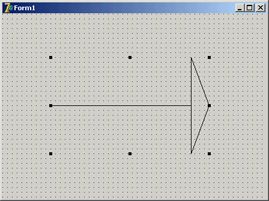
Figure 9.6: The output of the Arrow component
Adding TPersistent Properties
To make the output of the component more flexible, I've added to it two new properties, Pen and Brush, defined with a class type (a TPersistent data type, which defines objects that Delphi can automatically stream). These properties are a little more complex to handle, because the component now has to create and destroy these internal objects. This time, however, you also export the internal objects using properties, so that users can directly change these internal objects from the Object Inspector. To update the component when these subobjects change, you'll also need to handle their internal OnChange property. Here is the definition of the Pen property and the other changes to the definition of the component class (the code for the Brush property is similar):
type
 TMdArrow = class (TGraphicControl)
 private
 FPen: TPen;
 ...
 procedure SetPen (Value: TPen);
 procedure RepaintRequest (Sender: TObject);
 published
 property Pen: TPen read FPen write SetPen;
 end;
You first create the object in the constructor and set its OnChange event handler:
constructor TMdArrow.Create (AOwner: TComponent);
begin
 ...
  // create the pen and the brush
 FPen := TPen.Create;
  // set a handler for the OnChange event
 FPen.OnChange := RepaintRequest;
end;
These OnChange events are fired when one of the properties of the pen changes; all you have to do is to ask the system to repaint your component:
procedure TMdArrow.RepaintRequest (Sender: TObject);
begin
 Invalidate;
end;
You must also add a destructor to the component, to remove the graphical object from memory (and free its system resources). All the destructor has to do is call the Pen object's Free method.
A property related to persistent objects requires special handling: Instead of copying the pointer to the object, you have to copy the internal data of the object passed as a parameter. The standard := operation copies the pointer, so in this case you have to use the Assign method:
procedureTMdArrow.SetPen (Value: TPen);
begin
 FPen.Assign(Value);
 Invalidate;
end;
Many TPersistent classes have an Assign method you should use when you need to update the data of these objects. Now, to use the pen for the drawing, you must modify the Paint method, setting the corresponding property of the component Canvas to the value of the internal object before drawing a line (see the example of the component's new output in Figure 9.7):
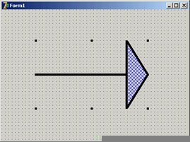
Figure 9.7: The output of the Arrow component with a thick pen and a special hatch brush
procedure TMdArrow.Paint;
begin
  // use the current pen
 Canvas.Pen := FPen;
As the Canvas uses a setter routine to Assign the pen object, you're not simply storing a reference to the pen in a field of the Canvas, but you are copying all of its data. This means that you can freely destroy the local Pen object (FPen) and that modifying FPen won't affect the canvas until Paint is called and the code above is executed again.
Defining a Custom Event
To complete the development of the Arrow component, let's add a custom event. Most of the time, new components use the events of their parent classes. For example, in this component, I've made some standard events available by redeclaring them in the published section of the class:
type
 TMdArrow = class (TGraphicControl)
 published
 property OnClick;
 property OnDragDrop;
 property OnDragOver;
 property OnEndDrag;
Thanks to this declaration, the events (originally declared in a parent class) will be available in the Object Inspector when the component is installed.
Sometimes, however, a component requires a custom event. To define a new event, you first need to ensure that there is already a method pointer type suitable for use by the event; if not, you need to define a new event type. This type is a method pointer type (see Chapter 5, "Visual Controls," for details). In both cases, you need to add to the class a field of the event's type: here is the definition I've added in the private section of the TMdArrow class:
FArrowDblClick: TNotifyEvent;
I've used the TNotifyEvent type, which has only a Sender parameter and is used by Delphi for many events, including OnClick and OnDblClick events. Using this field I've defined a published property, with direct access to the field:
property OnArrowDblClick: TNotifyEvent
 read FArrowDblClick write FArrowDblClick;
(Notice again the standard naming convention, with event names starting with On.) The fArrowDblClick method pointer is activated (executing the corresponding function) inside the specific ArrowDblClick dynamic method. This happens only if an event handler has been specified in the program that uses the component:
procedure TMdArrow.ArrowDblClick;
begin
 if Assigned (FArrowDblClick) then
 FArrowDblClick (Self);
end;
| Tip |
The use of Self as parameter of the invocation of the event handler method ensures that when the method is called its Sender parameter would actually refer to the object that fired the event, which you generally expect as a component user. |
Using Low-Level Windows API Calls
The fArrowDblClick method is defined in the protected section of the type definition to allow future descendant classes to both call and change it. Basically, this method is called by the handler of the
wm_LButtonDblClk Windows message, but only if the double-click took place inside the arrow's point. To test this condition, you can use some of the Windows API's region functions.
| Note |
A region is a screen area enclosed by any shape. For example, you can build a polygonal region using the three vertices of the arrow-point triangle. The only problem is that to fill the surface properly, you must define an array of TPoints in a clockwise direction (see the description of the CreatePolygonalRgn in the Windows API Help for the details of this strange approach). That's what I did in the ComputePoints method. |
Once you have defined a region, you can use the PtInRegion API call to test whether the point where the double-click occurred is inside the region. The complete source code for this procedure is as follows:
procedure TMdArrow.WMLButtonDblClk (
 var Msg: TWMLButtonDblClk); // message wm_LButtonDblClk;
var
 HRegion: HRgn;
begin
  // perform default handling
 inherited;

  // compute the arrowhead region
 HRegion := CreatePolygonRgn (FArrowPoints, 3, WINDING);
 try // check whether the click took place in the region
 if PtInRegion (HRegion, Msg.XPos, Msg.YPos) then
 ArrowDblClick;
 finally
 DeleteObject (HRegion);
 end;
end;
The CLX Version: Calling Qt Native Functions
The previous code won't be portable to Linux and makes no sense for the CLX/Qt version of the component. If you want to build a similar component for the CLX class library, you can replace the Win32 API calls with direct (low-level) calls to the Qt layer, creating an object of the QRegion class, as in the following listing:
procedure TMdArrow.DblClick;
var
 HRegion: QRegionH;
 MousePoint: TPoint;
begin
 // perform default handling
 inherited;
 // compute the arrow head region
 HRegion := QRegion_create (PPointArray(FArrowPoints), True);
 try
 // get the current mouse position
 GetCursorPos (MousePoint);
 MousePoint := ScreenToClient(MousePoint);
 // check whether the click took place in the region
 if QRegion_contains(HRegion, PPoint(@MousePoint)) then
 ArrowDblClick;
 finally
 QRegion_destroy(HRegion);
 end;
end;
Registering Property Categories
You've added to this component some custom properties and a new event. If you arrange the properties in the Object Inspector by category, all the new elements will appear in the generic Miscellaneous category. Of course, this is far from ideal, but you can easily register the new properties in one of the available categories.
You can register a property (or an event) in a category by calling one of the four overloaded versions of the RegisterPropertyInCategory function, defined in the DesignIntf unit. When calling this function, you indicate the name of the category, and you can specify the property name, its type, or the property name and the component it belongs to. For example, you can add the following lines to the Register procedure of the unit to register the OnArrowDblClick event in the Input category and the Filled property in the Visual category:
uses
 DesignIntf;

procedure Register;
begin
 RegisterPropertyInCategory ('Input', TMdArrow, 'OnArrowDblClick');
 RegisterPropertyInCategory ('Visual', TMdArrow, 'Filled');
end;
The first parameter is a string indicating the category name—a much simpler solution than the original Delphi 5 approach of using category classes. You can define a new category in a straightforward manner by passing its name as the first parameter of the RegisterPropertyInCategory function:
RegisterPropertyInCategory ('Arrow', TMdArrow, 'Direction');
RegisterPropertyInCategory ('Arrow', TMdArrow, 'ArrowHeight');
Creating a new category for the specific properties of your component can make it much simpler for a user to locate its specific features. Notice, though, that because you rely on the DesignIntf unit, you should compile the unit containing these registrations in a design-time package, not a run-time package (the required DesignIde unit cannot be distributed). For this reason, I've written this code in a separate unit from the one defining the component and added the new unit (MdArrReg) to the package MdDesPk, including all the design-time-only units; this approach is discussed later, in the section "Installing the Property Editor."
| Warning |
It's debatable whether using a category for the specific properties of a component is a good idea. On one hand, a user of the component can easily spot specific properties. At the same time, some of the new properties may not pertain to any of the existing categories. On the other hand, categories can be overused. If every component introduces new categories, users may be confused. You also face the risk of having as many categories as there are properties. |
Notice that my code registers the Filled property in two different categories. This is not a problem, because the same property can show up multiple times in the Object Inspector under different groups, as you can see in Figure 9.8. To test the arrow component, I've written the ArrowDemo program, which allows you to modify most of its properties at run time. This type of test is important after you have written a component or while you are writing it.
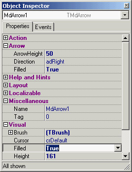
Figure 9.8: The Arrow component defines a custom property category, Arrow, as you can see in the Object Inspector. Notice that properties can be visible in multiple section, such as the Filled property in this case.
| Note |
The Localizable property category has a special role related to the use of the ITE (Integrated Translation Environment). When a property is part of this category, its value is listed in the Translation Environment as a property that can be translated into another language. |
Customizing Windows Controls
One of the most common ways of customizing existing components is to add predefined behavior to their event handlers. Every time you need to attach the same event handler to components of different forms, you should consider adding the event code to a descendant class of the component. An obvious example is edit boxes that accept only numeric input. Instead of attaching a common OnChar event handler to each edit box, you can define a new component.
However, this component won't handle the event; events are for component users only. Instead, the component can either handle the Windows message directly or override a method, often called a second-level message handler. The former technique was commonly used in the past, but it makes a component specific to the Windows platform. To create a component that's portable to CLX and Linux—and, in the future, to the .NET architecture—you should avoid low-level Windows messages and instead override virtual methods of the base component and control classes.
| Note |
When most VCL components handle a Windows message, they call a second-level message handler (usually a dynamic method), instead of executing code directly in the message-response method. This approach makes it easier for you to customize the component in a derived class. Typically, a second-level handler will do its own work and then call any event handler the component user has assigned. So, you should always call inherited to let the component fire the event as expected. |
In addition to portability, there are other reasons why overriding existing second-level handlers is generally a better approach than handling straight Windows messages. First, this technique is more sound from an object-oriented perspective. Instead of duplicating the message-response code from the base class and then customizing it, you're overriding a virtual method call that the VCL designers planned for you to override. Second, if someone needs to derive another class from one of your component classes, you should make it as easy for them to customize as possible, and overriding second-level handlers is less likely to induce errors (if only because you're writing less code). For example, I could have written the following numeric edit box control by handling the wm_Char system message:
type
 TMdNumEdit = class (TCustomEdit)
  public
 procedure WmChar (var Msg: TWmChar); message wm_Char;
However, the code is more portable if I override the KeyPress method, as I've done in the code of the next component. (In a later example I'll have to handle custom Windows messages, because there is no corresponding method to override.)
The Numeric Edit Box
To customize an edit box component to restrict the input it will accept, all you need to do is override its KeyPress method, which is called when the component receives the wm_Char Windows message. Here is the code for the TMdNumEdit class:
type
 TMdNumEdit = class (TCustomEdit)
  private
 FInputError: TNotifyEvent;
  protected
 function GetValue: Integer;
 procedure SetValue (Value: Integer);
 procedure KeyPress(var Key: Char); override;
  public
 constructor Create (Owner: TComponent); override;
  published
 property OnInputError: TNotifyEvent read FInputError write FInputError;
 property Value: Integer read GetValue write SetValue default 0;
 property AutoSelect;
 property AutoSize;
    // and so on...
This component inherits from TCustomEdit instead of TEdit so that it can hide the Text property and surface the Integer Value property instead. Notice that you don't create a new field to store this value, because you can use the existing (but now unpublished) Text property. To do so, you convert the numeric value to and from a text string. The TCustomEdit class (actually, the Windows control it wraps) automatically paints the information from the Text property on the surface of the component:
function TMdNumEdit.GetValue: Integer;
begin
 // set to 0 in case of error
 Result := StrToIntDef (Text, 0);
end;

procedure TMdNumEdit.SetValue (Value: Integer);
begin
 Text := IntToStr (Value);
end;
The most important method is the redefined KeyPress method, which filters out all the nonnumeric characters and fires a specific event in case of an error:
procedure TMdNumEdit.KeyPress (var Msg: TWmChar);
begin
 if not (Key in ['0'..'9']) and not (Key = #8) then
 begin
 Key := #0; // pretend that nothing was pressed
 if Assigned (FInputError) then
 FInputError (Self);
 end
  else
    inherited;
end;
This method checks each character as the user enters it, testing for numerals and the Backspace key (which has an ASCII value of 8). The user should be able to use Backspace in addition to the system keys (the arrow keys and Del), so you need to check for that value.
Now, place this component on a form, type something in the edit box, and see how it behaves. You might also want to attach a method to the OnInputError event to provide feedback to the user when an incorrect key is pressed.
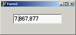
A Numeric Edit with Thousands Separators
As a further extension of the example, when the user types large numbers (stored internally as floating point numbers, which compared to integers can be larger and have decimal digits) it would be nice for the thousands separators to automatically appear and update themselves as required by the input:
You can do this by overriding the internal Change method and formatting the number properly. There are only a couple of small problems to consider. The first is that to format the number you need to have a string containing a number, but the text in the edit box is not a numeric string Delphi recognizes, as it has thousands of separators and cannot be converted to a number directly. I've written a modified version of the StringToFloat function, called StringToFloatSkipping, to accomplish this conversion.
The second small problem is that if you modify the text in the edit box, the current position of the cursor will be lost. So, you need to save the original cursor position, reformat the number, and then reapply the cursor position—considering that if a separator has been added or removed, the cursor position should change accordingly.
All these considerations are summarized by the following complete code for the TMdThousandEdit class:
type
 TMdThousandEdit = class (TMdNumEdit)
 public
 procedure Change; override;
 end;

function StringToFloatSkipping (s: string): Extended;
var
 s1: string;
 I: Integer;
begin
 // remove non-numbers
 s1 := '';
 for i := 1 to length (s) do
 if s[i] in ['0'..'9'] then
 s1 := s1 + s[i];
 Result := StrToFloat (s1);
end;

procedure TMdThousandEdit.Change;
var
 CursorPos, // original position of the cursor
 LengthDiff: Integer; // number of new separators (+ or -)
begin
 if Assigned (Parent) then
 begin
 CursorPos := SelStart;
 LengthDiff := Length (Text);
 Text := FormatFloat ('#,###',
 StringToFloatSkipping (Text));
 LengthDiff := Length (Text) - LengthDiff;
    // move the cursor to the proper position
 SelStart := CursorPos + LengthDiff;
 end;
 inherited;
end;
The Sound Button
The next component, TMdSoundButton, plays one sound when you press the button and another sound when you release it. The user specifies each sound by modifying two string properties that name the appropriate WAV files for the respective sounds. Once again, you need to intercept some system messages (wm_LButtonDown and wm_LButtonUp) or override the appropriate second-level handler.
Here is the code for the TMdSoundButton class, with the two protected methods and the two string properties that identify the sound files, mapped to private fields because you don't need to do anything special when the user changes those properties:
type
 TMdSoundButton = class(TButton)
 private
 FSoundUp, FSoundDown: string;
 protected
 procedure MouseDown(Button: TMouseButton;
 Shift: TShiftState; X, Y: Integer); override;
 procedure MouseUp(Button: TMouseButton;
 Shift: TShiftState; X, Y: Integer); override;
 published
 property SoundUp: string read FSoundUp write FSoundUp;
 property SoundDown: string read FSoundDown write FSoundDown;
 end;
Here is the code for one of the two methods:
uses
 MMSystem;

procedure TMdSoundButton.MouseDown(Button: TMouseButton; Shift: TShiftState;
 X, Y: Integer);
begin
 inherited MouseDown (Button, Shift, X, Y);
 PlaySound (PChar (FSoundDown), 0, snd_Async);
end;
Notice that you call the inherited version of the methods before you do anything else. For most second-level handlers, this is a good practice, because it ensures that you execute the standard behavior before you execute any custom behavior. Next, notice that you call the PlaySound Win32 API function to play the sound. You can use this function (defined in the MmSystem unit) to play either WAV files or system sounds, as the SoundB example demonstrates. Here is a textual description of the form of this sample program (from the DFM file):
object MdSoundButton1: TMdSoundButton
 Caption = 'Press'
 SoundUp = 'RestoreUp'
 SoundDown = 'RestoreDown'
end
| Note |
Selecting a proper value for these sound properties is far from simple. Later in this chapter, I'll show you how to add a property editor to the component to simplify the operation. |
Handling Internal Messages The Active Button
The Windows interface is evolving toward a new standard, including components that become highlighted as the mouse cursor moves over them. Delphi provides similar support in many of its built-in components. Mimicking this behavior for a button might seem a complex task to accomplish, but it is not. The development of a component can become much simpler once you know which virtual function to override or which message to hook onto.
The next component, the TMdActiveButton class, demonstrates this technique by handling some internal Delphi messages to accomplish its task in a simple way. (For information about where these internal Delphi messages come from, see the next section, "Component Messages and Notifications.") The ActiveButton component handles the cm_MouseEnter and cm_MouseExit internal Delphi messages, which are received when the mouse cursor enters or leaves the area corresponding to the component:
type
 TMdActiveButton = class (TButton)
 protected
 procedure MouseEnter (var Msg: TMessage); message cm_mouseEnter;
 procedure MouseLeave (var Msg: TMessage); message cm_mouseLeave;
 end;
The code you write for these two methods can do whatever you want. For this example, I've decided to toggle the bold style of the button's font. You can see the effect of moving the mouse over one of these components in Figure 9.9.
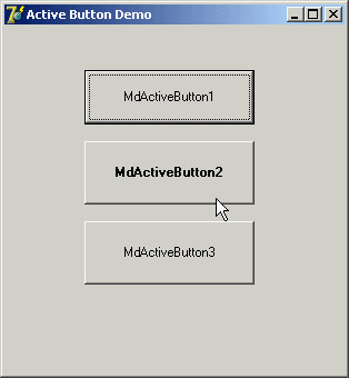
Figure 9.9: An example of the use of the ActiveButton component
procedure TMdActiveButton.MouseEnter (var Msg: TMessage);
begin
 Font.Style := Font.Style + [fsBold];
end;

procedure TMdActiveButton.MouseLeave (var Msg: TMessage);
begin
 Font.Style := Font.Style - [fsBold];
end;
You can add other effects, including enlarging the font, making the button the default, or increasing the button's size a little. The best effects usually involve colors, but you must inherit from the TBitBtn class to have this support (TButton controls have a fixed color).
Component Messages and Notifications
To build the ActiveButton component, I used two internal Delphi component messages, as indicated by their cm prefix. These messages can be quite interesting, as the example highlights, but they are almost completely undocumented by Borland. There is also a second group of internal Delphi messages, indicated as component notifications and distinguished by their cn prefix. I don't have enough space here to discuss each of them or provide a detailed analysis; browse the VCL source code if you want to learn more.
| Warning |
This is a rather advanced topic, so feel free to skip this section if you are new to writing Delphi components. Component messages are not documented in the Delphi help file, so I felt it was important to at least list them here. |
Component Messages
A Delphi component passes component messages to other components to indicate any change in its state that might affect those components. Most of these messages begin as Windows messages, but some of them are more complex, higher-level translations and not simple remappings. In addition, components send their own messages as well as forwarding those received from Windows. For example, changing a property value or some other characteristic of the component may necessitate telling one or more other components about the change.
You can group these messages into categories:
- Activation and input focus messages are sent to the component being activated or deactivated, receiving or losing the input focus:
cm_Activate
Corresponds to the OnActivate event of forms and of the application
cm_Deactivate
Corresponds to OnDeactivate
cm_Enter
Corresponds to OnEnter
cm_Exit
Corresponds to OnExit
cm_FocusChanged
Sent whenever the focus changes between components of the same form (later, you'll see an example using this message)
cm_GotFocus
Declared but not used
cm_LostFocus
Declared but not used
- Messages sent to child components when a property changes:
cm_BiDiModeChanged
cm_IconChanged
cm_BorderChanged
cm_ShowHintChanged
cm_ColorChanged
cm_ShowingChanged
cm_Ctl3DChanged
cm_SysFontChanged
cm_CursorChanged
cm_TabStopChanged
cm_EnabledChanged
cm_TextChanged
cm_FontChanged
cm_VisibleChanged
Monitoring these messages can help track changes in a property. You might need to respond to these messages in a new component, but it's not likely.
- Messages related to ParentXxx properties: cm_ParentFontChanged, cm_ParentColorChanged, cm_ParentCtl3DChanged, cm_ParentBiDiModeChanged, and cm_ParentShowHintChanged. These are similar to the messages in the previous group.
- Notifications of changes in the Windows system: cm_SysColorChange, cm_WinIniChange,
cm_TimeChange, and cm_FontChange. Handling these messages is useful only in special components that need to keep track of system colors or fonts. - Mouse messages: cm_Drag is sent many times during dragging operations. cm_ MouseEnter and cm_MouseLeave are sent to the control when the cursor enters or leaves its surface, but they are sent by the Application object as low-priority messages. cm_ MouseWheel corresponds to wheel-based operations.
Application messages:
cm_AppKeyDown
Sent to the Application object to let it determine whether a key corresponds to a menu shortcut
cm_AppSysCommand
Corresponds to the wm_SysCommand message
cm_DialogHandle
Sent in a DLL to retrieve the value of the DialogHandle property (used by some dialog boxes not built with Delphi)
cm_InvokeHelp
Sent by code in a DLL to call the InvokeHelp method
cm_WindowHook
Sent in a DLL to call the HookMainWindow and UnhookMainWindow methods
You'll rarely need to use these messages. There is also a cm_HintShowPause message, which is never handled in VCL.
- Delphi internal messages:
cm_CancelMode
Terminates special operations, such as showing the pull-down list of a combo box
cm_ControlChange
Sent to each control before adding or removing a child control (handled by some common controls)
cm_ControlListChange
Sent to each control before adding or removing a child control (handled by the DBCtrlGrid component)
cm_DesignHitTest
Determines whether a mouse operation should go to the component or to the form designer
cm_HintShow
Sent to a control just before displaying its hint (only if the ShowHint property is True)
cm_HitTest
Sent to a control when a parent control is trying to locate a child control at a given mouse position (if any)
cm_MenuChanged
Sent after MDI or OLE menu-merging operations
- Messages related to special keys:
cm_ChildKey
Sent to the parent control to handle some special keys (in Delphi, this message is handled only by DBCtrlGrid components)
cm_DialogChar
Sent to a control to determine whether a given input key is its accelerator character
cm_DialogKey
Handled by modal forms and controls that need to perform special actions
Cm_IsShortCut
Is currently not used (as most code simply calls IsShortCut), but it is intended to be used to identify if a shortcut is known to be supported by a form, through either the OnShortCut event, a menu item, or an action.
cm_WantSpecialKey
Handled by controls that interpret special keys in an unusual way (for example, using the Tab key for navigation, as some Grid components do)
- Messages for specific components:
cm_GetDataLink
Used by DBCtrlGrid controls (and discussed in Chapter 17, "Writing Database Components")
cm_TabFontChanged
Used by TabbedNotebook components
cm_ButtonPressed
Used by SpeedButtons to notify other sibling SpeedButton components (to enforce radio-button behavior)
cm_DeferLayout
Used by DBGrid components
- OLE container messages: cm_DocWindowActivate, cm_IsToolControl, cm_Release,
cm_UIActivate, and cm_UIDeactivate. - Dock-related messages, including cm_DockClient, cm_DockNotification, cmFloat, and
cm_UndockClient. - Method-implementation messages, such as cm_RecreateWnd, called inside the RecreateWnd method of TControl; cm_Invalidate, called inside TControl.Invalidate; cm_Changed, called inside TControl.Changed; and cm_AllChildrenFlipped, called in the DoFlipChildren methods of TWinControl and TScrollingWinControl. In the similar group fall two action list–related messages, cm_ActionUpdate and cm_ActionExecute.
Component Notifications
Component notification messages are those sent from a parent form or component to its children. These notifications correspond to messages sent by Windows to the parent control's window, but logically intended for the control. For example, interaction with controls such as buttons, edit boxes, or list boxes causes Windows to send a wm_Command message to the parent of the control. When a Delphi program receives these messages, it forwards the message to the control itself, as a notification. The Delphi control can handle the message and eventually fire an event. Similar dispatching operations take place for many other messages.
The connection between Windows messages and component notification ones is so tight that you'll often recognize the name of the Windows message from the name of the notification message, replacing the initial cn with wm. There are several distinct groups of component notification messages:
- General keyboard messages: cn_Char, cn_KeyUp, cn_KeyDown, cn_SysChar, and cn_ SysKeyDown
- Special keyboard messages used only by list boxes with the lbs_WantKeyboardInput style:
cn_CharToItem and cn_VKeyToItem - Messages related to the owner-draw technique: cn_CompareItem, cn_DeleteItem, cn_ DrawItem, and cn_MeasureItem
- Messages for scrolling, used only by scroll bar and track bar controls: cn_HScroll and cn_ VScroll
- General notification messages, used by most controls: cn_Command, cn_Notify, and
cn_ParentNotify - Control color messages: cn_CtlColorBtn, cn_CtlColorDlg, cn_CtlColorEdit,
cn_CtlColorListbox, cn_CtlColorMsgbox, cn_CtlColorScrollbar, and cn_CtlColorStatic
Other control notifications are defined for common controls support (in the ComCtrls unit).
An Example of Component Messages
As an example of the use of some component messages, I've written the CMNTest program. It has a form with three edit boxes and associated labels. The first message it handles, cm_ DialogKey, allows it to treat the Enter key as if it were a Tab key. The code of this method checks for the Enter key's code and sends the same message, but passes the vk_Tab key code. To halt further processing of the Enter key, you set the result of the message to 1:
procedure TForm1.CMDialogKey(var Message: TCMDialogKey);
begin
 if (Message.CharCode = VK_RETURN) then
 begin
 Perform (CM_DialogKey, VK_TAB, 0);
 Message.Result := 1;
 end
 else
 inherited;
end;
The second message, cm_DialogChar, monitors accelerator keys. This technique can be useful to provide custom shortcuts without defining an extra menu for them. Notice that while this code is correct for a component, in a normal application this can be achieved more easily by handling the form's OnShortCut event. In this case, you log the special keys in a label:
procedure TForm1.CMDialogChar(var Msg: TCMDialogChar);
begin
 Label1.Caption := Label1.Caption + Char (Msg.CharCode);
 inherited;
end;
Finally, the form handles the cm_FocusChanged message, to respond to focus changes without having to handle the OnEnter event of each of its components. Again, the action displays a description of the focused component:
procedure TForm1.CmFocusChanged(var Msg: TCmFocusChanged);
begin
 Label5.Caption := 'Focus on ' + Msg.Sender.Name;
end;
The advantage of this approach is that it works independently of the type and number of components you add to the form, and it does so without any special action on your part. Again, this is a trivial example for such an advanced topic, but if you add to this the code of the ActiveButton component, you have at least a few reasons to look into these special, undocumented messages. At times, writing the same code without their support can become extremely complex.
A Dialog Box in a Component
The next component we'll examine is completely different from those you have seen up to now. After building window-based controls and graphic components, I'll now show you how to build a nonvisual component.
The basic idea is that forms are components. When you have built a form that might be particularly useful in multiple projects, you can add it to the Object Repository or make a component out of it. The second approach is more complex than the first, but it makes using the new form easier and allows you to distribute the form without its source code. As an example, I'll build a component based on a custom dialog box, trying to mimic as much as possible the behavior of standard Delphi dialog box components.
The first step in building a dialog box in a component is to write the code for the dialog box itself, using the standard Delphi approach. Just define a new form and work on it as usual. When a component is based on a form, you can almost visually design the component. Of course, once the dialog box has been built, you have to define a component around it in a nonvisual way.
The standard dialog box in this example is based on a list box, because it is common to let a user choose a value from a list of strings. I've customized this common behavior in a dialog box and then used it to build a component. The ListBoxForm form has a list box and the typical OK and Cancel buttons, as shown in its textual description:
object MdListBoxForm: TMdListBoxForm
 BorderStyle = bsDialog
 Caption = 'ListBoxForm'
 object ListBox1: TListBox
 OnDblClick = ListBox1DblClick
 end
 object BitBtn1: TBitBtn
 Kind = bkOK
 end
 object BitBtn2: TBitBtn
 Kind = bkCancel
 end
end
The only method of this dialog box form relates to the list box's double-click event, which closes the dialog box as though the user clicked the OK button, by setting the ModalResult property of the form to mrOk. Once the form works, you can begin changing its source code, adding the definition of a component and removing the declaration of the global variable for the form.
| Note |
For components based on a form, you can use two Pascal source code files: one for the form and the other for the component encapsulating it. It is also possible to place both the component and the form in a single unit, as I've done for this example. In theory, it would be better to declare the form class in the implementation portion of this unit, hiding it from the component's users. But in practice, this is not a good idea. To manipulate the form visually in the Form Designer, the form class declaration must appear in the interface section of the unit. The rationale behind this behavior of the Delphi IDE is that, among other things, this constraint minimizes the amount of code the module manager has to scan to find the form declaration—an operation that must be performed often to maintain the synchronization of the visual form with the form class definition. |
The most important operation is the definition of the TMdListBoxDialog component. This component is defined as nonvisual because its immediate ancestor class is TComponent. The component has one public property and these three published properties:
- Lines is a TStrings object, which is accessed via two methods, GetLines and SetLines. This second method uses the Assign procedure to copy the new values to the private field corresponding to this property. This internal object is initialized in the Create constructor and destroyed in the Destroy method.
- Selected is an integer that directly accesses the corresponding private field. It stores the selected element of the list of strings.
- Title is a string used to change the title of the dialog box.
The public property is SelItem, a read-only property that automatically retrieves the selected element of the list of strings. Notice that this property has no storage and no data; it accesses other properties, providing a virtual representation of data:
type
 TMdListBoxDialog = class (TComponent)
 private
 FLines: TStrings;
 FSelected: Integer;
 FTitle: string;
 function GetSelItem: string;
 procedure SetLines (Value: TStrings);
 function GetLines: TStrings;
 public
 constructor Create(AOwner: TComponent); override;
 destructor Destroy; override;
 function Execute: Boolean;
 property SelItem: string read GetSelItem;
 published
 property Lines: TStrings read GetLines write SetLines;
 property Selected: Integer read FSelected write FSelected;
 property Title: string read FTitle write FTitle;
 end;
Most of this example's code is in the Execute method, a function that returns True or False depending on the modal result of the dialog box. This is consistent with the Execute method of most standard Delphi dialog box components. The Execute function creates the form dynamically, sets some of its values using the component's properties, shows the dialog box, and, if the result is correct, updates the current selection:
function TMdListBoxDialog.Execute: Boolean;
var
 ListBoxForm: TListBoxForm;
begin
 if FLines.Count = 0 then
 raise EStringListError.Create ('No items in the list');
 ListBoxForm := TListBoxForm.Create (Self);
 try
 ListBoxForm.ListBox1.Items := FLines;
 ListBoxForm.ListBox1.ItemIndex := FSelected;
 ListBoxForm.Caption := FTitle;
 if ListBoxForm.ShowModal = mrOk then
 begin
 Result := True;
 Selected := ListBoxForm.ListBox1.ItemIndex;
 end
 else
 Result := False;
 finally
 ListBoxForm.Free;
 end;
end;
Notice that the code is contained within a try/finally block, so if a run-time error occurs when the dialog box is displayed, the form will be destroyed anyway. I've also used exceptions to raise an error if the list is empty when a user runs it. This error is by design, and using an exception is a good technique to enforce it. The component's other methods are straightforward. The constructor creates the FLines string list, which is deleted by the destructor; the GetLines and SetLines methods operate on the string list as a whole; and the GetSelItem function (which follows) returns the text of the selected item:
function TMdListBoxDialog.GetSelItem: string;
begin
 if (Selected >= 0) and (Selected < FLines.Count) then
 Result := FLines [Selected]
 else
 Result := '';
end;
Of course, because you are manually writing the component code and adding it to the original form's source code, you have to remember to write the Register procedure.
Once you've written the Register procedure and the component is ready, you must provide a bitmap. For nonvisual components, bitmaps are very important because they are used not only for the Component Palette, but also when you place the component on a form.
Using the Nonvisual Component
I've written a project to test the component once the bitmap has been prepared and the component has been installed. The form of this test program has a button, an edit box, and the MdListDialog component. In the program, I've added only a few lines of code, corresponding to the button's OnClick event:
procedure TForm1.Button1Click(Sender: TObject);
begin
  // select the text of the edit, if corresponding to one of the strings
 MdListDialog1.Selected := MdListDialog1.Lines.IndexOf (Edit1.Text);
  // run the dialog and get the result
 if MdListDialog1.Execute then
 Edit1.Text := MdListDialog1.SelItem;
end;
That's all the code you need to run the dialog box placed in the component, as you can see in Figure 9.10. As you've seen, this is an interesting approach to the development of some common dialog boxes.
Figure 9.10: The ListDialDemo example shows the dialog box encapsulated in the ListDial component.
Collection Properties
At times you need a property holding a list of values, not a single value. Sometimes you can use a TStringList-based property, but it accounts only for textual data (even though an object can be attached to each string). When you need a property hosting an array of objects, the most VCL-sound solution is to use a collection. The role of collections, by design, is to build properties that contain a list of values. Examples of Delphi collection properties include the DBGrid component's Columns property, and the TStatusBar component's Panels property.
A collection is basically a container of objects of a given type. For this reason, to define a collection, you need to inherit a new class from the TCollection class and also inherit a new class from the TCollectionItem class. This second class defines the objects held by the collection; the collection is created by passing to it the class of the objects it will hold.
Not only does the collection class manipulate the items of the collection, but it is also responsible for creating new objects when its Add method is called. You cannot create an object and then add it to an existing collection. Listing 9.3 shows two classes for the items and a collection, with their most relevant code.
Listing 9.3: The Classes for a Collection and Its Items
type
 TMdMyItem = class (TCollectionItem)
 private
 FCode: Integer;
 FText: string;
 procedure SetCode(const Value: Integer);
 procedure SetText(const Value: string);
 published
 property Text: string read FText write SetText;
 property Code: Integer read FCode write SetCode;
 end;

 TMdMyCollection = class (TCollection)
 private
 FComp: TComponent;
 FCollString: string;
 public
 constructor Create (CollOwner: TComponent);
 function GetOwner: TPersistent; override;
 procedure Update(Item: TCollectionItem); override;
 end;

{ TMdMyCollection }

constructor TMdMyCollection.Create (CollOwner: TComponent);
begin
 inherited Create (TMdMyItem);
 FComp := CollOwner;
end;

function TMdMyCollection.GetOwner: TPersistent;
begin
 Result := FComp;
end;

procedure TMyCollection.Update(Item: TCollectionItem);
var
 str: string;
 i: Integer;
begin
 inherited;
  // update everything in any case...
 str := '';
 for i := 0 to Count - 1 do
 begin
 str := str + (Items [i] as TMyItem).Text;
 if i < Count - 1 then
 str := str + '-';
 end;
 FCollString := str;
end;
The collection must define the GetOwner method to be displayed properly in the collection property editor provided by the Delphi IDE. For this reason, it needs a link to the component hosting it, the collection owner (stored in the FComp field in the code). You can see this sample component's collection in Figure 9.11.
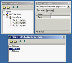
Figure 9.11: The collection editor, with the Object TreeView and the Object Inspector for the collection item
Every time data changes in a collection item, its code calls the Changed method (passing True or False to indicate whether the change is local to the item or refers to the entire set of items in the collection). As a result of this call, the TCollection class calls the virtual method Update, which receives as a parameter the single item requesting the update, or nil if all items changed (and when the Changed method is called with True as a parameter). You can override this method to update the values of other elements of the collection, of the collection itself, or of the target component.
In this example you update a string with a summary of the collection data that you've added to the collection and that the host component will surface as a property. Using the collection within a component is simple. You declare a collection, create it in the constructor and free it at the end, and expose it through a property:
type
 TCanTest = class(TComponent)
 private
 FColl: TMyCollection;
 function GetCollString: string;
 public
 constructor Create (aOwner: TComponent); override;
 destructor Destroy; override;
 published
 property MoreData: TMyCollection read FColl write SetMoreData;
 property CollString: string read GetCollString;
 end;

constructor TCanTest.Create(aOwner: TComponent);
begin
 inherited;
 FColl := TMyCollection.Create (Self);
end;

destructor TCanTest.Destroy;
begin
 FColl.Free;
  inherited;
end;

procedure TCanTest.SetMoreData(const Value: TMyCollection);
begin
 FColl.Assign (Value);
end;

function TCanTest.GetCollString: string;
begin
 Result := FColl.FCollString;
end;
Notice that the collection items are streamed in DFM files along with the component hosting them, using the special item markers and angle brackets, as in the following example:
object MdCollection1: TMdCollection
 MoreData = <
 item
 Text = 'one'
 Code = 1
 end
    item
 Text = 'two'
 Code = 2
 end
    item
 Text = 'three'
 Code = 3
 end>
end
Defining Custom Actions
In addition to defining custom components, you can define and register new standard actions, which will be made available in the Action List component's Action Editor. Creating new actions is not complex. You have to inherit from the TAction class and override some of the methods of the base class.
You must override three methods:
- The HandlesTarget function returns whether the action object wants to handle the operation for the current target, which is by default the control with the focus.
- The UpdateTarget procedure can set the user interface of the controls connected with the action, eventually disabling the action if the operation is currently not available.
- You can implement the ExecuteTarget method to determine the code to execute, so that the user can select the action and doesn't have to implement it.
To show you this approach in practice, I've implemented the three cut, copy, and paste actions for a list box, in a way similar to what VCL does for an edit box (although I've simplified the code a little). I've written a base class, which inherits from the generic TListControlAction class of the ExtActns unit. This base class, TMdCustomListAction, adds some common code shared by all the specific actions and publishes a few action properties. The three derived classes have their own ExecuteTarget code, plus little more. Here are the four classes:
type
 TMdCustomListAction = class (TListControlAction)
 protected
 function TargetList (Target: TObject): TCustomListBox;
 function GetControl (Target: TObject): TCustomListControl;
 public
 procedure UpdateTarget (Target: TObject); override;
  published
    property Caption;
    property Enabled;
    property HelpContext;
    property Hint;
    property ImageIndex;
    property ListControl;
    property ShortCut;
    property SecondaryShortCuts;
    property Visible;
    property OnHint;
 end;

 TMdListCutAction = class (TMdCustomListAction)
 public
 procedure ExecuteTarget(Target: TObject); override;
  end;

 TMdListCopyAction = class (TMdCustomListAction)
 public
 procedure ExecuteTarget(Target: TObject); override;
 end;

 TMdListPasteAction = class (TMdCustomListAction)
 public
 procedure UpdateTarget (Target: TObject); override;
 procedure ExecuteTarget (Target: TObject); override;
 end;
The HandlesTarget method, one of the three key methods of action classes, is provided by the TListControlAction class with this code:
function TListControlAction.HandlesTarget(Target: TObject): Boolean;
begin
 Result := ((ListControl <> nil) or
 (ListControl = nil) and (Target is TCustomListControl)) and
 TCustomListControl(Target).Focused;
end;
The UpdateTarget method has two different implementations. The default implementation is provided by the base class and used by the copy and cut actions. These actions are enabled only if the target list box has at least one item and an item is currently selected. The status of the paste action depends on the Clipboard status:
procedure TMdCustomListAction.UpdateTarget (Target: TObject);
begin
 Enabled := (TargetList (Target).Items.Count > 0)
 and (TargetList (Target).ItemIndex >= 0);
end;

function TMdCustomListAction.TargetList (Target: TObject): TCustomListBox;
begin
 Result := GetControl (Target) as TCustomListBox;
end;

function TMdCustomListAction.GetControl(Target: TObject): TCustomListControl;
begin
 Result := Target as TCustomListControl;
end;

procedure TMdListPasteAction.UpdateTarget (Target: TObject);
begin
 Enabled := Clipboard.HasFormat (CF_TEXT);
end;
The TargetList function uses the TListControlAction class's GetControl function, which returns either the list box connected to the action at design time or the target control (the list box control with the input focus).
Finally, the three ExecuteTarget methods perform the corresponding actions on the target list box:
procedure TMdListCopyAction.ExecuteTarget (Target: TObject);
begin
 with TargetList (Target) do
 Clipboard.AsText := Items [ItemIndex];
end;

procedure TMdListCutAction.ExecuteTarget(Target: TObject);
begin
 with TargetList (Target) do
 begin
 Clipboard.AsText := Items [ItemIndex];
 Items.Delete (ItemIndex);
 end;
end;

procedure TMdListPasteAction.ExecuteTarget(Target: TObject);
begin
 (TargetList (Target)).Items.Add (Clipboard.AsText);
end;
Once you've written this code in a unit and added it to a package (in this case, the MdPack package), the final step is to register the new custom actions in a given category. This category is indicated as the first parameter of the RegisterActions procedure; the second parameter is the list of action classes to register:
procedure Register;
begin
 RegisterActions ('List',
 [TMdListCutAction, TMdListCopyAction, TMdListPasteAction], nil);
end;
To test the use of these three custom actions, I've written the ListTest example (included with the source code for this chapter). This program has two list boxes plus a toolbar that contains three buttons connected to the three custom actions and an edit box for entering new values. The program allows a user to cut, copy, and paste list box items. Nothing special, you might think—but the strange fact is that the program has no code!
| Warning |
To set up an image for an action (and to define default property values in general) you need to use the third parameter of the RegisterActions procedure, which is a data module hosting the image list and an action list with the predefined values. As you have to register the actions before you can set up such a data module, you'll need a double registration while developing these actions. This issue is quite complex so I won't cover it here, but a detailed description can be found on http://www.blong.com/Conferences/BorCon2002/Actions/2110.htm in the sections "Registering Standard Actions" and "Standard Actions And Data Modules." |
Writing Property Editors
Writing components is an effective way to customize Delphi, helping developers to build applications more quickly without requiring a detailed knowledge of low-level techniques. The Delphi environment is also open to extensions. In particular, you can extend the Object Inspector by writing custom property editors and the Form Designer by adding component editors.
Along with these techniques, Delphi offers internal interfaces to add-on tool developers. Using these interfaces, known as the OpenTools API, requires an advanced understanding of how the Delphi environment works and a fairly good knowledge of many advanced techniques that are not discussed in this book. For references to technical information and some examples of these techniques, see Appendix A, "Extra Delphi Tools by the Author."
| Note |
The OpenTools API in Delphi has changed considerably over time. For example, the DsgnIntf unit from Delphi 5 has been split into DesignIntf, DesignEditors, and other specific units. Borland has also introduced interfaces to define the sets of methods for each kind of editor. However, most of the simpler examples, such as those presented in this book, compile almost unchanged from earlier versions of Delphi. For more information, you can study the extensive source code in Delphi's SourceToolsApi directory. Notice also that with Delphi 6 Update Pack 2 Borland has for the first time shipped a Help file with the documentation of the OpenTools API. |
Every property editor must inherit from the abstract TPropertyEditor class, which is defined in the DesignEditors unit and provides a standard implementation for the IProperty interface. Delphi already defines some specific property editors for strings (the TStringProperty class), integers (the TIntegerProperty class), characters (the TCharProperty class), enumerations (the TEnumProperty class), and sets (the TSetProperty class), so you can inherit your property editor from the one for the property type you are working with.
In any custom property editor, you must redefine the GetAttributes function so it returns a set of values indicating the capabilities of the editor. The most important attributes are paValueList and paDialog. The paValueList attribute indicates that the Object Inspector will show a combo box with a list of values (eventually sorted if the paSortList attribute is set) provided by overriding the GetValues method. The paDialog attribute style activates an ellipsis button in the Object Inspector, which executes the editor's Edit method.
An Editor for the Sound Properties
The sound button you built earlier has two sound-related properties: SoundUp and SoundDown. These are strings, so you can display them in the Object Inspector using a default property editor. However, requiring the user to type the name of a system sound or an external file is not friendly, and it's a bit error-prone.
We could write a generic editor to handle filenames, but you want to be able to choose the name of a system sound as well. (System sounds are predefined names of sounds connected with user operations, associated with actual sound files in the Windows Control Panel's Sounds applet.) For this reason, I built a more complex property editor. My editor for sound strings allows a user to either choose a value from a drop-down list or display a dialog box from which to load and test a sound (from a sound file or a system sound). The property editor provides both Edit and GetValues methods:
type
 TSoundProperty = class (TStringProperty)
 public
 function GetAttributes: TPropertyAttributes; override;
 procedure GetValues(Proc: TGetStrProc); override;
 procedure Edit; override;
 end;
| Tip |
The default Delphi convention is to name a property editor class with a name ending with Property and all component editors with a name ending with Editor. |
The GetAttributes function combines the paValueList (for the drop-down list) and paDialog (for the custom edit box) attributes, and also sorts the lists and allows the selection of the property for multiple components:
function TSoundProperty.GetAttributes: TPropertyAttributes;
begin
 // editor, sorted list, multiple selection
 Result := [paDialog, paMultiSelect, paValueList, paSortList];
end;
The GetValues method calls the procedure it receives as a parameter many times, once for each string it wants to add to the drop-down list (as you can see in Figure 9.12):
procedure TSoundProperty.GetValues(Proc: TGetStrProc);
begin
 // provide a list of system sounds
 Proc ('Maximize');
 Proc ('Minimize');
 Proc ('MenuCommand');
 Proc ('MenuPopup');
 Proc ('RestoreDown');
 ...
end;
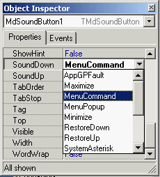
Figure 9.12: The list of sounds provides a hint for the user, who can also type in the property value or double-click to activate the editor (shown later, in Figure 9.13).
A better approach would be to extract these values from the Windows Registry, where all these names are listed. The Edit method is straightforward: It creates and displays a dialog box. I could have displayed the Open dialog box directly, but I decided to add an intermediate step to allow the user to test the sound. This is similar to what Delphi does with graphic properties: You open the preview first, and load the file only after you've confirmed that it's correct. The most important step is to load the file and test it before you apply it to the property. Here is the code for the Edit method:
procedure TSoundProperty.Edit;
begin
 SoundForm := TSoundForm.Create (Application);
 try
 SoundForm.ComboBox1.Text := GetValue;
 // show the dialog box
 if SoundForm.ShowModal = mrOK then
 SetValue (SoundForm.ComboBox1.Text);
 finally
 SoundForm.Free;
 end;
end;
The GetValue and SetValue methods are defined by the base class, the string property editor. They read and write the value of the current component's property that you are editing.
As an alternative, you can access the component you're editing by using the GetComponent method (which requires a parameter indicating which of the selected components you are working on—0 indicates the first component). When you access the component directly, you also need to call the Designer object's Modified method (a property of the base class property editor). You don't need this Modified call in the example, because the base class SetValue method does this automatically for you.
The previous Edit method displays a dialog box—a standard Delphi form that is built visually, as always, and added to the package hosting the design-time components. The form is quite simple; a ComboBox displays the values returned by the GetValues method, and four buttons allow you to open a file, test the sound, and terminate the dialog box by accepting the values or canceling. You can see an example of the dialog box in Figure 9.13. Providing a drop-down list of values and a dialog box for editing a property causes the Object Inspector to display only the arrow button that indicates a drop-down list and to omit the ellipsis button to indicate that a dialog box editor is available. In this case, as it happened for the default Color property editor, the dialog box is obtained by double-clicking the current value or pressing Ctrl+Enter.
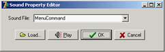
Figure 9.13: The Sound Property Editor's form displays a list of available sounds and lets you load a file and hear the selected sound.
The form's first two buttons have a method assigned to their OnClick event:
procedure TSoundForm.btnLoadClick(Sender: TObject);
begin
 if OpenDialog1.Execute then
 ComboBox1.Text := OpenDialog1.FileName;
end;

procedure TSoundForm.btnPlayClick(Sender: TObject);
begin
 PlaySound (PChar (ComboBox1.Text), 0, snd_Async);
end;
Notice that it is far from simple to determine whether a sound is properly defined and is available. (You can check the file, but the system sounds create a few issues.) The PlaySound function returns an error code when played synchronously, but only if it can't find the default system sound it attempts to play if it can't find the sound you ask for. If the requested sound is not available, it plays the default system sound and doesn't return the error code. PlaySound looks for the sound in the Registry first and, if it doesn't find the sound there, checks to see whether the specified sound file exists.
| Tip |
If you want to further extend this example, you might add graphics to the drop-down list displayed in the Object Inspector—if you can decide which graphics to attach to particular sounds. |
Installing the Property Editor
After you've written this code, you can install the component and its property editor in Delphi. To accomplish this, you have to add the following statement to the unit's Register procedure:
procedure Register;
begin
 RegisterPropertyEditor (TypeInfo(string), TMdSoundButton, 'SoundUp',
 TSoundProperty);
 RegisterPropertyEditor (TypeInfo(string), TMdSoundButton, 'SoundDown',
 TSoundProperty);
end;
This call registers the editor specified in the last parameter for use with properties of type string (the first parameter), but only for a specific component and for a property with a specific name. These last two values can be omitted to provide more general editors. Registering this editor allows the Object Inspector to show a list of values and the dialog box called by the Edit method.
To install this component, you can add its source code file to an existing or new package. Instead of adding this unit and the others in this chapter to the MdPack package, I created a second package containing all the add-ins built in this chapter. The package is named MdDesPk (Mastering Delphi design package). What's new about this package is that I compiled it using the {$DESIGNONLY} compiler directive. This directive is used to mark packages that interact with the Delphi environment, installing components and editors, but are not required at run time by applications you've built.
| Note |
The source code for all the add-on tools is in the MdDesPk subdirectory, along with the code for the package used to install them. There are no examples demonstrating how to use these design-time tools, because all you have to do is select the corresponding components in the Delphi environment and see how they behave. |
The property editor's unit uses the SoundB unit, which defines the TMdSoundButton component. For this reason, the new package should refer to the existing package. Here is its initial code (I'll add other units to it later in this chapter):
package MdDesPk;

{$R *.RES}
{$ALIGN ON}
...
{$DESCRIPTION 'Mastering Delphi DesignTime Package'}
{$DESIGNONLY}

requires
 vcl,
 MdPack,
 designide;

contains
 PeSound in 'PeSound.pas',
 PeFSound in 'PeFSound.pas' {SoundForm};
Writing a Component Editor
Using property editors allows the developer to make a component more user-friendly. The Object Inspector represents one of the key pieces of the user interface of the Delphi environment, and Delphi developers use it quite often. However, you can adopt a second approach to customize how a component interacts with Delphi: write a custom component editor.
Just as property editors extend the Object Inspector, component editors extend the Form Designer. When you right-click within a form at design time, you see some default menu items, plus the items added by the component editor of the selected component. Examples of these menu items are those used to activate the Menu Designer, the Fields Editor, the Visual Query Builder, and other editors in the environment. At times, displaying these special editors becomes the default action of a component when it is double-clicked.
Common uses of component editors include adding an About box with information about the developer of the component, adding the component name, and providing specific wizards to set up component properties. In particular, the original intent was to allow a wizard, or some direct code, to set multiple properties in one shot, rather than setting them all individually.
Deriving from the TComponentEditor Class
A component editor should generally inherit from the TComponentEditor class, which provides the base implementation of the IComponentEditor interface. The most important methods of this interface are as follows:
- GetVerbCount returns the number of menu items to add to the Form Designer's shortcut menu when the component is selected.
- GetVerb is called once for each new menu item and should return the text that will go in the shortcut menu for each.
- ExecuteVerb is called when one of the new menu items is selected. The number of the item is passed as the method's parameter.
- Edit is called when the user double-clicks the component in the Form Designer to activate the default action.
Once you get used to the idea that a "verb" is nothing but a new menu item with a corresponding action to execute, the names of the methods of this interface become quite intuitive. This interface is much simpler than those of property editors you've seen before.
| Note |
Like property editors, component editors were modified from Delphi 5 to Delphi 6, and are now defined in the DesignEditors and DesignIntf units. |
A Component Editor for the ListDialog
Now that I've introduced the key ideas about writing component editors, let's look at an example—an editor for the ListDialog component built earlier. In my component editor, I want to be able to show an About box, add a copyright notice to the menu (an improper but common use of component editors), and allow users to perform a special action—previewing the dialog box connected with the dialog component. I also want to change the default action to show the About box after a beep (which is not particularly useful but demonstrates the technique).
To implement this component editor, the program must override the four methods listed in the previous section:
uses
 DesignIntf;

type
 TMdListCompEditor = class (TComponentEditor)
 function GetVerbCount: Integer; override;
 function GetVerb(Index: Integer): string; override;
 procedure ExecuteVerb(Index: Integer); override;
 procedure Edit; override;
 end;
The first method returns the number of menu items to add to the shortcut menu, in this case 3. This method is called only once: before displaying the menu. The second method is called once for each menu item, so in this case it is called three times:
function TMdListCompEditor.GetVerb (Index: Integer): string;
begin
 case Index of
 0: Result := ' MdListDialog (©Cantù)';
 1: Result := '&About this component...';
 2: Result := '&Preview...';
 end;
end;
This code adds the menu items to the form's shortcut menu, as you can see in Figure 9.14. Selecting any of these menu items activates the ExecuteVerb method of the component editor:
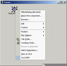
Figure 9.14: The custom menu items added by the component editor of the ListDialog component
procedure TMdListCompEditor.ExecuteVerb (Index: Integer);
begin
 case Index of
 0: ; // nothing to do
 1: MessageDlg ('This is a simple component editor'#13 +
 'built by Marco Cantù'#13 +
 'for the book "Mastering Delphi"', mtInformation, [mbOK], 0);
 2: with Component as TMdListDialog do
 Execute;
 end;
end;
I decided to handle the first two items in a single branch of the case statement, although I could have skipped the code for the copyright notice item. The other command changes calls the Execute method of the component you are editing, determined using the TComponentEditor class's Component property. Knowing the type of the component, you can easily access its methods after a dynamic typecast.
The last method refers to the component's default action and is activated by double-clicking the component in the Form Designer:
procedure TMdListCompEditor.Edit;
begin
  // produce a beep and show the about box
 Beep;

ExecuteVerb (0);
end;
Registering the Component Editor
To make this editor available to the Delphi environment, you need to register it. Once more, you can add to its unit a Register procedure and call a specific registration procedure for component editors:
procedure Register;
begin
 RegisterComponentEditor (TMdListDialog, TMdListCompEditor);
end;
I've added this unit to the MdDesPk package, which includes all the design-time extensions from this chapter. After installing and activating this package, you can create a new project, place a list dialog component in it, and experiment with it.
What s Next?
In this chapter, you have seen how to define various types of properties, how to add events, and how to define and override component methods. You have seen various examples of components, including simple changes to existing components, new graphical components, and, in the final section, a dialog box inside a component. While building these components, you have faced some new Windows programming challenges. In general, programmers often need to use the Windows API directly when writing new Delphi components.
Writing components is a handy technique for reusing software, but to make your components easier to use, you should integrate them as much as possible within the Delphi environment by writing property editors and component editors. You can also write many more extensions of the Delphi IDE, including custom wizards. I've built many Delphi extensions, some of which are discussed in Appendix A.
Chapter 10 focuses on Delphi DLLs. You have used DLLs in previous chapters, and it is time for a detailed discussion of their role and how to build them. I'll also further discuss the use of Delphi packages, which are a special type of DLL. To learn more about component development, refer to Chapter 17, which focuses specifically on data-aware controls and custom dataset components.
Part I - Foundations
- Delphi 7 and Its IDE
- The Delphi Programming Language
- The Run-Time Library
- Core Library Classes
- Visual Controls
- Building the User Interface
- Working with Forms
Part II - Delphi Object-Oriented Architectures
- The Architecture of Delphi Applications
- Writing Delphi Components
- Libraries and Packages
- Modeling and OOP Programming (with ModelMaker)
- From COM to COM+
Part III - Delphi Database-Oriented Architectures
- Delphis Database Architecture
- Client/Server with dbExpress
- Working with ADO
- Multitier DataSnap Applications
- Writing Database Components
- Reporting with Rave
Part IV - Delphi, the Internet, and a .NET Preview
- Internet Programming: Sockets and Indy
- Web Programming with WebBroker and WebSnap
- Web Programming with IntraWeb
- Using XML Technologies
- Web Services and SOAP
- The Microsoft .NET Architecture from the Delphi Perspective
- Delphi for .NET Preview: The Language and the RTL
- Appendix A Extra Delphi Tools by the Author
- Appendix B Extra Delphi Tools from Other Sources
- Appendix C Free Companion Books on Delphi
EAN: 2147483647
Pages: 279
