Hack 44. Plot Statistics Against Shapes


Easily render demographic maps in SVG from shapes and CSV or Excel files.
In late 2003, we helped a bit with tech support on the Matt Gonzalez mayoral election campaign in San Francisco. Among the many different groups of volunteers were a couple of academic GIS specialists. Adorning the walls of the Decision Support Room were fascinating maps, showing statistics plotted against voting precincts: voter turnout, voter registration rates, first and second choice votes in the previous round of the election and in previous elections. These maps were used to identify and target wards where "Get Out the Vote" and other canvassing initiatives would have the best effect on our candidate's chances.
The maps were produced by the high priesthood of GIS: crafted in ArcInfo and Illustrator, and exported to PDF for view on the Web, making real-time analysis of exit-poll data difficult. Well, we thought, the data is in the public domain, and we can make analysis maps with free software for ourselves. Now so can you, using the Perl module SVG::Shapefile, available from CPAN (http://search.cpan.org/).
The demo that accompanies this module and shows the uses of it is available at http://locative.us/indymapper/.
4.11.1. The Web Interface
Indymapper allows you to take your own shapefiles and spreadsheetsin CSV or Excel format, or the .dbf format that comes with shapefilesand make maps out of your data via a simple web interface.
|

We built a web service at http://locative.us/indymapper/ where you can upload your own data and generate SVG maps with PNG screenshots. Indymapper was designed to become a part of Indyvoter, the political-social networking software at http://indyvoter.org/. Figure 4-15 shows the core of the Indymapper map-making interface.
Figure 4-15. Plotting stats against shapes on the Web
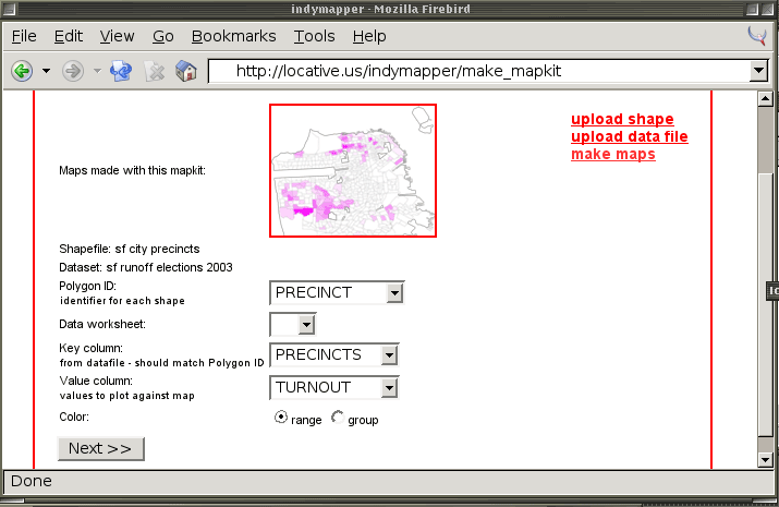
You can upload your own datafiles or select from a few sample mapkits, which consist of a shape, a data table, and various views on that table. Once you've selected or created a mapkit, the program looks at the columns in the shapefile's .dbf metadata and the column names from the spreadsheet. It presents you with several lists, with which you can match up the ID of each shape to a key column in your spreadsheet and plot the values of a second column against them. You can plot a range of valuese.g., a continuous numeric sequence that will be shaded between two colorsor a group of values, where you choose a different color for each distinct value in your data.
A choropleth map is a map that has appropriate shadings (value, texture, intensity) assigned to each area defined on the map. Choropleth shading works best for numbers with a consistent scale: the values should be ratios (e.g., "Number of Voters per 100,000 Inhabitants"), not absolute values (e.g., "Number of Voters"). Look carefully at choropleth maps you see in the press; what they represent can easily be illusory! Not all data should be uploaded to Indymapper; if you can normalize it, for example, by turning "Polling place incidents" into "Polling place incidents per 1,000 registered voters," then do so. Absolute values are best represented on a proportional symbol map, showing an icon shrink or grow according to the mapped value.
The rest of this hack should give you a clearer idea of what SVG::Shapefile and Indymapper can do, and illustrate how to "roll your own" map with code available from the Perl CPAN repository.
4.11.2. Rolling Your Own
Installing modules from CPAN is easy. As your system's root user, type:
#> perl -MCPAN -e shell
cpan> install SVG::Shapefile
cpan> install DBD::Excel
For more in-depth instructions on installing modules from CPAN, see [Hack #97] .
You can use SVG::Shapefile to plot a range of colors: one representing a low value, the other a high value, with a blend to and from white between them. You can also use it to plot specific values using a color palette that you supply. The first technique is the more useful here.
For this hack, we've provided a sample shapefile, voting precincts in San Francisco as of 2003, and an Excel file that has data that maps to it. You should be able to use any freely available political shape you find, if you can find or create statistics that share a key column with it. SVG::Shapefile reads .csv and .xls files using the Perl DBI interface, so you can hook it up directly to an SQL database if you want.
4.11.3. The Code
This script assumes you have the zipped-up shapefile and the Excel file in the same directory you run it from. Get them from http://mappinghacks.com/data/PRECINCTS.zip and http://mappinghacks.com/data/SF_runoff.xls. Type unzip PRECINCTS.zip to extract the contents of the shapefile, and then run this script:
#!/usr/bin/perl

use strict;
use lib qw(/home/jo/indymapper);
use SVG::Shapefile;

my $svg = SVG::Shapefile->new(ShapeFile => 'PRECINCTS.shp',
 PolygonID => 'PRECINCT',
 DataFile => 'SF_runoff.xls',
 KeyColumn => 'PRECINCTS',
 ValueColumn => 'TURNOUT',
 Colors => [[0,255,0],[255,0,0]]
 );
$svg->render('map.svg');
Reading large shapefiles and converting them to SVG geometry can take some time, so don't worry if the script waits for quite a few seconds before returning.
The PolygonID option specifies the identifier in the shapefile to use as the ID for each shape in the SVG. If it's not supplied, the default OBJECTID from the shapefile will be used. The values for the PolygonID column must match the values in the KeyColumn from the Excel or CSV file.
|
The KeyColumn and DataColumn options allow you to choose a key that corresponds to each shape and a value that you want to color the shapes with. The Colors option allows you to specify two colors as RGB values: the first color is the lowest in the range, and the second color is the highest. The two colors are both shaded to white.
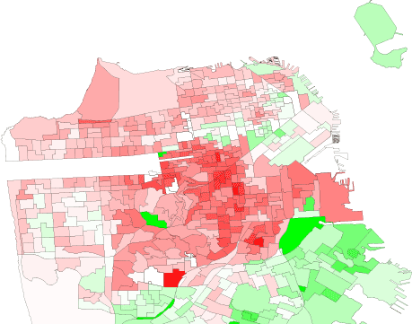
The results of running this script are illustrated in Figure 4-16.
Figure 4-16. Map showing voter turnout in San Francisco (note the central "progressive crescent" of political engagement)
You don't have to be a GIS geek to make your own political maps (though you probably still have to be a spreadsheet geek). Hopefully, once you're done with this book, it'll be a no-brainer.
Mapping Your Life
- Hacks 1-13
- Hack 1. Put a Map on It: Mapping Arbitrary Locations with Online Services
- Hack 2. Route Planning Online
- Hack 3. Map the Places Youve Visited
- Hack 4. Find Your House on an Aerial Photograph
- Hack 5. The Road Less Traveled by in MapQuest
- Hack 6. Make Route Maps Easier to Read
- Hack 7. Will the Kids Barf?
- Hack 8. Publish Maps of Your Photos on the Web
- Hack 9. Track the Friendly Skies with Sherlock
- Hack 10. Georeference Digital Photos
- Hack 11. How Far? How Fast? Geo-Enabling Your Spreadsheet
- Hack 12. Create a Distance Grid in Excel
- Hack 13. Add Maps to Excel Spreadsheets with MapPoint
Mapping Your Neighborhood
- Hacks 14-21
- Hack 14. Make Free Maps of the United States Online
- Hack 15. Zoom Right In on Your Neighborhood
- Hack 16. Who Are the Neighbors Voting For?
- Hack 17. Map Nearby Wi-Fi Hotspots
- Hack 18. Why You Cant Watch Broadcast TV
- Hack 19. Analyze Elevation Profiles for Wireless Community Networks
- Hack 20. Make 3-D Raytraced Terrain Models
- Hack 21. Map Health Code Violations with RDFMapper
Mapping Your World
- Hacks 22-34
- Hack 22. Digging to China
- Hack 23. Explore David Rumseys Historical Maps
- Hack 24. Explore a 3-D Model of the Entire World
- Hack 25. Work with Multiple Lat/Long Formats
- Hack 26. Work with Different Coordinate Systems
- Hack 27. Calculate the Distance Between Points on the Earths Surface
- Hack 28. Experiment with Different Cartographic Projections
- Hack 29. Plot Arbitrary Points on a World Map
- Hack 30. Plot a Great Circle on a Flat Map
- Hack 31. Plot Dymaxion Maps in Perl
- Hack 32. Hack on Base Maps in Your Favorite Image Editor
- Hack 33. Georeference an Arbitrary Tourist Map
- Hack 34. Map Other Planets
Mapping (on) the Web
- Hacks 35-46
- Hack 35. Search Local, Find Global
- Hack 36. Shorten Online Map URLs
- Hack 37. Tweak the Look and Feel of Web Maps
- Hack 38. Add Location to Weblogs and RSS Feeds
- Hack 39. View Your Photo Thumbnails on a Flash Map
- Hack 40. Plot Points on a Spinning Globe Applet
- Hack 41. Plot Points on an Interactive Map Using DHTML
- Hack 42. Map Your Tracklogs on the Web
- Hack 43. Map Earthquakes in (Nearly) Real Time
- Hack 44. Plot Statistics Against Shapes
- Hack 45. Extract a Spatial Model from Wikipedia
- Hack 46. Map Global Weather Conditions
Mapping with Gadgets
- Hacks 47-63
- How GPS Works
- Hack 47. Get Maps on Your Mobile Phone
- Hack 48. Accessorize Your GPS
- Hack 49. Get Your Tracklogs in Windows or Linux
- Hack 50. The Serial Port to USB Conundrum
- Hack 51. Speak in Geotongues: GPSBabel to the Rescue
- Hack 52. Show Your Waypoints on Aerial Photos with Terrabrowser
- Hack 53. Visualize Your Tracks in Three Dimensions
- Hack 54. Create Your Own Maps for a Garmin GPS
- Hack 55. Use Your Track Memory as a GPS Base Map
- Hack 56. Animate Your Tracklogs
- Hack 57. Connect to Your GPS from Multiple Applications
- Hack 58. Dont Lose Your Tracklogs!
- Hack 59. Geocode Your Voice Recordings and Other Media
- Hack 60. Improve the Accuracy of Your GPS with Differential GPS
- Hack 61. Build a Map of Local GSM Cells
- Hack 62. Build a Car Computer
- Hack 63. Build Your Own Car Navigation System with GpsDrive
Mapping on Your Desktop
- Hacks 64-77
- Hack 64. Mapping Local Areas of Interest with Quantum GIS
- Hack 65. Extract Data from Maps with Manifold
- Hack 66. Java-Based Desktop Mapping with Openmap
- Hack 67. Seamless Data Download from the USGS
- Hack 68. Convert Geospatial Data Between Different Formats
- Hack 69. Find Your Way Around GRASS
- Hack 70. Import Your GPS Waypoints and Tracklogs into GRASS
- Hack 71. Turn Your Tracklogs into ESRI Shapefiles
- Hack 72. Add Relief to Your Topographic Maps
- Hack 73. Make Your Own Contour Maps
- Hack 74. Plot Wireless Network Viewsheds with GRASS
- Hack 75. Share Your GRASS Maps with the World
- Hack 76. Explore the Effects of Global Warming
- Conclusion
- Hack 77. Become a GRASS Ninja
Names and Places
- Hacks 78-86
- Hack 78. What to Do if Your Government Is Hoarding Geographic Data
- Hack 79. Geocode a U.S. Street Address
- Hack 80. Automatically Geocode U.S. Addresses
- Hack 81. Clean Up U.S. Addresses
- Hack 82. Find Nearby Things Using U.S. ZIP Codes
- Hack 83. Map Numerical Data the Easy Way
- Hack 84. Build a Free World Gazetteer
- Hack 85. Geocode U.S. Locations with the GNIS
- Hack 86. Track a Package Across the U.S.
Building the Geospatial Web
- Hacks 87-92
- Hack 87. Build a Spatially Indexed Data Store
- Hack 88. Load Your Waypoints into a Spatial Database
- Hack 89. Publish Your Geodata to the Web with GeoServer
- Hack 90. Crawl the Geospatial Web with RedSpider
- Hack 91. Build Interactive Web-Based Map Applications
- Hack 92. Map Wardriving (and other!) Data with MapServer
Mapping with Other People
- Hacks 93-100
- Hack 93. Node Runner
- Hack 94. Geo-Warchalking with 2-D Barcodes
- Hack 95. Model Interactive Spaces
- Hack 96. Share Geo-Photos on the Web
- Hack 97. Set Up an OpenGuide for Your Hometown
- Hack 98. Give Your Great-Great-Grandfather a GPS
- Hack 99. Map Your Friend-of-a-Friend Network
- Hack 100. Map Imaginary Places
EAN: 2147483647
Pages: 172
