Optimizing Plate Levels
Anyone reading this book has no doubt tried to make a good image look better or, at the very least, tried to make a poorly shot image look acceptable. Even if you've already moved beyond using that time-honored method of flailing around with the controls until arbitrarily arriving at a more-or-less acceptable result, this section may help you nail things down faster and more effectively.
We're going to start by balancing brightness and contrast of the plate footage. The term "plate" stretches back to the earliest days of optical compositing (and indeed, of photography itself) and refers to the source footage, typically the background onto which foreground elements will be composited. A related term, "clean plate," refers to the background with any moving foreground elements removed; its usage is covered later in the book.
Matching footage would seem to be absoluteeither it's right or it's wrongbut optimizing footage is relative. What constitutes an "optimized" clip? What makes a color corrected image correct? Let's look at what is typically "wrong" with source footage levels and the usual methods for correcting them, laying the groundwork for color matching.
Notes
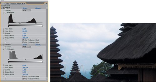
New in After Effects 7.0 are two check boxes at the bottom of the Levels effect controls; these specify whether black and white levels should be clipped on output. These are checked on by default, and until you reach Chapter 11 and start working in 32-bpc mode, you might as well ignore their very existence; they were added to allow Levels to work with levels that extend beyond the range that your monitor can display.
Levels
It's a wry joke in the effects world that you can create any shot using only two effects: Levels and Fast Blur. This sentiment is very punk rock, and like most such joking generalizations, while grossly exaggerated, it does contain a grain of truth: Those tools are used again and again in all sorts of permutations. Even if Levels is already your most used tool in After Effects, you may not be using it to full effect (pun fully intended).
Levels consists of five basic controls, each of which can be adjusted in one of five channel contexts (you can apply them to the four individual image channels R,G,B, and A, as well as to all three color channels, RGB, at once). There are two different ways to adjust these controls: via their numerical sliders or by dragging their respective carat sliders on the histogram. The latter is the more typical method for experienced users.
Contrast: Input and Output Levels
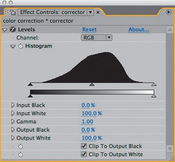
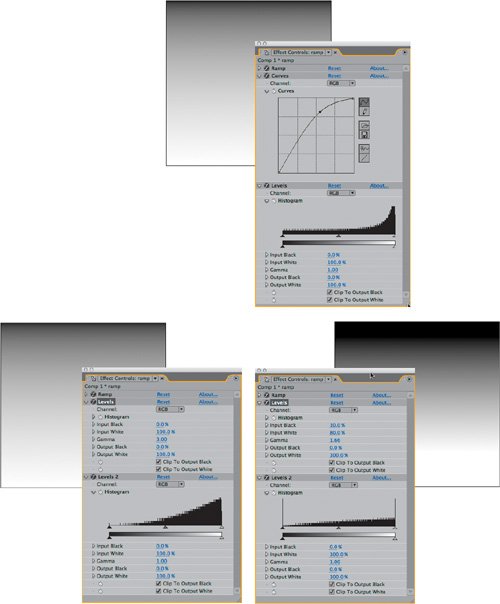
Leaving aside gamma for the moment, let's examine what four of the five controlsInput Black, Input White, Output Black and Output Whiteactually do to the image when adjusted (Figure 5.1). Together they control the brightness and contrast, and as you'll see they can do so with more precision than is possible with Brightness & Contrast.
Figure 5.1. Possibly the most used "effect" in After Effects, Levels consists of a histogram and five basic controls per channel; the controls are typically adjusted using the triangles on the histogram, although the corresponding numerical/slider controls appear below. New in version 7.0 are the Clip to Output Black and Clip to Output White toggles, explained further in Chapter 11.
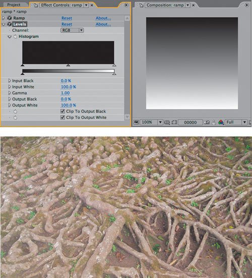
When doing your own experiments to see what an effect doesa very useful habit for cases in which you're uncertainit is helpful to have an image that will clearly show what is going on. In scientific experiments, this is known as a control; it prevents factors other than those being studied from affecting the outcome. In the case of color correction, the Ramp effect provides an effective control: a gradient that transitions evenly from black to white.
Figures 5.2a and b show a Ramp effect applied to a solid using the default settings, followed by the Levels effect. For the moment, leave the appearance of the histogram itself (odd in the case of a ramp, which is an even distribution of luminance values) alone and focus on what happens to the histogram as you adjust the settings.
Figures 5.2a and b. Levels is applied to a layer containing a Ramp effect at the default settings, which creates a smooth gradient from black to white (a); this will be the basis for understanding what the basic color correction tools do. You can create this for yourself or open 05_colorCorrection.aep, which also contains the image (b).
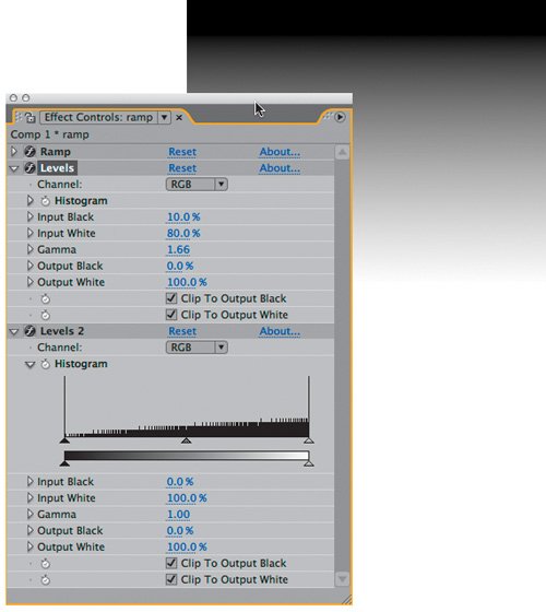
Begin by moving the black carat at the lower left of the histogramthe Input Black levelto the right. Pure blackness rolls across the gradient as values that were lighter than black are pushed toward pure black; the further up you move the carat, the more black values are "crushed" to pure black, below this specified threshold.
Now move the Input White carat at the right end of the histogram to the left, toward the Input Black carat. Watch the numbers beside the Input White value below, you should see them change as you adjust. The effect of bringing down the Input White value is just as with Input Black, except the effect is the opposite; more and more white values are "blown out" to pure white (Figure 5.3).
Figure 5.3. Raising Input Black and lowering Input White has the effect of increasing contrast at either end of the scale; at an extreme adjustment like this, many pixels are pushed to pure white or black (in an 8-bpc or 16-bpc project).
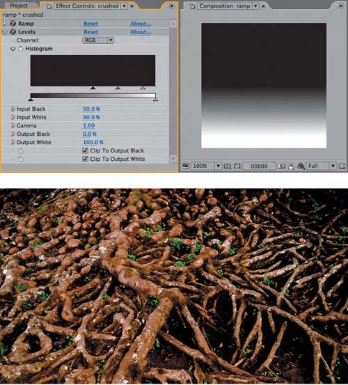
The net effect on your image of either adjustment is to increase the contrast. However, notice that (depending on what Input Black and Input White values you choose) you also change the midpoint of the gradient; in Figure 5.3 Input Black has been adjusted more heavily than Input White, causing the horizon of the gradient to move toward the white end as more of the image has been crushed to black. You can re-create a similar gradient using Brightness & Contrast (Figure 5.4) but not with the Contrast control alone, and not relative to a histogram, and not combined with a gamma adjustment (and the importance of the last two is yet to be explored).
Figure 5.4. It's pushing the outer limits of the meager Brightness & Contrast just to match the look of Figure 5.3, due to the lack of a histogram; with a real image, or one that requires a gamma adjustment as well, this approach becomes less possible.

Close-Up: Why Not Use Brightness & Contrast?
This section is all about adjusting the brightness and contrast of your image, without using the effect called Brightness & Contrast. Are we just too good for that effect? In a word, yes.
Brightness & Contrast contains two sliders, one for each property. Raising the Contrast value above 0.0 causes the values above middle gray to move closer to white and those below the midpoint to move closer to black, in proportion. Lower it and pixels turn gray. The Brightness control offsets the midpoint of any contrast adjustment, allowing a result like that in Figure 5.4.
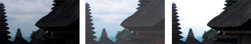
So what's the problem? Almost any image needs black and white adjusted to a different degree, and Brightness & Contrast allows this only indirectly; this can make adjustment a game of cat and mouse, as illustrated in Figures 5.5a, b, and c. Maddening. Add to that the fact that there is no histogram or individual Channel control, and you begin to feel like you're playing the piano with mittens on.
Figures 5.5a, b, and c. The source (a) was balanced for the sky, leaving foreground detail too dark to make out. Raising Brightness to bring detail out of the shadows makes the entire image washed out (b); raising Contrast to compensate completely blows out the sky (c). Madness.
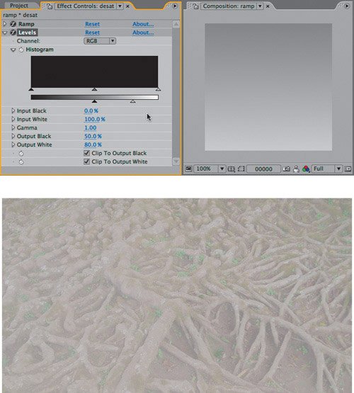
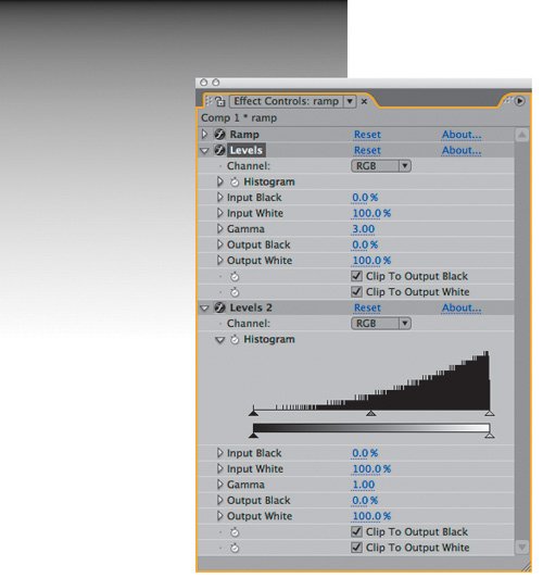
Now reset Levels (click Reset at the top of the Levels effect controls) and try the same experiment with the Output Black and Output White controls, which are found along the short gradient below the histogram. Output Black specifies the darkest black that can appear in the image; at the default of 0.00, black can be pure black, but at higher levels, any pixel below that level is raised to a new, lighter minimum value.
Notes
Note that you can even cross the two carats; if you drag Output White all the way down, and Output Black all the way up, you have inverted your image (although the more straightforward way to do this is typically to use the Channel: Invert effect).
Similarly, the effect of lowering Input White is something like dimming the image, cutting off the maximum possible white value at a level you specify. If you adjust both Output levels, you are effectively reducing the contrast in your image; push them close to one another and you will see your gradient become a solid gray (Figure 5.6).
Figure 5.6. Raising Output Black and lowering Output White reduces contrast in the dark and light areas of the image, respectively; they will come into play in the Matching section.
Evidently the Input and Output controls have the opposite effect on their respective black and white values, when examined in this straightforward fashion. What happens if you use them together?
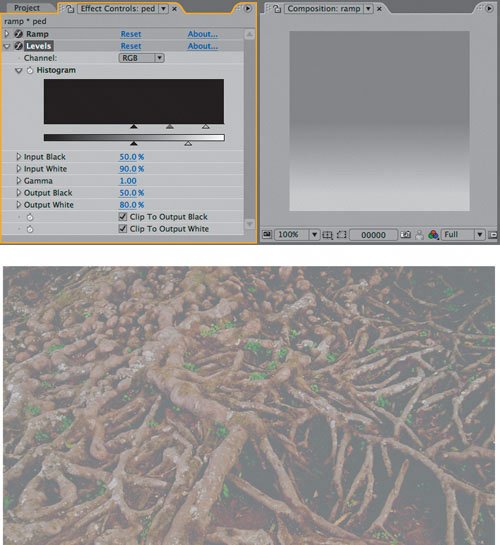
Reset, and try raising both Input Black and Output Black levels. As is the case throughout After Effects, the controls are operating in the order listed in the interface. In other words, the Input Black level first crushes the blacks, and then the Output Black level raises all of those pure black levels as one (Figure 5.7). It does not restore the black detail in the original pixels; the blacks remain crushed, they all just become lighter. If you're thinking, "So what?" at this point, just stay with thisan understanding of the controls is being broken down before it is built up.
Figure 5.7. At the risk of seeming dry and pedantic, because the image is now looking worse and worse, I just want to point out that none of the black and white levels that were crushed by adjusting the Input controls are brought back by the Output controls, which instead simply limit the overall dynamic range of the image, raising the darkest possible black level and lowering the brightest possible white.
Brightness: Gamma
You've probably noticed that as you adjust the Input Black and White values, the third carat that sits between them maintains its place between them, at the same proportion. This carat controls gamma, which corresponds to the midtonesthe middle gray pointof the image, all of the way out to black and white, which themselves remain unaffected. Try adjusting it over the gradient and notice that you can push the grays in the image brighter (to the left) or darker (to the right) with it, without changing the black and white levels.
Close-Up: Geek Alert: What Is Gamma, Anyway?
It would be so nice simply to say, "gamma is the midpoint of your color range" and leave it at that. The more accurate the discussion of gamma becomes, the more obscure and mathematical it gets. There are plenty of artists out there who understand gamma intuitively and are able to work with it without knowing the math behind it or the way the eye sees color midtones. That's fine, but if you'd like to broaden your understanding, read on.
The point of gamma adjustment is to take the midpoint of color values and shift it without affecting the black or white points. This is done by taking a pixel value and raising it to the power of the gamma value, then inverting the value. The formula looks like this
newPixel = pixel (1/gamma)
You're probably used to thinking of pixel values as being 0 to 255, but this formula works only if they are normalized to 1. In other words, all 255 values occur between 0 and 1, so 0 is 0, 255 is 1, and 128 is .5which is the "normal" way the math is done behind the scenes.
Why does it work this way? Because of the magic of logarithms: Any number to the power of 0 is 0, any number to the power of 1 is itself, and raising a fractional value (less than 1) to a higher and higher power makes it closer and closer to 0. This value is then inverted, or subtracted from 1, so that the higher the gamma, the closer the value gets to 1 or pure white. The real "magic" of logarithms is that the values are described on a curve, hence a gamma curve.
Hmmm, was that simple? If not, look ahead to the Curves discussion for a visual example of gamma in action.
Many images have perfect contrast levels yet need that extra bit of punch that boosting gamma slightly provides. Similarly, an image that looks a bit too hot may be instantly adjusted simply by lowering gamma. For now, this is a helpful way to think of gamma; as you progress through the book, you will see that it plays a crucial role not only in color adjustment but also in the inner workings of the image pipeline itself (more on that in Chapter 11).
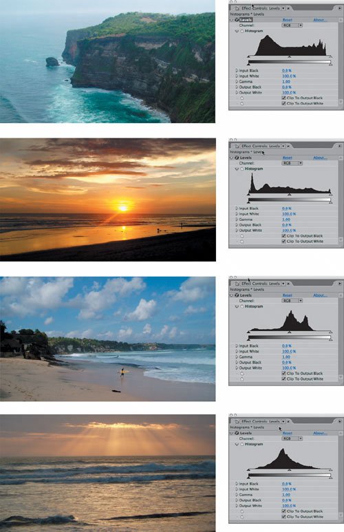
In most cases, the histogram won't offer much of a clue as to whether the gamma needs adjusting or by how much. (For more on histograms, see the section "Problem Solving with Histograms.") The image itself provides a better guide for how to adjust gamma, which is why it's more useful to think of it in terms of real images (Figure 5.8).
Figure 5.8. It was tempting to set this up as a game of "match the histogram with the image," so surprising (and revealing) can a histogram reading be to artists who haven't worked with them. Here are two sets of seemingly similar images with distinct histogram readings.
So what is your guideline for how much you should adjust gamma, if at all? In my first professional color correction job, my supervisor told me that he had to see it go too far before he knew how much to dial it back. That's a good approach, especially when you are learning. For a more powerful approach to adjusting gamma, it's worth looking at a related tool that scares most novice artists away: Curves.
By mixing these five controls together, can we learn everything there is to know about using Levels? Nobecause there are not, in fact, five basic controls in Levels (Input and Output White and Black plus Gamma), but instead, five times five (RGB, Red, Green Blue, and Alpha).
Individual Channels
Now it's time to lay some initial groundwork in the area of color correction that separates the artists from the hacks: the habit of adjusting footage on individual color channels.
Close-Up: Same Difference: Levels (Individual Controls)
Both Levels and Levels (Individual Controls) accomplish the exact same task. The sole difference is that Levels lumps all adjustments into a single keyframe property (which expressions cannot access). Levels (Individual Controls) is particularly useful when
- individual Levels settings need to be timed (and animated)
- an expression is being used in conjunction with Levels
- right-clicking on each individual property to reset it
Levels is more commonly used, but Levels (Individual Controls) is sometimes more useful.
The vast majority of After Effects users completely ignore that pull-down menu at the top of the Levels control that isolates red, green, blue, and alpha adjustments, and even those who do use it once in a while may do so with trepidation; how can you predictably understand what will happen when you adjust the five basic Levels controls on an individual channel? The gradient again serves as an effective learning tool to ponder what exactly is going on.
Reset the Levels effect applied to the Ramp gradient once more. Pick Red, Green, or Blue in the Channel pull-down of Levels and try adjusting each of the four Input and Output carats. Color is introduced into what was a purely grayscale image. With the Red channel selected, by moving Red Output Black inward, you tint the darker areas of the image red. If you adjust Input White inward, the midtones and highlights turn pink (light red). If, instead, you adjust Input Black or Output White inward, the tinting goes in the opposite directiontoward cyan, in the corresponding shadows and highlights. As you probably know, on the digital wheel of color, cyan is the opposite of red, just as magenta is the opposite of green and yellow is the opposite of blue (Figure 5.9).
Figure 5.9. Even if you've never worked with print files, you may be familiar with CMYK color, which is the system generally used by digital print professionals. Ignoring the "K" (which controls black for printing purposes), the letters "CMY" line up in the same order as "RGB," and they are the corresponding opposites on the digital color wheel.
Okay, this is straightforward enough on a gradient, but how are you supposed to remember what the effect will be in a real image? The only way to make sense of this is to develop the habit of studying your image in its individual color channels as you work. This will become evident in the next section of this chapter as the key to effective color matching.
Along the bottom of the Composition panel, all of the icons are monochrome by default save one: the Show Channel pull-down. It contains five selections: the three color channels as well as two alpha modes. Each one has a shortcut that, unfortunately, is not shown in the menu: Alt+1 through Alt+4 (Option+1 through Option+4) reveal each color channel in order. These shortcuts are toggles, so selecting the shortcut for the active channel sends you back to RGB. A colored outline around the edge of the composition palette reminds you which channel is displayed (Figure 5.10).
Figure 5.10. Here's an interesting use of the 4 Views layout (which is generally considered only for 3D channels): the red, green, blue, and RGB channels can be displayed simultaneously, with the stripes at the top and bottom of each viewer showing which channel is which. If you're wondering why this is useful, read on.

Tip
An often overlooked feature of Levels, Alpha Channel mode allows direct adjustment of brightness, contrast, and gamma of the grayscale transparency channel. More on this in Chapter 6, "Color Keying."
Try the same experiment, adjusting a single channel in Levels, but this time display only that channel as you work with it. Suddenly you are back on familiar territory, adjusting brightness and contrast of a grayscale image. This is how you will work with this effect until you are very confident with individual channel adjustments. Now take a look at what happens when you start to work with actual images instead of gradients, using the histogram to show you what is happening in your image.
Tip
You can reset any individual effect control by context-clicking it and choosing Reset. You know it's individual if it has its own stopwatch.
The Levels Histogram
You probably couldn't help but notice the odd appearance of the histogram in the preceding examples in which Levels was applied to a default Ramp. If you were to try this setup on your own, depending on the size of the layer to which you applied Ramp, you might see a histogram that is flat along the top with spikes protruding at regular intervals (Figures 5.11a and b).
Figures 5.11a and b. Strange-looking histograms such as these can actually help elucidate how the histogram works. The histogram of a colored solid (a) shows three spikes, one each for the red, green, and blue values, and nothing else. With a Ramp (b) the distribution is even, but the spikes at the top are the result of the ramp not being an exact multiple of 255 pixels, causing certain pixels to recur more often than others.

Tip
Does your histogram display an X across it? This means it does not have up-to-date information about your layer; if the histogram polled the image constantly, After Effects would slow to a crawl once you'd applied dozens of Levels effects. Simply clicking on the histogram, or toggling the effect, should refresh it; if not, you may have applied Levels to a layer, such as a null object, that has no image data.
The histogram is exactly 256 pixels wide; it is a bar graph with 256 single pixel bars, each corresponding to one of the 256 possible levels of luminance in an 8-bpc image (these levels are displayed below the histogram, above the Output controls). In the case of a pure gradient, such as Ramp generates, the histogram is flat because luminance is evenly distributed from black to white; the spikes occur because the image is not exactly 255 pixels high (or some exact multiple of 256, minus one edge pixel because the Ramp controls default to the edges of the layer), causing certain luminance values to occur one extra time.
Don't worry too much about that explanation if it doesn't instantly make sense. It's much more useful to look at real-world examples, because the histogram is useful for mapping image data that isn't plainly evident. Its basic function is to help you assess whether the changes you are making are liable to help or harm the image. There is in fact no one typical or ideal histogramthey can vary as much as the images themselves, as seen back in Figure 5.8.
Notes
The histogram displayed when RGB is selected in Channel is a composite average of the red, green, and blue channels. It becomes no more accurate at higher bit depths, but always averages to 8 bits per channel.
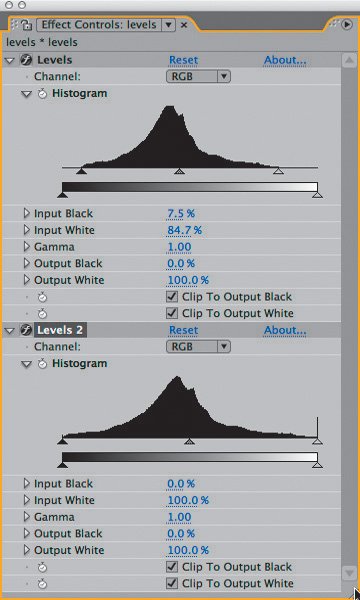
Despite that fact, there's a simple rule of thumb for optimizing contrast using Levels. Find the top and bottom end of the RGB histogramthe highest and lowest points where there is any data whatsoeverand bracket them with the triangle controls for Input Black and Input White. To "bracket" them means to adjust these controls inward so each sits just outside its corresponding end of the histogram (Figure 5.12). The result stretches values closer to the top or bottom of the dynamic range, as you can easily see by applying a second Levels effect and studying its histogram (Figure 5.13).
Figure 5.12. Here is a perfect case for bringing the triangle controls corresponding to Input Black and Input White in to bracket the edges of the histogram, increasing contrast without losing detail.
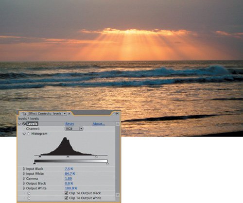
Figure 5.13. Adding a second Levels effect to this image's histogram only reveals the result of the prior adjustment; levels now extend to each end of the contrast spectrum. The stripes are the result of quantization, showing that values have been stretched. Although not severe in this case, they are a by-product of working in 8-bit color; 16 bpc will not produce them.
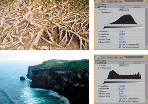
Try applying Levels to any image or footage from the disc and see for yourself how this works. First crush the blacks (by moving Input Black well above the lowest black level in the histogram) and then blow out the whites (moving Input White below the highest white value). Subsequent adjustments will not bring back that detailat least not until you start learning to work in 32 bpc mode (Chapter 11), which can store color data that has been pushed out of the visible range. Occasionally a stylized look will call for such a high-contrast result, but generally speaking and until you really know what you're doing, this is bad form (Figure 5.14).
Figure 5.14. Here's how the histogram really helps: The same Levels adjustment can bring a rich dramatic quality to one clip, while totally ruining another. Note in the second histogram how much more of the image is affected by this adjustment, including most of the lower range and all of the highlight variation.
Tip
Bracketing the Input levels in this manner offers a similar result of the Auto Levels effect. If that by itself isn't enough to convince you to avoid use Auto Levels, or the "Auto" correctors, consider also that they are processor intensive (in other words, slow) and resample on every frame (so the result is not consistent from frame to frame). If you're curious about them, apply one, take a snapshot of the result, and see if you can match what you like about it using the techniques in this chapter.
Black and white are not at all equivalent, in terms of how your eye sees them. Blown-out whites are not pretty and are usually a sign of overexposed digital footage, but your eye is much more sensitive to subtle gradations of low black levels. These low, rich blacks account for much of what makes film look filmic, and they can contain a surprising amount of detail, none of which, unfortunately, would be apparent on the printed page.
Tip
Footage is by its very nature dynamic, so it is a good idea to leave headroom for the whites and foot room for the blacks until you start working in 32 bits per channel. Headroom is particularly important if something exceptionally brightsuch as a sun glint, flare, or fireenters frame.
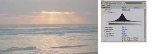
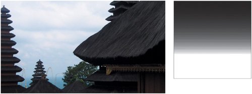
The occasions on which you would optimize your footage by adjusting Output Black and Output White controls are rare, as this lowers the dynamic range and the overall contrast of the image (Figure 5.15). However, the effects applications of lowering contrast are many, once you begin to use levels to create high-contrast mattes, to soften overlay effects (say, fog and clouds), and so on. More on that in the latter part of this chapter.
Figure 5.15. There are plenty of compositing situations in which you might want to make footage look like thissay, if it were meant to appear as if it were outside a windowbut this is not how you would optimize this image.
Notes
Many current displays, and in particular LCD flat-panels and projectors, lack the black detail that can be produced on a good CRT monitor or captured on film. The next time you see a projected film, notice how much detail you can see in the shadows and compare.
Problem Solving with the Histogram
As you've no doubt noticed, the Levels histogram shows only incoming image data, not the results of Levels adjustments. After Effects lacks a panel equivalent to Photoshop's Histogram palette, but you can, of course, apply a second Levels effect just to see how the histogram changed from adjustments in the first instance of Levels, at least for the purposes of learning (as was done in Figure 5.13).
Applied to the backlit shot from Figure 5.5, now adjusted with Levels to bring out foreground highlights, the resulting histogram reveals a couple of new wrinkles (Figures 5.16a and b). At the top end of the histogram the levels increase right up to the top white, ending in a spike. This may indicate that the white data has been crushed slightly, forcing too many whites to pure white and destroying image detail.
Figures 5.16a and b. In the first instance of Levels (a), Gamma is raised and the Input White brought in to enhance detail in the dark areas of the foreground (b). The second instance is applied only to show its histogram.
At the other end of the scale is the result of a Gamma adjustment: a series of spikes rising out of the lower values like protruding hash marks, even though the project is in 16 bpc mode which should prevent quantization. Raising Gamma moves the midpoint closer to black to raise midrange brightness. This in turn stretches the levels below the midpoint, causing them to clump up at regular intervals. As with crushing blacks and blowing out highlightsthe net effect is a loss of detail.
In this case, the spikes are not a worry because they occur among a healthy amount of surrounding dataa curve of data across the range. In more extreme cases, in which there is no data in between the spikes whatsoever, you will see the result of too much level adjusting in the form of banding (Figure 5.17).
Figure 5.17. Push an adjustment far enough and you may see quantization, otherwise known as banding in the image. Those big gaps in the histogram are expressed visible bands on a gradient. Switching to 16 bpc from 8 bpc is an instant fix for this problem in most cases.
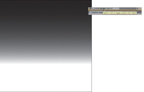
Banding is the result of limits associated with working in 8-bit color, and After Effects offers a ready-made solution: 16-bit color mode, which you can access by Alt-clicking (Option-clicking) on the bit-depth identifier along the bottom of the Project panel (Figure 5.18). 16-bpc mode was added to After Effects for this very situation; to understand more about what 16-bit color is and how it differs from After Effects 7.0's new 32-bpc mode, see Chapter 11.
Figure 5.18. An entire project can be toggled from the default 8-bit color mode to 16-bit mode by Alt-clicking (Option-clicking) the project color depth toggle in the Project panel; this prevents the banding seen in Figure 5.17.
Perfecting Brightness with Curves
Curves rocks. I heart curves. Curves is particularly preferable for gamma correction, because
- Curves can be used to gently roll off adjustments, giving a gentler, more organic curve to the corrections they introduce, weighted more toward one or the other end of the curve.
- You can use Curves to introduce more than one gamma adjustment to a single image or to restrict the gamma adjustment to just one part of the image's dynamic range.
- You can often nail an image adjustment with a single well-placed point in Curves, whereas deriving the equivalent adjustment using Levels would require coordinated adjustment of three separate controls.
It's also worth understanding Curves controls because they are a common shorthand for color adjustments in visual effects work; this control recurs not only in all of the other effects compositing packages but also in more sophisticated tools within After Effects, such as Color Finesse (discussed briefly later in this chapter).
Curves does, however, have drawbacks, compared with Levels:
- It's not initially intuitive how to use Curves, and on any creative team there may be people who aren't as comfortable with Curves as with Levels.
- Unlike Photoshop, After Effects doesn't offer a value you can derive from the points you create. It's a purely visual control requiring your eyes rather than numerical data to adjust correctly.
- Without a histogram, you may miss obvious clues as to contrast adjustments (for which Levels will remain more suitable as you are learning).
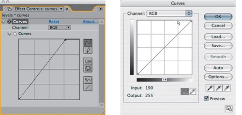
The most daunting thing about Curves is its interface, which is simply a grid with a diagonal line extending from lower left to upper right. There is a Channel selector at the top, set by default to RGB as in Levels, and there are some optional extra controls on the right to help you draw, save, and retrieve custom curves. To the novice, the graph is an unintuitive abstraction that you can easily use to make a complete mess of your image. Once you understand it, however, you can see it as an elegantly simple description of how image adjustment works.
Figure 5.19a diagrams the Curves controls, showing that the gradient along the bottom corresponds to input, and the gradient at the left output. Notice what happens to a given value when, for example, the overall brightness is raised by moving the point at the upper right to the left; all values raise proportionally, the exact equivalent of adjusting Input White in Levels.
Figures 5.19a and b. The Curves control in After Effects (a) isn't as helpful as Photoshop CS2's (b) in showing what is going on. The gradient along the left side of Photoshop Curves shows the output range, and the gradient along the bottom shows input; if you position the cursor on the arbitrary map, it even shows the input and output values that correspond to that position. The adjustment in 5.19a is exactly like raising Input White in Levels.
Figures 5.20a through f show some basic Curves adjustments and their effect on images, as well as on a linear gradient, and the equivalent Levels settings. This is the best way I could conceive to show what is happening with Curves, and it's the kind of thing you can try easily on your own, using the Ramp effect to create a gradient if you want a neutral palette on which to see the result of the changes. I would even go so far as to say that performing these kinds of scientific explorations into how these tools work is one of the things that will separate you from the mass of artists who work more haphazardly.
Figures 5.20a through f. This array of Curves adjustments applied to a gradient shows the results of some typical settings.
|
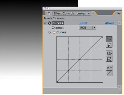
Figure 5.20a. The default gradient and Curves setting
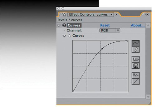
Figure 5.20b. An increase in gamma
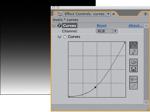
Figure 5.20c. A decrease in gamma
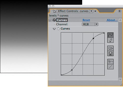
Figure 5.20d. An increase in brightness and contrast
Figure 5.20e. Raised gamma in the highlights only
Figure 5.20f. Raised gamma with clamped black values
|
More interesting than these basic adjustments (which are included only to give you a clear idea of what Curves is doing) are the types of adjustments that only Curves allows you to door at least do easily. I came to realize that most of the adjustments I make with Curves fall into a few distinct types that I use over and over, and so those are summarized here.
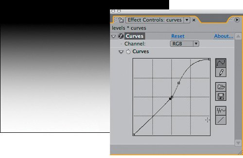
The most common adjustment is to simply raise or lower the gamma with Curves, by adding a point at the middle of the RGB curve and then moving it upward or downward. Figure 5.21 shows the result of each. This produces a subtly different result from raising or lowering the Gamma control in Levels because of how you control the roll-off (Figure 5.22).
Figure 5.21. Two equally valid gamma adjustments employ a single point adjustment in the Curves control. Dramatically lit footage particularly benefits from the roll-off possible in the highlights and shadows.
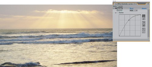
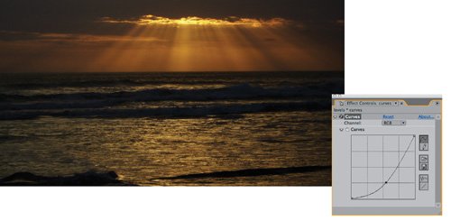
Figure 5.22. Both the gradient and the histogram show that you can push the gamma much harder, still preserving the full range of contrast, with Curves than with Levels, where you face a choice between losing highlights and shadows somewhat or crushing them.
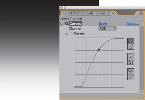
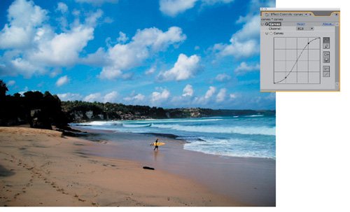
Take this idea further, and you can weight the adjustment to the high or low values of the image, pushing a nice roll-off into an image that might have appeared rather low in contrast (Figure 5.23). Combine high and low adjustments and you have a classic S-curve adjustment, which is universally understood to enhance brightness and contrast, but which additionally has the benefit of introducing roll-offs into the highlights and shadows (Figure 5.24). Keep in mind that you want to aim the curve to travel directly through the midpoint of your Curves grid if you don't wish to affect gamma.
Figure 5.23. This adjustment adds a boost to the highlight gamma only; the darker areas of the image, such as the beach, are unaffected, and only the bright areas become brighter.
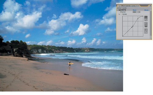
Figure 5.24. The classic S-curve adjustment: The midpoint remains the same, but contrast is boosted.
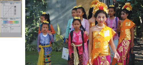
Some images need a gamma adjustment only to one end of the rangefor example, a boost to the darker pixels, below the midpoint, that doesn't alter the black point and doesn't brighten the white values. Here you are required to add three points (Figure 5.25):
- One to hold the midpoint
- One to boost the low values
- One to flatten the curve above the midpoint
Figure 5.25. The ultimate solution to the backlighting problem presented back in Figure 5.5: Adding a mini-boost to the darker levels while leaving the lighter levels flat preserves the detail in the sky and brings out detail in the foreground that was previously missing.
A typical method for working in Curves is to begin with a single point adjustment to adjust gamma or contrast, then modulating it with one or two added points. More points quickly become unmanageable, as each adjustment changes the weighting of the surrounding points. Typically, I will add a single point, then a second one to restrict its range, and a third as needed to bring the shape of one section back where I want it. The images used for the figures in this section are included as single stills for your own experimentation; open 05_colorCorrection.aep to find them.
Just for Color: Hue/Saturation
Third in the troika of essential color correction tools is Hue/Saturation. This one has many individualized uses:
- Colorizing images that were created as grayscale or monochrome
- Shifting the overall hue of an image
- De-emphasizing, or knocking out completely, an individual color channel
- Desaturating an image or adding saturation (the tool's most common use)
All of these uses will come into play in Chapters 12 through 14, when you start to create monochrome elements, such as smoke, from scratch.
The Hue/Saturation control allows you to do something you can't do with Levels or Curves, which is to directly control the hue, saturation, and brightness of an image. The HSB color model is merely a different way of looking at the same color data as exists in the RGB model used by Levels and Curves. All good color pickers, including the Apple and Adobe pickers, handle RGB and HSB as two different modes that use three values to describe any given color, which is the correct way to conceptualize it.
In other words, you could arrive at the same color adjustments using Levels and Curves, but Hue/Saturation gives you direct access to a couple of key color attributes that are otherwise difficult to get at. For example, desaturating an image is essentially bringing the red, green, and blue values closer together, reducing the relative intensity of the strongest of them. With a complex image, this approach would be difficult and unnecessary when a single slider will do it.
Desaturating an image slightlylowering the Saturation value somewhere between 5 and 20can be an effective way to make an image adjustment come together quickly (Figure 5.26). This is a case where understanding your delivery medium is essential, as film is more tolerant and friendly to saturated images than television.
Figure 5.26. For footage that is already saturated with color, even a subtle boost to the gamma can cause saturation to go over the top. There's no easy way to control this with RGB controls, such as Levels and Curves, but moving over to the HSB model allows you to single out Saturation and dial it back.
Notes
Chapter 12 details why Tint, not Hue/Saturation, is the right tool to convert an entire image to grayscale.
The other quick fix that Hue/Saturation affords you is a shift to the hue of the overall image or of one or more of its individual channels. The Channel Control menu for Hue/Saturation includes not only the red, green, and blue channels but also their chromatic opposites of cyan, magenta, and yellow. When you're working in RGB color, these secondary colors are in direct opposition, so that, for example, lowering blue gamma effectively raises the yellow gamma, and vice versa.
But in the HSB model all six are singled out individually, which means that if a given channel is too bright or over-saturated, you can dial back its Brightness & Saturation levels, or you can shift its Hue toward the part of the spectrum where you want it (Figures 5.27 and 5.28), without unduly affecting the other primary and secondary colors.
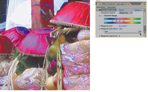
Figures 5.27a, b, and c. Sometimes one color channel comes in much too strong (a), and you can get away with isolating that channelin this case, magentaand knocking its Saturation back heavily (b). Go too far, however, and you may not notice artifacts such as areas that have lost too much saturation (c).
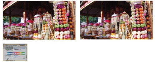
Figure 5.28. When in doubt about the amount of color in a given channel, try boosting its Saturation to 100%, blowing it outthis makes the presence of that tone in pixels very easy to spot.
More Color Tools and Techniques
This section has laid the foundation for color correction in After Effects using its most fundamental tools. The truth is that there are lots of ways to adjust the color levels of an image. Some alternatives for achieving a specific looklayering in a color solid, creating selections from an image using the image itself along with blending modes, and moreare discussed in Section III of this book.
Even with these basic tools, there are more usage alternatives. For example, you can apply these basic color correctors using an adjustment layer rather than directly to your footage. This gives you the added advantage of being able to dial back the correction by varying the opacity of the adjustment layer.
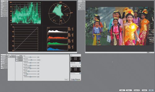
Will After Effects ever have a more sophisticated color correction system, and does the lack of one mean your output will be inferior? The answers are, it already sort of does, and in most cases, no, although more sophisticated tools might offer particular shortcuts to a given look. Color Finesse is a sophisticated color correction system included with After Effects Professional; unfortunately, it runs as a separate application, and does not allow you to see your corrections in the context of a composite (Figure 5.29), making it more suitable for overall color adjustments. Furthermore, it is made up mostly of tools that resemble the ones described in the preceding section, so you'll still want to master them. And although I love the way it allows easy isolation and adjustment of specific secondary color ranges, I rarely use it for compositing (other ways of isolating color for adjustment are revealed throughout Section II of the book).
Figure 5.29. Do the controls in Color Finesse seem familiar? Although snazzier looking, they combine the fundamental tools covered in depth thus far in the chapter: Levels, Curves, and Hue/Saturation.
Meanwhile, owners of the Adobe Production Suite (Windows only) may have noticed that Adobe Premiere Pro includes a Three-Way Color Corrector, and for the sake of support across the suite, this is a hidden effect inside of After Effects (again, Windows only) that appears only when it has been applied in a Premiere Pro project that is then imported into After Effects. Unfortunately, the effect is less useful in After Effects because its graphical user interface (consisting of color wheels) is missing; hopefully, this tool will make its way fully into a future version of After Effects, but for now, trying to use it is probably not worth the trouble for those few users who even have it.
Notes
Chapter 12 includes a "roll your own" recipe for three-way color correction.
Color Matching |
Section I. Working Foundations
The 7.0 Workflow
- The 7.0 Workflow
- Workspaces and Panels
- Making the Most of the UI
- Settings: Project, Footage, Composition
- Previews and OpenGL
- Effects & Presets
- Output: The Render Queue
- Study a Shot like an Effects Artist
The Timeline
- The Timeline
- Organization
- Animation Methods
- Keyframes and The Graph Editor
- Uber-mastery
- Transform Offsets
- Motion Blur
- Manipulating Time Itself
- In Conclusion
Selections: The Key to Compositing
- Selections: The Key to Compositing
- The Many Ways to Create Selections
- Compositing: Science and Nature
- Alpha Channels and Premultiplication
- Masks
- Combining Multiple Masks
- Putting Masks in Motion
- Blending Modes: The Real Deal
- Track Mattes
Optimizing Your Projects
- Optimizing Your Projects
- Navigating Multiple Compositions
- Precomposing and Nesting
- Adjustment and Guide Layers
- Understanding Rendering Order
- Optimizing After Effects
- Onward to Effects
Section II. Effects Compositing Essentials
Color Correction
- Color Correction
- Optimizing Plate Levels
- Color Matching
- Beyond the Basics
Color Keying
- Color Keying
- Good Habits and Best Practices
- Linear Keyers and Hi-Con Mattes
- Blue-Screen and Green-Screen Keying
- Understanding and Optimizing Keylight
- Fixing Typical Problems
- Conclusion
Rotoscoping and Paint
- Rotoscoping and Paint
- Articulated Mattes
- Working Around Limitations
- Morphing
- Paint and Cloning
- Conclusion
Effective Motion Tracking
- Effective Motion Tracking
- The Essentials
- Optimizing Tracking Using 3D
- Extending a Track with Expressions
- Tracking for Rotoscoping
- Using 3D Tracking Data
- Conclusion
Virtual Cinematography
- Virtual Cinematography
- 5D: Pick Up the Camera
- Storytelling and the Camera
- Camera Blur
- The Role of Grain
- Film and Video Looks
- Conclusion
Expressions
- Expressions
- Logic and Grammar
- Muting Keyframes
- Linking Animation Data
- Looping Animations
- Smoothing and Destabilizing
- Offsetting Layers and Time
- Conditionals and Triggers
- Tell Me More
Film, HDR, and 32 Bit Compositing
- Film, HDR, and 32 Bit Compositing
- Details
- Film 101
- Dynamic Range
- Cineon Log Space
- Video Gamma Space
- Battle of the Color Spaces
- Floating Point
- 32 Bits per Channel
- Conclusion
Section III. Creative Explorations
Working with Light
- Working with Light
- Light Source and Direction
- Creating a Look with Color
- Backlighting, Flares, Light Volume
- Shadows and Reflected Light
- HDR Lighting
- Conclusion
Climate: Air, Water, Smoke, Clouds
- Climate: Air, Water, Smoke, Clouds
- Particulate Matter
- Sky Replacement
- The Fog, Smoke, or Mist Rolls In
- Billowing Smoke
- Wind
- Water
- Conclusion
Pyrotechnics: Fire, Explosions, Energy Phenomena
- Pyrotechnics: Fire, Explosions, Energy Phenomena
- Firearms
- Sci-Fi Weaponry
- Heat Distortion
- Fire
- Explosions
- In a Blaze of Glory
Learning to See
Index
EAN: 2147483647
Pages: 157
