Example Four: LunarPhases
Example Four LunarPhases
 |
This next example, LunarPhases.java, [1] is a more complicated example of how to use images in your application. As an added bonus, you'll also see how to implement combo boxes. Here are two pictures of the LunarPhases application:
|
Figure 103. Two screenshots of the LunarPhases application.
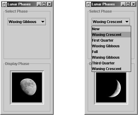
In this program, the user chooses the lunar phase from the combo box, and the selected phase of the moon is shown in the lower panel. This is the first example we've seen that uses multiple panels to group components. Let's take a quick look at how we set up these panels.
LunarPhases has three panels, as shown in Figure 104.
Figure 104. A depiction of the main panel and two subpanels in LunarPhases.java.
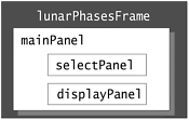
In the following code in the LunarPhases constructor, we construct all three panels and add the two subpanels (selectPanel and displayPanel) to mainPanel.
// Create the phase selection and display panels.
selectPanel = new JPanel();
displayPanel = new JPanel();

// Add various widgets to the subpanels.
addWidgets();

// Create the main panel to contain the two subpanels.
mainPanel = new JPanel();
mainPanel.setLayout(new GridLayout(2,1,5,5));
mainPanel.setBorder(BorderFactory.createEmptyBorder(5,5,5,5));

// Add the select and display panels to the main panel.
mainPanel.add(selectPanel);
mainPanel.add(displayPanel);
When we add the subpanels to the main panel, how can we make sure that they're added in the right place? By default, each container has a layout manageran object that performs layout management for the components within the container. Layout management is the process of determining the size and the position of components. The default layout manager for the containers we've looked at is FlowLayout. With FlowLayout, the components are simply positioned in the container from left to right in the order they are added.
In the previous code snippet, we use a layout manager called GridLayout to position the components within. Layout is further discussed in the section Layout Management (page 375).
Compound Borders
In previous examples, we've added a simple border to add a buffer of space around components. In this example, both subpanels, selectPanel and displayPanel, have a compound border. This compound border consists of a titled border (an outlined border with a title) and an empty border (to add extra space), as shown in Figure 105.
Figure 105. The compound border used in selectPanel.
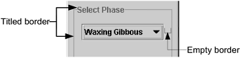
The code for the selectPanel border follows.
// Add border around the select panel
selectPanel.setBorder(BorderFactory.createCompoundBorder(
 BorderFactory.createTitledBorder("Select Phase"),
 BorderFactory.createEmptyBorder(5,5,5,5)));
The displayPanel sets its own border in the same way.
Combo Boxes
A combo box enables user choice. A combo box can be either editable or uneditable, but by default it is uneditable. An uneditable combo box looks like a button until the user interacts with it. When the user clicks it, the combo box displays a menu of items.
Figure 106. Two pictures of a combo box; the combo box on the right has been one dropped-down.
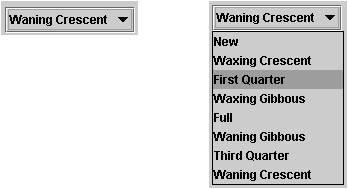
Use an uneditable combo box to display one-of-many choices when space is limited, when the number of choices is large, or when the menu items are computed at runtime. The following code in LunarPhases.java creates an uneditable combo box, phaseChoices, and sets it up:
JComboBox phaseChoices = null;
...
// Create combo box with lunar phase choices
String[] phases = { "New", "Waxing Crescent", "First Quarter",
 "Waxing Gibbous", "Full", "Waning Gibbous",
 "Third Quarter", "Waning Crescent" };
phaseChoices = new JComboBox(phases);
phaseChoices.setSelectedIndex(START_INDEX);
The code initializes the combo box with an array of strings, phases. You can also put icons in a combo box or initialize the combo box with a vector. [1] In the last line of code, the setSelectedIndex method specifies which phase of the moon should be shown when the program starts.
[1] To put other types of objects in a combo box or to customize how the items in a combo box look, you need to write a custom renderer. An editable combo box would need a custom editor, in addition. Refer to the section "Providing a Custom Renderer" in the book The JFC Swing Tutorial. This section is also available on this book's CD and online at: http://java.sun.com/docs/books/tutorial/uiswing/components/combobox.html#renderer
Handling Events on a Combo Box
The combo box fires an action event when the user selects an item from the combo box's menu. The following code from LunarPhases registers and implements an action listener on the combo box:
phaseChoices.addActionListener(this);
...
public void actionPerformed(ActionEvent event) {
 if ("comboBoxChanged".equals(event.getActionCommand())) {
 // update the icon to display the new phase
 phaseIconLabel.setIcon(images[phaseChoices.getSelectedIndex()]);
 }
}
This action listener gets the newly selected item from the combo box, uses that item to compute the name of an image file, and updates a label to display the image.
Multiple Images
In the CelsiusConverter program, we saw how to add a single ImageIcon to a button. The LunarPhases uses eight images. Only one image of the eight is used at a time, so we have a choice as to whether we load all the images up front or load the images as they are needed (known as "lazy image loading"). In this example, the images are all loaded up front when the class is constructed.
final static int NUM_IMAGES = 8;
final static int START_INDEX = 3;

ImageIcon[] images = new ImageIcon[NUM_IMAGES];
...

// Create the widgets to select and display the phases of the moon.
private void addWidgets() {
 // Get the images and put them into an array of ImageIcon.
 for (int i = 0; i < NUM_IMAGES; i++) {
 String imageName = "images/image" + i + ".jpg";
 URL iconURL = ClassLoader.getSystemResource(imageName);

 ImageIcon icon = new ImageIcon(iconURL);
 images[i] = icon;
 }
}
Note the use of getSystemResource, a method in ClassLoader that searches the classpath to find the image file names so that we don't have to specify the fully qualified path name.
Getting Started
- About the Java Technology
- How Will Java Technology Change My Life?
- First Steps (Win32)
- First Steps (UNIX/Linux)
- First Steps (MacOS)
- A Closer Look at HelloWorld
- Questions and Exercises
- Code Samples
Object-Oriented Programming Concepts
- What Is an Object?
- What Is a Message?
- What Is a Class?
- What Is Inheritance?
- What Is an Interface?
- How Do These Concepts Translate into Code?
- Summary
- Questions and Exercises
- Code Samples
Language Basics
Object Basics and Simple Data Objects
Classes and Inheritance
Interfaces and Packages
Handling Errors Using Exceptions
- What Is an Exception?
- The Catch or Specify Requirement
- Catching and Handling Exceptions
- Specifying the Exceptions Thrown by a Method
- How to Throw Exceptions
- Runtime Exceptions The Controversy
- Advantages of Exceptions
- Summary of Exceptions
- Questions and Exercises
- Code Samples
Threads: Doing Two or More Tasks at Once
- What Is a Thread?
- Using the Timer and TimerTask Classes
- Customizing a Threads run Method
- The Life Cycle of a Thread
- Understanding Thread Priority
- Synchronizing Thread
- Grouping Threads
- Summary of Threads
- Questions and Exercises
- Code Samples
I/O: Reading and Writing
- Overview of I/O Streams
- Using the Streams
- Object Serialization
- Working with Random Access Files
- And the Rest…
- Summary of Reading and Writing
- Questions and Exercises
- Code Samples
User Interfaces That Swing
- Overview of the Swing API
- Your First Swing Program
- Example Two: SwingApplication
- Example Three: CelsiusConverter
- Example Four: LunarPhases
- Example Five: VoteDialog
- Layout Management
- Threads and Swing
- Visual Index to Swing Components
- Summary
- Questions and Exercises
- Code Samples
Appendix A. Common Problems and Their Solutions
- Appendix A. Common Problems and Their Solutions
- Getting Started Problems
- General Programming Problems
- Applet Problems
- User Interface Problems
Appendix B. Internet-Ready Applets
- Appendix B. Internet-Ready Applets
- Overview of Applets
- AWT Components
- Taking Advantage of the Applet API
- Practical Consideration of Writing Applets
- Finishing an Applet
- Swing-Based Applets
- Code Samples
Appendix C. Collections
- Appendix C. Collections
- Introduction
- Interfaces
- Implementations
- Algorithms
- Custom Implementations
- Interoperability
Appendix D. Deprecated Thread Methods
- Appendix D. Deprecated Thread Methods
- Why Is Thread.stop Deprecated?
- Why Are Thread.suspend and Thread.resume Deprecated?
- What about Thread.destroy?
- Why Is Runtime.runFinalizersOnExit Deprecated?
Appendix E. Reference
 A Short Course on the Basics")
EAN: 2147483647
Pages: 125
