Bells and Whistles Controls
You'll finish off looking at Win Form controls by exploring some fun controls that you may not use that often but that can occasionally come in handy.
PictureBox
The PictureBox is a handy little control for displaying an existing image file. What makes it really cool is that it has built-in support for bitmaps, metafiles, and icons and .jpg, .gif, and .png files. You implement all of them the same way:
-
Drag and drop the PictureBox to your Win Form.
-
Update the Image property in the PictureBox's Properties view with the location of your file using the provided Open dialog box.
Like all controls, PictureBox provides properties to manipulate itself. In most cases you will only have to worry about the following:
-
BorderStyle is a BorderStyle enum that represents the border to surround your image. Three borders are available: Fixed3D, FixedSingle, and the default None.
-
Image is an Image object that represents the image to be displayed. The Image object supports bitmaps, metafiles, and icons and .jpg, .gif, and .png files.
-
Size is a Size object that represents the height and width of the control. If the SizeMode is set to StretchImage, then the images inside will stretch or shrink to fit this size.
-
SizeMode is a PictureBoxSizeMode that represents how the image will be displayed. The four modes are AutoSize, which forces the control to be the same size as the image; CenterImage, which centers the image within the control (the image will be clipped if the control is too small); the default Normal, which aligns the picture with the upper-left corner; and StretchImage, which make the image the same size as the control.
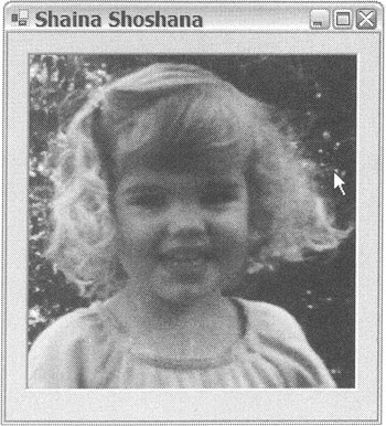
The code in Listing 10-7 shows a picture of my daughter in a StretchImage mode PictureBox.
Listing 10-7: PictureBox of Shaina
namespace PictureBoxEx { using namespace System; using namespace System::ComponentModel; using namespace System::Collections; using namespace System::Windows::Forms; using namespace System::Data; using namespace System::Drawing; public _gc class Form1 : public System::Windows::Forms::Form { public: Form1(void) //... protected: void Dispose(Boolean disposing) //... private: System::Windows::Forms::PictureBox * pictureBox; private: System::ComponentModel::Container * components; void InitializeComponent(void) { System::Resources::ResourceManager * resources = new System::Resources::ResourceManager(__typeof(PictureBoxEx::Form1)); this->pictureBox = new System::Windows::Forms::PictureBox(); this->SuspendLayout(); // // pictureBox // this->pictureBox->Anchor = (System::Windows::Forms::AnchorStyles) (((System::Windows::Forms::AnchorStyles::Top | System::Windows::Forms::AnchorStyles::Bottom) | System::Windows::Forms::AnchorStyles::Left) | System::Windows::Forms::AnchorStyles::Right); this->pictureBox->BorderStyle = System::Windows::Forms::BorderStyle::Fixed3D; this->pictureBox->Image = (dynamic_cast<System::Drawing::Image * > (resources->GetObject(S"pictureBox.Image"))); this->pictureBox->Location = System::Drawing::Point(16, 16); this->pictureBox->Name = S"pictureBox"; this->pictureBox->Size = System::Drawing::Size(272, 274); this->pictureBox->SizeMode = System::Windows::Forms::PictureBoxSizeMode::StretchImage; // // // Form1 // this->AutoScaleBaseSize = System::Drawing::Size(6, 15); this->ClientSize = System::Drawing::Size(304, 314); this->Controls->Add(this->pictureBox); this->Name = S"Form1"; this->Text = S"Shaina Shoshana"; this->ResumeLayout(false); } }; } You might want to note in the preceding code that Visual Studio .NET creates a resource of the PictureBox's image and places it within the assembly in a similar fashion to the ImageList, instead of referencing the file. If you don't want the image placed in the assembly for some reason, then you'll have to code the updating of the Image property manually with code similar to this:
this->pictureBox->Image = new Drawing::Bitmap(S"ShainaFace.jpg");
Figure 10-9 shows what PictureEx.exe looks like when you execute it.

Figure 10-9: A PictureBox of Shaina
MonthCalendar
The MonthCalendar is a neat little control that provides the ability to display a month to the user and then allow the user to do things such as navigate from month to month and select a year, month, day, or range of days. Another feature of the MonthCalendar control is it allows the user to highlight specific dates on the control, either on an annual, monthly, or specific single-day basis.
Like all controls, you configure MonthCalendar using properties. Here are some of the most commonly used properties:
-
AnnuallyBoldedDates is an array of DateTime objects that represents which dates to bold every year.
-
BoldedDates is an array of DateTime objects that represents which specific dates to bold.
-
CalendarDimensions is a System::Drawing::Size that represents the number of rows and columns of months to be displayed within the control. The maximum number of months that can be displayed is 12.
-
MaxDate is a DateTime that represents the maximum date that can be shown in the control. The default is 12/31/9998.
-
MaxSelectionCount is an Int32 that represents the maximum number of dates that can be selected at one time. The default is seven.
-
MinDate is a DateTime that represents the minimum date that can be shown in the control. The default is 01/01/1753.
-
MonthlyBoldedDates is an array of DateTime objects that represents which dates to bold every month.
-
SelectionEnd is a DateTime that represents the end date of the selected date range. The default is SelectionEnd (equaling SelectionStart).
-
SelectionRange is a SelectionRange that represents the selected range of dates within the control.
-
SelectionStart is a DateTime that represents the start date of the selected date range.
-
ShowToday is a Boolean that represents whether the date specified in the TodayDate property is shown at the bottom of the control.
-
ShowTodayCircle is a Boolean that represents whether the date specified in the TodayDate property is circled.
-
ShowWeekNumbers is a Boolean that represents whether the week number is displayed for each week.
-
TodayDate is a DateTime representing any date that you want to be set as today's date. The default is the current system date.
-
TodayDateSet is a Boolean that represents whether the TodayDate property was explicitly set.
Something you might want to note about the MonthCalendar control is that you can't select dates at random intervals. You can only select individual days or a range of days sequentially.
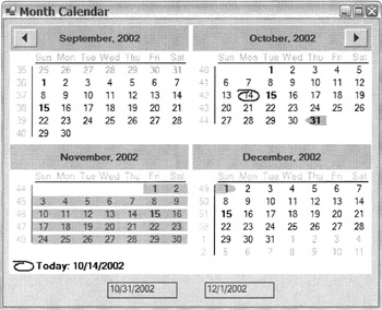
Listing 10-8 presents the MonthCalendar in action. The code simply shows a two-by-two MonthCalendar control that that generates DateChanged events when clicked. It also has two additional labels to display the selected day or ranges of days.
Listing 10-8: The MonthCalendar Control
namespace MonthCalendar1 { using namespace System; using namespace System::ComponentModel; using namespace System::Collections; using namespace System::Windows::Forms; using namespace System::Data; using namespace System::Drawing; public __gc class Form1 : public System::Windows::Forms::Form { public: Form1(void) //... protected: void Dispose(Boolean disposing) //... private: System::Windows::Forms::MonthCalendar * monthCal; private: System::Windows::Forms::Label * Start; private: System::Windows::Forms::Label * End; private: System::ComponentModel::Container * components; void InitializeComponent(void) { this->monthCal = new System::Windows::Forms::MonthCalendar(); this->Start = new System::Windows::Forms::Label(); this->End = new System::Windows::Forms::Label(); this->SuspendLayout(); // // monthCalendar1 // System::DateTime __mcTemp__1[] = new System::DateTime[1]; __mcTemp__1[0] = System::DateTime(2002, 10, 31, 0, 0, 0, 0); this->monthCal->AnnuallyBoldedDates = __mcTemp__1; this->monthCal->CalendarDimensions = System::Drawing::Size(2, 2); this->monthCal->Location = System::Drawing::Point(8, 8); this->monthCal->MaxSelectionCount = 365; System::DateTime __mcTemp__2[] = new System::DateTime[2]; __mcTemp__2[0] = System::DateTime(2002, 10, 1, 0, 0, 0, 0); __mcTemp__2[1] = System::DateTime(2002, 10, 15, 0, 0, 0, 0); this->monthCal->MonthlyBoldedDates = __mcTemp__2; this->monthCal->Name = S"monthCal"; this->monthCal->ShowWeekNumbers = true; this->monthCal->TabIndex = 0; this->monthCal->DateChanged += new System::Windows::Forms::DateRangeEventHandler(this, monthCal_DateChanged); // // Start // this->Start->BorderStyle = System::Windows::Forms::BorderStyle::FixedSingle; this->Start->Location = System::Drawing::Point(150, 375); this->Start->Name = S"Start"; this->Start->TabIndex = 1; // // End // this->End->BorderStyle = System::Windows::Forms::BorderStyle::FixedSingle; this->End->Location = System::Drawing::Point(290, 375); this->End->Name = S"End"; this->End->TabIndex = 2; // // Form1 // this->AutoScaleBaseSize = System::Drawing::Size(6, 15); this->ClientSize = System::Drawing::Size(540, 410); this->Controls->Add(this->End); this->Controls->Add(this->Start); this->Controls->Add(this->monthCal); this->Name = S"Form1"; this->Text = S"Month Calendar"; this->ResumeLayout(false); } private: System::Void monthCal_DateChanged(System::Object * sender, System::Windows::Forms::DateRangeEventArgs * e) { // Update start and end range labels when date changes Start->Text = e->Start.Date.ToShortDateString(); End->Text = e->End.Date.ToShortDateString(); } }; } The only thing unusual about the preceding code is that you need to remember that System::DateTime is a value type structure and thus you don't create it on the stack with the new statement. Also, when you use them in a statement, you use the operator . and not ->.
Figure 10-10 shows what MonthCalendar.exe looks like when you execute it.

Figure 10-10: The MonthCalendar control
ErrorProvider
The ErrorProvider control is a nice piece of eye candy, especially when it comes to form validation, as you can use it to provide visual attention to data entry errors on the form. It has the additional bonus of being able to tell the user the reason for the data entry error. It provides this functionality by placing an icon next to the control in error and then providing a ToolTip-like pop-up displaying the reason for the error when the mouse pauses over the icon. Actually, it displays any text that you provide to it. In theory, this text should be the reason for the error.
Another interesting feature of the ErrorProvider control is that you need only one for your entire form. Yet, at the same time, it provides a specific error message for each control in error.
To implement the ErrorProvider control, drag and drop it to your design form from the Toolbox view. Then, when an error occurs in your validation process, place an error message along with a pointer to the control in error into the ErrorProvider.
To customize the look and feel of the ErrorProvider control, a few members are provided. These are the properties that you will most likely change:
-
BlinkRate is an Int32 that represents the flash rate of the icon in milliseconds. The default is 250 milliseconds.
-
BlinkStyle is an ErrorBlinkStyle enum that represents the style that the icon blinks. The possible values are AlwaysBlink, NeverBlink, and the default BlinkIfDifferentError.
-
Icon is an Icon object that represents the icon to be displayed on error. The default is a red circle with a white exclamation point inside.
-
SetError() is a method that sets the error for a specified control to display when the mouse pauses over the icon. When the message is an empty string, no icon or error is displayed.
-
SetIconAlignment() is a method that sets the icon's location relative to a specified control. The default is MiddleRight.
-
SetIconIconPadding() is a method that specifies the number of pixels of padding to add between an icon and a specified control. Because many controls have white space surrounding them, this control is not used too often.
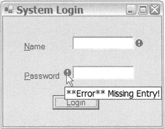
Listing 10-9 shows the ErrorProvider control in action. The code is the start of a login form that validates that a name and password have been entered. When either of these fields is blank, the ErrorProvider control is added after the control on the form. Just for grins and giggles, I show how to place the icon on the left side of the control when validating on the Button control.
Listing 10-9: The ErrorProvider Control
namespace ErrProvider { using namespace System; using namespace System::ComponentModel; using namespace System::Collections; using namespace System::Windows::Forms; using namespace System::Data; using namespace System::Drawing; public __gc class Form1 : public System::Windows::Forms::Form { public: Form1(void) //... protected: void Dispose(Boolean disposing) //... private: System::Windows::Forms::ErrorProvider * eProvider; private: System::Windows::Forms::TextBox * tbName; private: System::Windows::Forms::TextBox * tbPword; private: System::Windows::Forms::Button * bnLogin; private: System::Windows::Forms::Label * lbName; private: System::Windows::Forms::Label * lbPword; private: System::ComponentModel::Container * components; void InitializeComponent(void) { this->eProvider = new System::Windows::Forms::ErrorProvider(); this->tbName = new System::Windows::Forms::TextBox(); this->tbPword = new System::Windows::Forms::TextBox(); this->bnLogin = new System::Windows::Forms::Button(); this->lbName = new System::Windows::Forms::Label(); this->lbPword = new System::Windows::Forms::Label(); this->SuspendLayout(); // // errorProvider1 // this->eProvider->ContainerControl = this; // // tbName // this->tbName->Location = System::Drawing::Point(112, 32); this->tbName->Name = S"tbName"; this->tbName->TabIndex = 0; this->tbName->Text = S""; this->tbName->Validating += new System::ComponentModel::CancelEventHandler(this, textBox_Validating); // // tbPword // this->tbPword->Location = System::Drawing::Point(112, 80); this->tbPword->Name = S"tbPword"; this->tbPword->PasswordChar = '*'; this->tbPword->TabIndex = 1; this->tbPword->Text = S""; this->tbPword->Validating += new System::ComponentModel::CancelEventHandler(this, textBox_Validating); // // button1 // this->bnLogin->Location = System::Drawing::Point(80, 128); this->bnLogin->Name = S"bnLogin"; this->bnLogin->TabIndex = 2; this->bnLogin->Text = S"&Login"; this->bnLogin->Click += new System::EventHandler(this, bnLogin_Click); // // lbName // this->lbName->Location = System::Drawing::Point(32, 40); this->lbName->Name = S"lbName"; this->lbName->Size = System::Drawing::Size(64, 16); this->lbName->TabIndex = 0; this->lbName->Text = S"&Name"; // // lbPword // this->lbPword->Location = System::Drawing::Point(32, 88); this->lbPword->Name = S"lbPword"; this->lbPword->Size = System::Drawing::Size(64, 16); this->lbPword->TabIndex = 1; this->lbPword->Text = S"&Password"; // // Form1 // this->AutoScaleBaseSize = System::Drawing::Size(6, 15); this->ClientSize = System::Drawing::Size(256, 178); this->Controls->Add(this->lbPword); this->Controls->Add(this->lbName); this->Controls->Add(this->bnLogin); this->Controls->Add(this->tbPword); this->Controls->Add(this->tbName); this->Name = S"Form1"; this->Text = S"System Login"; this->ResumeLayout(false); } private: System::Void textBox_Validating(System::Object * sender, System::ComponentModel::CancelEventArgs * e) { try { TextBox *tb = dynamic_cast<TextBox*>(sender); if (tb->Text->Equals("")) eProvider->SetError(tb, "**Error** Missing Entry!"); else eProvider->SetError(tb, ""); } catch (...) { // Not TextBox } } private: System::Void bnLogin_Click(System::Object *sender, System::EventArgs *e) { if (tbName->Text->Equals("")) eProvider->SetError(tbName, "**Error** Missing Entry!"); else eProvider->SetError(tbName, ""); if (tbPword->Text->Equals("")) { // Place the icon on left side of control eProvider->SetIconAlignment(tbPword, ErrorIconAlignment::MiddleLeft); eProvider->SetError(tbPword, "**Error** Missing Entry!"); } else eProvider->SetError(tbPword, ""); } }; } What you'll want to notice about the preceding example is the Validating event, which is raised whenever the next control receives focus. The next control must also have the CausesValidation property set to true.
Figure 10-11 shows what ErrProvider.exe looks like when you execute it.

Figure 10-11: The ErrorProvider control
NotifyIcon
If you've tried to add an icon to the notification area in your past life, you know that it wasn't a simple task. Well, with the .NET Framework, it is. All it takes is a drag and drop of the NotifyIcon control from the Toolbox view to your design form.
The NotifyIcon control also provides four properties that you'll probably change:
-
Icon is an Icon object that represents the icon to display on the notification area. The default is null, which causes no icon to be displayed. (Why someone would do this, I'm not sure.)
-
Text is a String that represents the ToolTip text to be displayed when the mouse pauses over the icon in the notification area. The default is null, which causes no text to be displayed.
-
ContextMenu is a ContentMenu object that represents a pop-up menu displayed when the icon is right-clicked. The default is null, which causes no menu to be displayed. (I cover ContentMenus later in this chapter.)
-
Visible is a Boolean that represents whether the icon is displayed in the notification area. The default is true, which displays the icon.
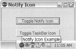
Listing 10-10 shows the NotifyIcon control in action. To give the example some life, I added two buttons. The first toggles the icon in the notification area and the second toggles the program display in the taskbar. When you write your own program, you may want to display either in the notification area or in the taskbar, but not in both.
Listing 10-10: The NotifyIcon Control
namespace NotifyIconEx { using namespace System; using namespace System::ComponentModel; using namespace System::Collections; using namespace System::Windows::Forms; using namespace System::Data; using namespace System::Drawing; public __gc class Form1 : public System::Windows::Forms::Form { public: Form1(void) //... protected: void Dispose(Boolean disposing) //... private: System::Windows::Forms::NotifyIcon * notifyIcon; private: System::Windows::Forms::Button * bnNotify; private: System::Windows::Forms::Button * bnTaskbar; private: System::ComponentModel::IContainer * components; void InitializeComponent(void) { this->components = new System::ComponentModel::Container(); System::Resources::ResourceManager * resources = new System::Resources::ResourceManager(_typeof(NotifyIconEx::Form1)); this->notifyIcon = new System::Windows::Forms::NotifyIcon(this->components); this->bnNotify = new System::Windows::Forms::Button(); this->bnTaskbar = new System::Windows::Forms::Button(); this->SuspendLayout(); // // notifyIcon // this->notifyIcon->Icon = (dynamic_cast<System::Drawing::Icon * > (resources->GetObject(S"notifyIcon.Icon"))); this->notifyIcon->Text = S"Notify Icon Example"; this->notifyIcon->Visible = true; // // bnNotify // this->bnNotify->Location = System::Drawing::Point(48, 32); this->bnNotify->Name = S"bnNotify"; this->bnNotify->Size = System::Drawing::Size(144, 23); this->bnNotify->Text = S"Toggle Notify Icon"; this->bnNotify->Click += new System::EventHandler(this, bnNotify_Click); // // bnTaskbar // this->bnTaskbar->Location = System::Drawing::Point(48, 72); this->bnTaskbar->Name = S"bnTaskbar"; this->bnTaskbar->Size = System::Drawing::Size(144, 24); this->bnTaskbar->Text = S"Toggle TaskBar Icon"; this->bnTaskbar->Click += new System::EventHandler(this, bnTaskbar_Click); // // Form1 // this->AutoScaleBaseSize = System::Drawing::Size(6, 15); this->ClientSize = System::Drawing::Size(240, 154); this->Controls->Add(this->bnTaskbar); this->Controls->Add(this->bnNotify); this->Icon = (dynamic_cast<System::Drawing::Icon * > (resources->GetObject(S"$this.Icon"))); this->Name = S"Form1"; this->Text = S"Notify Icon"; this->ResumeLayout(false); } private: System::Void bnNotify_Click(System::Object * sender, System::EventArgs * e) { notifyIcon->Visible = !notifyIcon->Visible; } private: System::Void bnTaskbar_Click(System::Object * sender, System::EventArgs * e) { this->ShowInTaskbar = ! this->ShowInTaskbar; } }; } There really isn't much to the preceding code, and building it is a snap (or a few drags and drops, to be more accurate). You simply drag the NotifyIcon and two buttons to the form and change a few properties. Then you add the events to toggle the icon and taskbar entry.
You change the program's icon and the NotifyIcon's icon in the exact same way. Just double-click the app.ico in the Resource folder of Solution Explorer. This brings up a paint editor on which you can draw your icon.
| Tip | Within an icon file are multiple icons of different sizes. Remember to change all the different sizes or you will get mismatching icons when the system uses icons of different sizes. (To switch to an icon of a different size, right-click in the graphic design view, outside of your icon drawing area, and select the Current Icon Image Types menu item. Then select the submenu item for the icon size you want to edit.) |
Figure 10-12 shows what NotifyIconEx.exe looks like when you execute it.

Figure 10-12: The NotifyIcon control
EAN: 2147483647
Pages: 169