Standard Toolbar Implementation
A common application-specific feature is a standard iconic toolbar that provides icons to carry out common form functions such as Save, Undo, Enter Query, Execute Query, Next Block, Previous Block, Next Record, Previous Record, Insert Record, Delete Record, Exit, Clear, List Values, and Close Application. Toolbars also let users invoke functions such as Notepad, Diary, Calculator, and so on. Such a toolbar is useful especially when the application uses a customized menu bar to replace the default menu provided by Oracle Forms runtime. In addition, a toolbar enhances the GUI's look and feel.
In Forms 5.x and above, the default toolbar comes with Forms runtime (by adding the suffix &SMARTBAR to the DEFAULT value of the Menu Module property). However, think of a function like Close Application, mentioned earlier. This function might refer to closing all forms invoked in a multiform application ”a task that cannot be achieved with the normal Exit toolbar icon unless it is clicked repeatedly.
In Forms 5.x and above, toolbars can be associated with a form at three levels at runtime:
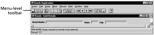
- At the menu level ”On an MDI platform, this toolbar is similar to the MDI toolbar in Forms 4.5. This toolbar also comes in an SDI platform. Forms supplies it by default with the name SMARTBAR with the DEFAULT menu.
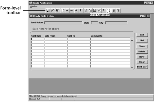
- At the form level ”This toolbar is new to Forms 5.x and above and is available for all windows within that form. It is not equivalent to the MDI toolbar.
- At the individual window level ”This toolbar is specific to a particular window to which it is attached.
Displaying Menu-Level Toolbars
To create a menu-level toolbar, specify &SMARTBAR after the DEFAULT menu module name in the Form Module property palette. Dynamically hiding the menu using REPLACE_MENU('') in the WHEN_NEW_FORM_INSTANCE trigger will also suppress the display of the associated toolbar.
To create a menu-level toolbar for any customized menu, set either the Visible In Horizontal Menu Toolbar or Visible In Vertical Toolbar property to Yes for each menu item that should appear in the menu toolbar.
Figure 1.1 shows a menu-level toolbar.
Figure 1.1. A menu-level toolbar.
Displaying a Form-Level or Window-Level Toolbar
To create a form-level or window-level toolbar, you create a horizontal toolbar canvas view with iconic buttons . Then, specify it as the value for the Form Horizontal Toolbar property or the Window Horizontal Toolbar property. To do so, follow these steps:
- Create a canvas view of type horizontal toolbar (that is, CANVAS_TOOLBAR ).
- Assign to the canvas view a property class specifying the standard canvas characteristics (such as PC_CANVAS ). The height of the canvas should be just enough to enclose an iconic button of standard size . Set the Visible property of this canvas to Yes and the Bevel property to None.
- Create a property class named PC_ICONIC_BUTTON with the following property values: Iconic set to Yes, Mouse Navigate set to Yes, Keyboard Navigable set to Yes, Width set to 10, Height set to 10, and ToolTip Visual Attribute Group set to DEFAULT.
- Construct a block named TOOLBAR with items as iconified push buttons for each of the individual functions. The buttons inherit their properties from the PC_ICONIC_BUTTON property class.
- A WHEN-BUTTON-PRESSED trigger for each of the buttons contains the appropriate Forms built in as arguments to the DO_KEY procedure. For example, the Save button can have the following line of code in its WHEN-BUTTON-PRESSED trigger:
WHEN-BUTTON-PRESSED

DO_KEY('COMMIT_FORM');
Tip
You can achieve the Close Application functionality described earlier by calling a procedure in the corresponding WHEN-BUTTON-PRESSED trigger. This technique is explained in the sub-section "Simulating a CLOSE ALL Forms" in Chapter 3, "Multi-form Applications."
- ToolTips can be specified for each iconic button. This is done by specifying the respective text for the ToolTip Text property for each of the iconic buttons. For example, the ToolTip text for the iconic button corresponding to the Save function can be given in the button property palette by entering Save Changes in the ToolTip Text property.
Note
Specifying ToolTips provides a visual hint feature when the cursor enters the icon. This feature is available from Forms 5.x onwards. In Forms 4.5, this functionality has to be simulated with extra coding, as illustrated later in this section.
- Specify this horizontal toolbar canvas CANVAS_TOOLBAR as the value for the Form Horizontal Toolbar property in Forms 5.x and above. In Forms 4.5, specify the Horizontal MDI Toolbar property in the Forms Module property sheet.
A sample toolbar constructed in this way looks like the one shown in Figure 1.2.
Figure 1.2. A form-level toolbar.
Simulating the ToolTip Feature in Forms 4.5
In Forms 4.5, you can display ToolTips by creating a display item, TOOLTIP_ITEM, with the following properties:
- Char data type
- The same visual attribute as the ToolTip visual attribute group
- The Bevel property set to None and Displayed property set to False
- Specify the ToolTip text as the value for the Label property for each iconic button
In addition, the property class PC_ICONIC_BUTTON discussed earlier can have the following two triggers attached to it: WHEN-MOUSE-ENTER and WHEN-MOUSE-LEAVE. The code for these triggers is explained in the steps that follow.
Dynamically populate this item with text equivalent to the Label in the WHEN-MOUSE-ENTER trigger, as follows :
WHEN-MOUSE-ENTER


DECLARE

 tooltip_x_pos NUMBER;

 tooltip_y_pos NUMBER;

 tooltip_text VARCHAR2(30);

 item_id ITEM;

BEGIN

 tooltip_x_pos := GET_ITEM_PROPERTY(:SYSTEM.MOUSE_ITEM,X_POS);

 tooltip_y_pos := GET_ITEM_PROPERTY(:SYSTEM.MOUSE_ITEM,Y_POS);

 tooltip_text := GET_ITEM_PROPERTY(:SYSTEM.MOUSE_ITEM,LABEL);

 :toolbar.tooltip_item := tooltip_text;

 item_id := FIND_ITEM('TOOLBAR.TOOLTIP_ITEM');

 IF NOT ID_NULL(item_id) THEN

 SET_ITEM_PROPERTY(item_id, DISPLAYED, PROPERTY_TRUE);

 SET_ITEM_PROPERTY(item_id, POSITION tooltip_x_pos+10, tooltip_y_pos+10);

 ELSE

 MESSAGE('Invalid Tooltip Item');

 RAISE FORM_TRIGGER_FAILURE;

 END IF;

END;
A WHEN-MOUSE-LEAVE trigger will hide the dynamic ToolTip by setting its DISPLAYED property to FALSE as follows:
WHEN-MOUSE-LEAVE


DECLARE

 item_id ITEM;

BEGIN

 item_id := FIND_ITEM('TOOLBAR.TOOLTIP_ITEM');

 IF NOT ID_NULL(item_id) THEN

 :toolbar.tooltip_item := NULL;

 SET_ITEM_PROPERTY(item_id, DISPLAYED, PROPERTY_FALSE);

 END IF;

END;
In Forms 5.x and above, the ToolTip appears below the iconic button, whereas in Forms 4.5 it appears on the side. This has been intentionally done because the ToolTip in Forms 4.5 is attached to the MDI horizontal toolbar; there is no way to display it outside the toolbar canvas without making the canvas height more than the icons'height. This leaves a view space on the MDI toolbar.
Toolbar Tips
The following tips provide the tidbits often ignored while developing form-level and window-level toolbars. Also, the points to remember while associating toolbars with forms in multiform applications are highlighted.
The Toolbar Template Form
Use a source template form in which the toolbar can be constructed. Then, you can base customized forms on this template.
Common Form Toolbars
Toolbars attached at the form level are not available to all forms in an application. In a multiform application, especially when you're using OPEN_FORM, you can subclass the CANVAS_TOOLBAR from the source template form. Then, set the Form Horizontal Toolbar property to CANVAS_TOOLBAR for each form. Doing so creates an application with a common toolbar for each independent form.
To simulate the same functionality while using Forms 4.5, the CANVAS_TOOLBAR can be referenced from the source template form. Then, set the MDI Horizontal Toolbar property to CANVAS_TOOLBAR for each form.
Window-Specific Toolbars for Modal Windows
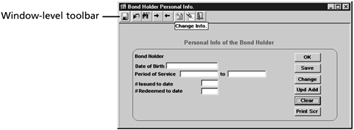
A modal window should have a window-level toolbar associated with it. Form-level toolbar icons are not accessible from a modal window. The same is true with toolbars associated with menu, SDI, or MDI windows. Figure 1.3 shows a form-specific toolbar with a Personal Info. icon. If you click on this icon, you get the window-specific toolbar for a modal window, shown in Figure 1.4.
Figure 1.3. A form-specific toolbar with a Personal Info. icon.
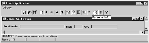
Figure 1.4. A window-level toolbar.
Floating Toolbars
This section discusses the techniques to implement dynamic toolbars. It starts by looking at the various ways a toolbar can be "dynamic."
Dynamic toolbars can be implemented several ways. You can create toolbars that dynamically shrink or expand, based on the current mouse position or the current item, record, block, canvas, or form; you hide, unhide, and resize proportionately the toolbar's iconic buttons, depending on the current cursor position. Examples are as follows:
- Hiding (or disabling) the List button when the cursor is in a nonupdateable item or an item that has no LOV attached to it, and showing it otherwise .
- Hiding (or disabling) the Next Record button when the cursor is in the last record of a Query Only block, and showing it otherwise.
- Hiding (or disabling) the Enter Query and Execute Query buttons when a control block receives input focus, and showing them otherwise.
- Generating a new toolbar by selecting a subset of buttons from the original set when a form is being run in Query Only mode.
Other dynamic toolbars are scrollable for forms that require greater functionality to be provided by means of application-specific buttons. Floating toolbars can appear almost anywhere ”that is, they "float" in an application or appear where you right-click. You can resize toolbars so that the icons fit proportionately. Finally, you can generate toolbars from a global set of iconic buttons, using point-and-click.
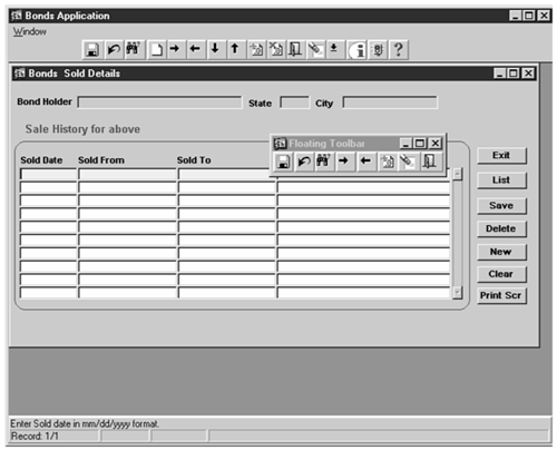
In this section, I will discuss the implementation of a floating toolbar. It has the flexibility of being able to float, or be displayed almost anywhere when initiated by a user action. It can also have dynamic resizing capability. It has the same functionality as a regular toolbar but remains displayed until closed by another user action. For example, the user action initiating the display of the toolbar can be a right mouse click on an empty part of the canvas (that's why it's floating), and the user action closing it can be a left mouse click in an empty area of the can vas.
Tip
The form objects including triggers can be included in an Object Group, which in turn can be included in an Object Library and shared (subclassed) across form modules.
Alternatively, a template form can be created with the described objects, and customized application-specific forms can be based on this template form.
Follow these steps to create the floating toolbar:
- Create a new WINDOW_FLOATING_TOOLBAR that is nonmodal and is not part of the normal windows being used in any form. Make this window's width and height the same as the canvas view width and height of the window-specific toolbar created in the last section's example.
- Set the window's window style to Dialog, its Modal property to No, its Closeable property to Yes, its Minimizable and Maximizable properties to No, and its Bevel property to None.
- Create a canvas named CANVAS_FLOATING_TOOLBAR. This canvas is created in the same manner as the standard toolbar described in the earlier example. The only difference is that the number of icons is less here. This number has been chosen at random and can be application specific. Note that this can also be a stacked canvas.
- Specify the canvas view properties: Set the Window property to WINDOW_FLOATING_ TOOLBAR, the Canvas Type to Horizontal Toolbar, the Visible property to No, and the Bevel property to None.
- Set the Horizontal Toolbar property of the WINDOW_FLOATING_TOOLBAR window to CANVAS_FLOATING_TOOLBAR.
- Initiate the window display by writing a WHEN-MOUSE-CLICK trigger at the form level and capturing the right mouse click event. The code for this trigger has the following logic:
- Check for the cursor not being positioned inside any item, including non “data- bearing items. This is done using the system variable :SYSTEM.MOUSE_ITEM.
- Check whether the mouse button pressed is not the left mouse button. This is done by checking that the value of the Forms system variable :SYSTEM.MOUSEBUTTON_PRESSED does not equal the constant 1. This system variable can take values 1, 2, or 3. The value 1 is for left, 2 for middle, and 3 for right mouse buttons. All these values are returned as character values. Checking for a value other than 1 ensures that the user-pressed mouse button is not the left one.
- Position the window WINDOW_FLOATING_TOOLBAR at the current (X,Y) position of the cursor. This is done by dynamically setting the X_POS and Y_POS properties of the window to the values :SYSTEM.MOUSE_X_POS and :SYSTEM.MOUSE_Y_POS, respectively, using SET_WINDOW_PROPERTY.
The WHEN-MOUSE-CLICK trigger code is as follows:
WHEN-MOUSE-CLICK


IF NAME_IN('SYSTEM.MOUSE_ITEM') IS NULL THEN

 IF NAME_IN('SYSTEM.MOUSEBUTTON_PRESSED') != '1'THEN

 SET_WINDOW_PROPERTY('WINDOW_FLOATING_TOOLBAR', X_POS,

 TO_NUMBER(NAME_IN('SYSTEM.MOUSE_X_POS')));

 SET_WINDOW_PROPERTY('WINDOW_FLOATING_TOOLBAR',Y_POS,

 TO_NUMBER(NAME_IN('SYSTEM.MOUSE_Y_POS')))

 SET_WINDOW_PROPERTY('WINDOW_FLOATING_TOOLBAR',

 VISIBLE,PROPERTY_TRUE);

 END IF;

END IF;
The floating toolbar will look like Figure 1.5.
Tip
The actual (X,Y) position of the displayed toolbar is an offset from the actual cursor (X,Y) position because the former is relative to the MDI Window and the latter is relative to the primary canvas of WINDOW0.
Figure 1.5. A floating toolbar.
You can initiate the window close in several ways. First, you can set the Hide On Exit property to Yes for this toolbar window. This is not a standard practice because the user might want to perform multiple functions in the form using this toolbar and would therefore want the toolbar to remain floating until explicitly closed. Applications demanding user-specific requests for such a feature are an exception to this rule.
Second, the window can close when the user clicks the upper-right x. This is the recommended practice, unless a user requirement specifies a different approach. To use this technique, write a WHEN-WINDOW-CLOSED trigger at form level that checks for the currently active window and closes it if it is WINDOW_FLOATING_TOOLBAR :
WHEN-WINDOW-CLOSED


IF NAME_IN('SYSTEM.EVENT_WINDOW') = 'WINDOW_FLOATING_TOOLBAR'THEN

 SET_WINDOW_PEROPERTY('WINDOW_FLOATING_TOOLBAR', VISIBLE, PROPERTY_FALSE);

END IF;
Third, the window can be made to disappear by creating a timer at the time of window initia tion and writing a WHEN-TIMER-EXPIRED trigger to hide it after a certain interval of time. You provide this second way of closing by specifying an appreciably large time interval ”a minute, for example. Closing the floating toolbar by means of a timer involves the following steps:
- Create a timer in the WHEN-MOUSE-CLICK trigger immediately before displaying the toolbar window. The modified WHEN-MOUSE-CLICK trigger is as follows:
WHEN-MOUSE-CLICK DECLARE timer_id TIMER; one_minute NUMBER := 60000; BEGIN IF NAME_IN('SYSTEM.MOUSE_ITEM') IS NULL THEN IF NAME_IN('SYSTEM.MOUSE_BUTTON_PRESSED') != '1'THEN SET_WINDOW_PROPERTY('WINDOW_FLOATING_TOOLBAR', X_POS, NAME_IN('SYSTEM.MOUSE_X_POS')); SET_WINDOW_PROPERTY('WINDOW_FLOATING_TOOLBAR', Y_POS, NAME_IN('SYSTEM.MOUSE_Y_POS')); BEGIN timer_id := FIND_TIMER('TIMER_HIDE_FT'); IF ID_NULL(timer_id) THEN timer_id := CREATE_TIMER('TIMER_HIDE_FT',one_minute, NO_REPEAT); END IF; END; SET_WINDOW_PROPERTY('WINDOW_FLOATING_TOOLBAR', VISIBLE, PROPERTY_TRUE); END IF; END IF; - Write a WHEN-TIMER-EXPIRED trigger at the form level to close the window after the time period elapses, in one minute in this case:
WHEN-TIMER-EXPIRED


IF GET_APPLICATION_PROPERTY(TIMER_NAME) = 'TIMER_HIDE_FT'THEN

 IF GET_WINDOW_PROPERTY('WINDOW_FLOATING_FT', VISIBLE) = 'FALSE'THEN

 SET_WINDOW_PROPERTY('WINDOW_FLOATING_TOOLBAR',

 VISIBLE, PROPERTY_FALSE);

 END IF;

END IF;
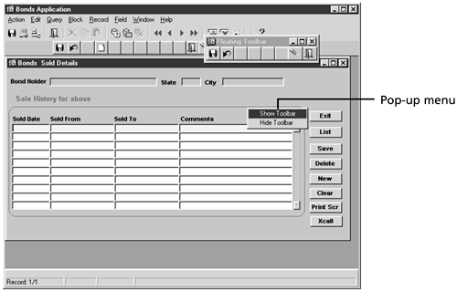
Floating Toolbar Pop-Up Menus
Another convenient way of displaying a floating toolbar is by providing a pop-up menu on a right mouse button click. This pop-up can have at least two menu options: Show Toolbar and Hide Toolbar. This can be achieved by the following steps:
- Create a pop-up menu in the Object Navigator with two items: SHOW_TOOLBAR (labeled Show Toolbar) and HIDE_TOOLBAR (labeled Hide Toolbar).
- The WHEN-MOUSE-CLICK trigger is still necessary because the :system.mouse_x_pos for a pop-up menu is when the cursor is in the pop-up. Therefore, you capture the ( mouse_x_pos, mouse_y_pos ) as soon as the user right-clicks to display the pop-up menu. You can write a WHEN-MOUSE-CLICK trigger , in addition to the menu item code, to capture the current (X,Y) of the cursor on right click before the cursor is positioned on one of the items of the pop-up menu:
WHEN-MOUSE-CLICK


IF :SYSTEM.MOUSE_BUTTON_PRESSED != '1'THEN

 IF :SYSTEM.MOUSE_ITEM IS NULL THEN


 COPY(NAME_IN('SYSTEM.MOUSE_X_POS'), 'CTRL_BLK.MOUSEXPOS');

 COPY(NAME_IN('SYSTEM.MOUSE_Y_POS'), 'CTRL_BLK.MOUSEYPOS');


 END IF;

END IF;
Here, CTRL_BLK.MOUSEXPOS and CTRL_BLK.MOUSEYPOS are two control items to hold the current values of SYSTEM.MOUSE_X_POS and SYSTEM.MOUSE_Y_POS as defined in the preceding code snippet.
- The menu item code for the SHOW_TOOLBAR item is as follows:
IF :SYSTEM.MOUSE_ITEM IS NULL THEN SET_WINDOW_PROPERTY('window_ft', X_POS, TO_NUMBER(:ctrl_blk.mousexpos)); SET_WINDOW_PROPERTY('window_ft', Y_POS, TO_NUMBER(:ctrl_blk.mouseypos)); SET_WINDOW_PROPERTY('window_ft', VISIBLE, PROPERTY_TRUE); END IF; - The menu item code for the HIDE_TOOLBAR item is as follows:
SET_WINDOW_PROPERTY('window_ft', VISIBLE, PROPERTY_FALSE);

:ctrl_blk.mousexpos := NULL;

:ctrl_blk.mouseypos := NULL;
The pop-up menu appears somewhat like the one shown in Figure 1.6.
Figure 1.6. A pop-up menu to display a dynamic floating toolbar.
GUI Development
- GUI Development
- Standard Toolbar Implementation
- Timers and Displaying a Clock
- Special Tips for List Items
- Ordering by Foreign Key Items in Forms
- Querying by Nonbase Table Items
- Tips for Standard GUI Practices and Forms Development
- Summary
Advanced GUI Development: Developing Beyond GUI
- Advanced GUI Development: Developing Beyond GUI
- Playing with Relations
- Obtaining Query Count Without EXECUTE-ing a Query
- Using Form and Global Variables
- Base Tables
- The Power of Record Groups
- Creating a Customized Sign-on Form
- Avoiding Confusion Between DO_KEY and the Corresponding KEY- Trigger
- Window Management in Forms
- Summary
Multi-form Applications
- Multi-form Applications
- Myths About the Form Filename, Form Module Name , and Form ID
- Passing Data from the Called Form to the Calling Form
- Form Management in an OPEN_FORM Configuration
- Tracking QUERY_ONLY Mode
- Special Tips for Working with Multi-form Applications
- Summary
Advanced Forms Programming
- Advanced Forms Programming
- The Work-around for PL/SQL 2.x Limitations in Forms 4.5
- Populating a PL/SQL Table from a Block
- Taking Advantage of PL/SQL 2.x in Forms
- File Output from a Block
- An Exclusive Server-Side Commit from Forms
- Intersession and Interdatabase Communication from Forms
- Sharing a Record Group Across Forms
- Summary
Error-Message Handling
- Error-Message Handling
- The Basics of Error-Message Handling
- Handling Errors
- Deficiencies in Forms Error-Message Handling
- Summary
Object-oriented Methods in Forms
- Object-oriented Methods in Forms
- Inheritance
- Encapsulation
- Object and Code Reusability
- Polymorphism
- Summary
Intelligence in Forms
- Intelligence in Forms
- Smart Classes and Smart Triggers - How Smart Are They?
- Does Subclassing Exhibit Intelligence?
- Normal Trigger Intelligence
- Intelligence with Regard to Form Object Properties
- Intelligence with Regard to Form Wizards
- Summary
Additional Interesting Techniques
- Additional Interesting Techniques
- Programmatically Canceling a Query
- Programmatic Equivalent of Cancel Query
- Validation, Navigation, and Simulating Navigation
- Enhancing the Function of Exit Form
- Preventing Validation of WHEN-VALIDATE-ITEM for Control Items During Query Time
- When to Use WHEN-VALIDATE-RECORD and When to Use WHEN-VALIDATE-ITEM
- When to Use the Same Trigger and How to Make It Fire at Multiple Levels
- A Block Level Commit
- Summary
Working with Trees
- Working with Trees
- Creating a Tree Item
- Operations on a Tree Item
- Planting and Growing Trees -Dynamically Adding Nodes Along with Data to an Existing Base Tree
- Shrinking Trees
- Summary
Oracle 8 and 8i Features in Forms Developer
EAN: 2147483647
Pages: 115
