Tool 41: Control Chart - p (Attribute)
Tool 41: Control Chart—p (Attribute)
| AKA | N/A |
| Classification | Analyzing/Trending (AT) |
Tool description
A control chart is a graph that plots randomly selected data over time in order to determine if a process is performing to requirements and is, therefore, under statistical control. The chart displays whether a problem is caused by an unusual or special cause (correctable error) or is due to chance causes (natural variation) alone.
Typical application
-
To determine if a process is performing to upper and lower control-limit requirements (process is kept in control).
-
To monitor process variations over time, with regard to both special or chance causes.
-
To identify opportunities for improving quality and to measure process improvement.
-
To serve as a quality measurement technique.
Problem-solving phase
| → | Select and define problem or opportunity |
| → | Identify and analyze causes or potential change |
| Develop and plan possible solutions or change | |
| → | Implement and evaluate solution or change |
| → | Measure and report solution or change results |
| Recognize and reward team efforts |
Typically used by
| 2 | Research/statistics |
| Creativity/innovation | |
| 4 | Engineering |
| Project management | |
| 1 | Manufacturing |
| Marketing/sales | |
| Administration/documentation | |
| Servicing/support | |
| 3 | Customer/quality metrics |
| Change management |
 |
before
-
Variance Analysis
-
Sampling Methods
-
Observation
-
Checksheet
-
Events Log
after
-
Process Capability Ratios
-
Standard Deviation
-
Descriptive Statistics
-
Process Analysis
-
Work Flow Analysis (WFA)
|
Notes and key points
| Types of Control Charts | |
|---|---|
| Data Required | For Specific Chart |
| Quantitative Variable Data |
|
| Qualitative Attribute Data |
|


Most commonly used charts:
| ‡For variable data: | |
| ‡‡For attribute data: | c Chart |
| †††For attribute data: | p Chart |

Note: For a description of other charts refer to a reference on statistical process control (SPC).
-
p Chart (attribute data)
-
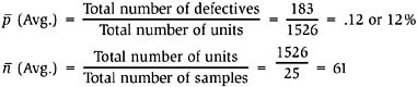
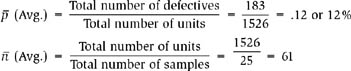
Sample data: Minimum (25) samples, subgroups size may vary (sample size varies). Subgroup size is typically 50 or greater to show defectives per subgroup of 4 or greater.
Note: Subgroup size (n) should be within + or − 20% of the average size or control limits need to be recalculated.
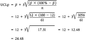
Calculations: See p Chart example.
Upper Control Limit:
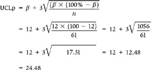
Lower Control Limit:
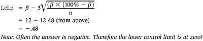
Note: Often the answer is negative. Therefore the lower control limits is at zero!
Step-by-step procedure
-
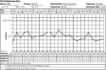
STEP 1 Determine the type of attribute control chart to be used. See example Paint Rejects per Hour (attribute control chart—type p).
-
STEP 2 Collect at least 25 samples of data; subgroups can vary but must have at least 50 units to show defectives per subgroup of 4 or greater.
-
STEP 3 Prepare a type p chart and continue to record collected data as shown. See example chart.
-
STEP 4 After all 25 subgroups (samples) have been recorded, perform all required calculations. See notes and key points above for example.
-
STEP 5 Plot and connect plotted points to form a trendline. Verify that the trendline points reflect percentage of defectives.
-
STEP 6 Finalize and date the chart.
Example of tool application

EAN: 2147483647
Pages: 326