Rich Controls
| The ASP.NET Rich controls are the most impressive of the ASP.NET controls. They emit rich content, and it's browser independent. Although the controls themselves are simple when you see them in your code, the HTML that comes in is long and somewhat complex. It's a good thing that these controls are complete and ready to use ”creating them would be quite an undertaking. Calendar ControlThe Calendar ASP.NET server control can serve many purposes. It can display and enable users to select dates. The control displays a calendar in which users can navigate to see any date in any year. The current date is highlighted. Optionally, users can move to dates by clicking a day or moving from month to month. The calendar can be configured to enable users to select multiple dates: either an entire week or an entire month. Typical uses for this control are to graphically display the current date on a daily news Web page, or to enable users to select dates in scheduling applications such as for airline reservations , concert tickets, and many other purposes. The Calendar control can display appointment or other information in a calendar grid. The Calendar control can display day-specific details for individual days, such as a to-do list, a schedule of events, or similar information. This feature enables you to display day information from a database. The Calendar control is based around the .NET framework DateTime object, and therefore supports the full range of dates allowed by that object. Effectively, you can display virtually any date between the years 0 and 9999 A.D. The Calendar control is rendered as an HTML table when the Web Forms page runs. Therefore, several of the control's properties pertain to various aspects of table formatting. A few of these properties are not fully supported in some older browsers, so some formatting features will not be available to users who access the Web applications with older browsers. Displaying and Selecting DatesThe Calendar control displays a month of dates at a time, with a total of six weeks appearing at once. Within the control, you can work with several types of dates:
Enabling Date SelectionBy default, the Calendar control enables users to click an individual date to select it. If you are using the control as a read-only calendar, you can disable all date selection. If day selection is enabled, each day of the calendar contains a LinkButton control that raises an event when clicked. If you enable week or month selection, a column of links is added to the left side of the calendar to enable the user to specify what week to select. Customizing the Calendar's AppearanceYou can set calendar properties to change the colors, size , text, and other visual features of the calendar. There are several ways to do this:
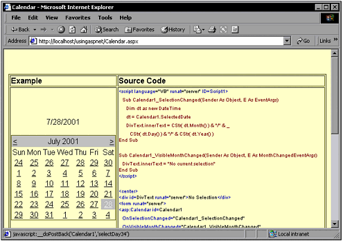
Capturing User Interaction with the Calendar ASP.NET Server ControlThe Calendar control raises an event when the user selects an individual date or range of dates or navigates to a new month. By creating methods for these events, you can determine what day or dates the user has selected and respond appropriately. A common scenario is to display information from a database in the calendar. For example, an events calendar often is based on information kept in a database. The Calendar control does not directly support data binding ”that is, you do not bind the calendar as a whole to a data source. Instead, you create a method for the control's DayRender event, which is raised as each day in the current calendar month (view) is being rendered. In the method for this event, you can extract information from a data source and add it to the stream being sent to the browser. Add a Calendar ControlIn its simplest form, you can add a Calendar control with the following code: <asp:Calendar id=Calendar1 runat="server"> This might not be very useful because it doesn't service any events. The two events, OnSelectionChanged and OnVisibleMonthChanged , can be added as follows : <asp:Calendar id=Calendar1 OnSelectionChanged="Calendar1_SelectionChanged" OnVisibleMonthChanged="Calendar1_VisibleMonthChanged" runat="server"> A complete working example follows. It displays a simple Calendar control with default appearance values. The two Calendar events are services: When the selection changes, the date is displayed; and when the month changes, it says "No Current Selection." This example appears in Figure 6.13. Figure 6.13. The Calendar control adds rich functionality. <script language="VB" runat="server" ID=Script1> Sub Calendar1_SelectionChanged(Sender As Object, E As EventArgs) Dim dt as new DateTime dt = Calendar1.SelectedDate DivText.innerText = CStr( dt.Month() ) & "/" & _ CStr( dt.Day() ) & "/" & CStr( dt.Year() ) End Sub Sub Calendar1_VisibleMonthChanged(Sender As Object, E As MonthChangedEventArgs) DivText.innerText = "No current selection" End Sub </script> <center> <div id=DivText runat="server">No Selection</div> <form runat="server"> <asp:Calendar id=Calendar1 OnSelectionChanged="Calendar1_SelectionChanged" OnVisibleMonthChanged="Calendar1_VisibleMonthChanged" runat="server"> </asp:Calendar> </form> </center> |
EAN: 2147483647
Pages: 233
- The Four Keys to Lean Six Sigma
- Key #1: Delight Your Customers with Speed and Quality
- Key #3: Work Together for Maximum Gain
- Making Improvements That Last: An Illustrated Guide to DMAIC and the Lean Six Sigma Toolkit
- The Experience of Making Improvements: What Its Like to Work on Lean Six Sigma Projects
