Using the Chart Expert
Reflecting back on the sample reports used in Chapters 2 and 3, you might find that there are opportunities for enhancement through the addition of meaningful charts. As you learned in Chapter 2 with groupings, it is quite easy to summarize the data you collect for a report into meaningful categories or groups. Chapter 2 reviews some examples of grouping based on fields such as country and employee ID. By hiding or suppressing the detail sections of reports, you learned how to bring the meaningful summarizations around these types of groups to the forefront. To further bring this aggregated data to the business user's attention, you can create a chart on this grouped data using the Chart Expert.
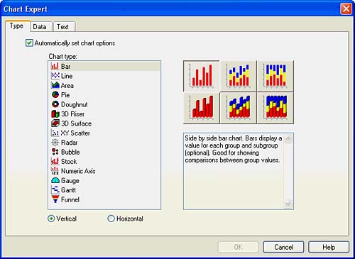
To open the Chart Expert, either click on the Chart icon located on the Insert toolbar or select the Insert Chart option under the main Insert menu. Figure 8.1 displays the Chart Expert.
Figure 8.1. The Chart Expert dialog enables the rapid addition of valuable charts to reports.
After you access the Chart Expert, several steps are required to actually complete the chart. These are reviewed in the next five sections.
Using the Chart Expert Type Tab
The Chart Expert consists of five different tabs. The initial display tab on the Chart Expert is the Type tab, shown in Figure 8.1. On this tab, the type of graphic or chart is selected. In Crystal Reports version 10, there are more than 40 different basic chart types from which to select.
In addition to the classic bar, line, pie, and area charts, new chart types in versions 9 and 10 are listed in Table 8.1.
|
New Chart Type |
Chart Type Description |
|---|---|
|
Numeric Axis (V.9) |
A Numeric Axis chart is a bar, line, or area chart that uses a numeric field or a date/time field as its On Change Of field. With Numeric Axis charts you can create a true numeric X-axis or a true date/time X-axis. |
|
Gauge(s) (V.9) |
A Gauge chart presents data using a speedometer visual and is often used to measure percentage completed against target type metrics. |
|
Gantt Chart (V.9) |
A Gantt chart is a project-focused horizontal bar chart used to provide a graphical illustration of a project schedule. The horizontal axis shows a time span, whereas the vertical axis lists project tasks or events. Horizontal bars on the chart represent event sequences and time spans for each task on the vertical axis. |
|
Funnel Chart (V.10) |
Funnel charts are most often used to represent stages in a sales cycle and visually depict proportionality of the different phases in that sales process. A funnel chart is similar to a stacked bar chart in that it represents 100 percent of the summary values for the groups included in the chart. |
These charts have been added to expand the visual capabilities of Crystal Reports and enrich your report presentations. Let's create a Sample Customer Order Listing report and add a chart to it that highlights the Company's Top 10 Customers in the following steps:
- Quickly create the basics of this sample report by selecting the Customer Name, Order ID, and Order Amount fields from the Xtreme Sample Database. Then Group by Customer Name and Summarize Order Amount by the Customer Name group.
- To restrict the data to the Top 10 Customers, access the Group Sort Expert from the Report menu option. Select a Top 10 Sort based on the Sum of Order Amount and do not include Others or Ties.
- Insert a Chart onto the report using the Chart icon or the Chart option from the Insert menu.
- Select a bar chart as the main chart type in the list box by clicking on it. Then click the Horizontal radio button that is present at the bottom of the dialog.
- Select the two-dimensional side-by-side bar chart sub-chart type (top left option) by clicking on the associated graphical icon to the right of the Chart Type list box.
- The last option to set in the Chart Type tab is whether you want Crystal Reports to automatically use the default legend, data-point, color, and axes options for your chart. The automatic option is enabled by default, but it can be turned off by clicking the check box near the top of the dialog. At this point, deselect the automatic check box.
Notice that the Axes and Options tabs appear when this check box is not clicked and disappear when it is selected. These tabs are discussed later in this section. Figure 8.2 displays the result of these six steps. You will continue creating this chart in the next four sections.
Figure 8.2. The Type tab on the Chart Expert dialog for the Sample Top 10 Customers report.
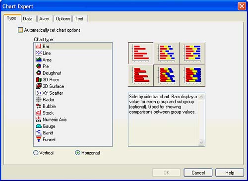
Table 8.2 highlights some common reports, their contained graphics, and the benefits of using them.
|
Report |
Chart Type |
Report and Chart Benefit |
|---|---|---|
|
Company Sales Report |
Pie or Donut Chart |
Highlights the regional breakdown of product sales across continents or countries facilitating analysis of revenue contribution. |
|
Product Profitability Report |
Horizontal or Vertical Bar Chart |
Highlights the profit margin per product that a company sells, facilitating comparative analysis of profitability. |
|
Actual versus Target Report |
Gauges |
Highlights the progress being made against specified targets through the use of a speedometer visual. When used across projects or divisions, it is relatively easy to compare how they are performing against certain initiatives. |
Using the Chart Expert Data Tab
After a chart type has been selected in the Type tab, click on the Data tab. The Data tab enables the selection of the specific data on which the chart is based and the chart's location on the report. Figure 8.3 displays one view of the second tab of the Chart Expert. This view might vary depending on the different Chart Type options you have selected. The Data tab is composed of three different sections: Placement, Layout, and Data. These sections and corresponding options are discussed next.
Figure 8.3. The Data tab of the Chart Expert enables specification of chart location, layout, and data options.
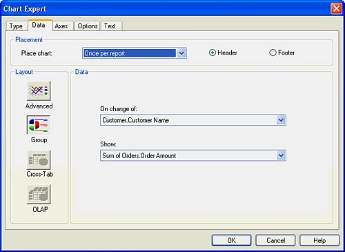
Specifying Chart Placement
The Placement section is used to select the location of the chart on the report and, subsequently, the recurrence of the chart throughout the report. Using the drop-down box, select the section of the report where the chart is to be located (for example, Group 1, Group 2, and so on). The options available in this drop-down box are limited to the groups previously created in the report in addition to the option to create the graphic only once for the entire report. Using the radio buttons located beside the drop-down box, the header or footer of the selected report section can be selected. By making these selections, you also specify the chart's recurrence in the report because the chart repeatedly appears in every section you have specified. For example, if a chart were placed on a report for each country group, a separate chart would appear on the report for each country in the report.
To continue with the addition of a bar chart to the sample report, perform the following steps:
- Select the Once Per Report option in the Place Chart drop-down box. This should be the only option and is already selected by default.
- Select the Header button to specify placement in the report header.
NOTE
When you select the Group Layout button (the second button from the top in the Layout sectionsee the next section for more details), you are presented with the options in the Chart Placement drop-down box based on what groups and summaries are already created in your report. Alternatively, if you select the Advanced Grouping Layout button, you are not as restricted and can dynamically create summaries across groups not yet in your report.
Specifying Chart Layout
The Chart Layout section specifies the data selection options that the selected chart provides to the report designer. The actual data is selected in the Chart Data section. Note that the options presented in that section are dependent on the specific Chart Layout button you have selected. Table 8.3 lists the different layout buttons and their typical uses.
<
|
Layout Button |
Description |
Typical Uses |
|---|---|---|
|
Advanced |
This layout button provides complete flexibility in chart creation by providing you with control of all charting options. |
Creation of charts based on summaries not already created in the report or charts to be created for every detail record. |
|
Grouping |
Part I. Crystal Reports Design
Creating and Designing Basic Reports
- Creating and Designing Basic Reports
- Introducing the Crystal Reports Designer
- Understanding Data and Data Sources
- Introduction to the Data Explorer
- Adding Database Objects to Your Report
- Joining Database Objects Together
- Understanding the Different Join Types
- Using the Report Creation Wizards
- Understanding the Crystal Reports Gallery
- Using the Standard Report Creation Wizard
- Creating a Report Without Wizards
- Troubleshooting
Selecting and Grouping Data
- Selecting and Grouping Data
- Introduction
- Understanding Field Objects
- Working with Groups
- Understanding Drill-down Reports
- Troubleshooting
Filtering, Sorting, and Summarizing Data
- Filtering, Sorting, and Summarizing Data
- Introduction
- Filtering the Data in Your Report
- Learning to Sort Records
- Working with the Sort Expert
- Creating Effective Summaries
- Troubleshooting
Understanding and Implementing Formulas
- Understanding and Implementing Formulas
- Introduction
- Using the Formula Workshop
- Using the Workshop Formula Editor
- Creating Formulas with the Formula Expert
- Using the Formula Extractor to Create Custom Functions
- The Multi-Pass Reporting Process of the Crystal Reports Engine
- Troubleshooting
Implementing Parameters for Dynamic Reporting
- Implementing Parameters for Dynamic Reporting
- Introduction
- Understanding the Value of Parameters
- Creating and Implementing Parameters Fields
- Using Parameters with Record Selections
Part II. Formatting Crystal Reports
Fundamentals of Report Formatting
- Fundamentals of Report Formatting
- Introduction
- Positioning and Sizing Report Objects
- Modifying Object Properties for Formatting Purposes
- Exploring the Format Editor Dialog Common Options
- Combining and Layering Report Objects
- Configuring Report Page and Margin Properties
Working with Report Sections
- Working with Report Sections
- Introduction
- Formatting Report Sections
- Modifying Report Section Properties
- Using Multiple Report Sections
- Troubleshooting
Visualizing Your Data with Charts and Maps
- Visualizing Your Data with Charts and Maps
- Introduction to Charts and Maps
- Using the Chart Expert
- Using the Map Expert
- Modifying Chart and Map Properties
- Troubleshooting
Custom Formatting Techniques
- Introduction
- Making Presentation-Quality Reports
- Common Formatting Features
- Conditional Formatting Using Data to Drive the Look of a Report
Part III. Advanced Crystal Reports Design
Using Cross-Tabs for Summarized Reporting
- Using Cross-Tabs for Summarized Reporting
- Introduction to Cross-Tabs
- Benefits of Cross-Tabs
- Using the Cross-Tab Wizard
- Using Top N with Cross-Tabs Reports
- Using Advanced Cross-Tab Features
Using Record Selections and Alerts for Interactive Reporting
- Using Record Selections and Alerts for Interactive Reporting
- Creating Advanced Record Selection Formulas
- Adding Alerting to Your Reports
- Performance Monitoring and Tuning
Using Subreports and Multi-Pass Reporting
- Using Subreports and Multi-Pass Reporting
- Understanding Subreports
- Understanding Linked Versus Unlinked Subreports
- Considering Subreport Execution Time and Performance
- Using Variables to Pass Data Between Reports
- Emulating Nested Subreports
- Troubleshooting
Using Formulas and Custom Functions
- Using Formulas and Custom Functions
- Becoming More Productive with Formulas
- Choosing a Formula Language: Crystal Versus Basic Syntax
- Using Brackets in Formulas
- Using Characters in Formulas
- Recent Improvements to Formulas
Designing Effective Report Templates
- Designing Effective Report Templates
- Understanding the Importance of Reuse in Reporting
- Understanding Report Templates
- Using Report Templates
- Using Existing Crystal Reports as Templates
- Understanding How Templates Work
- Creating Useful Report Templates
- Using Template Field Objects
- Using Report Templates to Reduce Report Creation Effort
- Applying Multiple Templates
Additional Data Sources for Crystal Reports
- Additional Data Sources for Crystal Reports
- Understanding the Additional Crystal Reports Data Sources
- Connecting to COM-based Data Sources
- Connecting to Java-based Data Sources
- Understanding Solution Kits for Crystal Enterprise
- Troubleshooting
Multidimensional Reporting Against OLAP Data with Crystal Reports
- Multidimensional Reporting Against OLAP Data with Crystal Reports
- Introduction to OLAP
- OLAP Concepts and OLAP Reporting
- Recently Added or Changed OLAP Features in Crystal Reports
- Using the OLAP Report Creation Wizard and OLAP Expert
- Advanced OLAP Reporting
- Introduction to Crystal Analysis
Part IV. Enterprise Report Design Analytic, Web-based, and Excel Report Design
Introduction to Crystal Repository
- Introduction to Crystal Repository
- What Is the Crystal Repository?
- Why Implement the Crystal Repository?
- Installing the Crystal Repository
- Adding Objects to and from the Repository
- Migration of the Crystal Enterprise Repository
- Troubleshooting
Crystal Reports Semantic Layer Business Views
- Crystal Reports Semantic Layer Business Views
- Introduction to Business Views
- Why Implement Business Views?
- Performance and Implementation Considerations
- Business Views Architecture and Implementation
- Troubleshooting
Creating Crystal Analysis Reports
- Creating Crystal Analysis Reports
- Introduction
- Introducing Crystal Analysis
- Accessing OLAP Data with Crystal Analysis
- Designing Crystal Analysis Reports and Applications
- Adding Crystal Analysis Objects to a Report
- Troubleshooting
Advanced Crystal Analysis Report Design
- Advanced Crystal Analysis Report Design
- Introduction
- Advanced Crystal Analysis Designer Tools
- Custom Calculations and Advanced Data Analysis
- Setting Report Options
- Troubleshooting
- Crystal Analysis in the Real World MDX
Ad-Hoc Application and Excel Plug-in for Ad-Hoc and Analytic Reporting
- Ad-Hoc Application and Excel Plug-in for Ad-Hoc and Analytic Reporting
- Introducing Ad-Hoc Reporting Conceptually
- Introducing the Crystal Enterprise Ad-Hoc Reporting Application
- Crystal Reports Excel Plug-in
- Crystal Analysis Excel Plug-in
Part V. Web Report Distribution Using Crystal Enterprise
Introduction to Crystal Enterprise
- Introduction to Crystal Enterprise
- What Is Crystal Enterprise?
- Why Implement a Crystal Enterprise Solution?
- Versions of Crystal Enterprise
- Understanding the Core Functions of Crystal Enterprise
Using Crystal Enterprise with Web Desktop
- Using Crystal Enterprise with Web Desktop
- Introduction
- Crystal Enterprise User Launchpad
- Crystal Enterprise Web Desktop
- Customizing the Web Desktop and Report Viewers
- Publishing to the Web Desktop
- Customizing the Web Desktop
- Troubleshooting
Crystal Enterprise Architecture
- Crystal Enterprise Architecture
- Introduction
- Crystal Enterprise Architecture Overview
- The Client Tier
- The Application Tier
- The Server Tier: Introduction to the Crystal Enterprise Framework
- The Server Tier: Overview of the Crystal Enterprise Services
- The Data Tier
- The Crystal Enterprise Architecture in Action
- Taking Advantage of the Crystal Enterprise Distributed Architecture
- Extending Crystal Enterprise
Planning Considerations When Deploying Crystal Enterprise
- Planning Considerations When Deploying Crystal Enterprise
- Ensuring a Successful Crystal Enterprise Implementation
- Approaching the Project
- Identifying Business Pain
- Establishing Project Requirements
- Understanding Organizational Reporting Requirements
- Troubleshooting
Deploying Crystal Enterprise in a Complex Network Environment
- Deploying Crystal Enterprise in a Complex Network Environment
- Introduction
- Understanding Network Protocols
- Understanding Firewall Types
- Configuring the Crystal Enterprise Architecture for Your Network Environment
- Interaction Between the WCS and the WC
- Deploying Crystal Enterprise with an IP Packet Filtering Firewall
- Using Crystal Enterprise with NAT
- Exploring the NAT and Crystal Enterprise Relationship
- Crystal Enterprise and Proxy Servers
Administering and Configuring Crystal Enterprise
- Introduction
- Using the Crystal Management Console
- Managing Accounts
- Managing Content
- Introducing Servers
- Managing Crystal Enterprise System Settings
- Using the Crystal Configuration Manager
Part VI. Customized Report Distribution Using Crystal Reports Components
Java Reporting Components
- Java Reporting Components
- Overview of the Crystal Reports Java Reporting Component
- Understanding the Java Reporting Components Architecture
- Differences with the Java Reporting Engine
- Configuring the Application Server
- Delivering Reports in Web Applications
- Using the Crystal Tag Libraries
- Exporting Reports to Other File Formats
- Printing Reports from the Browser
- Common Programming Tasks
- Troubleshooting
Crystal Reports .NET Components
- Crystal Reports .NET Components
- Understanding Microsofts .NET Platform
- Understanding the Different Crystal .NET Components
- An Overview of the Crystal Reports 10 .NET Components
- The Report Designer
- The Report Engine Object Model
- Delivering Reports with the Windows Forms Viewer
- Delivering Reports with the Web Forms Viewer
- Database Credentials
- Setting Parameters
- Troubleshooting
COM Reporting Components
- COM Reporting Components
- Understanding the Report Designer Component
- Building Reports with the Visual Basic Report Designer
- Programming with the Report Engine Object Model
- Delivering Reports Using the Report Viewer
- Troubleshooting
Part VII. Customized Report Distribution Using Crystal Enterprise Embedded Edition
Introduction to Crystal Enterprise Embedded Edition
- Introduction to Crystal Enterprise Embedded Edition
- Introduction to Crystal Enterprise Embedded Edition
- Understanding Crystal Enterprise Embedded Edition
- Crystal Enterprise Embedded Edition Samples
- DHTML Report Design Wizard
- Troubleshooting
Crystal Enterprise Viewing Reports
- Crystal Enterprise Viewing Reports
- Viewing Reports over the Web
- Introduction to the Crystal Report Viewers
- Understanding the Report Source
- Implementing the Page Viewer
- Implementing the Part Viewer
- Implementing the Interactive Viewer
- Implementing the Grid Viewer
- Troubleshooting
Crystal Enterprise Embedded Report Modification and Creation
- Introduction
- Deploying RAS Environments
- Loading Report Files
- Locating RAS Components in a Network Architecture
- Installing the RAS SDK
- Best Practices in RAS Exception Handling
- The RAS SDK in Action
Part VIII. Customized Report Distribution Using Crystal Enterprise Professional
Introduction to the Crystal Enterprise Professional Object Model
- Introduction to the Crystal Enterprise Professional Object Model
- Understanding the Crystal Enterprise Object Model
- Establishing a Crystal Enterprise Session
- Querying the Crystal Enterprise Repository
- Viewing Reports
- The Crystal Enterprise Java SDK
- Accessing the Java SDK
- Troubleshooting
Creating Enterprise Reports Applications with Crystal Enterprise Part I
- Creating Enterprise Reports Applications with Crystal Enterprise Part I
- Advanced Scenarios with the Crystal Enterprise Object Model
- Scheduling Reports
- Scheduling to a Destination
- Using Crystal Enterprise Notifications
- Scheduling to a Server Group
- Scheduling to a Specific Format
- Setting Database Credentials
- Troubleshooting
Creating Enterprise Reporting Applications with Crystal Enterprise Part II
- Creating Enterprise Reporting Applications with Crystal Enterprise Part II
- Querying the Crystal Enterprise InfoStore
- Creating and Responding to Crystal Enterprise Alerts
- Creating Schedulable Program Objects
- Troubleshooting
Appendix A. Using Sql Queries In Crystal Reports
Creating Enterprise Reporting Applications with Crystal Enterprise Part II
EAN: 2147483647
Pages: 341
