Section 6.2. Looking at Appearance Attributes
6.2. Looking at Appearance AttributesWith CSS, and by extension with Dreamweaver, you get a host of styling options or appearance attributes for the text on your site. You get so many, in fact, that this humble tome can't possibly explore them all. What it can do is to present the most important of these to give you a feel for the possibilities and leave the excitement of exploration to you.
6.2.1. Considering FontsThe typefaces or fonts that you choose for your web site make an important contribution to the overall look and feel of your design as well as the readability of your pages.
Before diving into this discussion, it's worth pointing out that the fonts that the browser displays on your site come from the visitor's computer, not your computer, which tends to limit your typographical choices. If you're a graphic designer, no doubt you have accumulated an impressive collection of obscure fonts over the years, but sadly you must overlook them for your web project, simply because your visitors aren't likely to have these fonts on their computers. You want to go for the obvious picks instead, the fonts that everyone has. Some designers refer to these as web-safe fonts, although perhaps safe isn't the best word for them. You won't crash the Internet if you happen to use a non-web-safe font on your site. Your pages just won't look the way that you want them to look for the majority of your audience.
With that in mind, you can divide web fonts into three types: serif, sans-serif, and monospaced, as shown in Figure 6-5. Serif fonts have little decorations on the ends of the characters, while sans-serif fonts don't. In monospaced fonts, all the characters in the set have the same width, much like the text from a typewriter. Aside from this, monospaced fonts can be either serif or sans-serif, although they are more commonly serif fonts. Figure 6-5. Here are the three types of web fonts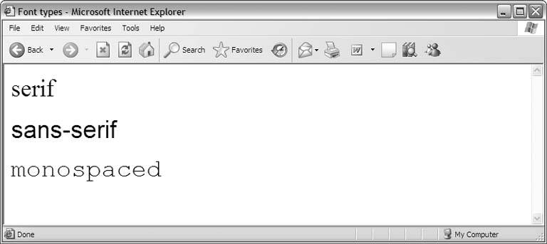 Table 6-1 lists the most common fonts of all three types. You should strongly consider using these fonts in your site rather than chancing it with less web-safe candidates.
To compensate for the visitor-centric model of font selection, the browser allows you to supply a list of acceptable fonts instead of locking you into a single pick. For instance, you might decide that your general paragraph style looks best in Geneva but that Times for your Mac users and Times New Roman for your Windows users who don't have Geneva are all suitable substitutes. You'll get into the concept of font lists more thoroughly when you actually build your stylesheet in Chapter 12. For now, just keep in mind that you can give a range of fonts for each of your text elements.
In theory, you can specify a different font list for every style rule in your Cascading Style Sheet, but in practice you pick one or two lists and use them for all the text formats and class styles that you define. At most, you want one font list of each type: one serif list, one sans-serif list, and one monospaced list. Use more font lists than this, and your site takes on something of the ransom-note aesthetic, with too many competing typefaces. Here are a few general guidelines for font selection:
6.2.2. Considering Type SizeType size measures the length or height of the characters in a block of text. The higher the type size, the larger your text appears on screen. You may specify a different type size for every style rule in your stylesheet.
CSS gives you a number of ways to measure type size, including traditional typographic measurements like points, picas, and ems, but for the Web it's usually best to think in terms of pixels. The page width, the width of your layout, and the dimensions of many of your design elements are expressed in pixels, so it's convenient for you to measure the size of the text in the same way. Also, pixel-based text tends to be more consistent across browsers, so you have a higher degree of confidence that your visitors see your text as you designed it.
As a point of reference, the average type size for running text on the Web is about 12 pixels, but depending upon your design, 12 pixels can easily feel too large. Screen real estate is always a precious resource in web design, so it behooves you to think small. You don't want to think so small, though, that your text becomes illegible. Reading on a computer screen is hard on the eyes as it is. Add to this the fact that your visitors are skimmers, and legibility becomes the driving goal of your online typography.
The best approach to sizing your text is to experiment with different length values during the building of your site. Many variables affect the overall legibility of your text, including the background color of the page and your selection of font. However, even in the best case, the smallest useful type size is about 8 pixels. Set this as your lower boundary, and work your way up.
6.2.3. Considering SpacingYou want spacing? You got spacing. CSS gives you spacing in every conceivable sense of the term, as this section illustrates.
To begin, let it be known that a block of web text, whether it's a single line or an entire paragraph, sits inside a rectangle or box. By default, the box is completely transparent, but its rectangular shape becomes apparent when you give it a border or background color (see "Considering Colors and Borders" later in this chapter). It's good to bring this up now, as visualizing your text as sitting in a box helps you to make sense of some of the spacing options available to you.
6.2.3.1. Looking at line spacingNormally, lines of text on the page are roughly as tall as the type size. Therefore, if you're displaying 16-pixel text, your lines are about 16 pixels tall. But with CSS, you can change the line height, as Figure 6-6 shows. Figure 6-6. These paragraphs in 16-pixel type have a line height of 24 pixels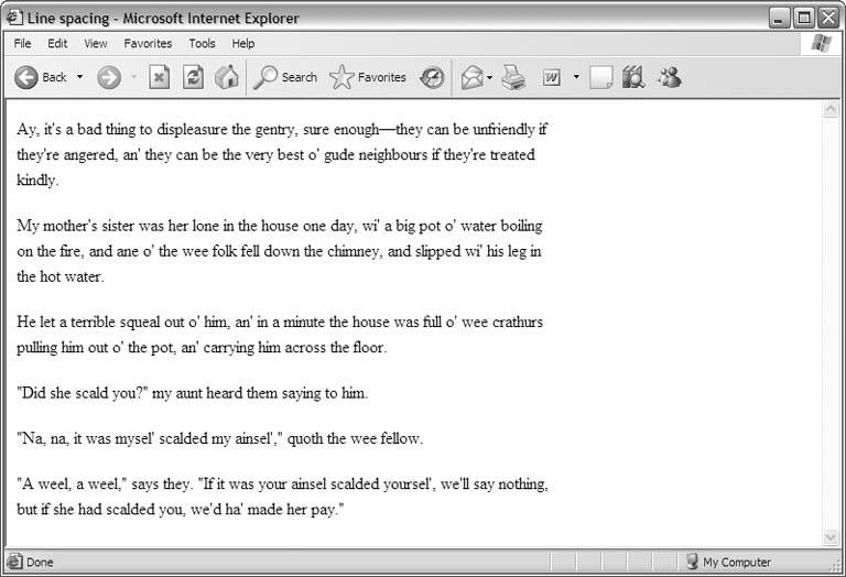 Because your lines are normally as tall as your type, you can very easily compute the line height for different kinds of spacing. Assuming that you have 16-pixel text, a line height of 16 pixels is the equivalent of normal, single-spaced text. A line height of 24 pixels gives you line-and-a-half spacing (16 times 1.5). For double spacing, increase the line height to 32 (16 times 2).
6.2.3.2. Looking at word and character spacingYou can control the amount of spacing between the words in a line of type. In Figure 6-7, the second paragraph has three extra pixels of word space, which makes it easier to read at this small type size. Figure 6-7. Increasing the word space improves readability Generally speaking, the larger the type size, the less word space you need. It's smart to decrease the word spacing for headings and the like, so you can fit more words onto a single line. Conversely, if your running text is 8 or 9 pixels long, you could probably stand to increase the word spacing to improve legibility.
Similarly, you can control the amount of spacing between characters in a line of type, as Figure 6-8 shows. Character spacing follows the same general guidelines as word spacing in terms of when to increase and decrease it. For large type sizes, less character space works well. In Figure 6-8, the words in the second heading have two fewer pixels of character space, giving it a more compact look and making it easier to read. Figure 6-8. The second heading has two fewer pixels of letter space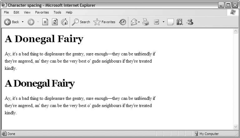 6.2.3.3. Looking at marginsNormally, the box of a text element is as large as it needs to be to accommodate the text inside it. The four margin attributestop, bottom, left, and rightdetermine the size of a box above and beyond its normal size. Most often, you use margins to set the "printable" area of the entire page, but individual text elements like paragraphs can also have margins. For example, you can design your paragraphs to have shorter margins than those of the page, which gives your text an offset appearance. In Figure 6-9, the paragraphs on the page have a left margin of 30 pixels more than the page's left margin and a right margin of 60 pixels less than the page's right margin. Figure 6-9. Offsetting text by adjusting the left and right margins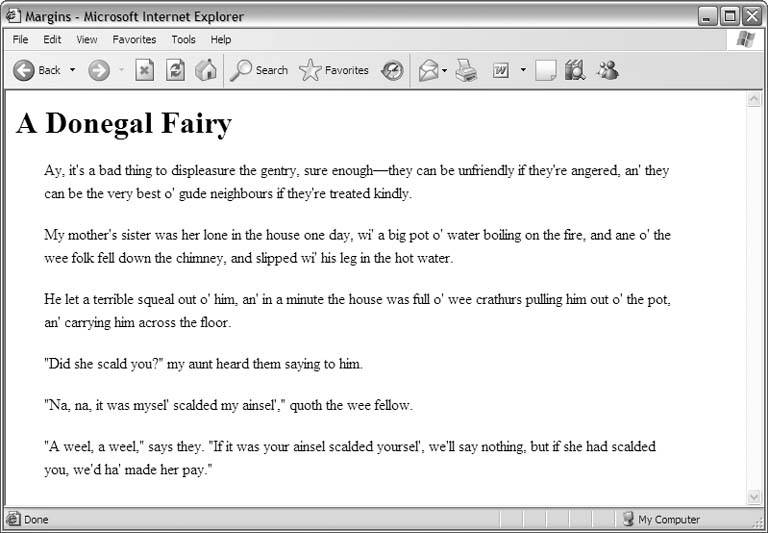
6.2.3.4. Looking at paddingThe padding attribute controls the amount of whitespace between the margin of the box and the edge of the content inside it. Like margins, padding also comes in four flavors: top, bottom, left, and right. In Figure 6-10, the top paragraph has no padding, while the bottom paragraph has 10 pixels of padding on all four sides. Use padding to position content inside its box. Because the areas of your design sit tightly against each other, padding is an essential attribute for helping your design to breathe. For example, if you have a side-nav design with a banner across the top of your page, your main content area probably sits in the lower right of the layout. Some tasteful padding along the top and down the left side of the main content area gives you a nice cushion of space, which helps to separate the content from the interface-type elements in your design. Figure 6-10. The effect of padding on paragraphs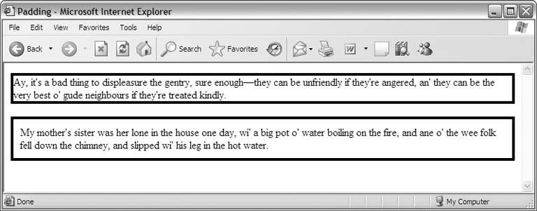 6.2.4. Considering Colors and BordersTo give your text that extra graphical appeal, you can apply color to both it and its box, and you can set its box in various types of borders. 6.2.4.1. Looking at text colorUse any one of your computer's 16 million distinct shades to color your text. Applying color to the text element's box creates an opaque rectangle on the page with the text inside it, as shown in Figure 6-11. You can also color the text itself independently of the box's color (or lack of one). Figure 6-11. This paragraph has white text against a black background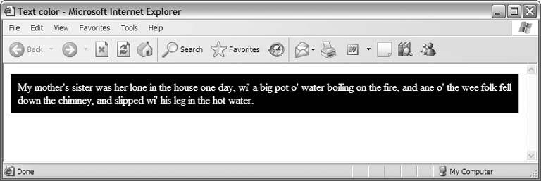 But just because you can do something doesn't mean that you should. While coloring the box of a text element is appropriate whenever you need this effect, coloring the text itself can cause problems, particularly if you single out individual words here or there for the color treatment. Text of one color in the middle of text of another color looks suspiciously like a hyperlink to your visitors, who will no doubt try to click it. When nothing happens, they become frustratednot a good thing.
That said, you can often get away with colored text if you use it consistently. For instance, setting all your headings in a different color than your running text doesn't normally lead to confusion, because the headings serve a different purpose than the paragraphs on your page. They're designed to separate sections of content, so your visitors are expecting them to contrast with the running text and therefore won't necessarily conclude that they are hyperlinks.
6.2.4.2. Looking at bordersWhen you add a border to a text element, you outline its box, as Figure 6-12 shows. The border can be of any color and weight or thickness, and you may choose from several styles, including solid, dashed, and dotted. Figure 6-12. This paragraph has a dashed border Borders around text elements work especially well when you also color the element's box. The effect is perfect for sidebars, special-attention-type announcements, and the like.
|
EAN: 2147483647
Pages: 154