User Interface Design
The user interface (UI) is one of the keys to a successful application. An application will be a failure if people can't use it easily and effectively, just as surely as if the application were too buggy to run. A good UI is elegant and efficient, exposing the functional requirements to the users clearly and intuitively.
For a program running in the Windows world, the Windows UI provides a foundation of expectations and capability. For example, most people today expect their applications to be Windows applications, as opposed to console, or DOS-style, command-line applications. The .NET Framework and the underlying Windows API provide the capability to satisfy these expectations. The Windows environment also shapes the way Windows applications look and feel. Windows applications look and feel different from, for example, Macintosh applications. For that matter, the Windows 98 UI is significantly different from Windows XP. On the other hand, all these graphical user interfaces (GUIs) share common design elements, such as windows, scrollbars, buttons, text boxes, tree views, and hyperlinks.
In a Windows application, you will find several broad categories of UI design: single-document interface (SDI), multiple-document interface (MDI), Explorer-style interface, and dialog boxes. The first three categories will be covered in this chapter. Dialog boxes will be covered in the next chapter.
5.5.1 UI Principles
Good UI design is both an aesthetic and a technical endeavor. Although there is as much art as science in UI design, it is still possible to identify several guidelines for good UI design in the modern era. Entire books can be written on this topic, and many have been. This section mentions several important design considerations to keep in mind.
|
Follow standard conventions
Learn once, use everywherethat is a key feature of any GUI. For example, copy (Ctrl-C) and paste (Ctrl-V) should work the same in all applications as it does in Windows itself. Don't decide that Ctrl-P makes more sense for Paste; you will only confuse users.
Windows provides many common dialog boxes, which will be described in Chapter 6. Use them. Don't create your own File Save dialog box, for example, unless the standard common dialog just won't do.
Be consistent
Be consistent in the design cues you decide to use in the application. For example, if read-only TextBoxes have a gray background color one place in the application, make sure all read-only TextBoxes have the same gray background color. Don't give some read-only TextBoxes a gray background color and others a white background color. If a TextBox changes status from editable to read-only, dynamically change the background color in the program code.
Maximize readability
Text presented in uppercase is not as easy to read as lowercase text with initial uppercase letters. If you want to emphasize some text, use a bold font, underline the text, use a contrasting color, or make the font larger.
Group controls by function
Controls that perform related functions should be grouped together. For example, the OK/Cancel/Apply/Help buttons that are commonly used in dialog boxes should be grouped together, rather than interspersed with other controls in the dialog box.
Arrange controls by importance
Keep in mind that the typical user of left-to-right languages (e.g., English, German, or French) will look first at the upper-left corner of the screen (or piece of paper), then scan across left to right and down the page. Place the most important controls in the upper-left corner and the least important controls in the lower-right corner.
Arrange controls by work flow
Controls should be arranged according to the way users typically work. For example, a form designed for input of biographical information might group all the fields relating to birthplace, then education, and then qualifications, as opposed to interspersing fields about these topics.
Align text and controls
Proper alignment of text and controls enhances the readability of a form. Consider a series of text boxes with labels. They could be arranged in so many ways. Three of those ways are shown in Figure 5-10. In the left-most example, the only alignment is the left edge of the labels. In the middle example, the left edges of both the label and the text box is aligned. In the right example, the right edge of the label is aligned, as are the text boxes.
Figure 5-10. Control alignment

Generally, the left example is the least effective. Which of the other two is preferable is a matter of taste. (I prefer the right example.)
Correctly sized text boxes
All the text boxes in Figure 5-10 are the same size. This generally enhances readability. However, if the text to be entered in different fields is of vastly different length, say an email address in one field and a two-character state abbreviation in another, then size the text boxes accordingly.
For potentially large input fields, make the text box resize when the form resizes. In addition, it is best to size a text box to make the entire entry visible at once, if possible.
Use color effectively
You can use color to convey information. For example, consider displaying negative numbers in red and positive numbers in black.
Colors can also enhance, or detract from, readability. Displaying black text on a brown background is very difficult to read, while displaying yellow text on a brown background is easy to read.
However it is good to keep in mind that color can culture-specific; not all cultures interpret the same color scheme the same way. Also, remember that some people are color-blind, so color should not be the only design cue.
Use modal dialogs sparingly
Modal dialogs (dialogs you must deal with before program flow can continue) are often necessary, but should be used as infrequently as possible since they disrupt the flow of the user's experience. Instead, provide modeless forms or dialogs to gather or present the information.
Provide keyboard equivalents
Many users prefer to type rather than use the mouse. Keyboard equivalents for all menu items and access keys for controls allow these people to work without removing their hands from the keyboard.
Get input and feedback from actual users
Talk to end users and get input as early in the design process as possible. Keep them involved, showing them mockups of the UI before all the code is in place.
Error handling
Errors happen. Deal with them so that your end user doesn't have to, or at the very least, receives a clear message describing what the problem is and how to fix it. If a runtime error occurs, whether due to unexpected user input, a dropped network connection, or a failed hard drive, it must be handled.
Specific errors or classes of errors can be handled with specific error-handling routines. Others can be handled with more generic error handlers. If an error is not handled by the application, the CLR will present an ugly error message to the user, a situation you should strive mightily to avoid.
Errors will be covered thoroughly in Chapter 21.
Help
A fully featured application provides Help to end users via a menu item or a hot key. It can be hyperlinked within itself or out to the Internet. It can be monolithic or dynamically context-sensitive. In any case, the development team must decide if and how much Help capability the program warrants or can be provided.
5.5.2 Interface Types
This section will look at four fundamental Windows interface types: SDI, MDI, tabbed interface, and Explorer style interface. The next chapter covers dialog boxes. You will use at least one of these interface types in virtually every Windows application you write.
Many applications, such as Office XP and Visual Studio .NET, mix elements from more than one type of interface. However, these classifications are still useful.
5.5.2.1 SDI
In a Single Document interface (SDI), an application can open only a single window. A typical SDI application is WordPad (shown in Figure 5-11), installed with most Windows installations.
Figure 5-11. Typical SDI application (WordPad)
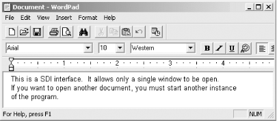
SDI windows can have all the controls and accouterments of a standard window. It can have menus, toolbars, scrollbars, a titlebar with window control buttons, a status bar, and rulers. It can also contain any control from the .NET Framework or any control derived from a control in the Framework.
The one thing an SDI application cannot have is a Window menu item. The Window menu contains commands for viewing and manipulating the many windows an application may have open. Since SDI applications cannot, by definition, have multiple windows, there is no need for the menu item.
An SDI application can have other forms as part of the application: dialog boxes (described in the next chapter) or standard windows. In any case, functionality provided by other forms generally pertains to the document contained in the main application window, or to the application as a whole.
To create an SDI application, set the IsMdiContainer property for the form to false. This is the default value set by Visual Studio .NET for a new form.
5.5.2.2 MDI
In a Multiple Document Interface (MDI), the application can have multiple windows open at the same time. As with SDI windows, MDI windows can have the full complement of form features and controls.
MDI applications are easily recognized by the presence of the Window menu item. This item allows you to view or manipulate the several windows, which may be open within the application.
Some MDI applications, such as SQL Server Enterprise Manager (shown in Figure 5-12) and Microsoft Excel, allow you to have several nonmaximized windows open at once, all within a parent, or main, application window.
Figure 5-12. Typical MDI application (SQL Server Enterprise Manager)
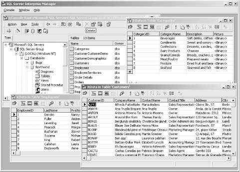
Other MDI applications, such as Microsoft Word 2000, allow you to split a document into separate panes within the parent window, but each open document is maximized within its own window. Each document has its own parent window, so the application appears to behave similarly to an SDI application. The Window menu command is aware of all the open documents in all the instances of the application, and allows you to switch between them.
Creating an MDI application is fairly straightforward. First, create the parent form, and then create one or more child forms that the parent form can contain.
To demonstrate this, open a new project in Visual Studio .NET. Call it MDIDemo. In the Properties window for the form, change the IsMdiContainer property to true. After changing the Text property, Visual Studio .NET will look like Figure 5-13. Notice that the color of the form will change to a darker gray.
Figure 5-13. MDI form design
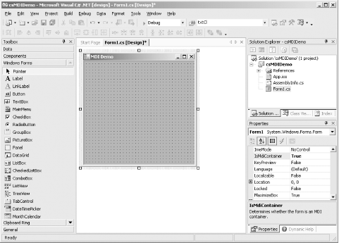
Give the parent form a menu by dragging a MainMenu control onto the form. (Menus will be covered in depth in Chapter 18.) You will eventually add a File menu item, with New and Close submenu items, plus a Window menu item.
Click on the menu at the top of the form where it says Type Here. Type File. When you press Enter, two Type Here labels will appear. Click on the one below File and type New. Press Enter, then below New, type Close. Click on the Type Here label to the right of File, and type Window.
Run this form as is and you will get Figure 5-14. The menu items don't do anything yet, but they will soon.
Figure 5-14. MDI sample form

Before adding functionality to the menu items, create a child form that can be instantiated every time the user clicks on the New command. To do this, add a form to the project in one of three ways:
- Select the Project
 Add Windows Form... menu item
 - Select the Project
 Add New Item... menu item
 - Right-click on the project name in the Solution Explorer and then click on either Add
 Add New Item... or Add
  Add Windows Form...
In any case, you will get the Add New Item dialog box, which will let you add a Windows Form to the project. Change the Text property of the new form to MDI Child.
To give the user something to do with this child form, drag a RichTextBox control onto the form. Clear the Text property and set the Dock property of the RichTextBox to Fill by clicking on the center rectangle of the drop-down in the Properties window. This will cause the RichTextBox to fill the child window completely, emulating Notepad or WordPad.
You can also add menus to the child forms. When the child form is activated, menu items on the child forms will automatically display as part of the parent form menu.
Now you can add functionality to the menu items. To do so, create event handlers and add code to each event handler.
Double-click on the New menu item. This will open up an event-handler skeleton for the menuItem2_Click method. Add the highlighted code shown in Example 5-11 (for C#) or in Example 5-12 (for VB.NET).
Example 5-11. File  New menu event handler in C#
![]()
private void menuItem2_Click(object sender, System.EventArgs e)
{
 Form mdiChild = new Form2( );
 mdiChild.MdiParent = this;
 mdiChild.Show( );
}
Example 5-12. File  New menu event handler in VB.NET
![]()
Private Sub MenuItem2_Click(ByVal sender As System.Object, _
 ByVal e As System.EventArgs) _
 Handles MenuItem2.Click
 dim mdiChild as New Form2( )
 mdiChild.MdiParent = me
 mdiChild.Show( )
End Sub
The first line of code in the New event handler instantiates a new child form, assigned to the variable mdiChild, using the child form you just created. The next line assigns the child form's parent, i.e., the calling form. In C# this is done with the this keyword and in VB.NET with the me keyword. The last line of code shows the child form.
Running the application now produces the screenshot shown in Figure 5-15 after you click the File  New menu item three times.
Figure 5-15. MDI form with children
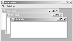
Each child form has full, basic form functionality within the parent window. You can maximize, minimize, or restore the child window, as well as move and resize it. Also, you can type in the window. Anything you type will automatically line wrap, even if you resize the window, courtesy of the RichTextBox control.
You can always close the child form by clicking the X button in the upper-right corner of the window. To implement that functionality in the parent menu, double-click on the Close menu item in the Design view. As before, this will open up a code skeleton for the Close menu event handler. Enter the highlighted code shown in Example 5-13 (for C#) or Example 5-14 (for VB.NET).
Example 5-13. File  Close event handler in C#
![]()
private void menuItem3_Click(object sender, System.EventArgs e)
{
 Form activeChild = this.ActiveMdiChild;
 activeChild.Close( );
}
Example 5-14. File  Close event handler in VB.NET
![]()
 Private Sub MenuItem3_Click(ByVal sender As System.Object, _
 ByVal e As System.EventArgs) _
 Handles MenuItem3.Click
 dim activeChild as Form = me.ActiveMdiChild
 activeChild.Close( )
 End Sub
The first line of code in the File  Close event handler identifies which child form is active, using the ActiveMdiChild property, and assigns the variable activeChild to that instance of the active form.
The second line closes the active form by using the Close( ) method of the Form class.
Now when you run the application, you can create multiple instances of the child document, and you can close them from the menu.
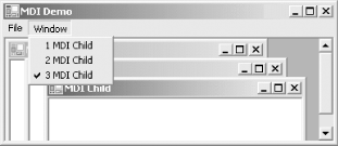
Next, program the Window menu item in the parent window to provide the sort of functionality users expect. The Window menu item provides a list of all currently available windows, allowing the user to switch between them by clicking on the list. This functionality is easily implemented by setting the MdiList property to true for the menu item in question. Click on the Window menu item in Design view, and set the MdiList property to true.
Run the application and open several windows in the parent form. Then click on the Window menu item. You will see something similar to Figure 5-16.
A maximum of nine MDI child windows can be listed in the Window menu item. If more than nine child windows need to be displayed, then a "More Windows..." menu item will display at the end of the list and expose a dialog box from which you can select the complete list of child windows.
The only forms that can be listed in the Window menu item are those you can define as MDI child windows by using the MdiParent property, as shown in Example 5-11 and Example 5-12.
Figure 5-16. Window menu item showing list of child forms
In addition to displaying a list of child windows, the Window menu item often provides window-arrangement commands. Again, the .NET Framework provides an easy way to implement it by using the LayoutMdi method of the Form class. This method takes one of the members of the MdiLayout enumeration, listed in Table 5-5, as an argument.
|
Value |
Description |
|---|---|
|
ArrangeIcons |
Arranges titlebars of minimized MDI child windows along the bottom of the parent window. |
|
Cascade |
Cascades all MDI child windows within the parent window. |
|
TileHorizontal |
Horizontally tiles all MDI child windows within the parent window. |
|
TileVertical |
Vertically tiles all MDI child windows within the parent window. |
To demonstrate these different types of window layout, add four submenu items to the parent Form's Window menu item: Arrange Icons, Cascade, Tile Horizontal, and Tile Vertical. Double-click on each submenu item, bringing up the event handler skeleton for that item. Then add the appropriate line of code shown in either Example 5-15 (for C#) or Example 5-16 (for VB.NET).
Example 5-15. LayoutMdi method in C#
![]()
this.LayoutMdi(System.Windows.Forms.MdiLayout.ArrangeIcons); this.LayoutMdi(System.Windows.Forms.MdiLayout.Cascade); this.LayoutMdi(System.Windows.Forms.MdiLayout.TileHorizontal); this.LayoutMdi(System.Windows.Forms.MdiLayout.TileVertical);
Example 5-16. LayoutMdi method in VB.NET
![]()
me.LayoutMdi(System.Windows.Forms.MdiLayout.ArrangeIcons)
me.LayoutMdi(System.Windows.Forms.MdiLayout.Cascade)
me.LayoutMdi(System.Windows.Forms.MdiLayout.TileHorizontal)
me.LayoutMdi(System.Windows.Forms.MdiLayout.TileVertical)
When you run the program and open several child windows, you will see the expected behavior from these menu items.
5.5.2.3 Tabbed interface
The tabbed interface borrows its metaphor from the divider tabs used in a loose-leaf binder. It provides a means of having multiple windows readily accessible to the user without taking up a lot of screen real estate. Only the top-most window is visible, but tabs identifying all the underlying windows are visible at all times.
Tabbed interfaces have become common in recent years, since they combine many of the best features of SDI and MDI interfaces: the screen is not cluttered with multiple windows and the nonvisible windows are not totally hidden, as with MDI programs, yet multiple windows are readily available, unlike SDI programs.
Perhaps the program that best exhibits a tabbed interface most familiar to .NET developers is Visual Studio .NET. Looking back at Figure 5-13, you'll see two tabs above the design window, labeled Start Page and Form1.cs [Design]. Clicking on any of those tabs brings that window to the top. It is possible to have many tabs across the top. If there are too many to fit in the available space, navigation arrows allow you to scroll back and forth amongst the tabs.
The .NET Framework provides the Windows Forms TabControl control to implement the tabbed interface. The TabControl contains a collection of TabPage objects. Various properties let you control the behavior and appearance of those tab pages.
The TabControl is covered thoroughly in Chapter 13.
5.5.2.4 Explorer style
The Explorer style interface is named for Windows Explorer, the file and directory management tool included with all versions of Windows since Win95, as shown in Figure 5-17.
Figure 5-17. Windows Explorer
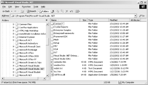
An Explorer interface is characterized by a two pane window. The left pane displays a list of items graphically and hierarchically. The right pane displays details relevant to the item selected on the left. In the case of Windows Explorer, the items in both panes consist of files and directories. Some icons are associated with each item to provide a visual representation of the item's classification. For example, most directories have the folder icon (![]() ), the currently selected directory has the open folder icon (
), the currently selected directory has the open folder icon (![]() ), and each file with a different extension has its own icon.
), and each file with a different extension has its own icon.
Like SDI and MDI windows, an Explorer style window may also have menus, toolbars, and a status bar.
The Explorer interface is minimally constructed from three controls. These controls will be described in detail in Chapter 14. In brief, each Explorer-style window has the features described next.
TreeView
Occupies the left pane of Windows Explorer. Displays hierarchical data as a series of labeled items called nodes. Each node may contain other nodes, called child nodes, in which case it is the parent node to its child nodes. The nodes are of type TreeNode and contained within the Nodes collection. The .NET Framework provides properties, methods, and events for managing and manipulating TreeViews and users' interactions with them.
ListView
Occupies the right pane of Windows Explorer. It is similar to the TreeView, except that it displays a single list of items rather than a hierarchical view. The list items can either be represented by icons (large or small) or text (with or without an icon). Each item can have subitems, which are displayed in columns, either with or without a header. As with the TreeView, there are many properties, methods, and events for setting behavior and appearance and for handling events.
Splitter
The Splitter is an unobtrusive little control used to separate two other controls docked to the Splitter, allowing user to set the relative size of the two docked controls easily.
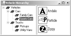
The next example demonstrates the creation of a simple Explorer style interface, using a hierarchy of motor vehicles. In this example, the TreeView in the left pane displays the different categories of vehicles. Drilling down through the nodes will eventually display a list of specific models in the ListView in the right pane. The finished application looks something like that shown in Figure 5-18.
Figure 5-18. Explorer-Style Interface (Vehicle Hierarchy)
Open a new Windows application in Visual Studio .NET using the language of your choice. Name it VehicleHierarchy.
Drag a TreeView control onto the form. Set its Dock property to Left. Next, drag a Splitter control on to the form. It will glom (a technical term meaning to stick on the side of something, as in "my daughter gloms onto my leg when we enter a room full of people.") onto the right edge of the TreeView control.
Drag a ListView control onto the form. Set its Dock property to Fill so that it fills the remaining space on the form between the Splitter and the right edge of the form. Also, change its View property from LargeIcon to List.
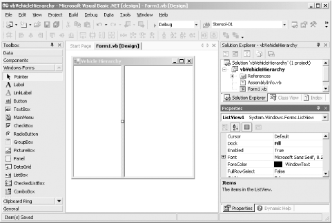
While you are at it, change the Text property of the form to Vehicle Hierarchy. At this point, the Visual Studio .NET design will look like Figure 5-19. (Note that the project shown in Figure 5-19 is actually named vbVehicleHierarchy, distinguishing it from csVehicleHierarchy.)
Figure 5-19. VehicleHierarchy design
The next step is to populate the Nodes collection of the TreeView. There are several ways to do this. In many applications, a TreeView or a ListView will be populated dynamically from a database. That technique will be covered fully in Chapter 19.
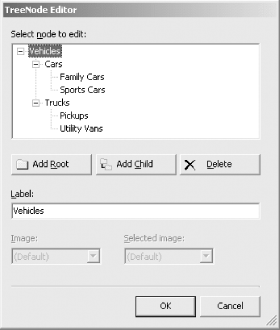
For this example, select the TreeView control in design view, and then use the Properties window to populate the Nodes collection. The Nodes property in the Properties window has a build button next to it. Click that build button to bring up the Tree-Node Editor dialog box.
|
Use the Add Root button to add all the root-level nodes. In this example, there is only a single root-level node, Vehicles. Click the Add Root button. The Label field will show the default node name, Node0. Replace it with Vehicles.
The Add Child and Delete buttons will now become enabled. With the Vehicles node highlighted, click the Add Child button. A child node named Node1 will appear beneath Vehicles. Highlight Vehicles again, and click the Add Child button again to create another child node named Node2.
Highlight Node1 and change its Label field to Cars. Highlight Node2 and change its Label field to Trucks.
Now add two more child nodes to both Cars and Trucks. Label the two child nodes under Cars as Family Cars and Sports Cars. Label the two child nodes under Trucks as Pickups and Utility Vans.
At this point, the TreeNode editor will look like Figure 5-20.
Figure 5-20. TreeNode editor dialog box
You will notice that the finished application shown in Figure 5-18 included small images with each item in the TreeView and the ListView. These images are contained in an ImageList component. A form can have more than one ImageList component, but all the images used in a single TreeView or ListView must come from the same ImageList. For this example, both TreeView and ListView will use the same ImageList. (Chapter 7 will cover the ImageList component in detail.)
To add the ImageList, drag an ImageList control from the Toolbox onto the form. The ImageList component, like all components, will not appear on the form itself, but at the bottom of the Design window, as shown in the screenshot in Figure 5-21.
Figure 5-21. ImageList on form
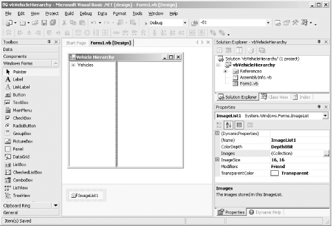
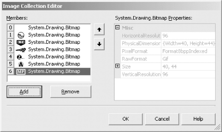
Referring to the Properties window for the ImageList shown in Figure 5-21, you can see that the Images property contains a collection of images. Click on the build button (...) for the Images collection to get the Image Collection Editor dialog box. The Add button will allow you to add images to the ImageList. You can browse to the location of your image files and add them to the Image collection.
The images can be in any of many different bitmap formats (bmp, gif, jpg, jpeg, png, ico). A large number of useful image files are included with Visual Studio .NET, including most of the standard icons and bitmaps from the Windows and Office UI, plus many others of general interest. They can be found, by default, in C:Program FilesMicrosoft Visual Studio .NET 2003Common7Graphics.
In this example, cars.ico will be the generic vehicle icon. To use this image, click on the Add button and browse to the C:Program FilesMicrosoft Visual Studio .NET 2003 Common7Graphicsiconsindustry directory. Select cars.ico. It will be added to the collection with an index of zero. The zero-based index identifies the position of the entry in the collection. Once the image is added to the collection, its source filename is lost.
Images for the manufacturer and model items were clipped from each manufacturer's web site (using an image-editing software package), saved as .gif files, and added to the collection. When all the images are added, the dialog box will look like Figure 5-22.
Figure 5-22. Image Collection Editor dialog box
Once you set up an ImageList, other controls in the project can refer to it. Select the TreeView control. There will be an entry with a drop-down for ImageList in the Properties window, as shown in Figure 5-23.
Figure 5-23. ImageList property
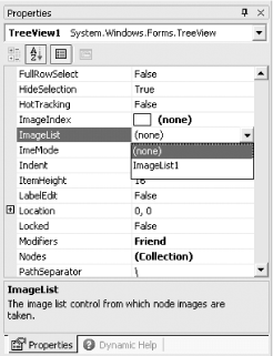
Select the previously created and populated ImageList1. (If the project had more than a single ImageList, all would be listed.) As soon as the ImageList property is assigned, all nodes in the TreeView in Design view will show the image at Index 0.
To assign specific, nondefault images to each item, go to the Nodes property of the TreeView and open the TreeNode Editor, as shown in Figure 5-20. Now, however, as you drill down and select the individual nodes, the Image and Selected Image drop-downs will be enabled. Each will expose all the images contained in the selected ImageList. The Image drop-down selects the image to be used for normal display of the item, and the Selected Image drop-down selects the image to be used when the item is selected. For this example, leave the default image for all the items in the TreeView.
When the TreeView is set, you can add code that will dynamically populate the ListView at runtime, in response to the user's selections. Put this code in the event handler for the TreeView AfterSelect event. This event fires after a tree node has been selected. It is the default event for the control, so all you have to do is double-click on the control and the code skeleton will be created for you.
Before coding to populate the ListView, set the SmallImageList property of the ListView control to ImageList1, the same ImageList used for the TreeView. This will let you add those images programmatically. (LargeImageList and StateImageList properties will be covered in Chapter 7.)
Double-click on the TreeView control. The code window will open with a code skeleton in place for the AfterSelect event. The cursor will also be properly positioned and ready for typing. Enter the code highlighted in Example 5-17 (for C#) or in Example 5-18 (for VB.NET).
Example 5-17. TreeView AfterSelect event handler in C#
![]()
private void treeView1_AfterSelect(object sender,
 System.Windows.Forms.TreeViewEventArgs e)
{
 switch (e.Node.Text)
 {
 case "Family Cars":
 listView1.Clear( );
 listView1.Items.Add("Ford Taurus",3);
 listView1.Items.Add("Chevy Impala", 4);
 listView1.Items.Add("VW Passat", 6);
 break;

 case "Sports Cars":
 listView1.Clear( );
 listView1.Items.Add("Corvette", 1);
 listView1.Items.Add("Ferrari", 2);
 listView1.Items.Add("Porsche", 5);
 break;
 }
}
Example 5-18. TreeView AfterSelect event handler in VB.NET
![]()
Private Sub TreeView1_AfterSelect(ByVal sender As System.Object, _
 ByVal e As System.Windows.Forms.TreeViewEventArgs) _
 Handles TreeView1.AfterSelect
 select case e.Node.Text
 case "Family Cars"
 listView1.Clear( )
 listView1.Items.Add("Ford Taurus",3)
 listView1.Items.Add("Chevy Impala", 4)
 listView1.Items.Add("VW Passat", 6)
 case "Sports Cars"
 listView1.Clear( )
 listView1.Items.Add("Corvette", 1)
 listView1.Items.Add("Ferrari", 2)
 listView1.Items.Add("Porsche", 5)
 end select
End Sub
Chapter 14 will discuss the AfterSelect event and the TreeView and ListView controls in more detail. For now, note that the event argument is of type TreeViewEventArgs. One of the TreeViewEventArgs properties is Node, which contains the tree node that was selected.
A switch (select) case block is used to test the selected node and branch accordingly. In this trivial example, all items are hardcoded using the Add method of the ListViewItemCollection class, after the ListView is first cleared. In a real application, a ListView would often be populated from a data store, such as an XML file or a relational database. (Populating TreeViews and ListViews from a data store will be covered in Chapter 19.)
The Add method of the ListViewItemCollection class is overloaded; the number and type of arguments determine exactly what the method will do. In this example, the first argument is the item to be added to the collection. The second argument is the index into the ImageList associated with this ListView control's SmallImageList property.
If this application is run now, it will look like Figure 5-18. However, nothing will happen if you click on or otherwise select any of the items in the ListView. Many applications will respond to a user clicking on one of the items in the ListView. Do not double click on the ListView control. Doing so would insert a code skeleton for the SelectedIndexChanged event, which is the default event for this control. Instead, add a code skeleton for the ItemActivate event of the ListView control. In C#, click on the Events icon in the Property window. In VB.NET, go to the code window, select the control from the left drop-down at the top of the window and the ItemActivate event from the right drop-down. (For more detail on creating event handlers, see Chapter 4.) Then enter the highlighted code shown in Example 5-19 for C# or in Example 5-20 for VB.NET.
Example 5-19. Click event handler and helper method in C#
![]()
private void listView1_ItemActivate(object sender,
 System.EventArgs e)
{
 String strItem = listView1.FocusedItem.Text;
 DisplayCar(strItem);
}

private void DisplayCar(string strCar)
{
 Form frmCar = new Form( );
 frmCar.Text = strCar;

 this.Hide( );
 frmCar.ShowDialog( );
 this.Show( );
}
Example 5-20. Click event handler and helper method in VB.NET
![]()
Private Sub ListView1_ ItemActivate (ByVal sender As Object, _
 ByVal e As System.EventArgs) _
 Handles ListView1.Click
 dim strItem as String = listView1.FocusedItem.Text
 DisplayCar(strItem)
End Sub

private sub DisplayCar(strCar as String)
 dim frmCar as Form = new Form( )
 frmCar.Text = strCar

 me.Hide( )
 frmCar.ShowDialog( )
 me.Show( )
End Sub
The ItemActivate event is raised whenever an item in the ListView is activated. The default way to activate an item at runtime is to either double-click on it or press Enter when the item (or items) is selected. By changing the ListView Activation property from Standard to either OneClick or TwoClick, you can change the activation technique.
- OneClick activates an item as soon as it is clicked. This property value also causes the item to change color as the mouse passes over it.
- TwoClick activates an item when it is clicked twice (not to be confused with double-clicking, in which the two clicks must occur within a short period of time). The first click selects the item, and the second click activates the item. The two clicks can be widely separated in time.
The ItemActivate event handler does not use the event argument at all here. Instead, it gets the Text property of the item that currently has focus using the FocusedItem property of the ListView control, and assigns it to strItem, a string variable. This string variable is passed as an argument to a helper method called DisplayCar, which does the work.
In this example, the "work" consists of creating a new form, setting its Text property to be the same as the item that was clicked, hiding the current form, and displaying the new form modally by using the ShowDialog method of the Form class.
|
Now when the application is run and the user selects one of the cars in the ListView control, a form specifically for that car is displayed. When the user closes that form by clicking on the Close button (X) in the upper right corner, the original form returns to visibility.
Other approaches could have been used to select items from the ListView. You could have handled either the Click or DoubleClick events, which work well as long as the user selects the list item with a mouseclick. However, they ignore keyboard navigation and activation. Alternatively, you can handle the SelectedIndexChanged event. The problem is that it requires special processing to prevent the event from being processed twice for every change, and it still does not yield the smooth operation expected of an Explorer interface.
This is a very simple example, but it shows the fundamental features of the Explorer interface. In a real application, TreeView and ListView controls might be populated from a database or other data store, and the response to selections might be to display a complex form or start a train of processing.
You can create a knock off of the Windows Explorer similarly, using the same basic controls. This will be demonstrated in Chapter 14, where TreeView, ListView, and Splitter controls are covered in detail.
5.5.3 Input
The primary means of input to a Windows Forms application is either through the mouse or the keyboard. Many other input devices (e.g., speech or bar code readers) use a device driver that translates the input into keyboard equivalents, so that the OS thinks the input is coming from a keyboard.
5.5.3.1 Mouse input
As a developer, you do not have to do anything for your Windows Forms application to have full-mouse functionality; it is automatically provided by the Control class. However, there are a full range of Mouse events and properties exposed that you can handle or set, respectively, to customize or extend the user's interaction with the mouse. This is covered fully in Chapter 8.
5.5.3.2 Keyboard input
Windows handles all the plumbing that allows your keyboard to talk to your system. A keyboard device drive mediates between Windows and the physical hardware. As with all hardware device drivers, this software layer abstracts the nitty-gritty details required for a specific hardware device to communicate with a broadly available operating system, providing the OS with a standard interface to deal with.
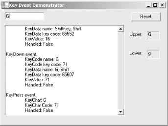
The KeyEvents example from Chapter 4, demonstrates how to read and process keyboard input in a Windows Forms application. Figure 5-24 shows a screenshot of that application.
Figure 5-24. KeyEvents application
Each key on a keyboard has unique value assigned to it called a scan code. This code is converted by the keyboard device driver into a virtual-key code. The virtual-key codes, which identifies the purpose of the key, are listed in Appendix A as decimal key codes.
An event is raised when the key is pressed down, called the KeyDown event, and again when the key is released, called the KeyUp event. Neither event is explicitly aware of any other keys being pressed in combination, such as for a Shifted character, or the Alt or Ctrl key being pressed in conjunction with another key. This information is conveyed in the KeyPress event as the KeyChar property of KeyPressEventArgs event argument. In Figure 5-24, the user entered an uppercase G, so the KeyPress KeyChar value is G (as is also, confusingly, the KeyDown KeyCode property of the KeyEventArgs event argument). If the user had instead pressed a lowercase g, then the KeyUp and KeyDown event data would have been the same as for the uppercase letter (except there would be no events for a Shift key that was not pressed, of course), but the KeyPress KeyChar value would be a lowercase g.
For a complete discussion of keyboard events, see Chapter 4.
5.5.3.3 Keyboard shortcuts
Most people would agree that the mouse is a wonderful thing, making modern graphical user interfaces both possible and easy to navigate. Still, many users are loathe to remove a hand from the keyboard any more than is absolutely necessary, since it slows down typing and disturbs the flow of thought and action.
Keyboard shortcuts help you interact with menus without the mouse. There are two different ways to add keyboard equivalents to button or menu selection:
Shortcut Keys
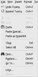
Special keys or key combinations that may be pressed to invoke a menu item. These keys are typically listed on a menu to the right of the menu item. In the Edit menu from Microsoft Word, shown in Figure 5-25, shortcut keys include Ctrl+Z, Ctrl+V, and Del.
Access Keys
Also known as keyboard accelerators, these keys allow menu and control navigation when pressed in combination with the Alt key. They are indicated by an underscored letter in a menu item or a control label. In the Edit menu from Microsoft Word, shown in Figure 5-25, access keys include the U in Undo Typing, the R in Repeat Typing, and the S in Paste Special.
The .NET Framework makes it very easy to add access keys to menu items and controlssimply add an ampersand (&) in front of the character in the Text property of the menu item or control that is to be the access letter. For example, suppose you have a button with the Text property set to "Continue." Changing the Text property to "&Continue" will make the button accessible from the keyboard when Alt-C is pressed.
Figure 5-25. Microsoft Word Edit menu
Menus, shortcut keys, and keyboard equivalents are detailed in Chapter 18.
Windows Forms and the .NET Framework
Getting Started
Visual Studio .NET
- Overview
- Start Page
- Projects and Solutions
- The Integrated Development Environment (IDE)
- Building and Running
Events
Windows Forms
- Windows Forms
- Web Applications Versus Windows Applications
- The Forms Namespace
- Form Properties
- Forms Inheritance
- User Interface Design
Dialog Boxes
- Dialog Boxes
- Modal Versus Modeless
- Form Properties
- DialogResult
- Termination Buttons
- Apply Button
- CommonDialog Classes
Controls: The Base Class
Mouse Interaction
Text and Fonts
Drawing and GDI+
Labels and Buttons
Text Controls
Other Basic Controls
TreeView and ListView
List Controls
Date and Time Controls
Custom Controls
- Custom Controls
- Specializing an Existing Control
- Creating a User Control
- Creating Custom Controls from Scratch
Menus and Bars
ADO.NET
- ADO.NET
- Bug Database: A Windows Application
- The ADO.NET Object Model
- Getting Started with ADO.NET
- Managed Providers
- Binding Data
- Data Reader
- Creating a DataGrid
Updating ADO.NET
- Updating ADO.NET
- Updating with SQL
- Updating Data with Transactions
- Updating Data Using DataSets
- Multiuser Updates
- Command Builder
Exceptions and Debugging
- Exceptions and Debugging
- Bugs Versus Exceptions
- Exceptions
- Throwing and Catching Exceptions
- Bugs
- Debugging in Visual Studio .NET
- Assert Yourself
Configuration and Deployment
EAN: 2147483647
Pages: 148


