First Impressions: Creating Great Opening Paragraphs
First Impressions Creating Great Opening Paragraphs
THE APPEARANCE OF AN OPENING PARAGRAPH is almost as important as its content for hooking the reader, or, if you are marking a section break, for providing visual relief from a continuous body of text. This chapter looks at initial capitals, specifically drop capsthose created manually and those created automatically using InDesign's Drop Caps feature.
Drop caps are part of a long tradition of decorative first letters stretching back to before the invention of the printing press. Before printing, books were dictated to, and subsequently copied by, scribes and each book was regarded as a unique treasure. The scribes incorporated individual flourishes to distinguish their work from others. In medieval times the ornamentation of manuscripts was a monastic discipline; each major section of a book usually began with an illuminated letter made with metallic, mineral, or vegetable pigments, which were bound by glue or gum to the paper or parchment.
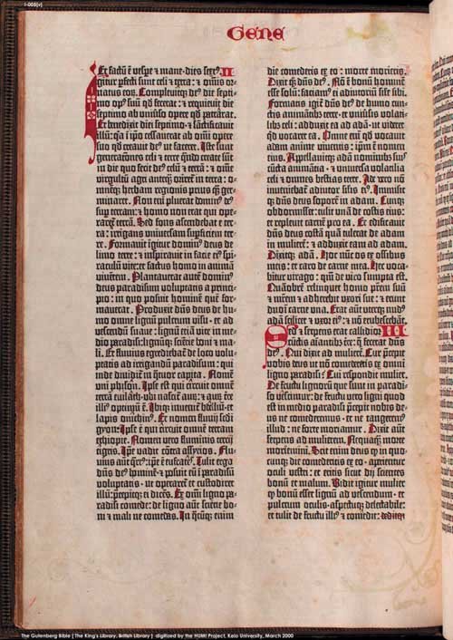
Figures 10-1A and 10.1B. Two pages from the Gutenberg Bible (1455), the first (this page) showing an illuminated first character painted by a scribe, the second (page 135) showing smaller initial characters in red to indicate new sections.
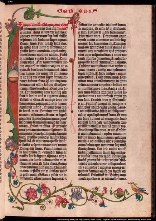
By the fourteenth century, initial letters or versals had evolved from enlarged heavy letters into elaborate illustrated works of art, most often used to decorate religious texts. An illuminated versal might flow down the whole side of a page, or extend up and around the top of the page. Sometimes they included illustrations and took over the entire page. In 1455, when Gutenberg printed his 42-line-per-page Biblethe first book to be printed in the western world with moveable typehe acknowledged the importance of this tradition by leaving space in the printed text for the scribe to add a decorative first letter.
Creating a Simple Drop Cap |
Part I: Character Formats
Getting Started
- Getting Started
- An InDesign Type Map: Where to Find Stuff
- Viewing Your Page
- Creating a Typography Workspace
- Up Next
Going with the Flow
- Going with the Flow
- A Blank Sheet: Typing on Your Page
- Text Flow
- Threading Text Frames
- Using Placeholder Text
- Pasting Text
- Importing Word Text
- Up Next
Character Reference
- Character Reference
- Less is More, Maybe
- Type Anatomy
- Type Classification
- Character Formatting Options
- Readability
- Up Next
Getting the Lead Out
- Getting the Lead Out
- How Much Is Enough?
- (Not) Using Auto Leading
- Keep It Consistent, Except. . .
- Leading Menu Options and Keyboard Shortcuts
- See Also
- Up Next
Kern, Baby, Kern
- Kern, Baby, Kern
- When to Kern
- Metrics Kerning
- Optical Kerning
- Manual Kerning
- How Much to Kern
- Tracking
- When to Track
- Controlling Widows and Orphans
- Up Next
Sweating the Small Stuff: Special Characters, White Space, and Glyphs
- Sweating the Small Stuff: Special Characters, White Space, and Glyphs
- Typographers Quotes
- Apostrophes
- Dashes
- Ellipses
- End Marks
- White Space Characters
- The Glyphs Palette
- Footnotes
- Footnote Options
- Up Next
OpenType: The New Frontier in Font Technology
- OpenType: The New Frontier in Font Technology
- Ligatures
- Discretionary Ligatures
- Ordinals/Raised and Lowered Characters
- Swash Characters
- Fractions
- Oldstyle Figures
- Contextual Alternates
- Opticals
- Glyph Positioning
- Stylistic Sets
- Up Next
Part II: Paragraph Formats
Aligning Your Type
- Aligning Your Type
- Centering Type
- Clean Shaven or Rugged: Justified vs. Ragged Type
- How InDesign Justifies Type
- Balancing Ragged Lines
- Right-Aligned Type
- Optical Margin Alignment
- Indent to Here
- Vertical Alignment
- Up Next
Paragraph Indents and Spacing
First Impressions: Creating Great Opening Paragraphs
- First Impressions: Creating Great Opening Paragraphs
- Creating a Simple Drop Cap
- Drop Cap Aesthetics
- Tricks with Drop Caps
- Up Next
Dont Fear the Hyphen
Mastering Tabs and Tables
- Mastering Tabs and Tables
- Setting Tabs
- Creating Decimal Tabs
- Using Tab Leaders
- Reply Forms
- Numbered Lists
- Right Indent Tab
- Working with Tables
- Creating a Table
- Working with Rows and Columns
- Working with Table Cells
- Up Next
Part III: Styles
Stylin with Paragraph and Character Styles
- Stylin with Paragraph and Character Styles
- Creating Styles
- Applying Styles
- Editing Styles
- Redefining Styles
- Creating Default Styles
- A Typical Style Sheet
- Up Next
Mo Style
Part IV: Page Layout
Setting Up Your Document
- Setting Up Your Document
- Choosing a Page Size
- Determining Margins
- Determining Column Width
- Changing Columns
- Break Characters
- Page Numbers
- Section Markers
- Up Next
Everything in Its Right Place: Using Grids
- Everything in Its Right Place: Using Grids
- Things to Consider
- Your Grid Tool Kit
- Calculating the Height of the Type Area
- Align to Grid
- First Baseline Options
- Snap to Guides
- Up Next
Text Wraps: The Good, the Bad, and the Ugly
- Text Wraps: The Good, the Bad, and the Ugly
- Applying Text Wraps
- Wrapping Type Around Irregularly Shaped Graphics
- Text Wrap Preferences
- Ignoring Text Wrap
- Anchored Objects
- Up Next
Type Effects
EAN: 2147483647
Pages: 186
