Up-Down Controls
Up-down controls consist of an edit box with an associated set of up and down arrows. The user can cycle through a range of values in the edit box by clicking on the arrows, or, if the ReadOnly property is not set to true, you can enter values in the edit box directly.
|

Most up-down control functionality comes from the UpDownBase class. This is an abstract/MustInherit class; it is not instantiated directly. The .NET Framework provides two classes derived from UpDownBase: NumericUpDown and DomainUpDown. The NumericUpDown control displays numeric values in the edit box, and the DomainUpDown control displays string values representing members of a collection of objects.
In addition to the properties inherited from Control and other base classes, such as ScrollableControl, UpDownBase has other properties, the most commonly used of which are listed in Table 13-16.
|
Property |
Value type |
Description |
|---|---|---|
|
BorderStyle |
BorderStyle |
Read/write. Valid values are members of the BorderStyle enumeration, listed in Table 13-9. |
|
InterceptArrowKeys |
Boolean |
Read/write. If true (the default), user can use up and down arrow keys to select values when the control has focus. |
|
PreferredHeight |
Integer |
Read-only. Height of control in pixels, based on PreferredHeight property of the text box portion of the control, adjusted for border style. |
|
ReadOnly |
Boolean |
Read/write. If false (the default), text in control can be edited by the user. If true, text can be changed using the up and down arrows only. |
|
Text |
String |
Read/write. Text displayed in the control. |
|
TextAlign |
HorizontalAlignment |
Read/write. Valid values are members of the HorizontalAlignment enumeration, listed in Table 13-17. Default is HorizontalAlignment.Left. |
|
UpDownAlign |
LeftRightAlignment |
Read/write. The side of the edit box on which the up and down arrows are placed. Valid values are either LeftRightAlignment.Left or LeftRightAlignment.Right (the default). |
|
Value |
Description |
|---|---|
|
Center |
Aligned in the center of the control. |
|
Left |
Aligned to the left of the control. |
|
Right |
Aligned to the right of the control. |
13.6.1 NumericUpDown
The NumericUpDown class displays a numeric value in the edit box. This number is incremented or decremented by the value of the Increment property every time the user clicks on one of the arrows or presses an arrow key on the keyboard (if the InterceptArrowKeys property is set to its default value of true).
If the user can enter values directly into the edit box, such as when the control is not set for ReadOnly, then validation automatically occurs when a new value is entered. The new value entered must be a number between the Minimum value and the Maximum value. If the entered value is outside the range of valid numbers, it will automatically be changed to either the Maximum or the Minimum value, depending on which property is exceeded.
|

A ValueChanged event is raised every time the Value property of the numeric up-down is changed, either by user interaction or programmatically. This event, with its event argument of type EventArgs (which has no additional properties), can be trapped and handled, as will be demonstrated shortly.
The commonly used properties of the NumericUpDown control that are not derived from UpDownBase are listed in Table 13-18.
|
Property |
Value type |
Description |
|---|---|---|
|
DecimalPlaces |
Integer |
Read/write. Number of decimal places displayed. Default is zero. |
|
Hexadecimal |
Boolean |
Read/write. If true, displays value in hexadecimal format. Default is false. |
|
Increment |
Decimal |
Read/write. Value to increment or decrement the Value property when an arrow is clicked or an arrow key is pressed. Default is 1. |
|
Maximum |
Decimal |
Read/write. The maximum value of the Value property. Default is 100. Use Decimal.MaxValue (equal to 296 or approximately 7.9 x 1028) to effectively remove the upper bound. |
|
Minimum |
Decimal |
Read/write. The minimum value of the Value property. Default is zero. Use Decimal.MinValue (equal to -296 or approximately -7.9 x 1028) to effectively remove the lower bound. |
|
ThousandsSeparator |
Boolean |
Read/write. If true, a thousands separator is displayed in the edit box, when appropriate. The separator to be used is determined by system settings. The default value is false. |
|
Value |
Decimal |
Read/write. The numeric value displayed by the control. |
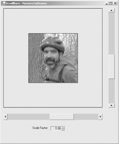
The programs listed in Example 13-11 (in C#) and in Example 13-12 (in VB.NET) demonstrate the use of a numeric up-down to complement the scrollbars used in Example 13-9 for scaling an image. In this example, which is nearly identical to the previous scrollbar and track bar examples, a numeric up-down control is added to the form, which scales the image uniformly in both directions.
When the code in either example is compiled and run, it looks like the screenshot shown in Figure 13-14.
The lines of code that differ from the previous examples are highlighted. An analysis of the code follows the listings.
Figure 13-15. NumericUpDown control
Example 13-11. NumericUpDown control in C# (NumericUpDowns.cs)

using System;
using System.Drawing;
using System.Windows.Forms;

namespace ProgrammingWinApps
{
 public class NumericUpDowns : Form
 {
 Panel pnl;
 PictureBox pb;
 HScrollBar hbar;
 VScrollBar vbar;
 NumericUpDown nupdwn;
 Image img;

 public NumericUpDowns( )
 {
 Text = "ScrollBars - NumericUpDowns";
 Size = new Size(480,580);

 // Get an image to use
 img = Image.FromFile(
 "Dan at Vernal Pool.gif");

 pnl = new Panel( );
 pnl.Parent = this;
 pnl.BorderStyle = BorderStyle.FixedSingle;
 pnl.Size = new Size(400,400);
 pnl.Location = new Point(10,10);

 pb = new PictureBox( );
 pb.Parent = pnl;
 pb.Size = new Size(200, 200);
 pb.Location = new Point((pnl.Size.Width / 2) -
 (pb.Size.Width / 2),
 (pnl.Size.Height / 2) - (pb.Size.Height /2));
 pb.BorderStyle = BorderStyle.FixedSingle;
 pb.SizeMode = PictureBoxSizeMode.StretchImage;
 pb.Image = img;

 // Horizontal scrollbar
 hbar = new HScrollBar( );
 hbar.Parent = this;
 hbar.Location = new Point(pnl.Left, pnl.Bottom + 25);
 hbar.Size = new Size(pnl.Width, 25);
 hbar.Minimum = 25;
 hbar.Maximum = 400;
 hbar.SmallChange = 10;
 hbar.LargeChange = 100;
 hbar.Value = pb.Width;
 hbar.ValueChanged += new EventHandler(hbar_OnValueChanged);

 // Vertical scrollbar
 vbar = new VScrollBar( );
 vbar.Parent = this;
 vbar.Location = new Point(pnl.Right + 25, pnl.Top);
 vbar.Size = new Size(25, pnl.Height);
 vbar.Minimum = 25;
 vbar.Maximum = 400;
 vbar.SmallChange = 10;
 vbar.LargeChange = 100;
 vbar.Value = pb.Height;
 vbar.ValueChanged += new EventHandler(vbar_OnValueChanged);

 // NumericUpDown & Label
 Label lbl = new Label( );
 lbl.Parent = this;
 lbl.Text = "Scale Factor:";
 lbl.Location = new Point(
 (((pnl.Right - pnl.Left) / 2) - 75),hbar.Bottom + 25) ;
 lbl.AutoSize = true;

 nupdwn = new NumericUpDown( );
 nupdwn.Parent = this;
 nupdwn.Location = new Point(
 (pnl.Right - pnl.Left) / 2, hbar.Bottom + 25);
 nupdwn.Size = new Size(60,20);
 nupdwn.Value = 1;
 nupdwn.Minimum = -10;
 nupdwn.Maximum = 10;
 nupdwn.Increment = .25m; // decimal
 nupdwn.DecimalPlaces = 2;
 nupdwn.ReadOnly = true;
 nupdwn.TextAlign = HorizontalAlignment.Right;
 nupdwn.ValueChanged += new EventHandler(nupdwn_OnValueChanged);
 } // close for constructor

 private void hbar_OnValueChanged(object sender, EventArgs e)
 {
 pb.Size = new Size(hbar.Value + hbar.LargeChange - 1, pb.Height);
 SetLocation( );
 }

 private void vbar_OnValueChanged(object sender, EventArgs e)
 {
 pb.Size = new Size(pb.Width, vbar.Value + vbar.LargeChange - 1);
 SetLocation( );
 }

 private void SetLocation( )
 {
 pb.Location = new Point(
 (pnl.Size.Width / 2) - (pb.Size.Width / 2),
 (pnl.Size.Height / 2) - (pb.Size.Height /2));
 }

 private void nupdwn_OnValueChanged(object sender, EventArgs e)
 {
 hbar.Value = Math.Max(hbar.Minimum,
 img.Width + (int)(( nupdwn.Value / 10) *
 ((hbar.Maximum - hbar.Minimum) / 2) ));
 vbar.Value = Math.Max(vbar.Minimum,
 img.Height + (int)(( nupdwn.Value / 10) *
 ((vbar.Maximum - vbar.Minimum) / 2) ));
 }

 static void Main( )
 {
 Application.Run(new NumericUpDowns( ));
 }
 } // close for form class
} // close form namespace
Example 13-12. NumericUpDown control in VB.NET (NumericUpDowns.vb)

Option Strict On
imports System
imports System.Drawing
imports System.Windows.Forms

namespace ProgrammingWinApps
 public class NumericUpDowns : inherits Form

 dim pnl as Panel
 dim pb as PictureBox
 dim hbar as HScrollBar
 dim vbar as VScrollBar
 dim nupdwn as NumericUpDown
 dim img as Image

 public sub New( )
 Text = "ScrollBars - NumericUpDowns"
 Size = new Size(480,580)

 ' Get an image
 img = Image.FromFile( _
 "Dan at Vernal Pool.gif")

 pnl = new Panel( )
 pnl.Parent = me
 pnl.BorderStyle = BorderStyle.FixedSingle
 pnl.Size = new Size(400,400)
 pnl.Location = new Point(10,10)

 pb = new PictureBox( )
 pb.Parent = pnl
 pb.Size = new Size(200, 200)
 pb.Location = new Point( _
 CType((pnl.Size.Width / 2) - (pb.Size.Width / 2),integer), _
 CType((pnl.Size.Height / 2) - (pb.Size.Height /2),integer))
 pb.BorderStyle = BorderStyle.FixedSingle
 pb.SizeMode = PictureBoxSizeMode.StretchImage
 pb.Image = img

 ' Horizontal scrollbar
 hbar = new HScrollBar( )
 hbar.Parent = me
 hbar.Location = new Point(pnl.Left, pnl.Bottom + 25)
 hbar.Size = new Size(pnl.Width, 25)
 hbar.Minimum = 25
 hbar.Maximum = 400
 hbar.SmallChange = 10
 hbar.LargeChange = 100
 hbar.Value = pb.Width
 AddHandler hbar.ValueChanged, AddressOf hbar_OnValueChanged

 ' Vertical scrollbar
 vbar = new VScrollBar( )
 vbar.Parent = me
 vbar.Location = new Point(pnl.Right + 25, pnl.Top)
 vbar.Size = new Size(25, pnl.Height)
 vbar.Minimum = 25
 vbar.Maximum = 400
 vbar.SmallChange = 10
 vbar.LargeChange = 100
 vbar.Value = pb.Height
 AddHandler vbar.ValueChanged, AddressOf vbar_OnValueChanged

 ' NumericUpDown & Label
 dim lbl as new Label( )
 lbl.Parent = me
 lbl.Text = "Scale Factor:"
 lbl.Location = new Point( _
 CType((pnl.Right - pnl.Left) / 2, integer) - 75, _
 hbar.Bottom + 25)
 lbl.AutoSize = true

 nupdwn = new NumericUpDown( )
 nupdwn.Parent = me
 nupdwn.Location = new Point( _
 CType((pnl.Right - pnl.Left) / 2, integer), _
 hbar.Bottom + 25)
 nupdwn.Size = new Size(60,20)
 nupdwn.Value = 1
 nupdwn.Minimum = -10
 nupdwn.Maximum = 10
 nupdwn.Increment = .25d ' decimal
 nupdwn.DecimalPlaces = 2
 nupdwn.ReadOnly = true
 nupdwn.TextAlign = HorizontalAlignment.Right
 AddHandler nupdwn.ValueChanged, AddressOf nupdwn_OnValueChanged
 end sub ' close for constructor

 private sub hbar_OnValueChanged(ByVal sender as object, _
 ByVal e as EventArgs)
 pb.Size = new Size(hbar.Value + hbar.LargeChange - 1, pb.Height)
 SetLocation( )
 end sub

 private sub vbar_OnValueChanged(ByVal sender as object, _
 ByVal e as EventArgs)
 pb.Size = new Size(pb.Width, vbar.Value + vbar.LargeChange - 1)
 SetLocation( )
 end sub

 private sub SetLocation( )
 pb.Location = new Point( _
 CType((pnl.Size.Width / 2) - (pb.Size.Width / 2), integer), _
 CType((pnl.Size.Height / 2) - (pb.Size.Height /2), integer))
 end sub

 private sub nupdwn_OnValueChanged(ByVal sender as object, _
 ByVal e as EventArgs)
 hbar.Value = Math.Max(hbar.Minimum, _
 img.Width + CType((nupdwn.Value / 10) * _
 ((hbar.Maximum - hbar.Minimum) / 2), integer))
 vbar.Value = Math.Max(vbar.Minimum, _
 img.Height + CType((nupdwn.Value / 10) * _
 ((vbar.Maximum - vbar.Minimum) / 2), integer))
 end sub

 public shared sub Main( )
 Application.Run(new NumericUpDowns( ))
 end sub
 end class
end namespace
The programs listed in Example 13-11 and Example 13-12 start off by declaring several controls as member variables. For these examples, the NumericUpDown and the Image variables are declared as member variables rather than in the constructor, because they are referenced throughout the code.
Inside the constructor, the form size is increased in the vertical direction and the Image object is instantiated from the file that was used before. The panel, picture box, and scrollbars are identical to those in Figure 13-12.
Two new controls are added to the constructor: a NumericUpDown, and an associated Label that acts as a caption. The Location property of both controls are calculated to center them below the horizontal scrollbar.
Several properties of the up-down control are set, including the initial Value, the Minimum and Maximum values, the Increment, and the DecimalPlaces. Notice the type character appended to the Increment property value, which is of type Decimal number. It is:
nupdwn.Increment = .25d;
nupdwn.Increment = .25m
The ReadOnly property of the up-down control is set to true so the user cannot enter or modify the value other than through arrows or an arrow key. In the screenshot in Figure 13-14, you can see that this makes the edit box portion of the control appear with a gray background. If the field were editable (if ReadOnly were set to false), then the edit box would be the default background color (typically white, unless the BackColor property were set otherwise).
The TextAlign property is set to a value of HorizontalAlignment.Right to align the text to the right edge of the edit box.
The last line of code in the constructor assigns an event handler method to the event delegate for the ValueChanged event. This event handler, nupdwn_OnValueChanged, is called every time the Value property of the control is changed.
The event handler method achieves the desired effect by setting the Value properties of the scrollbars. Since the picture box control has its SizeMode property set to PictureBoxSizeMode.StretchImage, the original display of the image stretches the 151 x 140 pixel image to 200 x 200, which is slightly distorted because it appears longer than it should. As soon as the up-down control value is changed, the scrollbars are set so that the image is correctly proportioned again.
13.6.2 DomainUpDown
The DomainUpDown control displays a collection of strings, which can represent objects. Items can be added or removed from the collection by using the Add or Remove methods, respectively. If the ReadOnly property is set to false (the default), then a string typed in the edit box must match the string representation of an item already in the collection in order to be accepted.
Like the NumericUpDown control, an event, SelectedItemChanged, is raised when a different item is selected. If the control's Items collection contains objects, then the SelectedItem property can be used as a reference to the selected object in the event handler method. If the Items collection contains strings, then the SelectedItem property will contain the selected string.
The commonly used properties of the DomainUpDown control that are not derived from UpDownBase are listed in Table 13-19.
|
Property |
Value type |
Description |
|---|---|---|
|
Items |
DomainUpDownItemCollection |
Read-only. Collection of objects assigned to the control. Items can be added by using the Add or Insert methods. |
|
SelectedIndex |
Integer |
Read/write. Zero-based index of selected item. If the user has entered a value or if no item is selected, the value is -1. Default value is -1. |
|
SelectedItem |
Object |
Read/write. Currently selected item. |
|
Sorted |
Boolean |
Read/write. If false (the default), the item collection is not sorted. If true, the collection is sorted alphabetically. |
|
Wrap |
Boolean |
Read/write. If true, the list appears to continuously loop from the bottom to the top, and vice versa. The default is false. |
The code listings in Example 13-13 (in C#) and in Example 13-14 (in VB.NET) are an extension of the previous example, adding a domain up-down control to change the border style of the panel. They show only the additional code required in Example 13-11 and Example 13-12 to add a DomainUpDown control. The additional control has its Items collection populated with the members of the BorderStyle enumeration (not with strings representing the members of the enumeration). Whenever the up-down control is changed, the SelectedItemChanged event is handled, which applies the currently displayed style to the panel control.
When these programs are compiled and run, they produce the form shown in Figure 13-15. An analysis follows the code listings.
Figure 13-16. DomainUpDown control

Example 13-13. DomainUpDown code delta from Example 13-11 in C# (DomainUpDowns.cs)
DomainUpDown dupdwn;

public DomainUpDowns( )
{

 // DomainUpDown & Label
 lbl = new Label( );
 lbl.Parent = this;
 lbl.Text = "BorderStyle:";
 lbl.Location = new Point(
 (((pnl.Right - pnl.Left) / 2) - 75),hbar.Bottom + 50) ;
 lbl.AutoSize = true;

 dupdwn = new DomainUpDown( );
 dupdwn.Parent = this;
 dupdwn.Location = new Point(
 (pnl.Right - pnl.Left) / 2, hbar.Bottom + 50);
 dupdwn.Size = new Size(150,dupdwn.PreferredHeight);
 dupdwn.ReadOnly = true;
 dupdwn.TextAlign = HorizontalAlignment.Center;
 dupdwn.UpDownAlign = LeftRightAlignment.Left;
 dupdwn.Wrap = true;
 dupdwn.SelectedItemChanged +=
 new EventHandler(dupdwn_OnSelectedItemChanged);
 // Create the collection of items
 dupdwn.Items.Add(BorderStyle.Fixed3D);
 dupdwn.Items.Add(BorderStyle.FixedSingle);
 dupdwn.Items.Add(BorderStyle.None);
 dupdwn.SelectedIndex = 0; // zero-based index
} // close for constructor

private void dupdwn_OnSelectedItemChanged(object sender, EventArgs e)
{
 pnl.BorderStyle = (BorderStyle)dupdwn.SelectedItem;
}
Example 13-14. DomainUpDown code delta from Example 13-12 in VB.NET (DomainUpDowns.vb)
dim dupdwn as DomainUpDown

public sub New( )
 Text = "ScrollBars - DomainUpDowns"

 ' DomainUpDown & Label
 lbl = new Label( )
 lbl.Parent = me
 lbl.Text = "BorderStyle:"
 lbl.Location = new Point( _
 (((pnl.Right - pnl.Left) / 2) - 75),hbar.Bottom + 50)
 lbl.AutoSize = true

 dupdwn = new DomainUpDown( )
 dupdwn.Parent = me
 dupdwn.Location = new Point( _
 CType(((pnl.Right - pnl.Left) / 2), integer), _
 hbar.Bottom + 50)
 dupdwn.Size = new Size(150,dupdwn.PreferredHeight)
 dupdwn.ReadOnly = true
 dupdwn.TextAlign = HorizontalAlignment.Center
 dupdwn.UpDownAlign = LeftRightAlignment.Left
 dupdwn.Wrap = true
 AddHandler dupdwn.SelectedItemChanged, _
 AddressOf dupdwn_OnSelectedItemChanged
 ' Create the collection of items
 dupdwn.Items.Add(BorderStyle.Fixed3D)
 dupdwn.Items.Add(BorderStyle.FixedSingle)
 dupdwn.Items.Add(BorderStyle.None)
 dupdwn.SelectedIndex = 0 ' zero-based index
end sub ' close for constructor

private sub dupdwn_OnSelectedItemChanged(ByVal sender as object, _
 ByVal e as EventArgs)
 pnl.BorderStyle = CType(dupdwn.SelectedItem, BorderStyle)
end sub
The programs excerpted in Example 13-13 and Example 13-14 are built up from the NumericUpDown examples in Example 13-11 and Example 13-12. They add a member variable for the DomainUpDown control inside the class declaration, but outside the constructor.
Inside the constructor, two controls are added: the domain up-down control is instantiated, and an accompanying label is declared and instantiated to identify the up-down to the user. The domain up-down resembles the numeric up-down used in the previous example, with some changes.
The size property of the domain up-down uses the PreferredHeight property to set the vertical size of the control, rather than hardcoding in a pixel height.
dupdwn.Size = new Size(150,dupdwn.PreferredHeight);
Again the ReadOnly property is set to true, so the user can change the value only by using the up-down arrows or keyboard arrow keys. This also grays the edit box.
|
The TextAlign property is set to HorizontalAlignment.Center to align the displayed text in the center of the edit box, and the UpDownAlign property is set to LeftRightAlignment.Left to put the up-down arrows to the left of the edit box rather than the default position on the right. The Wrap property is set to true so that the items in the collection will loop endlessly.
An event handler is added to the SelectedItemChanged event delegate so that the dupdwn_OnSelectedItemChanged method will be called every time the selection is changed. The dupdwn_OnSelectedItemChanged method itself is very simple, consisting of a single line of code. It casts the SelectedItem property back to an object of type BorderStyle and assigns that property to the BorderStyle property of the panel.
In the constructor, the final section of code adds three objects, of type BorderStyle, to the collection of Items that comprise the Items property of the domain up-down. It also sets the SelectedIndex property to 0, which causes the first item in the collection to be displayed. If you failed to set the SelectedIndex property, the control would display initially with nothing visible in the edit box and nothing selected, i.e., the SelectedIndex property would be -1.
Although objects are added to the collection, the control displays string representations of the objects. When the SelectedItem property is retrieved in the dupdwn_OnSelectedItemChanged method, these objects must be cast back to BorderStyle objects because it is a narrowing conversion. However, it is a safe cast because you know that the BorderStyle objects were put into the collection to begin with.
Windows Forms and the .NET Framework
Getting Started
Visual Studio .NET
- Overview
- Start Page
- Projects and Solutions
- The Integrated Development Environment (IDE)
- Building and Running
Events
Windows Forms
- Windows Forms
- Web Applications Versus Windows Applications
- The Forms Namespace
- Form Properties
- Forms Inheritance
- User Interface Design
Dialog Boxes
- Dialog Boxes
- Modal Versus Modeless
- Form Properties
- DialogResult
- Termination Buttons
- Apply Button
- CommonDialog Classes
Controls: The Base Class
Mouse Interaction
Text and Fonts
Drawing and GDI+
Labels and Buttons
Text Controls
Other Basic Controls
TreeView and ListView
List Controls
Date and Time Controls
Custom Controls
- Custom Controls
- Specializing an Existing Control
- Creating a User Control
- Creating Custom Controls from Scratch
Menus and Bars
ADO.NET
- ADO.NET
- Bug Database: A Windows Application
- The ADO.NET Object Model
- Getting Started with ADO.NET
- Managed Providers
- Binding Data
- Data Reader
- Creating a DataGrid
Updating ADO.NET
- Updating ADO.NET
- Updating with SQL
- Updating Data with Transactions
- Updating Data Using DataSets
- Multiuser Updates
- Command Builder
Exceptions and Debugging
- Exceptions and Debugging
- Bugs Versus Exceptions
- Exceptions
- Throwing and Catching Exceptions
- Bugs
- Debugging in Visual Studio .NET
- Assert Yourself
Configuration and Deployment
EAN: 2147483647
Pages: 148
