TrackBar
The TrackBar control resembles the ScrollBar because it provides a slider, analogous to the thumb of the scrollbar, for the user to position with the mouse or keyboard. The relative position of the slider is exposed as the Value of the control. Unlike the ScrollBar, there are no separate horizontal and vertical versions of the TrackBar control. Instead, an Orientation property can have the value of either Horizontal or Vertical. You can also change the background color using the BackColor property, unlike the ScrollBar control, although you still can't change the ForeColor or BackgroundImage properties or set the Text property.
A horizontal track bar is similar to a horizontal scrollbar in that the Value property increases as the slider is moved from left to right. In contrast, the vertical track bar is opposite the vertical scrollbar: the Value of a vertical scrollbar increases from top to bottom, but the value of a vertical track bar increases from bottom to top. This makes sense if you think about the primary use of the two controls: a scrollbar is usually used for positioning, but a track bar is generally used for setting a value.
Many of the TrackBar control's commonly used properties are listed in Table 13-13.
|
Property |
Value type |
Description |
|---|---|---|
|
AutoSize |
Boolean |
Read/write. If true (the default), the thickness of the control is sized automaticallythe thickness (height or width for horizontal or vertical controls, respectively) is not affected by the Size property. |
|
BackColor |
Color |
Read/write. The background color of the control. |
|
LargeChange |
Integer |
Read/write. The value to be added or subtracted from the Value property when the user presses the Page Up or Page Down key. Default value is 5. |
|
Maximum |
Integer |
Read/write. Maximum possible value of the Value property. Default value is 10. The SetRange method can set the Maximum and Minimum properties at the same time. |
|
Minimum |
Integer |
Read/write. Minimum possible value of the Value property. Default value is zero. The SetRange method can set the Maximum and Minimum properties at the same time. |
|
Orientation |
Orientation |
Read/write. Indicates the orientation of the control. Possible values are one of the two members of the Orientation enumeration: Horizontal or Vertical. Default is Orientation.Horizontal. |
|
SmallChange |
Integer |
Read/write. The value to be added or subtracted from the Value property when the user presses one of the arrow keys. Default value is 1. |
|
TickFrequency |
Integer |
Read/write. The delta between tick marks. Default is 1. |
|
TickStyle |
TickStyle |
Read/write. Deer tick, Lone Star tick, or Dog tick. Oops, sorry, wrong book. Indicates the type of tick marks on a track bar. Valid values are members of the TickStyle enumeration, listed in Table 13-14. Default is TickStyle.BottomRight. |
|
Value |
Integer |
Read/write. Numeric value representing the current position of the slider in the track bar. The smallest value of Value is the Minimum property. The largest value of Value is the Maximum property. Default value is zero. |
|

|
Value |
Description |
|---|---|
|
Both |
Tick marks on both sides of the control. |
|
BottomRight |
Tick marks on the bottom of horizontal track bars or on the right side of vertical track bars. |
|
None |
No tick marks. |
|
TopLeft |
Tick marks on the top of horizontal track bars or on the left side of vertical track bars. |
Although the TrackBar has the same named events as the ScrollBar control, listed in Table 13-15, they are somewhat different. Both TrackBar events take an event argument of type EventArgs. They occur togetherfirst the Scroll event and then the ValueChanged eventunless the change is made programmatically, in which case only the ValueChanged event is raised.
|
Event |
Event data |
Description |
|---|---|---|
|
ValueChanged |
EventArgs |
Raised when the Value property has changed, either by a Scroll event or programmatically. |
|
Scroll |
EventArgs |
Raised when the slider has been moved, either by the mouse or the keyboard. |
The program listed in Example 13-10 demonstrates track bar controls. This example is similar to the examples presented for the scrollbar control. The lines of code that differ are highlighted. (Only the C# version is presented here. The VB.NET version is identical to that listed in Example 13-8, except for the lines highlighted here, which are the same in both languages except for minor syntax differences.) An analysis follows the code listing.
Example 13-10. TrackBar in C# (TrackBars.cs)

using System;
using System.Drawing;
using System.Windows.Forms;

namespace ProgrammingWinApps
{
 public class TrackBars : Form
 {
 Panel pnl;
 PictureBox pb;
 TrackBar htbar;
 TrackBar vtbar;

 public TrackBars( )
 {
 Text = "TrackBars";
 Size = new Size(500,520);

 // Get an image to use
 Image img = Image.FromFile(
 "Dan at Vernal Pool.gif");

 pnl = new Panel( );
 pnl.Parent = this;
 pnl.BorderStyle = BorderStyle.FixedSingle;
 pnl.Size = new Size(400,400);
 pnl.Location = new Point(10,10);

 pb = new PictureBox( );
 pb.Parent = pnl;
 pb.Size = new Size(200, 200);
 pb.Location = new Point((pnl.Size.Width / 2) -
 (pb.Size.Width / 2),
 (pnl.Size.Height / 2) - (pb.Size.Height /2));
 pb.BorderStyle = BorderStyle.FixedSingle;
 pb.SizeMode = PictureBoxSizeMode.StretchImage;
 pb.Image = img;

 // Horizontal trackbar
 htbar = new TrackBar( );
 htbar.Parent = this;
 htbar.Orientation = Orientation.Horizontal;
 htbar.Size = new Size(pnl.Width, 10); //thickness doesn't matter
 htbar.Location = new Point(pnl.Left, pnl.Bottom + 25);
 htbar.TickStyle = TickStyle.BottomRight;
 htbar.TickFrequency = 25;
 htbar.Minimum = 25;
 htbar.Maximum = 400;
 htbar.SmallChange = 10;
 htbar.LargeChange = 25;
 htbar.BackColor = Color.Yellow;
 htbar.Value = pb.Width;
 htbar.ValueChanged += new EventHandler(htbar_OnValueChanged);

 // Vertical scrollbar
 vtbar = new TrackBar( );
 vtbar.Parent = this;
 vtbar.Orientation = Orientation.Vertical;
 vtbar.Size = new Size(25,pnl.Height); //thickness doesn't matter
 vtbar.Location = new Point(pnl.Right + 25, pnl.Top);
 vtbar.TickStyle = TickStyle.Both;
 vtbar.SetRange(25,400);
 vtbar.SmallChange = 10;
 vtbar.LargeChange = 50;
 vtbar.TickFrequency = vtbar.Maximum / 20;
 vtbar.BackColor = Color.Pink;
 vtbar.Value = pb.Height;
 vtbar.ValueChanged += new EventHandler(vtbar_OnValueChanged);
 } // close for constructor

 private void htbar_OnValueChanged(object sender, EventArgs e)
 {
 pb.Size = new Size(htbar.Value, pb.Height);
 SetLocation( );
 }

 private void vtbar_OnValueChanged(object sender, EventArgs e)
 {
 pb.Size = new Size(pb.Width, vtbar.Value);
 SetLocation( );
 }

 private void SetLocation( )
 {
 pb.Location = new Point((pnl.Size.Width / 2) -
 (pb.Size.Width / 2),
 (pnl.Size.Height / 2) - (pb.Size.Height /2));
 }

 static void Main( )
 {
 Application.Run(new TrackBars( ));
 }
 } // close for form class
} // close form namespace
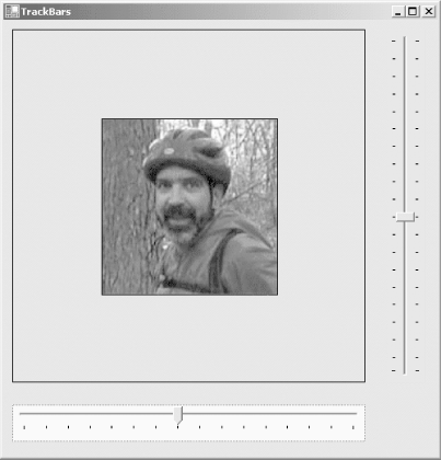
When this program is compiled and run, it looks like the screenshot in Figure 13-13. Although not visible in this monochrome book, the background color of the horizontal track bar is yellow, and pink for the vertical track bar. Notice the dotted line around the horizontal track bar, indicating that it has focus. Unlike scrollbars, track bars participate in the tab order and can receive focus.
Figure 13-14. Track bars
The first difference between the track bar example and the scrollbar examples is the declaration of the member variables for the controls: here you declare two TrackBar objects which will subsequently have an Orientation property applied to make them horizontal or vertical, rather than an HScroll object and a VScroll object.
Other than minor text and size differences, the next change relative to the scrollbar examples occurs when the track bar controls are instantiated in the constructor. Rather than separate horizontal and vertical versions of the control, both are instances of the TrackBar class, with the Orientation property set to Orientation.Horizontal or Orientation.Vertical, as appropriate.
The Size and Location properties are set as they were for the scrollbar examples. Note, however, that the thickness argument of the Size property (height of the horizontal control and width of the vertical control) has no effect, since the default AutoSize value of true is in effect.
The next two lines for each control set the tick mark style and frequency. The horizontal control has the TickStyle property set to TickStyle.BottomRight, while the vertical control has it set to TickStyle.Both. The results are visible in Figure 13-13.
The TickFrequency property specifies how far apart the tick marks are. For the horizontal control, it is hardcoded to 25, while the vertical control has it set to a function of the Maximum property for the control. In the latter case, the TickFrequency is not set until after the line calling the SetRange method, which effectively sets the Maximum property for that control. If the TickFrequency line (which uses the Maximum property) comes before the Maximum property is set, the default value of Maximum, 10, is used. This does not have the desired effect.
The Minimum, Maximum, SmallChange, and LargeChange properties are set for the horizontal control just as they were for the scrollbars. For the vertical control, however, the SetRange method is used, and you do not set the Minimum and Maximum properties in two separate statements. The result is the same.
The initial Value properties are set to match the size of the image. Unlike the scrollbar example, there is no need to consider the size of the LargeChange property.
The BackColor properties are set for both controlsa feature that is not available to scrollbars.
The event handlers for the track bars are nearly the same as for the scrollbars, except that there is no need to deal with the thickness of the thumb as part of the calculation, greatly simplifying matters.
Windows Forms and the .NET Framework
Getting Started
Visual Studio .NET
- Overview
- Start Page
- Projects and Solutions
- The Integrated Development Environment (IDE)
- Building and Running
Events
Windows Forms
- Windows Forms
- Web Applications Versus Windows Applications
- The Forms Namespace
- Form Properties
- Forms Inheritance
- User Interface Design
Dialog Boxes
- Dialog Boxes
- Modal Versus Modeless
- Form Properties
- DialogResult
- Termination Buttons
- Apply Button
- CommonDialog Classes
Controls: The Base Class
Mouse Interaction
Text and Fonts
Drawing and GDI+
Labels and Buttons
Text Controls
Other Basic Controls
TreeView and ListView
List Controls
Date and Time Controls
Custom Controls
- Custom Controls
- Specializing an Existing Control
- Creating a User Control
- Creating Custom Controls from Scratch
Menus and Bars
ADO.NET
- ADO.NET
- Bug Database: A Windows Application
- The ADO.NET Object Model
- Getting Started with ADO.NET
- Managed Providers
- Binding Data
- Data Reader
- Creating a DataGrid
Updating ADO.NET
- Updating ADO.NET
- Updating with SQL
- Updating Data with Transactions
- Updating Data Using DataSets
- Multiuser Updates
- Command Builder
Exceptions and Debugging
- Exceptions and Debugging
- Bugs Versus Exceptions
- Exceptions
- Throwing and Catching Exceptions
- Bugs
- Debugging in Visual Studio .NET
- Assert Yourself
Configuration and Deployment
EAN: 2147483647
Pages: 148
