Using Poorly Designed Display Media
It isn't enough to choose the right medium to display the data and its messageyou also must design the components of that medium to communicate clearly and efficiently, without distraction. Most graphs used in business today are poorly designed. The reason is simple: almost no one has been trained in the fundamental principles and practices of effective graph design. This content is thoroughly covered in my book Show Me the Numbers: Designing Tables and Graphs to Enlighten, so I won't repeat myself here. Instead, I'll simply illustrate the problem with a few examples.
In addition to the fact that a bar graph would have been a better choice to display this data (the division of revenue between six sales), Figure 3-19 exhibits several design problems. Look at it for a moment and see if you can identify aspects of its design that inhibit quick and easy interpretation.
Figure 3-19. This pie chart illustrates several design problems.
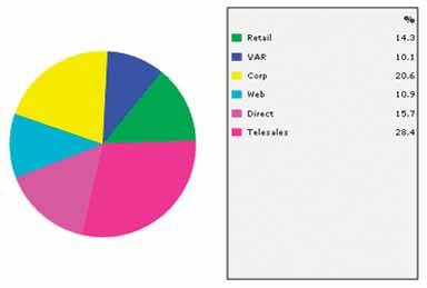
Here are the primary problems that I see:
A legend was used to label and assign values to the slices of the pie. This forces our eyes to bounce back and forth between the graph and the legend to glean meaning, which is a waste of time and effort when the slices could have been labeled directly.
The order of the slices and the corresponding labels appears random. Ordering them by size would have provided useful information that could have been assimilated instantly.
The bright colors of the pie slices produce sensory overkill. Bright colors ought to be reserved for specific data that should stand out from the rest.
The pie chart in Figure 3-20 also illustrates a problem with color choice.
Figure 3-20. This pie chart uses of colors for the slices that are too much alike to be clearly distinguished.
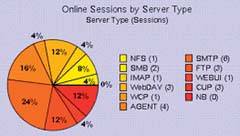
In this case, the 11 colors that were chosen are too similar. It is difficult to determine which of the hues along the yellow through orange to red spectrum in the legend corresponds to each slice of the pie. This kind of eye-straining exercise is deadly, especially on a dashboard.
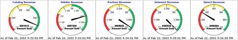
Another example of an ineffective display medium is shown in Figure 3-21. These meters are an attempt to be true to the metaphor of a car dashboard. Notice that the numbers look just like they would on an odometer: they lack the commas normally used to delineate every set of three digits to help us distinguish thousands from millions, and so on. In a misguided effort to make these meters look realistic, their developers made the numbers harder to readengineers designed these meters, not business people. Notice also that numbers along the quantitative scale are positioned inside rather than outside the axis, which will cause them to be obscured by the needle when it points directly to them, and that the positioning of the text at the bottom of each meter (for example, "4382934 Amount Sold" on the "Internet Revenue" meter) obstructs the needle for measures near the bottom or top of the scale.
Figure 3-21. These dashboard meters have definitely taken the dashboard metaphor too far.
In the last section, I spoke of bar graphs as a preferable alternative to certain other display media. However, while bar graphs can do an excellent job of displaying quantitative data, they can be misused as well. Examine the graph in Figure 3-22, and take a moment to list any problems with its design that you see. Write down your observations below before reading on, if you'd like.
Figure 3-22. This bar graph, found on a dashboard, exhibits several design problems.
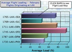
You might have noticed that the grid lines on the graph (not to mention the background pattern of colored rectangles) do nothing but distract from the data. Grid lines such as these, especially when visually prominent, make it more difficult to see the shape of the data. Perhaps you also noticed that the 3-D effect of the graph not only added no value, but also made the values encoded by the bars harder to interpret. Anything else? Well, this graph illustrates a common problem with color. Why is each of the bars a different color? The colors aren't being used to identify the bars, as each one has a label to its left. Differences in the color of data-encoding objects should always be meaningful; otherwise, they needlessly grab our attention and cause us to search for meaning that isn't there.
The distinct colors of the bars in Figure 3-23 do, thankfully, carry meaning, but here the colors are distractingly bright and the 3-D effect makes them hard to read.
Figure 3-23. This bar graph, found on a dashboard, was poorly designed in a number of ways.
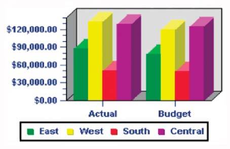
However, this isn't the problem that I most want you to notice. The purpose of the graph is to compare actual to budgeted revenues for each of the four regions, but something about its design makes this difficult. Can you see the problem? Given its purpose, the bars for actual and budgeted revenues for each region should have been placed next to one another. As they are, it is unnecessarily difficult to compare them. Simple design mistakes like this can significantly undermine the success of a dashboard.
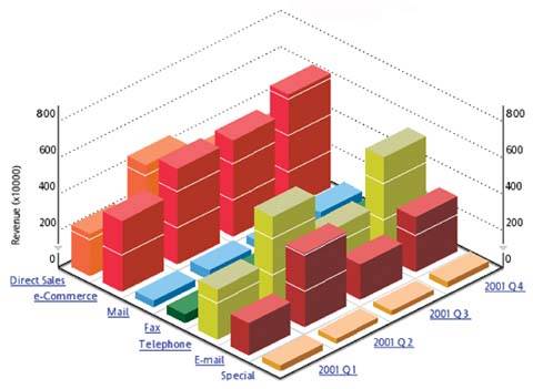
Several of the examples that we've examined have been rendered in 3D, even though the third dimension of depth doesn't encode any meaning. Even when the third dimension is used to encode a separate variable, however, it still poses a problem. The graph in Figure 3-24 uses the third dimension of depth to represent time (the four quarters of the year 2001). The problem in this case isn't that the third dimension is meaningless, but rather that you can't read everything on the chart. This is caused by occlusion. Adding the dimension of depth causes some of the bars to be hidden behindor occluded byothers. For instance, what were fax revenues for Quarter 3? You can't tell because the bar is completely hidden. Whether the third dimension is used to encode data or not, you should almost always avoid 3-D graphs. Exceptions to this rule are rare when displaying typical business data.
Figure 3-24. This 3-D bar graph illustrates the problem of occlusion.
Clarifying the Vision
- Clarifying the Vision
- All That Glitters Is Not Gold
- Even Dashboards Have a History
- Dispelling the Confusion
- A Timely Opportunity
Variations in Dashboard Uses and Data
Thirteen Common Mistakes in Dashboard Design
- Thirteen Common Mistakes in Dashboard Design
- Exceeding the Boundaries of a Single Screen
- Supplying Inadequate Context for the Data
- Displaying Excessive Detail or Precision
- Choosing a Deficient Measure
- Choosing Inappropriate Display Media
- Introducing Meaningless Variety
- Using Poorly Designed Display Media
- Encoding Quantitative Data Inaccurately
- Arranging the Data Poorly
- Highlighting Important Data Ineffectively or Not at All
- Cluttering the Display with Useless Decoration
- Misusing or Overusing Color
- Designing an Unattractive Visual Display
Tapping into the Power of Visual Perception
- Tapping into the Power of Visual Perception
- Understanding the Limits of Short-Term Memory
- Visually Encoding Data for Rapid Perception
- Gestalt Principles of Visual Perception
- Applying the Principles of Visual Perception to Dashboard Design
Eloquence Through Simplicity
- Eloquence Through Simplicity
- Characteristics of a Well-Designed Dashboard
- Key Goals in the Visual Design Process
Effective Dashboard Display Media
- Effective Dashboard Display Media
- Select the Best Display Medium
- An Ideal Library of Dashboard Display Media
- Summary
Designing Dashboards for Usability
- Designing Dashboards for Usability
- Organize the Information to Support Its Meaning and Use
- Maintain Consistency for Quick and Accurate Interpretation
- Make the Viewing Experience Aesthetically Pleasing
- Design for Use as a Launch Pad
- Test Your Design for Usability
Putting It All Together
EAN: 2147483647
Pages: 80
